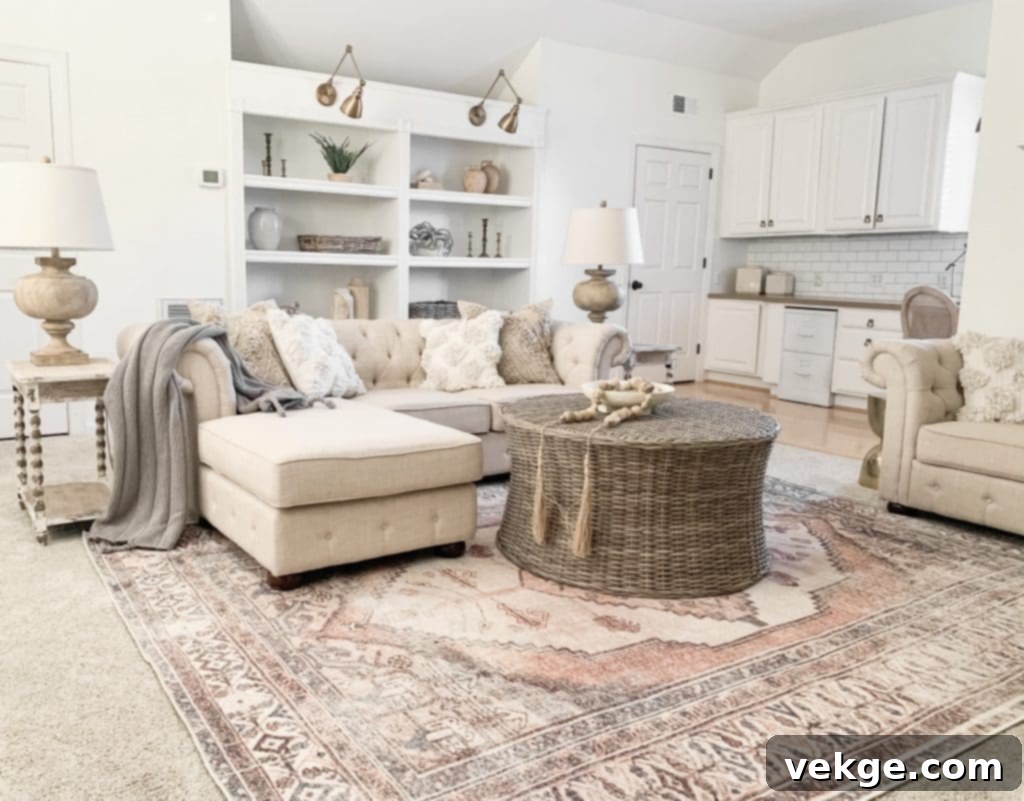
Elevate Your Home with Sherwin Williams Alabaster: The Ultimate Guide to Complementary Colors
In the expansive world of interior design, few elements hold as much power as color. The strategic selection and harmonious combination of hues can breathe life, character, and an undeniable sense of elegance into any space. Among the most cherished and versatile shades, Sherwin Williams Alabaster (SW 7008) stands out. This timeless off-white color, with its soft, creamy undertones, has captured the hearts of homeowners and designers alike, serving as a perfect canvas for diverse design aesthetics.
Alabaster isn’t just a paint color; it’s a foundation. Its inherent warmth and understated sophistication make it an ideal backdrop that elevates any room, allowing other design elements to truly shine. However, its true potential is unleashed when paired with the right complementary colors. Choosing these companions is crucial, as they work together to define the mood, depth, and overall personality of your home.
The quest for the perfect partner for Sherwin Williams Alabaster often leads to a delightful exploration of various shades, ranging from subtle neutrals to bold, commanding accents. The beauty of Alabaster lies in its flexibility; it’s a color that can transition seamlessly across different palettes, adapting to your personal taste and the desired theme of your living space. This article delves into five exceptional color pairings that beautifully complement Sherwin Williams Alabaster, offering insights into why they work and how they can transform your interiors into a welcoming and stylish sanctuary. Prepare to discover the hues that will bring character and a serene ambiance to your living room and beyond.
1. Urban Bronze: A Sophisticated & Grounding Partner for Alabaster

Sherwin Williams Urban Bronze (SW 7048) is a deeply intriguing color, a rich member of the brown family that often flirts with very dark greige due to its significant grey undertones. This complex shade of brown paint, infused with a subtle hint of grey, offers a sophisticated and grounding presence in any room. Its versatility extends beyond the living room, making a striking statement in kitchens, bedrooms, on front doors, kitchen cabinets, or as a dramatic feature wall.
The inherent darkness and depth of Urban Bronze create an exquisite contrast when paired with Alabaster. The creamy, soft white of Alabaster provides a luminous backdrop, allowing the bold accent of Urban Bronze to truly pop and radiate warmth throughout the space. Since Alabaster is a quintessential neutral, introducing a powerful accent like Urban Bronze is an astute design choice. This combination achieves a perfect balance: the rich, dark notes of Urban Bronze are beautifully softened and brightened by the creamy white of Alabaster, preventing the darker shade from overwhelming the room.
When incorporating this pairing, consider how it interacts with fixed elements in your home, such as kitchen cabinet colors or flooring. Choosing these elements to harmonize with the Alabaster and Urban Bronze combination will ensure a cohesive and polished look. This dynamic duo will transform your living room into a radiant and welcoming haven, exuding an air of modern elegance and comforting sophistication. The interplay of light and dark, soft and bold, makes Urban Bronze a highly recommended complementary color for Alabaster.
2. Clary Sage: Embracing Nature with Alabaster
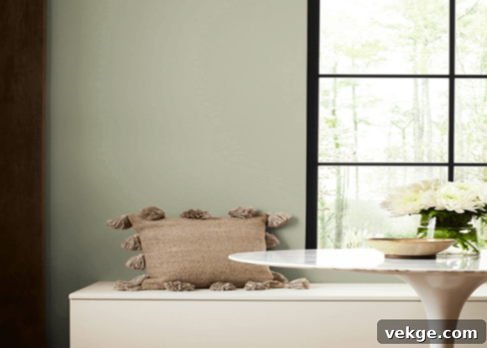
Sherwin Williams Clary Sage (SW 6178) is a truly enchanting green, reminiscent of freshly picked sage from a serene garden. This natural hue belongs firmly to the green family, characterized by its medium grey-green tone and a subtle hint of yellow. It offers a gentle, calming presence that makes it an excellent choice for creating tranquil interiors. When considering a palette for your living room, the combination of Alabaster and Clary Sage emerges as one of the most aesthetically pleasing and harmonious options.
Both Alabaster and Clary Sage share soft, subtle, and warm undertones, allowing them to “dance well together” in perfect unison. This synergistic pairing creates a living room that feels inherently warm, calm, and incredibly welcoming. The natural essence of Clary Sage, balanced by Alabaster’s creamy lightness, evokes a sense of peace and connection to the outdoors, fostering a relaxed atmosphere that is ideal for unwinding.
The versatility of this color combination means it can seamlessly extend beyond the living room, gracing kitchens, dining areas, and other adjacent spaces to maintain a cohesive flow throughout your home. It’s important to remember, however, that like all colors, Clary Sage’s appearance can shift dramatically under different lighting conditions. In south-facing rooms, its warmth may be accentuated, while in north-facing rooms, it might lean slightly cooler. Always test large swatches in your specific environment to fully appreciate how this beautiful natural green will interact with Alabaster and your home’s unique light.
3. Repose Gray: The Cool, Sophisticated Greige Companion to Alabaster
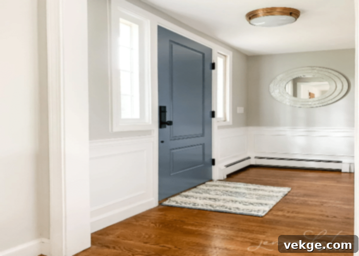
Sherwin Williams Repose Gray (SW 7015) stands as one of the most popular greige colors in the market, celebrated for its perfect balance between grey and beige. This makes it an incredibly versatile, neutral, and inoffensive color palette choice that adapts beautifully to various design styles. Repose Gray is known for its subtle undertones of blue and green, which become more apparent in north-facing rooms, lending it a cooler, crisper appearance. Conversely, in south-facing rooms, its beige side tends to emerge more prominently, offering a warmer, more inviting feel. These subtle undertone shifts contribute to its dynamic character, making it a stellar choice for a sophisticated living room.
The complexity of Repose Gray’s mixed tones adds considerable depth and character to any space, allowing it to radiate a refined elegance. Its appearance, as with many nuanced colors, is highly dependent on the ever-changing lighting conditions throughout the day. The inherent grey qualities within this shade make it remarkably adaptable, working seamlessly across a multitude of spaces and furnishings.
When paired with Alabaster, Repose Gray truly shines. The creamy white warmth of Alabaster provides an excellent base, harmoniously complementing the cool yet balanced nature of Repose Gray. Alabaster brightens and softens Repose Gray, preventing it from appearing too stark or cold, while Repose Gray adds a layer of subtle sophistication that allows Alabaster to stand out as a clean, crisp trim or ceiling color. This combination offers a timeless and elegant foundation for any interior, creating an atmosphere that is both serene and stylish.
4. Sea Salt: A Serene Coastal Escape with Alabaster
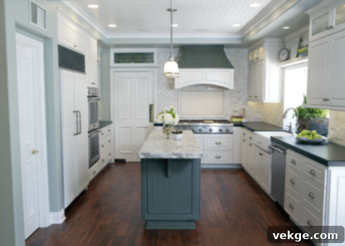
For those yearning to infuse their living room with a serene, beachy, or coastal theme, Sherwin Williams Sea Salt (SW 6204) is an unparalleled choice. This color evokes the soothing tranquility of ocean breezes and the gentle lapping of waves, making it an ideal candidate for creating a truly relaxing atmosphere. While often associated with bathrooms due to its calming aquatic connotations, Sea Salt’s versatile charm extends beautifully into living spaces, transforming them into peaceful retreats.
Sea Salt is a fascinating chameleon of a color, possessing a distinct greenish-grey tone that subtly shifts depending on the prevailing lighting conditions. In its purest form, it offers a soft, muted green with underlying grey notes, providing a slightly warmer and more organic vibe. However, in north-facing rooms, its blue undertones can emerge more strongly, giving it a cooler, more distinctly oceanic feel. This dynamic quality adds depth and interest, ensuring the color never feels flat.
The creamy white of Alabaster proves to be an exquisite partner for Sea Salt. Both shades share a subtle, gentle quality, allowing them to harmonize effortlessly. The warmth of Alabaster balances the potentially cooler aspects of Sea Salt, while Sea Salt introduces a refreshing pop of color that remains soft and inviting. Together, the creamy white Alabaster and the greenish-gray Sea Salt create a dance of delicate tones, perfectly encapsulating the essence of a coastal theme. This pairing is not just a color scheme; it’s an invitation to unwind, making it an impeccable choice for a living room designed for relaxation and calm.
5. Redend Point: A Soft, Warm, and Earthy Accent for Alabaster
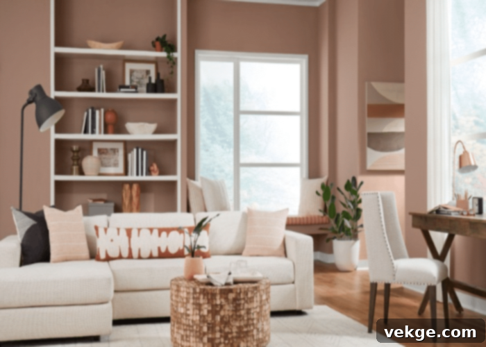
Sherwin Williams Redend Point (SW 9192), the celebrated Sherwin Williams Color of the Year 2023, is a captivating mid-toned clay color that beautifully oscillates between a soft pinky-brown and a warm terracotta. This inviting shade exudes “cozy vibes” and brings a unique blend of warmth and personality to any interior. Its earthy richness makes it an ideal accent color that can be effortlessly incorporated with other subtle, neutral tones, creating a welcoming and grounded ambiance.
Redend Point is a perfect choice for the living room, as it radiates a charming blend of the popular pop colors pink and brown, without being overly saturated. Under bright lighting conditions, this color truly glows, infusing the room with an inviting warmth that feels both modern and timeless. Its inherently warm undertones are a perfect match for the creamy white Alabaster, creating a harmonious and sophisticated pairing that feels incredibly cohesive.
When combined with Alabaster, Redend Point offers a welcoming embrace, making you and your guests feel instantly at home. The earthy tone of Redend Point provides a distinctive character and a focal feature to the space, especially when used on an accent wall or within architectural details. The strategic placement of furniture and decor in relation to these painted walls plays a major role in enhancing the room’s overall aesthetic, allowing the rich warmth of Redend Point and the serene purity of Alabaster to collectively define a space of comfort and style.
Final Thoughts on Pairing Colors with Sherwin Williams Alabaster
As we’ve explored, while there are countless options for pairing colors with Sherwin Williams Alabaster, the five selections discussed above – Urban Bronze, Clary Sage, Repose Gray, Sea Salt, and Redend Point – offer distinct and beautiful pathways to creating a captivating living space. This exploration into color theory highlights the incredible versatility of Alabaster as a foundational hue.
Sherwin Williams Alabaster is truly a designer’s dream, capable of harmonizing with both soft, muted tones and bold, vibrant accents. The ultimate choice of combination rests entirely on your personal taste and the specific theme or atmosphere you wish to cultivate in your living room and throughout your home. Do you envision a dramatic, modern contrast, a serene natural retreat, a sophisticated neutral backdrop, a refreshing coastal haven, or a warm, earthy embrace?
The thoughtful exchange of color radiance between Alabaster and its chosen complementary shade holds the potential to transform an ordinary room into an extraordinary one. By carefully selecting the right combination, Sherwin Williams Alabaster can elevate your space, infusing it with character, warmth, and unparalleled style. Remember, a touch of color psychology, combined with your own creative insights, is all it takes to make your living room not just bright, but truly lively and reflective of your unique personality. Don’t shy away from testing swatches on your walls to see how these beautiful pairings come to life in your home’s unique lighting conditions before making your final decision.
