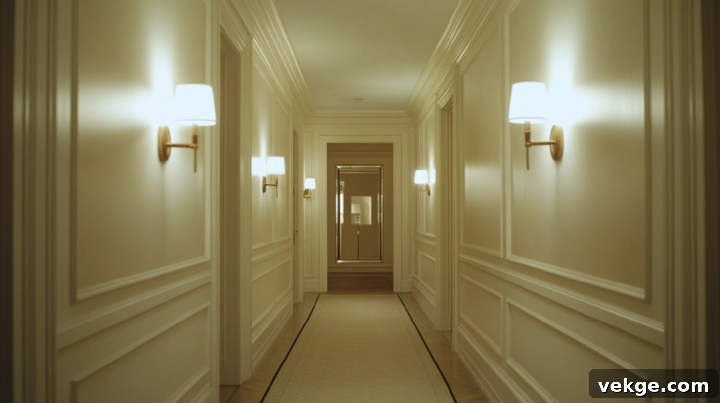
Transform Your Home: Best Paint Colors to Brighten a Dark, Narrow Hallway
Every time I walked through my hallway, it felt more like a forgotten tunnel than a welcoming part of my home – dark, cramped, and often overlooked. Knowing I couldn’t add a window or knock down a wall, I turned to a surprisingly simple yet powerful solution: paint. The transformation was far more significant than I had anticipated, proving that even the most challenging spaces can be revitalized with the right approach.
In this comprehensive guide, I’m sharing the exact colors and expert tips that helped me turn my narrow, windowless hallway into a space that now feels remarkably brighter, more open, and significantly more inviting. If you’re struggling with a hallway that feels heavy, closed-in, or just plain gloomy, these ideas are designed to help you infuse it with light and character, even when natural light is scarce. Let’s explore how to make your hallway feel as fresh and vibrant as the rest of your home.
The Undeniable Impact of Color Choice in Small, Dim Hallways
Choosing the right colors for a narrow, poorly lit hallway isn’t just about aesthetics; it’s a strategic design decision that can fundamentally change how the space feels. The colors on your walls possess an incredible power to manipulate perception, making a tight space feel expansively larger and a dark area appear significantly brighter.
Color’s Essential Role in Light Reflection and Amplification
Light colors are truly miraculous in small, dim hallways because they inherently reflect a greater amount of light compared to their darker counterparts. When light, whether from a fixture or a neighboring room, strikes a pale-colored wall, a substantial portion of that light is bounced back into the space. This optical phenomenon instantly brightens the area. This is why shades of white, cream, and other light tones are universally recommended for areas with limited or no natural lighting.
A fresh coat of a soft, luminous white paint, for instance, can almost instantly make a hallway feel noticeably brighter and more expansive. Beyond pure whites, gentle pastels such as soft blues and greens also perform exceptionally well, adding a subtle hint of color without compromising the light-reflecting benefits. These light shades are specifically chosen to maximize whatever ambient or artificial light is available, effectively making even the most narrow corridor feel more open and less claustrophobic.
The Psychology of Light Shades: Expanding Perceptions
Beyond the simple physics of light reflection, the colors we choose deeply influence our psychological perception of a space. Light colors naturally lead us to perceive areas as larger and more open than their actual dimensions. This is a powerful tool in interior design, especially for challenging spaces like hallways.
Soft, pale colors evoke a sense of calm, tranquility, and boundless openness. This can transform even the most cramped and restrictive corridor into a pathway that feels welcoming and less confining. For example, light blues often recall clear, open skies, fostering a sense of airiness and freedom. Gentle greens, on the other hand, connect us to nature, creating a serene and peaceful atmosphere. By understanding and utilizing these psychological effects, you can craft a hallway that not only looks brighter but genuinely feels more pleasant and inviting to traverse.
Top Color Ideas to Dramatically Brighten a Dark Narrow Hallway
Choosing the perfect paint color can utterly transform the ambiance of your dark hallway, turning it from a gloomy passage into a vibrant, welcoming artery of your home. Below, you’ll find a curated selection of tried-and-tested options specifically chosen for their ability to open up and brighten even the most challenging, light-deprived spaces.
These versatile colors are suitable for a wide range of home styles, from contemporary minimalist to rustic farmhouse. They can be effortlessly matched with various trim and flooring types, allowing you to create a cohesive and captivating hallway that feels expansive, luminous, and infinitely more welcoming. Experiment with these shades to discover the perfect solution for your unique home.
1. Soft Pure White
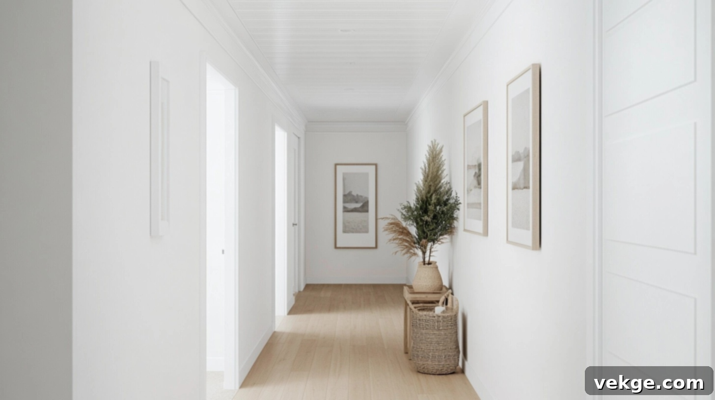
Soft, pure white remains the quintessential choice for making any dark space feel instantly bigger and significantly brighter. This pristine, uncomplicated shade boasts the highest light reflectance value, creating an immediate and noticeable boost in brightness even in areas with minimal existing lighting. Its crispness brings a fresh, clean feel to the entire space. It adapts beautifully to any interior design style, from ultra-modern to charming country, and pairs seamlessly with all types of flooring. For maximum impact and to visually erase boundaries, consider extending the same pure white paint from your walls onto the ceiling, creating a continuous, boundless expanse.
2. Creamy White
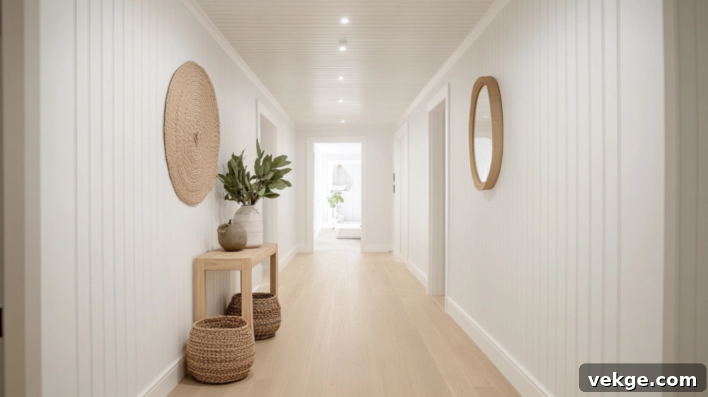
Creamy white offers all the exceptional light-reflecting benefits of pure white but introduces a subtle hint of warmth, preventing the space from feeling stark or cold. This inviting shade imbues dark hallways with a sun-kissed, welcoming glow, rather than a clinical atmosphere. It harmonizes beautifully in homes featuring natural wood trim or flooring, enhancing the inherent warmth and richness of the wood. Creamy white creates a cozy, lived-in feel while meticulously maintaining an open and light aesthetic, making it an ideal choice for a bright and welcoming hallway.
3. Pale Gray
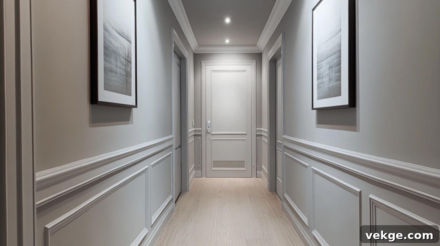
Pale gray introduces a sophisticated and modern sensibility to hallways while retaining sufficient lightness to effectively open up the space. This subtle neutral hue feels fresh, contemporary, and incredibly versatile without veering into overly cold territory. It pairs elegantly with light wood floors and crisp white trim, culminating in a clean, polished, and thoughtfully curated look. When selecting a pale gray, opt for shades with warm undertones (like a hint of beige) rather than pronounced blue undertones, to ensure the hallway maintains a cozy and inviting atmosphere.
4. Light Taupe
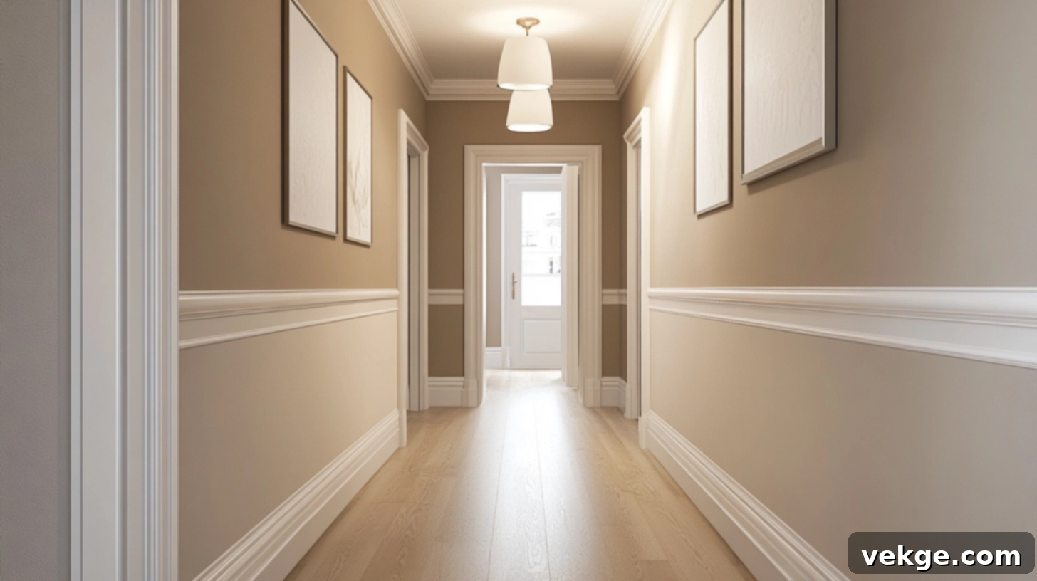
Light taupe is a wonderfully cozy neutral that provides a bit more visual interest and color depth than pure white or pale gray, all while diligently preserving the space’s brightness. This sophisticated blend of gray and beige imparts a rich, subtle depth to your walls without any risk of making the space feel confined or smaller. It integrates seamlessly into homes that feature earth tones and natural elements in their decor. Light taupe pairs particularly well with creamy white trim, creating a soft, layered, and utterly inviting aesthetic.
5. Ivory
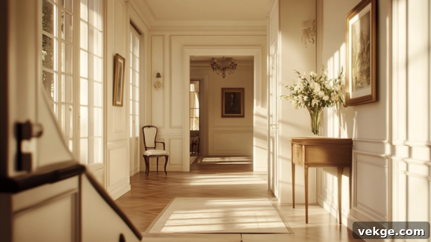
Ivory stands as a timeless and elegant choice that effectively brightens a space without the starkness often associated with pure white. This classic shade possesses a subtle hint of yellow warmth, allowing it to make hallways feel sunny and welcoming even in the complete absence of windows or direct sunlight. Its gentle glow is universally appealing, working well in both historic and contemporary homes, and it pairs beautifully with various wood elements. Ivory cultivates a gentle, luminous appearance that exudes classic charm and never goes out of style.
6. Pale Blush
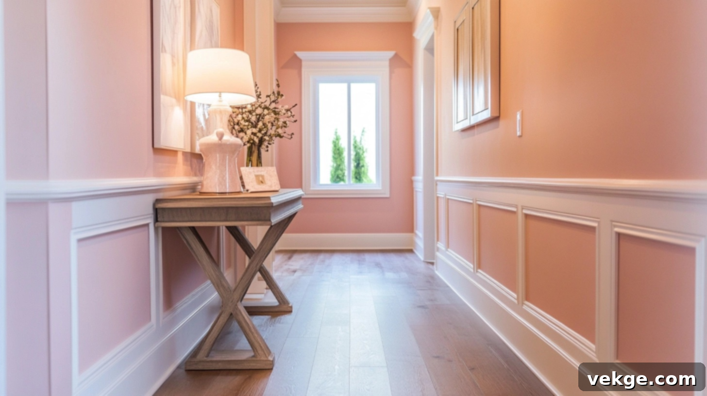
Pale blush introduces the slightest, most delicate touch of color while retaining all the powerful brightening capabilities of a light neutral. This soft, understated pink tone infuses hallways with an undeniable sense of warmth, gentleness, and welcoming appeal. It reflects light exquisitely, creating a happy, open, and airy feel that lifts the spirits. Pair this charming shade with crisp white trim for a clean, modern aesthetic, or combine it with light wood elements for a more natural and inviting style. Pale blush is surprisingly versatile and sophisticated.
7. Peachy Beige
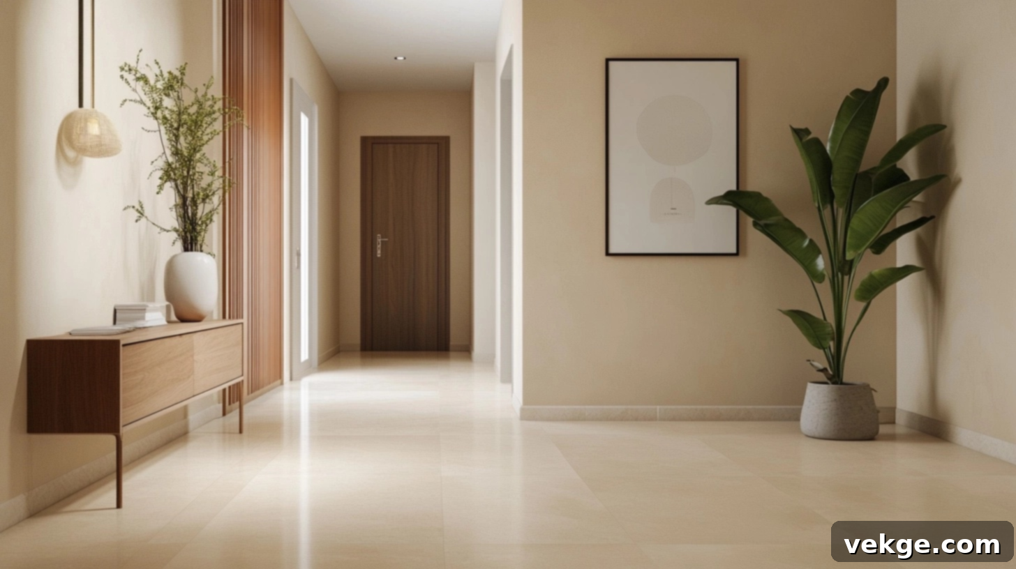
Peachy beige imparts a subtle, radiant glow to hallways, as if the space is perpetually kissed by the warm light of a sunset. This inviting warm shade contains just enough color to feel distinctly homey and comforting, yet it remains sufficiently light to ensure the space feels open and expansive. It integrates beautifully into homes with warm color palettes and themes, making the space feel thoughtfully curated and cared for. This amiable shade pairs particularly well with creamy or white trim, completing a harmonious and luminous look.
8. Warm Sand
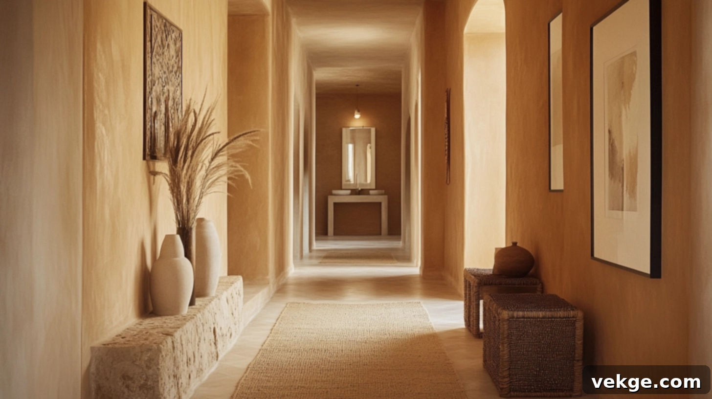
Warm sand cultivates an earthy, grounded, and incredibly soothing atmosphere while remaining light enough to reflect an abundance of light. This versatile neutral possesses enough inherent warmth to make the hallway feel undeniably cozy and inviting, yet it is carefully balanced to ensure it never closes in the space. It pairs wonderfully with natural materials such as various wood types and stone accents. Sand tones establish a calm, clean, and sophisticated look that still boasts a distinct personality and depth, making it a stellar choice for enhancing brightness.
9. Pale Sky Blue
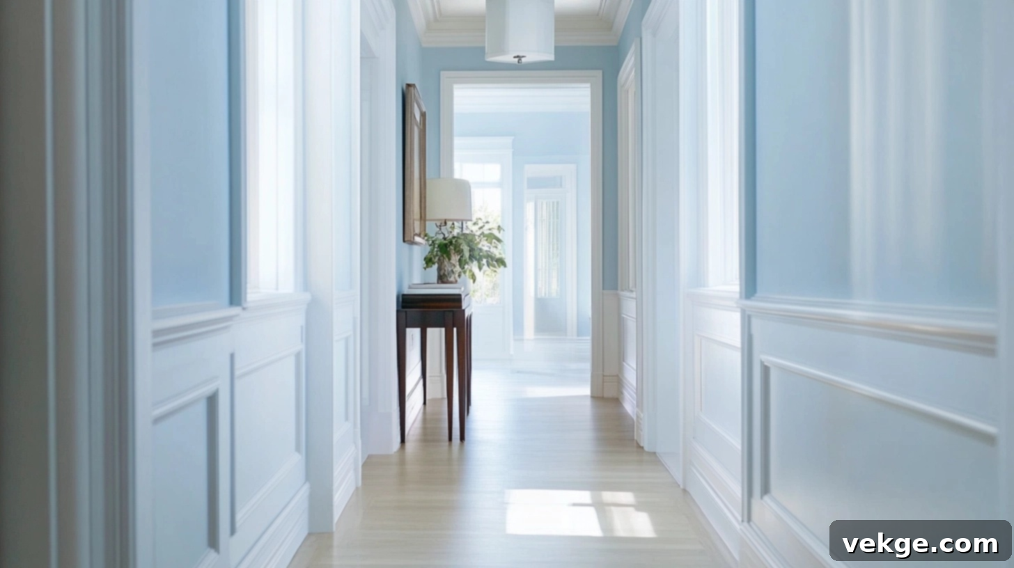
Pale sky blue introduces a delightfully cool, serene, and open sensation that makes hallways instantly appear taller and wider. This ethereal light shade subtly hints at vast open skies, creating an immediate sense of boundless space even within the tightest or most confined hallway. It complements homes with cool color themes beautifully and pairs elegantly with crisp white trim for a clean, fresh, and invigorating aesthetic. Always choose a very pale shade of sky blue to ensure maximum brightness and to prevent the space from feeling overwhelmed by color.
10. Dusty Aqua
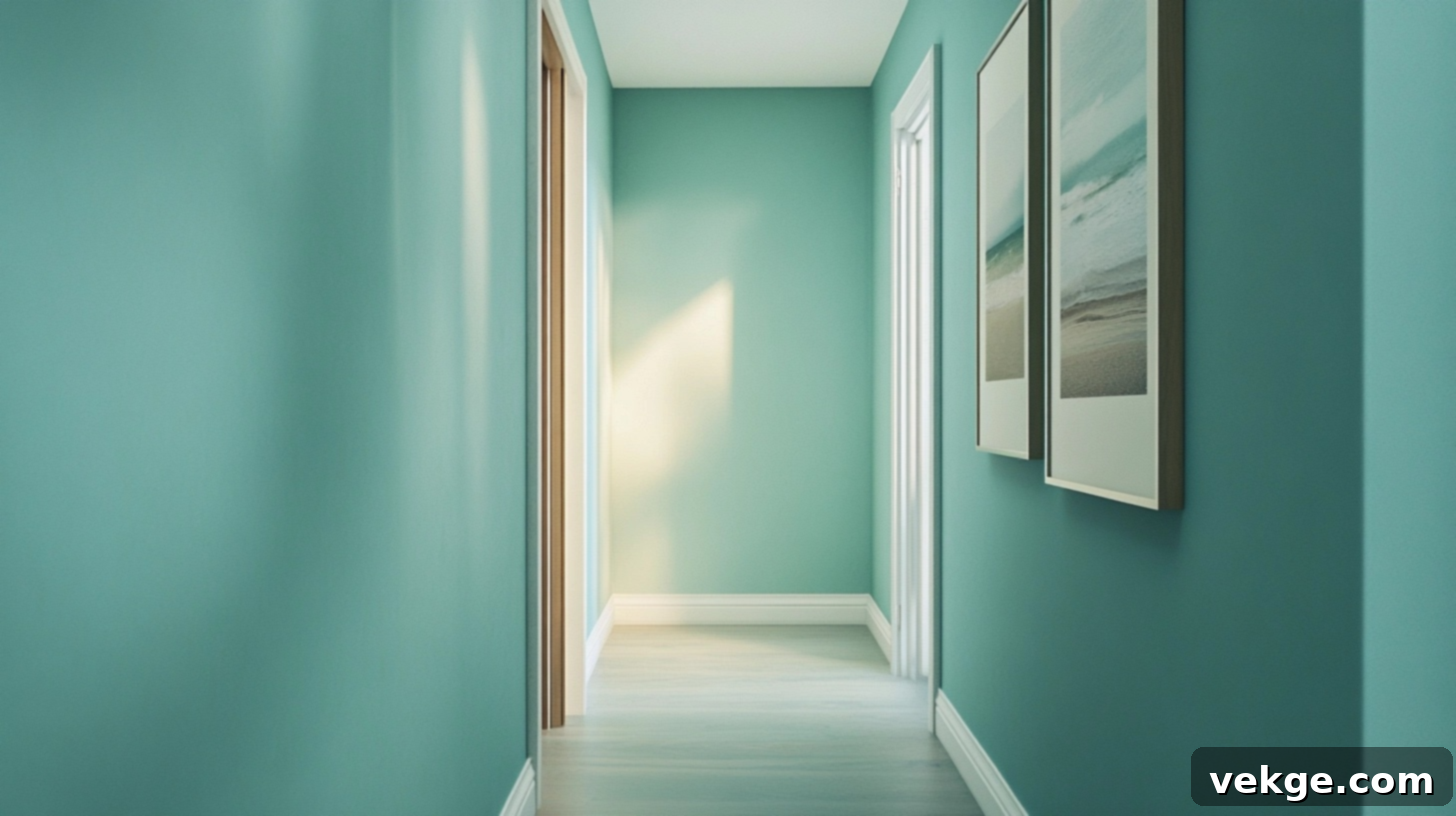
Dusty aqua adds a refreshing hint of color that feels simultaneously calm, clean, and utterly inviting. This light blue-green shade infuses a breezy, open, and relaxed feeling into dark hallways, reminiscent of a serene coastal escape. It works exceptionally well in homes with a beach-inspired aesthetic or in any space where you desire a delicate whisper of color without venturing into bold or overpowering tones. Pair it with pristine white trim to maintain an open, bright, and airy ambiance throughout the corridor.
11. Mint Green
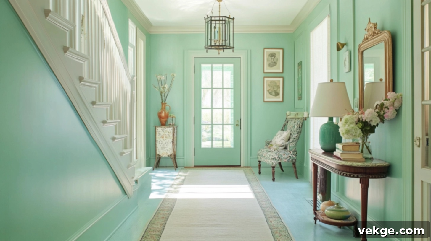
Mint green imparts an incredibly fresh, clean, and invigorating feel to dark hallways. This light shade masterfully offers the brightness typically found in pale neutrals, but with just enough subtle color to feel lively and engaging. It catches and reflects light beautifully, making any space feel cool, airy, and expansive. Mint green is remarkably versatile, fitting seamlessly into both modern minimalist and charming vintage-inspired homes. Pair it with white trim for a crisp, contemporary look or with light wood for a more organic and natural aesthetic.
12. Soft Lavender
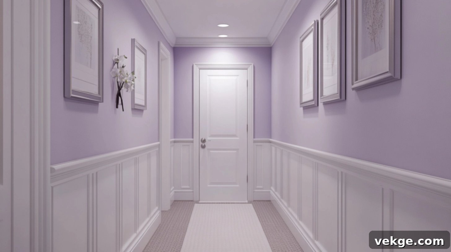
Soft lavender introduces a subtle yet distinctive personality to a hallway without any risk of making it feel smaller or enclosed. This very pale purple tone is thoughtfully chosen to be light enough to reflect an abundance of light, while simultaneously adding a gentle, ethereal touch of color. It cultivates a calm, peaceful, and almost meditative feeling as you navigate through the space, enhancing the overall experience. This delicate shade pairs exquisitely with white or light gray trim and looks particularly lovely in homes adorned with silver or chrome fixtures, adding a touch of understated elegance.
13. Muted Sage
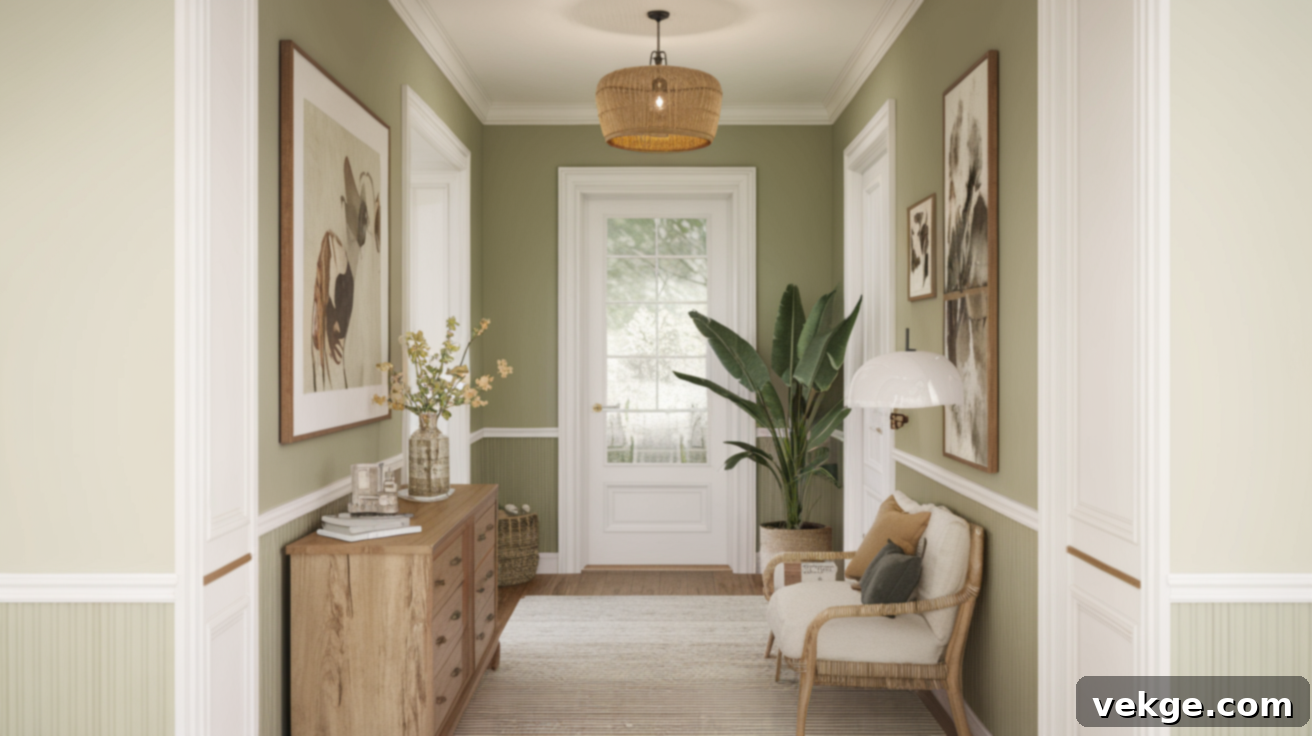
Muted sage skillfully brings a touch of the serene outdoors indoors, all while meticulously maintaining a light and open atmosphere. This gentle green-gray shade feels both remarkably current and timeless, making it an adaptable choice that complements a vast array of home styles, from rustic farmhouse to sleek modern. It reflects light exceptionally well, adding a nuanced depth and captivating interest to your walls without overwhelming the space. Muted sage pairs beautifully with creamy trim and various natural wood tones, creating a harmonious and sophisticated palette.
14. Off-White with Yellow Undertones
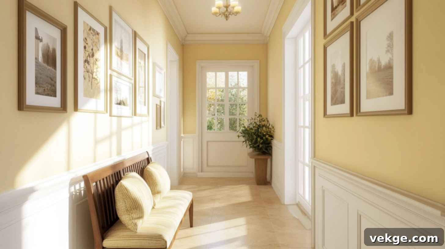
Off-white with yellow undertones creates an inherently warm, sunny, and incredibly cheerful feel, even in hallways completely devoid of windows or direct natural light. This specific shade is brighter than a standard cream but offers more warmth than a pure, stark white, striking a perfect and inviting balance. It instantly makes the space feel happy and welcoming, banishing any artificial or cold sensations. This warm white is universally compatible with any home style and pairs exceptionally well with both light and dark flooring, making it a versatile and effective choice.
15. Antique White
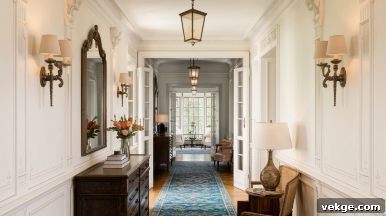
Antique white imbues a hallway with a touch of charming vintage elegance while diligently preserving all the brightness and luminosity of a light color. This creamy shade possesses a subtle aged quality, which gives it a comforting, lived-in, and inherently homey appeal. It is particularly well-suited for older homes or spaces that embrace a classic or traditional styling. Antique white successfully brings warmth and character to the forefront while still reflecting an abundance of light, ensuring the hallway remains beautifully bright and inviting.
16. Cool Greige
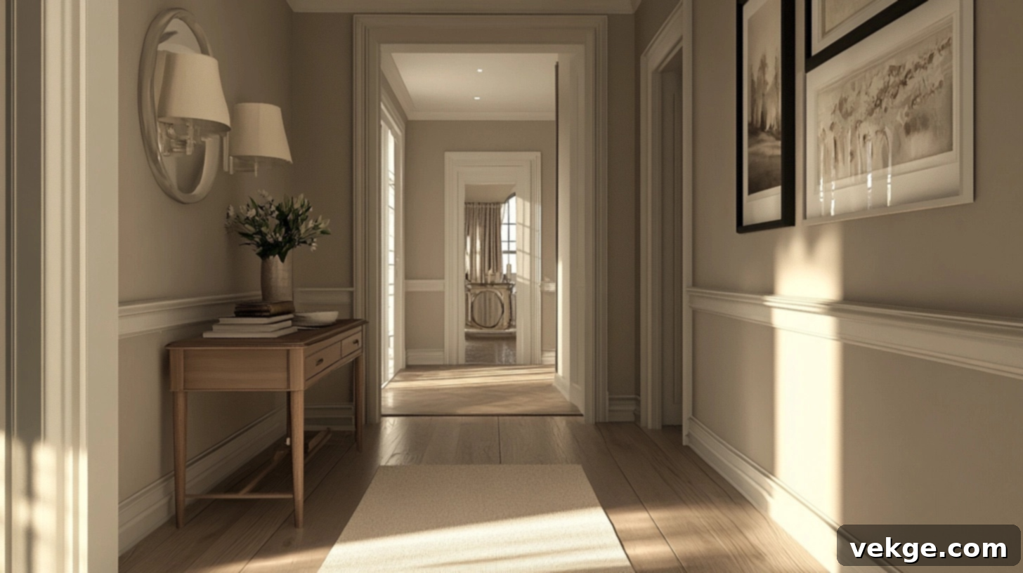
Cool greige offers an impeccable balance between the sophistication of gray and the warmth of beige, culminating in a modern neutral that feels wonderfully inviting and adaptable. This light shade is an excellent choice for homes with a transitional style, as it effortlessly allows you to blend both warm and cool design elements. It reflects light exceptionally well, while also possessing more inherent depth and character than a plain white. Pair cool greige with crisp white trim for a clean, fresh, and polished look that elevates the entire space.
17. Chalky Rose
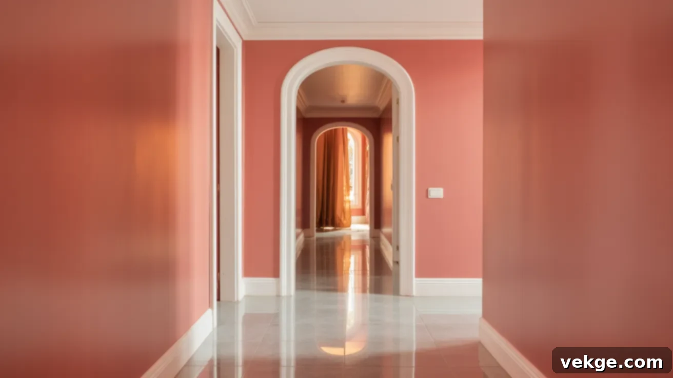
Chalky rose introduces a modern, understated pink tone that feels distinctly grown-up and sophisticated rather than juvenile. This pale shade skillfully adds a welcome touch of warmth to a dark hallway without any risk of making it feel smaller or enclosed. Its soft, muted quality ensures it never appears too bold or overpowering, maintaining a delicate balance. Chalky rose pairs beautifully with white or light gray trim and looks stunning with both wood and tile floors, offering a refined and contemporary aesthetic that enhances brightness.
18. Pale Apricot
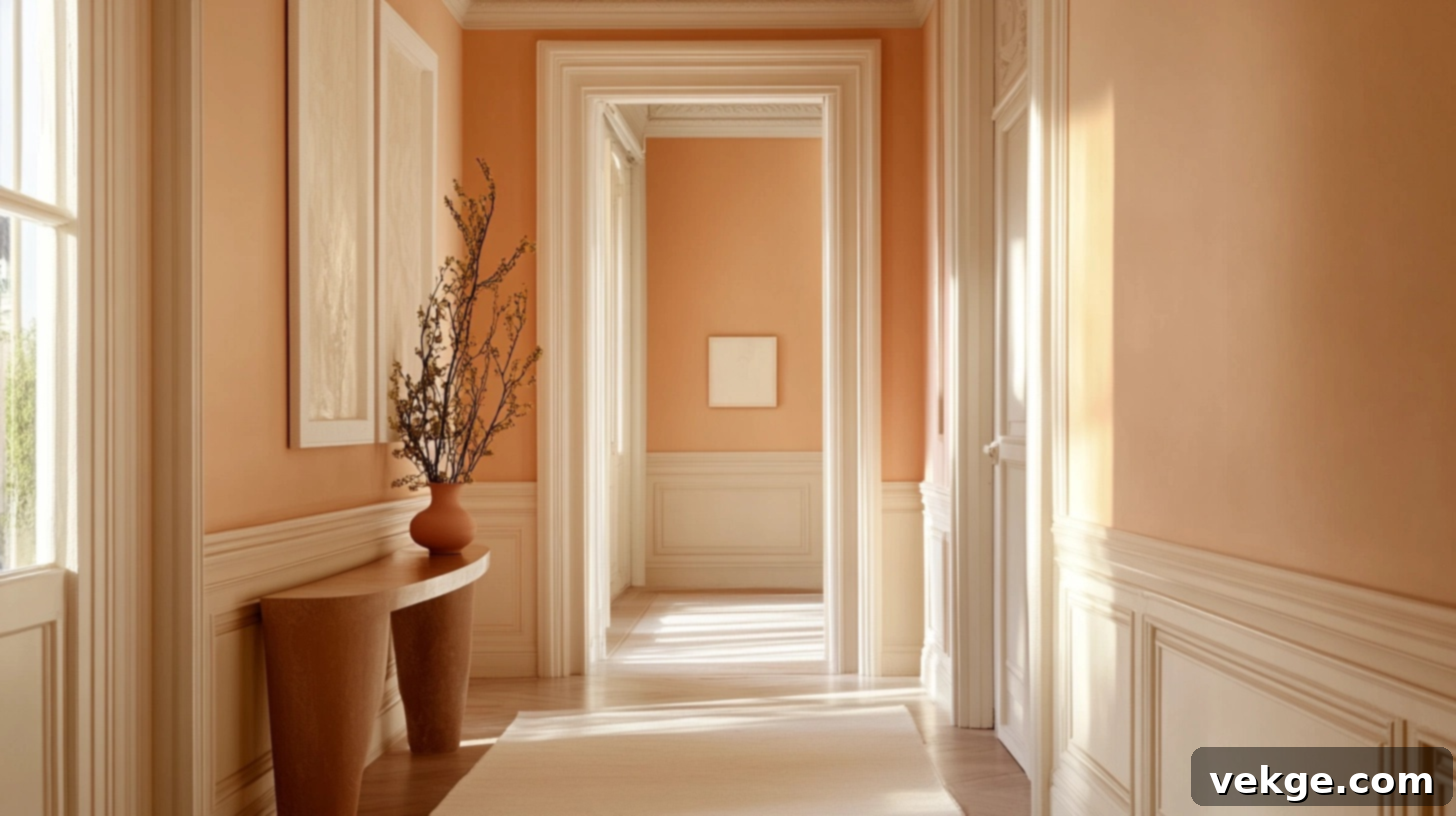
Pale apricot adds a delightful sunny glow to dark hallways without ever being too bright or loud. This light, orange-tinted shade feels inherently warm and exceptionally welcoming, as if the space is perpetually bathed in the soft, flattering light of a sunset. It is sufficiently light to keep the hallway feeling bright and airy, yet it possesses enough subtle color to feel truly special and distinct. This charming shade pairs beautifully with creamy trim and natural wood elements, creating a harmonious and luminous design.
19. Buttercream
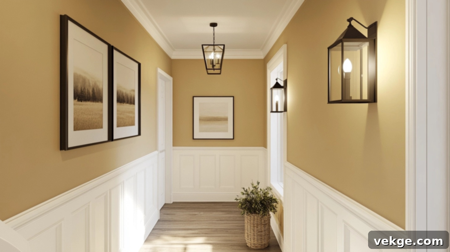
Buttercream cultivates a wonderfully cozy, bright, and inviting feel that is absolutely perfect for hallways that are in desperate need of warming up. This yellow-tinted white possesses all the superior light-reflecting qualities of pure white, but with the added benefits of warmth, richness, and depth. It feels distinctly sunny and homey without ever making the space feel closed in. Buttercream is an excellent choice for country, traditional, or farmhouse style homes and pairs beautifully with crisp white trim, enhancing its natural luminosity.
20. Bone
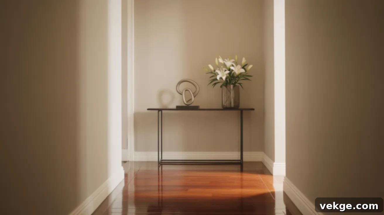
Bone is a graceful, barely-tinted white that injects a profound sense of sophistication and understated elegance into any hallway. This incredibly subtle shade possesses just enough inherent warmth to feel less stark and imposing than a pure white, while still maximally enhancing brightness. It works effortlessly in both modern and classic homes, consistently creating a clean, open, and refined feel. Bone pairs beautifully with any trim color and complements all floor types, making it an exceptionally versatile and universally appealing choice for any home style.
21. Soft Almond
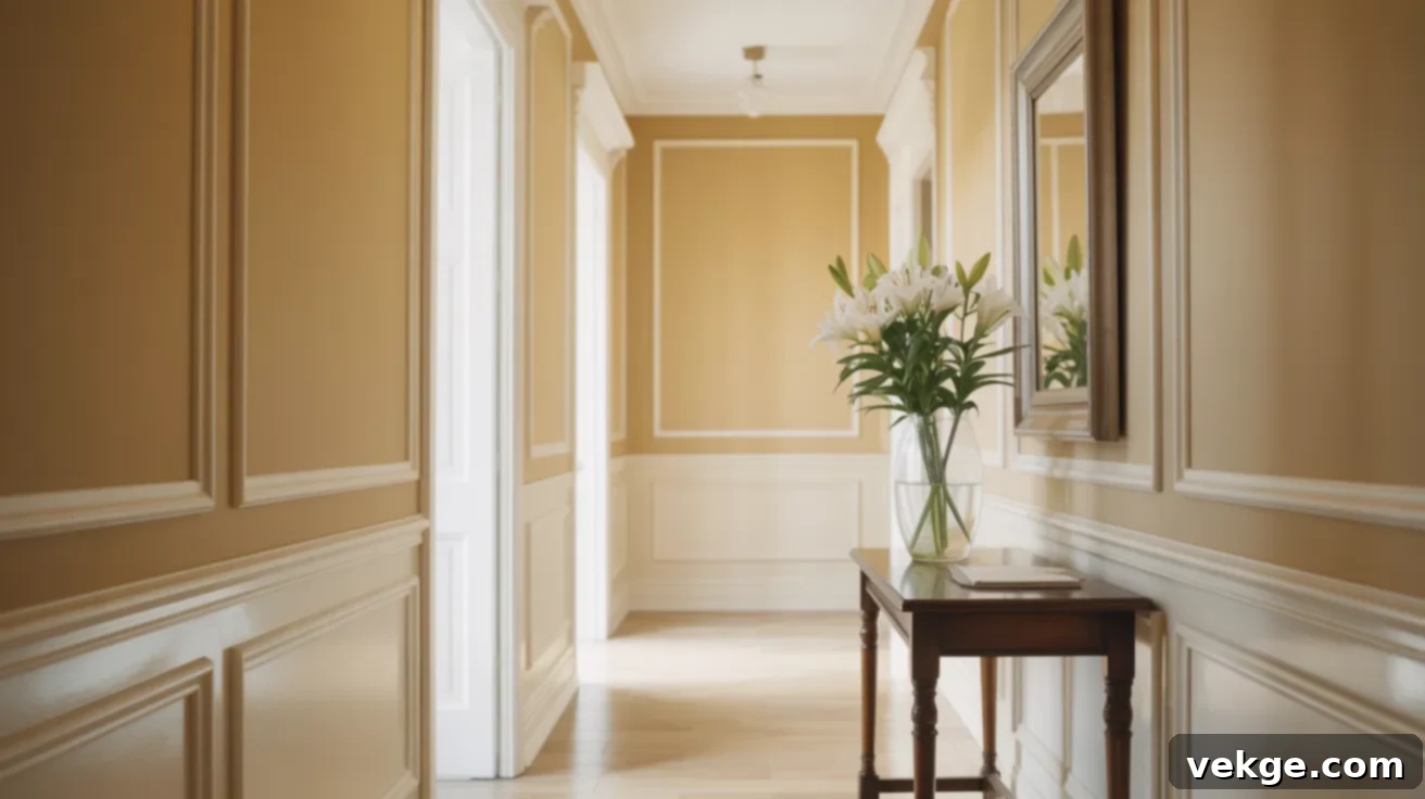
Soft almond cultivates a warm, inviting, and truly comforting feel while ensuring the hallway remains remarkably light and open. This creamy neutral possesses just enough delicate yellow and brown undertones to feel rich and substantial without ever darkening the space. It works beautifully in homes with traditional or classic styling and pairs elegantly with crisp white trim for a clean, timeless look. Soft almond brings an enduring quality to hallways while diligently reflecting an abundance of light, ensuring a bright and welcoming passage.
22. Pastel Lemon
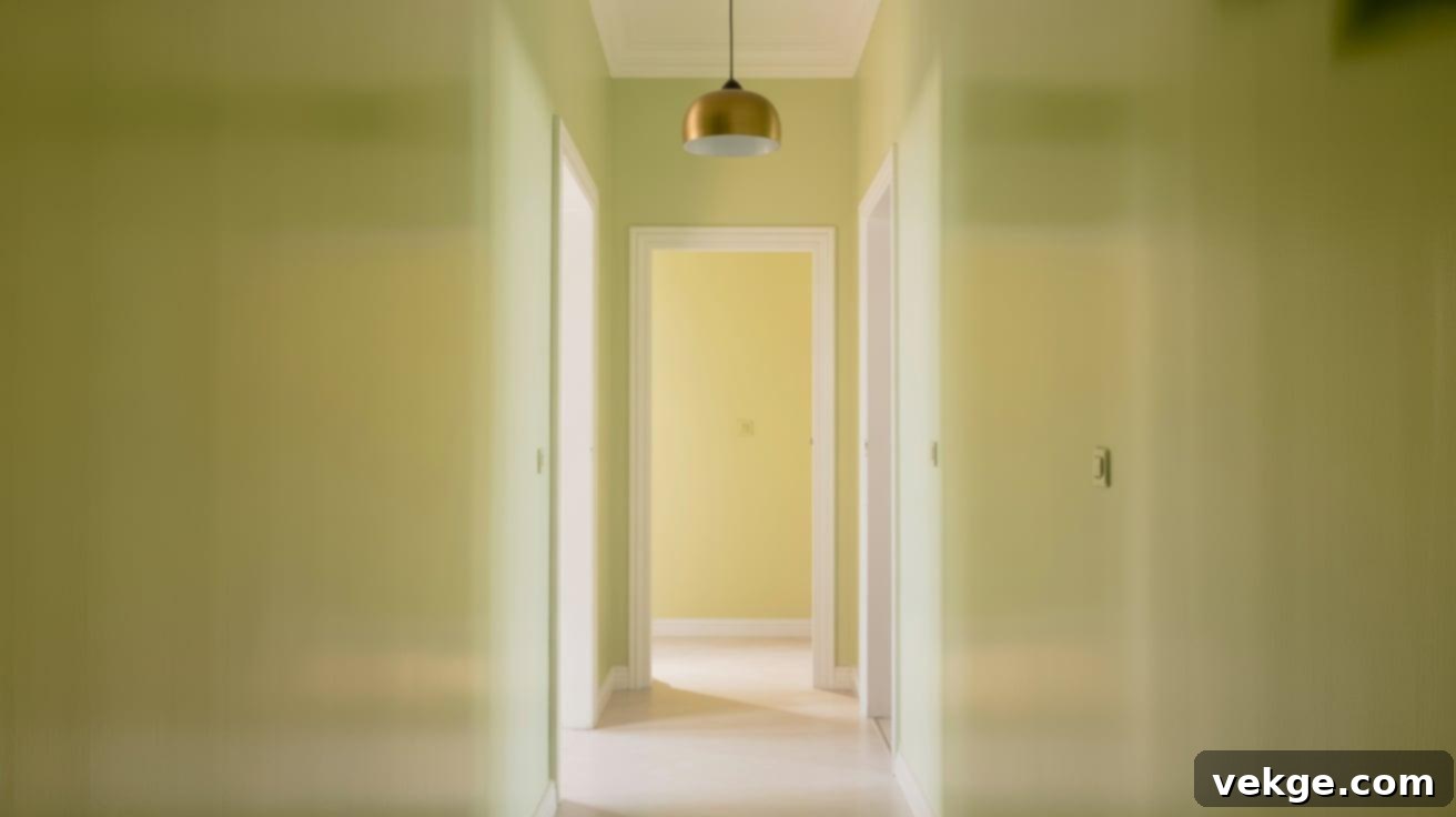
Pastel lemon injects a burst of vibrant energy and unmistakable brightness into even the darkest hallway. This incredibly light yellow shade feels distinctly sunny and cheerful without ever being too bold, harsh, or overpowering. It is perfectly light enough to maximize brightness, yet it contains enough color to create a happy, welcoming, and uplifting feel throughout the space. This effervescent shade works exceptionally well in homes with a bright, clean, and modern style and pairs beautifully with crisp white trim to further amplify its light-reflecting qualities and overall luminosity.
23. Frosted Lilac
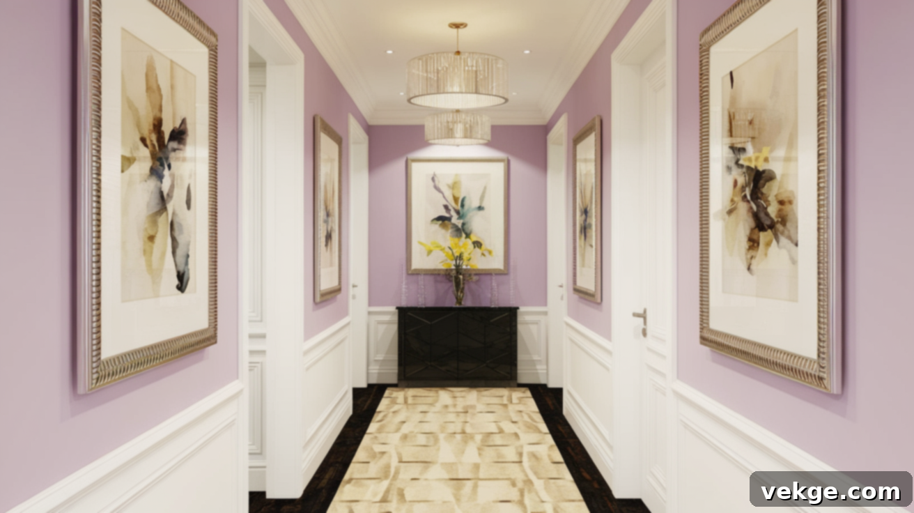
Frosted lilac offers a unique and surprisingly effective color choice that still works wonders in narrow spaces. This very pale purple possesses a misty, soft, and almost ethereal quality that feels both special and wonderfully subtle. It skillfully brings personality and a touch of unexpected charm to a hallway without any risk of making it feel smaller or darker. This gentle, enchanting shade pairs beautifully with white or light gray trim, creating an unexpected yet immensely pleasing look that guests will undoubtedly notice and enjoy for its distinctive elegance.
24. Seashell Pink
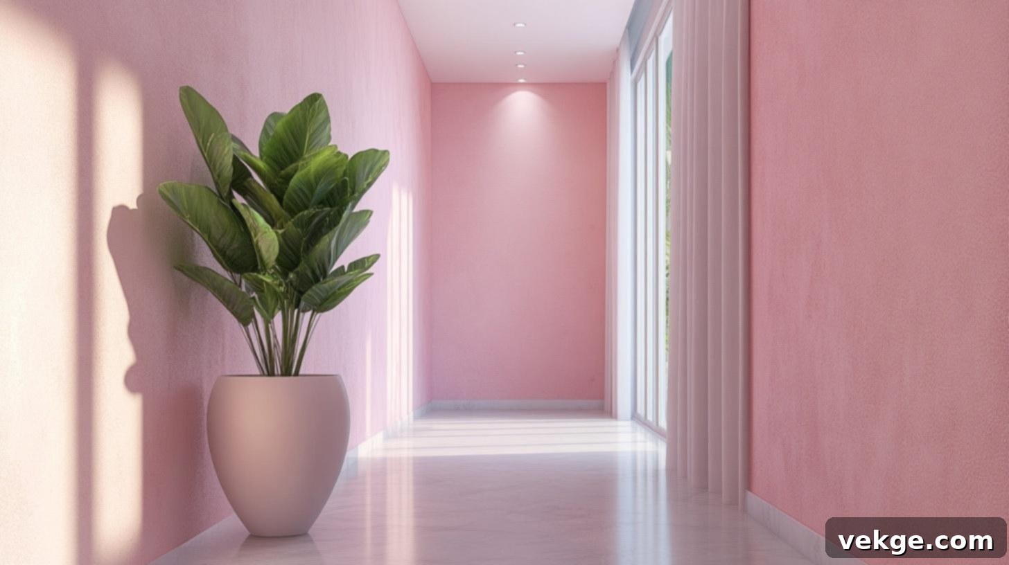
Seashell pink adds a clean, contemporary touch with just the right amount of personality and warmth. This particular pink possesses a fresh, modern feel that is far removed from any childish connotations, instead exuding sophistication. It’s bright enough to effectively open up the space while simultaneously adding a delicate hint of warmth and intriguing visual interest. Seashell pink works exceptionally well in modern homes and cultivates a light, airy, and inviting feel. Pair it with crisp white trim for a polished look that significantly upgrades its inherent brightness and visual appeal.
25. Barely Blue
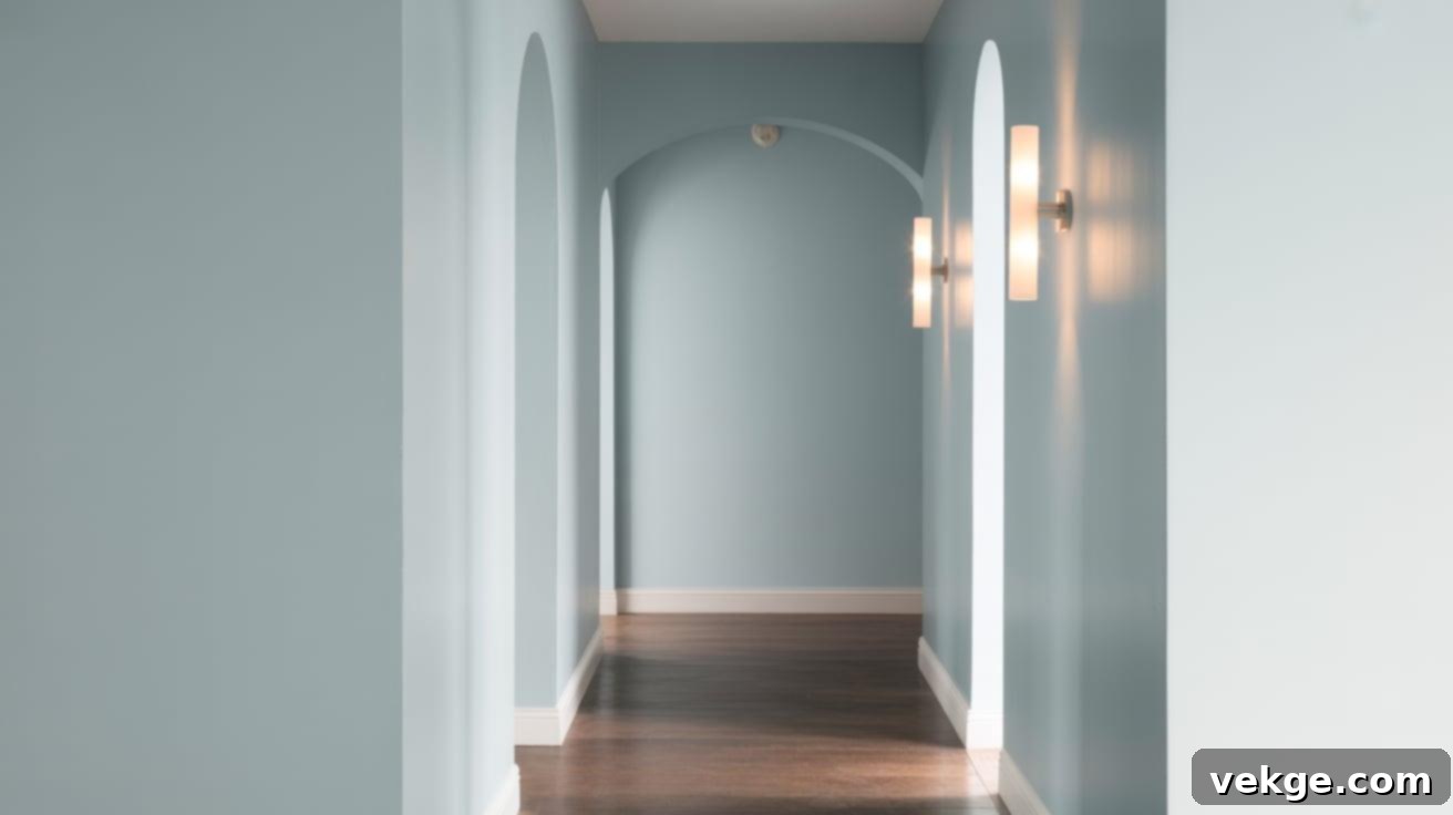
Barely blue is so incredibly subtle that it’s almost white, but with just enough color to hint at clear, open skies. This extremely pale blue shade masterfully maximizes brightness while imbuing the space with the slightest, most refreshing cool tone. It makes hallways feel perceptibly taller and more open, creating an illusion of being connected to the expansive outdoors. This versatile and subtle shade works beautifully in any home style and pairs effortlessly with all trim colors, making it a safe yet uniquely special choice for enhancing light and space.
Essential Design Tricks to Boost Hallway Brightness
While the choice of paint color is paramount in brightening a dark hallway, combining it with intelligent and strategic design choices can significantly multiply the desired effect. These complementary techniques work in synergy with your chosen wall color to create a hallway that feels dramatically brighter, more open, and truly welcoming.
Leverage Mirrors to Masterfully Reflect and Distribute Light
Mirrors are exceptionally powerful tools for making dark hallways feel both brighter and considerably larger. Their reflective surfaces catch and artfully bounce light from nearby rooms, windows, or existing light fixtures, helping to effectively spread brightness throughout the entire space. A strategically placed large mirror at one end of a long hallway can visually double its length, creating an astonishing illusion of depth and expanse. For particularly narrow hallways, even a curated series of smaller decorative mirrors along one wall can help to effectively break up the restrictive “tunnel effect” while adding a touch of sparkling light and refined elegance.
Implement Layered Lighting with Wall Sconces and LED Strips
Thoughtful and well-executed lighting design is crucial and can elevate even the darkest hallway into a well-lit, inviting passage. Wall sconces, strategically placed at eye level, create comforting pools of ambient light that make the hallway feel welcoming, warm, and distinctly bright. For a contemporary touch and to create a sense of width, consider installing LED strip lighting along the bottom of the walls. This creates a soft, warm glow that not only illuminates the floor but also visually expands the hallway. Combining overhead lighting with these wall-mounted options effectively combats shadows from multiple angles, ensuring uniform brightness.
Opt for Light-Colored Flooring and Thoughtful Rug Choices
The floor occupies a substantial visual area within any hallway, making its color choice incredibly impactful. Light wood tones, pale tiles, or even white flooring can make a dramatic and immediate difference in how bright and open the space feels. If replacing your existing flooring isn’t a feasible option, a light-colored runner rug can provide significant brightness while also adding comfort and defining the space. Choose rugs in cream, soft beige, or pale patterns that are designed to reflect light upward, contributing to the overall luminosity of the hallway.
Harmonize Trim and Ceiling Tones for Visual Continuity
Painting your ceiling a crisp, bright white is a time-honored technique that actively helps bounce light back down into the space, enhancing overall brightness. To further eliminate visual boundaries and foster an even more expansive feel, consider painting the ceiling the same light color as your walls. For trim work, using a slightly glossier version of your chosen wall color can create subtle definition without harsh contrast. Alternatively, painting trim a brighter white than your walls provides a pleasant, crisp contrast that draws the eye through the hallway, simultaneously adding definition, brightness, and a clean finish.
Choosing the Right Color for Your Specific Lighting Conditions
The lighting in your hallway—whether it primarily relies on natural light, artificial light, or a combination—plays a crucial role in how paint colors will actually appear once applied to your walls. The same paint color can exhibit remarkably different characteristics depending on the light source, its intensity, and its direction throughout the day.
Embrace Warm Tones for Spaces Lacking Natural Light
In hallways that are completely devoid of windows or significant natural light, warmer paint colors are essential for cultivating a welcoming and inviting feel. Cool whites and grays, while often effective in naturally lit rooms, can unfortunately appear flat, dull, or even stark without the dynamic interplay of natural light to bring them to life. Instead, gravitate towards whites with delicate yellow or peach undertones, soft and creamy hues, or pale warm neutrals. These shades cleverly mimic the sunlit quality, injecting a much-needed warmth and brightness into an otherwise dark and potentially cold space.
Understanding North vs. South-Facing Light Dynamics
The direction from which any natural light enters your hallway significantly impacts how colors are perceived. Understanding these nuances is key to selecting the perfect shade:
| Light Direction | Light Quality | Best Color Choices | Colors to Avoid |
|---|---|---|---|
| North-facing | Cool, bluish, often dim light throughout the day. | Warm whites, creamy tones, soft peach tones, pale yellows. These colors counteract the coolness and add warmth. | Cool blues, grays, and true whites. These can look sterile, dull, or overly cold in northern light. |
| South-facing | Warm, golden, and often intense light for most of the day. | Most colors work well here. Even cool tones can be balanced by the warm light. Greiges, blues, greens, and whites with cool undertones can be stunning. | Very warm colors, such as strong yellows or oranges, which can appear excessively intense or too yellow in strong southern light. |
| East-facing | Bright and warm morning light, transitioning to dimmer, cooler light in the afternoon. | Adaptable colors like versatile greige, soft blues, and greens. Colors that can gracefully shift with the changing light are ideal. | Very cool colors that might appear too stark or washed out in the afternoon, or overly intense warm colors that could be jarring in the morning. |
| West-facing | Dim and somewhat cool morning light, transforming into a dramatic, warm, and often intense evening light. | Mid-tones that possess a balanced warmth. Colors that can absorb some of the strong evening light without becoming overwhelming. Soft taupes, muted greens, or gentle off-whites. | Very pale colors that can look completely washed out or uninviting in the evening, and very deep colors that might feel too heavy in the morning. |
When faced with uncertainty, the most reliable approach is to test paint samples directly on your hallway walls. Observe these samples at different times of the day and under various lighting conditions (natural and artificial). Remember, the way a color appears on a small paint chip is rarely an accurate representation of how it will look within the unique lighting environment of your specific hallway.
Best Paint Finishes for a Brighter, More Refined Look
The type of paint finish you select is as critically important as the color itself when your goal is to make a dark hallway appear brighter and more inviting. The right finish can actively help to bounce light around the space, creating a clean, expansive look that effectively opens up narrow areas and maximizes luminosity.
Understanding Semi-Gloss vs. Satin: Light Reflection and Durability
The level of sheen, or shine, in your paint finish significantly impacts how light behaves within your hallway. Both semi-gloss and satin finishes are excellent choices for making a dark space feel brighter, but they each possess distinct strengths that make them suitable for different situations.
| Feature | Semi-Gloss | Satin |
|---|---|---|
| Light Reflection | Offers the highest level of light reflection due to its considerable sheen. Creates a bright, almost mirror-like effect. | Provides good light reflection with a softer, more diffused glow. Less intense than semi-gloss but still effective. |
| Appearance | Features a more noticeable, crisp shine, making surfaces appear highly polished. | Presents a subtle, soft sheen that is often described as an “eggshell” finish, providing a gentle luminescence. |
| Best For | Very dark hallways or high-traffic areas where maximum light bounce and durability are paramount. Excellent for trim. | Moderately lit hallways or those where a slightly softer, less reflective look is desired. Ideal for walls. |
| Durability & Cleaning | Exceptionally durable and highly washable, making it resistant to scuffs and easy to clean. | Offers very good washability and durability, standing up well to everyday wear and tear. |
| Flaw Visibility | Its high reflectivity means it can accentuate any imperfections or bumps on the wall surface. | Its softer sheen helps to subtly camouflage minor wall imperfections, making it more forgiving. |
When deciding between these two popular finishes, carefully consider the overall darkness of your hallway and the current condition of your walls. For maximum brightness and resilience, particularly in high-traffic hallways, semi-gloss is a strong contender. For a softer, yet still bright and durable finish, satin is an excellent all-around choice.
When to Thoughtfully Utilize Matte Finishes
While glossier finishes are generally recommended for their superior light-reflecting properties in dark hallways, matte finishes certainly have their place and can be used strategically. If your hallway walls possess numerous bumps, imperfections, or textural flaws, a matte finish is advantageous as it effectively absorbs light rather than reflecting it, thus minimizing attention to these issues. Matte finishes work best in hallways that already receive a decent amount of natural or artificial lighting, as they won’t add any reflective qualities to combat darkness.
If you choose to use a matte finish in a hallway, it is crucial to stick with very light, bright colors (such as pure whites, off-whites, or the palest pastels) to compensate for the inherent lack of light reflection. These bright hues will still help to keep the space feeling open and expansive, even without the added shine of a satin or semi-gloss finish. The key is to balance the non-reflective quality of matte with the highest possible inherent brightness of the chosen color.
Bonus Styling Tips for Enhancing Narrow Hallways
Beyond carefully selected paint colors and optimal lighting, a few smart and strategic styling choices can further elevate the sense of openness and brightness in narrow hallways. These simple additions work in harmony with your color scheme to transform a potentially cramped passage into a truly welcoming and aesthetically pleasing part of your home.
- Incorporate Vertical Stripes in Soft Colors: Thin, subtle vertical stripes gently draw the eye upward, creating an optical illusion that makes ceilings appear significantly higher. To maintain the brightening effect, stick to tone-on-tone stripes or very light, ethereal colors that blend seamlessly rather than creating harsh contrast. This elongates the perceived height of the space.
- Opt for Minimal, Light-Weight Furniture: When furnishing a narrow hallway, choose slim console tables or sleek floating shelves instead of bulky, heavy pieces. Furniture crafted from light-colored wood, glass, or acrylic keeps the visual footprint minimal and ensures the space feels open and uncluttered, rather than restrictive.
- Utilize Glossy Decor Accents: Introduce elements with a subtle sheen. Shiny picture frames, polished metal hardware (like door handles or hooks), or elegant glass items add a touch of sparkle by actively catching and reflecting light throughout the space. These small, reflective details contribute significantly to overall brightness.
- Select Light and Bright Artwork: When choosing artwork, opt for pieces with white matting and light, airy colors. This helps maintain the open and luminous feel of the hallway. Avoid dark, heavy, or overly busy pieces that tend to absorb light and can make the space feel smaller and more imposing.
- Add Several Decorative Mirrors: Beyond a single large mirror, consider grouping smaller decorative mirrors. These work double-duty as both stylish decor elements and powerful light reflectors. A cluster of mirrors can create greater impact and spread light more effectively than a single, smaller piece.
- Consider Light-Colored Wallpaper with Subtle Patterns: If you’re looking to add texture and interest, select wallpaper with subtle patterns in pale colors. Look for options that incorporate a slight shimmer, metallic thread, or gentle gloss in their design. This adds visual depth without darkening the space and can even enhance light reflection.
By implementing these thoughtful styling tips, you can create a hallway that not only feels brighter but also more characterful, inviting, and a true extension of your home’s aesthetic, rather than just a passageway.
Conclusion: Your Brighter Hallway Awaits
You don’t need an extensive or costly remodel to transform a dark, uninviting hallway into a brighter, more welcoming space. As I discovered in my own home, just a few smart and strategic choices can make a monumental difference in how the area looks and feels. The right paint color, chosen with consideration for light reflection and psychological impact, paired with an appropriate finish, and complemented by a few simple styling touches, can truly turn a gloomy hallway into a warm, functional, and cherished part of your home.
Begin your transformation by carefully considering what fits your unique space, its existing light conditions, and your personal style. You might be surprised to find that just one coat of paint in the perfect shade can achieve more than you ever thought possible. Little changes, thoughtfully executed, truly do add up to create a significant impact. Remember, your hallway is the connective tissue of your home; it deserves just as much attention and care as any other room.
Ready for more easy and impactful ways to refresh and fix up your space? Explore our other blog posts for a wealth of ideas you can confidently try this weekend, bringing more light and joy into every corner of your home.
