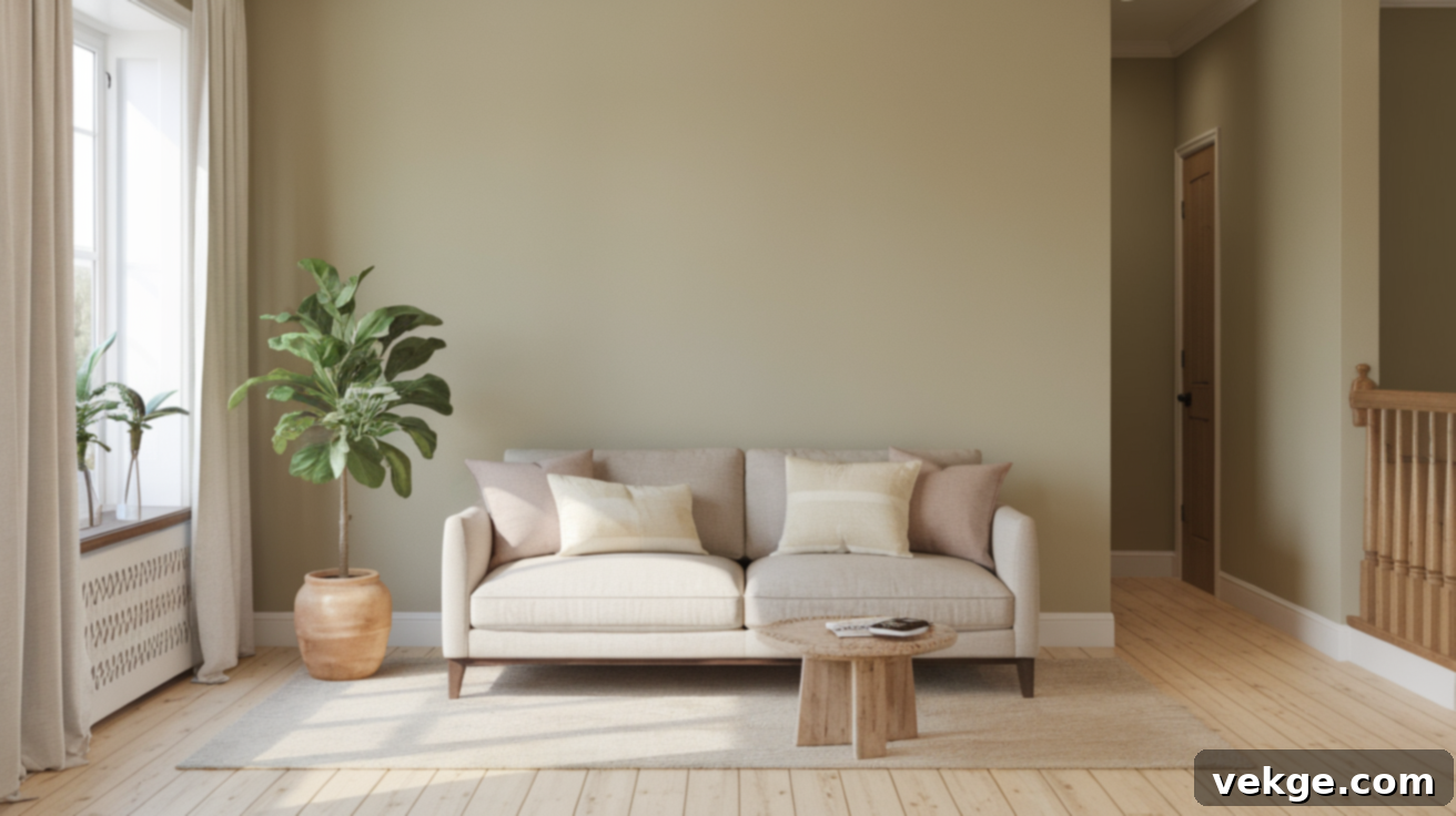
Sherwin-Williams Useful Gray (SW 7050): The Ultimate Greige Paint Color Guide
Choosing the perfect paint color can feel like navigating a maze, especially when faced with an overwhelming array of similar shades. That moment standing in front of dozens of gray swatches, each subtly different, is a common experience for many homeowners. If your goal is to create a space that feels calm, exceptionally cozy, and undeniably warm without leaning too stark or cool, then Sherwin-Williams Useful Gray (SW 7050) might just be the ideal solution for your next painting project.
This comprehensive guide dives deep into everything you need to know about this versatile greige paint color before you commit. We’ll explore its unique characteristics, how its appearance shifts under different lighting conditions in various rooms, and the best complementary colors to create harmonious palettes. From understanding its subtle undertones to comparing it with other popular Sherwin-Williams grays, you’ll gain practical, real-life tips and insights.
We’ll also highlight common mistakes to avoid, ensuring you make an informed decision and achieve a look you’ll love. So, if you’re curious whether this soft, inviting greige is the right fit for your home, let’s embark on a detailed exploration together and uncover the true potential of Useful Gray.
Useful Gray (SW 7050) by Sherwin-Williams: A Deeper Look

Sherwin-Williams Useful Gray (SW 7050) is celebrated for its soft, inviting character. It distinguishes itself from typical grays with a gentle warmth, derived from its harmonious blend of gray and beige tones. This specific combination earns it the popular classification of “greige,” expertly marrying the best attributes of both color families. It offers the sophisticated neutrality of gray with the comforting warmth of beige, resulting in a hue that feels both modern and timeless.
Basic Color Profile: Understanding Useful Gray’s Core Attributes
- HEX Code: #CFCABD
- LRV (Light Reflectance Value): 59
- Color Family: Neutral
With an LRV of 59, Useful Gray sits comfortably in the medium-light range, meaning it reflects a fair amount of light without feeling overly bright or too dark. This makes it an excellent choice for a wide variety of spaces. It’s a cozy yet sophisticated blend, providing a foundation that is warm without being overly creamy, and subtle without appearing stark or cold. Its neutral designation makes it incredibly versatile, acting as a superb backdrop for diverse design styles and color palettes.
Useful Gray Undertones: Unraveling Its Subtle Nuances
Understanding a paint color’s undertones is crucial, as these subtle hints of other colors significantly influence how a shade appears in your home. Useful Gray is a chameleon, and its appearance can vary based on lighting, surrounding colors, and even the time of day. Here’s a closer look at the undertones you might observe:
- Beige: This is the dominant and most defining undertone. The beige component is what infuses Useful Gray with its characteristic warmth, preventing it from ever appearing too cool, stark, or flat. It’s the reason it feels so welcoming and adaptable, especially in spaces where you want to avoid anything overtly chilly.
- Green: In specific lighting conditions, particularly in natural light with certain exposures (like north-facing rooms), you might detect a very faint greenish hue. This is not an overt green, but rather a soft, muted whisper that adds to its organic feel. It’s subtle, often unnoticed by the casual observer, but contributes to the color’s depth and natural earthiness.
- Yellow or Red (Taupe-like Warmth): While less common than the beige and green, some individuals occasionally perceive a faint hint of yellow, or even a soft, taupe-like warmth (which can be a blend of beige and a touch of red/violet). This particular undertone gives the color an added layer of richness and depth, making it feel more complex and less one-dimensional. It’s this subtle interplay of undertones that makes Useful Gray so dynamic and interesting.
Observing these undertones is key to predicting how Useful Gray will perform in your unique environment. Always sample the paint in your actual space to see how these subtle shifts play out.
Useful Gray in Real Spaces: Transforming Every Room
Living Room: An Inviting Foundation

Useful Gray shines in living rooms, providing a serene and warm foundation without making the space feel heavy or dim. Its balanced nature allows it to serve as the perfect backdrop for virtually any decor style, from minimalist and contemporary to more traditional and layered aesthetics. It gracefully recedes, allowing your furniture, artwork, and accent pieces to truly stand out. Pair it with soft, textured fabrics like linen or wool, warm wood tones, and metallic accents for an elevated, harmonious design.
Bedrooms: A Soothing Sanctuary
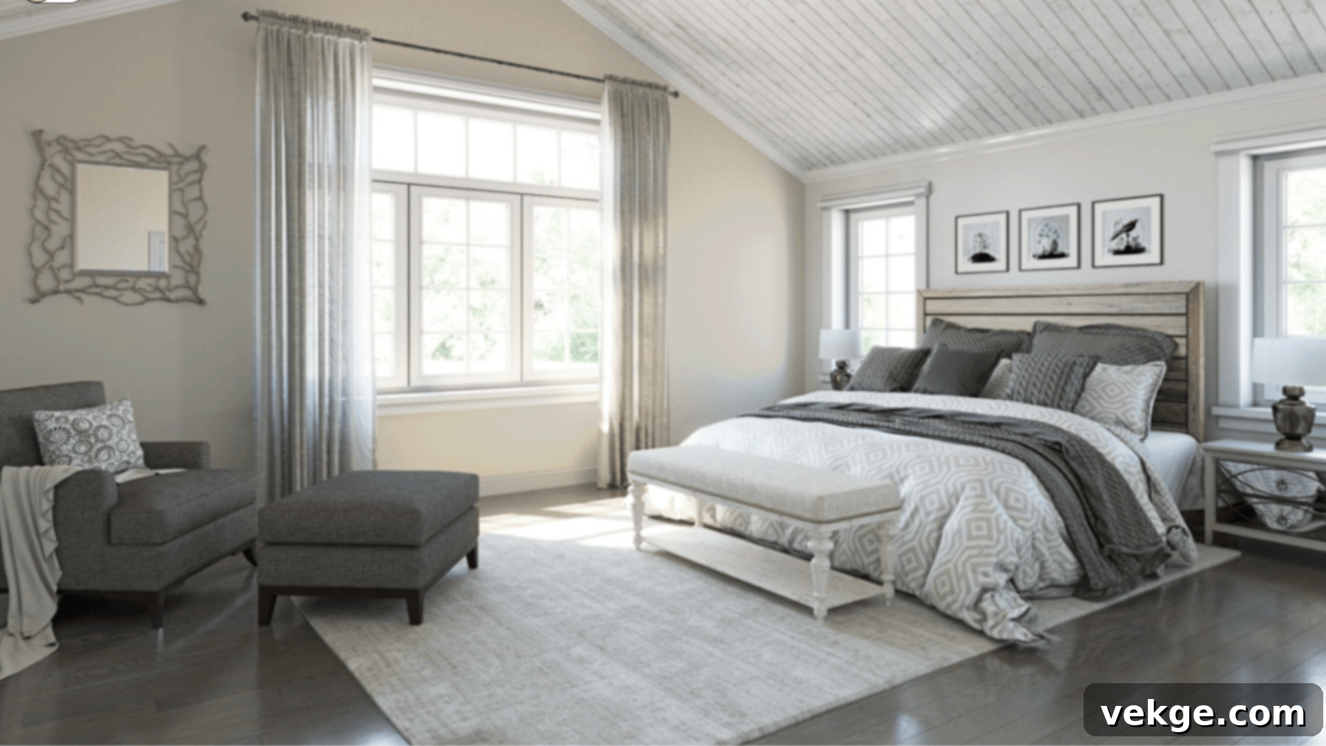
In bedrooms, Useful Gray transforms the space into a soothing, cocoon-like retreat. Its gentle warmth creates an atmosphere conducive to relaxation and rest. It pairs exceptionally well with plush, soft linens in whites, creams, or muted blues, and complements warm lighting from bedside lamps. This combination makes the room feel incredibly restful and serene, perfect for unwinding after a long day. Consider using it with a matte finish for an even softer, more absorbent look.
Kitchens: Versatility Meets Functionality
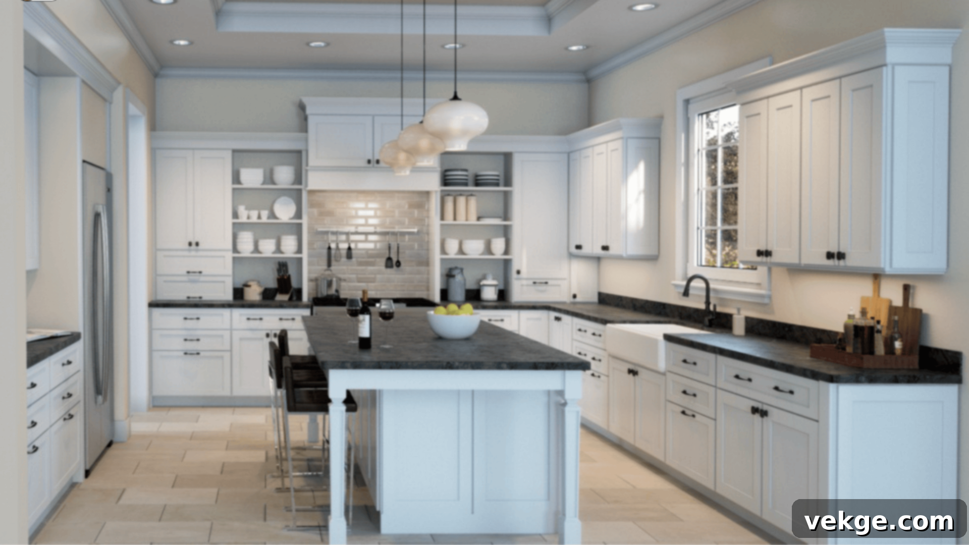
The versatility of Useful Gray makes it an excellent choice for kitchens. It effortlessly integrates with a wide array of kitchen elements, from classic white shaker cabinets and sleek stainless steel appliances to rustic butcher block countertops or elegant marble. Whether used on walls, as a cabinet color, or even on an island, Useful Gray provides a clean, understated backdrop that allows other kitchen features to shine. Its ability to adapt to both cool and warm elements ensures a cohesive and polished look.
Bathrooms: Clean, Modern, and Calm
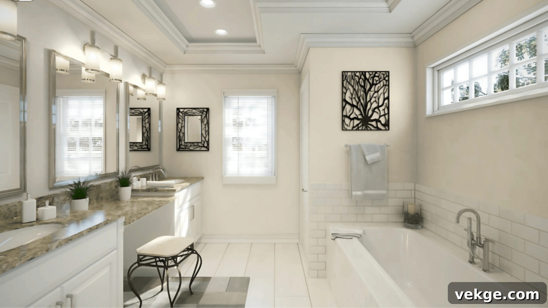
Useful Gray brings a sense of calm and sophistication to bathrooms. It pairs beautifully with crisp white tiles, creating a fresh and spacious feel. When combined with matte black fixtures, polished chrome, or natural wood accents, it enhances the modern aesthetic without feeling sterile. Adding greenery can further elevate the spa-like ambiance. Its gentle, non-aggressive tone ensures the room feels clean and contemporary, providing a perfect balance of warmth and crispness.
Exteriors: Welcoming and Enduring Appeal

For home exteriors, Useful Gray offers a simple yet profoundly stylish option that feels both welcoming and inviting. It performs exceptionally well on siding, shutters, or trim, harmonizing effortlessly with natural materials like brick, stone, and various wood features. In the ever-changing outdoor light, Useful Gray maintains its integrity, never appearing too washed out in bright sun nor too dark on overcast days. Its inherent warmth ensures your home feels grounded and approachable, exuding timeless curb appeal.
What Colors Go Well With Useful Gray? Expert Color Pairings
Pairing Useful Gray with the right complementary colors is essential to truly bring out its nuanced beauty and create a cohesive design scheme. Here are some tried-and-true combinations that highlight its best features:
- Trim & Ceiling (Crisp Whites): To achieve a clean, defined edge that makes Useful Gray appear even crisper and more sophisticated, opt for a bright, clean white. Sherwin-Williams’ Extra White (SW 7006, #EEEFEA) is an excellent choice. Its pure base provides a striking contrast that enhances the depth of the greige walls, making the room feel fresh and vibrant. Avoid overly creamy or yellow-toned whites, as they can sometimes mute Useful Gray’s appeal.
- Accent Walls & Bold Contrast: For a dramatic yet sophisticated statement, consider an accent wall in a deep, rich color. Think deep navy blue for a classic nautical touch, rich charcoal for a modern, grounded feel, or even a lush forest green to bring in an organic, earthy vibe. These bolder shades provide a beautiful contrast that allows Useful Gray to act as a calming counterpoint.
- Soft & Harmonious Partners: To maintain a serene and flowing aesthetic, pair Useful Gray with other soft, muted neutrals. Colors like Sherwin-Williams’ Greek Villa (SW 7551, #F0ECE2) for a creamy off-white, Nuance (SW 7049, #E2E0D6) for a lighter greige, and Acacia Haze (SW 9132, #969C92), a muted green, beautifully complement Useful Gray. These partners create an inviting, layered look without harsh transitions.
- Natural Tones & Textures: Integrating natural elements significantly enhances Useful Gray’s inherent warmth. Think furniture and decor in light oak, woven rattan, or rich tan leather. These textures and tones bring out the beige undertones in Useful Gray, creating a warm, organic, and grounded atmosphere. Other natural materials like linen, jute, and unpolished stone also work wonderfully.
Pro Tip: Useful Gray’s adaptability makes it suitable for both sleek modern and cozy rustic styles. To achieve a fresh, natural look, incorporate abundant greenery (indoor plants), light-toned woods, and simple, natural fabrics. This approach allows the greige to feel vibrant and alive, seamlessly connecting your interior with the outdoors.
Useful Gray vs. Other Sherwin-Williams Grays: A Comparative Analysis
To truly appreciate Useful Gray, it’s helpful to compare it with other popular Sherwin-Williams grays. These comparisons reveal its unique position in the greige spectrum and help clarify which shade is best suited for your specific design needs.
Useful Gray vs. Agreeable Gray (SW 7029)
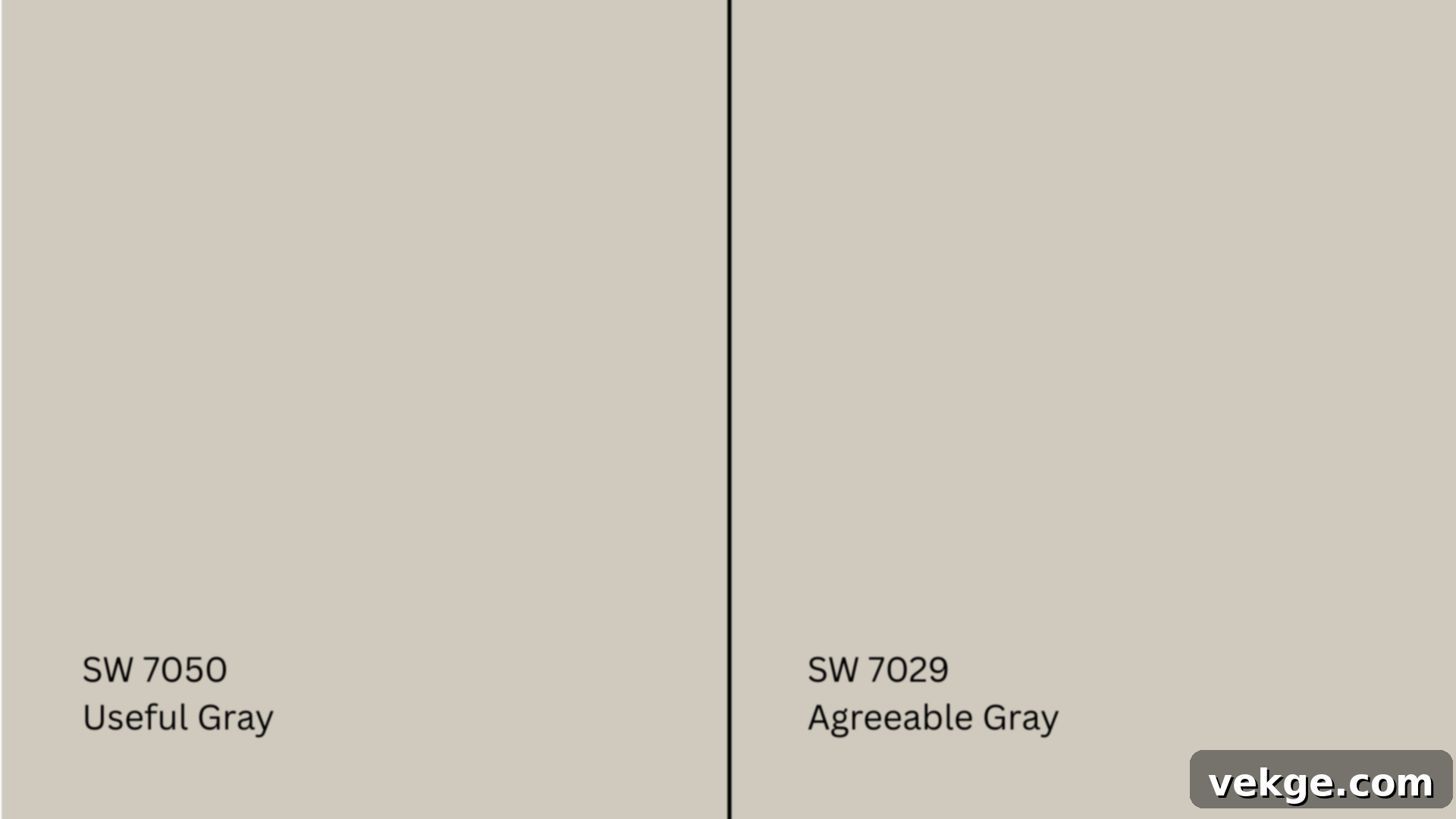
Agreeable Gray (SW 7029, #D1CBC1) is arguably one of Sherwin-Williams’ most popular grays, and for excellent reason. With an LRV of 60, it is slightly lighter than Useful Gray (LRV 59) and possesses a more balanced, slightly more neutral base, leaning just a touch more into its gray side while still retaining significant beige warmth. It’s often considered a true “Goldilocks” greige – not too warm, not too cool.
In homes with varied lighting conditions or cooler flooring, Agreeable Gray often provides a more universally balanced feel. Useful Gray, by contrast, leans a bit warmer, with its beige undertones being more pronounced, especially in lower light. It offers a slightly richer depth. If you’re seeking a consistently warmer greige that feels distinctly cozy, Useful Gray may be the better option. If you prefer a lighter, more universally adaptable greige that can sometimes show a subtle green/taupe undertone depending on the light, Agreeable Gray might be your choice.
Useful Gray vs. Repose Gray (SW 7015)
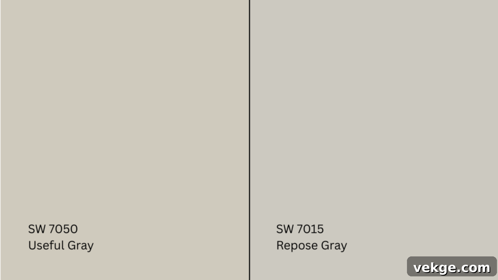
Repose Gray (SW 7015, #CCC9C0) (LRV 58) is another immensely popular gray, but it tends to lean noticeably cooler than Useful Gray. While still a greige, Repose Gray often reveals subtle blue or purple undertones, particularly in rooms with cooler lighting. This makes it feel more crisp and modern compared to the warmer, earthier Useful Gray.
Repose Gray has a sharper, more contemporary feel. Useful Gray, grounded by its stronger beige influence, maintains a consistent warmth and comfort. If your goal is a space that feels distinctly warm, inviting, and traditionally cozy, Useful Gray will likely feel more natural and aligned with your vision. If you prefer a slightly cooler, more sophisticated gray with the potential for subtle blue/purple hints, Repose Gray might be more appealing.
Useful Gray vs. Versatile Gray (SW 6072)
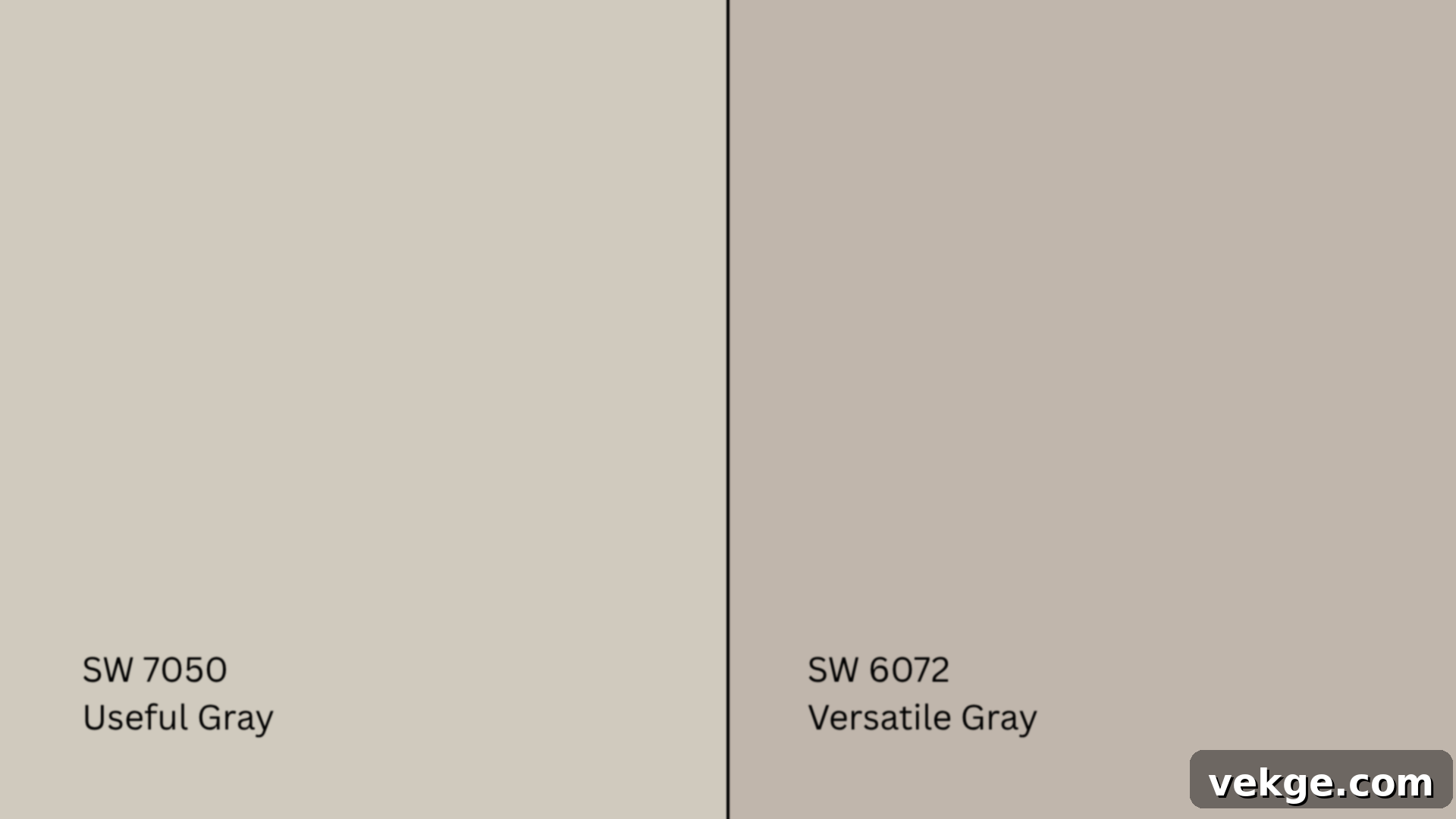
Versatile Gray (SW 6072, #C1B6AB) (LRV 46) is significantly deeper and more saturated than Useful Gray. As its name suggests, it is quite flexible, but its increased depth allows it to make a stronger, more pronounced statement in a room. While Useful Gray is soft and understated, Versatile Gray offers a richer, more intense hue that commands more attention.
If you’re aiming for a richer, bolder backdrop, or need a color that provides more visual weight, Versatile Gray would be a strong contender. However, if your preference is for a light, airy, and more expansive feel, sticking with the softer, more subtle Useful Gray will achieve that aesthetic. In essence, Useful Gray strikes a beautiful balance between the lightness of a soft gray and the grounding warmth of a true beige, often finding a sweet spot that many other grays miss.
How Lighting Affects Useful Gray: A Dynamic Experience
The amount and type of natural and artificial light in a room are arguably the most critical factors influencing how any paint color, especially a nuanced greige like Useful Gray, will appear. Understanding these shifts is vital for a successful outcome:
- North-Facing Rooms: These rooms typically receive a cooler, bluer light for most of the day. In such conditions, Useful Gray will tend to lean more into its gray side and appear more muted. The subtle green undertones might become slightly more noticeable, particularly in areas with less direct natural light, giving it a calm, somewhat sophisticated appearance that is less overtly warm.
- South-Facing Rooms: Bathed in abundant, warm sunlight throughout the day, south-facing rooms are where Useful Gray’s warm beige side truly comes alive. The direct light boosts its creamy undertones, giving the room a soft, inviting glow that feels incredibly cozy and welcoming without ever veering into yellow territory. It will appear at its warmest and brightest here.
- East-Facing Rooms: These rooms are flooded with bright, warm light in the morning, which fades as the day progresses. Useful Gray will likely appear brighter and more beige-dominant during the morning hours. As the day turns to afternoon, the light softens and cools, and the color will gradually take on a flatter, more subdued gray tone, showcasing its versatility across the day.
- West-Facing Rooms: West-facing rooms receive minimal light in the morning but are illuminated with richer, warmer light in the afternoon and evening. Expect Useful Gray to appear warmer and deeper as the day progresses, particularly in the golden hours of late afternoon. Its beige undertones will become much more prominent, creating a cozy and enveloping atmosphere perfect for evening relaxation.
Always observe your paint samples at different times of the day to fully appreciate how Useful Gray interacts with your home’s unique lighting conditions.
Where to Sample and Buy Sherwin-Williams Useful Gray
The cardinal rule of paint selection is: always sample! This step is non-negotiable for a color as dynamic as Useful Gray.
Where to Get Peel-and-Stick Samples
Peel-and-stick samples are an invaluable tool for testing paint colors because they provide a true representation of the color on your wall without the mess of traditional paint pots. They are easy to move around and observe in different lights.
- Samplize: This is a highly recommended source for real Sherwin-Williams paint on large (12×12 inch) removable adhesive sheets. Samplize ensures color accuracy and allows you to test the color on multiple walls without damaging your existing paint.
- Sherwin-Williams Stores: You can also obtain physical sample cards or purchase 8 oz. test jars directly from any Sherwin-Williams retail location. This allows you to paint a small section of your wall or a poster board.
- Hardware Stores: Many authorized hardware stores also carry color chips for Sherwin-Williams paints or can custom mix tester pots for you. Always verify the color code to ensure accuracy.
Remember to view your sample in morning, afternoon, and evening light, and crucially, place it next to your existing trim, furniture, and flooring. This holistic approach is the best way to make a truly confident and informed choice that you won’t regret.
Where to Buy the Paint
Once you’ve made your decision, purchasing Useful Gray is straightforward:
- Sherwin-Williams.com: The official website allows you to order paint online for convenient delivery directly to your home or for quick in-store pickup at your local Sherwin-Williams store.
- Sherwin-Williams Stores: Visiting a physical Sherwin-Williams store provides access to full-size cans, expert advice from color consultants, and personalized help with choosing the right finish (e.g., matte, eggshell, satin, semi-gloss) for your specific project.
- Authorized Retailers: Certain hardware stores and home improvement centers are authorized Sherwin-Williams retailers and can accurately tint Useful Gray by formula. Always double-check the color code and name before purchasing.
Many stores also offer convenient curbside pickup services and potential bulk discounts for larger painting projects, making it economical for extensive renovations.
Common Mistakes to Avoid When Using Useful Gray
While Useful Gray is undeniably a versatile and forgiving color, there are a few common pitfalls that can diminish its beauty and cause it to appear less than perfect in your space. Being aware of these can save you time, effort, and money:
- Skipping the Sample Test: This is the most crucial mistake. Many assume that because Useful Gray is a popular “safe” neutral, it will work everywhere. However, its subtle undertones dramatically shift with light and surrounding elements. Always, always test large samples on multiple walls in your actual space before committing to a full paint job.
- Choosing the Wrong Trim Color: Pairing Useful Gray with an overly creamy or yellow-toned white trim can create a clash, making the walls look dull or the trim appear dirty. Stick to crisp, clean whites (like Sherwin-Williams Extra White) for trim and ceilings to provide a sharp, fresh contrast that elevates the greige.
- Underestimating the Impact of Lighting: As detailed above, lighting is paramount. Failure to consider your room’s natural light exposure (north, south, east, west) and the type of artificial light (warm vs. cool bulbs) can lead to disappointment. What looks warm and inviting in a south-facing room might appear cooler and more muted in a north-facing one.
- Using it in Dark Spaces Without Adequate Light: While Useful Gray has a good LRV, in rooms with very little natural or artificial light, it can sometimes fall flat or appear a bit dull. If painting a low-light area, ensure you compensate with sufficient, well-placed artificial lighting to bring out its warmth and vibrancy. Otherwise, it might lose its inviting character.
- Ignoring Fixed Elements: Always consider your existing fixed elements like flooring, countertops, and upholstery. Useful Gray needs to harmonize with these elements. If your flooring has strong cool undertones (e.g., gray tile), Useful Gray’s beige might clash slightly, or its green undertone could become more prominent.
Taking your time with testing, careful planning, and considering these common mistakes can truly save you from costly repaints and ensure that Sherwin-Williams Useful Gray looks its absolute best, enhancing the ambiance of every room it graces.
Conclusion: Embracing the Enduring Appeal of Useful Gray
Sherwin-Williams Useful Gray (SW 7050) is indeed one of those rare paint colors that consistently surprises and delights. It’s not just another neutral; it’s a sophisticated, soft, and incredibly warm greige that possesses a unique adaptability, making it suitable for almost any space in your home, provided you take the time to understand its nuances.
The true magic of Useful Gray lies in its complex undertones. Its predominant beige base infuses spaces with comforting warmth, while subtle hints of green, and occasionally a taupe-like depth, allow it to transform beautifully under varying light conditions. This dynamic interplay ensures the color never feels static or boring, but rather evolves throughout the day, offering new layers of visual interest.
My experience has consistently shown that when you diligently test Useful Gray in your unique environment and thoughtfully pair it with crisp whites for trim and complementary natural textures, it truly comes into its own. It radiates a quiet elegance that is both modern and timeless.
If you are searching for a paint color that promises calm, offers a welcoming embrace, and is effortlessly easy to live with, then Sherwin-Williams Useful Gray (SW 7050) is unequivocally worth a closer, detailed look. It offers a perfect balance that few other neutrals can achieve, creating a serene and sophisticated backdrop for your life.
For more expert paint color tips, detailed analyses, and inspiring side-by-side comparisons of popular shades, be sure to explore my other comprehensive paint guides available on the website.
