Sherwin-Williams Origami White (SW 7636): Your Guide to This Versatile, Warm Off-White Paint
Choosing the perfect white paint for your home can feel like a surprisingly daunting task. With countless shades that appear almost identical on paint chips, it’s easy to feel overwhelmed. You might find yourself holding up sample after sample, wondering if there’s a subtle difference you’re missing until the color is actually on your walls.
This comprehensive guide is designed to cut through the confusion and help you determine if Sherwin-Williams Origami White (SW 7636) is the ideal serene white you’ve been searching for. We’ll delve deep into its unique characteristics, exploring how it adapts to various rooms and lighting conditions, and uncover the best colors to pair with it. You’ll also discover similar shades from other brands and receive practical shopping tips to empower your decision-making process.
Unveiling Sherwin-Williams Origami White (SW 7636)

Origami White (SW 7636) by Sherwin-Williams is a beautifully soft, creamy white often celebrated for its inviting warmth. It holds a cherished spot within the brand’s highly regarded neutral palette, making it an incredibly versatile choice for a wide array of design styles—from traditional and transitional spaces to more contemporary and light-modern interiors. Its ability to adapt makes it a perennial favorite among designers and homeowners alike.
Origami White’s Core Color Profile
- HEX code: #E5E2DA (a digital representation of its color)
- LRV (Light Reflectance Value): 76
- Color family: A soft white infused with gentle warm gray and subtle taupe undertones.
As a key member of Sherwin-Williams’ White Paint Colors collection, Origami White is crafted to evoke feelings of cleanliness, calmness, and natural serenity. Its LRV of 76 indicates it reflects a significant amount of light, contributing to a bright and airy feel without being blindingly stark. It strikes an exceptional balance: it possesses enough inherent warmth and softness to create a cozy atmosphere, yet it almost always reads as a true, sophisticated white in most interior settings.
Understanding Origami White’s Undertones
The magic of Origami White lies in its delicate blend of warm gray and soft taupe undertones. This sophisticated combination is precisely what makes it more adaptable and forgiving than cooler, crisper whites that can sometimes feel too stark. Simultaneously, it avoids the overtly yellow leanings of a true cream, offering a balanced, nuanced white that’s incredibly easy to live with.
- In bright, natural daylight: The warm gray undertones beautifully soften the space, providing a tranquil feel without tipping into an overly creamy or yellowish hue. It retains its elegant white appearance while adding a subtle depth.
- Under artificial warm light bulbs: You’ll notice Origami White lean a touch more towards its taupe side. However, it’s crucial to note that it never veers into a drab beige or a dingy off-white. Instead, this taupe influence adds a sophisticated layer of warmth, making the room feel snug and inviting during evenings.
This exquisite balance of underlying tones is the secret to Origami White’s widespread appeal and versatility. It consistently offers a gentle warmth that prevents it from ever appearing harsh, sterile, or cold, making it a perfect foundation for a comforting and stylish home.
Experiencing Origami White in Real-World Spaces
One of the most important things to remember about any paint color is that it rarely behaves uniformly across different rooms. Environmental factors like natural light, artificial lighting, and surrounding decor significantly influence its appearance. Here’s what you can generally expect from Origami White in various areas of your home:
How It Looks in Different Rooms
Kitchens
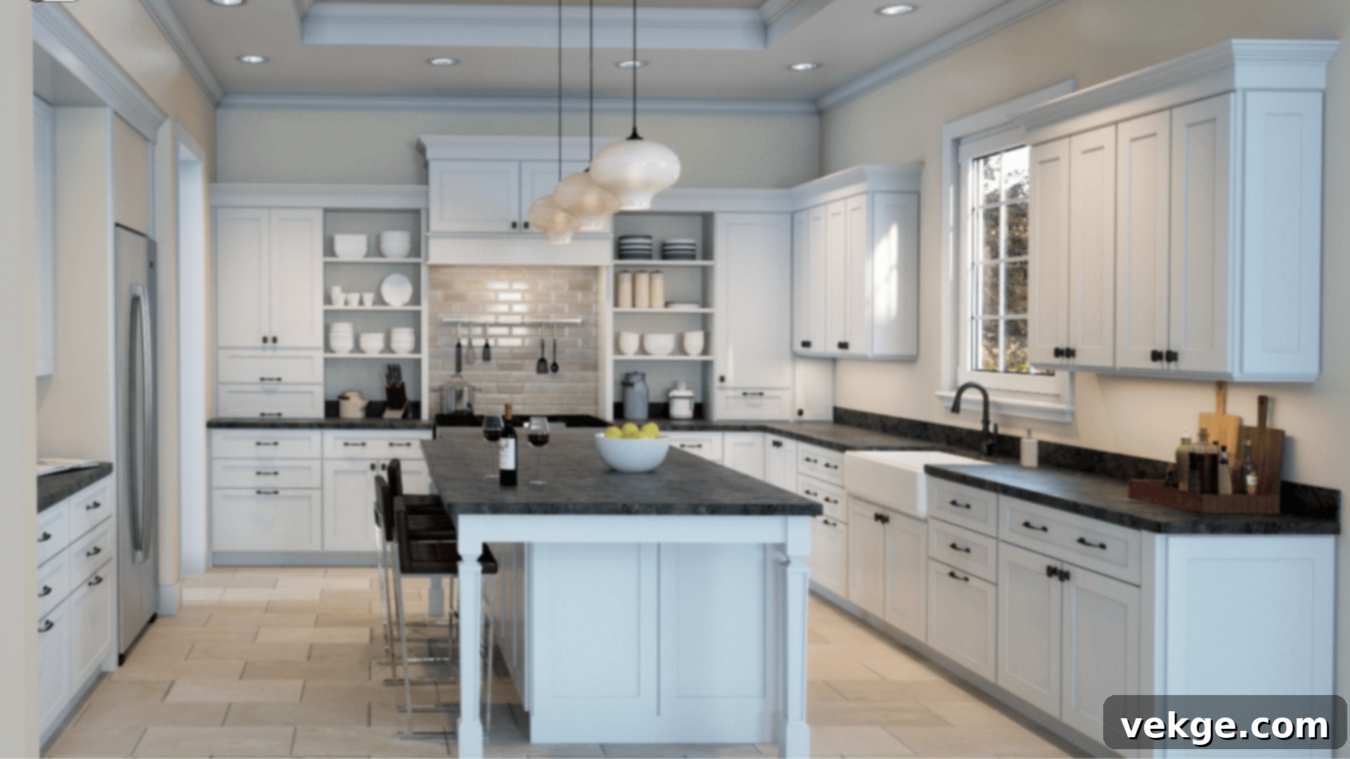
In kitchens, Origami White lends a sense of enduring freshness and timeless elegance. Its inherent warmth beautifully complements a wide range of materials, making it an excellent choice for cabinets or walls. Imagine it paired with rich wood cabinets—such as natural oak or warm walnut—shining brass hardware, and bright, light countertops like quartz or marble. The paint’s warmth perfectly balances the often bright overhead lighting found in kitchens, softening the glow without introducing an unwanted yellow tint. It creates a welcoming and sophisticated culinary space.
Bathrooms
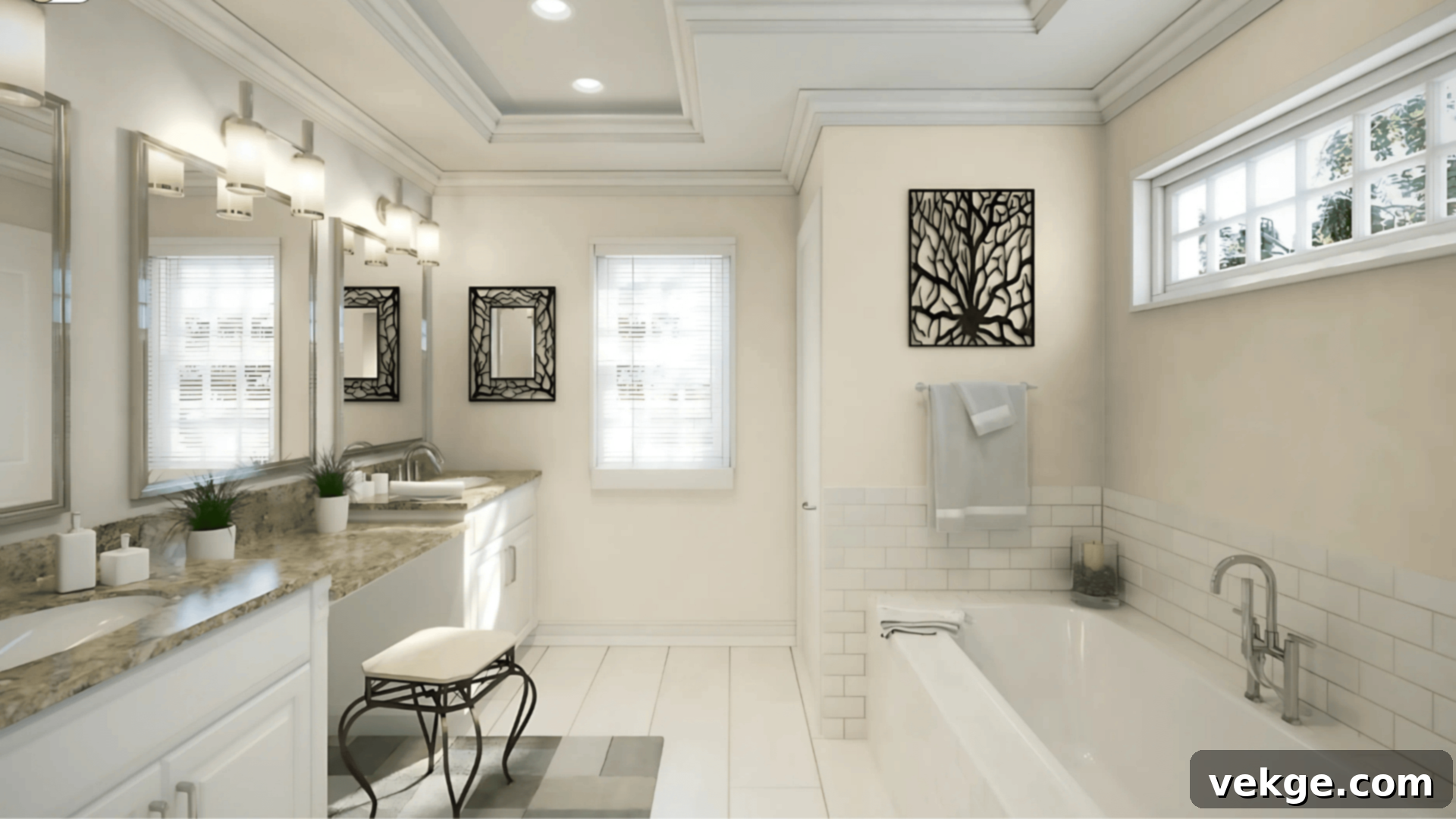
For bathrooms, Origami White provides a clean yet profoundly cozy ambiance. Its gentle warmth prevents the space from feeling clinical or cold, which can often be a challenge with brighter whites in moisture-rich environments. Pair it with luxurious marble tiles, brushed gold or champagne bronze fixtures, and soft white towels to maintain an upscale feel that remains inviting. It’s an especially inspired choice for smaller bathrooms, where cooler whites might feel overly harsh or unwelcoming, offering a comforting embrace instead.
Living Rooms
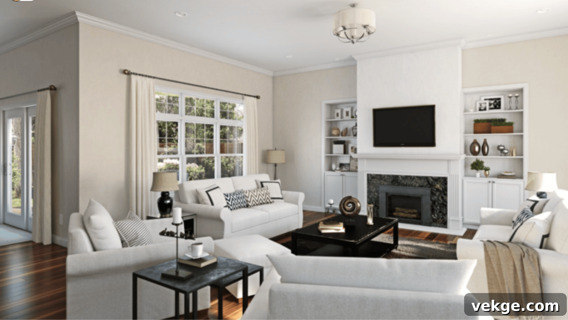
In living rooms, Origami White excels at adding a layer of softness and profound comfort. It serves as an incredibly versatile backdrop, effortlessly blending with both warm-toned furniture (like leather sofas or deep wood coffee tables) and cooler-toned pieces (such as gray sectionals or glass-top tables). The result is a sophisticated neutral space that feels anything but flat. It allows your furnishings and decor to shine while providing a harmonious, relaxing atmosphere for gathering and unwinding.
Bedrooms

Bedrooms are sanctuaries, and Origami White beautifully supports this concept by creating a soothing, light-filled environment conducive to rest and relaxation. If your goal is a white that feels effortlessly relaxed rather than stark or starkly bright, this is an excellent choice. It pairs wonderfully with natural textures like linen bedding, warm woods (such as birch or light oak furniture), or soft-toned textiles in muted blues, greens, or blush. This color truly excels in homes aiming for a natural, inviting, and calm feel, deliberately avoiding the crispness of a pure, unadulterated white.
The Impact of Natural Lighting on Origami White
Understanding how natural light interacts with Origami White is crucial for predicting its appearance in your home. The direction of your windows plays a significant role in revealing its subtle nuances:
- North-facing rooms: These rooms typically receive cooler, indirect light throughout the day. In such settings, Origami White’s inherent warm gray undertones will be more prominent, leading to a slightly muted and sophisticated look. It will still read as white, but with a noticeable cool-leaning gray influence that prevents it from feeling stark.
- South-facing rooms: Abundant, bright natural light characterizes south-facing rooms. Here, the warm rays beautifully enhance Origami White, drawing out its creamy and cozy aspects. The color will appear brighter and more genuinely warm, radiating a comforting glow.
- East-facing rooms: Morning light in east-facing rooms is generally bright and warm, but it shifts to a cooler, softer light later in the day. Origami White will feel incredibly fresh and clean during the morning hours, gradually transitioning to a slightly more subdued, balanced white as the day progresses.
- West-facing rooms: West-facing rooms are famous for their warm, golden afternoon and evening light. As the sun begins to set, this light will intensify, bringing out the deeper, richer taupe side of Origami White. It can make the color feel more substantial and inviting, adding an extra layer of coziness.
To truly grasp how Origami White will appear in your unique space, it is absolutely essential to test paint samples on different walls. Observe these samples at various times throughout the day and under both natural and artificial light sources before making your final decision. This will ensure no unwelcome surprises!
Origami White Compared to Other Sherwin-Williams Neutrals
Sherwin-Williams boasts an impressive collection of off-white paints, each with its distinct personality. To help you choose confidently, here’s how Origami White stands out against some of its most popular counterparts:
Origami White vs. Alabaster (SW 7008)
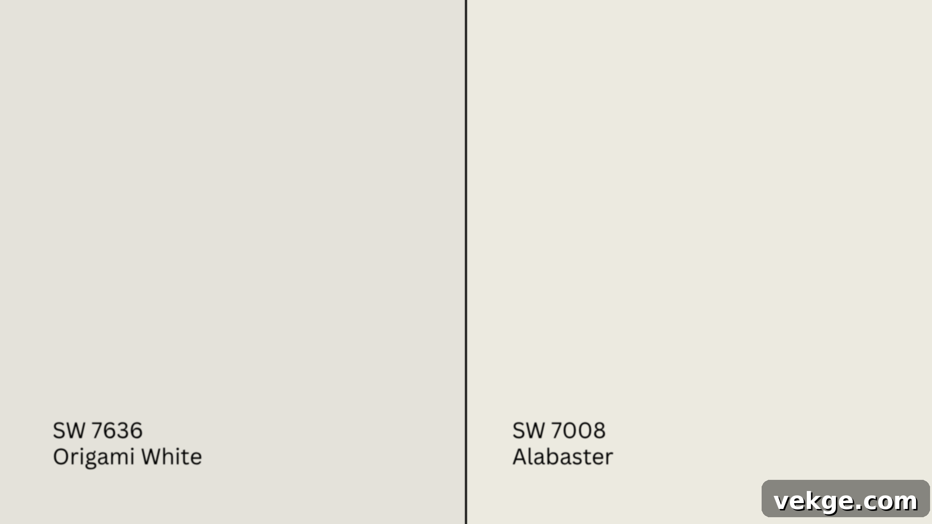
Alabaster (SW 7008, #EDEAE0) is arguably one of Sherwin-Williams’ most beloved warm whites, celebrated for its soft, creamy character. It is generally a step warmer and noticeably creamier than Origami White, possessing more overt beige undertones.
- Alabaster has a higher LRV (82) and feels incredibly cozy and enveloping, especially in spaces with less natural light. It offers a more pronounced creamy glow.
- Origami White (LRV 76) is softer and more inherently neutral, with its defining warm gray and subtle taupe undertones keeping it from appearing overly yellow or creamy. It offers warmth without as much saturation.
Choose Alabaster if your goal is a distinctly warmer, creamy, and inviting look, particularly in farmhouse, traditional, or coastal styles. Stick to Origami White if you desire subtle warmth combined with a fresher, slightly more sophisticated finish that leans less into yellow or beige and offers greater versatility.
Origami White vs. Greek Villa (SW 7551)
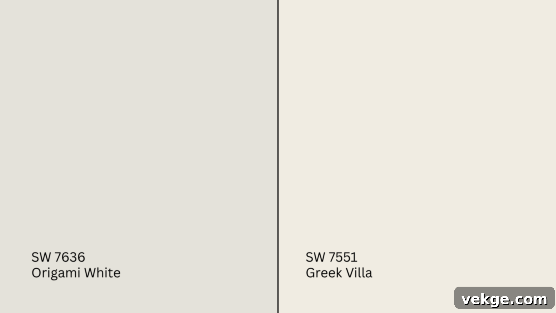
Greek Villa (SW 7551, #F0ECE2) is another popular warm white known for its bright and clean yet creamy undertones.
- Greek Villa has an even higher LRV (84) and a more noticeable creamy, almost yellow tint, especially when exposed to direct sunlight. It feels very bright and sunny.
- Origami White (LRV 76) maintains a more balanced neutrality, remaining less susceptible to strong yellow shifts. Its gray and taupe undertones give it a slightly more modern and grounded feel.
Greek Villa is often preferred for truly traditional or Mediterranean-inspired rooms where a brighter, sunnier, and more obviously creamy white is desired. Origami White feels a bit more flexible and contemporary, adapting better to a wider range of styles without introducing as much yellow.
Origami White vs. Snowbound (SW 7004)
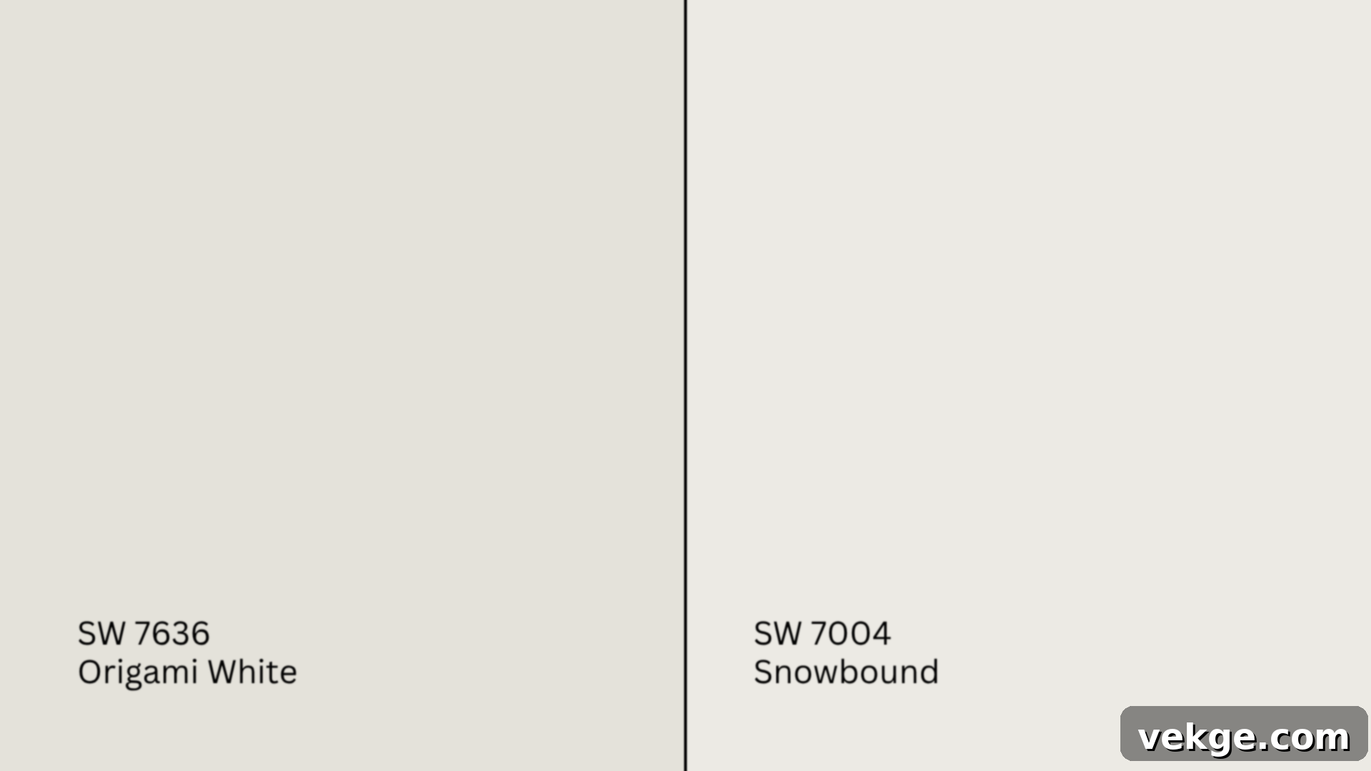
Snowbound (SW 7004, #EDEAE5) represents a cooler end of the off-white spectrum. It carries subtle pink or purple undertones, which give it a distinct character.
- Snowbound (LRV 83) is noticeably crisper and tends to feel cooler and more stark in most lighting conditions, especially in north-facing rooms.
- Origami White (LRV 76) is distinctly warmer and more grounded. Its gray and taupe undertones provide a soft, welcoming warmth that Snowbound lacks.
Choose Snowbound if you’re looking for a sharp, clean white that can provide striking contrast against warmer finishes, or if you prefer a cooler, more minimalist aesthetic. Opt for Origami White when you desire a soft, adaptable neutral base that offers warmth without leaning creamy or yellow, ensuring a more inviting atmosphere.
Origami White vs. White Duck (SW 7010)
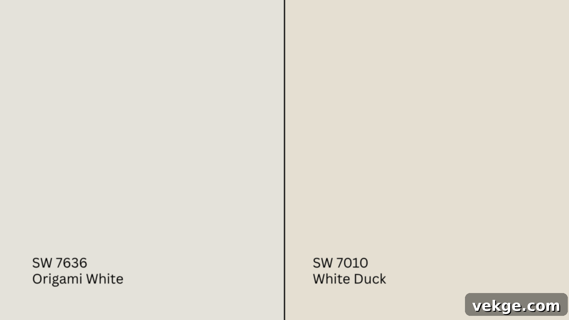
White Duck (SW 7010, #E5DFD2) is considerably warmer and leans much more distinctly into the greige (gray-beige) category than Origami White.
- White Duck (LRV 74) is almost a light beige or a very light greige in rooms with strong warm light. It has more saturated beige undertones.
- Origami White (LRV 76) consistently maintains more of a soft, true off-white presence, with its gray and taupe notes keeping it away from a heavy beige appearance.
Use White Duck if your decorating scheme involves rich, deep woods, earthy tones, or natural materials where a soft greige would provide a seamless backdrop. Origami White offers greater versatility as a neutral white, maintaining its light and bright character while still providing a comforting warmth.
Undertone and LRV Comparison Table
For a quick reference, here’s how these popular Sherwin-Williams whites stack up:
| Paint Color | Primary Undertones | LRV | Overall Warmth/Coolness |
|---|---|---|---|
| Origami White (SW 7636) | Warm gray/soft taupe | 76 | Warm |
| Alabaster (SW 7008) | Creamy beige | 82 | Warm |
| Greek Villa (SW 7551) | Yellow-white/creamy | 84 | Warm |
| Snowbound (SW 7004) | Cool pink-purple | 83 | Cool |
| White Duck (SW 7010) | Beige-greige | 74 | Warm |
Best Color Pairings for Sherwin-Williams Origami White
While Origami White is incredibly adaptable, strategic color pairings can elevate its appeal and define the mood of your space. Its balanced warmth makes it a fantastic partner for a wide range of colors.
Trim and Ceiling Color Suggestions
Choosing the right trim and ceiling color is crucial for creating a cohesive look. Here are some excellent choices that complement Origami White:
- Pure White (SW 7005, #EDECE6): This is a fantastic option for trim and ceilings. It offers a clean, crisp contrast without being overly stark. Its very subtle gray undertone prevents it from feeling cold and ensures it harmonizes beautifully with Origami White’s warmth.
- Alabaster (SW 7008, #EDEAE0): For a softer, more monochromatic look, matching Origami White with Alabaster on trim and ceilings can add a gentle layer of warmth that perfectly echoes Origami White’s cozy side. This creates a seamless, enveloping feel.
- Extra White (SW 7006, #EEEFEA): If you desire a higher level of contrast and a crisper, brighter edge, Extra White is a strong contender. Its high brightness can make Origami White appear slightly warmer in comparison, adding definition to architectural details.
Pro Tip: For ceilings, always opt for a matte or flat finish. This absorbs light, hides imperfections, and prevents any unwanted shine that could distract from your wall color.
Accent Wall and Furniture Colors
Origami White provides a versatile canvas for a variety of accent colors. Consider these pairings to enhance your desired aesthetic:
- For a soft, serene, and harmonious look: Pair Origami White with muted, earthy tones such as warm grays (like Sherwin-Williams Mindful Gray SW 7016), dusty blushes, tranquil muted olives, or light clay tones. These combinations work exceptionally well in bedrooms, living areas, and nurseries, creating a peaceful and restorative ambiance.
- For impactful contrast and a touch of modern edge: Don’t shy away from bolder, deeper colors. Navy blue (like Sherwin-Williams Naval SW 6244), charcoal gray, rich espresso brown, or even classic black can create striking contrast. These darker tones will make Origami White appear brighter and provide the space with a sophisticated, architectural feel.
When selecting upholstery, aim for neutral tones like light beige, soft tan, or oatmeal to maintain balance and allow your wall color to be the star. Introduce pops of color through throws, decorative pillows, artwork, or accent chairs to bring personality and vibrancy to the room.
Hardware and Flooring Compatibility
The finishes and materials you choose for hardware and flooring will significantly impact the overall feel of a room painted with Origami White.
- Hardware: Brushed nickel offers a classic, understated look that blends beautifully with Origami White’s subtle warmth without competing. Champagne bronze or satin brass will lean into the paint’s warm undertones, adding a touch of elegance and cohesion. For a contemporary touch and a bit of drama, matte black hardware can provide a crisp, modern contrast.
- Flooring: For a light and airy feel, consider flooring options like white oak, natural maple, or light-colored wide-plank flooring. These choices will enhance the brightness of Origami White. Medium wood tones such as chestnut, walnut, or even warm gray laminates can introduce warmth and depth, grounding the space. If opting for tile, look for warm grays, soft beiges, or creamy whites that echo the subtle tones found within Origami White, ensuring a cohesive flow.
Paint Finish Recommendations for Origami White
The sheen or finish of your paint drastically alters how Origami White looks and how well it wears over time. Each finish offers a different aesthetic and level of durability:
- Matte/Flat: This finish is ideal for ceilings and low-traffic areas like bedrooms. It offers virtually no sheen, which helps to conceal minor wall imperfections and gives Origami White a remarkably soft, almost powdery, and sophisticated appearance. It absorbs light, creating a very calm and deep color impression.
- Eggshell: A popular choice for living rooms, dining rooms, and hallways, eggshell offers a subtle, low-luster sheen reminiscent of an eggshell. It provides just enough reflectivity to bounce light around without producing a distracting glare. This finish offers good durability and is relatively easy to clean, making it a versatile choice for many areas.
- Satin: With a slightly higher sheen than eggshell, satin is excellent for high-traffic spaces such as kitchens, bathrooms, and children’s rooms. This durable and washable finish will make Origami White appear a little brighter and can sometimes make its undertones (warm gray and taupe) slightly more noticeable due to increased light reflection.
- Semi-Gloss/Gloss: These high-sheen finishes are typically reserved for trim, doors, and cabinets. They are highly durable, very easy to clean, and create a crisp, reflective contrast against the flatter wall finishes. If using Origami White on trim, a semi-gloss finish would highlight its subtle warmth beautifully.
Still unsure which finish to choose? A smart strategy is to test the same paint sample in two different finishes (e.g., eggshell and satin) side-by-side in your room’s actual lighting conditions. This direct comparison will provide valuable insight into which finish best achieves your desired look and practical needs.
Sampling and Purchasing Sherwin-Williams Origami White
Before committing to gallons of paint, the importance of testing Origami White directly in your space cannot be overstated. Factors such as unique lighting, existing adjacent finishes, and even the texture of your walls can subtly—or dramatically—shift how the color appears.
Where to Find Peel-and-Stick Samples
Peel-and-stick samples are a modern, mess-free way to test paint colors:
- Samplize: This popular online retailer offers genuine Sherwin-Williams paint swatches applied to a sticky backing. They are incredibly easy to apply, reposition, and remove without damaging your walls, making it simple to observe the color on multiple walls and at different times of day.
- Sherwin-Williams Stores: Your local Sherwin-Williams retail store will carry traditional large sample chips, which are useful for initial assessments. They also offer small tester pots, allowing you to paint a patch directly on your wall, offering the most accurate representation of the color.
- Hardware Stores: Some larger hardware stores or home improvement centers may be able to custom-mix Origami White into small sample sizes from their paint counter. Always double-check the accuracy of the mix.
Remember to place your samples on several different walls in the room you intend to paint. Observe them throughout the day and into the evening under both natural and artificial light. This comprehensive approach will help reveal any hidden undertones and ensure the color behaves as you expect.
Where to Purchase Sherwin-Williams Paint
Once you’ve confidently chosen Origami White, here are your primary purchasing options:
- Sherwin-Williams.com: The official website offers convenient online ordering with options for in-store pickup or direct home delivery, ensuring you get fresh paint from a trusted source.
- Sherwin-Williams Stores: Visiting a physical Sherwin-Williams store is an excellent option. Their staff are experts and can provide personalized advice on paint types, finishes, and quantities. They stock all standard finishes and can mix your color on the spot.
- Authorized Dealers: Various independent paint and hardware stores may be authorized Sherwin-Williams dealers. They can mix the paint on demand, often providing a convenient local option.
- Large Box Stores: While some large home improvement stores like Lowe’s or Home Depot carry certain Sherwin-Williams lines (e.g., HGTV Home by Sherwin-Williams), they may not stock all specific colors like Origami White in their standard inventory. However, most can custom order or color-match if you provide the SW 7636 code.
It’s always a good idea to call ahead to your chosen store if you’re looking for same-day pickup, curbside service, or to confirm stock availability, especially for larger quantities or specific finishes.
Paint Equivalents and Similar Shades from Other Brands
If Sherwin-Williams stores aren’t easily accessible, or if you prefer to work with another brand, here are some similar shades that capture the essence of Origami White’s soft, warm off-white character. Keep in mind that no two paints are identical, and undertones can differ subtly.
- Benjamin Moore:
- White Dove (OC-17, #F0EDE4): A highly popular and versatile off-white, White Dove shares Origami White’s soft warmth but leans slightly more into creamy beige undertones rather than gray.
- Swiss Coffee (OC-45, #EDEAE0): Another favorite, Swiss Coffee offers a gentle warmth and creamy touch, very comparable in overall feel to Origami White, though it can appear a touch more yellow in certain lights.
- Behr:
- Almond Wisp (PPU5-12, #D6C9BA): This shade offers a creamy off-white with visible warm undertones that can echo the softness of Origami White, though it can appear slightly deeper.
- Spun Cotton (YL-W09, #F7F2E4): A lighter, brighter creamy off-white that captures a similar subtle warmth and inviting feel, making it a good alternative for a fresh, soft white.
- Valspar:
- Du Jour (7002-6, #F4F2EB): A clean and warm white that shares Origami White’s ability to create a fresh yet cozy atmosphere.
- Cream in My Coffee (3005-10C, #E8DFCF): This option is a warmer, slightly richer cream that still offers the gentle, inviting qualities found in Origami White, suitable for those who want a touch more depth.
No matter which brand you lean towards, the golden rule remains: always test paint samples first. Even minute differences in base formulas or pigment combinations can lead to noticeable visual distinctions once painted on your walls.
Conclusion: Is Sherwin-Williams Origami White Right for Your Home?
If you’ve journeyed through this guide, you now possess a comprehensive understanding of Sherwin-Williams Origami White (SW 7636) and its potential to transform your living spaces. You’ve explored how this versatile off-white unfolds its character in various rooms, how the ever-changing play of light and the chosen finish can subtly shift its tone, and which complementary colors will truly make it sing.
My hope is that this detailed analysis empowers you to approach your paint selection with confidence. Remember the key takeaways: Origami White offers a unique blend of soft warmth, thanks to its gentle warm gray and taupe undertones, ensuring it feels cozy without ever appearing overtly yellow or dingy. Its mid-range LRV makes it bright yet inviting, suitable for almost any room direction.
Whether you prefer the tactile experience of shopping in-store or the convenience of online ordering, being well-informed makes all the difference. And above all, never underestimate the power of a physical sample on your own walls—the nuances of light and surrounding elements are truly more impactful than you might imagine.
Still contemplating your options or curious about other exceptional white and neutral paint colors? I encourage you to explore my other detailed paint guides. Comparing different shades and understanding their unique attributes will undoubtedly lead you to the perfect color that truly resonates with your vision and elevates your home. Take the time to delve into the wealth of information available and find the one that works best for your space.
