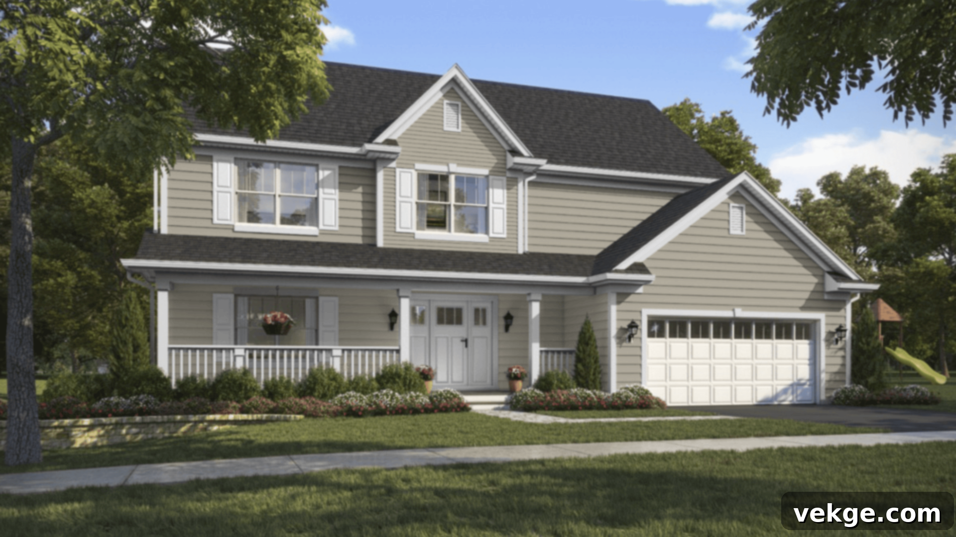
Sherwin-Williams Jogging Path (SW 7638) Review: Your Comprehensive Guide to This Versatile Warm Greige Paint
Choosing the ideal neutral paint color for your home can be surprisingly challenging. Many homeowners find themselves navigating a sea of options, trying to strike that perfect balance – avoiding a color that feels too cold, too stark, too yellow, or simply uninspiring on the walls. The quest for a warm gray, in particular, often leads to frustrations, as subtle undertones can drastically change a room’s entire ambiance.
It’s precisely this common dilemma that inspired this in-depth guide. Our goal is to provide you with all the essential information needed to confidently decide if Sherwin-Williams Jogging Path (SW 7638) is the perfect fit for your unique home and design vision.
Throughout this comprehensive review, we’ll delve into the specifics of Jogging Path. You’ll discover how this popular greige paint truly looks in a variety of real-world settings, how it compares to other highly sought-after warm neutrals from Sherwin-Williams, and what complementary colors and finishes will allow it to shine brightest. We’ll also equip you with practical tips for effectively testing this color in your own space, selecting the most appropriate paint finish, and even finding similar alternatives from other reputable brands. Let’s explore everything Sherwin-Williams Jogging Path has to offer.
Getting to Know Sherwin-Williams Jogging Path (SW 7638)

Jogging Path (SW 7638) stands out as a wonderfully warm, soft greige from the esteemed Sherwin-Williams collection. It masterfully bridges the gap between a subtle light taupe and a sophisticated muted gray. This unique positioning allows it to create that coveted cozy, neutral aesthetic without ever veering too far into overly yellow or distinctly green territories, making it a highly adaptable choice for various interior styles.
Basic Color Profile of SW Jogging Path
To truly understand Jogging Path, let’s break down its fundamental characteristics:
- HEX code: #C0B9A9
- LRV (Light Reflectance Value): 49
- Color family: Warm greige (a harmonious blend of gray and beige)
With an LRV of 49, Jogging Path falls into the mid-range of light reflectance. This means it’s neither overly bright nor excessively dark, offering a balanced presence on your walls. Colors with an LRV around this number tend to be very versatile, providing enough depth to feel substantial without making a room feel dim. It reflects a moderate amount of light, contributing to a soft, diffused glow rather than a stark brightness.
Jogging Path is a proud member of Sherwin-Williams’ extensive Neutral Paint Colors collection. Its balanced nature makes it an excellent candidate for whole-home color schemes, creating a cohesive flow throughout multiple rooms. It evokes a sense of calm and coziness, while its inherent versatility makes it particularly well-suited for transitional, traditional, and even modern farmhouse-inspired spaces.
Understanding Jogging Path’s Undertones
One of the most critical aspects of any paint color lies in its undertones, and Jogging Path is no exception. This particular greige possesses subtle yet impactful green and beige undertones. What makes Jogging Path so appealing is how well-balanced these undertones are, preventing any single one from becoming overwhelming.
- In bright natural light, especially from south-facing windows, the beige undertone tends to come forward, lending the color a soft, sandy, almost creamy warmth. It can feel incredibly inviting and sunny.
- In dim or north-facing light, which often casts a cooler, bluer light, the green-gray undertone becomes more apparent. This can give Jogging Path a slightly more muted, sophisticated, and earthy quality, preventing it from appearing too yellow or muddy.
A significant advantage of Jogging Path is that it very rarely presents as overtly yellow or pink. This consistent neutrality is a major reason why it remains a top choice for high-traffic areas like living rooms and kitchens, as well as more private spaces like bedrooms, where a soothing backdrop is desired.
However, the adage “always test your paint color” holds especially true for shades like Jogging Path. Its undertones are chameleon-like, subtly shifting based on a myriad of factors. Existing fixed elements in your room, such as flooring, cabinetry, and even large pieces of furniture, can significantly influence how the color is perceived. Furthermore, the type of light (natural vs. artificial, and the time of day) will play a pivotal role in revealing its true character. We recommend observing samples throughout the day and evening to fully grasp its dynamic nature.
SW Jogging Path in Real Spaces: A Visual Tour
Jogging Path is renowned for its remarkable flexibility, making it a suitable choice for almost any room in the home. Yet, its character and feel can subtly transform depending on the specific lighting conditions and the primary function of the space. Let’s explore how it manifests in different environments:
How It Looks in Different Rooms
Kitchens
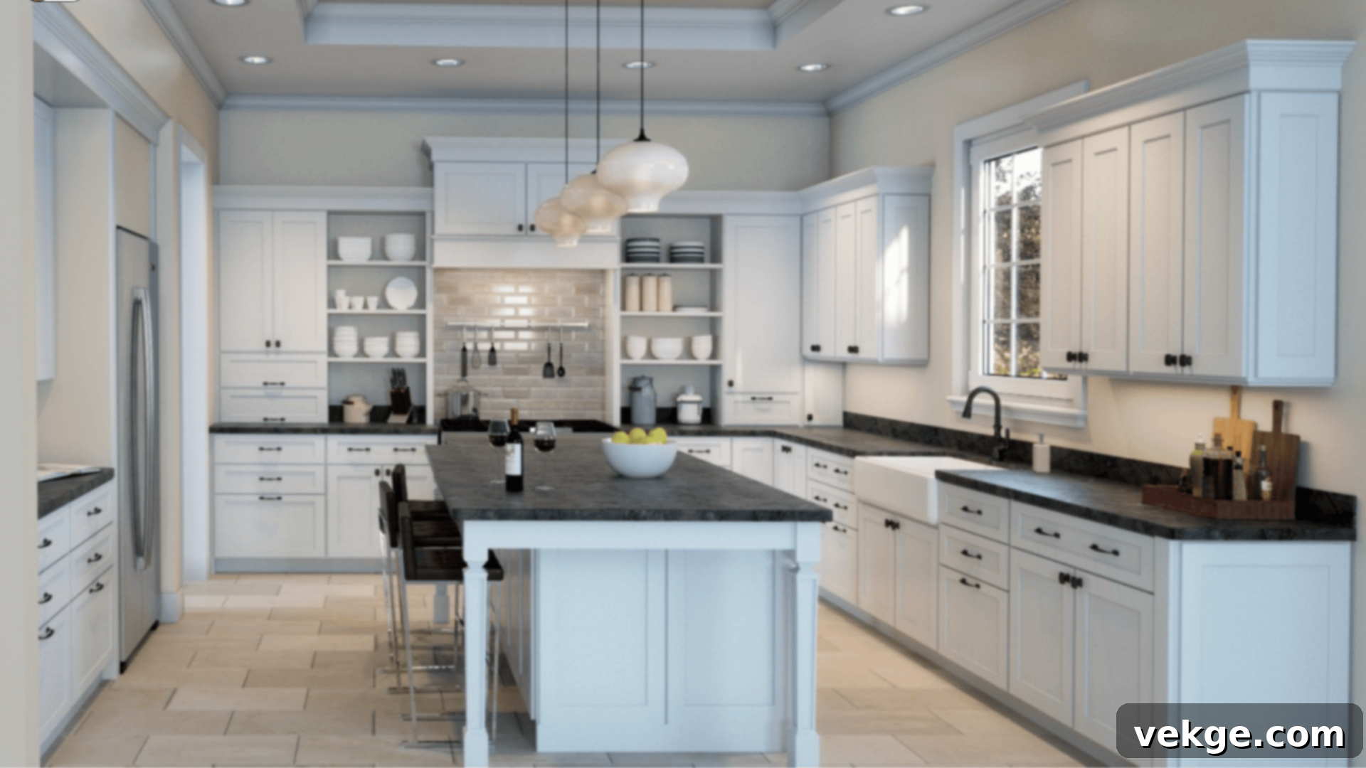
In kitchens, Jogging Path delivers a soft, grounded, and incredibly inviting ambiance. It acts as a sophisticated backdrop that pairs exquisitely with popular kitchen elements such as crisp white cabinets, sleek matte black hardware, and elegant natural stone countertops. Unlike some grays that can feel cold or some taupes that lean too yellow, Jogging Path offers a balanced warmth, creating a comfortable and functional space that feels both modern and timeless. It provides just enough contrast to white elements without feeling stark, making it perfect for a harmonious kitchen design.
Bathrooms
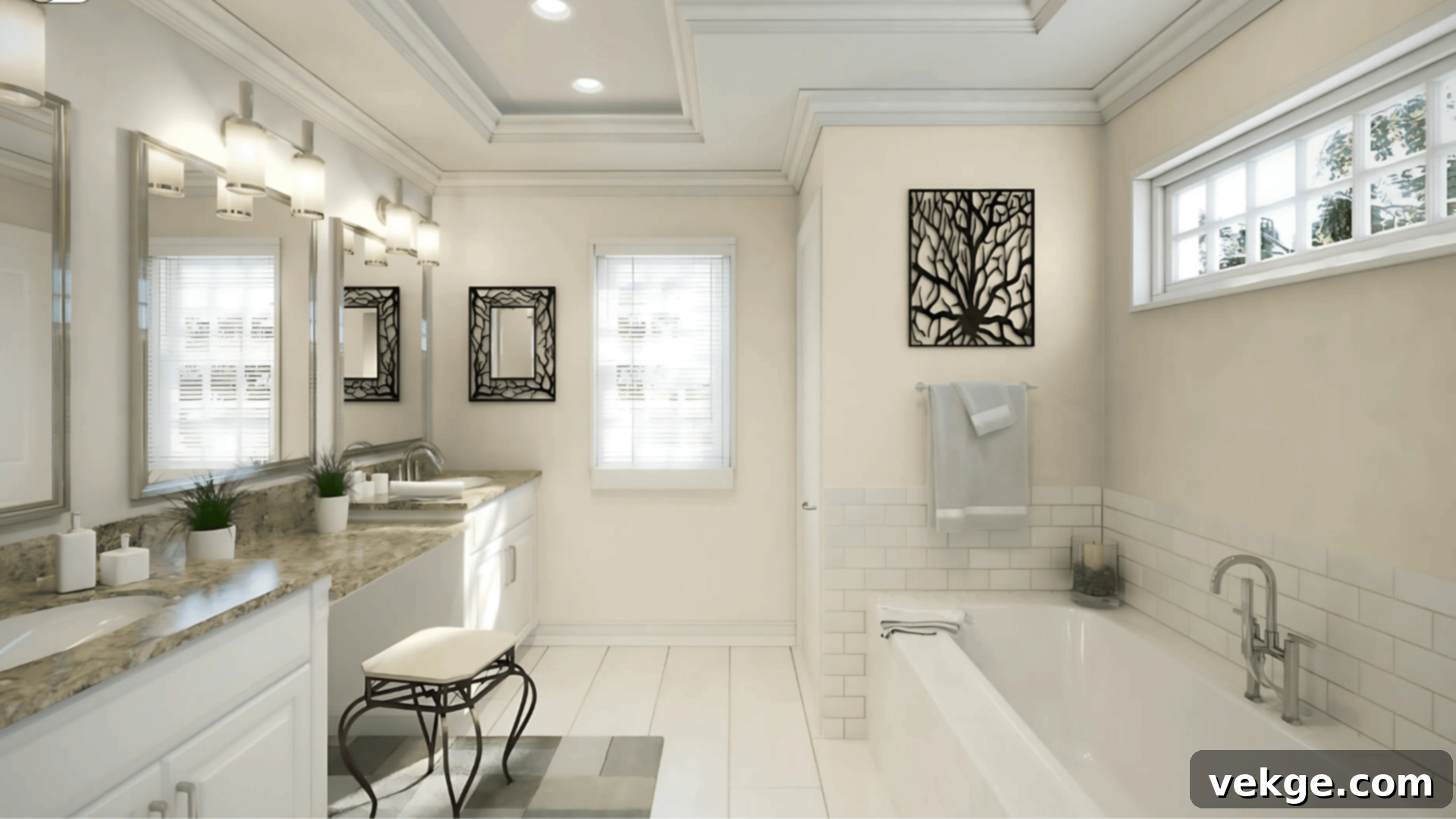
This adaptable greige shade works exceptionally well in bathrooms, where a sense of tranquility and cleanliness is paramount. It’s particularly effective when combined with soft whites for fixtures and towels, and brushed nickel finishes for faucets and hardware. In bathrooms with minimal natural light, or those that are north-facing, Jogging Path may tend to read slightly cooler due to the increased presence of its green-gray undertone. To counteract this and maintain warmth, consider contrasting it with rich warm wood tones in vanities or shelving, or by incorporating cozy textures through bath mats and window treatments.
Living Rooms
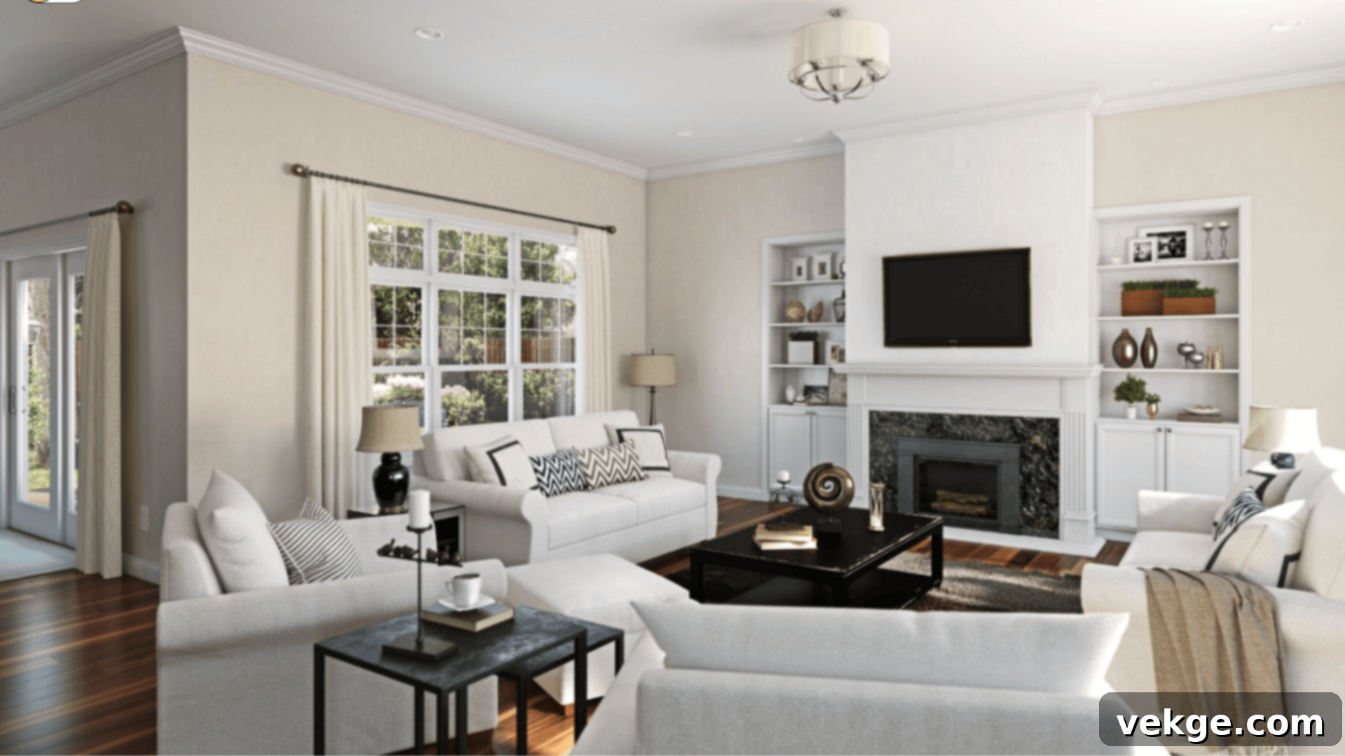
For living areas, Jogging Path creates an atmosphere of unparalleled comfort and timeless elegance. Its neutral yet warm quality allows it to seamlessly integrate with a wide array of decor styles, from modern minimalist to cozy traditional. If your goal is a versatile neutral that provides warmth without feeling overly beige or overtly gray, Jogging Path is an excellent contender. It offers a beautiful, subtle contrast against crisp white trim, defining architectural details without being overtly bold, thereby fostering a serene and welcoming environment perfect for relaxation and entertaining.
Bedrooms
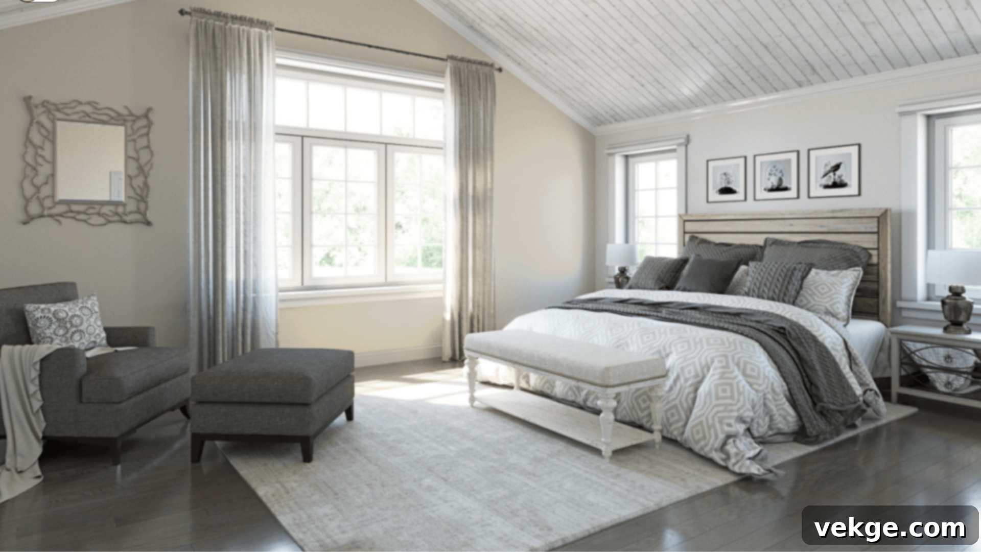
Transform your bedroom into a calm, slightly earthy sanctuary with Sherwin-Williams Jogging Path. Its muted warmth is conducive to rest and relaxation. This color looks particularly stunning when paired with soft off-white bedding, deeper warm grays in accent pieces, and rustic wood furniture, enhancing a natural, grounded aesthetic. If you’re seeking a color that offers more depth than a standard off-white but feels softer and less stark than a pure greige, Jogging Path perfectly hits that sweet spot, contributing to a peaceful and inviting sleep space.
How Lighting Affects Jogging Path’s Appearance
As mentioned, Jogging Path’s LRV of 49 positions it as a mid-range color, reflecting a moderate amount of light. This characteristic is key to its versatility, allowing it to adapt more gracefully than very dark grays or extremely light off-whites. However, the direction and quality of light in a room will always influence its final appearance:
- North-facing rooms: These rooms typically receive cooler, indirect light. In such conditions, expect the gray and green-gray undertones of Jogging Path to become more pronounced, giving it a slightly cooler, more muted, and sophisticated look.
- South-facing rooms: Bathed in abundant warm, direct light, Jogging Path will lighten up considerably here, showcasing its beautiful warm beige notes more prominently. It will feel brighter, sunnier, and undeniably cozier.
- East-facing rooms: In the morning, with the rise of cooler eastern light, Jogging Path will feel soft and truly neutral. As the day progresses and the light shifts, it will transition to a slightly warmer perception.
- West-facing rooms: During the afternoon and evening, when warmer western light floods in, this can significantly enhance Jogging Path’s beige tone, making it appear a bit toastier and more saturated.
- Artificial Lighting: The type of light bulbs you use (warm white vs. cool white LEDs) will also impact the color. Warm white bulbs (around 2700K-3000K) will emphasize its beige undertones, while cooler bulbs (4000K+) might bring out the subtle green-gray.
It is absolutely essential to try samples of Jogging Path on multiple walls within your space. Observe them at different times of the day, with both natural and artificial lighting, to fully understand how this dynamic color interacts with your specific environment. The way it feels on one wall may be entirely different on another due to varying light angles and conditions.
Jogging Path vs. Other Sherwin-Williams Neutrals
Sherwin-Williams boasts an impressive array of warm neutrals, making the selection process quite extensive. To help clarify Jogging Path’s unique position, let’s compare it to some of the brand’s other highly popular and frequently chosen shades.
Jogging Path vs. Accessible Beige (SW 7036)
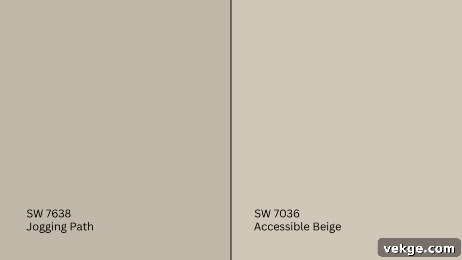
Accessible Beige (SW 7036, #D1C7B8) is a lighter beige-gray that is well-known for its undeniably warm undertones and slightly higher LRV of 58. It’s often celebrated for its ability to brighten a room while maintaining a cozy feel.
- Accessible Beige projects a noticeably creamier and more pronounced beige character, making it feel softer and sunnier.
- In contrast, Jogging Path is slightly darker (LRV 49), cooler, and generally more balanced in its gray-beige blend. Its subtle green undertone adds a layer of sophistication that Accessible Beige lacks.
Recommendation: Opt for Accessible Beige if you have sunny rooms and desire a brighter, more overtly beige-leaning neutral. Choose Jogging Path if you’re looking for something more muted, earthy, and with greater depth, especially in spaces where you want a refined greige that doesn’t lean too heavily into yellow tones.
Jogging Path vs. Repose Gray (SW 7015)

Repose Gray (SW 7015, #CCC9C0) is a highly popular light gray, distinguished by its soft, often detectable purple undertones and an LRV of 58. It’s a true gray with just enough warmth to keep it from feeling cold.
- Repose Gray distinctly leans cooler and presents a more modern, crisp aesthetic. Its subtle violet undertone gives it a unique character.
- Jogging Path, with its beige and green-gray undertones, consistently reads warmer and tends to complement more traditional or transitional decor styles.
Recommendation: Repose Gray is an excellent choice for homes with cool-toned decor, modern furnishings, or abundant natural light where you want a clean, sophisticated gray. Jogging Path is a better fit if your existing color palette incorporates taupe, other greiges, or muted greens, and you desire a softer, warmer, and more grounded neutral without a hint of purple.
Jogging Path vs. Worldly Gray (SW 7043)
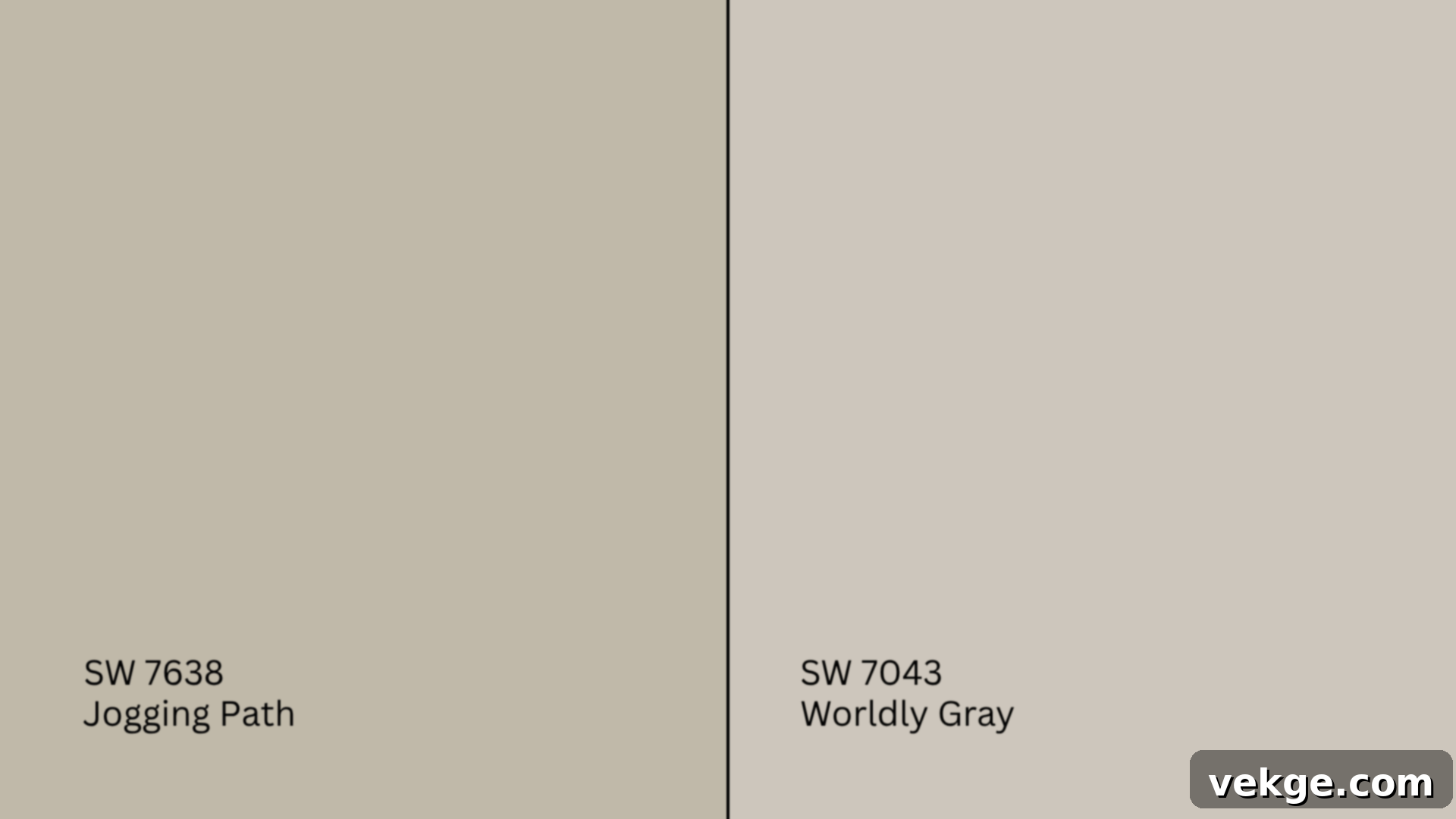
Worldly Gray (SW 7043, #CEC6BB) is another beloved warm gray that sits slightly above beige on the color spectrum, offering an LRV of 57. It’s known for its chameleon-like ability to adapt to various lighting conditions.
- Worldly Gray is generally lighter and often perceived as more flexible across a broader range of interior design styles due to its subtle nature.
- Jogging Path possesses more depth and tends to lean slightly more towards its green undertone, giving it a richer, more grounded presence on the wall.
Recommendation: Choose Worldly Gray if you’re seeking a very light, airy, and adaptable neutral for a whole-home scheme that maintains brightness. Jogging Path is a superior choice when you desire a neutral with more substance and depth, offering a noticeable contrast against white trim without making the room feel dark, and when you appreciate a hint of sophisticated green-gray.
Jogging Path vs. Agreeable Gray (SW 7029)
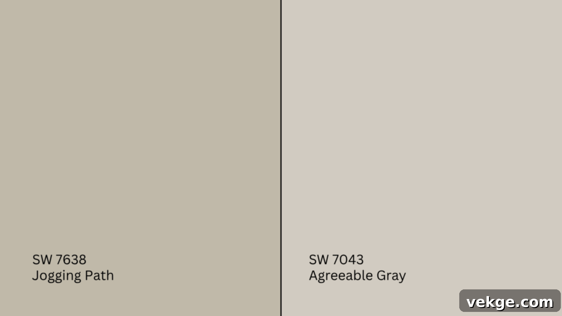
Agreeable Gray (SW 7029, #D1CBC1) holds the title of Sherwin-Williams’ most popular greige, and for good reason. With an LRV of 60, it’s a remarkably versatile and forgiving color that brightens spaces.
- Agreeable Gray is generally slightly warmer, brighter, and typically leans more towards its beige side, making it feel very welcoming and approachable.
- Jogging Path, while still warm, has a lower LRV (49) and is therefore moodier and more grounded. Its deeper tone and subtle green-gray undertone give it a more established, sophisticated feel.
Recommendation: Agreeable Gray is an excellent choice if you prioritize a bright, universally appealing, and slightly beige-leaning greige that can work in almost any setting. Opt for Jogging Path if you desire a richer, quieter, and more substantive feel, creating a cozy yet refined atmosphere that embraces its unique green-gray depth.
Undertone and LRV Comparison Table
For a quick reference, here’s how these popular Sherwin-Williams neutrals stack up against each other:
| Paint Color | Undertones | LRV | Warm or Cool |
|---|---|---|---|
| Jogging Path (SW 7638) | Beige, green-gray | 49 | Warm |
| Accessible Beige (SW 7036) | Beige, taupe | 58 | Warm |
| Repose Gray (SW 7015) | Gray, violet | 58 | Cool |
| Worldly Gray (SW 7043) | Beige-gray | 57 | Warm |
| Agreeable Gray (SW 7029) | Beige-gray | 60 | Warm |
Remember, the perception of “neutral” can drastically change once a color moves from a small chip to a large wall. Always test these colors side-by-side in your specific lighting conditions to make the most informed decision.
Best Color Pairings for Sherwin-Williams Jogging Path
While Jogging Path is a remarkably dependable and versatile backdrop on its own, its true potential for beauty and sophistication is fully realized when thoughtfully paired with the right complementary colors, textures, and finishes throughout your home.
Trim and Ceiling Suggestions
The right white trim can significantly enhance Jogging Path’s warmth and depth, providing a crisp frame or a softer transition, depending on your desired aesthetic:
- Extra White (SW 7006, #EEEFEA): This is a bright, clean white with virtually no discernible undertones. It creates a sharp, modern contrast against Jogging Path, making your trim pop and defining architectural details with precision. Ideal for a crisp, contemporary feel.
- Alabaster (SW 7008, #EDEAE0): A softer, off-white, Alabaster carries a subtle creaminess that harmonizes beautifully with Jogging Path’s inherent warmth. This pairing fosters a more cohesive, cozy, and traditional feel, softening the overall look rather than creating a stark break.
- Greek Villa (SW 7551, #F0ECE2): For an even warmer and creamier option, Greek Villa is an excellent choice. Its inviting undertones complement Jogging Path perfectly, making it ideal for classic, transitional, or farmhouse-inspired rooms where a softer, more integrated white is desired.
For ceilings, a flat finish in one of these whites (or even a diluted version of Jogging Path for a seamless look in smaller rooms) is generally recommended to help conceal imperfections and absorb light, creating a serene overhead plane. For trim, doors, and baseboards, a semi-gloss finish is preferred. Its slight sheen offers durability, ease of cleaning, and a subtle contrast that highlights the woodwork, contributing to a clean, professional, and polished appearance.
Accent Wall and Furniture Colors
Jogging Path provides a fantastic foundation upon which to build a rich and varied color palette for your furnishings and accent pieces:
- For soft, cozy pairings: To enhance the welcoming vibe, consider incorporating accent colors like warm off-whites, gentle sage greens, earthy clay tones, soft oatmeal, or even a muted, dusty blush. These colors will blend seamlessly, creating a tranquil and harmonious environment. You might feature these on throw pillows, smaller decorative items, or even a soft area rug.
- For striking contrast and depth: If you wish to add a touch of drama or visual interest, Jogging Path can beautifully support bolder accent colors. Deep navy blues, sophisticated charcoal grays, rich olive greens, or even crisp black accents (think picture frames or accent furniture) can create a dynamic focal point.
When it comes to furniture, materials like natural wood (oak, maple, walnut), rattan, woven textures, supple leather, or inviting off-white upholstery all harmonize exceptionally well with Jogging Path. These materials reinforce the color’s organic, grounded feel. You can inject additional personality and boldness into the room through textiles like throws and decorative pillows, or through striking artwork in richer jewel tones or vibrant warm earth colors, creating layers of visual interest.
Hardware and Flooring Compatibility
Jogging Path’s adaptable nature extends to its compatibility with various hardware and flooring finishes, allowing it to fit seamlessly into different design styles and spaces.
- Brushed nickel offers a soft, clean, and contemporary look. It blends harmoniously in kitchens and bathrooms, providing a subtle metallic accent that doesn’t compete with or draw attention away from the wall color, allowing Jogging Path’s subtle beauty to take center stage.
- Matte black hardware introduces a sharp, modern contrast and a sense of structure. This pairing is particularly effective in modern, industrial, or farmhouse-style spaces, where the defined lines of black hardware help Jogging Path feel more crisp and contemporary.
- Aged brass or antique gold finishes add a touch of warmth, vintage charm, and refined elegance. These work exceptionally well with traditional or transitional decor, especially when paired with warm wood accents or period-appropriate furnishings, enhancing the richness of Jogging Path.
For flooring, the options are equally diverse:
- Light woods like natural oak, maple, or pale pine keep the overall aesthetic feeling bright, airy, and expansive, complementing Jogging Path’s softer side.
- Mid-toned options such as walnut, hickory, or cherry add significant depth and balance to a room, creating a richer, more grounded foundation that highlights the wall color.
- Greige or beige tile is a pragmatic and stylish choice for areas like bathrooms, entryways, or laundry rooms. It offers superior durability and water resistance while naturally blending with Jogging Path’s earthy undertones, ensuring a cohesive and sophisticated look from floor to ceiling.
Paint Finish Recommendations for Jogging Path
The chosen paint finish plays a surprisingly significant role, impacting both the visual appeal and practical functionality of Sherwin-Williams Jogging Path on your walls. Different sheens reflect light differently and offer varying levels of durability.
- Matte Finish: This low-sheen option provides a soft, velvety appearance that absorbs light rather than reflecting it. It’s ideal for quiet, low-traffic rooms such as guest bedrooms, studies, or formal dining rooms where a sophisticated, understated ambiance is desired. A matte finish will soften Jogging Path’s overall tone, making it feel even cozier and helping to conceal minor wall imperfections.
- Eggshell Finish: Offering a slight, subtle sheen, eggshell is a popular and versatile choice for main living areas like living rooms, family rooms, and dining rooms. It provides a touch more light reflection than matte, contributing to a welcoming and slightly more refined feel without being too shiny. It also offers increased durability and washability compared to matte.
- Satin Finish: With a noticeable sheen, satin is highly durable and easy to clean, making it an excellent choice for high-moisture and high-traffic areas. This includes bathrooms, kitchens, laundry rooms, and children’s bedrooms or playrooms. The satin finish helps Jogging Path stand up to humidity, splashes, and general wear and tear, while also making the color feel a bit richer and more vibrant.
If you’re uncertain about which finish will best suit your space, it’s highly recommended to test all three finishes on sample boards or discreet sections of your wall. The difference in sheen can subtly shift how warm or cool Jogging Path appears, and how it interacts with the light in your specific room. Considering the room’s function and the desired aesthetic will guide you to the perfect choice.
Sampling and Buying Options for SW Jogging Path
Making the right paint choice involves more than just liking a color on a tiny chip. Seeing it in your home is paramount. Here’s how to sample and purchase Sherwin-Williams Jogging Path:
Where to Get Peel-and-Stick Samples
Peel-and-stick samples have revolutionized the paint selection process by providing a mess-free, accurate way to test colors. We highly recommend them for Jogging Path:
- Samplize: This is a top recommendation for easy, clean, and repositionable samples. Samplize uses actual paint applied to a peel-and-stick backing, ensuring color accuracy without the commitment or mess of sample pots. They are perfect for moving around different walls and observing in various lighting conditions.
- Sherwin-Williams stores: You can purchase traditional sample pots or pre-painted boards directly from any Sherwin-Williams retail location. This allows you to paint a larger swatch if you prefer, or to take a physical board home to see.
- Local retailers: Some independent paint and hardware stores may also carry Jogging Path swatches or be able to order them for you. Always ensure it’s an official Sherwin-Williams product for true color accuracy.
When testing, remember to place your samples on multiple walls within the room you intend to paint. Observe them throughout the day – in bright morning light, soft afternoon light, and under artificial lighting at night – to fully understand how Jogging Path’s subtle undertones behave and transform in your unique environment.
Where to Buy the Paint
Once you’ve confidently chosen Jogging Path, purchasing the actual paint is straightforward:
- Sherwin-Williams.com: For ultimate convenience, you can purchase Jogging Path directly from the official Sherwin-Williams website. Options often include in-store pickup, which allows you to order online and collect at your nearest store, or having the paint delivered directly to your home.
- Local Sherwin-Williams stores: Visiting a local store provides the benefit of speaking with knowledgeable staff who can offer advice on finishes, quantities, and application. They typically carry Jogging Path in various finishes and can mix it on the spot.
- Larger hardware stores: While not always guaranteed to stock Sherwin-Williams brand paints, larger hardware stores like Lowe’s or independent paint centers may be able to color-match the shade using their own brands, or custom-order Sherwin-Williams products for you. Always double-check color accuracy if opting for a color match.
Pro tip: Keep an eye out for Sherwin-Williams’ frequent 30–40% off sales. These promotions run often throughout the year and can result in significant savings on your paint purchase!
Paint Equivalents in Other Brands
If you love the look of Sherwin-Williams Jogging Path but prefer to work with another paint brand, there are several similar colors that capture a comparable warm greige essence. While an exact match is rarely possible due to variations in pigment and base, these options come quite close:
- Benjamin Moore: For a similar warm greige feel, consider Revere Pewter (HC-172, #CCC4B8). Revere Pewter is a slightly lighter, very popular greige with green-gray undertones that are quite similar to Jogging Path’s. Another option is Abalone (2108-60, #D6CFC7), which offers a soft, muted greige with subtle violet-gray undertones, providing a slightly different but still warm and sophisticated feel.
- Behr: Look at Natural Gray (PPU18-10, #C4C0BB). This color is a balanced gray with strong beige undertones that make it feel warm and inviting, echoing Jogging Path’s character. Another close option is Classic Silver (PPU18-11, #B9B9B4), which leans a bit more gray but still carries enough warmth to be considered a soft greige.
- Valspar: Check out Smoked Oyster (6005-1C, #ACA194). This is a very deep, rich greige with strong warm undertones that can feel quite similar to Jogging Path’s earthy depth. Alternatively, Filtered Shade (4003-1B, #CBC9c4) offers a lighter, softer greige that balances gray and beige beautifully, though it might be slightly less saturated than Jogging Path.
As always, the golden rule of paint selection applies: always sample first! Colors that appear almost identical on paper or on a screen can present quite differently on your wall, reacting uniquely to your home’s specific lighting conditions and existing elements. Get a sample of the alternative color and compare it directly to a Sherwin-Williams Jogging Path sample in your space.
Conclusion: Is Sherwin-Williams Jogging Path Right for You?
After this extensive exploration, it’s clear that Sherwin-Williams Jogging Path (SW 7638) is an exceptionally versatile and beautiful paint color. If your design aspirations include a warm, inviting, and inherently cozy gray that retains a true sense of neutrality and grounding, then Jogging Path might just be the perfect hue you’ve been searching for.
You’ve now gained a deep understanding of its unique characteristics: how its subtle beige and green-gray undertones manifest in different lighting conditions, how it breathes life into various rooms from kitchens to bedrooms, and how it stands in comparison to other beloved Sherwin-Williams neutrals like Accessible Beige, Repose Gray, Worldly Gray, and Agreeable Gray. Furthermore, you’re now equipped with expert advice on complementary color pairings for trim, accents, hardware, and flooring, ensuring a cohesive and harmonious design.
Before you commit to gallons of paint, remember the crucial step: try a peel-and-stick sample or a sample pot directly in your space. Observe Jogging Path on multiple walls, at different times of day, and under various lighting conditions. This hands-on testing will provide the ultimate confidence, allowing you to move forward with your painting project, knowing that you’ve chosen a color that truly enhances your home’s aesthetic and atmosphere.
Still refining your color choices or looking for inspiration for other areas of your home? Feel free to explore our other detailed paint reviews on the website. Each one follows this same comprehensive format, designed to empower you with the knowledge and confidence to make the absolute best color decisions for your unique living spaces.
