Discover the Best Sherwin-Williams Warm Neutral Paint Colors for a Cozy & Inviting Home
Choosing the perfect paint color can be a daunting task, especially when you desire a shade that effortlessly harmonizes with every room in your home. If you’re seeking a versatile palette that eliminates guesswork, the best warm neutral paint colors from Sherwin-Williams offer an ideal solution. These sophisticated shades are renowned for their ability to infuse any space with a gentle, welcoming, and profoundly livable ambiance.
Whether you’re embarking on a major home renovation or simply refreshing a single accent wall, selecting the right warm neutral paint can be transformative. It’s the secret to creating a cohesive flow and a unified sense of style throughout your entire living environment. These colors provide a soft backdrop that allows your furniture, decor, and personal style to truly shine.
In this comprehensive guide, I will walk you through my top picks from Sherwin-Williams’ exquisite collection of warm neutrals. We’ll delve into each color’s unique characteristics, exploring how to effectively match them with existing trim, natural light conditions, and various flooring types. By the end of this article, you’ll feel empowered and confident in choosing the warm neutral paint color that perfectly aligns with your personal style, home’s lighting, and architectural layout. Let’s embark on this journey to find your perfect warm neutral and create a home you’ll adore.
Sherwin-Williams’ Top Warm Neutral Paint Colors for Ultimate Comfort and Style
The leading warm neutral paint colors from Sherwin-Williams are carefully curated to bring an unparalleled sense of comfort, balance, and sophistication to any space. These exquisite shades are distinguished by their subtle hints of beige, taupe, or greige, working in concert to create a quiet, refined, and exceptionally inviting atmosphere. Their inherent versatility makes them a designer favorite.
These adaptable hues perform beautifully in diverse lighting conditions, from sun-drenched rooms to those with lower natural light. They blend effortlessly with classic white trim, the rich textures of natural wood floors, and the subtle gleam of soft metal finishes. This makes them an excellent foundation for a wide range of interior design styles, from modern farmhouse to minimalist contemporary.
Whether your project involves painting an entire home or simply refreshing a single room, these thoughtfully selected tones possess the remarkable ability to establish a smooth, continuous flow from one space to the next. Their unique characteristic of shifting gently and gracefully with the changing light throughout the day makes them a perennial favorite for anyone desiring a space that feels consistently ‘right’ and harmonious, regardless of the time or season.
Top Sherwin-Williams Warm Neutral Colors to Elevate Your Home
These carefully selected Sherwin-Williams warm neutrals strike an impeccable balance of color depth and inviting comfort. Each shade offers distinct light reflectance values (LRV) and nuanced undertones, making them suitable for specific room types, prevailing lighting conditions, and a variety of design styles. Understanding these attributes is key to making the best choice for your home.
1. Accessible Beige (SW 7036) – The Grounded Greige
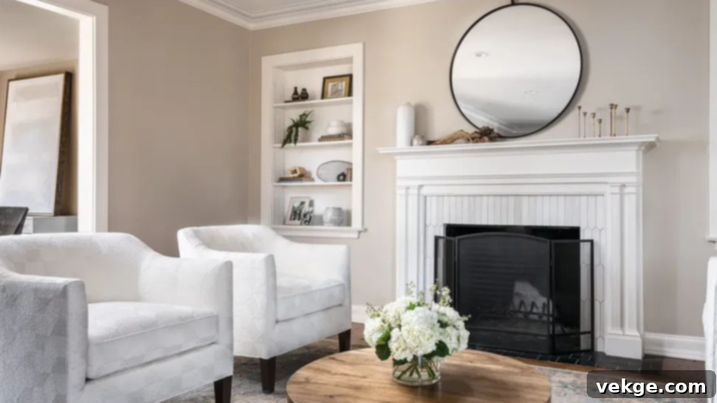
- LRV: 58
- Undertone: Greige with warm beige notes
Accessible Beige stands out as a remarkably reliable and universally appealing neutral. It masterfully balances warmth and an earthy groundedness. Its brilliance lies in its ability to avoid leaning too heavily into either yellow or gray, making it an exceptional choice for rooms with balanced or shifting natural light. This earthy, natural tone imparts a comfortable yet clean and tidy feel, making it perfectly suited for bedrooms, inviting dining areas, and expansive open-concept layouts. It harmonizes beautifully with soft white trim, rich wood accents, and subtle muted green accessories, offering warmth without appearing heavy or overwhelming. It’s an ideal choice for a sophisticated yet approachable backdrop.
2. Agreeable Gray (SW 7029) – The Ultimate Greige Chameleon
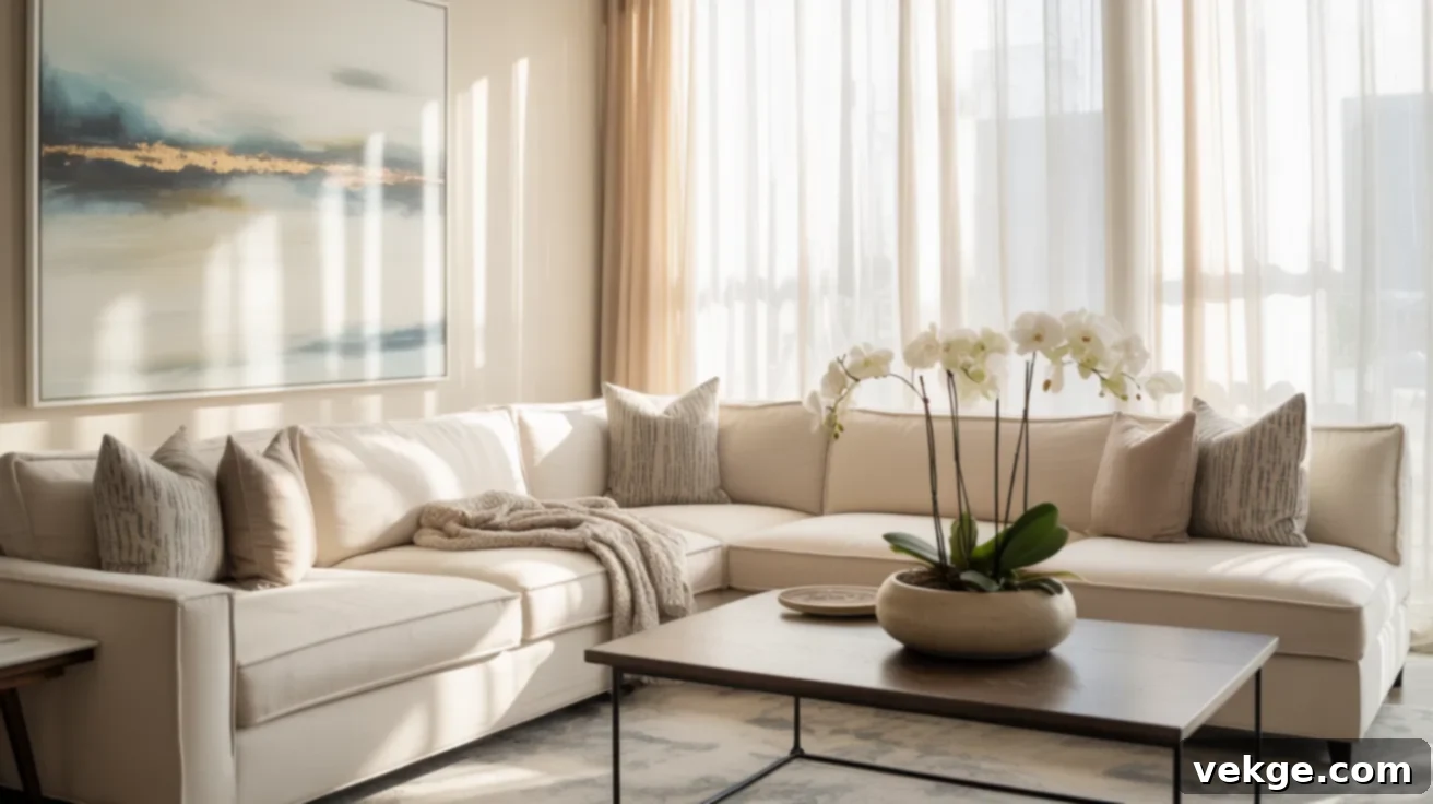
- LRV: 60
- Undertone: Warm greige
Agreeable Gray consistently ranks as a top favorite due to its extraordinary versatility; it truly works almost anywhere. Its soft greige tone delivers warmth while maintaining a light and airy feel. With a relatively high LRV, it effectively reflects light, helping smaller or darker rooms feel more spacious and open. This shade is subtle enough for entire-home application, seamlessly blending with crisp white trim, calming soft blue accents, and natural wood elements. It provides a non-intrusive backdrop, adapting gracefully to both cool and warm decor schemes, making it a safe yet stylish choice for almost any interior.
3. Creamy (SW 7012) – The Buttery Off-White
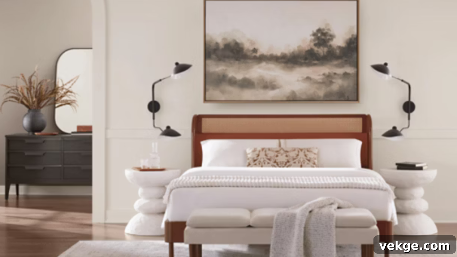
- LRV: 81
- Undertone: Warm yellow-cream
Creamy is a beautifully soft and inviting off-white that introduces warmth without venturing into deep beige territories. Its high LRV ensures that it brightens spaces significantly while simultaneously retaining a comforting, cozy feel. This color is an impeccable choice for kitchens, ceilings, or trim where a pure, stark white might feel too cold or uninviting. It possesses just the right amount of warmth to complement traditional or farmhouse design styles, and critically, it resists shifting to cool undertones even in low-light conditions. Think of it as a soft, buttery light rather than a heavy beige, making it an excellent alternative to stark whites.
4. Alabaster (SW 7008) – The Beloved Soft White
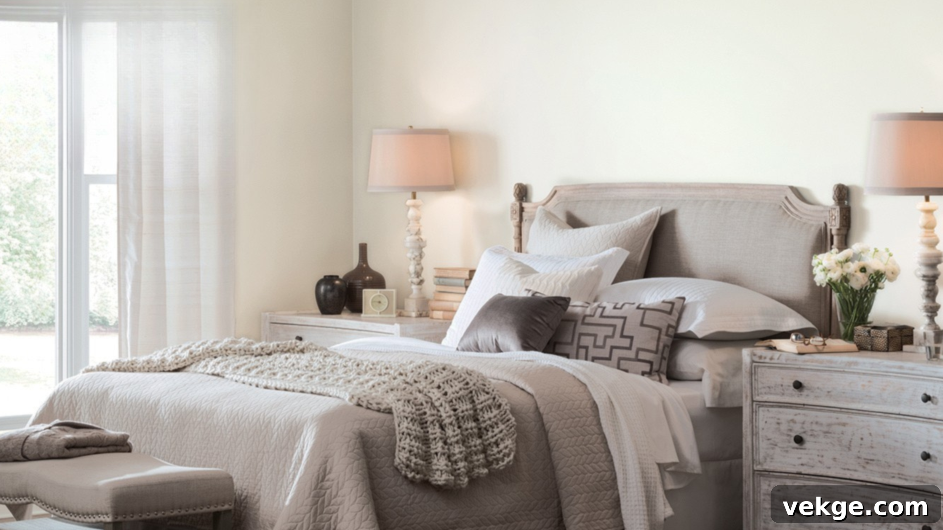
- LRV: 82
- Undertone: Subtle beige with a creamy base
Alabaster offers a distinctly fresh and clean backdrop, yet it remarkably avoids feeling cold or clinical. It is arguably one of Sherwin-Williams’ most cherished warm neutrals, largely due to its incredible versatility and gentle nature. The delicate beige undertone gives it a soft, almost ethereal quality, particularly noticeable in the gentle glow of morning or afternoon light. It excels as both a primary wall color and a trim color, fostering a calm, luminous ambiance in bedrooms, bathrooms, or expansive open living areas. Alabaster maintains its neutral integrity without ever appearing flat, chalky, or overly bright, making it a sophisticated choice for almost any space.
5. Balanced Beige (SW 7037) – The Rich & Deep Neutral
- LRV: 46
- Undertone: Warm taupe
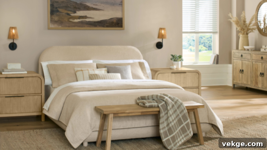
Balanced Beige presents itself as a deeper neutral, exuding intense warmth and a luxurious richness. It leans more distinctly into beige tones than gray, making it an exceptional choice for rooms bathed in ample natural light. Its lower LRV contributes to a deeply grounded and anchored feel, making it particularly splendid for sophisticated dining rooms or cozy, inviting dens. This shade pairs exquisitely with creamy whites and offers a stunning contrast when set against deep blues or earthy greens. Balanced Beige manages to feel wonderfully cozy without ever appearing dark, lending a sense of refined structure and serene calm to even larger rooms.
6. Natural Linen (SW 9109) – The Sunny & Serene Tan
- LRV: 66
- Undertone: Light tan with soft yellow warmth
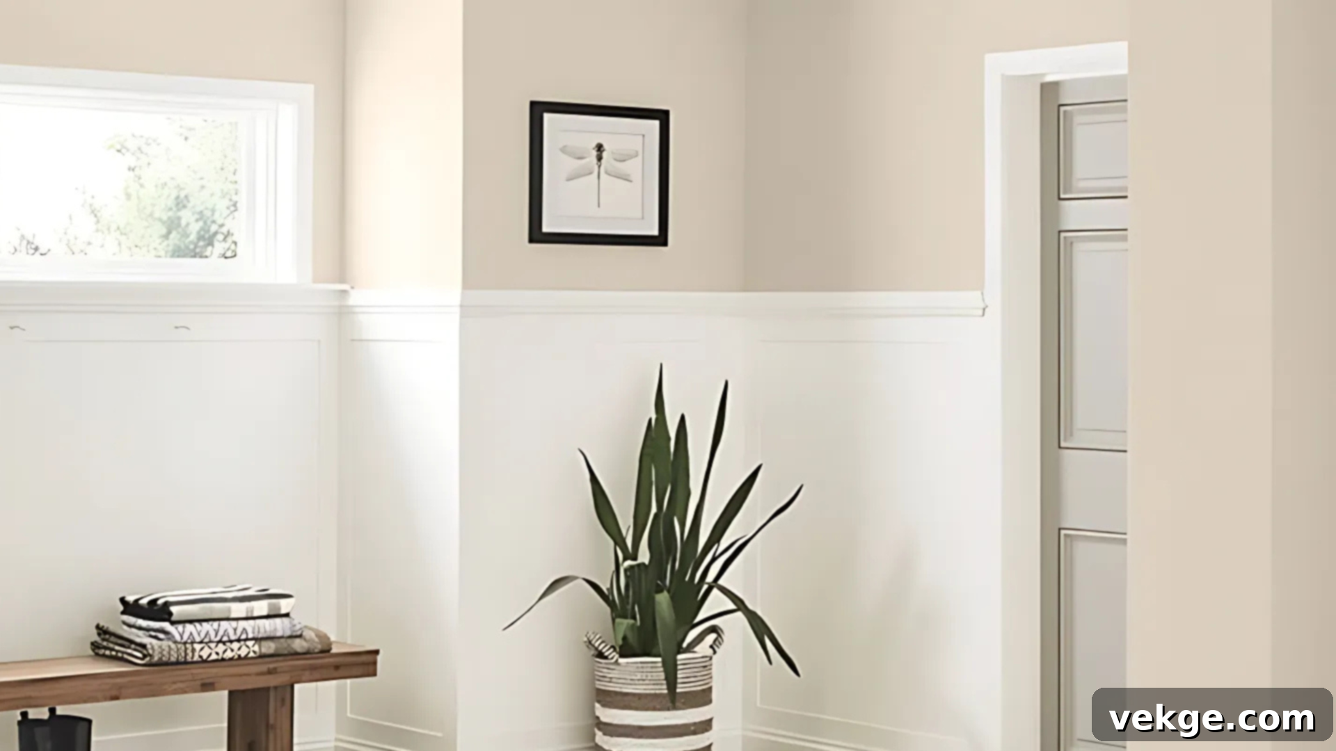
Natural Linen is the quintessential choice if you desire a sunny and bright neutral that still reads as profoundly calm and collected. It introduces a delightful touch of light, warm tan to your walls, helping rooms feel open and expansive without ever feeling sterile or cold. Its subtle yellow undertone pairs beautifully with organic textures like rattan, the natural grain of oak, or soft creamy trim. This color is wonderfully suited for casual yet elegant spaces such as welcoming entryways or tranquil bedrooms. It reflects a gentle, ambient brightness while remaining incredibly easy on the eyes. Opt for Natural Linen when you seek softness and warmth devoid of any gray undertones.
7. Stone Lion (SW 7507) – The Deep & Earthy Neutral

- LRV: 38
- Undertone: Deep beige with gray-brown hints
Stone Lion imparts a profound sense of depth and quiet, inherent strength to any space it graces. It is most effectively utilized in larger rooms or areas that benefit from abundant natural light, where its lower LRV will enhance rather than diminish the sense of openness. The muted brown-gray undertone provides a distinctly grounded, organic, and natural feel. This color is outstanding for creating sophisticated accent walls, establishing a cozy, focused atmosphere in home offices, or defining elegant dining areas. It pairs exceptionally well with crisp whites for a clean contrast or with rich bronze finishes to enhance its inherent warmth, creating a truly inviting and powerful statement.
8. Whole Wheat (SW 6121) – The Golden & Inviting Beige
- LRV: 45
- Undertone: Yellow beige
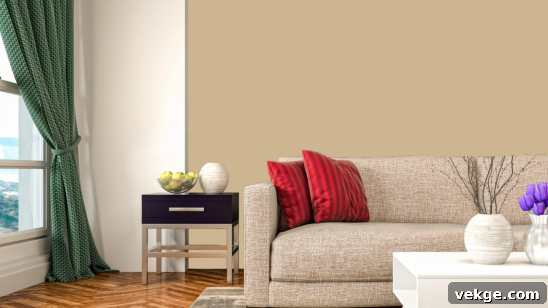
Whole Wheat is a timeless, classic golden neutral that offers an irresistibly inviting and earthy warmth. It adds character and a distinct personality without ever being overtly bold or dominating. While its undertone leans unmistakably yellow, it’s a mellow, not bright, yellow, making it supremely suitable for warm and welcoming family rooms or traditional interior designs. It looks absolutely superb when paired with rich terracotta, deep red, or sophisticated muted navy accents. Its mid-range LRV allows it to hold its own, providing depth without unduly darkening the space. It’s an excellent choice for crafting autumn-inspired or charming rustic designs.
9. Shiitake (SW 9173) – The Modern & Balanced Taupe

- LRV: 51
- Undertone: Warm taupe with subtle green-gray base
Shiitake is a perfectly balanced and thoroughly modern neutral that radiates a calm, versatile, and understated elegance. It occupies a sweet spot squarely in the middle of light and dark, performing consistently well in both abundant natural and various artificial lighting conditions. The delicate hint of green-gray in its undertone is key to preventing it from feeling either too beige or too pink, ensuring its contemporary appeal. This makes it a compelling option for open-concept spaces or kitchens where you desire warmth without any yellow leanings. It also blends effortlessly with striking black, crisp white, or natural wood elements, offering a sophisticated foundation.
Warm Neutrals by Style & Mood to Match Any Room Aesthetic
Understanding that not all warm neutral colors serve the same purpose is crucial for achieving your desired interior design vision. Some shades are inherently better suited to creating intimate, cozy corners, while others are designed to brighten expansive open spaces or perfectly complement rustic finishes. Here’s a detailed guide to help you pick the precise warm neutral that aligns with your specific style and the mood you wish to cultivate.
Best for Cozy Living Rooms: Creating an Embrace
For living rooms where comfort and invitation are paramount, colors like Kilim Beige, Practical Beige, and Woven Wicker are unparalleled choices. These hues feature rich beige or deep tan bases that feel profoundly welcoming and enveloping without ever appearing dark or heavy. They possess a unique quality that helps rooms feel wonderfully snug and intimate, rather than visually shrinking the space. These shades thrive when paired with warm, ambient lighting, an abundance of layered textures, and soft, tactile materials such as linen or wool. They also beautifully complement the warmth of solid wood furniture or the classic richness of brown leather. Deploy these colors in living rooms where creating a hygge-like atmosphere is your primary goal, particularly effective in cooler months or spaces designed for relaxed seating and gathering.
Best for Airy, Bright Spaces: Expanding Your Horizon
If your aim is to achieve a fresh, expansive, and open feel in your rooms, then Creamy, Divine White, and Ivoire are your ideal companions. Their significantly higher light reflectance values make walls appear remarkably bright and luminous, even when illuminated by soft, diffused natural light. These exceptional neutrals boast gentle yellow or delicate cream undertones that introduce a soft glow without casting any unwelcome shadows or appearing stark. They are perfect for invigorating kitchens, brightening long hallways, or enhancing sun-filled bedrooms. They also pair wonderfully with light-colored flooring, minimalist window treatments, and simple, elegant neutral textiles. Choose these shades if your space already enjoys good natural light and your objective is to maintain and amplify that bright, airy, and open sensation.
Best for Rustic or Earthy Styles: Grounding Your Design
For those drawn to rustic homes or wishing to incorporate an earthy, organic palette, Utaupeia, Double Latte, and Stone Lion deliver natural warmth and profoundly grounded tones. These colors are characterized by rich brown or subtle taupe undertones that blend seamlessly with natural elements like stone, various wood types, or clay finishes. They maintain their integrity and depth even in dimmer lighting conditions, providing a steady and reassuring presence without being overtly bold or demanding attention. They are magnificent for crafting impactful accent walls, creating focused and serene studies, or enhancing farmhouse-style rooms. Pair them with sleek matte black hardware, exposed raw wood beams, or soft sage green accents to cultivate a relaxed, down-to-earth space that remarkably still feels clean, current, and modern.
Room-by-Room Warm Neutral Recommendations That Truly Work
The optimal warm neutral can subtly shift and evolve depending on the specific function, available light, and desired overall feel of each room. Utilize this quick, practical guide to assist you in selecting the most fitting shades based on these crucial considerations for every distinct part of your home.
1. Living Room: Warm Tones That Invite You In
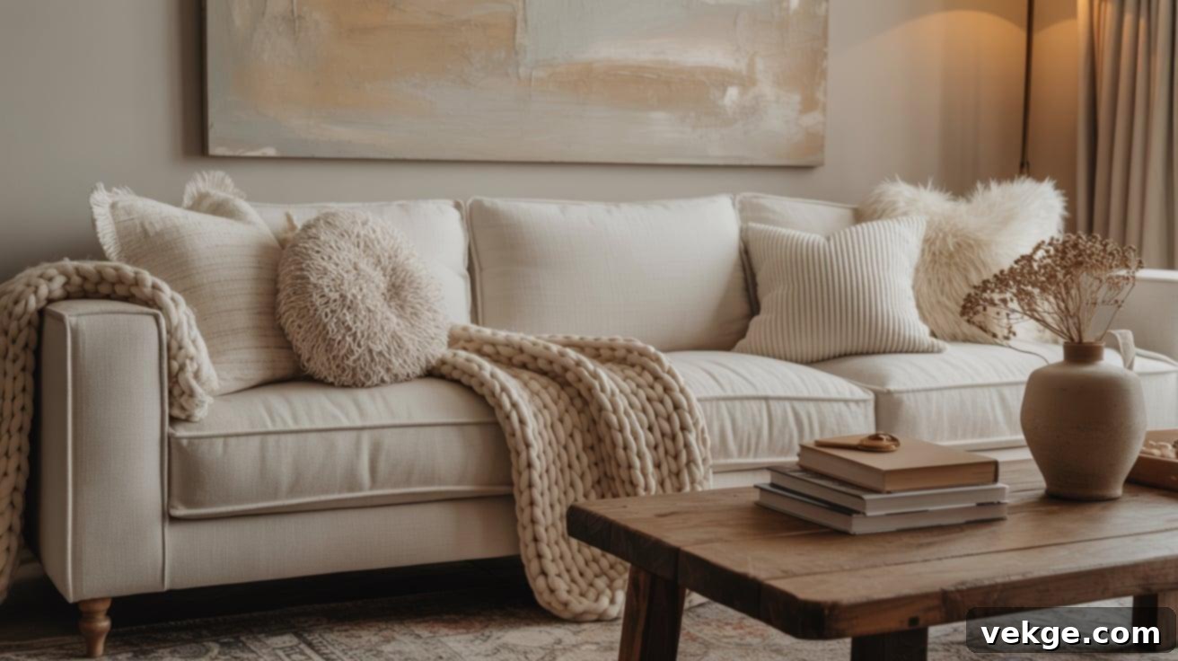
In the living room, the heart of your home, opt for soft beiges or sophisticated greiges that exude a welcoming embrace without feeling visually heavy. Colors like Accessible Beige or Balanced Beige provide just the right amount of warmth to instantly relax the space, yet remain refined and not overly bold. These shades create a harmonious environment that works beautifully with diverse textures of wood, a variety of textiles, and thoughtfully placed soft lighting, making the room feel both grand and intimately comfortable.
2. Bedroom: Calm Colors for Rest and Quiet Serenity
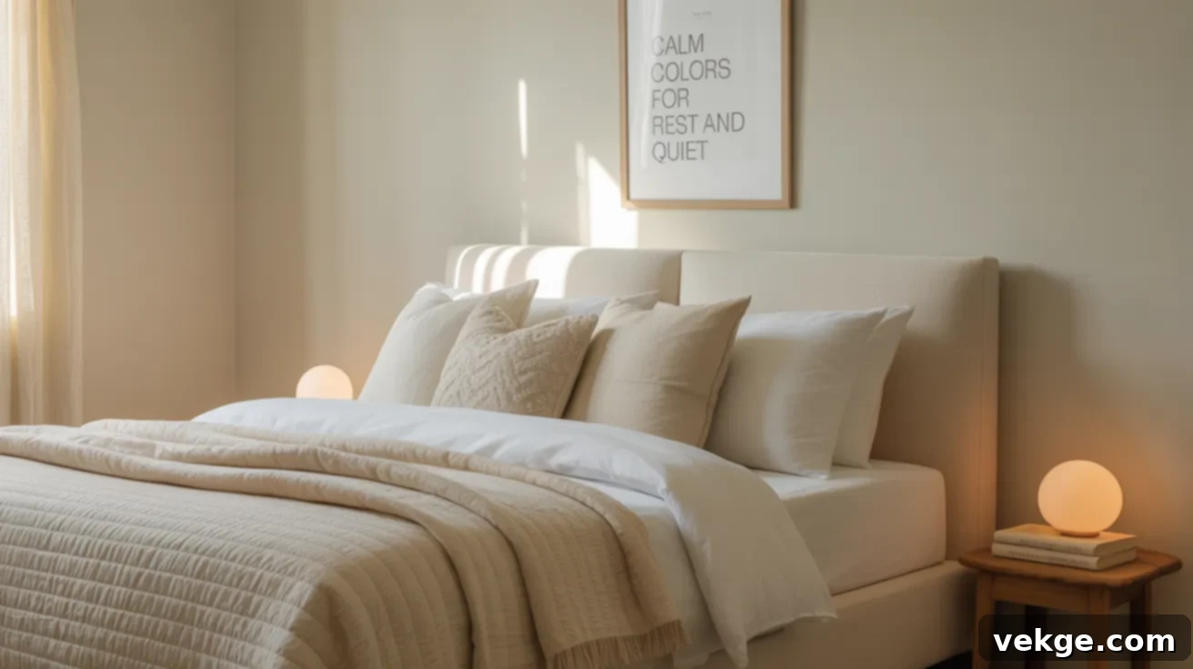
For the bedroom, a sanctuary of rest and rejuvenation, select gentle neutrals imbued with subtle warmth, such as Creamy or Alabaster. These particular shades are adept at creating a soft, ethereal, and profoundly restful atmosphere, conducive to relaxation and peaceful sleep. Pair them with luxurious simple linens, gentle warm lighting fixtures, and minimalist, quiet decor to foster a serene setting that is utterly perfect for a truly restful night’s sleep and a calm awakening.
3. Bathroom: Clean Neutrals with Light and Lasting Warmth
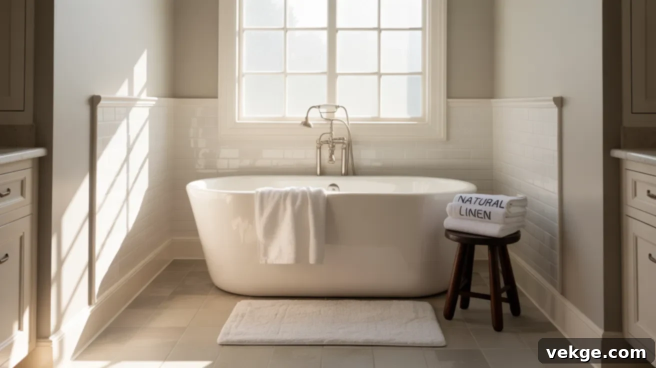
Bathrooms necessitate a delicate balance of crisp freshness and comforting warmth. Experiment with Natural Linen or Divine White; these colors possess the remarkable ability to brighten even smaller spaces without ever appearing cold or clinical. Furthermore, they exquisitely complement light-colored tiles and various soft metal accents, such as the refined gleam of bronze or the subtle sophistication of brushed nickel, transforming a functional space into a spa-like retreat.
4. Kitchen: Soft Shades That Feel Natural and Neat
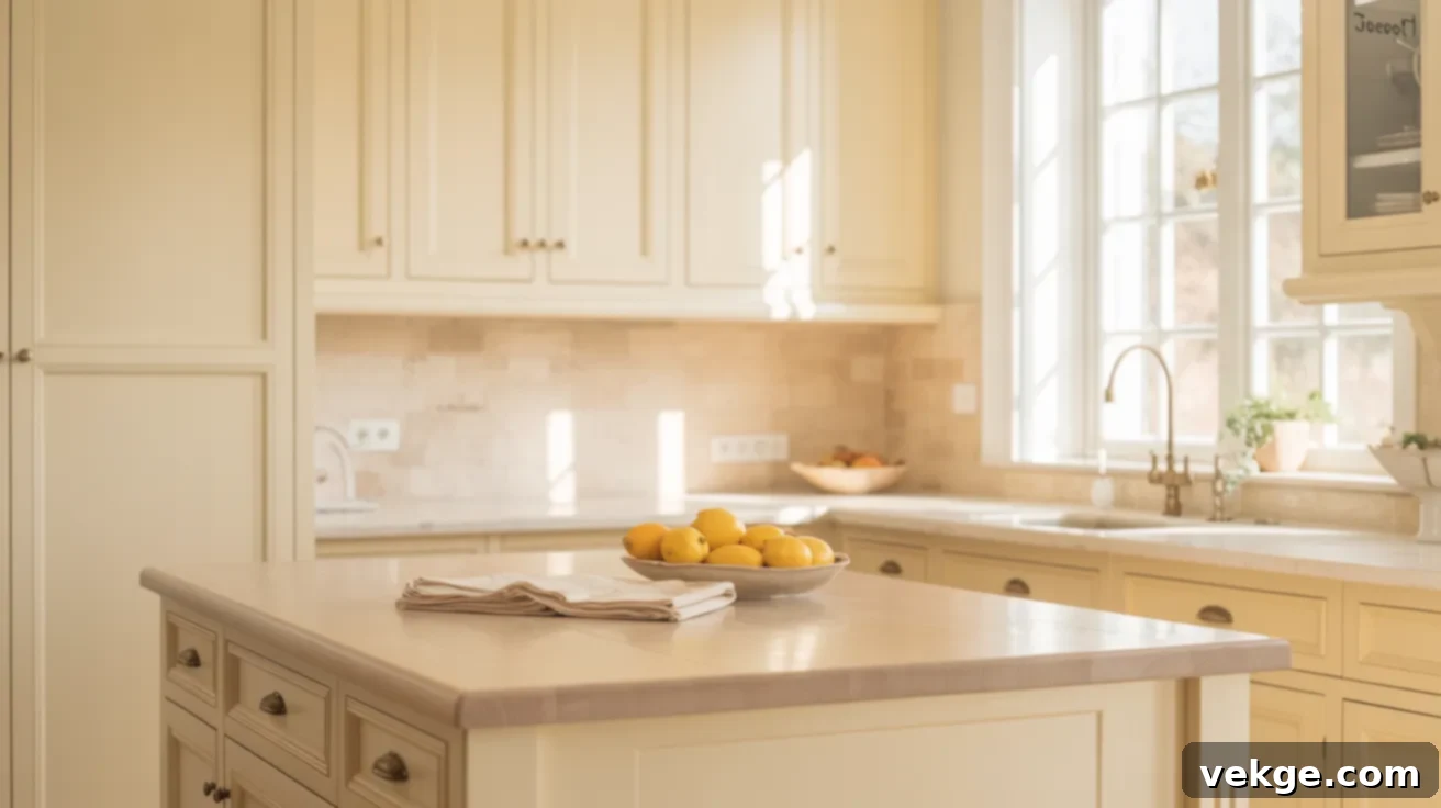
In the kitchen, a space of culinary creativity and gathering, gravitate towards warm neutrals that offer invigorating energy without any harshness or sharpness. Whole Wheat or Ivoire are excellent choices, pairing harmoniously with rich wood cabinets, elegant stone countertops, and classic white trim. These shades ensure kitchens remain bright, inviting, and wonderfully grounded, providing a serene backdrop that doesn’t compete with bold surfaces or vibrant culinary activities.
5. Whole Home Use: Balanced Colors for Every Wall
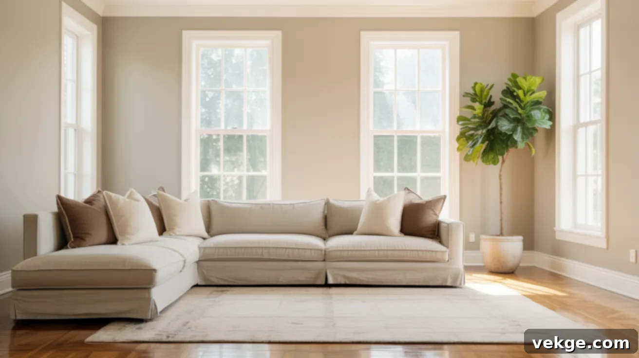
When the goal is to achieve a seamlessly consistent color palette throughout your entire home, mid-tone neutrals like Agreeable Gray or Shiitake emerge as exceptionally strong and reliable options. These versatile shades are characterized by their perfectly balanced tones that steadfastly maintain their consistency and charm across diverse lighting conditions and varied room layouts. They create a beautiful, cohesive narrative that flows effortlessly from one space to the next, promoting a sense of peace and unity.
How to Pair Warm Neutrals Without Overthinking It for a Cohesive Look
While warm neutrals are inherently flexible and forgiving, the complementary colors you choose to pair with them can profoundly influence the overall ambiance and aesthetic of your space. Elements like trim, accent colors, and flooring play a significant role in how your wall color is perceived. Employ these expert tips to maintain visual balance and ensure everything in your home looks harmoniously appealing and professionally designed.
With Trim and Ceiling Colors: The Perfect Frame
To elegantly highlight the inherent warmth of your chosen neutral, pair it with soft, sympathetic whites such as Sherwin-Williams’ Alabaster, Snowbound, or Creamy. These specific options are formulated to enhance the warmth of your walls without introducing any unwanted cool or blue undertones that can often make a space feel disconnected. It’s best to avoid stark, brilliant whites, as they can sometimes appear too sharp or jarring against the softness of a warm neutral. For ceilings, a timeless and effective strategy is to use the exact same trim color but in a flat finish to maintain simplicity and continuity. This technique ensures your warm neutral walls feel softly framed and intrinsically connected to the entire room, a particularly important consideration in bedrooms and living spaces where supreme comfort is the ultimate goal.
Accent Colors: Creating Impact and Harmony (Navy, Olive, Terra Cotta)
Warm neutrals serve as an excellent canvas for creating striking yet harmonious contrast with deeper, richer accent colors. Navy introduces a sense of calm strength and refined depth, instantly grounding a space. Olive green provides a sophisticated, earthy natural feel, connecting the interior with the outdoors. Terra cotta, with its inherent warmth and organic texture, adds a touch of rustic charm and vibrant earthiness. These accent colors work exceptionally well when introduced through elements such as decorative pillows, area rugs, flowing curtains, or thoughtfully painted furniture pieces. As a general rule, steer clear of overly bright or primary colors, as subtle and muted tones are far more effective at maintaining a steady, sophisticated mood. Additionally, incorporate a variety of textures, like sumptuous linen, supple leather, or elegant matte metals, to further support your warm base palette without creating visual clashes, adding richness and tactile interest.
With Flooring or Wood Tones: Grounding Your Palette
When the task is matching warm neutrals with your existing flooring or significant wood tones (like cabinetry), the key is to look for shared undertones to ensure a seamless transition. If your floors, such as red oak or cherry, lean towards red or orange undertones, then beige or gold-based neutrals like Whole Wheat will create a beautiful and cohesive synergy. Conversely, for floors that present gray-brown undertones (like many modern laminates or certain stained woods), opt for taupe or sophisticated greige shades such as Shiitake. It is critical not to overlook trim and cabinets in this process; a paint color that works flawlessly on a large wall might clash significantly with nearby permanent wood fixtures. Always, without exception, test large paint samples directly next to your floor and cabinetry, not just in open wall spaces, and observe them under various lighting conditions throughout the day for the most accurate assessment.
Finish and Sheen Guide: The Final Touch to Your Warm Neutrals
The paint finish you ultimately choose for your warm neutrals is far more than a mere afterthought; it profoundly influences how your paint looks, its durability, and how it reflects light within a room. This guide will help you make the most informed choice for every surface and room in your home.
Flat vs. Satin vs. Eggshell for Neutrals: Understanding the Nuances
The finish you apply can dramatically alter how a warm neutral feels and performs, even if the underlying color remains identical. Each finish offers distinct advantages:
| Finish Type | Look | Best For | Things to Note / Durability |
|---|---|---|---|
| Flat | Soft, velvety, and no shine | Ceilings, low-traffic areas, formal dining rooms, master bedrooms | Excellent at hiding surface imperfections and flaws. However, it is generally harder to clean and less durable against scuffs and marks. Ideal for a sophisticated, subdued look. |
| Eggshell | Subtle, low-luster glow, similar to an eggshell | Living rooms, bedrooms, hallways, family rooms | Offers a balance of softness and durability. Easier to wipe clean than flat, making it practical for moderate traffic areas while still providing a soft, inviting aesthetic. |
| Satin | Smooth, slightly glossy, more reflective sheen | Kitchens, bathrooms, trim, doors, high-traffic areas | Highly durable and significantly easier to clean, standing up well to moisture and frequent wiping. The increased reflectivity can make colors appear slightly brighter and can highlight imperfections more than flatter finishes. |
How Finish Affects Color Perception: A Deeper Dive
The paint finish you select plays a pivotal role in how your walls reflect ambient light and, consequently, how the color itself is perceived. Flat finishes, by their nature, absorb more light, which tends to make warm neutrals appear a little deeper, richer, and more relaxed, enhancing their subtle complexities. Conversely, finishes with a higher sheen, like satin or semi-gloss, reflect more light. This reflectivity can make the inherent undertones of a color appear more pronounced or even cause the shade to shift slightly in appearance depending on the angle and intensity of the light source. It’s crucial to view your paint samples in both morning and evening light, paying close attention to areas near windows and lamps. What might feel perfectly balanced during the day could potentially seem brighter or more intense under artificial night lighting. Always, for the most accurate representation, test your final choice on a substantial area of your wall using the exact finish you intend to use for the entire room.
Conclusion: Your Journey to a Perfectly Painted Home
Embarking on the journey of selecting the ideal paint color can seem overwhelming, but once you methodically consider factors such as nuanced undertones, the ever-changing natural and artificial lighting in your home, and the specific function and desired mood of each room, the path to your perfect palette truly begins to clarify and come together. This comprehensive guide has presented you with my meticulously curated top picks from Sherwin-Williams’ exceptional range of warm neutrals, and importantly, has shown you how these colors perform and evolve in real-world home environments.
Now armed with this valuable knowledge, you are more than ready to confidently choose the warm neutral paint color that will best complement your unique personal style and enhance the intrinsic beauty of your living spaces. I highly recommend taking the vital next step of testing a few of your favorite selections with actual paint samples. Apply these samples to a decent-sized section of your wall and observe them diligently at different times of the day, as well as under various lighting conditions, to truly appreciate how these subtle shades can shift and transform. This hands-on approach is invaluable for making a choice you will love for years to come.
If this guide has provided you with clarity and inspiration, I warmly invite you to explore my other posts on paint colors and comprehensive home tips, designed to further assist you in creating the home of your dreams. You have already taken the most significant first step toward finding a shade that will not only bring comfort and style but also a sense of profound contentment and pride in your beautifully curated home.
