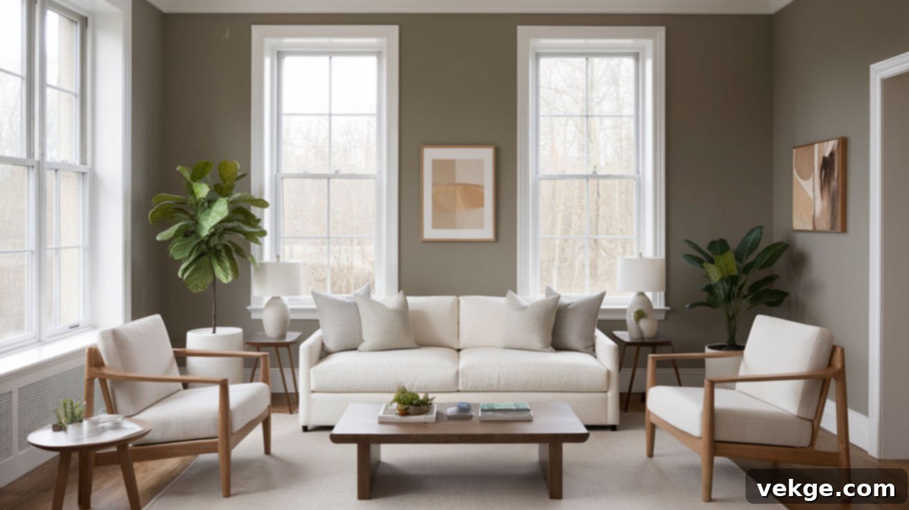
Sherwin-Williams Dorian Gray (SW 7017): A Comprehensive Review of This Popular Warm Gray Paint
Choosing the perfect gray paint can feel like an overwhelming task. What initially seems like a straightforward decision often turns into hours spent sifting through an endless array of samples that all seem to blend into one another. The fear of selecting a shade that might ultimately feel too cold, too dark, or just “off” once it graces your walls is a common struggle for homeowners and designers alike. I’ve certainly been there, wrestling with those exact uncertainties.
That’s precisely why this comprehensive guide was created: to meticulously break down Sherwin-Williams Dorian Gray (SW 7017) and help you confidently determine if this specific shade of gray is the ideal choice for your unique space. We’ll delve into its core characteristics, explore how it truly appears in a variety of real homes, analyze the significant impact of different lighting conditions, compare it to other highly sought-after gray paints, and uncover which colors, textures, and finishes complement it exceptionally well. Let’s embark on this journey together, eliminating the guesswork and empowering you to make an informed decision.
Sherwin-Williams Dorian Gray (SW 7017): An In-Depth Look

Sherwin-Williams Dorian Gray (SW 7017) is an exquisite, medium-depth neutral paint color that has earned a reputation for being a perfectly balanced, warm gray. It strikes a harmonious chord, offering enough saturation to provide distinct character without ever overwhelming a room. This remarkable versatility allows it to seamlessly integrate into a vast array of interior design styles, from the sleek lines of modern aesthetics to the timeless charm of more traditional settings. It’s a color that speaks volumes through its subtle sophistication.
Basic Color Profile: Dorian Gray
- HEX code: #ACA79E
- LRV (Light Reflectance Value): 39
- Color family: Warm gray
With an LRV of 39, Dorian Gray falls squarely into the “not too light, not too dark” category, making it an excellent middle-ground option. This LRV ensures it has enough depth to hold its own against contrasting trim colors, richer decor, and diverse furnishings, providing a substantial backdrop without feeling heavy. It is also proudly part of the Sherwin-Williams Living Well Collection: Renew, a curated selection of colors designed to foster well-being and comfort in living spaces. Designers frequently turn to Dorian Gray when seeking a shade that offers a touch more depth and warmth than typical light greiges, providing a nuanced and sophisticated alternative.
Understanding Dorian Gray’s Subtle Undertones
One of the defining characteristics of Dorian Gray is its inviting warmth, which stems from its primary taupe undertones, often accompanied by faint hints of purple. While these subtle nuances might not always be immediately apparent, they are key to its unique charm and contribute significantly to how the color adapts and shifts throughout the day, particularly in response to varying light conditions.
- In abundant natural daylight, Dorian Gray reveals its softest, most neutral side. The warmth of the greige quality becomes more pronounced, making the color feel incredibly inviting and balanced. It loses any potential for coolness, embracing a comforting, earthy appeal.
- Under artificial warm light bulbs, especially during the evening hours or in dimly lit corners, you may notice the subtle taupe or even faint violet shadows emerging. These undertones contribute to a richer, more complex appearance, adding depth and a slightly moody, sophisticated atmosphere to the room.
These dynamic undertones are what make Dorian Gray exceptionally versatile and, at times, captivatingly moody. It possesses the remarkable ability to transform a space into either a supremely cozy sanctuary or a refined, elegant statement, depending entirely on the complementary colors, textures, and decor choices you pair it with. Understanding these shifts is crucial for predicting how Dorian Gray will truly live in your home.
Where to Beautifully Incorporate Dorian Gray in Your Home
Dorian Gray’s adaptability makes it suitable for a far wider range of applications than many other gray shades. Its balanced nature allows it to excel on entire walls, serve as a striking accent feature, or even transform built-in cabinetry. Let’s explore the various areas where this elegant color truly shines.
Interior Rooms: Transforming Spaces with Dorian Gray
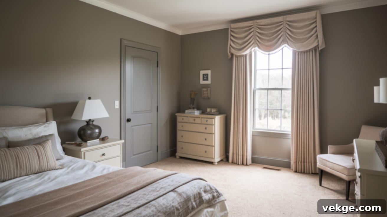
The versatility of Dorian Gray makes it a superb choice for virtually any interior room. In living rooms, it creates an effortlessly sophisticated and welcoming atmosphere. It harmonizes beautifully with natural wood furniture, such as oak or walnut, and complements neutral fabrics like linen, wool, or soft cottons, adding depth without visual clutter. For a truly cohesive look, consider layering textures and using metallic accents to enhance its inherent warmth.
In bedrooms, Dorian Gray fosters a profound sense of calm and tranquility. It’s light enough to feel airy and open but deep enough to provide a cocoon-like comfort, making it ideal for relaxation. Paired with soft whites, muted blues, or deep greens in bedding and accessories, it contributes to a serene retreat. For home offices, it offers a focused and quiet backdrop, promoting concentration without feeling sterile. Its balanced nature avoids distractions, allowing the mind to remain clear and productive.
Kitchens and Bathrooms: Durability Meets Elegance
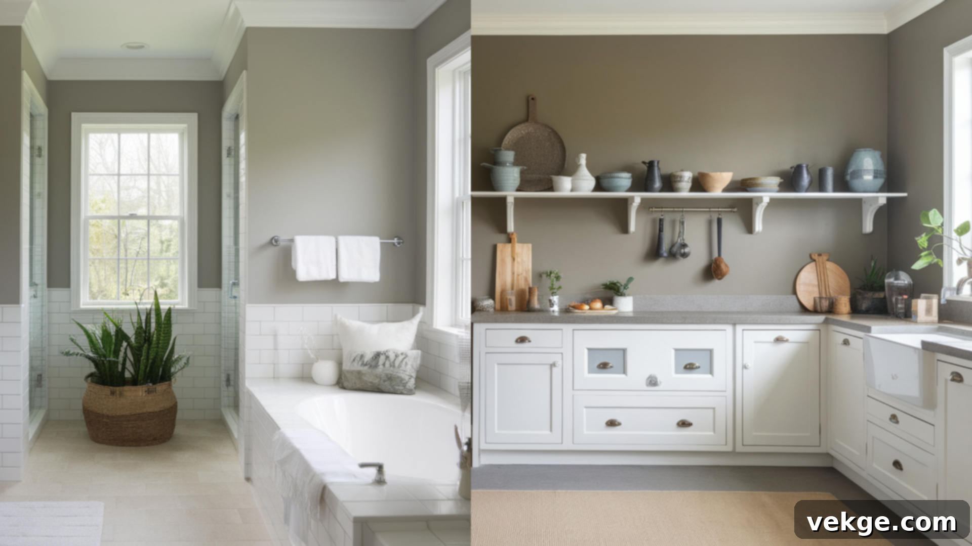
Dorian Gray truly excels when applied to kitchen and bathroom cabinetry. Its medium depth and warm undertones provide a sophisticated alternative to stark whites or darker colors. When paired with pristine white quartz or marble countertops, the warmth inherent in the paint prevents the space from feeling cold or sterile, creating a beautifully balanced and inviting kitchen or bath. For a more organic feel, it also pairs wonderfully with butcher block countertops.
A practical benefit of this particular shade is its ability to subtly conceal minor scuffs, fingerprints, and everyday wear-and-tear far better than lighter shades, making it an exceptionally smart and durable choice for these high-traffic, utilitarian spaces. This means less frequent touch-ups and a consistently fresh appearance.
Exterior Applications: A Grounded and Classic Appeal
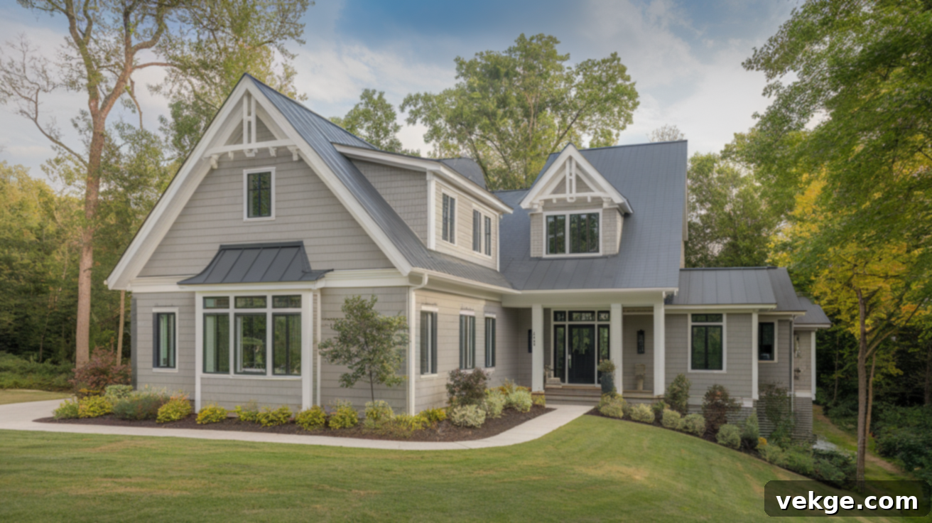
Beyond interiors, Dorian Gray possesses the resilience and depth required for stunning exterior applications. Its robust pigmentation ensures it doesn’t fade quickly, standing up admirably to direct sunlight and various weather conditions. On exteriors, it bestows homes with a wonderfully grounded and classic look, making them feel established and inviting. It’s particularly effective when contrasted with a crisp, bright trim color such as Sherwin-Williams Pure White (SW 7005) or even a slightly warmer white like Alabaster, which enhances its architectural details and creates a sophisticated curb appeal. It complements a variety of architectural styles, from traditional craftsman homes to modern farmhouses.
How Lighting Conditions Transform Dorian Gray
The nuanced undertones and inherent depth of Dorian Gray make it highly reactive and captivatingly responsive to changes in natural and artificial lighting throughout the day. This dynamic quality is precisely why sampling is so critical.
- North-facing rooms: These spaces receive cooler, indirect light, which can often intensify the subtle purple-gray base within Dorian Gray. In such conditions, the color may appear slightly cooler and more muted, leaning into its sophisticated gray side.
- South-facing rooms: Abundant, warm natural light from south-facing windows tends to bring out the very best in Dorian Gray’s warmth. Here, it feels exceptionally soft, inviting, and distinctly greige, showcasing its taupe undertones more prominently.
- East-facing rooms: Morning light in east-facing rooms can initially make Dorian Gray appear somewhat cooler and fresher. However, as the day progresses and the light shifts towards midday, the color gradually warms up, revealing more of its inherent richness.
- West-facing rooms: The warm, golden glow of evening light in west-facing rooms significantly deepens Dorian Gray’s taupe characteristics. This dramatic illumination adds a cozy, enveloping depth, making the color feel particularly rich and inviting during sunset hours.
Given these pronounced shifts, it is absolutely essential to sample Dorian Gray on multiple walls within your space. Observe it at different times of the day, under various lighting conditions, to fully grasp how this chameleon-like color will truly behave in your home before making a final commitment.
Dorian Gray vs. Other Popular Sherwin-Williams Grays
The Sherwin-Williams collection boasts an impressive spectrum of gray paints, each with its own distinct personality and undertone profile. Understanding how Dorian Gray stacks up against its popular counterparts is crucial for making the best selection for your project. Let’s compare it to a few frequently chosen options:
Dorian Gray vs. Mindful Gray (SW 7016)
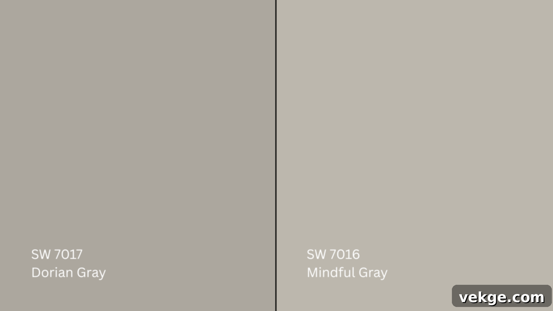
Mindful Gray (SW 7016, #BCB7AD) is a noticeably lighter gray compared to Dorian Gray, typically presenting with a subtle hint of green undertone. This gives Mindful Gray a softer, more ethereal quality, making it appear unequivocally neutral in most room settings. In contrast, Dorian Gray (SW 7017) is a step darker on the paint strip and anchors itself with a warmer, more pronounced taupe base. While Mindful Gray is airy and bright, Dorian Gray offers more substance and a richer, more grounded feel.
If your goal is to achieve a light, calming, and understated gray that provides a gentle backdrop, Mindful Gray is an excellent choice. However, if you are seeking a gray with greater depth, more character, and a distinctly warmer, richer appeal that can stand on its own, Dorian Gray will undoubtedly serve your needs better, providing a sophisticated presence without overwhelming the space.
Dorian Gray vs. Repose Gray (SW 7015)
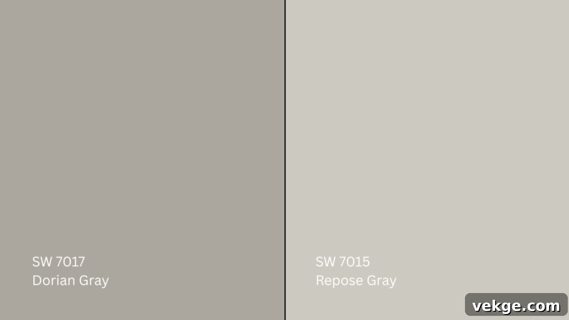
Repose Gray (SW 7015, #CCC9C0) is another popular gray that is considerably lighter than Dorian Gray. Its defining characteristic is its cool undertone, which subtly features hints of purple and blue. These cool undertones lend Repose Gray a crisper, almost ethereal quality, making it feel fresh and modern. While it is a versatile gray, its cool leanings are more evident than Dorian Gray’s warmth. Dorian Gray, on the other hand, consistently maintains its warmer character and tends to be less influenced by lighting shifts when it comes to its core temperature, making it a more consistent warm-toned gray.
If you desire a cool-toned gray that offers a crisp, clean aesthetic and blends effortlessly with a wide spectrum of other colors, Repose Gray is an incredibly smart pick. Conversely, if your preference leans towards a gray that exudes a warmer, more grounded, and cozy feel, and you appreciate a color that doesn’t stray into cool territory, then Dorian Gray is likely the superior fit for your design vision.
Dorian Gray vs. Gauntlet Gray (SW 7019)
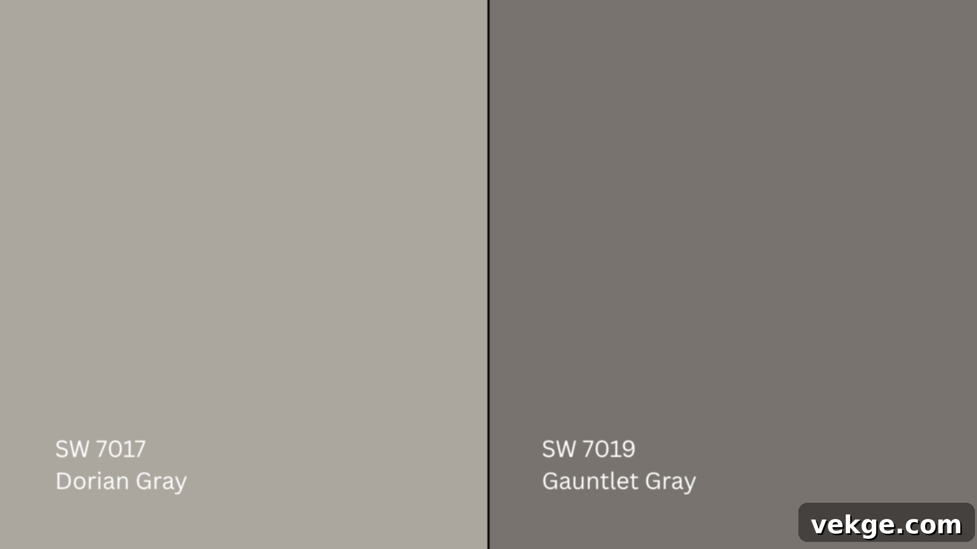
Gauntlet Gray (SW 7019, #78736E) represents a significantly darker and bolder end of the gray spectrum when compared to Dorian Gray. This deep, charcoal-like gray delivers a strong, dramatic, and often moody vibe to a room, making a powerful statement. It’s an intense color with profound presence. Dorian Gray, in stark contrast, maintains its balanced medium depth and warm undertones, preventing it from ever feeling as heavy or imposing as Gauntlet Gray. Dorian Gray provides substance without the overwhelming intensity.
If your design ambition is to create a deep, dramatic, and highly impactful gray accent wall, a commanding fireplace, or a space with a truly moody ambiance, Gauntlet Gray might be precisely the color you need. However, if you are looking for a gray that still adds significant weight and sophistication but without delving into overly dark or dramatic territory, offering a more livable and balanced warmth, Dorian Gray will undoubtedly be the better and more versatile choice for your project.
LRV and Undertone Comparison Table
| Color | LRV | Undertone | Best For |
|---|---|---|---|
| Dorian Gray (SW 7017) | 39 | Warm taupe/slight purple | Cabinets, exteriors, cozy bedrooms, living rooms needing depth |
| Mindful Gray (SW 7016) | 48 | Warm green-gray | Living rooms, kitchens, open floor plans, bright, airy spaces |
| Repose Gray (SW 7015) | 58 | Cool violet-blue | Gallery walls, hallways, bedrooms, crisp modern aesthetics |
| Gauntlet Gray (SW 7019) | 17 | Warm charcoal-brown | Accent walls, fireplace surrounds, bold contrast, dramatic statements |
Best Coordinating Colors for Sherwin-Williams Dorian Gray
Pairing Dorian Gray with the right complementary colors can truly enhance its beauty and create a cohesive, inviting aesthetic in your home. Its warm nature allows it to work well with a range of both crisp whites and richer, deeper hues.
Wall & Trim Pairings for a Polished Look
To achieve a clean, crisp contrast that allows Dorian Gray to truly shine, consider pairing it with these classic Sherwin-Williams whites for your trim, ceilings, or even adjacent walls:
- Pure White (SW 7005, #EDECE6): This is a consistently popular choice for trim. Its inherent crispness and lack of strong undertones make it a perfect, clean partner for Dorian Gray, providing a sharp and fresh delineation.
- Alabaster (SW 7008, #EDEAE0): For a softer, more creamy contrast, Alabaster is an excellent alternative. Its subtle warmth harmonizes beautifully with Dorian Gray, creating a gentle and inviting transition rather than a stark one.
- Greek Villa (SW 7551, #F0ECE2): This is a slightly warmer white than Alabaster, offering a touch more balance and depth. It creates a serene and elegant pairing with Dorian Gray, particularly in spaces with abundant natural light, where its creamy undertones can truly glow.
Accent Colors: Adding Depth and Personality
When it comes to introducing accent colors, Dorian Gray provides a fantastic neutral canvas that can support a variety of complementary hues, allowing you to infuse personality and depth into your space:
- Urbane Bronze (SW 7048, #54504A): As Sherwin-Williams’ former Color of the Year, Urbane Bronze is a deep, grounding, and rich bronze-brown that creates a sophisticated and contemporary contrast with Dorian Gray. Use it for accent furniture, decorative accessories, or even a bold accent wall for a dramatic, earthy feel.
- Naval (SW 6244, #2F3D4C): This rich, deep navy blue offers a striking and classic contrast. Naval introduces a sense of elegance and formality, working beautifully in textiles, artwork, or smaller furniture pieces, bringing a pop of vibrant depth against the warm gray.
- Warm taupes and muted greens: To cultivate an exceptionally cozy, organic, and natural feel, integrate other warm taupes and a range of muted, earthy greens. Think olive green, sage, or a deep forest green in throw pillows, rugs, or indoor plants. These colors echo Dorian Gray’s inherent warmth and connect the space to nature.
- Burnt oranges and rusts: For a bolder, more energetic touch, especially in fall or bohemian-inspired decor, consider warm accent colors like burnt oranges or rusts. These unexpected pops can invigorate a room without clashing with Dorian Gray’s grounded nature.
Paint Finish Recommendations for Dorian Gray
The chosen paint finish can dramatically alter the perception of Dorian Gray, influencing everything from its visual depth to its durability. Each finish offers distinct advantages, making selection crucial for both aesthetics and functionality.
- Matte: This finish has a very low sheen, offering a soft, velvety, and sophisticated appearance. It’s superb for masking minor wall imperfections and creating a very understated, luxurious feel. Matte is ideal for bedrooms, formal dining areas, and ceilings, where its non-reflective quality enhances a cozy, intimate atmosphere.
- Eggshell: A popular choice for living rooms, dining areas, and hallways, eggshell offers a subtle sheen, reminiscent of an eggshell (hence the name). It adds a soft glow to the walls without harsh reflections, making colors appear richer. It’s more durable and easier to clean than matte, making it practical for moderately trafficked areas.
- Satin: With a slightly higher sheen than eggshell, satin finishes are more reflective, which helps in brightening spaces and showcasing the depth of the color more vividly. Its increased durability and washability make it the ideal choice for high-traffic areas like kitchens, bathrooms, laundry rooms, and children’s playrooms where moisture and frequent cleaning are concerns.
If you find yourself deliberating between two finishes, the best approach is to apply both in sample swatches on your walls. Observe them under various natural and artificial lighting conditions throughout the day to fully appreciate how each finish interacts with Dorian Gray and the unique ambiance of your space.
Sampling and Buying Options for Sherwin-Williams Dorian Gray
Before making a significant investment in gallons of paint, the importance of sampling Dorian Gray in your home’s unique lighting conditions cannot be overstated. This crucial step will save you from potential disappointment.
Where to Get Peel-and-Stick Samples
- Samplize: For the ultimate convenience, Samplize offers high-quality, large-scale peel-and-stick samples made with real Sherwin-Williams paint. These adhesive-backed swatches are incredibly easy to apply, remove, and reposition, allowing you to test Dorian Gray on different walls and in various rooms without commitment.
- Sherwin-Williams stores: Your local Sherwin-Williams retail store is an excellent resource, providing traditional paint chips and small, inexpensive sample pots of liquid paint. These allow you to paint small sections directly onto your wall or onto poster board to observe the color.
- Online: Sherwin-Williams.com offers the convenience of ordering paint samples, larger color chips, or comprehensive test kits directly to your doorstep. This is particularly useful if you don’t have a store nearby.
Remember to stick samples on multiple walls within the desired rooms and observe them over several days. Pay close attention to how Dorian Gray shifts with morning, midday, and evening light, as well as under different types of artificial illumination.
Where to Buy Sherwin-Williams Dorian Gray Paint
- Sherwin-Williams stores: The most reliable source, these stores typically have Dorian Gray in all available finishes and sizes in stock or can quickly mix it for you. Their staff are also color experts who can offer valuable advice.
- Sherwin-Williams.com: The official website provides easy online ordering with options for in-store pickup, curbside service, or direct delivery to your home, making the purchase process seamless.
- Authorized dealers and hardware stores: Some authorized paint dealers and larger hardware stores may stock Sherwin-Williams paints or have the capability to custom mix Dorian Gray for you. Always call ahead to confirm availability.
Many retailers now offer convenient services like curbside pickup or local delivery, so it’s always a good idea to check their specific options before planning your purchase.
Paint Equivalents in Other Popular Brands
While Sherwin-Williams Dorian Gray (SW 7017) is a distinctive color, you might be exploring options from other reputable paint brands. While no two colors are ever exact matches, several brands offer shades that come remarkably close in terms of mood, depth, and undertones.
Benjamin Moore Alternatives
- Revere Pewter (HC-172, #CBC6B8): This iconic Benjamin Moore color is a very popular warm gray (often called a greige) with soft, subtle undertones, making it very similar in overall mood, warmth, and depth to Dorian Gray. It’s incredibly versatile and a go-to for many designers.
- Pashmina (AF-100, #BBB2A1): Pashmina is a slightly deeper, more saturated warm gray than Revere Pewter, with a more pronounced taupe quality. It captures a similar cozy, grounded feeling as Dorian Gray, though it might lean a little more towards brown in certain lights.
Behr Alternatives
- Mined Coal (PPU18-18, #6C6B65): Despite its name, Behr Mined Coal is a soft, earthy gray that leans distinctly warm, offering a similar inviting and balanced feel to Dorian Gray. It’s a versatile mid-tone that avoids being too dark.
- Perfect Taupe (PPU18-13, #B6ACA0): This Behr color lives up to its name, presenting as a balanced warm gray with strong taupe undertones, giving it a grounded and sophisticated look that closely mirrors Dorian Gray’s appealing tone and warmth.
As with any gray paint, it is absolutely paramount to test these equivalents side-by-side with a Sherwin-Williams Dorian Gray sample. Subtle differences in paint base, surface texture, and the unique lighting conditions of your home can all significantly impact how the final color appears on your walls. Always test before committing to ensure the perfect match for your vision.
Conclusion: Embracing the Elegance of Dorian Gray
Sherwin-Williams Dorian Gray (SW 7017) has deservedly earned its place as one of the most beloved and versatile warm grays in the paint world. Its exquisite balance, inherent warmth, and remarkable adaptability make it a joy to work with, effortlessly enhancing a diverse range of spaces and design aesthetics.
If you’ve ever felt overwhelmed by the challenge of selecting the “just right” gray, this comprehensive guide has aimed to equip you with all the essential insights. We’ve explored its fascinating undertones, analyzed how it transforms under various lighting conditions, compared it in detail to other leading grays, and provided clear guidance on its ideal coordinating colors and finishes. You now have a clearer understanding of how this elegant shade appears in real-world applications and how it can integrate into your home’s unique style.
The single most important takeaway remains: always, always test a physical sample in your space. The nuanced interplay of light, existing furnishings, and even neighboring colors can shift Dorian Gray’s appearance more dramatically than you might anticipate from a mere swatch. Take the time to observe it throughout the day, ensuring it harmonizes perfectly with your vision.
Ready to confidently embark on your next painting adventure or seeking further inspiration? Explore our extensive collection of other detailed paint guides and expert design tips. Our goal is to make your home improvement projects as simple, enjoyable, and stress-free as possible, helping you achieve the beautiful results you envision.
