The Power of Calming Colors: Reduce Stress and Enhance Well-being Through Color Psychology
In the relentless pace of modern life, where daily stressors can often feel overwhelming, actively seeking and cultivating moments of peace and tranquility has become an essential pursuit. Interestingly, what represents calm in our everyday lives is frequently, and often subtly, influenced by the colors that surround us. These powerful visual cues possess an extraordinary ability to deeply impact our emotions, mental state, and even our fundamental physiological responses, frequently operating beneath the surface of our conscious awareness.
When feelings of stress, anxiety, or unease begin to mount, specific colors have been scientifically shown to possess an incredible capacity to usher in a profound sense of peace and serenity. The fascinating and continually evolving field of color psychology unequivocally demonstrates that certain hues are intrinsically linked to sensations of relaxation, stability, and overall well-being. For instance, the serene expanse of blue, with its profound associations with clear, boundless skies and calm, expansive oceans, consistently evokes feelings of tranquility, stability, and thoughtful introspection. Green, on the other hand, immediately transports our minds to the heart of nature, promoting harmony, balance, and a powerful sense of renewal that resonates with our innate connection to the natural world.
Furthermore, soft purples, particularly delicate shades like lavender, suggest a unique blend of gentleness, spiritual introspection, and subtle elegance. These hues can create an atmosphere conducive to both relaxation and creative thought. Meanwhile, various neutral tones—such as warm beige, soft cream, and muted gray—are masters at creating quiet, uncluttered spaces that allow the mind to settle, rejuvenate, and find focus without visual distraction. Understanding this intricate and powerful link between colors and calmness is far more than an interesting academic curiosity; it is a profoundly practical tool for cultivating a more peaceful, balanced, and fulfilling existence. By intentionally and thoughtfully choosing the right colors for our homes, our professional workspaces, and even our personal clothing, we gain the power to proactively create environments that significantly reduce stress, foster greater focus and productivity, and ultimately enhance our overall mental and emotional well-being, transforming our surroundings into personal sanctuaries.
Understanding Color Psychology: The Impact of Hues on Human Experience
Color psychology is a dynamic and extensive field dedicated to meticulously examining how colors profoundly affect human emotions, thoughts, and subsequent behaviors. This fascinating discipline delves deep into the intricate, often subconscious, relationship between various color stimuli and our immediate, often visceral, responses to them. When we perceive colors, our brain rapidly processes these visual signals through the highly complex visual cortex. This rapid processing subsequently triggers a cascade of neurochemical and physiological responses that directly influence our mood, feelings, and even our physical state.
These reactions are not merely subjective interpretations; they often manifest as measurable physiological changes that can be observed and quantified. For example, exposure to vibrant, intense red can lead to a notable increase in our heart rate, blood pressure, and respiratory rate, signaling urgency, passion, or even danger. Conversely, engaging with serene, cooler blue tones can lead to a measurable decrease in blood pressure and a calming of breathing patterns, indicating a state of profound relaxation and reduced stress. Extensive studies consistently show that warm colors such as red, orange, and yellow tend to energize, stimulate, and evoke feelings of excitement, warmth, or optimism. In stark contrast, cool colors—primarily blue, green, and certain soothing shades of purple—are widely recognized for their powerful ability to promote relaxation, introspection, and an overarching sense of calm.
It is crucial to acknowledge that the specific emotional and physiological effect of a color can vary significantly based on its intensity, saturation, and the broader context in which it is perceived. A bright, highly saturated red might feel intense, aggressive, or even alarming, while a soft, delicate pastel pink can evoke feelings of gentleness, comfort, and compassion. Similarly, a deep, rich navy blue might suggest authority, stability, and depth, whereas a light, airy sky blue speaks of openness, freedom, and peace. The relationships between colors also play a vital role in our perception; complementary colors, which are positioned directly opposite each other on the color wheel (such as blue and orange), tend to create visual interest, dynamic contrast, and a sense of vibrant energy. Conversely, analogous colors, found next to each other on the color wheel (like blue and green), tend to create a more harmonious, flowing, and inherently soothing visual experience. Armed with this comprehensive understanding of color psychology, we gain the invaluable power to consciously design our personal and professional spaces in ways that actively support our emotional needs, enhance our cognitive functions, and help us effectively achieve our desired well-being goals, fostering environments that are both functional and deeply nurturing.
Colors that Represent Calmness: A Palette for Peace
Throughout human history, across diverse cultures and civilizations, specific peaceful colors have been extensively studied, revered, and strategically utilized to cultivate environments that naturally reduce stress, promote profound relaxation, and foster holistic well-being. A deeper, more nuanced understanding of these universally acknowledged calming hues empowers us to make more informed and deliberate choices about our surroundings, ultimately transforming ordinary spaces into deeply comforting sanctuaries of serenity. By intentionally selecting these colors, we can proactively shape our emotional landscape.
1. Blue: The Sky’s Tranquility and Ocean’s Depth
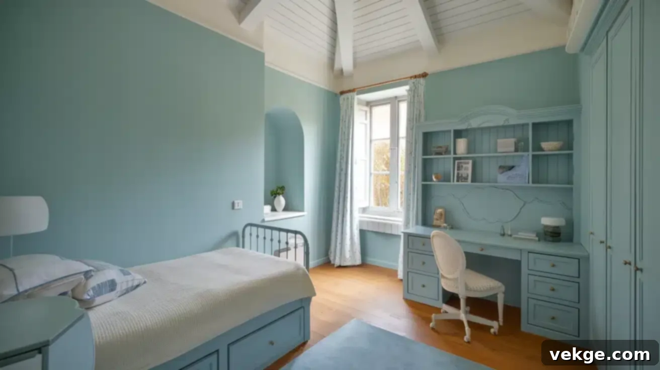
Blue has long been universally heralded as the quintessential color of serenity, effortlessly wrapping us in a profound sense of calm, much like the boundless expanse of a clear summer sky or the endless, tranquil depths of a vast ocean. Its innate connection to expansive bodies of water and open skies imbues it with powerful qualities of stability, constancy, and infinite possibility. Physiologically, consistent exposure to blue tones has been consistently shown to gently slow our breathing, significantly reduce heart rate, and lower blood pressure, effectively signaling to our nervous system that it is safe to relax, unwind, and release tension. This makes blue an unparalleled and primary choice for any environment where stress needs to be actively managed and peace cultivated.
When daily pressures mount and feelings of anxiety begin to take hold, spaces thoughtfully imbued with blue offer an immediate and powerful refuge. There’s a compelling and well-researched reason why hospital walls, widely used meditation apps, luxurious spa retreats, and even corporate environments seeking to foster deep focus and collective calm frequently incorporate various shades of blue into their core designs—it serves as a powerful, non-verbal cue to our brain, promoting a state of peaceful repose and mental clarity. The remarkable versatility of blue allows for a broad spectrum of calming effects; lighter, softer blues evoke a sense of airiness, openness, and gentle escapism, while deeper, richer blues, such as navy or indigo, create a more profound, grounding sense of calm, stability, and sophisticated introspection. Whether utilized as a subtle accent color or as a dominant wall color, blue remains a steadfast and reliable ally in creating environments that are supremely conducive to relaxation, enhanced mental clarity, and profound emotional well-being. It’s a color that speaks volumes without uttering a single word.
2. Green: Nature’s Comfort and Renewal
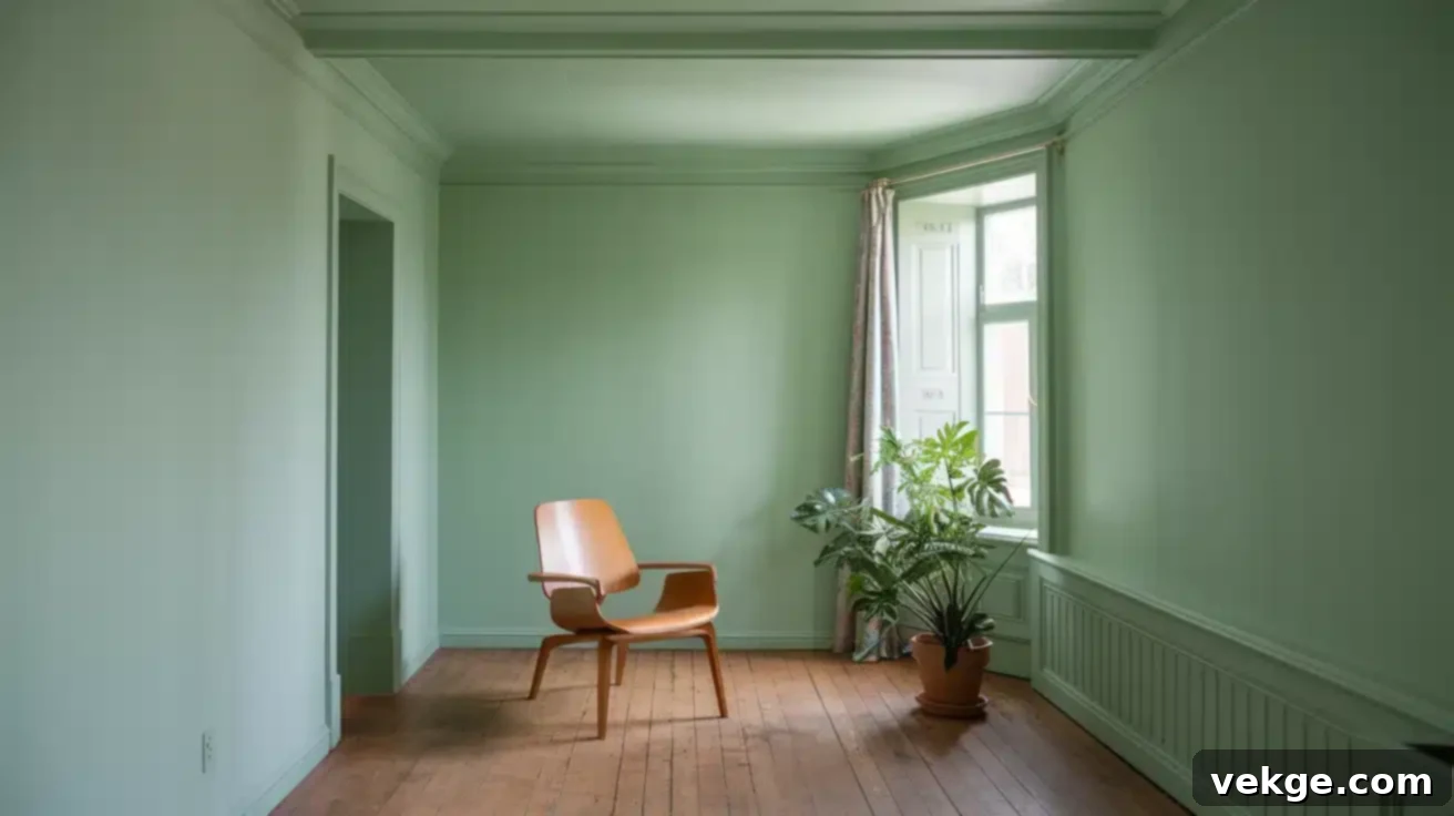
Green is the vibrant and deeply restorative color that effortlessly brings the unparalleled healing and calming power of the outdoors into any indoor space. As the dominant color in the natural world, green inherently reminds us of lush, thriving forests, verdant meadows, and the continuous, life-affirming cycle of growth, renewal, and vitality. This deep-seated and fundamental connection to nature is often scientifically referred to as ‘biophilia,’ a concept which posits that humans possess an innate and profound psychological need to connect with other living systems and natural processes. This connection is believed to be absolutely fundamental to our overall well-being. Numerous scientific studies have consistently demonstrated that even brief periods spent looking at natural green scenes can significantly reduce heart rate, effectively alleviate muscle tension, and measurably lower levels of the stress hormone cortisol, inducing a state of calm.
This explains the remarkable and documented effectiveness of therapy gardens, thoughtfully designed biophilic office spaces, and eco-friendly architectural projects—green environments inherently help to diffuse anxiety, promote accelerated healing, and effectively restore mental fatigue, allowing the mind to rejuvenate. The expansive spectrum of green offers diverse and nuanced calming properties: from the invigorating freshness of mint green and delicate sage, which evoke a sense of clean air, subtle energy, and clarity, to the grounding depth of forest green and rich olive tones, which provide a powerful feeling of security, rootedness, and stability. Incorporating green into your surroundings, whether through vibrant houseplants, thoughtfully painted walls, plush textiles, or even small decorative accents, is an accessible, versatile, and profoundly potent way to invite nature’s unparalleled sense of peace, harmony, and restorative energy directly into your daily life, creating a continuous dialogue between your interior space and the natural world.
3. Purple: Gentle Lavender Calm and Creative Inspiration
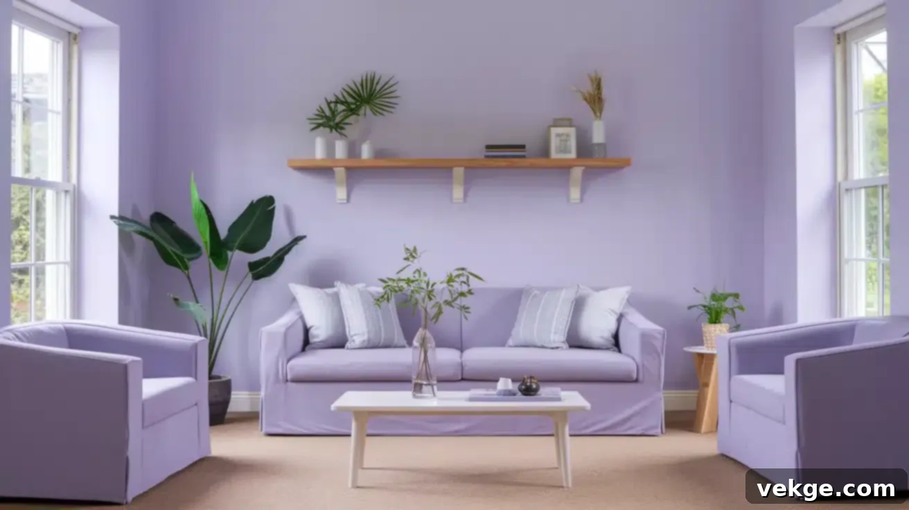
While often globally associated with royalty, luxury, and spiritual enlightenment, it is specifically the lighter, softer shades of purple, particularly the delicate hue of lavender, that offer a truly unique and profoundly sophisticated form of tranquility. These soft, ethereal, and often romantic hues strike a beautiful and harmonious balance between the serene stability and coolness of blue and the subtle, gentle warmth of red, resulting in an atmosphere that is both deeply peaceful and gently expressive, encouraging introspection without feeling somber. Lavender, in particular, is renowned for its remarkable ability to promote mental clarity and contemplative focus alongside deep physiological relaxation, making it an exceptional and unique color for fostering both serene concentration and gentle, unforced inspiration.
Its delicate and nuanced presence is often linked to spirituality, thoughtful introspection, intuition, and creative contemplation. This unique blend of attributes makes soft purple shades like lilac, periwinkle, or lavender absolutely perfect for creative spaces where you need to cultivate both a serene, focused mindset and an open, imaginative spirit. Bedrooms decorated with these tones can become significantly more restful and conducive to deep sleep, meditation rooms can feel more profound and sacred, and home offices can transform into more inviting, less stressful, and inspiring environments for productive work. The subtle sophistication and inherent calm of lavender purple gently encourages a sense of emotional balance, supports healing processes, and enhances a peaceful yet intellectually stimulated environment, making it a powerful choice for those seeking a blend of serenity and imaginative thought.
4. Neutral Tones: Quiet Foundations for the Mind
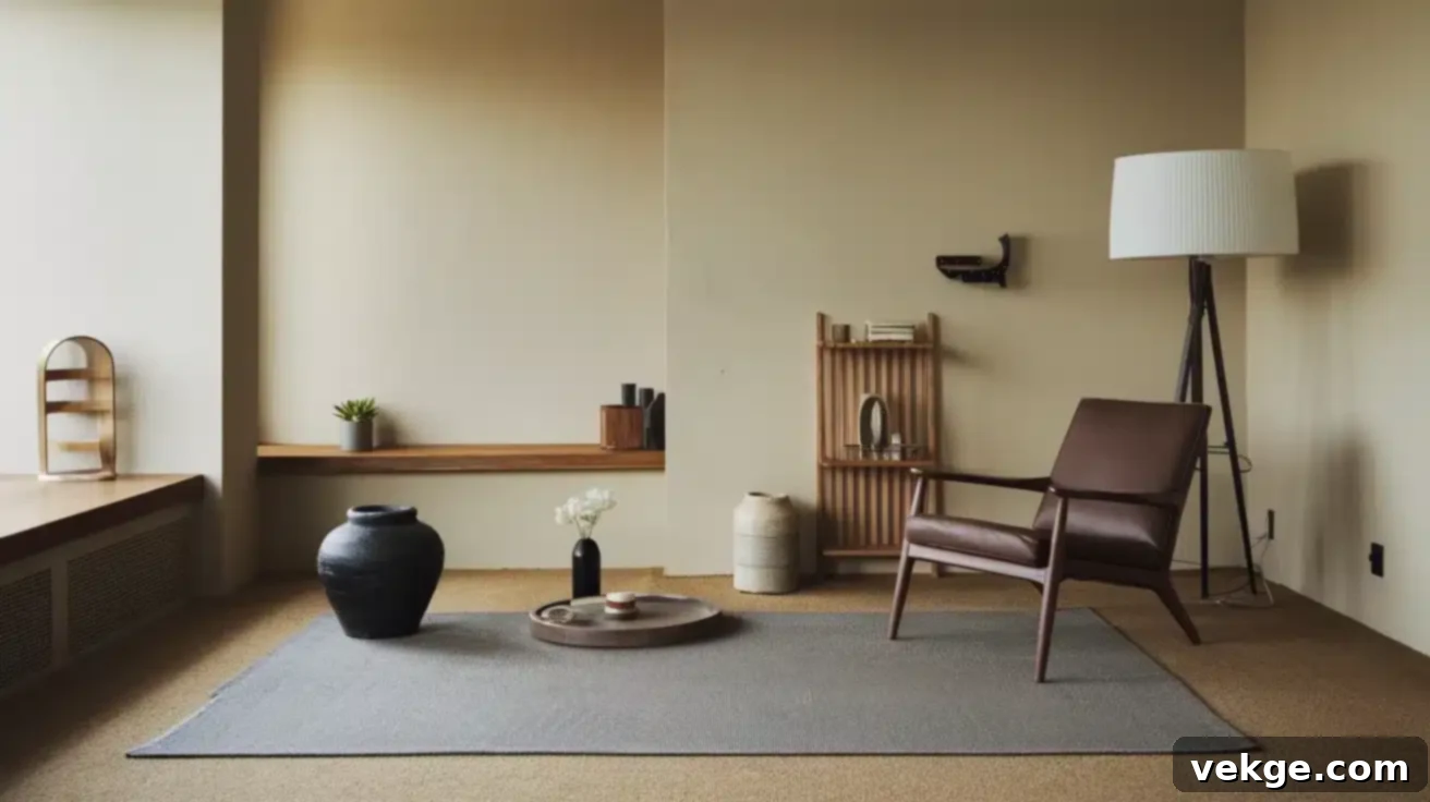
In an often visually noisy and overstimulated world, the understated elegance and inherent versatility of soft neutral tones offer invaluable breathing room for the mind. Colors such as warm beige, creamy off-white, soothing pale gray, and subtle, muted yellow-green are masters at creating peaceful, unobtrusive backgrounds that do not demand or compete for attention. These sophisticated, understated colors excel at significantly reducing visual noise and clutter within a space, thereby allowing thoughts to settle, focus to sharpen, and the nervous system to relax without unnecessary stimulation. They provide a calm canvas upon which life can unfold.
Modern spas, minimalist homes, and thoughtfully designed contemporary offices frequently rely on these quiet, grounding tones to craft spaces that instantly feel calming, spacious, and harmoniously balanced. Neutrals provide a versatile, timeless, and effortlessly elegant foundation, allowing other elements—be it a vibrant piece of art, rich natural textures, carefully chosen furniture, or strategic accent colors—to truly shine and take center stage, while always maintaining an overarching sense of balance, sophistication, and peaceful simplicity. Their subtle yet consistent presence provides a reassuring and stable backdrop that fosters mental clarity, reduces cognitive load, and creates an environment largely free from unnecessary distractions. This makes neutral tones absolutely essential for designing truly restful, productive, and aesthetically pleasing spaces that promote profound mental well-being and a sense of enduring calm.
Scientific Backing of Color and Calmness: Empirical Evidence
The profound connection between specific colors and our emotional and physiological states is far from being merely intuitive, anecdotal, or culturally prescribed; it is robustly supported by a continually growing body of rigorous scientific research. Across multiple academic disciplines, including psychology, neuroscience, and environmental design, numerous studies have consistently confirmed that certain colors possess the remarkable and measurable ability to physically alter our stress responses, influence brain activity, and significantly impact our overall sense of well-being. This compelling and accumulating evidence provides a clear physiological and psychological explanation for why humans have historically, and instinctively, been drawn to particular colors for purposes of relaxation, healing, mental restoration, and the cultivation of inner peace.
Benefits of Blue Backed by Research
- A significant 2013 study, published in a leading psychology journal, meticulously observed participants exposed to various color environments. The compelling findings revealed that exposure to blue hues specifically led to a measurable reduction in heart rate, a decrease in blood pressure, and a calming of respiration rate in individuals experiencing experimentally induced stress. Consistently, blue was overwhelmingly rated by participants as the single most calming and preferred color among all tested, reinforcing its therapeutic potential.
- Further strengthening this body of evidence, a comprehensive 2019 study underscored that environments predominantly featuring blue significantly reduced subjective feelings of anxiety and simultaneously increased self-reported experiences of tranquility and peace. Beyond these psychological effects, emerging research indicates that specific blue light wavelengths, particularly those emitted from natural light, can play a crucial role in the production and regulation of melatonin, the hormone essential for regulating sleep cycles and overall mood, thereby contributing to a more balanced and calm internal state.
Benefits of Green Backed by Research
- A landmark 2010 study, featured in the highly respected journal Environmental Science & Technology, provided compelling empirical evidence that even a mere five minutes of viewing a natural green setting was sufficient to significantly reduce cortisol levels (the primary stress hormone) and alleviate self-reported psychological stress. This groundbreaking research strongly supports the “biophilia hypothesis,” which posits that humans possess an innate and profound evolutionary connection to nature and natural processes, deriving substantial restorative benefits from interacting with green environments.
- Expanding on this, a series of comprehensive studies conducted between 2010 and 2019, specifically focusing on the traditional Japanese practice of “shinrin-yoku” (often translated as “forest bathing”), consistently demonstrated that spending dedicated time in green, forested environments led to a tangible reduction in stress hormones, lowered blood pressure, and enhanced overall physiological relaxation. These profound effects are largely attributed to increased activity in the parasympathetic nervous system, which is directly responsible for the body’s essential “rest and digest” functions, promoting recovery and calm.
- Further validation came from a significant 2018 study which highlighted that the thoughtful integration of green spaces within healthcare settings demonstrably reduced patient anxiety and significantly lowered perceived pain levels. This impactful finding also correlated with shorter hospital stays for patients, illustrating the profound therapeutic potential and practical benefits of green environments in diverse medical contexts, accelerating healing and comfort.
Benefits of Neutral Tones Backed by Research
- A key 2015 study rigorously investigated the psychological impact of minimalist environments featuring neutral color schemes. The findings consistently indicated that these subdued and harmonious palettes effectively reduced cognitive load and minimized visual stress on the brain. By stripping away distracting visual stimuli and simplifying the environment, neutral settings created a powerful and tangible sense of mental spaciousness, which directly contributed to promoting a state of profound calm and significantly improved mental clarity and focus.
- Adding to this, a comprehensive 2020 study specifically explored the psychological effects of beige and light gray environments. It found that these inherently neutral settings provided a unique and beneficial “background effect” that actively facilitated mental rest and cognitive recovery. This subtle yet significant reduction in overstimulation proved particularly beneficial for individuals experiencing high levels of stress or sensory overload, allowing them to achieve a more peaceful, grounded, and balanced internal state, thus supporting sustained mental well-being.
Cultural Perspectives on Calming Colors: A Global Spectrum of Meanings
While the physiological responses to certain color wavelengths might share some universal commonalities across human populations, it is vitally important to acknowledge that color perception and symbolism are profoundly contextual and deeply influenced by cultural, historical, and individual experiences. What might be perceived as deeply calming, positive, or sacred in one culture could carry an entirely different, or even contradictory, emotional or spiritual significance in another. This rich, intricate tapestry of cultural interpretation adds another fascinating layer of complexity and nuance to the comprehensive study of color psychology.
For example:
- Blue: While blue is almost universally regarded as a profoundly calming color in most Western cultures, signifying peace, stability, contemplation, and trustworthiness, its meanings can expand significantly elsewhere. In some Middle Eastern and North African traditions, blue is not only associated with tranquility but also carries deep spiritual protection, often used prominently in architecture, textiles, and amulets (such as the widespread “evil eye” charm) to ward off negativity, bring good fortune, and ensure safety.
- White: In many cultures worldwide, white universally represents purity, innocence, cleanliness, and new beginnings (ee.g., wedding dresses in Western societies and many parts of Asia). However, its symbolism dramatically shifts in traditional Chinese, Korean, and Indian cultures, where white is the customary and symbolic color of mourning and funerals, representing death, grief, and the transition of the soul. This stands in stark contrast to many Western interpretations where black typically holds this solemn role.
- Green: In Western cultures, green is strongly associated with nature, environmentalism, growth, health, prosperity, and relaxation, drawing directly from its overwhelming prevalence in natural landscapes. Conversely, in Buddhist traditions, green takes on a more profound spiritual significance, representing spiritual healing, new life, compassion, and the tranquility of the enlightened natural world, often linked to the heart chakra. In many Islamic cultures, green is considered an exceptionally sacred color, symbolizing paradise, growth, and divine favor, frequently used in flags and religious architecture.
- Yellow: Often associated with happiness, sunshine, warmth, and optimism in Western contexts, yellow can have markedly contrasting meanings in other regions. In some parts of Latin America, it can be a symbol of mourning, sorrow, or death, while in Egypt, it is traditionally associated with mourning. In traditional Chinese culture, yellow historically represented royalty, imperial power, and prosperity, being reserved exclusively for the emperor.
These diverse cultural perspectives profoundly underscore the critical importance of understanding the specific context when utilizing colors, particularly in global communication, international branding, interior design projects, or cross-cultural artistic endeavors. While innate human physiological responses to certain light wavelengths exist, the learned associations, historical narratives, and cultural frameworks profoundly shape our emotional and symbolic relationship with color, making it a truly multifaceted phenomenon.
Conclusion: Harnessing Color for a Calmer, More Intentional Life
The compelling and ever-growing science of color and calm unequivocally encourages us to be more intentional, mindful, and strategic about the colors we integrate into our daily lives and physical surroundings. We have extensively explored how the profound depths of blue can effectively calm our physiological responses, inducing a state of deep relaxation and mental clarity, while the vibrant, natural hues of green effortlessly connect us to nature’s inherent healing properties, restoring balance, reducing stress, and fostering a sense of renewal. Soft purples, particularly the soothing shade of lavender, beautifully balance deep tranquility with a gentle spark of creativity, fostering an environment conducive to both profound peace and imaginative introspection. Meanwhile, the elegant simplicity and grounding presence of neutral tones provide essential mental spaciousness, allowing our minds to declutter, find focus, and experience a welcome respite from visual overload.
The extensive body of scientific research, spanning multiple disciplines, consistently supports these powerful and measurable effects, offering us practical, evidence-based tools for proactively managing our emotional environments and significantly enhancing our overall well-being. However, it is equally important to remember that while there are discernible universal tendencies in color perception, individual and cultural responses to color can and do vary significantly. What might profoundly soothe and calm one person could potentially energize, inspire, or even mildly agitate another, depending on their unique personal experiences, deeply ingrained cultural background, and individual neurological sensitivities.
Therefore, by cultivating a keen awareness of both the scientific principles and our personal, subjective responses to different colors—and understanding their broader psychological and cultural implications—we empower ourselves to make deliberate, informed choices that truly resonate with our individual sense of peace, harmony, and well-being. This thoughtful and intentional approach to color integration allows us to consciously craft spaces—be it our cherished home, our productive office, or even our chosen wardrobe—that actively support our mental and emotional health, transforming our everyday surroundings into powerful, personal sanctuaries of calm, creativity, and resilience. Embracing the profound power of calming colors is a simple yet deeply transformative step towards living a more balanced, less stressed, and ultimately more joyful and harmonious life, where every hue contributes to a richer experience.
Frequently Asked Questions
What is the Calmest Color?
While a range of colors promotes calmness, **blue** is almost universally considered the calmest color. Its strong associations with expansive, clear skies and tranquil, vast oceans evoke profound feelings of peace, stability, and serenity. Scientific studies have consistently demonstrated that exposure to blue light or blue environments can measurably lower heart rate, reduce blood pressure, and slow breathing, making it exceptionally effective for promoting deep relaxation and significantly reducing stress levels.
How Can I Use Calming Colors to Reduce Stress?
To effectively reduce stress and foster a more peaceful environment, actively incorporate calming colors such as various shades of blue, green, and soft neutral tones (like warm beige, creamy off-white, or muted light gray) into your personal and professional surroundings. You can achieve this through several strategic applications: paint walls in these soothing hues, choose furniture and decorative elements that align with these colors, select textiles like bedding and curtains in calming palettes, introduce natural elements like houseplants, or even opt for clothing in these tranquil shades. Creating a consistent and harmonious palette of calming colors helps to establish a serene, balanced, and inherently stress-reducing atmosphere in any space.
Can Calming Colors Improve Sleep Quality?
Absolutely, yes. Calming colors, particularly soft blues, gentle greens, and soothing neutrals, can significantly improve sleep quality. By creating a bedroom environment that feels serene, restful, and explicitly conducive to deep relaxation, these colors signal to your brain and body that it’s time to unwind and prepare for rest. For instance, a light blue bedroom can help lower physiological arousal and reduce mental overstimulation, making it easier to fall asleep and experience deeper, more restorative sleep. These colors minimize visual stimulation and promote a sense of security, allowing your mind to quiet down more effectively before sleep, thus enhancing the overall quality of your rest.
