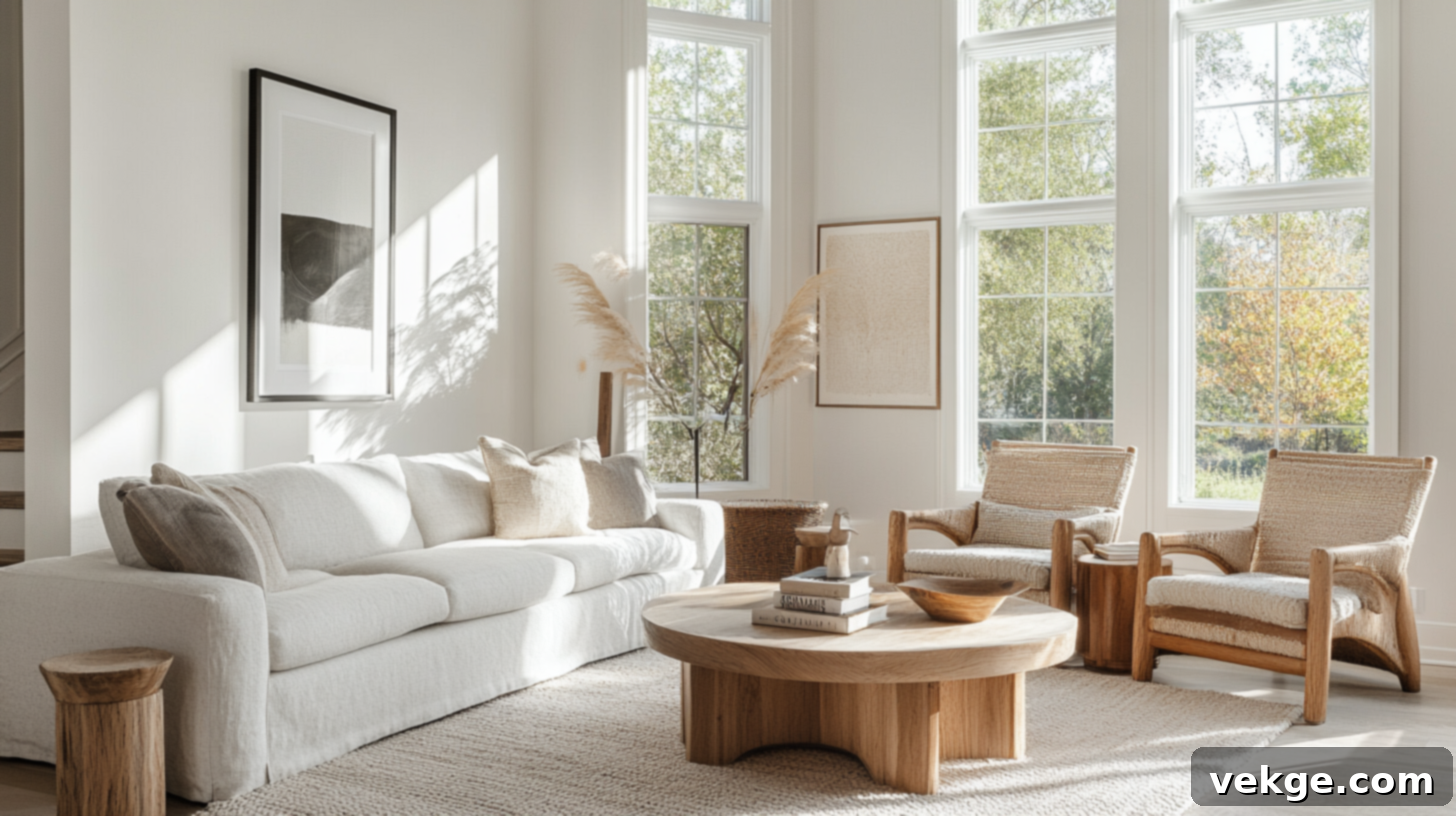
Discover Sherwin-Williams Repose Gray (SW 7015): Your Ultimate Guide to Undertones, LRV, and Perfect Coordinating Colors
Choosing the perfect gray paint for your home can feel like navigating a maze of endless options. What seems like a simple “light gray” can quickly reveal a spectrum of shades, each with unique characteristics that profoundly impact a room’s atmosphere. Will it feel too cool and sterile, too beige and muddy, or just plain flat on your walls? I understand this challenge well, having guided countless homeowners through the same decision-making process.
That’s precisely why I’ve crafted this in-depth guide: to provide you with all the essential insights needed to confidently decide if Sherwin-Williams Repose Gray (SW 7015) is the ideal shade for your space. This isn’t just a surface-level review; we’ll dive deep into its nuances, exploring how this versatile color performs in various settings.
Throughout this comprehensive article, you’ll discover how Repose Gray appears in real-world applications, how it stacks up against other popular grays in the Sherwin-Williams palette, and the definitive list of coordinating colors that complement it beautifully. We’ll also cover crucial tips for proper paint testing, selecting the right finish, and understanding how different lighting conditions can transform its look. By the end, you’ll have a clear understanding of Repose Gray, empowering you to make an informed and stylish choice for your home.
Getting to Know Sherwin-Williams Repose Gray (SW 7015): A Versatile Neutral

Repose Gray (SW 7015) from Sherwin-Williams is celebrated as one of the most versatile and beloved soft gray paint colors available today. It masterfully balances both warm and cool tones, making it an incredibly adaptable choice for a wide array of design styles. As a key member of Sherwin-Williams’ popular neutral collection, Repose Gray seamlessly integrates into both modern, minimalist spaces and more traditional, classic interiors, offering a sophisticated backdrop that enhances any decor.
Repose Gray’s Core Color Profile
To truly understand Repose Gray, let’s look at its fundamental characteristics:
- HEX code: #CCC9C0
- LRV (Light Reflectance Value): 58
- Color family: Warm gray with beautifully balanced undertones
With an LRV of 58, Repose Gray falls into the medium-light range. This means it’s light enough to reflect a significant amount of light, helping rooms feel open, airy, and more spacious, especially in smaller areas or those with limited natural light. Yet, it possesses enough depth to provide a grounded, inviting warmth, preventing the space from feeling stark or washed out. It strikes that perfect equilibrium between bright and cozy, making it a reliable choice for almost any room in your home.
Understanding Repose Gray’s Subtle Undertones
One of the most frequently discussed aspects of Repose Gray, and indeed many popular grays, is its undertones. Repose Gray features incredibly subtle purple and taupe undertones. These undertones are not overt; they are gentle and tend to reveal themselves under specific lighting conditions, adding to the color’s depth and complexity without ever dominating the primary gray hue.
- In abundant natural light, particularly in rooms with a south-facing exposure, the warmth within Repose Gray becomes more pronounced, and the taupe (a blend of gray and brown) undertone can subtly emerge, lending a softer, almost greige-like quality.
- Conversely, in low-light environments, or under certain types of artificial illumination (especially cooler LED lights), the gray can take on a slightly cooler, almost silvery or barely perceptible blue-gray appearance.
This chameleon-like flexibility is a major reason why Repose Gray is such a safe and widely popular choice. However, its adaptability also underscores the critical importance of sampling. These undertones are gentle enough that they might not be noticeable in a small swatch but can become more apparent when painted across an entire wall. Always sample Repose Gray directly on your walls and observe it over several days before committing to a full room.
How Different Lighting Affects Repose Gray
The direction and intensity of natural light, along with the type of artificial lighting, play an immense role in how Repose Gray presents itself. The very same paint can shift dramatically depending on your room’s orientation, the time of day, and even the surrounding decor and fixed elements.
- North-facing rooms: These rooms typically receive cooler, indirect light throughout the day. In such settings, Repose Gray might lean a bit more into its cooler side, potentially showcasing a hint of a gray-blue undertone and contributing to a slightly moodier or more crisp atmosphere.
- South-facing rooms: Bathed in steady, warm, bright light, south-facing rooms bring out the inherent warmth in Repose Gray. Here, it tends to appear lighter, softer, and can even take on a creamier, almost greige-like quality, highlighting its taupe undertones.
- East-facing rooms: Morning light in east-facing rooms is bright and somewhat warm, making Repose Gray feel crisp, fresh, and airy. As the day progresses and the light shifts, it may transition to a slightly cooler appearance, especially in the afternoon.
- West-facing rooms: These rooms receive cooler light in the morning but are flooded with intense, warm, golden light in the late afternoon and evening. This late-day sun can often bring out the faint purple or taupe undertones in Repose Gray, depending on the surrounding colors and furnishings.
Given these dynamic shifts, it is absolutely essential to test Repose Gray directly on different walls within your chosen room. Observe how it looks in morning, afternoon, and evening light, and how it interacts with your existing flooring, furniture, and fixed elements. This diligent testing process will give you the most accurate prediction of how Repose Gray will truly appear in your unique space.
Top Coordinating Colors for Sherwin-Williams Repose Gray (SW 7015)
Repose Gray’s balanced nature makes it a fantastic foundation for a diverse range of color palettes. Whether you aim for a harmonious blend or a striking contrast, these coordinating colors will help Repose Gray shine and achieve the desired aesthetic for your home.
Perfect White Trims for Repose Gray
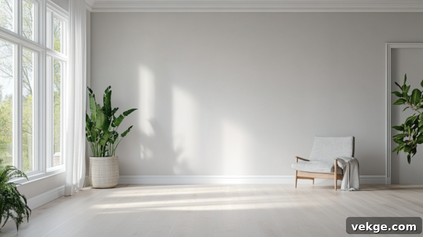
Repose Gray pairs exquisitely with soft, inviting whites that avoid feeling overly bright or stark. Selecting the right white trim can significantly enhance the sophistication of Repose Gray walls.
- Eider White (SW 7014) is an exceptional choice and a frequent favorite. Its subtle gray base perfectly complements Repose Gray, creating a cohesive and harmonious transition between walls and trim that feels elegant and understated.
- Pure White (SW 7005) offers a clean, crisp, and bright contrast without any harshness. It’s a beautifully neutral white that allows Repose Gray to truly stand out while maintaining a fresh, classic look.
- If you desire a slightly warmer, creamier trim to soften the overall effect, Alabaster (SW 7008) is an outstanding option. Its gentle warmth creates a welcoming contrast that feels rich and comforting.
Harmonious Warm Neutrals
Warm neutrals are a natural and intuitive match for Repose Gray, enhancing its subtle warmth and creating a cozy, inviting atmosphere. These colors work beautifully in adjacent rooms or as accent elements.
- Accessible Beige (SW 7036) is a phenomenal partner, introducing a soft, balanced tan that warms up the space without clashing with Repose Gray’s undertones. It’s an excellent choice for open-concept living rooms, hallways, or dining areas, fostering a sense of flow and cohesion.
- Kilim Beige (SW 6106) adds a touch more richness and depth compared to Accessible Beige. Its slightly deeper, cozier tone makes it perfect for creating a more intimate or traditional feel, blending seamlessly with Repose Gray’s soft foundation.
Stylish Cool Accents
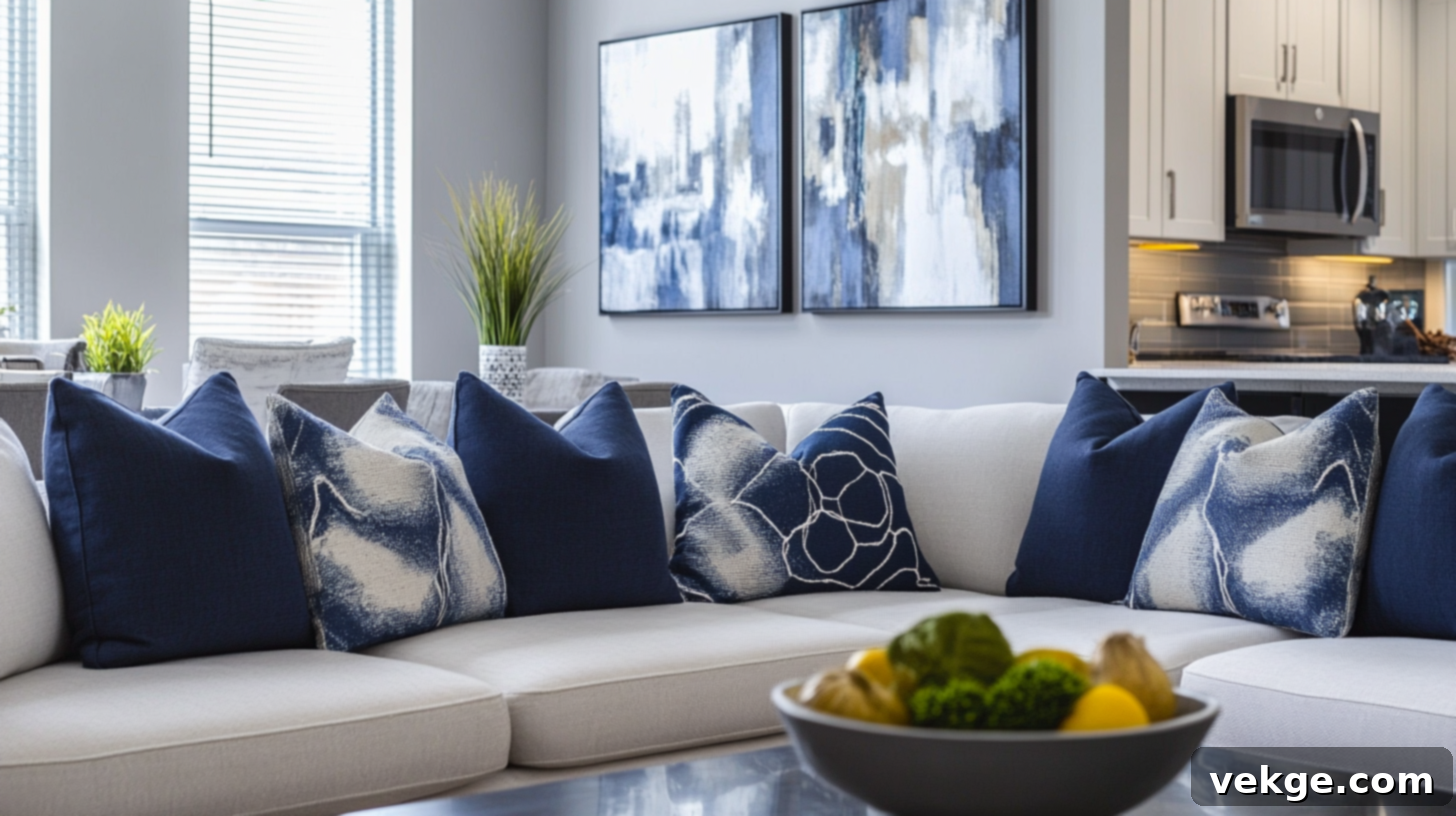
For those who appreciate a touch of cool contrast or prefer a sophisticated, modern palette, Repose Gray provides an excellent backdrop for cooler accent shades. These colors can be used on accent walls, cabinetry, or decor to add interest and depth.
- Naval (SW 6244) offers a strong, elegant navy tone that provides a beautiful, striking pop against the soft gray of Repose Gray. It works exceptionally well on kitchen islands, bathroom vanities, or as a dramatic accent wall, bringing a classic yet bold statement.
- Storm Cloud (SW 6249) is a sophisticated, moody blue-gray that enhances the calm and serene qualities of Repose Gray while adding a captivating layer of depth. It’s ideal for creating a refined and tranquil atmosphere.
- Dovetail (SW 7018) is another excellent cool shade, a deeper, true gray with a strong presence that leans towards a sophisticated slate look. It can act as a more grounding accent, providing a strong anchor in a Repose Gray scheme.
Grounded Earthy Tones
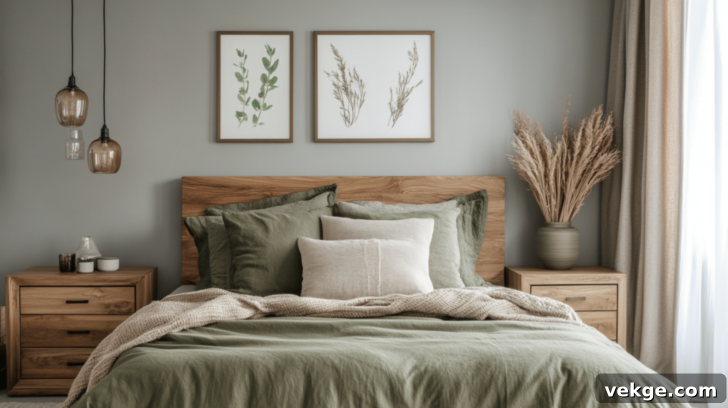
Incorporating earthy shades can make Repose Gray feel more grounded, natural, and inherently connected to the outdoors. These tones are perfect for creating a serene and organic environment.
- Dried Thyme (SW 6186), a muted, dusty green, introduces a soft, natural touch that pairs beautifully with Repose Gray. It evokes a sense of calm and tranquility, making it an excellent choice for bedrooms, home offices, or a sunroom.
- Urbane Bronze (SW 7048), a deep, rich brown-gray, brings significant weight and strength to any space. When paired with Repose Gray, it creates a sophisticated and contemporary look, perfect for accent walls, doors, or even cabinetry, providing a strong, organic anchor.
Striking Bold Contrast Colors
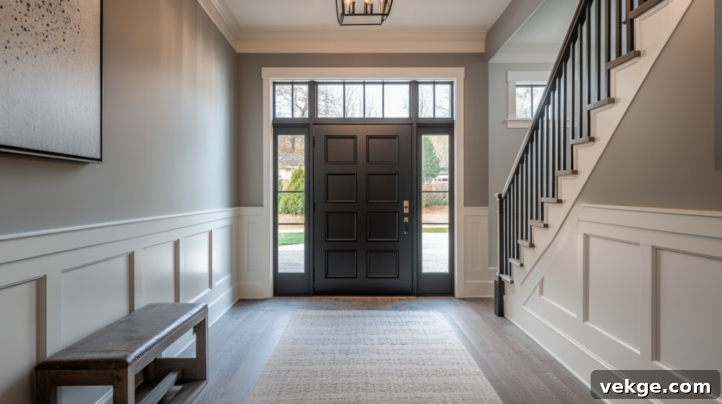
For those looking to add drama and make a definitive statement, Repose Gray serves as an excellent canvas for bold, dark accent colors. These contrasting shades can elevate the entire design, making Repose Gray truly pop.
- Caviar (SW 6990) is a deep, warm black with subtle brown undertones. When used alongside Repose Gray, it creates a sophisticated and cozy contrast, giving the soft gray something rich to play off without feeling overly stark or cold. It’s superb for architectural details or furniture.
- Tricorn Black (SW 6258) is Sherwin-Williams’ truest, richest black. Cooler and more intense than Caviar, it provides a crisp, undeniable contrast that adds drama and contemporary edge. It’s fantastic for interior doors, window frames, or bold accent furniture, ensuring Repose Gray stands out with elegant clarity.
Coordinating Color Palettes by Room Type for Repose Gray
Repose Gray is celebrated as a go-to color that seamlessly integrates into almost any area of the house. However, the way you thoughtfully apply and combine it with other colors can dramatically alter the mood and functionality of each specific room. Here are some simple, yet highly effective, color combinations and styling ideas tailored to different room types.
Living Room: Creating a Welcoming Haven with Repose Gray
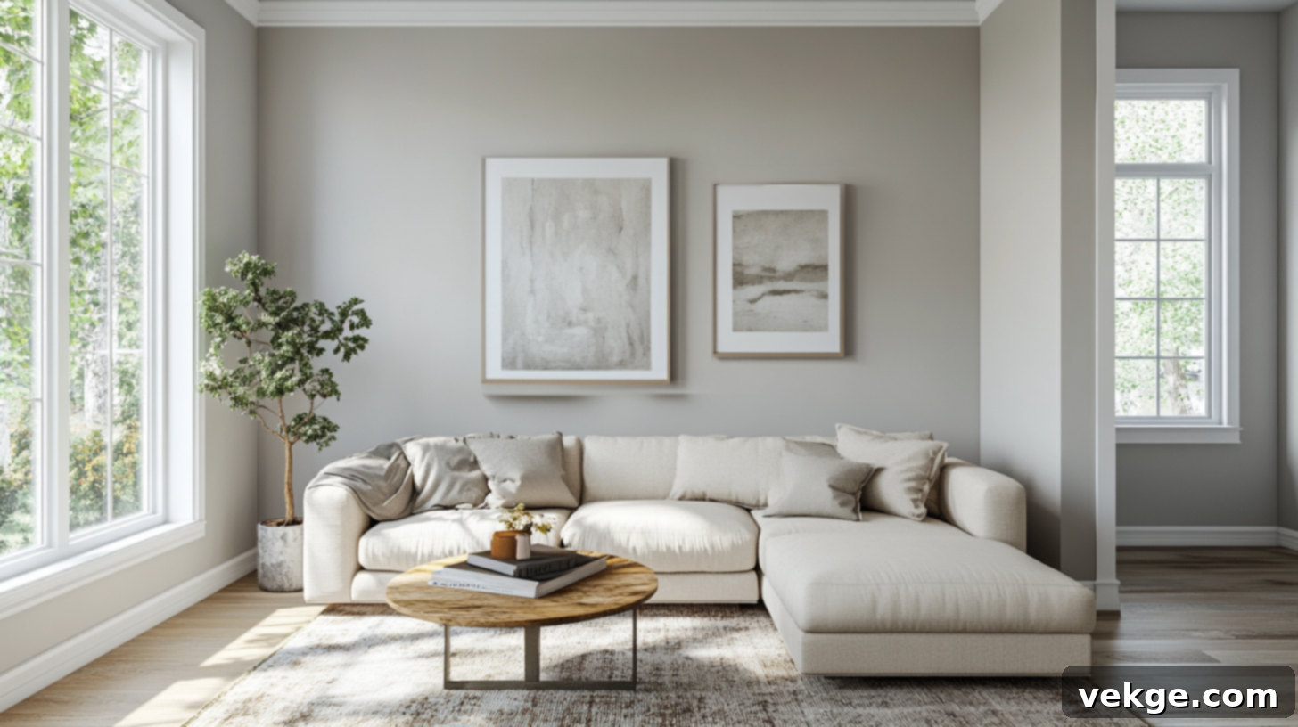
In the living room, Repose Gray acts as an anchor, creating a sophisticated yet inviting foundation. It pairs beautifully with a palette of soft neutrals such as creamy whites, warm greiges, and cozy off-whites. These secondary colors contribute to an atmosphere that feels both warm and expansive. To complete the look, incorporate crisp white trim (like Pure White or Eider White), light-toned wood furniture (such as oak or maple), and natural fiber rugs. This combination results in a calm, welcoming setting that is perfect for both daily relaxation and entertaining guests, fostering comfort without sacrificing style.
Bedroom: A Serene Retreat with Repose Gray
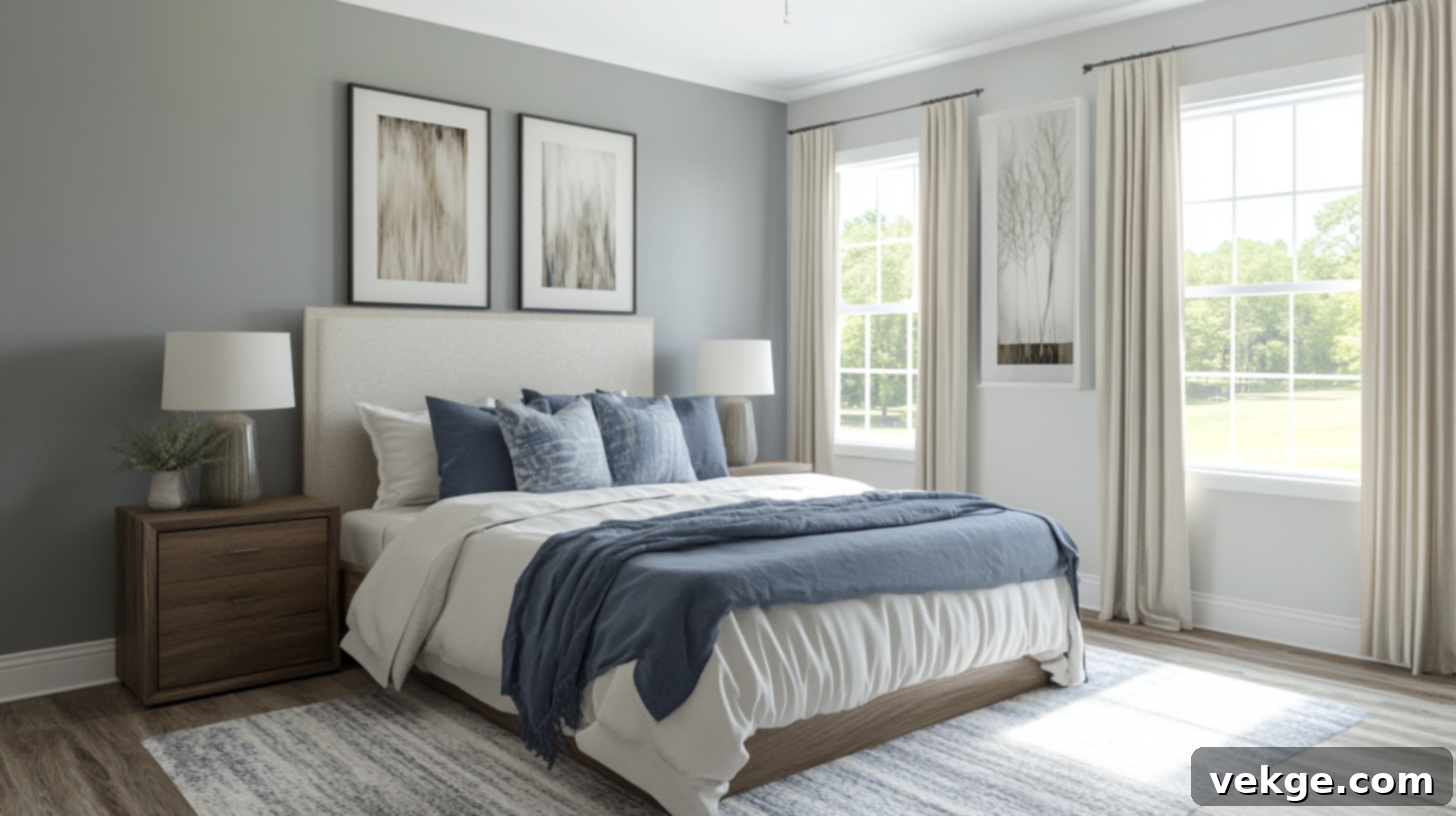
For a truly restful and serene bedroom, Repose Gray provides an ideal tranquil backdrop. Pair it with calming greens (like Dried Thyme or a soft sage) or muted, dusty blues. These shades work in harmony with Repose Gray to build a peaceful, restorative feel that is far from sterile or flat. Enhance the cozy ambiance by adding luxurious linen bedding, plush throw blankets in varying textures, and understated decor elements. The combination ensures a soothing and relaxed environment, conducive to peaceful sleep and quiet reflection.
Kitchen: Modern and Inviting with Repose Gray
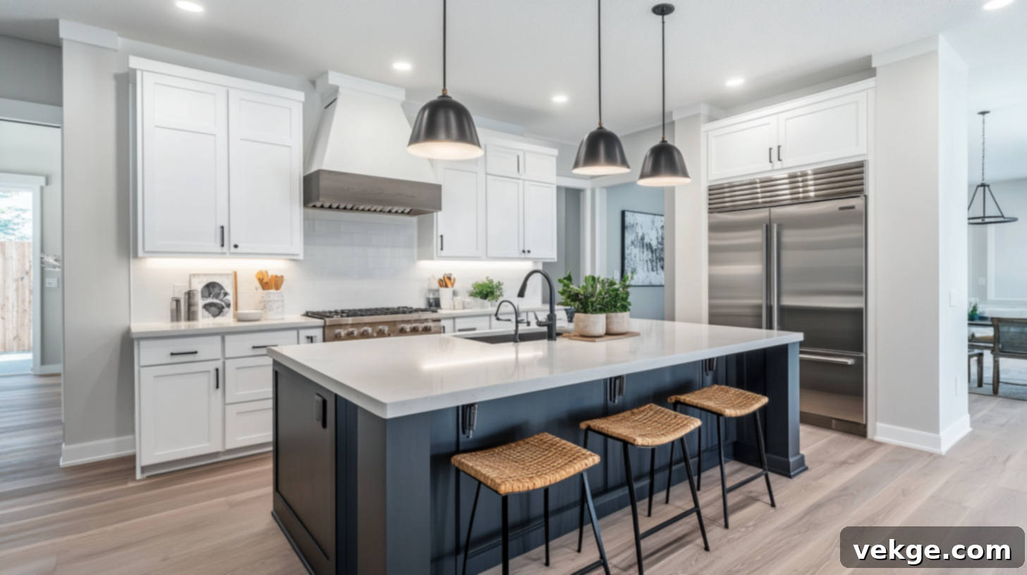
Repose Gray is an excellent choice for kitchen walls or even cabinetry, offering a clean, contemporary, and versatile look. For a bright and airy aesthetic, pair it with crisp white cabinets or a subway tile backsplash. If you desire a more dramatic and sophisticated statement, consider navy blue (like Naval) for an island or lower cabinets, creating a striking contrast. Greige tones also work wonderfully for complementing cabinets, backsplashes, or even an accent wall. These combinations ensure the kitchen remains bright and functional while adding significant depth, interest, and a touch of modern elegance.
Bathroom: Fresh and Spa-like with Repose Gray
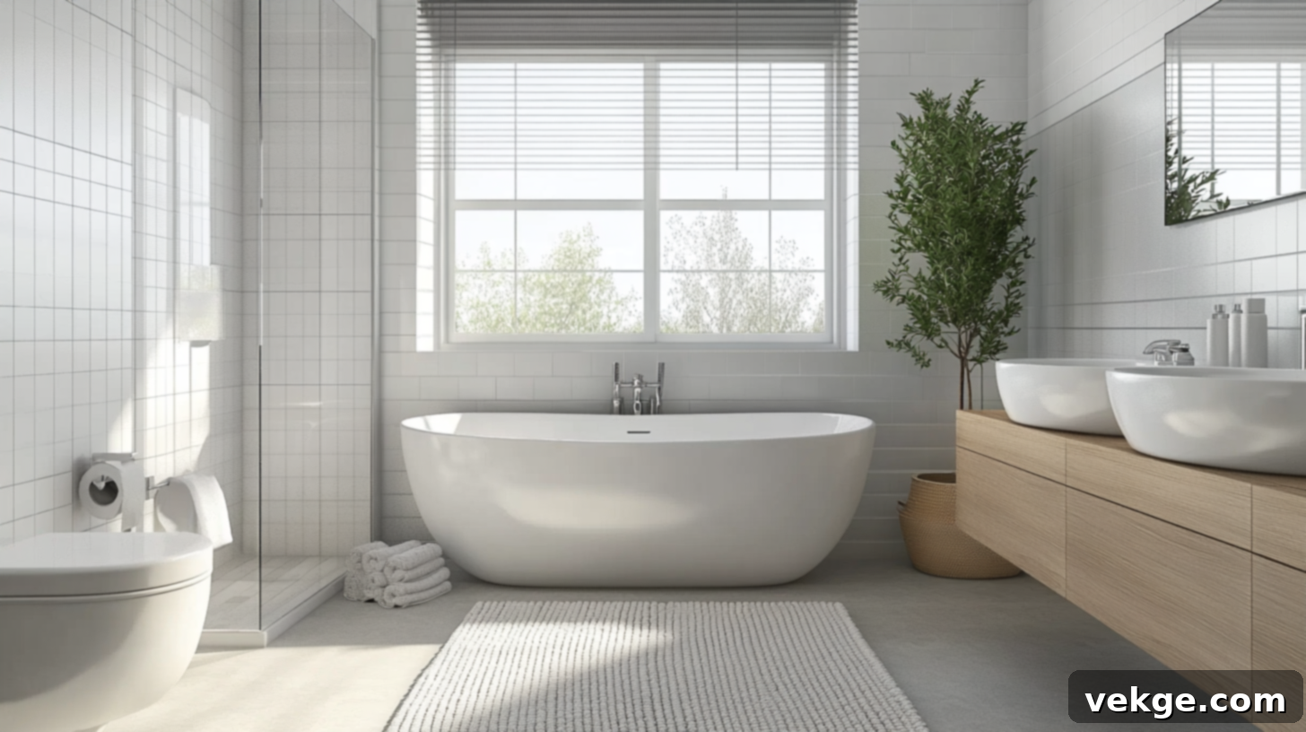
In a bathroom, Repose Gray brings a sense of freshness and softness, perfect for creating a spa-like sanctuary. Incorporate light blue accents (perhaps in towels or small decorative items) or a clean off-white trim (such as Eider White) to make the space feel exceptionally clean and tranquil without appearing cold. Simple, classic tiles, bright white countertops, and brushed nickel or polished chrome fixtures will complete this balanced and refreshing look. Repose Gray provides a sophisticated foundation that feels both modern and effortlessly clean.
Exterior Use: Enduring Curb Appeal with Repose Gray
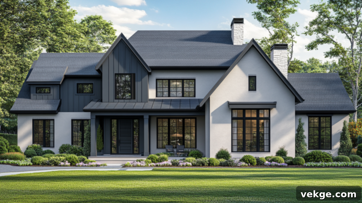
For the exterior of your home, Repose Gray is a superb choice, offering timeless curb appeal. It pairs exceptionally well with strong trim colors that can beautifully stand up to varying sunlight conditions. Consider warm whites like Alabaster for trim, windows, and fascia to create a welcoming, classic contrast. Alternatively, for a more modern and striking effect, use a deep shade like Tricorn Black for front doors, shutters, or architectural accents. Repose Gray’s balanced nature allows it to look sophisticated and inviting on a home’s exterior, adapting well to different architectural styles and landscaping elements.
How to Pair Furniture and Decor With Repose Gray Walls
Beyond paint colors, the success of your Repose Gray scheme hinges on thoughtful furniture, finishes, and textile choices. Understanding how to integrate these elements will bring your entire design together seamlessly. Here’s a detailed guide to styling your space with confidence:
Selecting Complementary Wood Tones
When choosing wood furniture or flooring, aim for light to medium wood tones. Varieties like white oak, maple, natural walnut, or even light birch are ideal. These woods possess warm, organic undertones that beautifully highlight and complement the subtle warmth in Repose Gray without clashing. It’s generally best to avoid woods with strong red (like cherry) or overtly yellow (some pine finishes) undertones, as these can inadvertently pull out or emphasize undesirable cool undertones in the paint, creating an unbalanced look.
Furniture Choices for Repose Gray Spaces
For upholstery and larger furniture pieces, prioritize neutral colors that maintain the serene and grounded feel that Repose Gray provides. Think along the lines of beige, greige, cream, light brown, or soft off-white fabrics. This palette ensures seamless integration and keeps the space feeling expansive and calm. Both clean-lined modern pieces and more classic, comfortable shapes work exceptionally well, allowing the architecture of the furniture to shine against the versatile gray backdrop. Don’t shy away from natural textures like linen, cotton, or even a soft chenille to add tactile interest.
Optimal Metal Finishes
Repose Gray pairs beautifully with a range of metal finishes, each contributing a different character to the room. Brushed brass or matte gold can introduce a touch of elegance and warmth, enhancing Repose Gray’s subtle taupe undertones. Matte black offers a contemporary, graphic contrast that grounds the space and adds a modern edge. Soft silver or brushed nickel fixtures provide a classic, clean look that harmonizes with Repose Gray’s cooler aspects without making the room feel cold. High-shine chrome, while clean, can sometimes feel too stark or sharp if your goal is a truly warm and inviting space.
Textiles, Rugs, and Accessories
Layering with the right textiles is crucial for adding warmth, depth, and personality to a Repose Gray room. Opt for natural fabrics like linen, organic cotton, wool, or textured boucle in muted, earthy tones or soft pastels. For rugs, selections made from jute, sisal, or wool are excellent. They not only bring essential texture and grounding elements but also maintain a calm and cohesive color scheme. Introduce throws, pillows, and curtains in coordinating shades to build a rich, inviting atmosphere that perfectly complements your Repose Gray walls.
Repose Gray vs. Other Popular Sherwin-Williams Grays
Repose Gray occupies a unique and highly coveted spot within the vast spectrum of Sherwin-Williams grays. Its balanced nature often places it as a central contender, making comparisons with other popular shades essential for finding your perfect fit. Here’s how it stacks up against some of its closest and most frequently compared counterparts:
Repose Gray vs. Agreeable Gray (SW 7029)
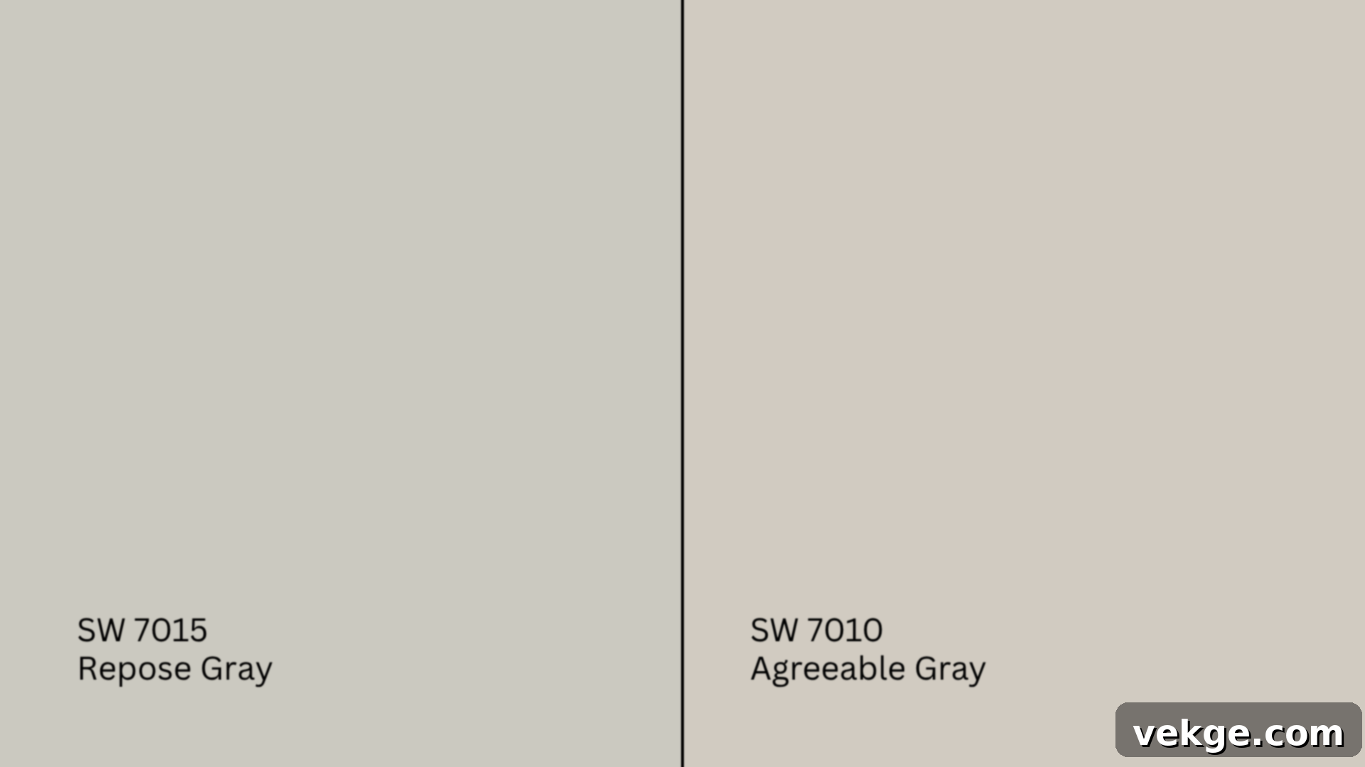
Agreeable Gray (SW 7029) is widely recognized as one of the most popular greige colors, meaning it leans more significantly into the beige side than Repose Gray. It possesses a distinctly warmer profile, often feeling creamier and softer in most lighting conditions, which can give a space a slightly more traditional and overtly cozy feel. Repose Gray, in contrast, sits closer to a true gray, maintaining a more balanced blend of warm and cool tones, with its purple/taupe undertones being more subtle than Agreeable Gray’s stronger beige lean. If your primary goal is to inject pronounced warmth with a hint of gray, Agreeable Gray might be your choice. If you prefer a more refined, cooler gray that still offers warmth without being overtly beige, Repose Gray is the better fit.
Repose Gray vs. Light French Gray (SW 0055)
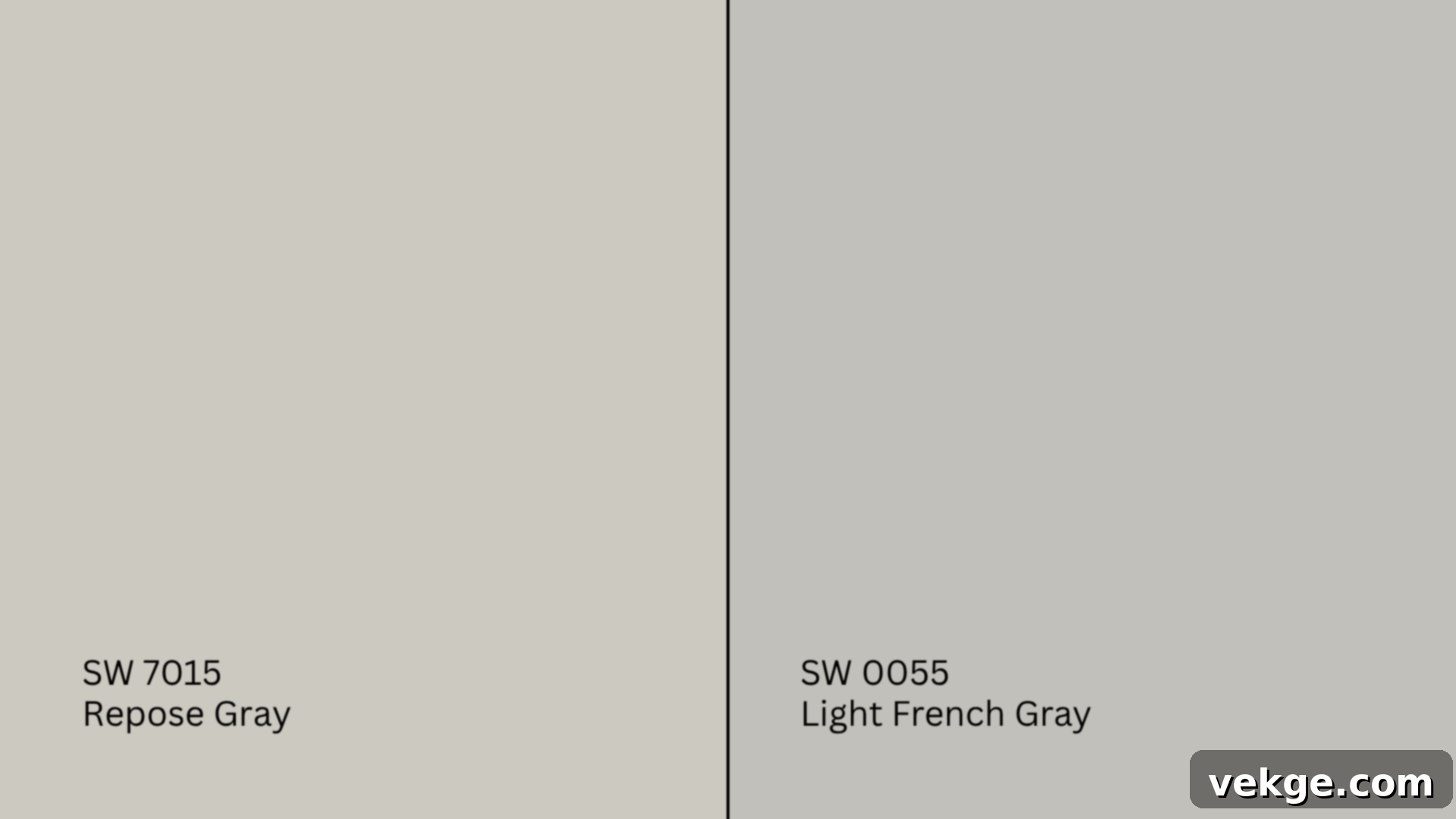
Light French Gray (SW 0055) is noticeably cooler and crisper than Repose Gray. It carries more pronounced blue undertones that become quite evident, especially in bright natural light, giving it a sharper, more contemporary edge. While Repose Gray maintains a muted and softer appearance, capable of blending into both warm and cool settings due to its balanced undertones, Light French Gray is a choice for those who specifically desire a clean, modern, and distinctly cool gray feel. It’s less forgiving with clashing warm tones in a room, whereas Repose Gray offers greater flexibility.
Repose Gray vs. Mindful Gray (SW 7016)
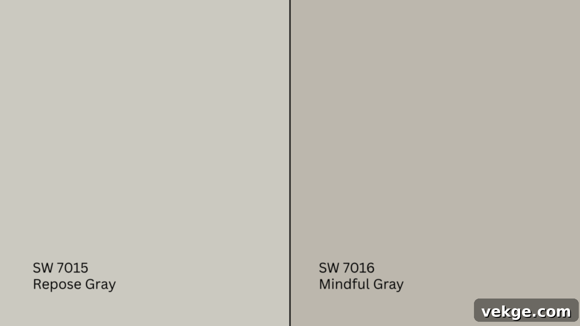
Mindful Gray (SW 7016) is a deeper and richer shade than Repose Gray. It possesses stronger warm undertones, giving it more visual presence and a slightly darker, more saturated look on walls. Think of Mindful Gray as a more intensified version of a warm gray. If you’re seeking a color that offers a bit more depth and a slightly cozier embrace without venturing into overly dark territory, Mindful Gray could be an excellent alternative. Repose Gray, conversely, provides a lighter, more ethereal, and gentle feel, serving as a sophisticated yet less commanding foundation for your room, making it ideal for spaces where you want brightness and subtle warmth.
Common Mistakes to Avoid When Using Repose Gray
Achieving optimal results with Repose Gray means not only understanding its strengths but also being aware of potential pitfalls. Avoiding these common mistakes can save you time, effort, and ensure your walls look exactly as envisioned:
- Ignoring Clashing Undertones: One of the biggest mistakes is not considering existing fixed elements. Strong red or yellow-toned flooring, cabinetry, or brickwork can significantly shift how Repose Gray appears on your walls, potentially pulling out unexpected cool or muddy undertones that detract from its beauty. Always test swatches against these elements.
- Pairing with Too-Cool Whites: While Repose Gray has subtle cool undertones, pairing it with overly bright, icy, or blue-tinged white trim can make it feel sharper and colder than intended. This can create an unwanted stark contrast. Stick with softer, slightly warmer whites like Eider White, Pure White, or Alabaster for a harmonious and inviting look.
- Overlooking Bold or Mismatched Furniture Choices: Repose Gray excels as a serene and balanced backdrop. Introducing overly loud, clashing, or mismatched decor and furniture can disrupt the calm, sophisticated feel this color naturally brings. Aim for cohesive furniture palettes and decor that complement its understated elegance rather than overpowering it.
- Skipping the Essential Sample Step: This cannot be stressed enough. Lighting conditions (natural and artificial), adjacent finishes, and surrounding colors dramatically change how any paint looks. Never rely solely on online images or small paint chips. Always purchase a sample pot, paint large swatches on different walls in your room, and observe them throughout the day and night before making a final commitment. This simple step is the most critical for ensuring satisfaction.
Taking these quick checks seriously can prevent costly surprises and ensure that your Repose Gray walls contribute beautifully to your home’s aesthetic. Live with a swatch for a few days – you’ll be grateful you did.
Conclusion: Embracing the Versatility of Sherwin-Williams Repose Gray
Sherwin-Williams Repose Gray (SW 7015) has earned its place as one of the most beloved and versatile paint choices for good reason. Its remarkable adaptability to various lighting conditions and its unique balance of warm and cool undertones allow it to perform beautifully in almost any space, once you truly understand its character.
Now that you’ve explored why Repose Gray stands out from the crowd, how its subtle undertones can shift with different lighting exposures, and which colors perfectly complement its sophisticated nature, you are well-equipped to confidently integrate it into your own home design. Remember, the key to success lies in careful planning and observation.
I always emphasize the importance of thorough testing; applying large swatches to your walls and observing them across different times of day is non-negotiable. Pay close attention to how it interacts with your existing fixed features, such as flooring, cabinetry, and natural light. When thoughtfully paired with the right Repose Gray coordinating colors – from soft, inviting whites to grounding earthy tones, and even bold, dramatic accents – you can create a space that feels cohesive, elegant, and uniquely yours.
If this guide has helped you feel more confident in your color selection, I encourage you to delve deeper. Explore my other paint guides and room-by-room color tips available on the website to keep your home improvement projects moving forward with inspiration and expertise.
