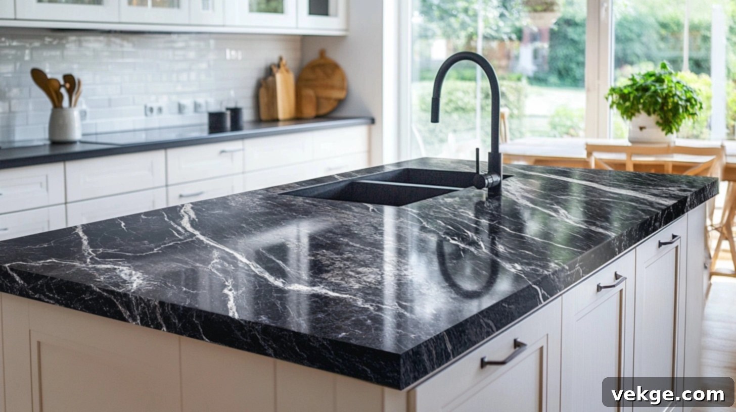
Transform Your Kitchen: 35 Calming Backsplash Ideas for Busy Granite Countertops
Is your granite countertop a vibrant focal point, or does its dynamic pattern tend to overwhelm your kitchen’s aesthetic? Many homeowners fall in love with granite’s unique natural beauty but then face a common design dilemma: how to choose a backsplash that complements rather than competes. The wrong tile choice can transform a stunning kitchen into an overly stimulating and chaotic space.
This comprehensive guide is crafted to resolve that very challenge. We’ll explore smart, stylish, and serene backsplash ideas specifically designed for busy granite, aiming to bring harmony and balance into your kitchen. From soothing color palettes that echo the quieter tones in your stone to tile styles that provide a much-needed visual break, you’ll discover everything required to create a cohesive and peaceful culinary haven.
If you’ve been struggling to find the perfect backsplash pairing for your statement-making granite, read on. Achieving a beautifully balanced kitchen might be simpler and more satisfying than you imagine, turning potential chaos into curated calm.
Understanding What Makes Granite “Busy”
Granite countertops are celebrated for their natural variations, but sometimes these very qualities can make a surface feel “busy.” This visual intensity often stems from a combination of three key characteristics:
Movement: Some granite slabs feature sweeping, flowing patterns, dramatic swirls, and intricate lines that twist and turn across the surface. While this dynamic movement adds incredible character and depth, it can also create a sense of constant activity, potentially clashing with other design elements if not carefully balanced.
Speckling: Many granites are characterized by countless tiny flecks of various colors – think gold, black, white, brown, or even subtle hints of red or blue – scattered across the stone. The more colors and the denser the speckling, the greater the “visual noise” created. This complexity can make it particularly challenging to select a coordinating backsplash tile or cabinet color without adding to the visual clutter.
Bold Veining: Distinct, thick, and often dark veins cutting through a lighter granite base can be incredibly striking. These prominent streaks naturally draw the eye and can become a dominant feature in your kitchen. If not carefully considered, these bold veins can compete directly with any patterned or highly textured backsplash, resulting in a visually overwhelming effect.
When Does This Become a Design Challenge?
Your granite might feel “too much” when:
- It incorporates more than two or three sharply contrasting colors.
- It is paired with other strong patterns, such as an intricate backsplash mosaic or patterned wallpaper.
- The surrounding elements, like the backsplash or cabinet tones, lack a calm, neutral backdrop to allow the granite to shine without creating overload.
Recognizing these characteristics in your granite is the first crucial step in selecting a backsplash that will bring balance and complement, rather than intensify, its inherent boldness.
How to Choose a Backsplash That Calms Busy Granite
Your granite countertop is a work of art, with its unique swirls, specks, and color shifts. This natural beauty is part of its charm, but it requires a thoughtful approach to backsplash selection to ensure your kitchen feels inviting and balanced, not overstimulating. Here are effective strategies:
Use Solid Colors That Pull from Granite Tones
To effectively calm a busy granite, the most straightforward approach is to select a backsplash in a solid, understated color that appears within the granite itself. Look closely at your countertop for the softest, most neutral shades – perhaps a light beige, a subtle gray, a creamy off-white, or a muted taupe. These quieter tones, often found in the granite’s background or fainter flecks, serve as natural anchors. By choosing a backsplash that matches one of these colors, you create a seamless transition, allowing the backsplash to recede into the background. Always avoid bold, contrasting shades, which will only heighten the visual activity. Opt for finishes like matte, satin, or even a soft eggshell to further enhance the calm, clean, and simple aesthetic, preventing any reflective glare from competing with the granite’s natural shimmer.
Stick with Simple Tile Styles and Larger Formats
When your granite is the star of the show, its surrounding elements should act as supporting cast members, not rivals. Simple tile styles are paramount here. Think classic subway tiles, large-format rectangular or square tiles, or even a single slab backsplash. The goal is to minimize grout lines and intricate details that can add more visual “noise.” Choose plain, untextured tiles in your chosen calm color. Avoid anything too shiny, reflective, or with strong patterns (like elaborate mosaics, geometrics, or high-gloss finishes). Keeping the tile design flat and smooth provides an uncluttered background, allowing the granite’s complexity to be appreciated without overwhelming the space. Consider the scale too; larger tiles often create a more serene, modern look by reducing the number of busy grout lines.
Consider a Monochrome Look for Cohesion
For an exceptionally harmonious and modern aesthetic, consider a monochrome approach. This involves matching your backsplash color to your cabinet color, or to one of the most prominent, yet subdued, colors in your granite. For instance, if you have white or light gray cabinets, use the same or a very similar shade for your backsplash. This strategy effectively eliminates visual contrast at the wall-to-cabinet line, creating an expansive, continuous flow. The granite then becomes the undeniable focal point, while everything else gracefully fades into a cohesive backdrop. This simple color matching technique significantly reduces visual clutter, making the entire kitchen feel incredibly calm, sophisticated, and intentionally designed.
Try Peel-and-Stick Options for Easy Fixes and Testing
If you’re looking for a quick, budget-friendly, or temporary solution, peel-and-stick backsplash tiles are an excellent option. They are particularly ideal for renters, those on a tight budget, or homeowners who want to test a look before committing to a more permanent installation. For busy granite, select peel-and-stick options that are plain, light-colored, and feature a matte or low-sheen finish. Steer clear of any faux textures or overly shiny surfaces that could clash with the granite. The beauty of these tiles lies in their ease of application and removal, allowing you to experiment with different looks and ensure you find the perfect match without stress or significant investment.
Matching Bold Granite with Simple Backsplashes: 35 Inspiring Pairings
These curated combinations demonstrate how even the most dynamic granite patterns can be beautifully balanced with simple, calming backsplashes, ensuring your kitchen or bathroom feels elegant and collected, not overwhelming. Each pairing is designed to highlight the granite’s unique beauty while maintaining overall harmony.
1. Black Galaxy Granite + White Subway Tile
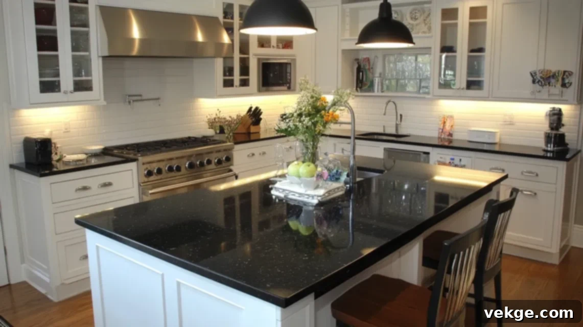
Black Galaxy granite is striking with its deep, inky black base adorned with shimmering golden and copper flecks. To temper its intensity, a plain white subway tile backsplash offers a crisp, clean contrast. The smooth, bright white background not only softens the granite’s bold shine but also helps to visually expand the space. This pairing is especially effective in smaller kitchens, preventing them from feeling dark or enclosed. Opt for a matte or satin finish on the subway tiles for a sophisticated, glare-free effect that allows the granite’s sparkle to truly pop.
2. River White Granite + Light Gray Glass Tile
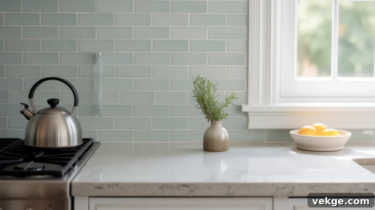
River White granite captivates with its delicate swirls of soft gray and occasional cranberry veins set against a pale, often creamy white base. A light gray glass tile backsplash complements this stone perfectly by echoing its cooler tones and adding a subtle, contemporary shimmer. The reflective quality of glass tiles, particularly in a subdued shade, enhances natural light without adding busy patterns. This combination excels in open-concept kitchens or spaces abundant with natural light, creating an airy, modern feel. Consider longer glass tiles laid horizontally to visually stretch the wall space.
3. Typhoon Bordeaux + Cream Tile With No Pattern
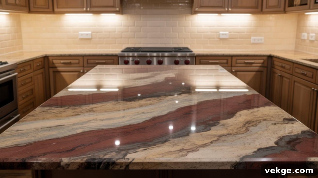
Typhoon Bordeaux is an absolute showstopper, featuring dramatic waves of burgundy, gold, and deep brown set against a beige or cream background. To prevent its bold drama from becoming overwhelming, a plain, pattern-free cream backsplash is essential. This neutral backdrop allows the intricate patterns and rich colors of the granite to remain the undisputed focal point. For a truly refined look, choose large-format ceramic or porcelain tiles, or even a full slab backsplash, to minimize grout lines and maintain a sleek, contemporary appearance. Warm LED under-cabinet lighting can further enhance the granite’s colors, making them blend beautifully with the cream tones.
4. Blue Bahia + Matte White Brick Tile
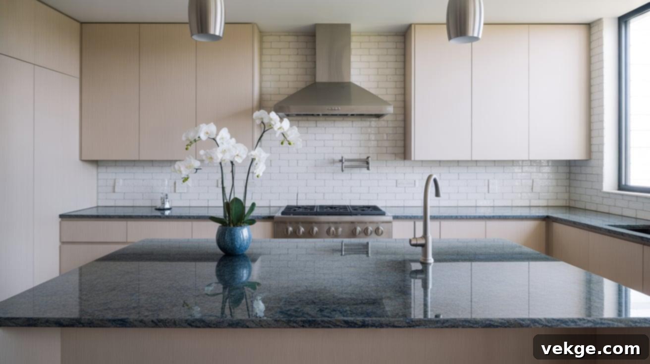
Blue Bahia granite is a rare and luxurious stone, immediately drawing the eye with its vibrant deep blue, white, and often black patterns. To anchor this striking material, a flat matte white brick tile backsplash provides a serene and sophisticated counterpoint. The unglazed finish of the matte tile absorbs light rather than reflecting it, allowing the granite’s intense colors to truly pop like a piece of art. Maintain a consistent grout color, such as white or a very light gray, to keep the backsplash seamless. This pairing creates a powerful yet balanced statement, ideal for kitchens with white cabinetry and sleek silver or chrome fixtures.
5. Giallo Ornamental + Beige Ceramic Tile
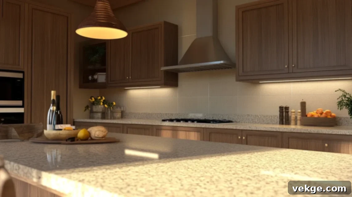
Giallo Ornamental granite, with its warm golden, beige, and brown speckling and subtle movement, brings an inviting warmth to any kitchen. A simple beige ceramic tile backsplash beautifully complements its base tones, creating a cohesive and cozy atmosphere. The warmth of the ceramic tile enhances the granite’s natural hues, forming a soft, enveloping space. This pairing is perfect for traditional or country-style kitchens, especially those featuring wood or cream-painted cabinets. Opt for slightly larger ceramic tiles to achieve a more modern feel and reduce the visual interruption of excessive grout lines.
6. Lapidus Granite + Pale Almond Tile
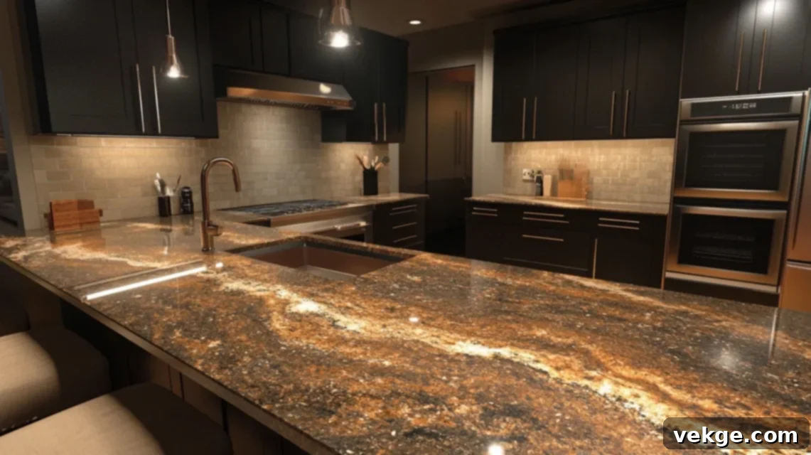
Lapidus granite is brimming with character, featuring a dynamic blend of copper, gold, black, and often reddish flecks that create a lively surface. A pale almond tile backsplash provides the necessary visual relief, calming the granite without clashing with its vibrant tones. The understated almond shade pulls out the lighter elements of the granite, creating a sense of continuity. This combination works exceptionally well in kitchens with darker, rich wood or espresso-colored cabinets, providing a lighter element to brighten the space. Consider pairing with brushed bronze or dark metal fixtures to bring out the metallic warmth in the granite.
7. Cosmic Black Granite + White Marble Tile
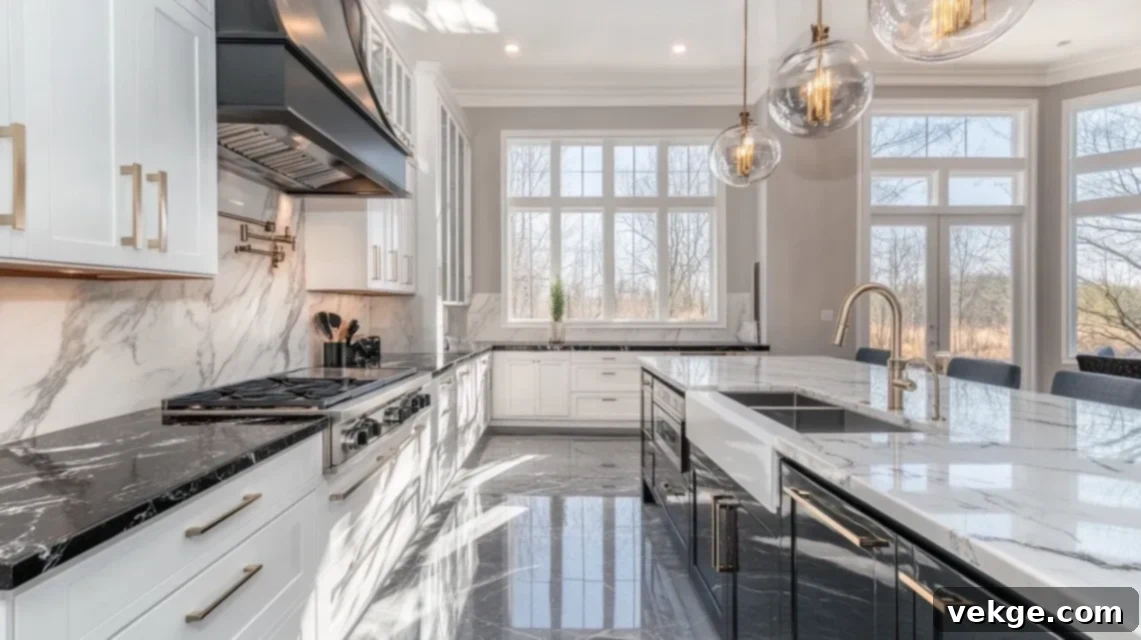
Cosmic Black granite is a dramatic masterpiece, characterized by its deep black background punctuated by sweeping white and golden streaks, reminiscent of distant galaxies. To soften this intense drama while maintaining elegance, a white marble tile backsplash with very subtle gray veining is an exquisite choice. The soft contrast of the marble highlights the granite’s inherent beauty without competing for attention. It’s crucial to keep the backsplash design simple – avoid intricate mosaic patterns or highly pronounced marble veining. This sophisticated setup is ideal for luxury kitchens, especially those with ample natural light that can accentuate the subtle details of both stone types.
8. Verde Butterfly Granite + Soft Cream Tile
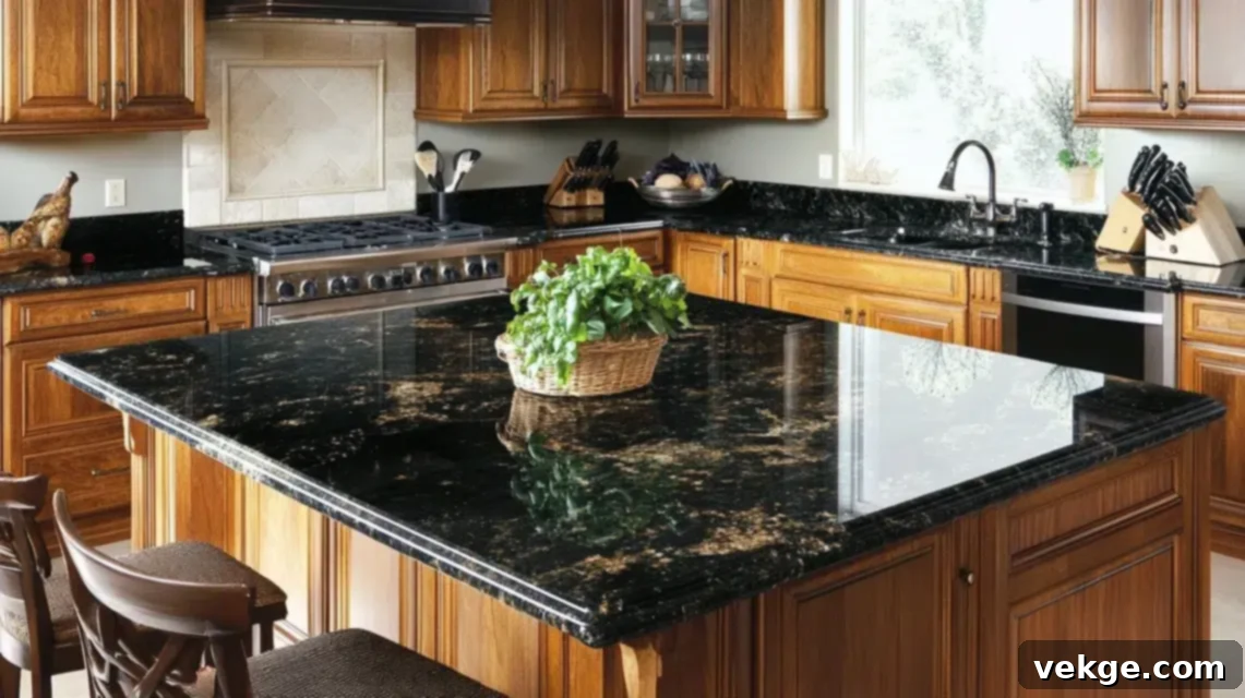
Verde Butterfly granite boasts a rich, deep green base with distinctive gray and white speckling that gives it a vibrant texture. A soft cream backsplash provides a warm, inviting counterpoint, effectively warming up the space and creating visual balance. The calm cream tile draws out the lighter speckles in the granite, tying the two elements together without introducing clutter or conflict. This pairing is particularly beautiful in kitchens with natural wooden cabinets or those adorned with gold-tone hardware, where the cream can enhance the warm undertones of the wood and metal.
9. White Spring Granite + Soft Blue Tile
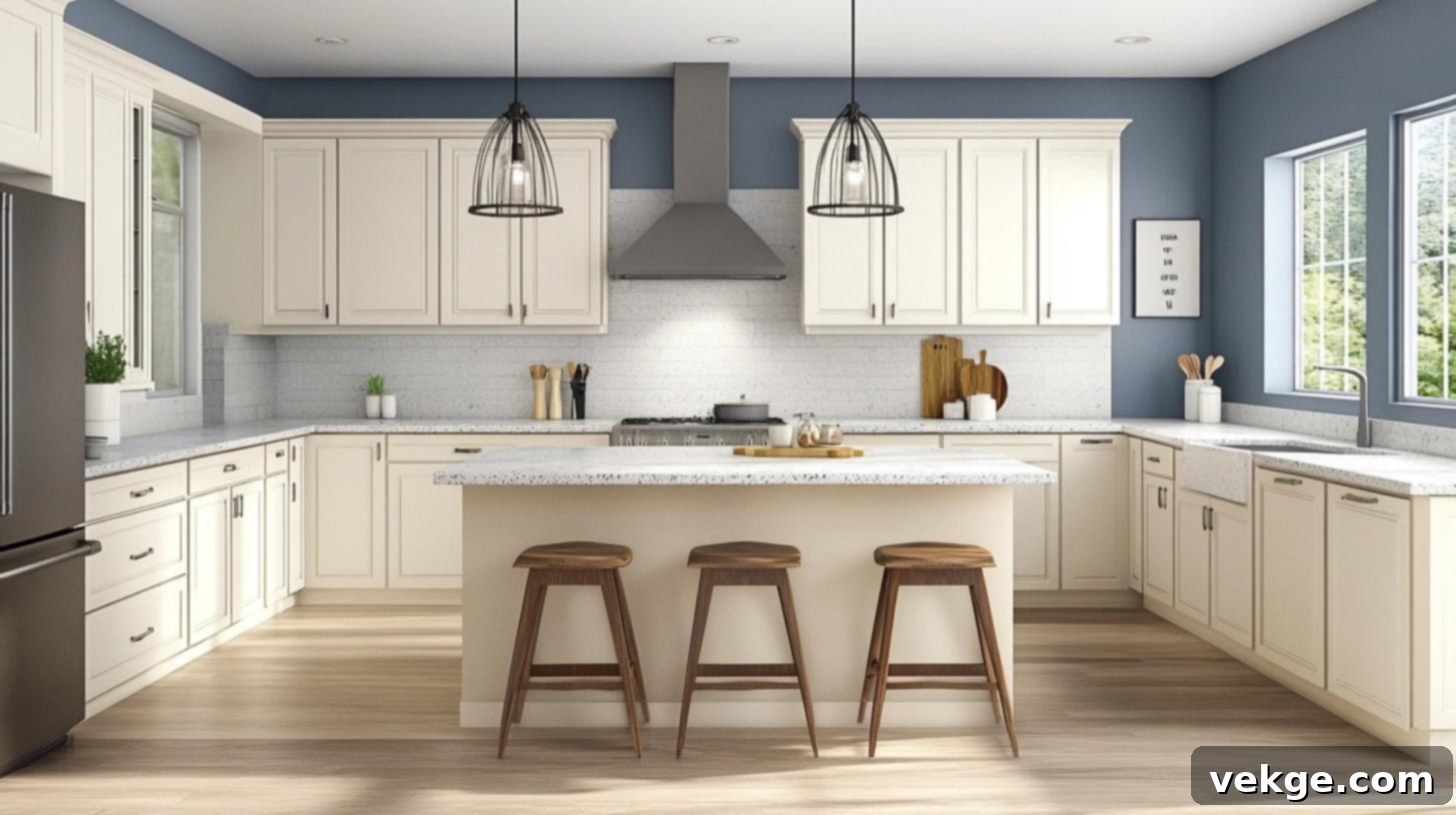
White Spring granite features intricate red and gray veins elegantly flowing across a predominantly white base. Introducing a calm, soft blue tile backsplash can add a gentle hint of color without clashing with the granite’s existing patterns. This subtle blue tone helps to emphasize the cooler gray veins in the stone, creating a harmonious and refreshing atmosphere. Opt for a smooth or very lightly textured tile, avoiding anything glossy or highly reflective, to maintain a serene backdrop. This combination brings both calmness and a touch of serene color, perfect for a kitchen that feels bright and airy.
10. Golden Crystal Granite + Pale Taupe Tile
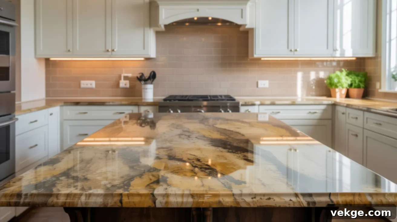
Golden Crystal granite presents warm, sandy tones intermingled with dark mineral grains, giving it a natural yet bold presence. A pale taupe backsplash acts as a quiet canvas, allowing the granite’s inherent beauty to take center stage without competition. Taupe is a versatile neutral that can pull out both the warm and cool undertones in the granite, making it incredibly adaptable. This pairing works exceptionally well in kitchens with light wood or classic white cabinets, creating an inviting and balanced look. You can further enhance the seamless appearance by choosing grout that closely matches the tile color, keeping the wall smooth and simple.
11. Alaska White Granite + Light Gray Subway Tile
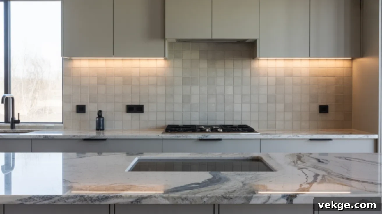
Alaska White granite is distinguished by its dark speckles and smoky gray swirls set against a pale, often icy white, base. A light gray subway tile backsplash perfectly complements this granite by echoing its cooler tones without adding any competing visual noise. This pairing creates a clean, bright, and contemporary feel that adapts well to both modern and transitional kitchen designs. To maintain the elegant simplicity, use a thin grout line with a color that matches the tile, ensuring a smooth, cohesive wall appearance that doesn’t detract from the granite’s intricate patterns.
12. Brown Antique Granite + Ivory Tumbled Tile
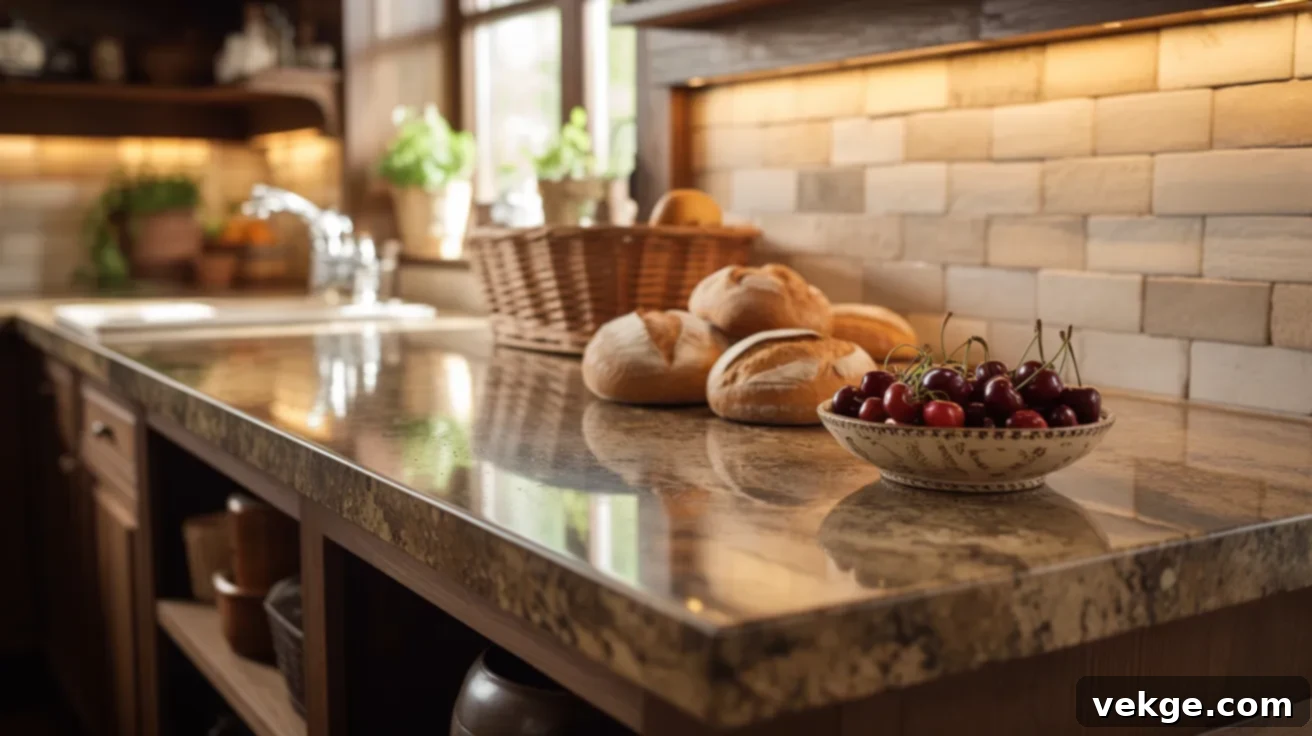
Brown Antique granite exudes a rich, earthy charm with its warm browns and golds, often displaying significant movement and depth. Pairing it with ivory tumbled stone tiles introduces a soft, natural, and slightly rustic vibe that beautifully complements the granite’s character. The subtle texture of tumbled stone adds warmth and interest without overwhelming the space, ensuring the wall remains visually calm. This combination is ideal for rustic, traditional, or farmhouse-style kitchens, especially those with earthy tones and natural wood elements. Crucially, avoid high-shine or polished tiles here, as they would clash with the granite’s organic, rugged appeal.
13. Titanium Granite + Cream Beveled Tile
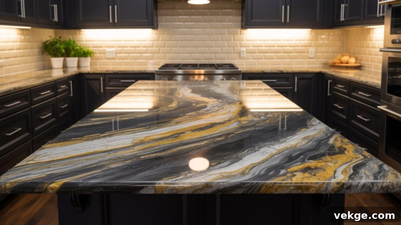
Titanium granite is renowned for its striking contrast, featuring bold black, gold, and white streaks that create a powerful visual impact. To soften this intensity and introduce a classic touch, cream beveled tiles are an excellent choice. The gentle 3D edge of beveled tiles adds a subtle layer of interest and sophistication without introducing chaos or busy patterns. This combination looks exceptionally sharp when paired with black or dark gray cabinetry, creating a modern yet timeless aesthetic. Incorporate warm lighting to truly make the golden streaks in the granite glow and enhance the rich feel of the space.
14. Persa Gold Granite + Matte Ivory Tile
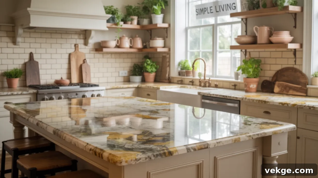
Persa Gold granite offers a beautiful blend of gold, gray, and cream swirls, creating a bold yet inherently warm aesthetic. A matte ivory tile backsplash perfectly matches its lighter base tones, providing a restful visual break for the eyes. The matte finish helps to ground the space and allows the granite’s warm hues to truly shine. This pairing is particularly well-suited for farmhouse-style kitchens or those with open shelving, where a simple background can prevent a cluttered feel. Stick to straightforward tile layouts like a straight stack or a classic running bond to avoid introducing any additional patterns.
15. Azul Aran Granite + Soft Taupe Tile
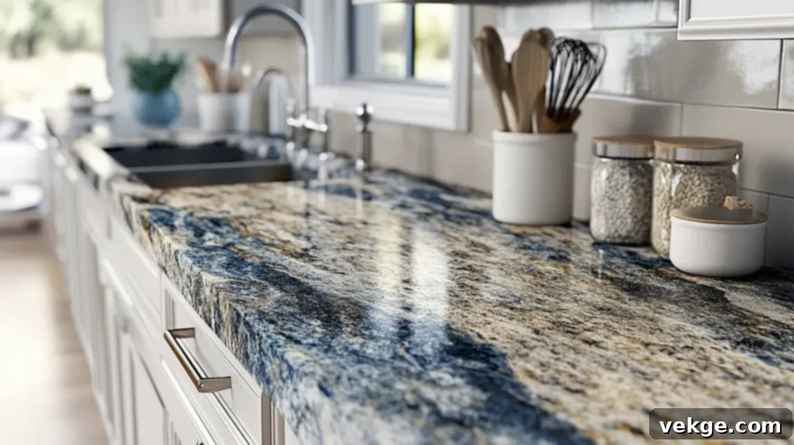
Azul Aran granite elegantly combines cool grays with distinctive blue and taupe veins, offering a sophisticated palette. A soft taupe backsplash is an ideal complement, balancing the cooler tones of the granite with a touch of warmth. This pairing creates a cozy yet undeniably elegant atmosphere, ensuring the kitchen feels both inviting and refined. Opt for medium to large format tiles to create a smooth, visually quiet wall surface that doesn’t compete with the granite’s intricate patterns. This combination works beautifully in both traditional and updated contemporary kitchen styles.
16. Santa Cecilia Granite + Simple Bone Tile
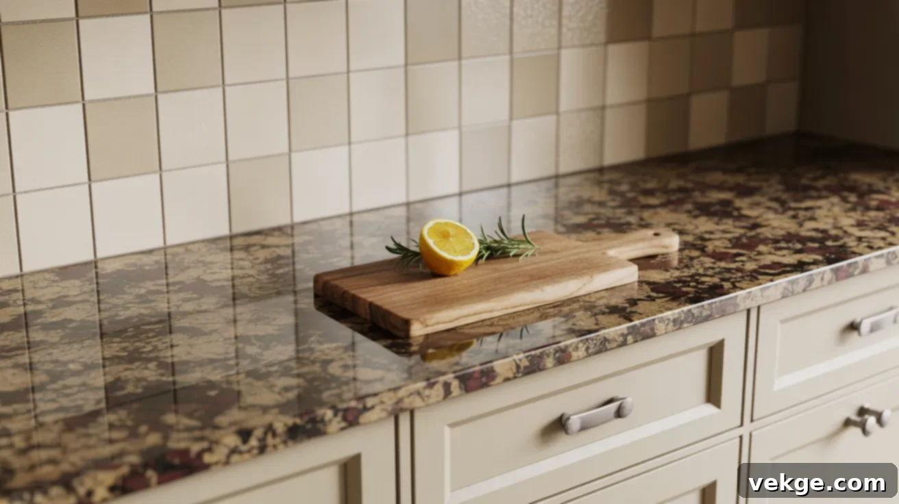
Santa Cecilia granite is a popular choice, known for its warm, speckled appearance with hints of gold, black, and occasional burgundy. A plain, bone-colored tile backsplash offers a perfectly harmonious match, embracing the granite’s warmth without creating visual clutter. This combination fosters a warm and welcoming atmosphere, making it ideal for bustling family kitchens. It’s important to keep the tile finish matte or satin; excessive shine can make the space feel overly busy when paired with the myriad flecks and patterns present in the granite, causing an undesired visual competition.
17. Blue Pearl Granite + White Shiplap Tile
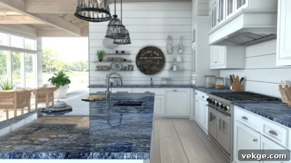
Blue Pearl granite captivates with its iridescent, silvery-blue flecks and deep blue-gray base, creating a sophisticated shimmer. To introduce a more casual yet clean aesthetic, a white shiplap-look tile backsplash is an unexpected and charming pairing. This combination works wonderfully in coastal, cottage, or farmhouse-inspired kitchens, bringing a fresh and relaxed vibe. Shiplap tiles add subtle linear texture and architectural interest without overwhelming the space or competing with the granite’s sparkle. Complete the look with soft white or brushed nickel hardware for a truly serene and cohesive design.
18. Colonial Gold Granite + Sand Tile
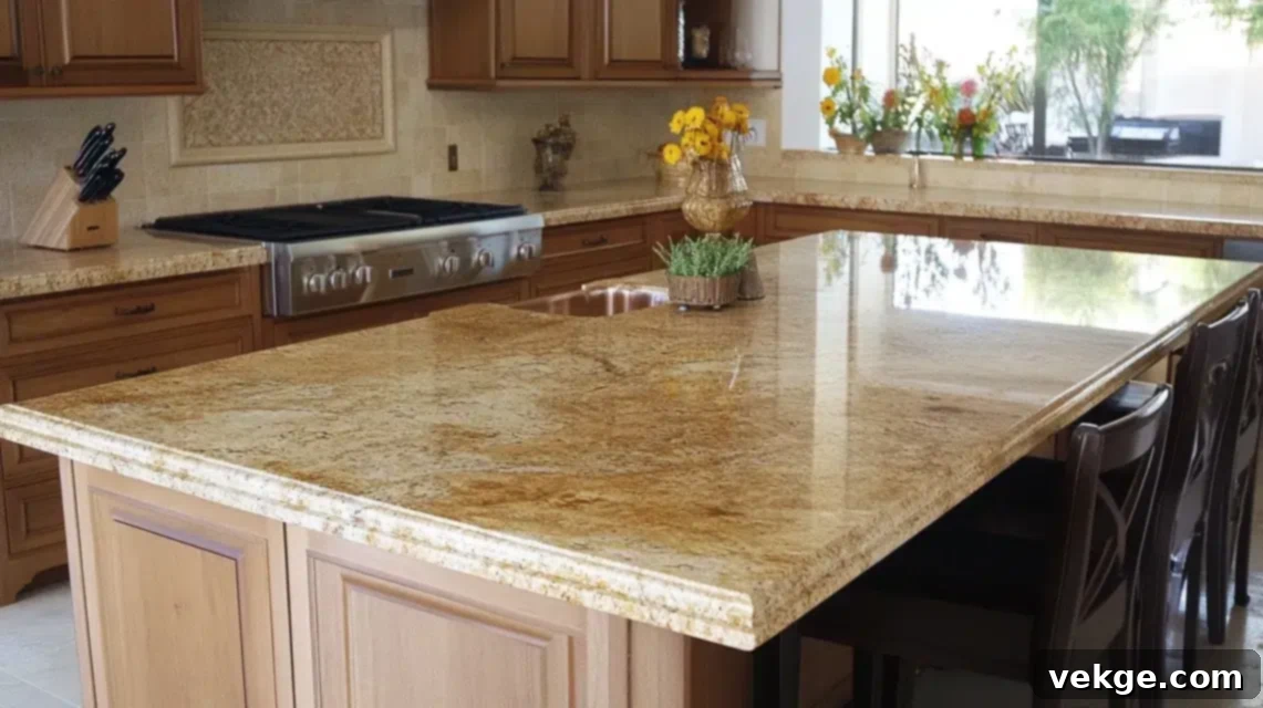
Colonial Gold granite features warm cream and golden veins, often with subtle specks, exuding a classic and inviting appeal. A soft sand-colored backsplash tile perfectly complements its warm undertones, fostering a relaxed and harmonious environment. Choosing large ceramic or porcelain tiles for the backsplash will contribute to a more modern and uncluttered aesthetic. This combination truly shines in kitchens adorned with white or natural oak cabinets, creating a bright yet warm ambiance. Employ warm-toned lighting to further accentuate the golden flecks within the granite, enhancing the overall glow of the space.
19. Magma Gold Granite + Flat White Tile
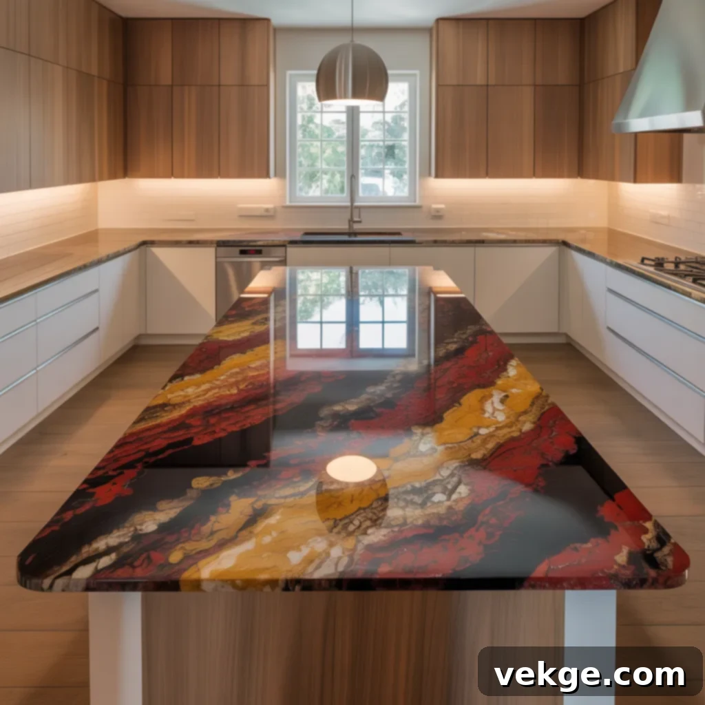
Magma Gold granite is an incredibly bold statement, bursting with fiery reds, rich golds, and deep browns that mimic molten lava. To allow this magnificent granite to truly take the spotlight, a plain, flat white tile backsplash is the ultimate choice. The stark simplicity of the white creates a powerful contrast, providing a clean and expansive backdrop. For maximum calming effect, opt for oversized tiles or even a full slab backsplash to minimize grout lines and maintain a sleek, uninterrupted surface. This pairing is ideal for kitchens where the granite itself is the primary design focus and other elements are kept intentionally neutral.
20. Lennon Granite + Pale Greige Tile
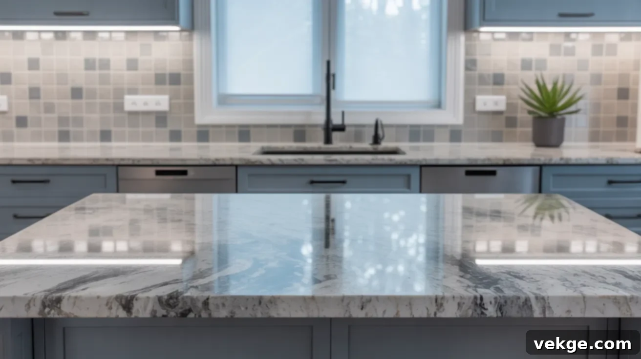
Lennon granite is characterized by its elegant swirling patterns that blend various shades of grays, whites, and subtle blue tones, creating a sophisticated and often ethereal look. A pale greige (a blend of gray and beige) tile backsplash provides a soft, neutral foundation that tones down the granite’s movement without sacrificing its cool, modern feel. This versatile neutral helps bridge the gap between warm and cool elements in the kitchen. Consider using square tiles with thin, matching grout lines for a neat and minimalist appearance. This combination is particularly well-suited for minimalist, contemporary, or even industrial-style kitchens.
21. Golden Thunder Granite + Light Biscuit Tile
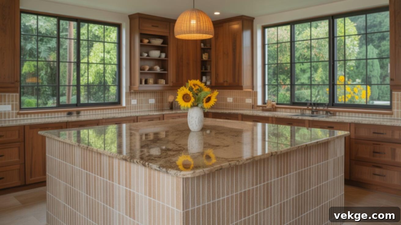
Golden Thunder granite lives up to its name, bringing considerable movement and a rich palette of gold, black, and brown tones. To soften its powerful presence, a light biscuit-colored tile offers a warm and inviting solution. This subtle, creamy hue provides a gentle contrast that prevents the kitchen from feeling overly dark or heavy. Consider arranging the tiles in a vertical pattern to add a touch of unique visual interest without creating conflict with the granite’s dynamic design. This approach adds just enough thoughtful detail while allowing the granite to remain the star.
22. Mascarello Granite + Soft Butter Tile
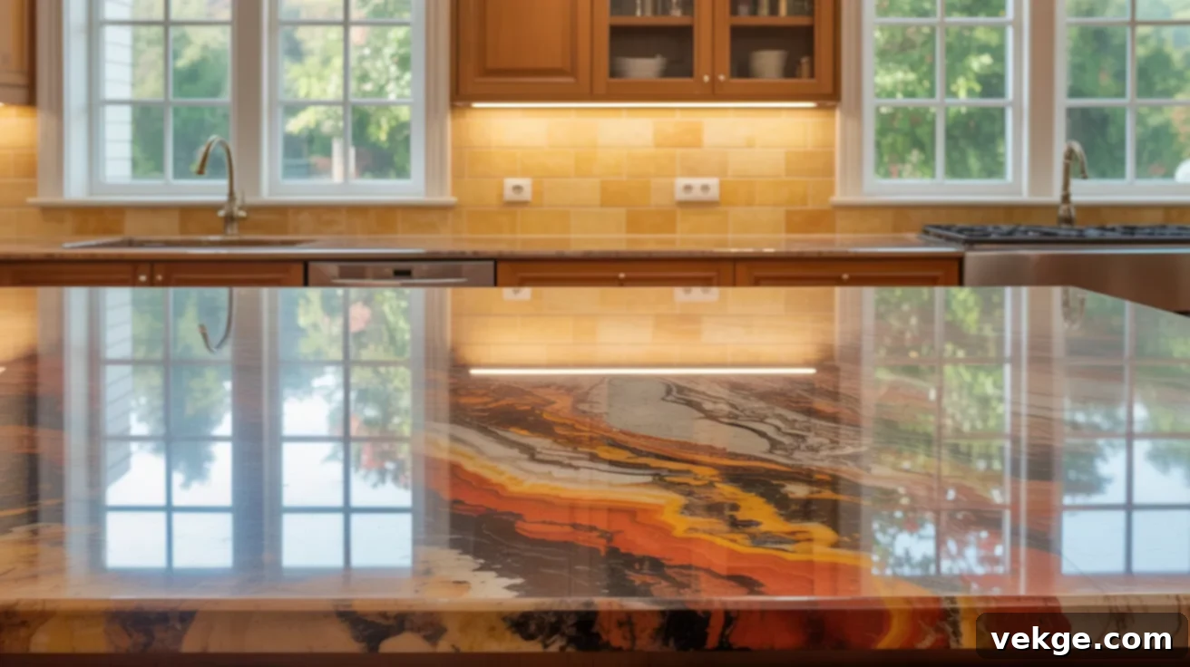
Mascarello granite is undeniably fiery and bold, showcasing rich oranges, deep reds, and vibrant golds that command attention. A soft butter-toned backsplash can temper this intensity, making the room feel sunny and welcoming rather than overwhelming. The warm, muted yellow of the butter tile complements the granite’s vibrant hues beautifully. This pairing is best utilized in kitchens that receive ample natural daylight, allowing the colors to truly glow. Choose wide tiles with soft, rectified edges and crucially, avoid any glossy finishes, as they would compete too aggressively with the granite’s inherent luminosity and dynamic patterns.
23. Bianco Antico Granite + Frosted Gray Tile
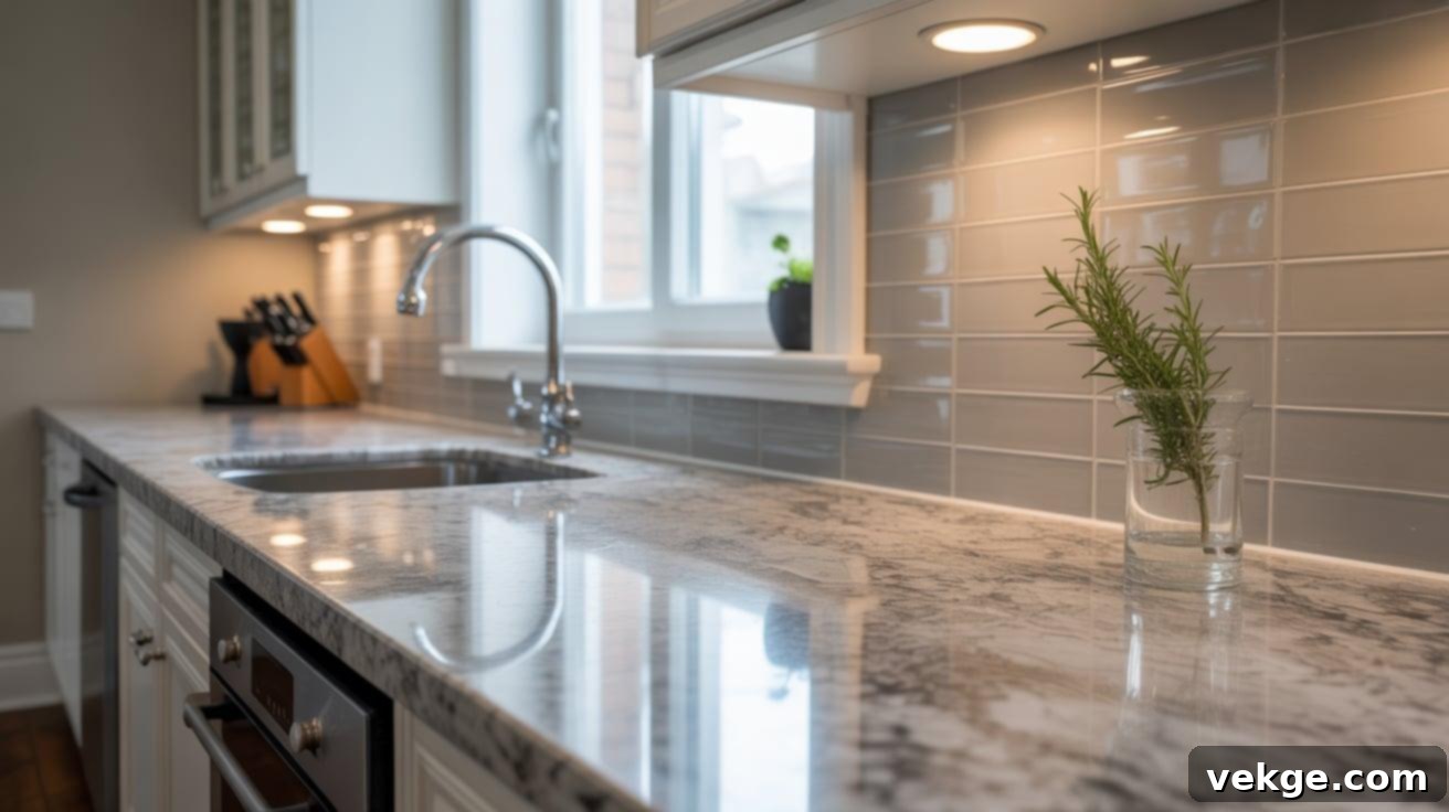
Bianco Antico granite features a cool-toned palette of grays, whites, and delicate rose speckles, offering a sophisticated and slightly ethereal appearance. A frosted gray tile backsplash blends seamlessly, bringing a calming and settled quality to the space. The frosted finish of the tile diffuses light, providing a soft-catching effect without any harsh glare. Consider using frosted glass or ceramic tiles for this look. This combination works exceptionally well with stainless steel appliances and minimalist cabinet styles, creating a sleek, modern, and perfectly balanced kitchen environment.
24. Café Imperial Granite + Simple Linen Tile
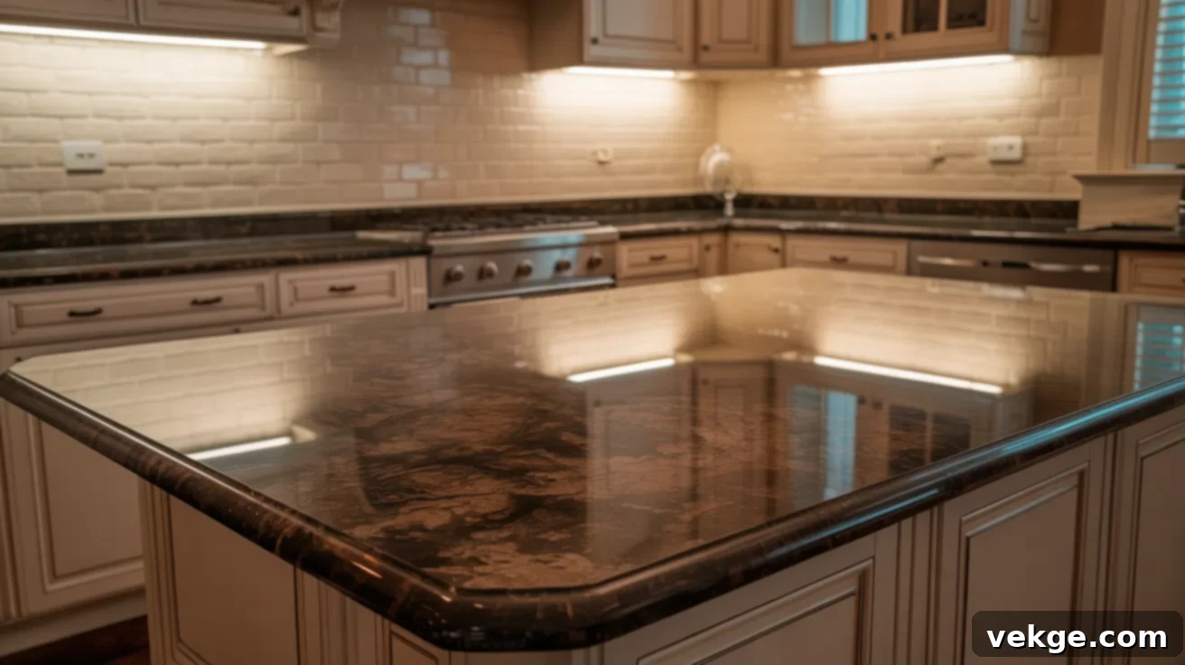
Café Imperial granite is a rich and luxurious stone with deep chocolate tones often interspersed with lighter, elegant veins. To prevent the space from feeling too heavy or dark, a linen-colored backsplash tile provides a crucial element of lightness and warmth. This combination fosters a cozy and calm atmosphere, perfect for inviting kitchen environments. If you desire a subtle textural element without introducing competing patterns, opt for a classic brick lay (offset) pattern. This pairing performs excellently in smaller, cozier kitchens where a balance of warmth and openness is key.
25. Bordeaux Dream Granite + Soft Rose Beige Tile
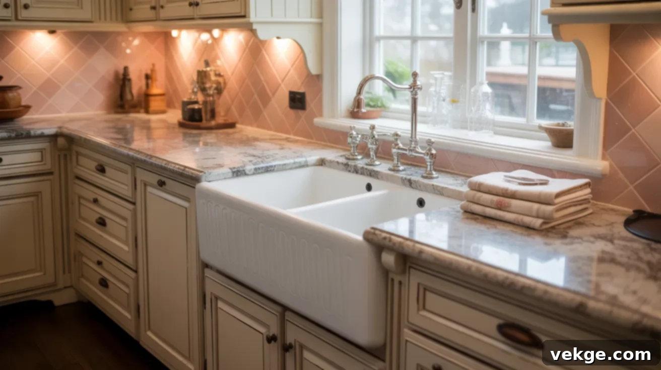
Bordeaux Dream granite is a magnificent stone, artfully blending bold wine reds with soft cream and gray tones, creating a vibrant yet sophisticated canvas. A soft rose-beige tile backsplash gracefully supports the granite’s inherent warmth while subtly dialing down its visual intensity. This specific beige hue, with its gentle rosy undertones, beautifully complements the red components of the granite without competing. Choose smooth, medium-sized tiles to maintain a refined look. This pairing is perfect for kitchens featuring brushed gold or antique bronze finishes, offering a warm and slightly opulent feel without being over-the-top.
26. White Ice Granite + Matte Fog Tile
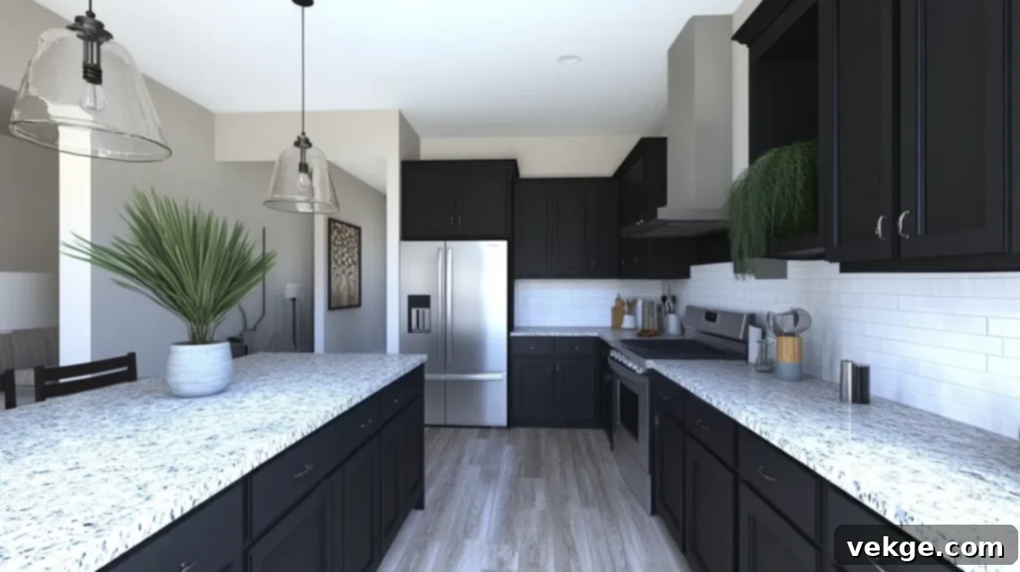
White Ice granite captivates with its icy grays, dramatic dark veins, and crisp whites, creating a cool and modern aesthetic. A matte fog-gray tile backsplash provides a beautifully understated and calming background, allowing the granite’s bold features to stand out without feeling chaotic. This combination delivers a fresh, clean, and perfectly balanced look. It works wonderfully with dark cabinets for a striking contrast, or with white cabinets for a seamless, harmonious flow. For an expanded, clean, and open feel, consider longer rectangular tiles laid in a straight stack pattern.
27. Costa Esmeralda Granite + Warm Sand Tile
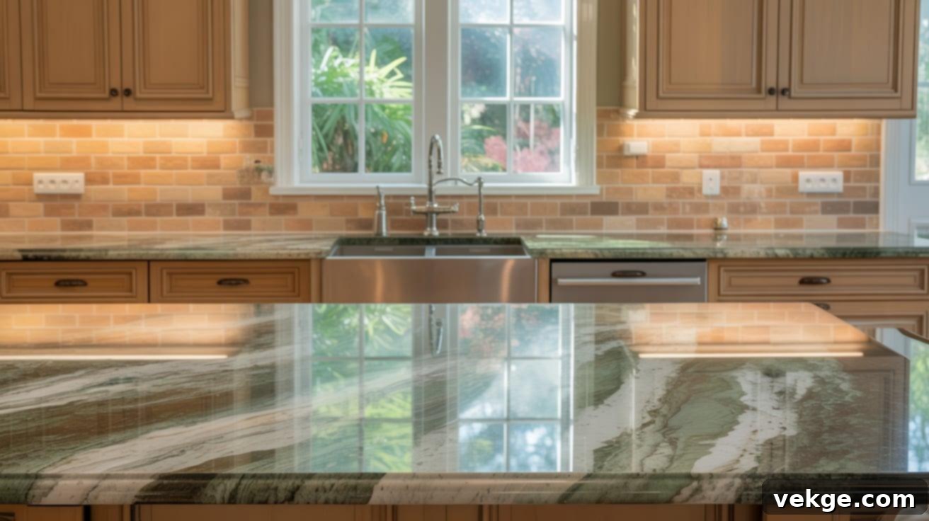
Costa Esmeralda granite is celebrated for its soothing green tones, often accented with white and gray swirls that evoke a serene landscape. A warm sand backsplash tile beautifully softens the cool green of the granite without clashing, bringing a welcoming earthiness to the space. This pairing creates a harmonious balance between cool and warm elements. It works particularly well in kitchens that feature warm wood tones or cream-colored cabinetry. To ensure a cohesive look, keep the tile shape basic – simple rectangles or squares – to avoid distracting the eye from the granite’s natural beauty.
28. Sienna Bordeaux Granite + Beige Marble Tile
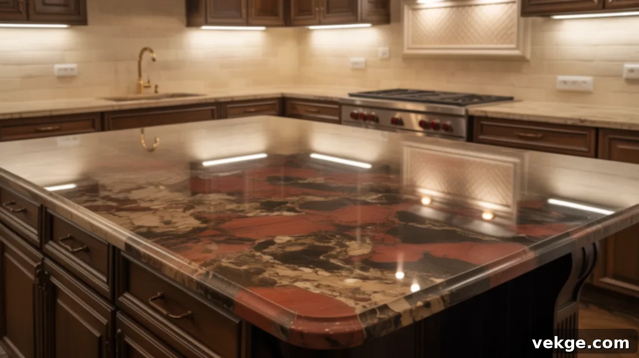
Sienna Bordeaux granite is a showstopper, renowned for its dramatic red veins and intricate golden patterns that create a vibrant, active surface. To temper this inherent intensity, a soft beige marble tile backsplash offers a sophisticated and calming counterpoint. It’s crucial to select a marble tile with minimal veining or pattern to avoid any visual competition with the granite. This combination is perfect for kitchens featuring bronze or antique brass hardware, which will beautifully complement the granite’s warm tones. Adding warm white lights can further enhance the cozy, inviting glow of the space.
29. Baltic Brown Granite + Light Tan Tile
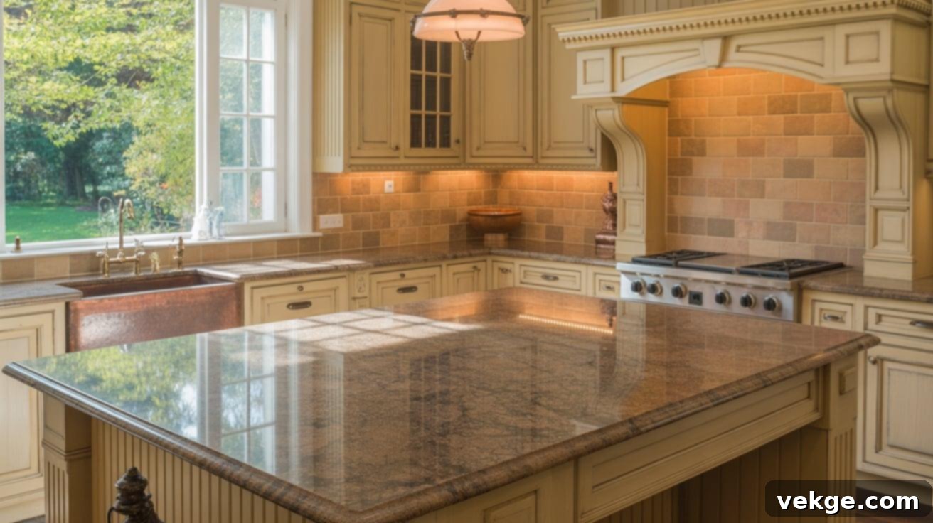
Baltic Brown granite is characterized by its heavy speckling in rich brown and black tones, often with hints of red or gold, creating a dense, active surface. A light tan tile backsplash provides a grounding and brightening effect, preventing the space from feeling too enclosed. Stick with larger format tiles to minimize the number of grout lines on the wall, thereby reducing visual clutter. The neutral tones of this pairing make it incredibly versatile, working well with both traditional and country-style kitchens, and allowing for flexibility in other design choices.
30. Peacock Green Granite + Buttermilk Tile
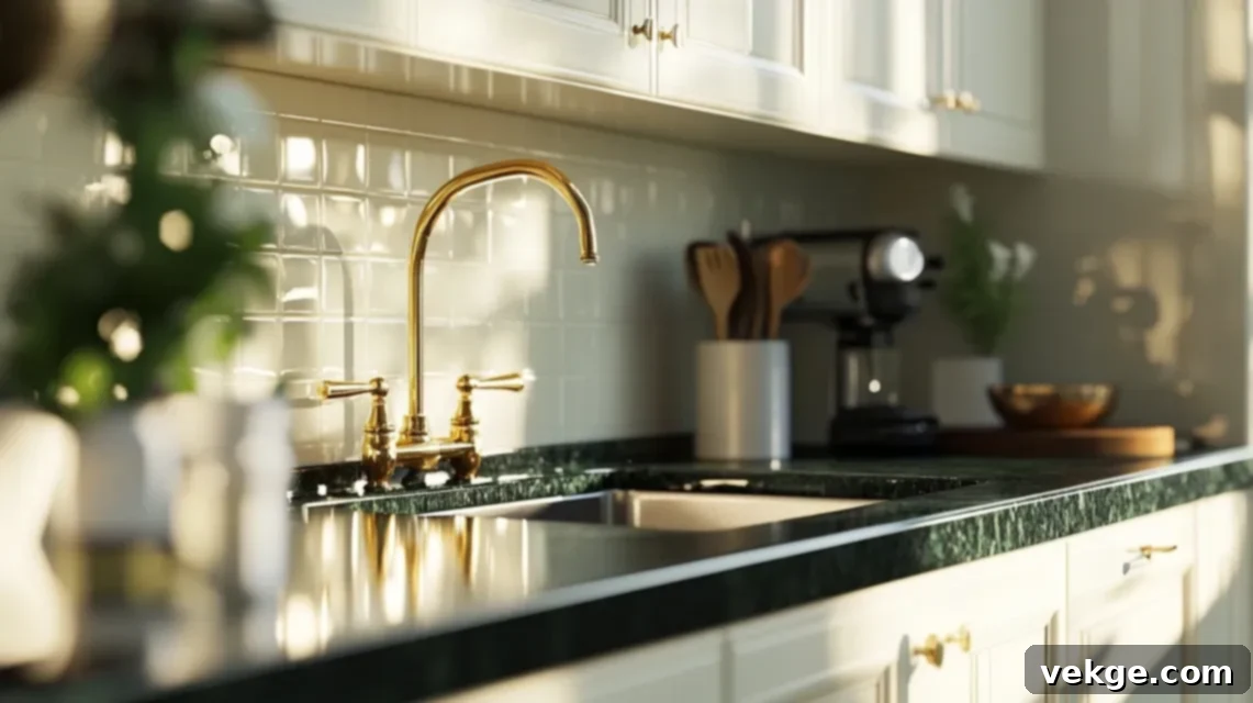
Peacock Green granite reveals mesmerizing green and gold flashes when kissed by light, set against a dark, often black or deep green, background. Buttermilk-colored tiles offer a gentle and effective way to soften the intensity of the green while maintaining a warm and inviting atmosphere. The subtle creaminess of buttermilk tiles beautifully complements the gold flecks in the granite. This pairing is perfect for classic-style kitchens seeking an elegant and timeless look. Employ matte-finish tiles to reduce unwanted shine and ensure the room feels smooth and refined, allowing the granite’s natural iridescence to be appreciated without distraction.
31. Ivory Fantasy Granite + Soft Blush Tile
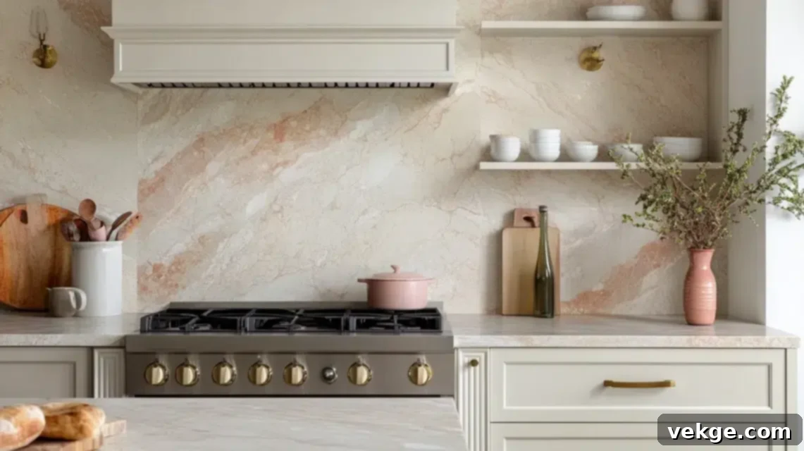
Ivory Fantasy granite is defined by its elegant sweeping gold and cream swirls, creating a sense of graceful movement. A soft blush backsplash introduces a subtle hint of warmth and contemporary style without overwhelming the granite’s natural beauty. This gentle, unexpected hue creates a fresh and welcoming aesthetic that feels both refined and inviting. To maintain this serene look, use large-format tiles with matching grout to create a quiet, calming background that allows the granite’s intricate patterns to truly shine as the focal point of the kitchen design.
32. White Ornamental Granite + Soft Pewter Tile
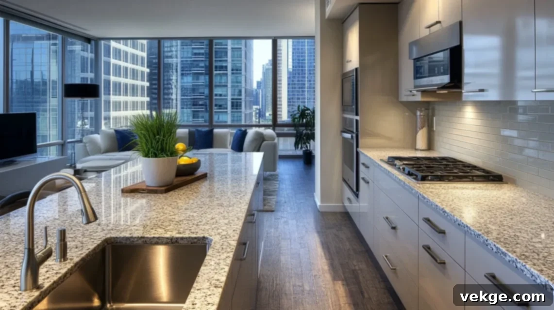
White Ornamental granite offers a light and airy appearance, typically featuring delicate brown and gray flecks over a creamy white base. Soft pewter tiles are an excellent choice as they subtly draw out the gray tones present in the granite without introducing any additional patterns or busyness. This pairing creates a sophisticated and balanced look, making it ideal for transitional kitchen styles that blend classic and modern elements. To keep the aesthetic classic and relaxed, use standard 3×6 subway tiles laid in a simple offset pattern, ensuring a timeless and uncluttered backsplash.
33. Red Dragon Granite + Bone Tile
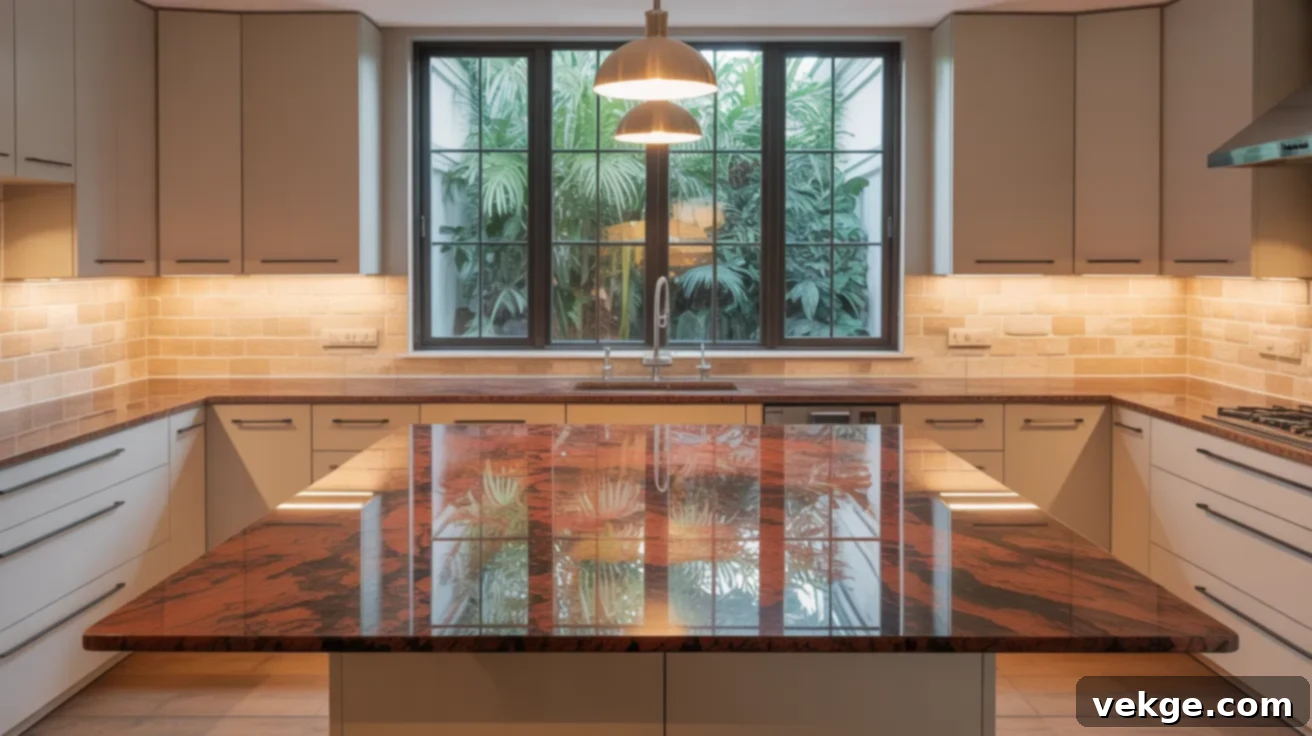
Red Dragon granite is a fiery and intensely vibrant stone, full of dynamic reds, blacks, and whites that create a bold statement. A bone-colored tile backsplash provides a crucial calming match, allowing the granite’s dramatic red hues to truly shine without competition. This pairing works best in kitchens where cabinetry is kept neutral, such as white, cream, or light wood, to prevent the space from becoming overly stimulated. Choose matte or low-sheen finishes for the tiles and actively avoid textured tiles, as their added dimension could clash with the granite’s already wild and energetic personality.
34. Ice Brown Granite + Creamy Porcelain Tile
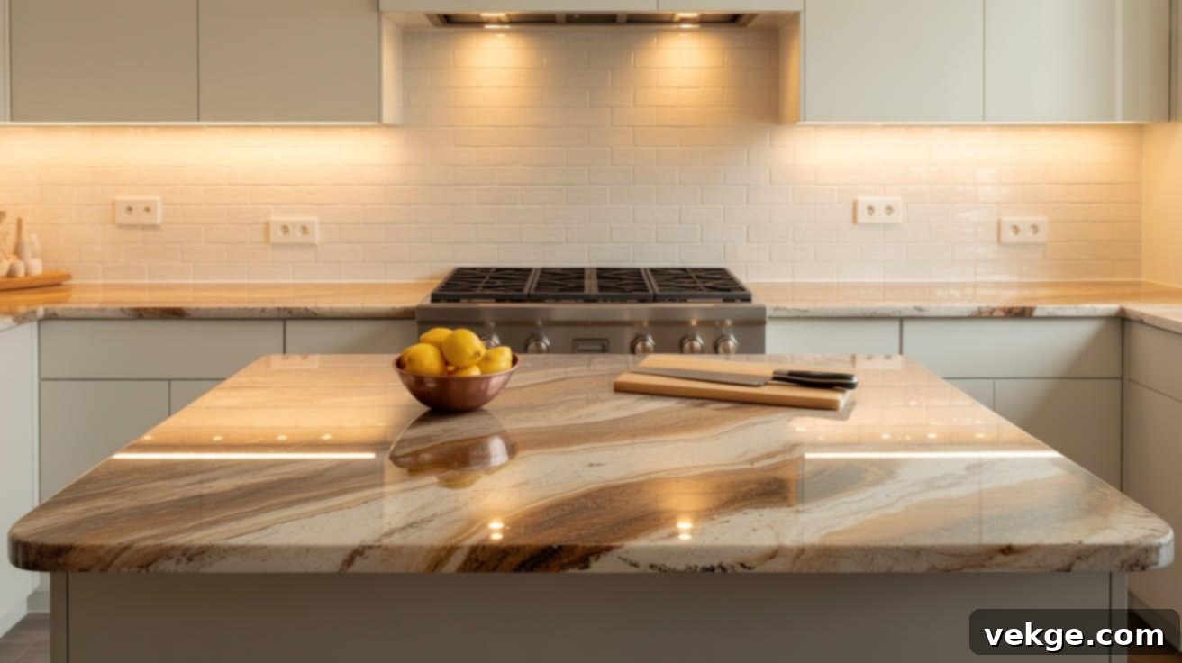
Ice Brown granite is characterized by its smooth, flowing waves of warm brown and creamy white tones, often with a subtle shimmer, creating a modern and elegant feel. A creamy porcelain tile backsplash beautifully maintains this smooth, contemporary aesthetic, making it an excellent choice for newer kitchens with clean lines and minimalist design. For an expansive and sleek backsplash look, opt for large, rectangular tiles laid in a horizontal stack pattern. This approach minimizes grout lines and ensures the backsplash seamlessly complements the granite, enhancing its sophisticated movement without adding any visual distractions.
35. Fantasy Brown Granite + White Textured Tile
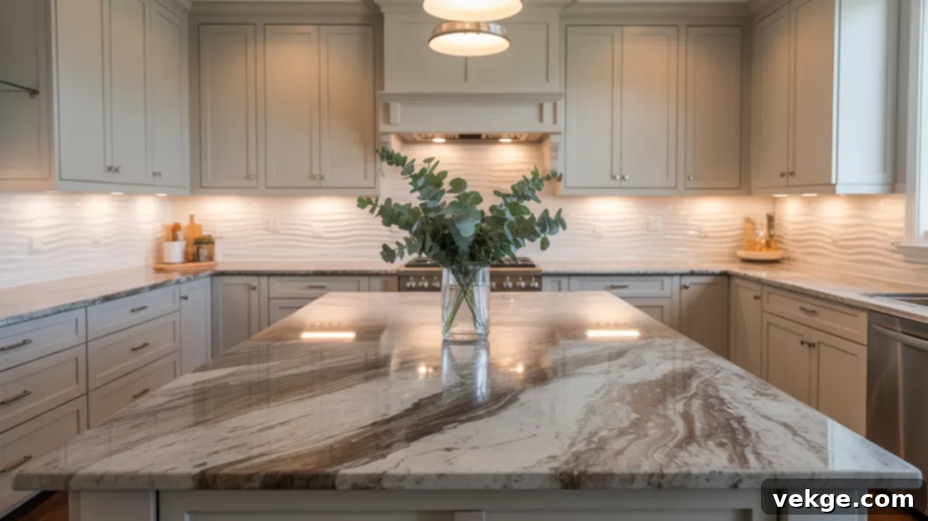
Fantasy Brown granite, often mistaken for marble, offers a delicate blend of soft browns and grays intertwined with gentle, flowing veins. A white textured backsplash can add an interesting layer of depth and sophistication without introducing competing patterns. Look for tiles with a subtle wave, ripple, or even a very fine linen-like texture to echo the granite’s gentle motion and organic feel. This pairing works beautifully in a variety of home styles, from modern farmhouse to contemporary, providing visual interest and tactile appeal while keeping the overall kitchen atmosphere serene and cohesive.
Backsplash Styles to Avoid with Busy Granite
While personal taste always plays a role in design, certain backsplash styles are generally best avoided when working with busy granite to prevent a visually overwhelming and chaotic kitchen. Busy granite already commands attention with its strong movement, varied speckling, or bold veining. Introducing additional competing elements will only lead to an unbalanced and stressful environment.
High-contrast patterned tiles: Avoid intricate mosaics, geometric patterns, or tiles with highly contrasting designs. These will directly compete with the granite’s inherent patterns, causing visual dissonance and making both the countertop and the backsplash appear “noisy” and jumbled.
Glossy or highly reflective surfaces: While some shine can be elegant, excessive gloss on a backsplash can reflect light in a way that amplifies the busyness of the granite. It creates additional “sparkle” or “movement” that draws the eye away from the granite, contributing to a sense of visual clutter rather than calm.
Bright or clashing colors: Introducing a backsplash in a color that is not subtly pulled from the granite, or one that is overtly bright and contrasting, will disrupt the flow of the space. It can create an abrupt visual break, making the kitchen feel disjointed and less cohesive.
Rough or heavily uneven textures: Tiles with pronounced rough or uneven textures (like heavily tumbled stone with deep crevices or highly dimensional tiles) can add too much additional visual weight and tactile interest. When paired with busy granite, this creates an overabundance of sensory information, preventing the eye from finding a resting point.
The overarching goal is to provide a calm, supportive backdrop for your granite. By sticking with smooth, understated finishes, simple forms, and neutral shades that are derived from the granite itself, you ensure the focus remains on the beautiful stone while fostering a serene and elegant kitchen environment.
Essential Tips for Balancing Your Granite Kitchen
Achieving a perfectly balanced kitchen with busy granite requires a thoughtful approach that considers every element. Here are some indispensable tips to guide your design choices:
- Balance Contrast and Calm: If your granite is inherently bold and dynamic, make a conscious effort to select a backsplash that offers calmness and simplicity. Resist the urge to introduce another strong visual element; too much contrast or complexity can quickly overwhelm the space and make it feel cluttered.
- Stick to One Showstopper: In any well-designed room, there should be one primary focal point. With busy granite, let the countertop be that showstopper. This means your backsplash, cabinetry, and other finishes should take a supporting role, allowing the granite’s beauty to be appreciated without competition.
- Match Tones, Not Patterns: The secret to a cohesive look isn’t to try and find a backsplash that mimics your granite’s pattern. Instead, carefully pull one or two of the quietest, most neutral colors from your granite’s background or flecks. Use these chosen tones to guide your backsplash and even cabinet color decisions, ensuring a harmonious palette.
- Think About Size and Space: The scale of your kitchen impacts tile choice. In smaller kitchens, lighter-colored and larger-format backsplash tiles can help to visually expand the space and prevent it from feeling confined. For expansive kitchens, you might have slightly more flexibility with deeper, more saturated neutral tones, but simplicity remains key.
- Maintain Consistent Finishes: While not a hard-and-fast rule, generally, a consistent finish across your backsplash, and sometimes even cabinets, creates a more cohesive look. If your granite has a polished finish, a matte backsplash can offer a pleasing contrast. If your granite is honed, a satin or matte backsplash often works beautifully. Mixing too many different textures and sheens can introduce visual noise.
Conclusion
Choosing a backsplash that perfectly complements busy granite doesn’t have to be an arduous task. We hope the ideas and specific pairings presented in this comprehensive guide have provided you with clear steps and inspiring examples to make your design decisions much easier and more confident. The core principle remains: if your granite countertop already makes a powerful statement, the most effective strategy is to keep your backsplash simple, understated, and harmoniously toned.
Embracing soft, neutral tones and clean, uncluttered tile styles can introduce much-needed balance, allowing the unique beauty of your granite to be celebrated without overwhelming the rest of your kitchen. Whether you’re planning a minor update or a complete kitchen overhaul, these insights are designed to steer you in the right direction towards creating a space you’ll love.
We encourage you to save the styles that resonate most with you, order a few samples to see how they look in your actual kitchen lighting, and confidently begin shaping a culinary environment that truly reflects your personal style and brings a sense of calm. Take your time with each choice—every decision brings your kitchen closer to the peaceful and put-together atmosphere you desire.
