Mastering Your Home’s Hue: Hayley Servatius’s 5 Secrets to Crafting the Perfect Color Palette
You don’t have to be an ’80s pop icon to appreciate the timeless sentiment of “True Colors.” And when it comes to transforming your living space with the perfect shades, you certainly don’t need to be a seasoned interior design guru. Especially not when an acclaimed expert like Hayley Servatius is more than happy to share her invaluable insights and design tips.
Color is arguably the most powerful element in interior design. It’s the silent storyteller, the unsung hero that shapes the entire energy and atmosphere of a room. The moment you step into a space, color whispers its greeting, setting the stage for every interaction and emotion that follows. It’s the magical ingredient that cultivates that elusive feeling of “home” – a place where harmony, balance, and your unique personality seamlessly intertwine.
Few designers understand this profound impact better than Hayley Servatius. Her exceptional talent for creating cohesive, livable, and deeply personal spaces always begins with one fundamental ingredient: the meticulously curated color palette. As Servatius wisely puts it, “Color is a mood driver for your home.” And she couldn’t be more right.
Consider the stark difference: a deep, moody bedroom can envelop you in a comforting embrace, fostering relaxation and intimacy. Conversely, a bright, airy white kitchen can spark creativity, invite movement, and inspire culinary adventures. Each hue, each combination, evokes a distinct feeling, influencing how you live, work, and relax within your own four walls. So, how does one consistently achieve this perfect balance and impact?
Enter Hayley Servatius’s innovative, foolproof method. She distills the complex world of color theory into five essential palette picks, designed to deliver impeccable home harmony and a truly personalized aesthetic every single time. Let’s delve into her expert strategies for building a beautiful, inspiring, and functional home through the power of color.
1. The Grounding Colors — Your Foundation for Serenity and Cohesion

In any masterpiece, a strong foundation is paramount. In Servatius’s insightful design philosophy, grounding colors serve as the bedrock of your home’s entire aesthetic. These are not merely background shades; they are the sturdy, consistent undercurrent that meticulously ties every element, every room, and every piece of furniture together. They provide a sense of stability, peace, and uninterrupted flow throughout your living spaces.
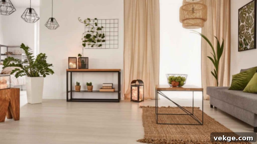
Imagine stepping into a living room bathed in the soft embrace of a warm greige, or a muted taupe that instantly invites you to sink into the plush comfort of a sofa. This is far beyond the realm of a stark, impersonal white-wall moment. These carefully chosen grounding colors provide a profound sense of security and calm, offering the eye a tranquil place to rest while simultaneously allowing other vibrant or textural elements in the room to truly shine.
Servatius’s expert take is clear: Always begin your color journey with three to five base colors. The key to their power lies in their consistent application throughout your home. These harmonizing hues are instrumental in creating the cohesive and serene flow that transforms a collection of rooms into a unified, peaceful sanctuary.
And let’s be clear: grounding colors are not confined to the traditional spectrum of beige and gray. For homes that receive less natural sunlight, Hayley thoughtfully suggests incorporating soft whites, gentle creams, or lighter, reflective tones. These choices are strategic, designed to maximize ambient light and inject that much-needed brightness, making spaces feel larger and more welcoming. Why fight against natural light when you can strategically choose colors that make it your most powerful ally?
2. Accent Colors — Layers of Depth, Personality, and Visual Connection
Once that essential foundation of grounding colors is meticulously set, it’s time to introduce layers of depth and distinctive personality into your home. Accent colors are where the true fun begins, where your individual style starts to subtly, yet confidently, emerge and define your space. Hayley Servatius recommends a thoughtful approach: layer three to four complementary hues into your home’s overarching color scheme, ensuring they are seamlessly carried and echoed from room to room.
Think of these accent shades as the intricate threads that weave the rich, compelling story of your home. They aren’t just isolated splashes of color; they are deliberate connections that link disparate spaces, adding remarkable richness, captivating texture, and a profound sense of continuity. A particular shade of deep forest green, for instance, might appear in a set of dining chairs, then subtly reappear in a piece of abstract art in the living room, and finally echo in the throw pillows on a master bedroom bench.
Consider the heart of the home, the kitchen. Your grounding color might be a sophisticated creamy white, but an accent like a soft, tranquil sage green on the cabinetry or a warm, earthy terra-cotta backsplash can instantly breathe vibrant life into the entire space. These accent shades are carefully chosen to enhance the room, adding a captivating level of intrigue that subtly shifts and reveals new nuances depending on how the light plays upon them, all without ever overwhelming the core palette.
In larger living spaces, accent colors frequently make their way onto plush textiles, statement rugs, elegant draperies, or even thoughtfully selected feature walls. They occupy that perfect middle ground; they are neither overtly shouting for attention nor are they passively fading into the background. It is precisely this delicate balance that prevents a home from feeling monotonous or one-note, instead offering dynamic layers of visual interest that compel both lingering enjoyment and curious exploration. These accents are the true articulators of your home’s character.
3. Pops of Pigment — Unleashing Energy and Excitement in Small Doses
This is the moment where the design journey truly electrifies: the strategic introduction of vibrant pops of color. If the grounding hues represent the quiet, steadfast foundation and the accent colors weave the rich, continuous narrative, then pops of color are the bold, exhilarating exclamation points. Hayley Servatius, with her keen eye for impact, suggests limiting these dynamic bursts to just one or two carefully selected colors. When used sparingly yet strategically, these small doses of pigment deliver maximum visual impact and inject exhilarating energy into any space.
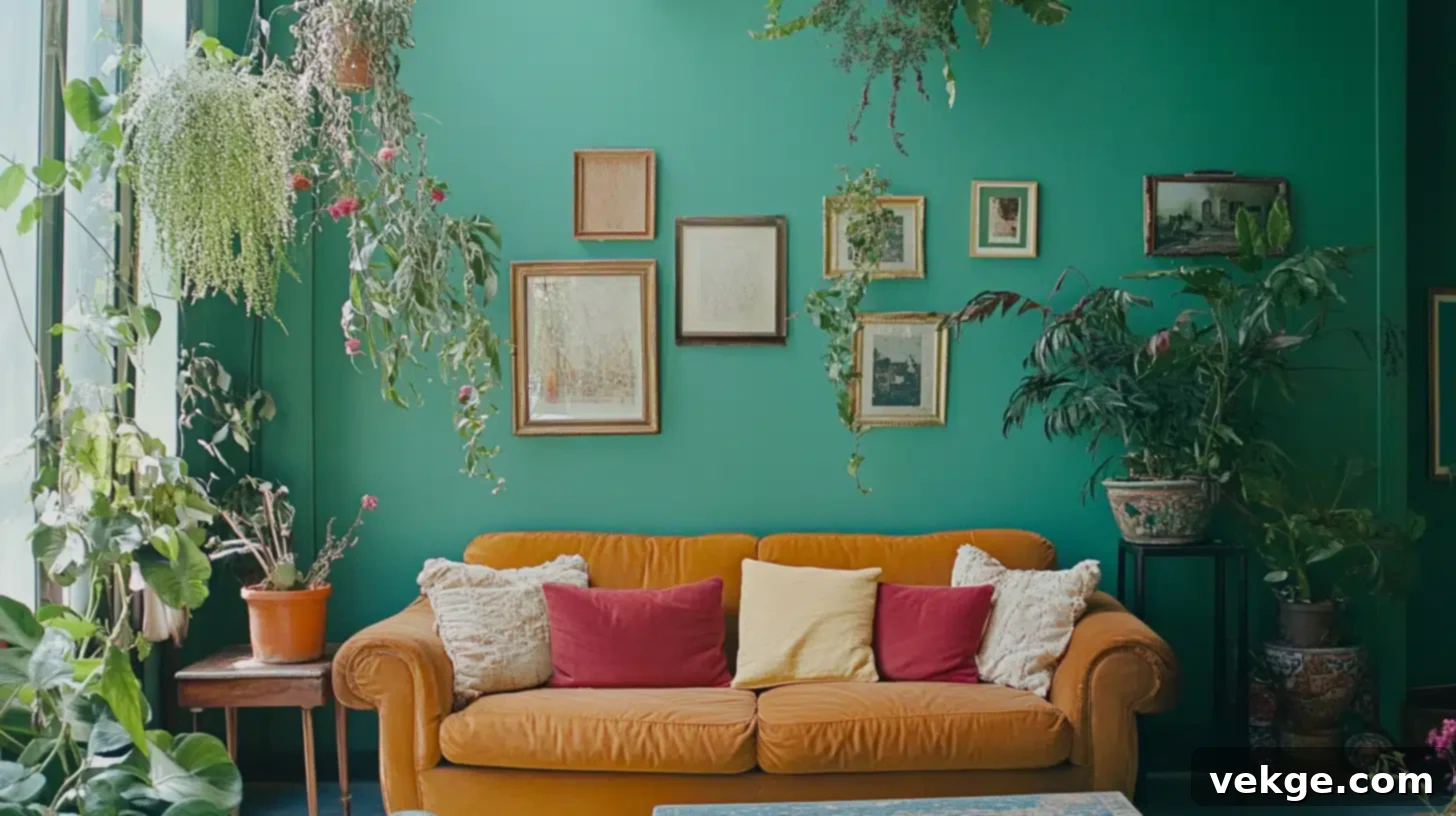
Imagine a sleek, sophisticated living room adorned with deep charcoal walls and luxurious gray velvet sofas. Then, unexpectedly – bam! – a pair of bold mustard-yellow cushions radiate warmth, or an electric-blue vase on the coffee table creates a stunning focal point. Suddenly, the entire space awakens and truly sings. These pops of color are not intended to dominate; rather, they are there to surprise, to delight, and to invigorate the senses.
Small but undeniably mighty, these bursts of color shine brightest in accessories. Think exquisite throw pillows, captivating artwork, a collection of intriguing decorative objects, or even a single, standout piece of furniture like an armchair in an unexpected hue. Their magic lies in their remarkable adaptability and ease of transformation. You can effortlessly swap them out seasonally, refresh them when a new mood strikes, or simply update them to reflect current trends. Witness how easily the entire room shifts its personality and vibrancy, all without requiring a complete and costly overhaul. That is the incredible power of the pop – a tiny change that yields an enormous payoff in style and atmosphere.
4. Harmonizing With Nature — Bringing the Outdoors In for Enduring Calm
Homes that exude a profound sense of harmony and tranquility often subtly, yet powerfully, echo the natural world just beyond their doors. This intrinsic connection to nature is a cornerstone of Servatius’s design approach. She masterfully draws inspiration from the great outdoors, meticulously weaving organic hues and natural textures into every space to ground a home firmly within its surroundings, fostering a sense of enduring peace and well-being.
The vast palette of nature offers boundless opportunities to create a home that feels both refreshingly modern and eternally timeless. Consider the calming effect of soft, verdant greens reminiscent of a serene forest, the comforting warmth of sandy beiges from a sun-kissed beach, or the tranquil depth of ocean blues that evoke boundless skies and deep waters. Incorporating these natural colors helps to blur the lines between inside and out, making your home feel more expansive and connected to the world around it.
A few carefully placed leafy green plants in the living room, perhaps a richly textured, mossy-toned throw draped casually in the bedroom, or elegant, earthy clay tiles adorning the bathroom floor – these subtle yet impactful touches work wonders. They actively connect your interior space to the expansive world beyond, creating that effortless, intrinsic harmony that every homeowner instinctively craves. This biophilic approach not only beautifies but also calms, making your home a genuine retreat.
5. Playing with Contrast — Bold and Subtle in Tandem for Dynamic Living
For Hayley Servatius, the art of experimenting with contrast is not just a technique; it’s a crucial element that breathes life and dynamism into her designs. “I love to play with color, layer color, and add unexpected pops,” she shares, and it is precisely this playful, intuitive approach that prevents a home from ever feeling static or flat. Contrast, in her hands, becomes a tool for creating visual intrigue and sophisticated balance.
Think about how a deep, dramatic navy accent wall can instantly make crisp white trim feel even brighter and more defined, creating a striking visual edge. Or how a sleek, minimalist space, which might otherwise feel cold, becomes significantly richer and more inviting when thoughtfully paired with earthy, textural elements like warm reclaimed wood or intricately woven fabrics. This deliberate juxtaposition creates a compelling tension – but it’s the good kind of tension, the kind that compels you to pause, to look a little longer, and to appreciate the thoughtful interplay of elements.
Servatius’s designs are the epitome of this nuanced balance. She frequently pairs soft, serene primary palettes with a touch of calculated boldness. This could manifest as a charcoal-black accent chair positioned against a neutral-toned room, creating an immediate focal point, or a single, powerfully vibrant piece of abstract art commanding attention in an otherwise muted space. It’s this delicate, strategic dance between contrasting elements – be it color, texture, light, or shadow – that imbues a home with its unique heartbeat. It makes a space feel not just decorated, but truly dynamic, alive, and utterly captivating.
Crafting Your Own Perfect Palette with Confidence
Hayley Servatius’s masterful approach offers a clear, actionable roadmap for anyone looking to transform their home. It begins with establishing grounding colors for serenity, layers in accent colors for depth and continuity, introduces exhilarating pops of energy, harmonizes the space with the natural world, and finally embraces the power of contrast for dynamic living. Her method demystifies color selection, making it accessible and exciting for everyone.
Start by identifying a color palette that genuinely inspires you, one that resonates deeply with your personal style and desired mood. Then, with Servatius’s expert guidance, watch with delight as your space evolves from mere four walls into a living, breathing sanctuary – a true reflection of your unique spirit and a harmonious haven for all who enter.
