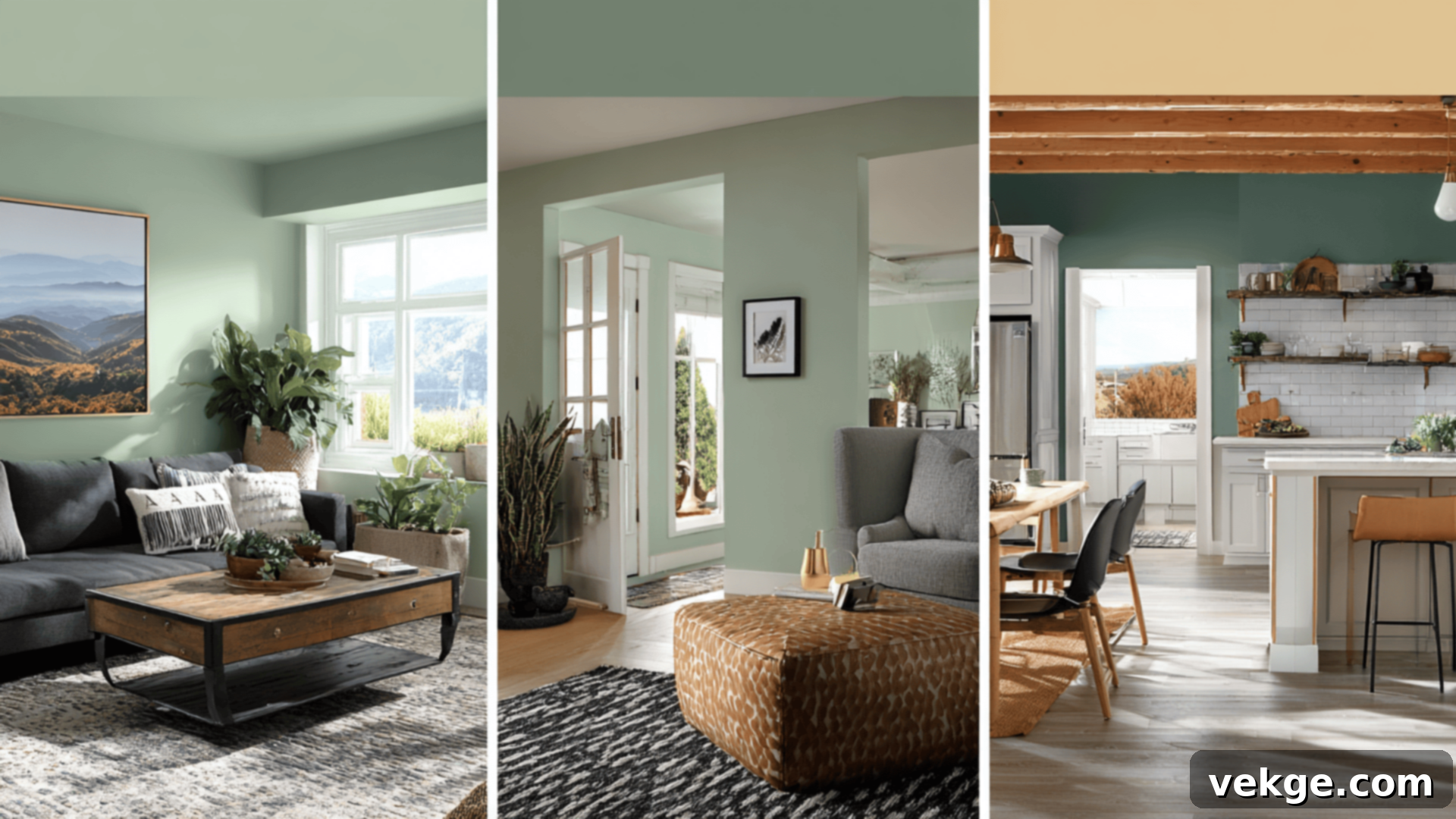
Discover the Best Green Paint Colors for Every Room: Your Ultimate Guide to Stylish and Serene Walls
Are you dreaming of giving your home a refreshing new look but feeling overwhelmed by the endless color choices? You’re not alone! If you haven’t considered green for your walls, you might be missing out on one of the most versatile and impactful shades available. Green isn’t just a color; it’s a mood, a statement, and a connection to nature that can transform any space.
From the soothing tranquility it brings to a bedroom to the vibrant energy it injects into a light-filled kitchen, green offers a spectrum of possibilities. It’s remarkably flexible, adapting beautifully to various design styles—from modern minimalist to classic farmhouse. Its inherent calming properties are well-documented, making it an ideal choice for creating inviting and stress-reducing environments throughout your home.
In this comprehensive guide, we’ll dive deep into the world of green paint, showcasing the best green wall paint colors for every room in your house. We’ll provide expert tips on how to pair these shades with other colors and textures, explore smart painting techniques, and even highlight eco-friendly paint options for a healthier home. Whether you’re drawn to a soft, airy whisper of green or a rich, bold emerald statement, there’s a perfect green waiting to be discovered for your walls. Let’s embark on this colorful journey and find the ideal green to elevate your living spaces.
Best Green Wall Paint Colors for Every Room
Choosing the right green shade can feel like a big decision, but with a better understanding of the options, you’ll find your perfect match. We’ve curated a selection of tried-and-true green paints that are celebrated for their versatility and ability to enhance almost any room, regardless of its size or natural light.
Light & Airy Greens: Perfect for Bright, Open Spaces
Light green paint colors are a fantastic choice for creating an expansive, open, and airy feeling. These shades can make smaller rooms appear larger and infuse any space with a sense of freshness and calm. They are particularly effective in rooms that receive ample natural light, where their subtle nuances can truly shine. Here are a few options that might just become your new favorite:
1. Sherwin-Williams Sea Salt (SW 6204)
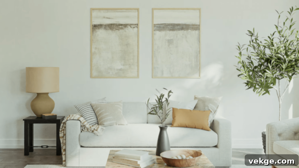
Sherwin-Williams Sea Salt (SW 6204) is a truly iconic hue, beloved for its ability to bring a soothing, coastal-inspired vibe into any home. This delicate blend of green and blue, with faint gray undertones, creates an instantly calming atmosphere that feels both serene and refreshing. It’s a go-to choice for spaces where tranquility is paramount, such as master bathrooms, powder rooms, and bedrooms, turning them into spa-like retreats. Sea Salt adapts beautifully to different lighting conditions, often appearing more green in natural light and leaning slightly bluer in artificial light or cooler-lit rooms.
This chameleon-like shade pairs exceptionally well with crisp white trim, sandy beige accents, and natural wood furniture, helping you build a cohesive and relaxing environment. Consider using it in a guest room or a sunroom to evoke a breezy, laid-back feel. For a cohesive look, integrate soft textures like linen and cotton, and perhaps add some natural elements like seagrass or light-colored pottery. Its subtle nature ensures it won’t overwhelm your space, making it perfect for those seeking a gentle pop of color.
2. Sherwin-Williams Rainwashed (SW 6211)
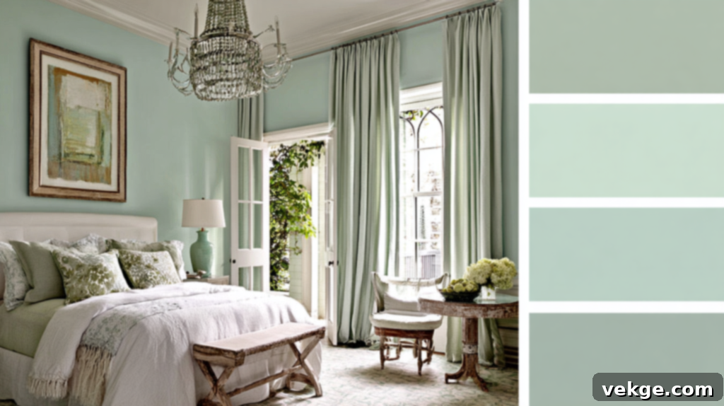
Sherwin-Williams Rainwashed (SW 6211) offers another gentle yet distinctly refreshing green hue that carries cool blue and subtle gray undertones. This makes it an excellent fit for spaces that receive abundant natural light, such as living rooms, sun-filled home offices, or open-concept areas. It’s a color that feels soft enough to act as a neutral backdrop, yet it provides a delightful and invigorating pop of color that awakens the senses without being overpowering.
Rainwashed is perfect for creating a clean, coastal, or subtly modern aesthetic. It pairs beautifully with warm wood tones, such as natural oak or maple, which bring out its warmth, or with crisp whites and light grays for a more contemporary and airy feel. Imagine it in a kitchen with white cabinetry or in a family room with light-colored upholstery. Its ability to shift subtly between green and blue depending on the light adds depth and interest, ensuring your walls are never boring but always inviting. This shade is particularly effective in spaces where you want to promote focus and calm, making it a stellar choice for a productive yet peaceful home office.
3. Sherwin-Williams Softened Green (SW 6177)
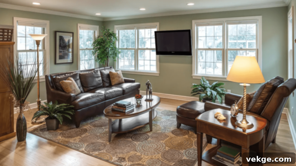
Sherwin-Williams Softened Green (SW 6177) is precisely what its name implies: a muted, peaceful shade of green that adds a subtle wash of color without ever feeling too bold or demanding attention. Its understated elegance makes it an ideal choice for living rooms, kitchens, or any area where you wish to cultivate a calm, welcoming, and relaxed atmosphere. This particular green leans into the sage family, giving it a timeless appeal that blends effortlessly with various decor styles.
What makes Softened Green so versatile are its balanced, neutral undertones, which allow it to harmonize beautifully with a wide range of complementary elements. It looks stunning when paired with warm wood finishes, from light maple to rich walnut, enhancing its organic appeal. Crisp whites provide a clean contrast, while brass or brushed gold finishes can introduce a touch of sophistication and warmth. This flexibility makes it a designer favorite for creating foundational backdrops that can be easily updated with accessories and textiles. Whether you’re aiming for a farmhouse chic, transitional, or even a Scandinavian-inspired interior, Softened Green provides a perfect, understated base.
Mid-Tone Greens: Balanced and Versatile
Mid-tone greens strike the perfect balance between the lightness of airy shades and the depth of darker hues. They offer a comfortable and grounding presence that works exceptionally well in almost any room, adapting beautifully to different lighting conditions. These greens provide enough color to make a statement without overwhelming the space, making them incredibly versatile for various design aesthetics.
4. Benjamin Moore October Mist (1495)
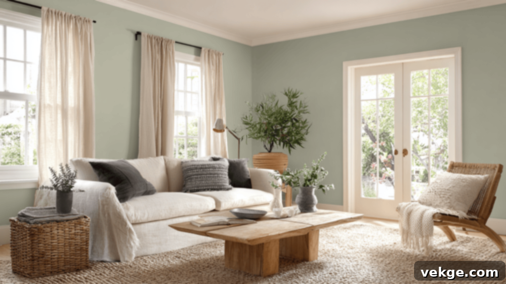
Benjamin Moore October Mist (1495) was famously chosen as Benjamin Moore’s Color of the Year in 2022, and for good reason. This exquisite sage green effortlessly blends into almost any setting, offering a soft, earthy, and truly natural feel. It’s a sophisticated yet approachable hue that brings a sense of grounded tranquility to living rooms, bedrooms, hallways, and even dining areas. Its slightly desaturated quality means it functions beautifully as a neutral, providing color without competing with other elements in the room.
This versatile shade adds a cozy, yet light and airy tone, creating an inviting atmosphere that encourages relaxation and connection with nature. Pair it with warm creams, soft grays, or natural linen textiles for a serene and understated look. October Mist also shines alongside raw wood finishes, antique brass, or simple black accents, showcasing its ability to adapt to both traditional and modern decor. It’s particularly effective in spaces where you want to foster a sense of calm creativity, making it a wonderful choice for an artist’s studio or a reading nook.
5. Sherwin-Williams Evergreen Fog (SW 9130)
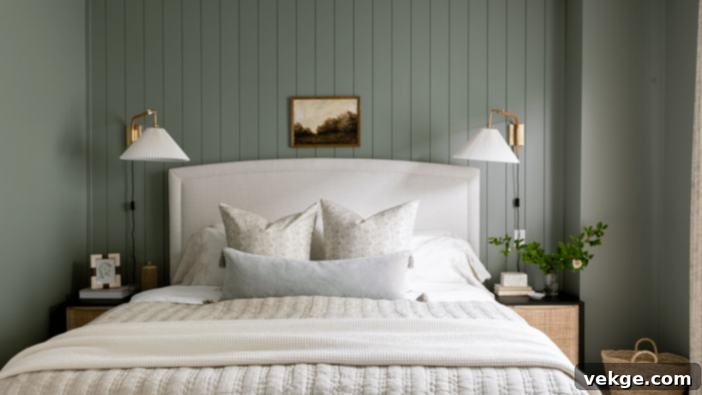
Sherwin-Williams Evergreen Fog (SW 9130), another former Color of the Year, is a captivating green-gray shade that masterfully strikes a balance between cozy warmth and subtle vibrancy. It’s bold enough to make a distinctive statement on your walls yet soft enough to seamlessly blend with existing decor and furniture. This sophisticated hue draws inspiration from nature, offering a grounded and organic feel that can instantly elevate the ambiance of a room.
Evergreen Fog is particularly well-suited for home offices, bathrooms, and even kitchen cabinetry, where it can provide a calming backdrop with a contemporary edge. It looks exceptionally stylish when paired with matte black accents, such as light fixtures or cabinet hardware, which enhance its modern appeal. Light wood finishes, such as birch or ash, also complement its natural undertones beautifully, creating a harmonious and serene environment. Consider incorporating plants and natural textures to further enhance its organic charm. Its ability to feel both classic and modern makes it a highly adaptable choice for various interior design schemes.
6. Benjamin Moore Cushing Green (HC-125)
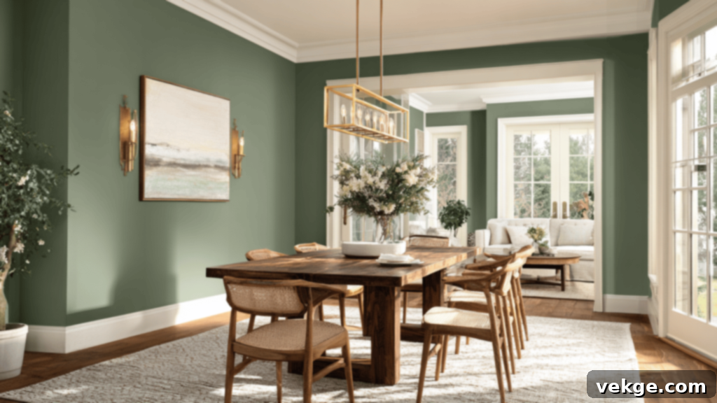
Benjamin Moore Cushing Green (HC-125) is a wonderfully rich and muted green that exudes a quiet sophistication. Part of Benjamin Moore’s Historical Collection, this shade possesses a timeless quality that feels both traditional and current. It makes a strong yet refined statement in spaces where you desire a touch of classic style and depth, such as formal dining rooms, welcoming entryways, or cozy libraries and studies. This deeper mid-tone green provides warmth without ever feeling overpowering, creating an intimate and inviting atmosphere.
Cushing Green works beautifully with a variety of finishes and materials. It pairs elegantly with polished brass hardware, bringing out its inherent richness, and contrasts stunningly with dark wood furniture, such as mahogany or cherry, for a truly luxurious feel. For a fresh, bright contrast, consider crisp creamy white trim. The depth of Cushing Green allows it to be a focal point, grounding the room and providing a sophisticated backdrop for artwork or decorative pieces. It’s a color that speaks of heritage and comfort, ideal for creating spaces with enduring appeal.
Dark & Moody Greens: Bold and Dramatic
Dark greens possess a unique ability to transform any room into a cozy, luxurious haven. These rich, deep shades add significant depth, character, and drama, making them perfect for creating accent walls, enveloping an entire large space, or adding a touch of bold elegance. They evoke feelings of security, comfort, and connection to lush natural landscapes.
7. Sherwin-Williams Pewter Green (SW 6208)

Sherwin-Williams Pewter Green (SW 6208) is a sophisticated dark gray-green that offers an incredible sense of depth and understated character. It’s an ideal choice for rooms that crave richness and a somewhat brooding elegance, such as dedicated home offices, libraries, or intimate dens where you want to create a sense of focus and comfort. This moody yet refined tone makes it feel both classic and distinctly modern, allowing it to bridge various design eras with ease.
Pewter Green truly shines when paired with complementary textures and materials. Imagine it as a backdrop for luxurious leather furniture, which enhances its refined feel, or alongside warm wood accents like a reclaimed wood mantel or bookshelf. Crisp white trim provides a sharp, clean contrast that highlights its depth. For a touch of contemporary flair, consider matte black hardware or sleek, metallic finishes. This color is also excellent for creating a dramatic accent wall in a larger living space or as the primary color in a powder room, instantly adding a high-end, bespoke feel.
8. Sherwin-Williams Retreat (SW 6207)
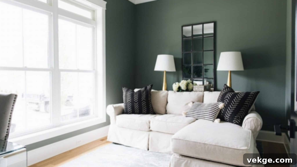
Sherwin-Williams Retreat (SW 6207) is a beautifully earthy green, imbued with warm undertones that immediately evoke a sense of grounding and peacefulness. This inviting shade feels like a comforting embrace, making it an excellent choice for bedrooms where relaxation is key, or in larger living rooms where you aim to create a cozy, pulled-together, and cohesive look. It’s a color that deeply connects with nature, fostering a serene environment that encourages unwinding.
To truly bring out the best in Retreat, try pairing it with an array of natural textures. Think rattan furniture, jute rugs, woven baskets, or various wood finishes, which enhance its organic, laid-back appeal. These elements combine to create a nature-inspired design that feels both modern and timeless. Gold or brass accents can introduce a touch of warmth and luxury, while soft creams and off-whites on trim or upholstery will provide a gentle contrast. Retreat is particularly effective in spaces with ample natural light, where its warm undertones can truly glow, creating a welcoming and sophisticated sanctuary.
9. Farrow & Ball Calke Green (No. 34)
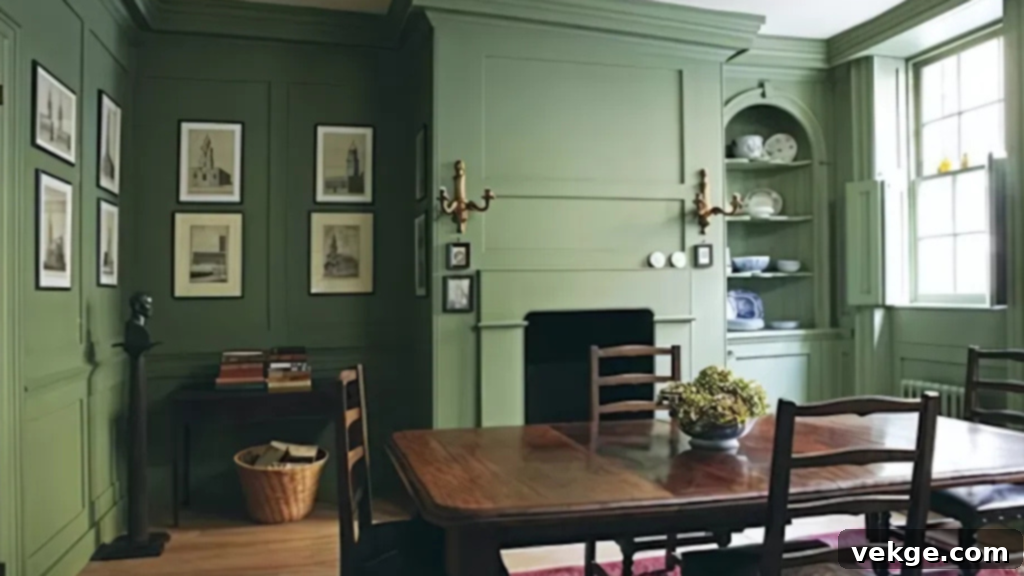
Farrow & Ball Calke Green (No. 34) is a profoundly deep, almost forest-like green that carries an undeniable old-world charm and a luxurious feel. This bold and dramatic shade is ideal for making a significant statement, whether you’re creating a standout feature wall or looking to anchor a room with vintage or traditional decor. Its rich pigment and velvety finish, characteristic of Farrow & Ball paints, add an incredible depth that shifts beautifully with the light, offering a dynamic visual experience.
Calke Green looks especially opulent in formal dining rooms, grand studies, or libraries, where it can create an enveloping, intimate atmosphere. It pairs exquisitely with warm metallics, such as antique bronze or aged brass, which enhance its historical richness. Incorporate antique accents, dark wood furniture (like a mahogany dining table or a walnut bookshelf), and plush fabrics like velvet for a truly magnificent setting. For a striking contrast, use it with a deep cream or even a very light, desaturated pink. This color is for those who aren’t afraid to embrace drama and sophistication in their home decor.
10. Benjamin Moore Great Barrington Green (HC-122)
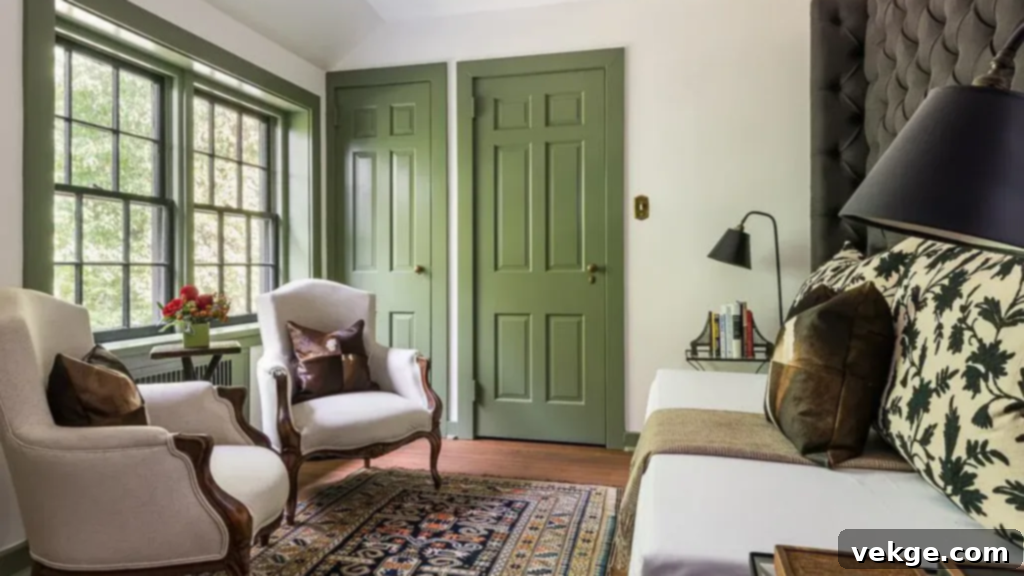
Benjamin Moore Great Barrington Green (HC-122) is a strong, cool-toned dark green that introduces a fresh, contemporary edge to any room. Unlike some warmer dark greens, this shade has a crispness that adds depth without feeling heavy or oppressive, making it surprisingly versatile. It’s a superb choice for home offices where focus is key, sophisticated living rooms that crave a modern touch, or as a commanding accent wall that anchors an open space.
To balance its bold look with a clean, contemporary feel, pair Great Barrington Green with light woods like natural maple or white oak. Matte black finishes—on hardware, lighting, or furniture—create a sleek, sophisticated contrast. Soft neutrals, such as off-whites, grays, or even blush pinks, can help soften its intensity and add visual interest. This green also works well in spaces with natural light, where its cool undertones can truly pop, creating a dynamic and invigorating atmosphere. It’s a fantastic choice for those looking to infuse their home with a touch of modern drama and natural elegance.
11. Sherwin-Williams Clary Sage (SW 6178)
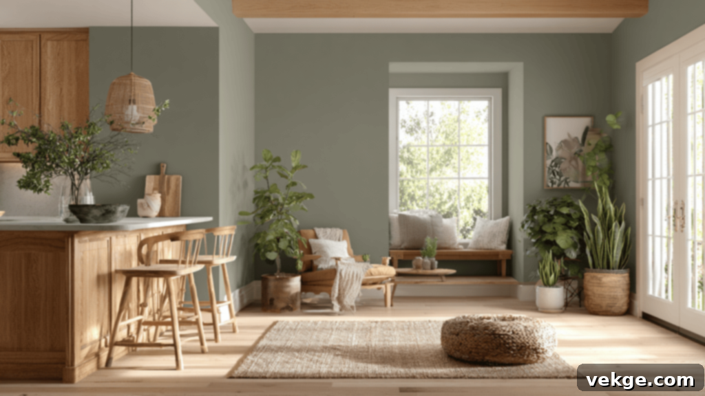
Sherwin-Williams Clary Sage (SW 6178) is a wonderfully soft, earthy green distinguished by its comforting warm undertones. This harmonious shade brings an immediate sense of calm and tranquility to any room, making it incredibly easy to live with and appreciate daily. It’s perfectly suited for kitchens, bedrooms, cozy reading nooks, or even an inviting entryway, especially when paired with other warm neutrals or natural wood finishes.
Clary Sage offers just the right touch of subtle color, enriching a space without ever feeling overwhelming. Its gentle nature makes it an excellent choice for creating a serene and grounded atmosphere. Consider using it in a kitchen with cream-colored cabinetry for a classic, inviting feel, or in a bedroom alongside linen bedding and light-colored furniture for a truly restful sanctuary. This versatile green harmonizes with various decor styles, from rustic and farmhouse to transitional and modern organic, proving that subtle can indeed be powerful. It’s a shade that fosters well-being and a gentle connection to the natural world.
12. Sherwin-Williams Rosemary (SW 6187)
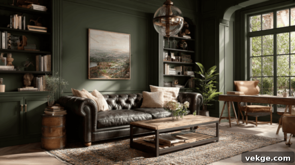
Sherwin-Williams Rosemary (SW 6187) is a deep, herbal green that effortlessly adds richness, sophistication, and undeniable style to your space. Its bold, yet organic tone makes it a standout choice for creating dramatic feature walls, painting kitchen or bathroom cabinetry, or enveloping a moody bedroom in a cocoon of color. Inspired by the aromatic herb, this shade brings a grounding and mature presence to interiors.
When paired thoughtfully, Rosemary truly comes alive. It creates a striking and sophisticated look with brass fixtures or other warm metallics. Leather furniture and dark wood elements, such as a substantial dining table or antique chest, enhance its grounded and organic feel. For contrast, consider crisp white trim or soft, creamy neutrals on adjoining walls or textiles. This versatile green works wonderfully across a range of styles, from rustic and modern farmhouse to traditional and even contemporary, proving that a deep, natural hue can be both elegant and inviting. It’s a color that makes a confident statement without being overtly flashy.
13. Sherwin-Williams Soft Sage (SW 9647)
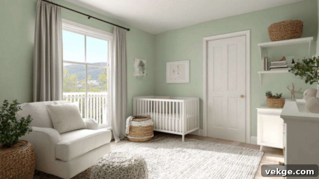
Sherwin-Williams Soft Sage (SW 9647) perfectly lives up to its name, offering a light, gentle green that achieves a beautiful dual effect: it simultaneously brightens a space while instilling a profound sense of calm. This airy and delicate hue is an ideal choice for rooms where a subtle wash of color is all that’s needed to enhance the atmosphere. It’s particularly well-suited for bathrooms, narrow hallways, or serene nurseries, where its unobtrusive charm can truly shine.
Soft Sage is incredibly versatile in its ability to pair with other colors and textures. It creates a wonderfully clean and fresh look when combined with crisp whites, creamy off-whites, or soft grays on trim, ceilings, or complementary furnishings. These pairings enhance its tranquil qualities, making any space feel more open and peaceful. Its subtle green tint adds just enough character to prevent a room from feeling sterile, yet it remains neutral enough to accommodate almost any decor style. For a truly cohesive and serene environment, consider incorporating natural light wood finishes and simple, minimalist accessories. Soft Sage is the epitome of understated elegance and quiet sophistication.
Green Paint Combinations: What Pairs Well with Green
Understanding how to pair green paint with other colors, textures, and finishes is key to unlocking its full potential and completely transforming the mood of a room. Green’s natural versatility allows it to harmonize with a wide array of palettes. Here are a few tried-and-true combinations that consistently bring out the best in green paint, creating balanced and visually appealing spaces:
- Green and White: This combination is the quintessential classic—clean, fresh, and utterly timeless. White acts as a crisp counterpart to green, making the green hues pop and feel more vibrant, regardless of whether it’s a light or dark shade. This pairing is especially effective in kitchens, bathrooms, and any space that benefits from an airy, bright aesthetic and abundant natural light. White trim, ceilings, and even white furniture can create a striking contrast that keeps the room feeling light and expansive.
- Green and Natural Wood: For an inherently warm, earthy, and organic feel, pairing green with natural wood tones is an unbeatable choice. The rich textures and varying hues of wood—from light oak to deep walnut—complement green’s natural origins, making green walls feel instantly cozier and more grounded. This works beautifully with wood floors, exposed beams, wooden furniture, or even wooden accent pieces. It’s a combination that evokes the serene beauty of a forest, promoting a sense of calm and connection to nature.
- Green and Gold or Brass: To infuse a touch of glam, luxury, and sophistication into your green-painted room, incorporate elements of gold or brass. These warm metallics create a beautiful contrast with green, adding a sense of richness and elegance. This pairing is perfect for light fixtures, decorative mirrors, cabinet hardware, or even subtle accent pieces in living rooms, dining rooms, or bedrooms. The metallic sheen can elevate even the simplest green shade, making the space feel more refined and opulent.
- Green and Soft Neutrals (Beige, Cream, Gray): For an atmosphere that is truly calm, relaxing, and effortlessly chic, combine green with soft neutral tones like beige, cream, or light gray. These gentle shades provide a subtle backdrop that allows the green to stand out without feeling overly bold or saturated. This combination is particularly excellent for bedrooms, reading nooks, or any area where you desire a serene and understated elegance. Soft neutrals can be used on upholstery, curtains, rugs, or as the color for adjacent walls, ensuring a harmonious flow and a comfortable, inviting feel.
Whether you’re aiming for a cozy cottage feel, a sophisticated classic look, or a hint of modern glam, these thoughtful color pairings will ensure your green walls feel balanced, intentional, and beautifully integrated into any space within your home.
Where to Get Peel-And-Stick Samples
Before committing to painting an entire room, testing paint colors in your actual space is absolutely crucial. Lighting conditions, existing furniture, and surrounding elements can drastically change how a color appears. Peel-and-stick paint samples are a game-changer for this process, offering a mess-free and accurate way to preview colors. Here are a few reliable places where you can easily find peel-and-stick paint samples to test various green shades in your space:
- Sherwin-Williams & Benjamin Moore: Both of these leading paint brands offer convenient peel-and-stick samples directly from their websites. This allows you to easily order specific green shades you’re considering and test them in different lighting conditions throughout the day before making a significant commitment.
- Samplize: A highly popular and highly recommended site, Samplize specializes in large (typically 9×12 inch) peel-and-stick samples. They carry an extensive selection of colors from major brands like Sherwin-Williams, Benjamin Moore, and Behr, providing a realistic representation of the paint color without the need for small, messy paint pots.
- Home Depot & Lowe’s: These major home improvement retailers also offer a wide variety of peel-and-stick samples for various green paint colors from different brands they stock. Checking their online stores or visiting in person can make it easy to grab a few samples to test at home, comparing them against your existing decor.
Taking the time to test samples will save you from potential regret and ensure you select the perfect green that truly enhances your home.
Eco-Friendly Green Paint Options for a Healthier Home
If you’re looking to choose a green paint color that is not only easy on the eyes but also kind to the environment and, more importantly, to your health, you’ll be pleased to know there are plenty of excellent eco-friendly choices available on the market today. Opting for greener paint options contributes to better indoor air quality and reduces your ecological footprint.
The key factor to look for is low-VOC (Volatile Organic Compound) or, even better, zero-VOC paints. VOCs are harmful chemicals released into the air as paint dries, contributing to strong odors and potentially causing health issues like headaches, nausea, and respiratory problems. By choosing paints with reduced or eliminated VOCs, you’re creating a healthier living environment for yourself and your family.
Many reputable brands now offer robust eco-friendly lines:
- Benjamin Moore’s Natura and Eco Spec lines are well-regarded zero-VOC options that are also allergy-friendly, making them perfect for sensitive individuals or children’s rooms.
- Sherwin-Williams Harmony is another fantastic zero-VOC paint that goes a step further by helping to reduce common household odors, ensuring your home smells fresh and clean.
- For a more budget-friendly yet still conscious choice, Behr Premium Plus offers a low-VOC paint option available at major retailers.
- Brands like Clare and ECOS Paints specialize in designer-quality, non-toxic, and truly zero-VOC paints, often using plant-based ingredients for a minimal environmental impact.
When selecting your green shade, rest assured that you won’t have to compromise on color or performance with these safer formulations. Many of the popular colors mentioned earlier, such as Benjamin Moore’s October Mist, Sherwin-Williams Sea Salt, or Evergreen Fog, are available in low-VOC or zero-VOC versions. This means you can achieve your desired aesthetic while upholding your commitment to health and sustainability.
Beyond the paint itself, consider other aspects of your project for an even more eco-friendly approach: use recycled paint trays and drop cloths, ensure proper ventilation in the room by opening windows and using fans, and always dispose of leftover paint responsibly at designated hazardous waste facilities. Going green with your walls genuinely doesn’t mean you have to sacrifice style, durability, or, most importantly, your family’s health.
Conclusion
Embarking on a journey to transform your home with green paint colors can be an incredibly rewarding experience. Now that you’ve explored some of the best green wall paint colors for every room, from the tranquil whispers of light sage to the dramatic depths of forest green, you’re well-equipped with a wealth of ideas to start planning your space.
Remember to consider the key elements that will influence your final choice: the overall mood you wish to create, the amount and direction of natural light the room receives, and how the chosen green tones will harmonize with your existing furniture and decor. My strongest recommendation is always to test a few large peel-and-stick samples on your walls and observe them throughout the day. This simple step can prevent costly mistakes and ensure you truly love the color in your unique environment. Furthermore, whenever possible, prioritize eco-friendly paint options for a healthier home that benefits both your family and the planet.
Whether you ultimately choose something soft and subtle to create a peaceful sanctuary or a rich and dramatic shade to make a bold statement, green paint will consistently infuse your home with a fresh, inviting, and naturally grounded feel. It’s a color that timelessly connects us to the serenity of the outdoors, offering endless possibilities for personal expression in your interior design.
Ready to dive deeper and explore more creative ideas for your next home improvement project? Don’t hesitate to explore my other blogs on the website for additional color inspiration, detailed paint comparisons, and practical tips that will help your home feel just right, reflecting your unique style and needs.
