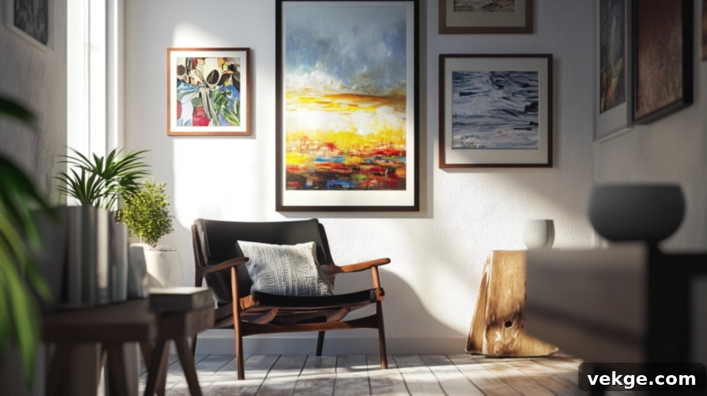
Mastering Gallery Wall Spacing: Your Complete Guide to Flawless Art & Photo Layouts
Are you eager to display your cherished photos and artwork but feel intimidated by the challenge of achieving perfect spacing and a cohesive layout? Creating a stunning gallery wall can dramatically enhance your living space, but its success hinges on careful planning and precise execution of spacing and arrangement principles.
This comprehensive guide will demystify the art of hanging pictures and art prints, providing you with fundamental techniques to create a visually appealing and well-balanced display. You’ll learn the optimal distances to maintain between pieces, how to effectively plan your layout before making a single hole, and the essential tools required to achieve professional-looking results.
Whether your collection consists of sentimental family photographs, sophisticated art prints, vibrant posters, or a thoughtful mix of various decorative items, this guide will equip you with the knowledge to assemble them into a clean, organized, and impactful gallery wall. Get ready to transform your walls into a captivating focal point that reflects your personal style and brings your space to life through proper spacing and thoughtful arrangement.
What is a Gallery Wall and Why Does Spacing Matter So Much?
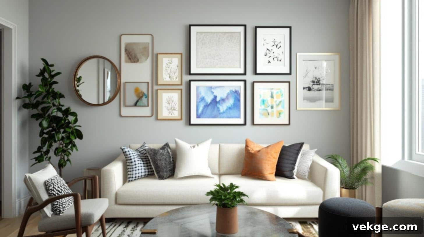
A gallery wall is more than just a collection of items on your wall; it’s a curated display of framed art, photographs, prints, or other decorative elements thoughtfully arranged to create a single, cohesive focal point in any room. When executed correctly, a gallery wall tells a story, adds personality, and significantly elevates your interior design. The magic truly happens when good spacing transforms a disparate collection into a unified, planned, and sophisticated visual statement, rather than a cluttered or haphazard assembly.
Defining the Elements of a Dynamic Gallery Wall
A successful gallery wall brings together a variety of framed items and objects to form a harmonious display. These often include:
- Framed photographs: Personal memories, family portraits, travel snapshots.
- Art prints: Posters, lithographs, digital art, or original paintings.
- Personal mementos: Shadow boxes with souvenirs, children’s artwork, postcards.
- Wall decor accents: Decorative plates, woven baskets, small sculptures.
- Mirrors: Adding depth, light, and a touch of elegance.
- Small decorative objects: Clocks, small shelves, or other unique finds.
The beauty of a gallery wall lies in its versatility. You can mix and match styles, sizes, and textures to create a truly unique reflection of your taste.
The Critical Role of Proper Spacing in Gallery Wall Design
While the choice of items is important, the space between them is paramount. The right spacing transforms a collection of individual pieces into a well-planned and visually appealing unit. Good spacing achieves several key objectives:
- Enhances readability: Each piece gets enough room to be appreciated without competing with its neighbors.
- Creates visual balance: Prevents the wall from looking too heavy or too sparse in any one area.
- Guides the viewer’s eye: Allows observers to focus on the art and the overall composition without distraction.
- Fosters an organized aesthetic: Makes the entire display look intentional, neat, and professionally curated.
- Prevents visual clutter: Ensures that even a dense collection feels comfortable and inviting, not overwhelming.
Common Gallery Wall Spacing Mistakes to Actively Avoid
Many aspiring gallery wall designers encounter common pitfalls that can detract from the overall impact. Being aware of these errors can help you sidestep them:
- Frames too close together: This is a common mistake that makes the wall feel cramped and overwhelming, preventing individual pieces from standing out.
- Uneven gaps between pieces: Inconsistent spacing creates a chaotic and unprofessional look, regardless of how beautiful the art itself is.
- Neglecting to plan the layout first: Jumping straight to hanging without a preliminary plan almost always leads to costly re-dos and frustration.
- Display too large or too small for the wall: A gallery wall should be proportionate to the wall it occupies, complementing the space rather than dominating or getting lost in it.
- Failing to measure before hanging: Eyeballing distances is a recipe for disaster; precise measurements are crucial for a polished result.
Understanding Frame Spacing: How Much Space Between Frames is Ideal?
Achieving the perfect gap between your framed pieces is the cornerstone of a polished and harmonious gallery wall display. Let’s delve into the fundamental rules and aesthetic considerations for frame spacing that yield excellent results in most home environments.
General Guidelines for Optimal Frame Spacing
The widely accepted “sweet spot” for spacing frames in a gallery wall is typically between 2 to 3 inches. This range is not arbitrary; it’s a carefully balanced distance that allows each piece to “breathe” and stand on its own, while simultaneously ensuring the entire collection looks connected and unified as a single visual entity. To fine-tune this guideline, consider the following:
- Small rooms or narrow walls: In more intimate spaces, leaning closer to a 2-inch gap provides a clean, streamlined look that avoids overwhelming the area. It keeps the collection feeling tight and cohesive.
- Large walls or expansive rooms: For bigger walls, you can extend the spacing up to 3 inches or even slightly more (3.5 inches in very grand spaces). This helps fill the larger canvas effectively without making the display appear sparse or disconnected.
- Room style and aesthetic: The overall feel of your room can influence your spacing choice. A minimalist or contemporary space might benefit from slightly wider, more deliberate gaps, while a cozy, eclectic, or bohemian room might embrace slightly tighter spacing for a layered effect.
Symmetrical vs. Asymmetrical Layouts: Does Spacing Differ?
The type of layout you choose can subtly influence your spacing strategy:
- Symmetrical Layouts: These layouts demand consistent, uniform spacing between all pieces. This approach is ideal when you desire:
- A formal, highly structured, and orderly appearance.
- Equal visual emphasis on each piece within a grid or linear arrangement.
- An arrangement that is straightforward to plan and execute, relying on precise measurements.
- Asymmetrical Layouts: These more dynamic layouts allow for slight variations in spacing between items, though the goal is still visual balance, not randomness. This works best when you seek:
- A more casual, organic, or eclectic feel.
- The freedom to add new pieces over time without disrupting a rigid structure.
- A mix of different-sized items, where a central “anchor” piece might have slightly more space around it, for example.
Frame Size Matters: Adjusting Space for Larger or Smaller Frames
The size of your individual frames plays a crucial role in determining appropriate spacing. Larger frames naturally require more visual “breathing room” than smaller ones. Here’s how to adjust your gaps:
- For large frames (typically over 16×20 inches): Consider expanding your gaps to 3-4 inches. This prevents large pieces from feeling cramped and allows their scale to be fully appreciated.
- For medium frames (around 11×14 inches to 16×20 inches): Stick to the general guideline of 2-3 inch gaps. This provides ample space without making the collection feel too spread out.
- For small frames (8×10 inches or less): You can tighten the spacing slightly to 1.5-2 inch gaps. Smaller pieces often look better when grouped a bit more closely, creating a miniature cluster within the larger gallery.
When mixing frame sizes within a single gallery wall, a common scenario, here’s a practical approach:
- Group similar-sized frames: Try to cluster pieces of comparable dimensions together to create mini-sections within the larger display.
- Establish a base spacing: Start with a consistent medium spacing (e.g., 2.5 inches) as your default.
- Adjust visually: From across the room, assess if larger pieces need a bit more space, or smaller clusters could benefit from being slightly closer. The goal is visual harmony, even with varied frame sizes.
How to Plan and Arrange a Gallery Wall Layout with Confidence
The key to a successful wall display lies in meticulous planning and a systematic approach. This section will guide you through each step, from selecting the ideal location to ensuring every piece is perfectly aligned.
Step-by-Step Process for Designing Your Dream Gallery Wall
1. Select Your Perfect Wall
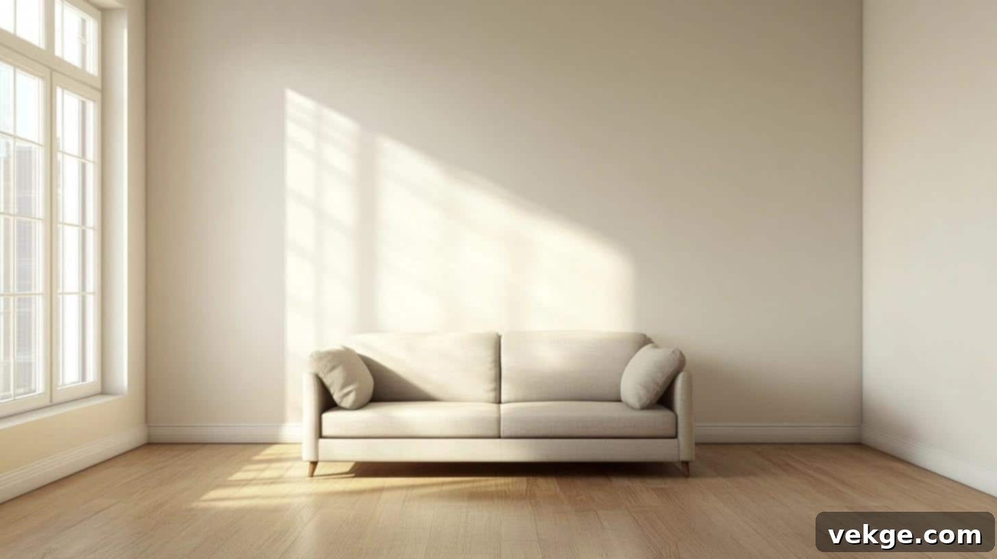
The chosen wall is your canvas. Make sure it sets the stage for your art:
- Opt for an unobstructed wall: Look for a wall free from windows, large furniture (other than what it will hang above), or dominant architectural features that might compete with your display.
- Assess lighting conditions: Good natural or artificial lighting is essential to showcase your art. Avoid walls with direct, harsh sunlight that could fade artwork or create glare.
- Consider sightlines: Choose a wall that is easily visible from key vantage points in the room, making it a natural focal point.
2. Strategize Your Layout and Collection Size
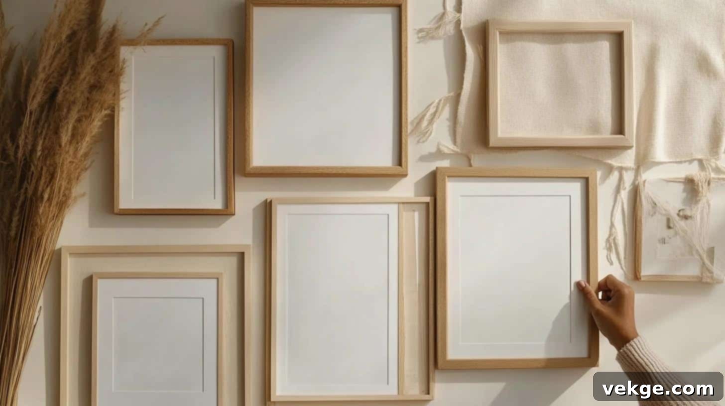
Before you even think about hanging, plan the scope and composition of your gallery:
- Curate your collection: Gather all the frames, art, and objects you intend to include. Consider themes, color palettes, or frame styles that will tie them together.
- Determine the right number of pieces: For a smaller wall, starting with 5-7 pieces creates a balanced yet impactful display. For larger walls, you can incorporate more, but always aim for cohesion over sheer volume.
- Allow for future expansion: If you plan to add to your collection over time, design your initial layout with some flexibility, perhaps leaving a bit more breathing room on the periphery.
3. Test Your Layout Thoroughly on the Floor (or with Templates)

This crucial step allows you to visualize and refine your arrangement without commitment:
- Arrange on the floor: Lay all your framed pieces on the floor, mirroring the dimensions of your wall space.
- Experiment with different configurations: Try various symmetrical, asymmetrical, or organic setups. Move pieces around, swap positions, and adjust spacing until you find a composition that feels right.
- Document your options: Take photos of each successful arrangement. This allows you to compare layouts side-by-side and revisit options.
- Step back and observe: View your floor layout from a distance, mimicking how it would appear on the wall. This helps identify any imbalances or awkward spacing.
Leveraging Templates and Essential Tools for Layout Precision
Once you have a floor plan you love, it’s time to transfer it to the wall with accuracy.
Create Paper Templates for Damage-Free Planning:
- Trace and cut: Cut pieces of kraft paper, newspaper, or wrapping paper to the exact size and shape of each frame.
- Mark hanging points: On each paper template, accurately mark where the nail or hook will need to go (this is usually the center of the hanging hardware on the back of the frame).
- Tape to the wall: Use painter’s tape to stick these paper templates onto your chosen wall, replicating your floor layout. This allows for final adjustments without any holes.
- Visualize and refine: Live with the paper templates for a day or two. Walk past them, observe from different angles, and make any last-minute adjustments to spacing or alignment. Mark the nail holes directly through the paper template.
Indispensable Tools for a Flawless Gallery Wall:
- Measuring tape: For precise spacing between frames and from furniture/ceiling/floor.
- Level (spirit or laser): Absolutely critical for ensuring every frame hangs perfectly straight.
- Pencil: For marking nail holes and temporary alignment guides on the wall or templates.
- Ruler: Useful for smaller, more detailed measurements and drawing straight lines.
- Hammer and nails (or appropriate hanging hardware): Depending on your frame weight and wall type.
- Painter’s tape: For temporarily securing templates and creating guide lines on the wall without damaging paint.
Symmetry and Alignment Tips for Flawless Results
Achieving a professional-looking gallery wall boils down to careful alignment and a keen eye for visual balance.
Ensuring Everything Hangs Straight and Even:
- Establish a central anchor: For most layouts, begin by identifying a central point on your wall or a primary anchor piece around which other frames will radiate.
- Work outwards from the center: Once your anchor is placed (or its position marked), expand your layout outwards, systematically adding pieces and checking their relationship to the center.
- Maintain eye level: A general rule is to place the center of your primary art or the entire gallery wall at eye level for an average person (approximately 57-60 inches from the floor).
- Verify horizontal alignment: Use your level religiously to ensure all frames in a row are perfectly horizontal.
- Check vertical alignment: If creating columns, ensure the sides of frames align vertically. When hanging above furniture, ensure the bottom edge of the lowest frames is consistent.
Creating a Cohesive and Harmonious Display:
- Group similar items thoughtfully: Consider grouping frames of similar styles, colors, or subject matter together to create mini-themes within your larger gallery.
- Balance visual weight: Place heavier, larger pieces closer to the center or bottom of your arrangement to ground the display. Distribute smaller pieces evenly around them.
- Consistent spacing is key: Even in asymmetrical layouts, strive for consistent spacing between pieces that are close to each other. Vary spacing only when it serves a deliberate design purpose.
- Regularly step back: Periodically step across the room to gain perspective. What looks good up close might reveal imbalances from a distance.
- Address perceived imperfections: If a section looks “off,” trust your eye. It’s often easier to fix minor alignment or spacing issues during the planning stage than after holes are drilled.
Gallery Wall Design Rules and Best Practices
To truly elevate your gallery wall from a simple collection to a curated masterpiece, understanding a few fundamental design rules and best practices is essential. These guidelines will help you avoid common pitfalls and create a layout that feels intentional, balanced, and professionally arranged.
The 2/3 Rule: A Powerful Guideline for Layout Balance
The “2/3 Rule” is an invaluable principle for achieving proportionality and balance in your gallery wall. It suggests that your art display should comfortably occupy roughly two-thirds of the available wall space, leaving the remaining one-third as negative space. This empty space acts as a natural border, allowing your display to stand out without feeling cramped or overwhelming the wall.
Understanding and Applying the Rule:
- Fill the canvas thoughtfully: Aim to have your gallery wall take up approximately 60-70% of the visible wall area. This creates a pleasing visual density.
- Frame your display naturally: The empty space around the edges of your gallery wall helps to define its boundaries and makes the entire arrangement look intentional and well-composed.
- Practical application on different walls:
- For a large, empty wall (e.g., 10 feet wide): Plan your display to span roughly 6 to 7 feet in width, leaving 1.5 to 2 feet of clear wall space on either side.
- Above furniture (e.g., a sofa): Your gallery wall’s width should ideally be about two-thirds to three-quarters the width of the furniture piece it sits above. This creates a harmonious relationship between the art and the furniture.
- Vertical spacing: Ensure your display stops roughly 8-12 inches from the ceiling (or crown molding) to prevent it from looking like it’s touching the sky. Also, leave adequate space above furniture, typically 6-8 inches from the top of the sofa or console.
Tips for Effectively Using the 2/3 Rule:
- Measure your wall space first: Before laying out frames, measure the total width and height of your chosen wall section. Calculate 2/3 of these dimensions.
- Mark the boundaries: Use painter’s tape to create a temporary rectangle on the wall that represents your 2/3 area. This visual guide helps keep all your frames within the intended zone.
- Work within the frame: Ensure all your frames, once spaced, fit comfortably within these marked boundaries.
Crucial Mistakes to Avoid When Designing a Gallery Wall
Even with good intentions, several design missteps can diminish the impact of your gallery wall. Being aware of these common errors can save you time and frustration.
1. The “Too Many Frames” Trap: Overcrowding Your Space
- Stick to a manageable number: Select a number of pieces that genuinely fit your wall size and the desired aesthetic. Less is often more.
- Ruthlessly edit your collection: If your wall looks overly busy or chaotic, be prepared to remove some pieces. Not every piece you own needs to be on display simultaneously.
- Prioritize breathing room: Ensure there’s enough negative space around each item so it can be appreciated individually, preventing a “visual noise” effect.
2. Incorrect Spacing Problems: The Visual Disconnect
- Uneven gaps: This is a primary culprit for a messy, unprofessional-looking gallery wall. Inconsistent spacing creates jarring visual disruptions.
- Gaps too wide: Excessive space between frames can make the individual pieces appear disconnected and isolated, destroying the “gallery” effect and making the wall look sparse.
- Gaps too narrow: Frames crammed too tightly together result in a cramped, claustrophobic feeling, making it difficult to discern individual pieces and creating visual confusion.
3. Poor Alignment Issues: The Crooked Truth
- Frames at different heights: Even slight variations in height can create a lopsided, unbalanced, and amateurish appearance.
- Lack of uniform lines: If frames intended to line up (e.g., along a top or bottom edge) are misaligned, it immediately draws the eye to the imperfection.
- Crooked frames: A single crooked frame can undermine the entire display, making the whole wall look unkempt and poorly executed.
Quick Fixes and Prevention for Design Flaws:
- Always use a level: Invest in a good quality level (spirit or laser) and use it for every single frame you hang.
- Double-check measurements: Measure twice, cut (or nail) once! Verify all your spacing and alignment marks before committing to a hole.
- Step back regularly: Consistently step away from the wall during the hanging process to view the overall composition from a distance.
- Correct issues immediately: If you spot a spacing or alignment problem, fix it before proceeding. It’s much easier to adjust one or two frames than to overhaul an entire wall.
Visual Inspiration for Stunning Gallery Wall Layouts
To help visualize these principles in action, let’s explore various popular gallery wall layouts and understand how spacing plays a crucial role in each style. These examples offer practical insights into transforming your space.
1. The Classic Grid Layout
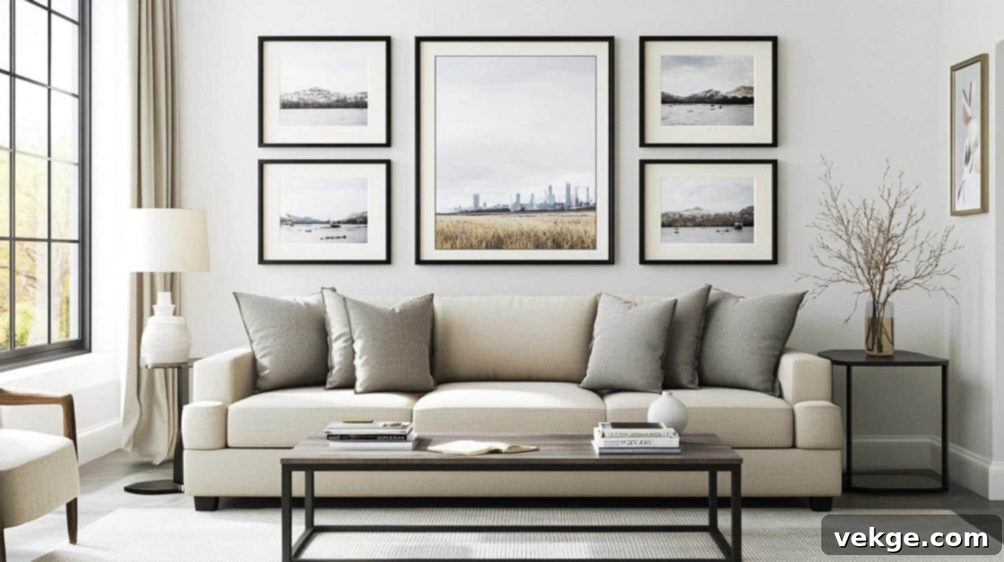
Imagine six identical black frames, each containing striking black and white photos, arranged in a neat 2×3 formation above a sleek modern sofa. With precise 2-inch gaps between each frame, this layout exudes order and sophistication. The clean lines and matching dimensions create a perfectly tidy, balanced wall that seamlessly complements the room’s contemporary aesthetic.
Key Design Considerations:
- Frame Selection: Crucial to use frames of the exact same size, style, and color for uniformity.
- Spacing: Strict adherence to equal gaps (typically 2-3 inches) is vital for the grid’s precision.
- Wall Position: Optimal when centrally aligned, often above a piece of furniture, to anchor the room.
- Style Match: Best suited for minimalist, modern, or formal interiors where clean lines are preferred.
2. The Elegant Linear Layout
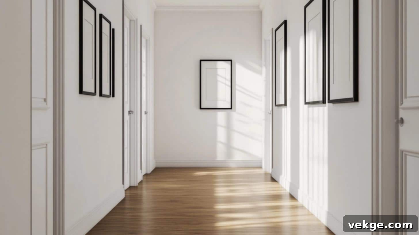
Picture five medium-sized frames, each showcasing vibrant art prints, aligned perfectly in a single straight line along a hallway wall. A consistent 3-inch gap separates each frame, positioned at a comfortable eye level. This linear arrangement not only makes a narrow hallway feel longer and more curated but also offers a streamlined visual flow, guiding the eye smoothly from one piece to the next.
Key Design Considerations:
- Frame Selection: Often works best with frames of similar size and style to maintain linearity.
- Spacing: Uniform gaps (2-3 inches) are essential to preserve the straight-line aesthetic.
- Wall Position: Excellent for hallways, above headboards, or long console tables.
- Style Match: Versatile, fitting both modern and traditional spaces, especially where horizontal emphasis is desired.
3. The Dynamic Organic Layout
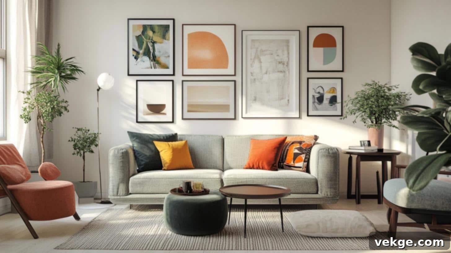
Visualize a wall where frames of various sizes—small sketches alongside larger paintings—are spread out naturally, creating a sense of effortless artistry. A mix of white, black, and natural wood frames adds visual depth and intrigue, maintaining a loose yet harmonious balance. The layout typically begins with a denser cluster in the center, gradually fanning out towards the edges, giving it a lively, unconstrained feel.
Key Design Considerations:
- Frame Selection: Embraces mixed sizes, styles, and even colors for an eclectic charm.
- Spacing: While not strictly uniform, average gaps of 2-3 inches are still important to maintain balance and prevent clutter.
- Wall Position: Highly adaptable; works well over sofas, staircases, or in dining areas.
- Style Match: Ideal for bohemian, eclectic, casual, or artistically inclined interiors.
4. The Rich Salon Style Layout
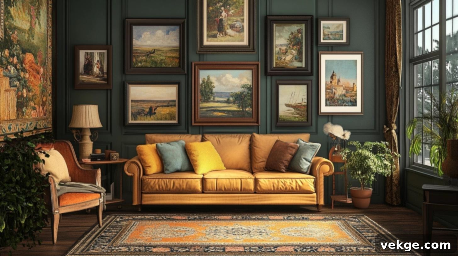
Imagine a wall almost entirely covered with a diverse array of frames, where large statement art pieces sit comfortably beside smaller, intricate works. Black and gold frames hold a rich mix of prints, photographs, and even mirrors, filling the vertical space from sofa to ceiling. The key here is minimal, consistent gaps between pieces, creating one expansive, immersive display that truly makes a statement.
Key Design Considerations:
- Frame Selection: A bold mix of sizes, styles, and colors is encouraged to create a layered, rich effect.
- Spacing: Tighter, uniform gaps (often 1.5-2 inches) are common to achieve a dense, maximalist look.
- Wall Position: Best for large walls in living rooms, dining rooms, or dramatic entryways.
- Style Match: Perfect for traditional, opulent, eclectic, or maximalist aesthetics.
5. The Ascending Staircase Layout
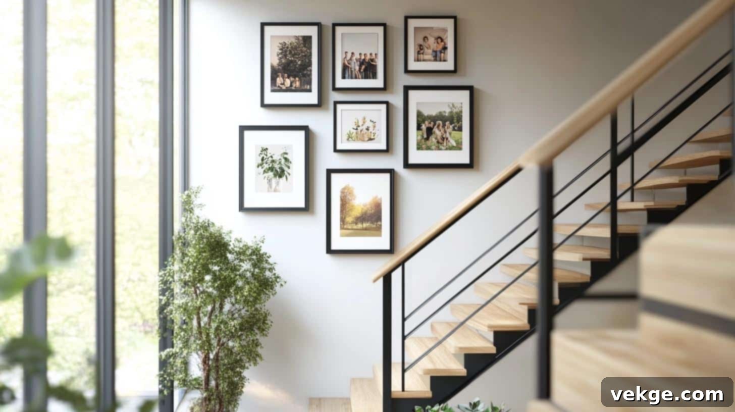
Picture eight frames gracefully following the natural upward slope of a staircase, each one ascending in harmony with the steps below. These frames typically hold cherished family photos, perhaps getting slightly smaller as they rise, while maintaining the same precise spacing between each piece. This layout provides a continuous visual journey up the stairs, enhancing a often-overlooked area.
Key Design Considerations:
- Frame Selection: Can feature gradual size changes (larger at bottom, smaller at top) or consistent sizes.
- Spacing: Consistent gaps (2-3 inches) are vital to maintain the visual rhythm of the ascent.
- Wall Position: Exclusively for staircase walls, aligning with the angle of the stairs.
- Style Match: Works beautifully in both traditional and modern homes, especially for family photos.
6. The Center-Focused Layout
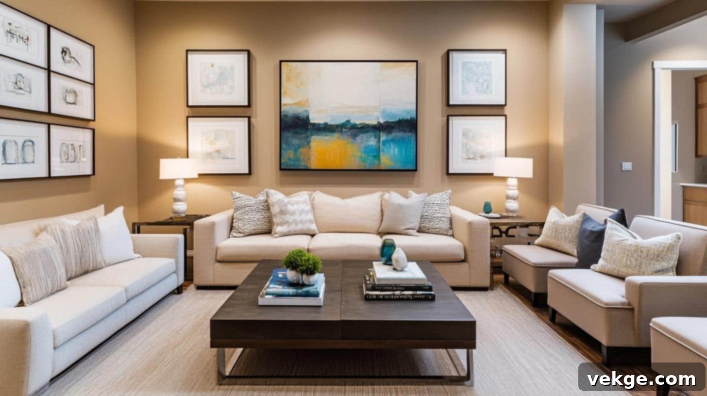
Imagine a prominent, large statement piece proudly positioned in the middle, surrounded by eight smaller frames placed evenly around it. The central artwork instantly captures the eye, acting as the anchor for the entire composition. The surrounding pieces, often in matching frames, add depth and context without overshadowing the main attraction, creating a well-balanced and intentional display.
Key Design Considerations:
- Frame Selection: Mixed sizes are essential, but often with consistent frame styles or colors for cohesion.
- Spacing: Equal gaps (2-3 inches) around the central piece and between the smaller frames are key.
- Wall Position: Excellent for walls above mantels, beds, or in a prominent living room spot.
- Style Match: Versatile; suits many styles but particularly effective for showcasing a beloved, larger art piece.
7. The Dramatic Floor-to-Ceiling Layout
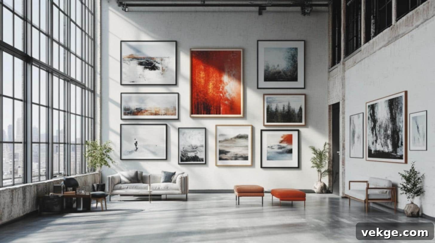
Envision an entire wall completely filled with frames, from the floor to the ceiling, utilizing twenty or more pieces of varied sizes. This maximalist approach creates an immersive wall of art, often with larger pieces grounding the display at the bottom and gradually transitioning to smaller pieces towards the top. Each row and column maintains steady spacing for an organized yet impactful look, making the wall a true work of art itself.
Key Design Considerations:
- Frame Selection: High variety in size, but maintaining a consistent style or color family can prevent chaos.
- Spacing: Consistent, tighter gaps (1.5-2.5 inches) are often used to create a dense, “covered” effect.
- Wall Position: Ideal for large, open walls in lofts, living rooms, or any space desiring a dramatic artistic statement.
- Style Match: Suited for industrial, eclectic, artistic, or contemporary spaces with a bold design vision.
8. The Flexible Shelf or Ledge Layout
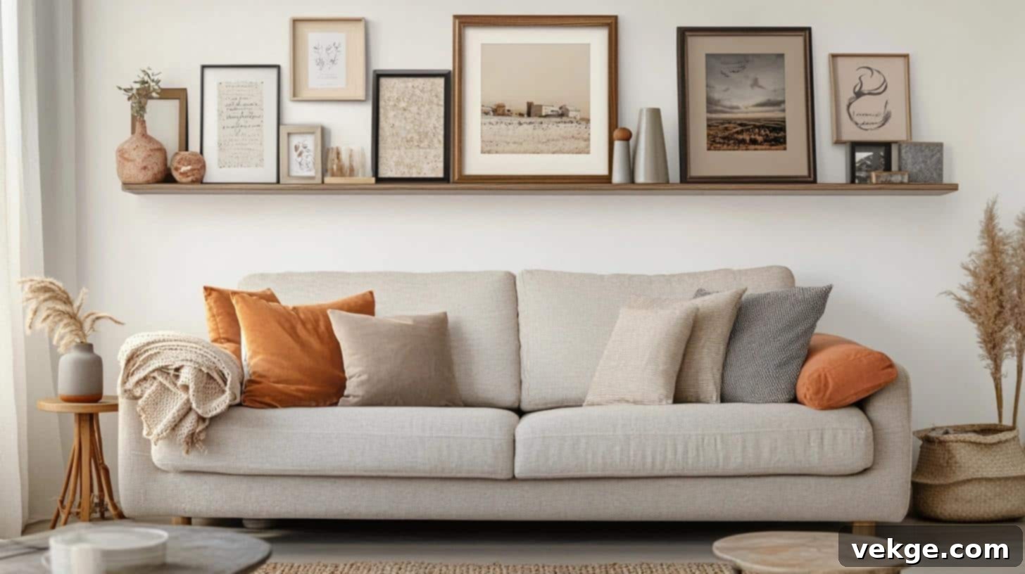
Imagine three sleek, long white shelves, each gracefully holding an assortment of different-sized frames that simply lean against the wall. On each shelf, frames might subtly overlap, with taller pieces positioned at the back and shorter ones layered in front. Small decorative objects nestled between frames add texture and extra visual interest, creating a dynamic and easily changeable display without a single nail hole.
Key Design Considerations:
- Frame Selection: Highly flexible for mixed sizes and styles, allowing for easy rotation and updates.
- Spacing: “Layered placement” and slight overlapping are characteristic, offering a more informal, curated feel.
- Wall Position: Versatile, perfect for living rooms, bedrooms, or above desks where flexibility is desired.
- Style Match: Adaptable to virtually any decor style, from Scandinavian to bohemian, offering effortless charm.
Templates and Tools for Layout Precision: Your Toolkit for Success
Beyond understanding the rules, having the right tools and techniques at your disposal is crucial for executing a flawless gallery wall. These aids will transform a potentially daunting task into an enjoyable and precise creative process.
1. Paper Templates for Effortless Frame Placement
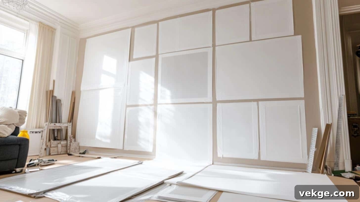
The paper template method is a game-changer for planning your gallery wall without any guesswork or damage. By creating paper cutouts that mimic your actual frames, you can experiment endlessly with different arrangements directly on your wall before committing to drilling any holes. This process empowers you to refine your spacing, adjust heights, and visualize the final look, significantly reducing the risk of errors and ensuring your layout is perfect on the first attempt.
Key Points for Using Paper Templates:
- Required Items: Roll of kraft paper (or newspaper/wrapping paper), sharp scissors, pencil, painter’s tape, measuring tape.
- Setup Steps:
- Measure each frame precisely (length and width).
- Cut paper pieces to these exact dimensions for every frame.
- Carefully locate and mark the exact hanging point on the back of each frame, then transfer this mark accurately onto its corresponding paper template.
- Use painter’s tape to temporarily adhere the paper templates to your wall, replicating your desired layout.
- Step back, adjust, and re-adjust until the spacing and arrangement are perfect.
- Once finalized, drive your nail or screw directly through the marked hanging point on the paper template, then remove the paper.
- Safety Notes: Ensure your workspace (floor) is clear of obstacles. Use a stable step stool or ladder for high placements. Test painter’s tape on an inconspicuous wall area first to ensure it won’t damage your paint.
2. Picture Hanging Level or Laser Level for Perfect Straightness
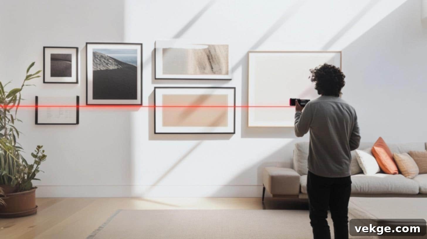
A level is an absolute non-negotiable tool for any gallery wall project. It ensures that every single frame, and every row of frames, hangs perfectly straight, contributing to a polished and professional appearance. While a traditional spirit level is effective, a laser level offers unparalleled precision by projecting clear, long horizontal and vertical lines across your wall. This eliminates any doubt about alignment, making it incredibly useful for creating perfectly straight rows and columns, especially when working with multiple frames.
Key Points for Using a Level:
- Required Items: A reliable level tool (spirit or laser), fresh batteries (for laser levels), marking pencil, and a ruler.
- Setup Steps:
- For laser levels, check battery life and ensure it’s fully charged.
- Determine your desired height and center point on the wall.
- Use the level to draw or project a perfectly straight guide line (e.g., the top or bottom edge of a row of frames).
- Align each frame or template to this guide line before marking the hanging point.
- Periodically re-check the level as you work to ensure accuracy.
- Safety Notes: Never look directly into a laser beam as it can cause eye damage. Always secure the level tool properly if it’s free-standing. Keep laser levels out of reach of children.
3. Measuring Tape or Ruler for Exact Spacing Between Frames
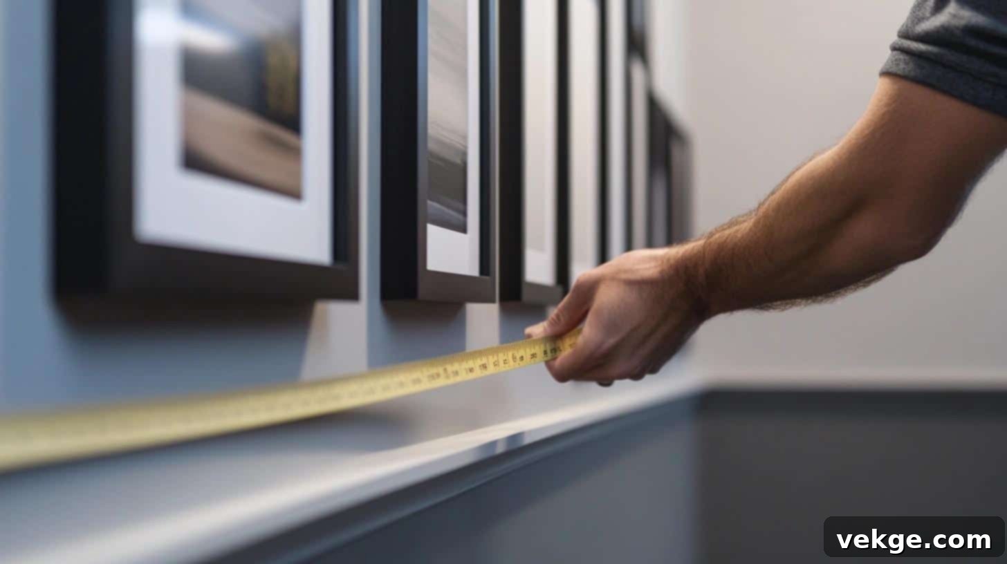
Precision in spacing is what separates a haphazard collection from a thoughtfully curated gallery. A high-quality measuring tape or ruler is fundamental for maintaining consistent gaps between your frames, resulting in a clean, balanced, and harmonious visual flow. These basic tools allow you to methodically mark out each frame’s position with identical distances, ensuring perfect alignment from the central anchor point outwards. Accurate measurements are the critical difference between an arbitrary display and one that radiates professional craftsmanship.
Key Points for Using Measuring Tools:
- Required Items: A retractable metal measuring tape (or a long, rigid ruler), a sharp pencil, an eraser, and a notepad for jotting down measurements.
- Setup Steps:
- Establish your central point or starting frame.
- Measure outwards, marking your desired 2-3 inch (or adjusted) gaps precisely between each frame.
- Take thorough notes of all measurements, especially when dealing with complex layouts or mixed frame sizes.
- Always double-check your measurements before making any permanent marks or holes.
- Safety Notes: Keep measuring tapes clean and dry to prevent rust. Be mindful of sharp edges on metal tapes. Store tools properly to avoid damage or injury.
4. Painter’s Tape for Temporary Guides and Marks
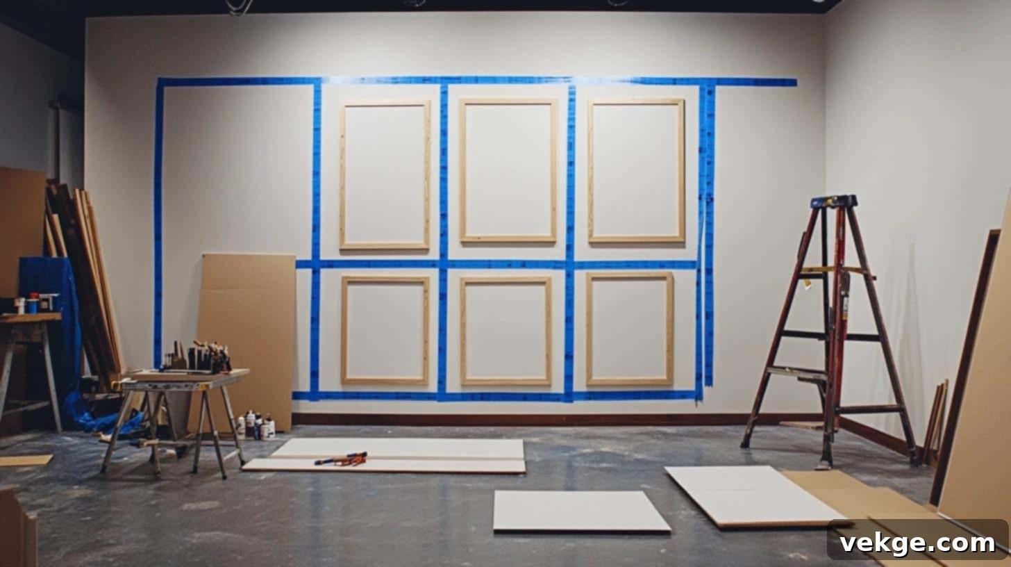
Painter’s tape is an unsung hero in gallery wall planning. Unlike regular masking tape, this specialized adhesive tape allows you to create temporary marks and guide lines on your walls without the risk of damaging your paint or leaving sticky residue. It’s incredibly useful for outlining where each frame will go, establishing straight lines for linear arrangements, or creating boundaries for your overall gallery. The ease with which it peels off makes it perfect for iterative planning, letting you test and adjust layouts freely before any permanent steps are taken.
Key Points for Using Painter’s Tape:
- Required Items: A roll of blue painter’s tape, scissors or a utility knife, and a clean cloth for gently wiping the wall surface.
- Setup Steps:
- Ensure the wall surface is clean and dry before applying tape.
- Cut strips of tape to create outlines of your frames or to mark straight guide lines.
- Use it to temporarily hold paper templates in place.
- Test the tape adhesion on a small, inconspicuous area of your wall first to confirm compatibility with your paint type.
- Safety Notes: Remove painter’s tape within 24-48 hours of application to prevent potential residue or minor paint lifting, especially on older or delicate paint jobs.
5. Frame Spacing Calculator Tools (Online & Apps)
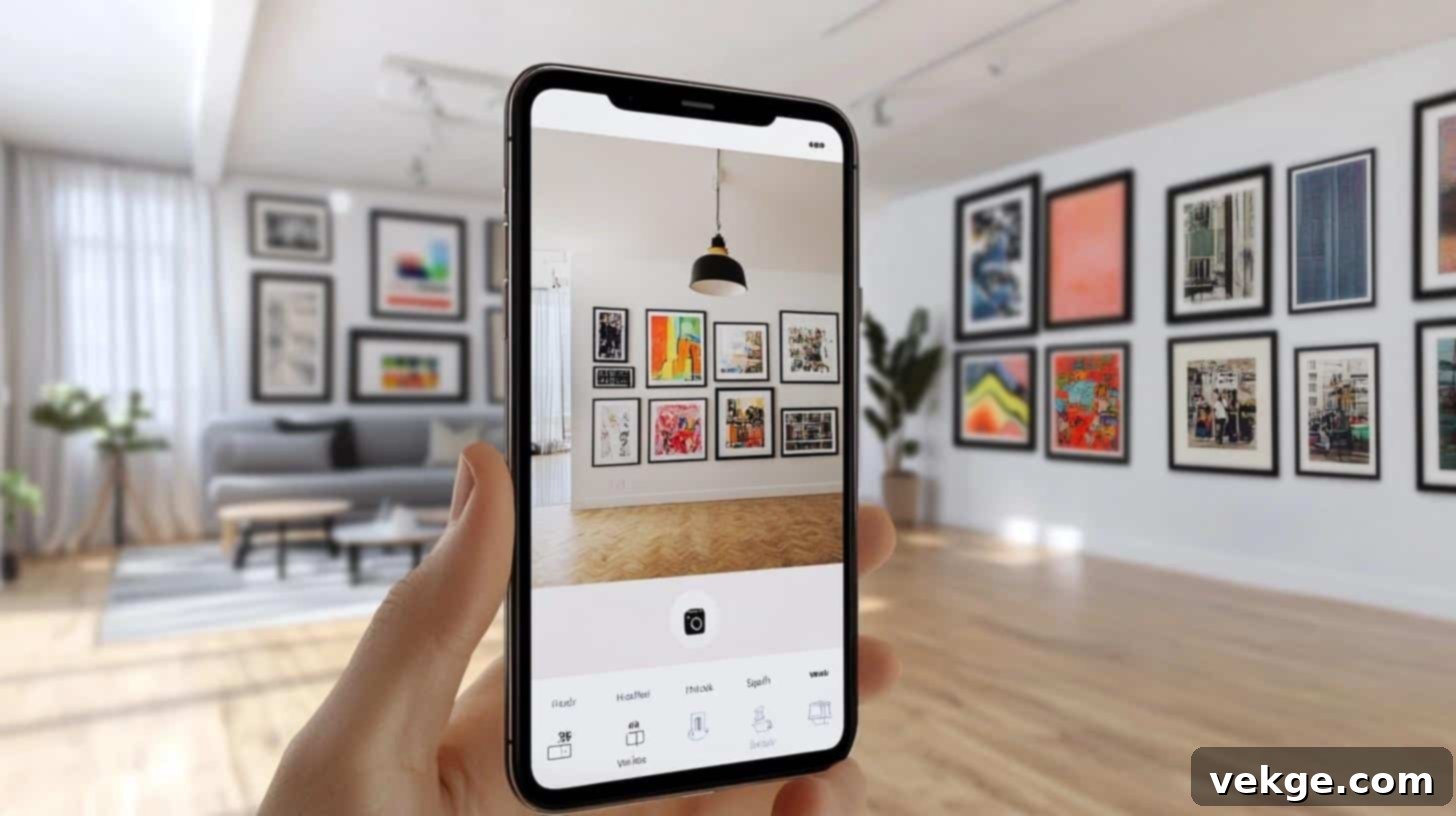
For those who prefer a technological assist, digital frame spacing calculator tools can be invaluable. These online resources or mobile applications take the complexity out of the mathematical calculations required for symmetrical layouts. By inputting your wall dimensions and the number/sizes of your frames, these tools can instantly generate precise measurements for optimal placement and spacing. They are fantastic for saving time, minimizing human error, and ensuring your frames fit perfectly and proportionately within your designated space, especially for grid-style layouts.
Key Points for Using Calculator Tools:
- Required Items: A smartphone or computer, a reliable internet connection (for online tools), notepad, measuring tape (to gather initial wall/frame dimensions), and a basic calculator for cross-referencing.
- Setup Steps:
- Accurately measure the width and height of your wall section.
- Count all the frames you intend to hang. For more advanced tools, measure individual frame dimensions.
- Input these numbers into the calculator tool.
- Carefully write down or screenshot the calculated results (e.g., center point, spacing between frames, distance from ceiling/floor).
- Safety Notes: Always double-check the tool’s output with a quick manual calculation or measurement to ensure accuracy. Save your calculations and make backup notes for future reference.
6. Picture Hanging Kits for Comprehensive Setup
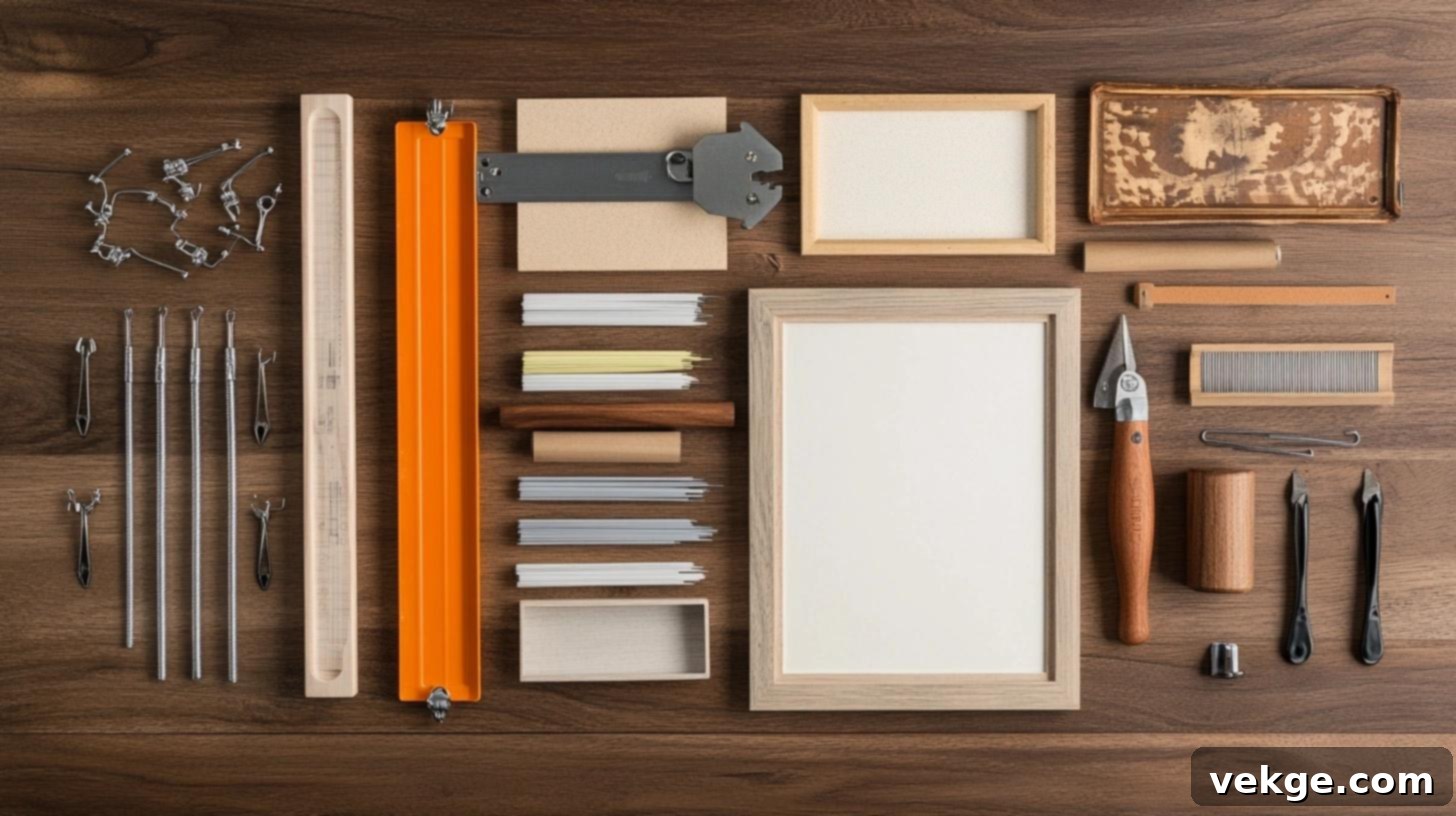
Picture hanging kits are a convenient all-in-one solution that provides most of the hardware you’ll need to securely hang your frames. These kits typically include an assortment of hooks, nails, D-rings, and often a small level or a measuring guide. Using a complete kit ensures you have a variety of hardware suitable for different frame weights and sizes, all designed to work together effectively. It simplifies the procurement process and provides confidence that you have the right tools for each step of the hanging process.
Key Points for Using Picture Hanging Kits:
- Required Items: A complete picture hanging kit, a hammer, and potentially wall anchors if you’re hanging heavy frames in drywall without studs.
- Setup Steps:
- Familiarize yourself with the contents of the kit and the different weight ratings of the hooks.
- Match the appropriate hook to each frame’s weight.
- Pre-mark your hanging spots on the wall (using templates or direct measurement).
- Install the hooks according to the kit’s instructions, ensuring they are level and secure.
- Safety Notes: Always use hooks rated for the actual weight of your frames. Use a stud finder to avoid drilling into electrical wires or plumbing pipes. Wear safety glasses, especially when hammering or drilling.
Symmetry and Alignment Tips for Flawless Gallery Wall Results
A well-aligned gallery wall is a joy to behold. It conveys intentionality, sophistication, and a keen eye for detail. Let’s explore how to create strong center points, achieve impeccable lines, and ensure all elements harmonize for a truly stunning display.
Establishing a Strong and Balanced Center Point
The central element of your gallery wall is its anchor, setting the visual tone and guiding the placement of every other piece. Make these decisions with purpose:
- Prioritize your focal piece: Position your largest, most visually captivating, or most personally significant artwork in the very center of your intended display area. This piece will naturally draw the eye first.
- Balance visual weight: Generally, heavier or larger items should gravitate towards the center or lower half of your arrangement to ground the display visually.
- Optimize eye level: For a single piece or the overall center of your gallery wall, aim to have its middle point at the average eye level, which is typically 57-60 inches (about 145-152 cm) from the floor.
- Use it as your guide: Once your center piece is determined and its position marked, use it as the primary reference point for placing all subsequent frames around it, ensuring consistent spacing and balance.
- Mark clear reference points: After establishing your center, mark clear horizontal and vertical lines (using a level and pencil or painter’s tape) extending from your central piece to aid in even spacing for adjacent frames.
Achieving Impeccable Lines and Perfect Straightness
Precise alignment is non-negotiable for a professional finish. Every degree of tilt is noticeable.
- The indispensable level: Use a spirit level or laser level religiously. Check the horizontal and vertical alignment of *each* frame before committing to its final placement.
- Consistent top and bottom edges: When arranging frames in a horizontal row, aim for either perfectly aligned top edges or perfectly aligned bottom edges (depending on your desired aesthetic). Mixed alignment can look messy.
- Maintain vertical consistency: For frames stacked in a column, ensure their side edges are perfectly aligned vertically.
- Consider ceiling and furniture proximity: Maintain a consistent distance between the top of your gallery wall and the ceiling (or crown molding), and between the bottom of your gallery wall and any furniture it hangs above.
- Corner harmony: If your gallery wall wraps around a corner, ensure the frames on either side of the corner maintain a consistent height and spacing relationship.
- Iterative spacing checks: As you add each new piece, re-evaluate the spacing between it and its immediate neighbors to ensure the overall flow remains harmonious.
Making Every Piece Work Together for Cohesion
A successful gallery wall is more than just individual pieces; it’s a unified composition where every element contributes to the whole.
- Group by color palette: Create visual pockets by grouping frames with similar color schemes or frame finishes (e.g., all gold frames, or a cluster of black and white art).
- Match frame styles strategically: While mixing styles can be eclectic, try to balance it. For instance, if you have very ornate frames, juxtapose them with simpler ones to avoid visual overload.
- Maintain consistent spacing within groupings: While overall spacing might vary slightly in an organic layout, ensure a consistent gap between frames that are part of a smaller, cohesive cluster.
- Consider shape harmony: Think about how rectangular, square, and circular frames interact. Use different shapes to add interest, but ensure they don’t clash.
- Fill negative space thoughtfully: If there are awkward empty spots, consider introducing a smaller piece, a mirror, or a subtle decorative object to balance the composition.
- Continual evaluation: Step back frequently and observe your display from various points in the room. This helps you catch imbalances or areas that feel crowded/sparse.
Actionable Tips for Gallery Wall Success
- Always start from the center: Whether it’s the largest frame or the conceptual middle point of your entire layout, begin here and build outwards.
- Use your level constantly: Make it your best friend throughout the hanging process.
- Take visual breaks: Step back, look from different angles, and even take a photo to catch details your eye might miss up close.
- Correct small issues immediately: It’s easier to adjust one frame early on than to fix a cascade of misalignments later.
- Embrace patience: Rushing leads to mistakes. Take your time with each frame.
- Keep all measuring tools handy: Having your tape measure, ruler, and pencil within arm’s reach prevents interruptions.
Harnessing Spacing Calculators and Apps for Ultimate Precision
For those who love to leverage technology, several digital tools can simplify the complex geometry of gallery wall planning, providing an added layer of confidence in your measurements.
Explore Helpful Online Tools and Mobile Apps:
- Photo wall planning websites: Many home decor and DIY sites offer interactive tools where you can input your wall dimensions and the number of frames. They often suggest various layouts and provide precise measurements.
- Mobile apps with augmented reality (AR): Some advanced apps allow you to “scan” your wall using your phone’s camera and then virtually place frames, offering real-time visual feedback on placement and spacing.
- Simple geometric calculators: Basic online calculators can help you quickly determine the exact center point of your wall or calculate even spacing between multiple objects over a given distance.
How to Effectively Integrate These Tools into Your Process:
- Measure Your Wall Accurately: The input is only as good as your measurements. Use a tape measure to get precise height and width for your wall and each frame.
- Input Your Numbers: Enter these dimensions into your chosen tool. Specify the number of frames and your desired spacing (e.g., 2.5 inches).
- Get Your Results: The tool will output precise measurements for where each hook should be placed, often providing distances from the floor, ceiling, and side walls, as well as the gaps between frames.
- Make Adjustments: Use the tool to experiment with different spacing, frame sizes, or layout styles until you find a plan that perfectly fits your vision.
Troubleshooting Common Issues with Gallery Wall Layouts
Even with careful planning, unexpected challenges can arise. Let me guide you through identifying and resolving the most common gallery wall problems, and more importantly, how to prevent them in the first place.
Uneven Frames or Inconsistent Spacing: How to Fix It
These are the most frequent culprits behind a less-than-perfect gallery wall. The good news is, they’re fixable!
Diagnosing and Rectifying Spacing Problems:
1. Assess Your Current Layout Objectively
- Capture a photo: Step back and take a wide-angle photo of your entire gallery wall. Often, the camera lens will highlight inconsistencies that your eye might overlook up close.
- Use visual markers: Grab some sticky notes or small pieces of painter’s tape. Place them next to frames that appear uneven or have incorrect spacing. This helps you systematically address each issue.
- Identify problematic frames: Determine which specific frames need to be moved—are they too far apart, too close, or simply crooked?
2. Execute the Fix with Precision
- Carefully remove frames: Take down the frames in the immediate problem area. It’s often easier to reset a small section than to try and adjust one frame in isolation.
- Repair old holes: Fill and touch up any old nail holes. This ensures a clean slate and avoids unsightly blemishes if the frame is moved.
- Re-measure and re-mark: Using your measuring tape and a level, meticulously re-measure the intended spaces between frames. Mark new hanging spots with light pencil marks.
- Hang one by one: Re-hang the frames one at a time, checking the level and spacing of each piece as you go, before proceeding to the next.
3. Perform a Final Double-Check
- Step back for perspective: Once all adjustments are made, step back at least 10 feet to view the entire wall composition from a distance.
- Level every frame: Do a final pass with your level on every single frame to ensure perfect straightness.
- Verify all spacing: Quickly measure the gaps between frames one last time to confirm consistency.
Quick Fixes for Common Spacing and Alignment Glitches:
- Persistent crooked frames: Consider adding “level-lock” hangers or a small blob of museum putty behind the bottom corners of the frame to keep it firmly in place.
- Gaps too wide: Take down the affected frames, gently shift them inward by half an inch (or your desired adjustment), mark new spots, and re-hang.
- Frames too close: Remove frames, measure and mark new spots that are slightly further apart (e.g., shift each piece outward by half an inch), and re-hang.
- Uneven rows (horizontally): Use a laser level to project a perfectly straight guide line across the wall. Re-hang frames, aligning their top or bottom edges to this line.
How to Prevent Frames from Shifting and Causing Future Issues
Once your gallery wall is perfect, you want it to stay that way. Prevention is key to long-term stability.
Best Practices for Secure Hanging Methods:
1. Utilize the Correct Hanging Hardware
- Match hardware to weight: Always use picture hooks or wires that are explicitly rated for the weight of your specific frame. Overloading can lead to falls.
- Two hooks for larger pieces: For frames over 18-24 inches in width, using two D-rings or sawtooth hangers (spaced apart) provides greater stability and makes leveling much easier.
- Hangers with built-in levels: Some modern picture hangers come with small integrated levels, offering a quick check during installation.
- Proper wall anchors: If you’re hanging heavy frames on drywall without hitting a wall stud, use appropriate drywall anchors (e.g., toggle bolts, self-drilling anchors) for secure attachment.
2. Implement Frame Stabilization Techniques
- Rubber bumpers: Attach small adhesive rubber bumpers to the bottom corners of your frames. These prevent sliding, protect your wall from scuffs, and allow air circulation.
- Museum putty/wax: For added security, especially in high-traffic areas or earthquake-prone regions, apply small dabs of museum putty or wax to the bottom corners of frames to gently adhere them to the wall.
- Security clips: For very valuable or irreplaceable pieces, consider using specialized security clips or devices that lock the frame onto the wall hook.
- Verify wall type and weight limits: Be aware of your wall material (drywall, plaster, brick) and its capacity to hold weight.
3. Maintain Stability and Regular Checks
- Dust regularly: Keep dust from accumulating on frame wires and hooks, which can sometimes interfere with proper seating.
- Inspect frame wires: Periodically check any hanging wires on the back of your frames for fraying, rust, or wear. Replace them if necessary.
- Tighten loose hardware: If you notice any screws on the back of the frame or picture hook becoming loose, tighten them immediately.
- Address loose corners: If a frame’s mitered corners start to separate, reinforce them or have them professionally repaired to prevent the frame from distorting or falling apart.
Long-Term Protection and Care:
- Avoid extreme conditions: Keep frames away from direct air vents, radiators, or areas with significant temperature and humidity fluctuations, which can warp frames or damage art.
- Protect from sunlight: Direct, prolonged sunlight can fade artwork. Consider UV-protective glass for valuable pieces or adjust placement.
- Gentle cleaning: Clean frames with a soft, dry cloth. Avoid harsh chemicals that can damage frame finishes or artwork.
- Annual wall stability check: Twice a year, visually inspect your gallery wall for any signs of shifting, sagging, or cracks around the hanging points. Address any issues proactively.
Conclusion: Your Path to a Perfectly Spaced Gallery Wall
Creating a beautiful and well-organized gallery wall is an incredibly rewarding endeavor that adds immense personality and charm to any home. While it might seem like a detailed process, mastering the art of gallery wall spacing is entirely achievable with a bit of planning, patience, and the right techniques.
Always remember to begin your design journey by applying the foundational 2/3 rule, ensuring your display harmonizes with the scale of your wall. Aim for the universally pleasing 2-3 inch gap between your frames to allow each piece to breathe while maintaining visual cohesion. Crucially, equip yourself with the essential tools: a reliable measuring tape, a trusty level, and practical paper templates, which are your best friends in achieving precision and avoiding costly mistakes.
The core principles are remarkably simple yet profoundly effective: measure twice, hang once; use your level consistently for every single piece; and resist the urge to rush the layout process. Most common issues stem from either insufficient planning or a hasty execution.
Ready to truly elevate your interior design with a breathtaking gallery wall? Bookmark this comprehensive guide and refer to each step as you progress. Should any challenges arise, revisit our dedicated troubleshooting section for quick, actionable solutions. The most important thing is to embark on your project with a clear plan and the confidence to see it through.
So, gather your favorite frames and artwork, arm yourself with your measuring tape, and start creating the perfectly spaced and beautifully arranged gallery wall you’ve always envisioned. Your walls are waiting to tell their story!
Frequently Asked Questions About Gallery Wall Spacing
How far apart should frames typically be spaced on a gallery wall?
For most gallery walls, the ideal spacing between frames is generally 2 to 3 inches. This range allows each piece to be seen clearly while ensuring the entire collection looks connected and unified, creating a clean and balanced visual experience.
What are the essential tools to help achieve perfect spacing and alignment?
To achieve impeccable spacing and alignment, you’ll need a few key tools: a measuring tape or ruler for precise distances, a spirit or laser level to ensure everything hangs perfectly straight, a pencil for marking, and painter’s tape for creating temporary guides and testing layouts without damaging your walls. Picture hanging kits can also provide helpful hardware.
How should I adjust spacing when working with larger or smaller frames?
Frame size influences ideal spacing:
- For large frames (e.g., over 16×20 inches), aim for slightly wider gaps, typically 3-4 inches, to give them enough breathing room.
- For medium frames (e.g., 11×14 to 16×20 inches), the standard 2-3 inch gap works well.
- For small frames (e.g., 8×10 inches or less), you can slightly reduce the spacing to 1.5-2 inches to create a cohesive cluster. Always adjust visually to ensure harmony.
Can I create a gallery wall successfully on both small and large walls?
Absolutely! Gallery walls are versatile. For small walls, focus on a curated collection of 5-7 pieces to avoid overcrowding. For large walls, you can incorporate more frames, but always adhere to the 2/3 rule: ensure your display occupies approximately two-thirds of the available wall space. This prevents the wall from looking too empty or too busy, regardless of its size.
