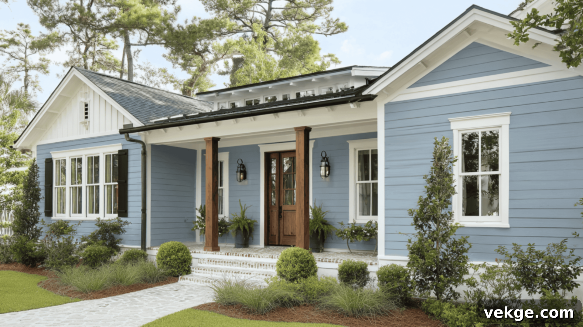
Benjamin Moore Van Courtland Blue (HC-145): The Ultimate Guide to This Classic Gray-Blue Paint
Choosing the perfect blue paint can feel like navigating a minefield of potential design mishaps. Some blues are too vibrant, others too cold, and many simply don’t translate from a small paint chip to a full wall the way you’d hoped. Many homeowners find themselves yearning for a blue that feels both sophisticated and inviting, a shade that offers depth without overwhelming the space. This quest for a classic yet characterful blue is a common challenge in interior design.
That’s precisely why this comprehensive guide has been crafted: to meticulously explore Benjamin Moore Van Courtland Blue and help you determine if this distinguished shade is the ideal choice to infuse your space with timeless elegance and subtle personality.
Within this guide, we’ll delve into the nuances of Van Courtland Blue. You’ll see how it truly appears in various real-world rooms, understand its captivating shifts under different lighting conditions, and learn how it measures up against other popular Benjamin Moore blues. Furthermore, we’ll uncover the best coordinating finishes and complementary color pairings that bring this shade to life. To ensure your complete confidence, you’ll also receive practical sampling tips and a list of comparable brand equivalents, should you wish to broaden your exploration of blue paint options.
Getting to Know Benjamin Moore Van Courtland Blue (HC-145)

Van Courtland Blue (HC-145) holds a special place in Benjamin Moore’s esteemed Historical Collection. This particular collection is renowned for its colors that are inspired by America’s historic landmarks and traditional estates, making them inherently classic and enduring. Van Courtland Blue is a beautifully muted, mid-tone blue, subtly infused with a touch of gray. This unique combination grants it an elegant, sophisticated appeal while ensuring it remains incredibly livable and versatile in a wide range of settings.
Basic Color Profile: Understanding the Fundamentals
To truly appreciate Van Courtland Blue, it’s helpful to understand its core characteristics:
- HEX code: #879A9D (This hexadecimal code represents the color for digital applications, giving you a precise idea of its digital appearance.)
- LRV (Light Reflectance Value): 31.47 (An LRV of 31.47 indicates that this color absorbs a moderate amount of light rather than reflecting it. This contributes to its rich, grounded feel. Colors with an LRV below 50 are generally considered darker, while those above 50 are lighter.)
- Color family: Muted blue with soft gray undertones (This classification highlights its refined and subdued nature, making it a sophisticated alternative to brighter, more saturated blues.)
This particular shade beautifully captures the richness and depth often found in colonial-era palettes, yet it manages to do so without ever feeling dated or overly traditional. It’s an ideal choice for individuals who desire to incorporate a meaningful splash of color into their home without committing to a bold, bright, or overwhelming hue. Van Courtland Blue offers a calming presence that enriches any room.
Undertones Explained: The Subtle Shifts
The magic of Van Courtland Blue lies significantly in its complex undertones. It possesses discernable gray and green undertones, which are largely responsible for its quiet, smoky, and almost ethereal appearance. These undertones are key to its chameleon-like quality:
- In abundant natural daylight, the primary blue hue comes to the forefront with a noticeable clarity, often revealing a subtle, slightly coastal or serene sky-like vibe. The green undertones might peek through, adding to its organic feel.
- In artificial or low-light conditions, the gray undertones become more prominent. This causes the color to recede slightly, feeling more subdued, grounded, and intensely muted. It can appear more like a sophisticated gray-blue in these settings, providing a cozy and enveloping atmosphere.
This dynamic interplay of undertones makes Van Courtland Blue a true shapeshifter, adapting gracefully to its surroundings. It never appears too stark or overwhelming, yet its presence is always distinctly felt and appreciated. Because of these fascinating and subtle shifts, it is absolutely crucial to sample this color directly in your own space before making a final decision and committing to painting an entire room. How it looks in a photograph or on a small swatch might differ significantly from its appearance on your wall under your unique lighting conditions.
Van Courtland Blue in Real Spaces: A Versatile Hue
This captivating color is far more versatile than its initial muted appearance might suggest. It has the remarkable ability to serve as a striking feature color, a calming backdrop, or even an elegant choice for cabinetry. Let’s explore how it truly performs and transforms in various rooms throughout the home:
How It Looks in Different Rooms
Kitchens: Elegance and Character
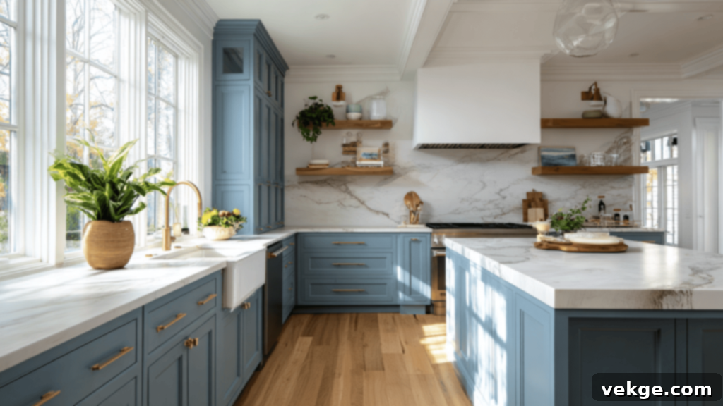
Van Courtland Blue radiates sophistication and warmth when applied in kitchens. It looks particularly stunning on lower cabinets, creating a grounded yet elegant base, or as an accent color on a kitchen island, transforming it into a focal point. For a more immersive experience, consider it on full walls in kitchens that embrace a traditional, cottage, or even a classic farmhouse style. Its muted quality perfectly complements the often busy nature of a kitchen. It pairs exquisitely with the rich tones of brass hardware, the earthy depth of soapstone countertops, the crisp purity of white marble, and the comforting warmth of natural wood finishes. This combination creates a kitchen space that feels both inviting and remarkably timeless.
Bathrooms: Serene and Refreshing
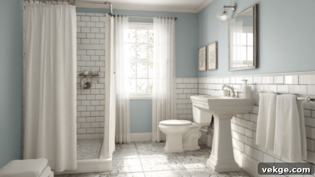
In bathrooms, Van Courtland Blue introduces a soft, incredibly refreshing, and spa-like ambiance. It harmonizes beautifully with classic white subway tiles or more intricate mosaic patterns, creating a clean yet calming aesthetic. Paired with brushed nickel fixtures, it exudes a polished, contemporary feel, while chrome accents would lend a brighter, more traditional touch. This shade remarkably manages to feel both immaculately clean and wonderfully cozy at the same time. Even in smaller bathrooms, its depth provides visual interest without making the space feel heavy or confined, offering a sense of openness and tranquility.
Living Rooms: Relaxed and Grounded
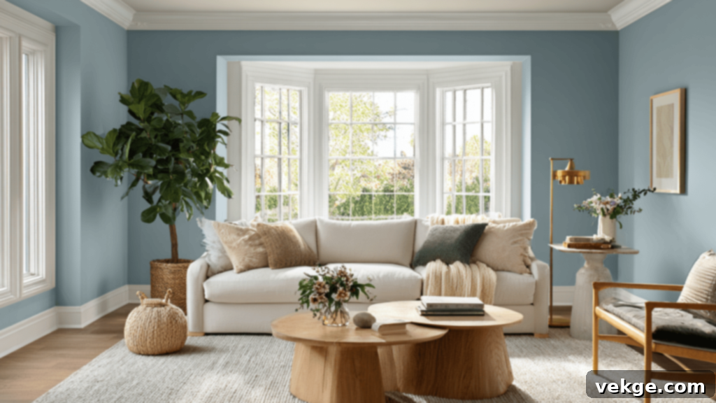
As a chosen wall color in a living room, Van Courtland Blue masterfully creates a serene, relaxed, and deeply grounded mood. It is particularly effective in rooms that benefit from ample natural light, where its blue tones can truly sing without becoming too intense. This color looks exceptionally harmonious when paired with soft, inviting upholstery in shades of cream, warm white, or a sophisticated greige. Its subtle gray undertones prevent it from feeling too cold, instead imparting a sense of quiet sophistication that encourages relaxation and comfortable conversation. It’s a wonderful choice for creating a cohesive and inviting central gathering space.
Bedrooms: Calming and Timeless Sanctuary
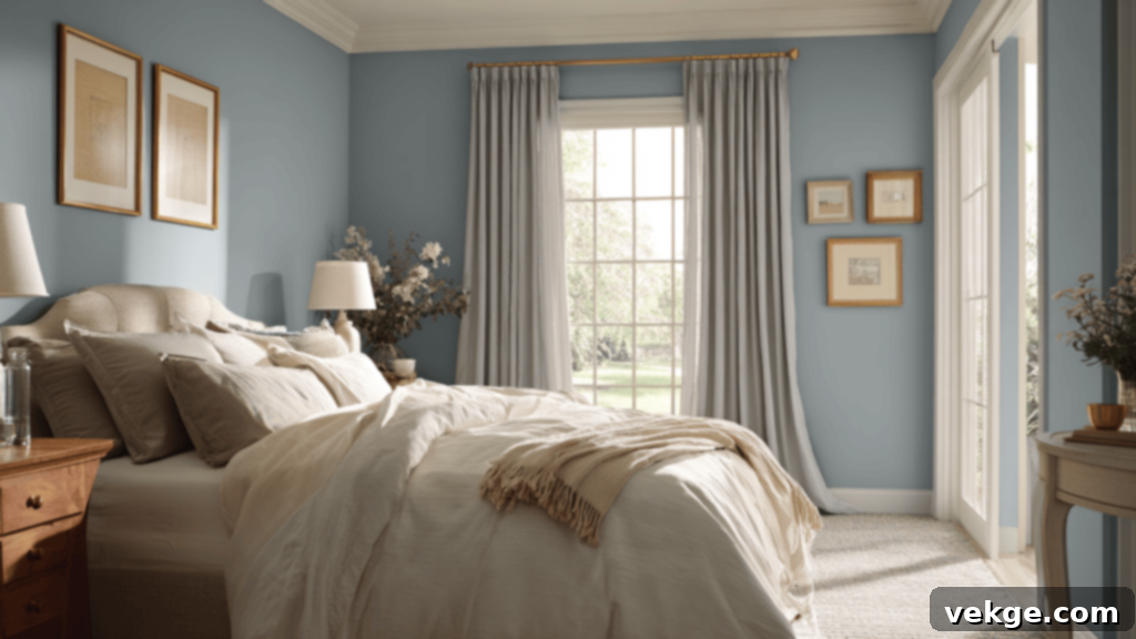
Unsurprisingly, this shade is a perennial favorite for bedrooms, and for good reason. It offers an intrinsically calming and profoundly timeless feel, reminiscent of the comforting familiarity of well-worn denim or the serene beauty of a misty morning sky. Its gentle presence promotes rest and relaxation, making it an ideal choice for a personal sanctuary. To create a perfectly balanced and peaceful sleeping space, consider pairing it with crisp white trim, simple yet elegant neutral bedding, and perhaps natural wood furniture. The overall effect is one of understated elegance and profound tranquility, perfect for unwinding after a long day.
How Lighting Affects It: A Dynamic Interaction
As noted earlier, Van Courtland Blue has a relatively low LRV of 31.47, meaning it will absorb light rather than extensively reflect it. This characteristic is precisely why ambient and directional light play such a significant role in defining its perceived personality and depth throughout the day. Understanding how different exposures influence this color is crucial for predicting its behavior in your specific space:
- North-facing rooms: In rooms receiving cooler, indirect light from the north, the inherent gray-green undertones of Van Courtland Blue will be significantly stronger. The color will appear softer, cooler, and take on a distinct smoky quality, leaning more towards a sophisticated gray with a blue whisper. It creates a serene and introspective atmosphere.
- South-facing rooms: With the warmer, brighter, and more direct light of south-facing rooms, the blue component of Van Courtland Blue will visibly brighten. It will feel more cheerful and vibrant without ever becoming loud or overly saturated. The warmth of the light helps to balance its cool undertones, presenting a more balanced and inviting blue-gray.
- East-facing rooms: The gentle, often golden morning light in east-facing rooms will imbue Van Courtland Blue with a fresh, somewhat powdery and airy look. It can appear slightly clearer and more purely blue during these early hours, making the room feel bright and revitalized as the day begins.
- West-facing rooms: As the sun sets and the evening light filters into west-facing rooms, the color will naturally deepen. In this warmer, often intense light, Van Courtland Blue may lean more towards a rich slate-blue or even a deeper, more profound gray-blue, creating a cozy and intimate atmosphere perfect for evening relaxation.
Given these noticeable shifts, it is absolutely imperative to test a sample of Van Courtland Blue on multiple walls within your chosen room, observing it in both morning and evening light. This careful observation will reveal the full spectrum of its gentle yet perceptible transformations, ensuring you make an informed decision that you’ll love for years to come.
Van Courtland Blue vs. Other Benjamin Moore Blues: A Comparative Analysis
To fully appreciate the unique qualities of Van Courtland Blue, it’s helpful to compare it with some of Benjamin Moore’s other highly popular blue-gray paint colors. This side-by-side analysis will highlight its distinct characteristics and help you pinpoint the best shade for your specific design vision.
Van Courtland Blue vs. Smoke (2122-40)
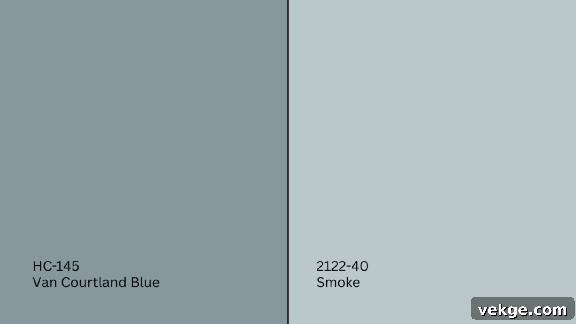
Smoke (2122-40, #BBC8C8) is a much lighter blue-gray, characterized by its distinctly cool and often icy undertones. With an LRV significantly higher than Van Courtland Blue, Smoke will reflect more light and appear airier.
- Smoke is notably brighter, clearer, and presents a more icy, delicate blue-gray.
- Van Courtland Blue is considerably deeper, dustier, and possesses a more grounded, historical presence due to its stronger gray and green influences.
When to choose: Opt for Smoke if your goal is an airy, expansive, and subtly coastal or minimalist vibe. Select Van Courtland Blue when you desire a color with more historical character, greater depth, and a more enveloping, sophisticated feel that still retains a soft touch of blue.
Van Courtland Blue vs. Boothbay Gray (HC-165)
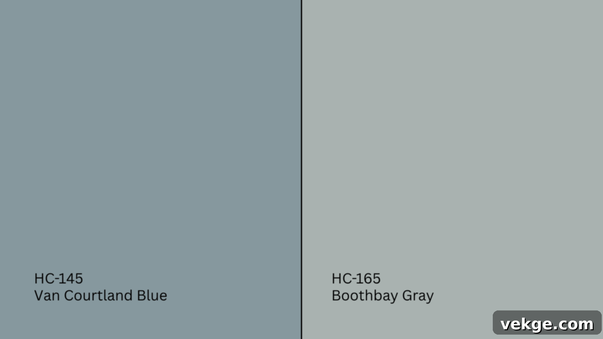
Boothbay Gray (HC-165, #AAB2B0) is another classic blue-gray, but it features a notably stronger and more assertive gray presence compared to Van Courtland Blue. Its blue is more of a tint within a gray base.
- Boothbay Gray leans significantly grayer and feels more neutral overall, with the blue acting as a soft hint rather than a dominant feature.
- Van Courtland Blue is decidedly more colorful and blue-forward, offering a richer blue experience while still benefiting from its graying out effect.
When to choose: Boothbay Gray is an excellent choice for minimalist, modern, or Scandinavian styles where a clean, neutral backdrop with just a hint of cool color is desired. Van Courtland Blue, conversely, brings more discernible color, softness, and traditional charm, making it better suited for spaces that embrace a more classic or layered aesthetic.
Van Courtland Blue vs. Santorini Blue (1634)
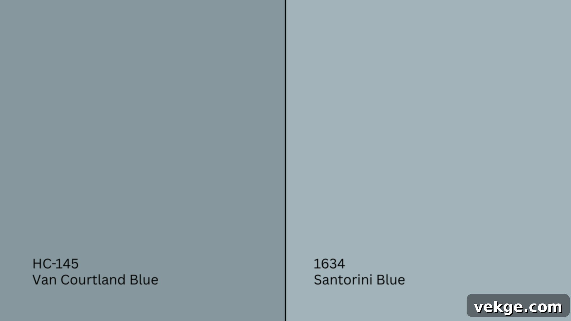
Santorini Blue (1634, #A2B5B8) is a lighter, brighter, and more vivid blue with crisp cool undertones. It evokes a stronger sense of a true sky or sea blue.
- Santorini Blue feels distinctly cheerful, fresh, and more overtly “blue.”
- Van Courtland Blue is substantially more muted, subtle, and subdued, with its gray and green undertones softening its blue character.
When to choose: Use Santorini Blue in playful, energetic, or explicitly beachy/coastal-themed rooms where a more vibrant and direct blue statement is desired. Opt for Van Courtland Blue in settings where you aim to create a sophisticated mood and a sense of calm without venturing into dramatic or overtly bright territory.
Van Courtland Blue vs. Newburyport Blue (HC-155)
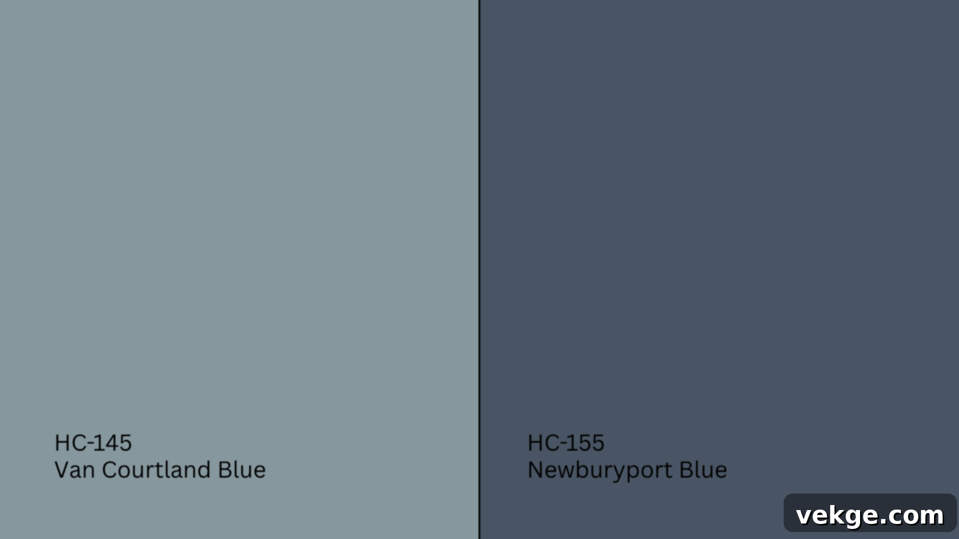
Newburyport Blue (HC-155, #425765) is a dramatic, deep navy with strong steely undertones. It is a profoundly dark and impactful color, a true statement blue.
- Newburyport Blue is significantly darker, bolder, and more intense, creating a strong, sophisticated statement.
- Van Courtland Blue is a soft, gentle mid-tone, offering a far more relaxed and easier-to-live-with blue experience.
When to choose: Newburyport Blue is ideal for making a powerful, elegant statement, perfect for an accent wall, a formal dining room, or a dramatic study. Van Courtland Blue, conversely, serves to support and enhance a space with its calming presence, rather than dominating it, making it suitable for broader application on all walls.
Undertone and LRV Comparison Table: A Quick Reference
This table summarizes the key characteristics to help you quickly differentiate these popular Benjamin Moore blues:
| Paint Color | Undertones | LRV | Warm or Cool |
|---|---|---|---|
| Van Courtland Blue | Gray, green-blue | 31.47 | Cool |
| Smoke | Blue-gray, hint of green | 56.49 | Cool |
| Boothbay Gray | Gray with soft blue tint | 43.26 | Cool |
| Santorini Blue | Clear, cool blue | 53.96 | Cool |
| Newburyport Blue | Deep navy, slate | 10.31 | Cool |
As you can see, while all these colors fall into the blue or blue-gray family, they serve very different stylistic and atmospheric purposes. Use this comparison table as a valuable tool to match the ideal tone, depth, and underlying character to your room’s specific design needs and desired mood.
Best Color Pairings for Benjamin Moore Van Courtland Blue
One of Van Courtland Blue’s most appealing qualities is its versatility. Its subtle nature allows it to beautifully complement a wide spectrum of colors, from crisp neutrals to deeper, more saturated tones. Here’s how to expertly pair it to bring out its full potential and enhance your home’s aesthetic.
Trim and Ceiling Suggestions: The Foundation
The right trim and ceiling color can significantly impact how Van Courtland Blue reads in a room. Here are some excellent choices:
- Chantilly Lace (OC-65, #F5F5EF): This is Benjamin Moore’s purest, brightest white. It provides a sharp, clean contrast against Van Courtland Blue, making the blue appear deeper and more pronounced. Ideal for a crisp, modern, or high-contrast traditional look.
- White Dove (OC-17, #F0EDE4): A softer, slightly off-white with a hint of warmth. White Dove offers a gentler transition and a more harmonious balance with the dusty quality of Van Courtland Blue. This pairing creates a sophisticated and timeless feel, perfect for a classic or transitional home.
- Simply White (OC-117, #F7F4EB): A versatile and popular white that has a subtle, almost creamy warmth. Simply White works wonderfully for a traditional, inviting feel, preventing the blue from feeling too cold and adding a touch of cozy elegance.
For the optimal finish, always use a flat paint on the ceiling to minimize imperfections and absorb light, creating a seamless canopy. For trim, doors, and baseboards, choose a satin or semi-gloss finish. These higher sheens provide durability, easy cleaning, and a subtle luster that beautifully frames the walls and highlights architectural details.
Accent Wall and Furniture Colors: Adding Depth and Interest
Van Courtland Blue provides a beautiful foundation for a variety of accent colors and furniture choices:
- For calm, layered pairings: Consider integrating soft taupes, light greiges, warm whites, or delicate dusty rose tones. These combinations create a serene and sophisticated palette, perfect for bedrooms or living rooms where tranquility is key. A muted yellow or soft sage green can also introduce a subtle, harmonious contrast.
- For contrast and mood: To create a more dramatic or vibrant interior, pair Van Courtland Blue with deeper hues. Deep navy, charcoal gray, rich olive green, or warm gold accents can truly pop against the muted blue walls, adding depth and visual intrigue. Consider an accent wall in a complementary deep color or incorporate these shades through textiles and artwork.
When selecting furniture, pieces in natural wood tones (like oak, walnut, or maple), comfortable beige fabrics, crisp white slipcovers, or even rich navy upholstery will balance and enhance the room. Accent with textures such as soft linen, chunky knits, polished brass, warm ceramic, or woven natural fibers to add tactile interest and layers of sophistication.
Hardware and Flooring Compatibility: The Finishing Touches
The right hardware and flooring choices can complete the look and feel of a room painted with Van Courtland Blue:
- Hardware: Van Courtland Blue works exceptionally well with brushed brass. The warm, golden tones of brass create a striking contrast with the cool blue, adding an instant touch of classic elegance and warmth. For a cleaner, more contemporary aesthetic, chrome or brushed nickel fixtures are excellent choices, especially in bathrooms and kitchens where a crisp, modern look is desired. For a strong, deliberate contrast that works in both modern and traditional spaces, consider matte black hardware. This choice can add a touch of industrial chic or graphic definition.
- Flooring: For flooring, light wood species like white oak or light maple will keep the room feeling open, bright, and airy, enhancing the serene qualities of the blue. Medium-tone woods, such as natural oak or cherry, will introduce additional depth and warmth, creating a more traditional and grounded atmosphere. For a classic, timeless, and impeccably fresh look, consider patterned black-and-white tile or natural marble flooring, particularly in entryways, bathrooms, or kitchens. These choices offer a beautiful interplay with Van Courtland Blue, elevating the overall design.
Paint Finish Recommendations: Choosing the Right Sheen
The paint finish you choose for Van Courtland Blue will significantly alter its appearance, durability, and how it interacts with light. Different sheens offer distinct visual effects and functional benefits:
- Flat: This finish has no shine at all and is the least reflective. It’s best suited for ceilings or low-traffic areas like formal dining rooms or bedrooms where minor imperfections need to be hidden. While it offers a soft, velvety look and excellent color saturation, it’s generally the least durable and most difficult to clean.
- Matte: Slightly more durable than flat, matte paint still offers a very low sheen and a rich, velvety appearance. It’s a popular choice for bedrooms, dining rooms, and other spaces where you desire a sophisticated, soft look without the starkness of a flat finish. It’s a good balance between appearance and moderate durability.
- Eggshell: Offering a subtle, low sheen reminiscent of an eggshell, this finish provides better durability and washability than flat or matte. Eggshell is a versatile and widely recommended choice for living rooms, hallways, and other mid-traffic areas. It holds up well to everyday wear and tear while still providing a soft, elegant look.
- Satin: A satin finish boasts a smooth, slightly lustrous surface with a gentle sheen. It’s highly durable and resistant to moisture, making it an excellent choice for high-traffic areas like kitchens, bathrooms, and laundry rooms. Satin is also commonly used for trim and doors where a subtle sheen is desired.
- Semi-Gloss: Noticeably shinier than satin, semi-gloss provides a sleek, reflective surface. It is exceptionally durable and easy to clean, making it ideal for trim, doors, cabinets, and other high-moisture areas that require frequent wiping or scrubbing. Its higher sheen tends to highlight surface imperfections, so proper wall prep is crucial.
- Gloss/High Gloss: These are the shiniest and most durable finishes available, offering a mirror-like reflection. Best reserved for furniture, cabinetry, or decorative trim where you want to make a bold, impactful statement and enhance architectural details. Due to their high reflectivity, gloss finishes will magnify any surface flaws, emphasizing the importance of meticulous preparation.
To ensure you achieve your desired aesthetic and functionality, it’s highly recommended to sample Van Courtland Blue in various finishes side-by-side on your actual walls. Observe them under different lighting conditions to find your favorite balance of sheen, color depth, and practicality.
Sampling and Buying Options: Making the Right Choice
Before committing to gallons of paint, testing the color in your home is the single most important step. This ensures that Benjamin Moore Van Courtland Blue performs as expected in your unique environment.
Where to Get Peel-and-Stick Samples: Test with Confidence
Traditional paint chips can be misleading, and liquid tester pots can be messy. Peel-and-stick samples offer a convenient and accurate way to test colors:
- Samplize: This popular service offers large, mess-free adhesive swatches made with real Benjamin Moore paint. They are ideal for easily moving samples around your room and observing them on different walls under varying light conditions without the fuss of actual paint.
- Benjamin Moore retailers: Your local Benjamin Moore store will always stock traditional paint cards and often carry small tester jars. While not as versatile as peel-and-stick, these offer a direct source.
- Hardware stores: Larger hardware chain stores may carry a selection of Benjamin Moore swatches or can often order small sample pots for you.
Remember to apply your chosen samples to multiple walls within the room. Observe them throughout the day, paying close attention to how the color shifts in both morning and evening light, as well as under artificial light. This comprehensive approach will give you the most accurate representation of the color’s behavior before you commit.
Where to Buy the Paint: Your Purchase Options
Once you’ve made your final decision, purchasing Benjamin Moore Van Courtland Blue is straightforward:
- BenjaminMoore.com: The official website offers convenient options for both online ordering with delivery to your home or in-store pickup at your nearest retailer.
- Local paint stores: Independent Benjamin Moore paint stores are excellent resources. They typically carry the full Historical Collection, offer all available finishes, and provide expert advice on paint quantities and application.
- Big box stores: While some larger home improvement stores may carry Benjamin Moore products, their selection might be limited. They can often color-match, but it’s always best to purchase Benjamin Moore colors directly from authorized retailers for guaranteed color accuracy and quality.
It’s a good practice to call ahead to your chosen retailer to confirm stock availability of your desired paint color and finish, especially if you’re undertaking a large project or need a specific product.
Paint Equivalents in Other Brands: Similar Shades
While no two paint colors are ever exactly alike across different brands due to unique pigment formulations, you might be looking for a similar aesthetic in another brand for convenience or preference. Here are some colors that come close to the feel of Benjamin Moore Van Courtland Blue:
- Sherwin-Williams: For a comparable muted gray-blue, consider Morning Fog (SW 6255, #A8AEB1), which offers a similar subdued quality, or North Star (SW 6246, #CAD0D2), which is a bit lighter and cooler but maintains that essential blue-gray balance.
- Behr: From Behr, you might explore Blueprint (S470-5, #577C8A), which is a slightly more saturated but still muted blue, or Watery (HDC-CT-26, #ADBCBC), which provides a softer, more ethereal blue-gray.
- Valspar: Valspar offers Voyage (4006-3A, #B5BABD), a serene gray with noticeable blue undertones, or Filtered Shade (4003-1A, #DBDBD5), a very light, almost white gray with a whisper of blue, for a more subtle touch.
Remember, “similar” is rarely “identical.” Different brands use unique pigment mixes, so while these suggestions offer a comparable aesthetic, they will not be exact matches. It is always, always essential to test these equivalents side-by-side with Benjamin Moore Van Courtland Blue in your space to truly compare and ensure the color meets your expectations.
Conclusion: Embracing the Timeless Appeal of Van Courtland Blue
If your design aspirations lean towards a classic, soft blue that exudes elegance, feels inherently livable, and possesses a subtle depth, then Benjamin Moore Van Courtland Blue (HC-145) is undoubtedly a prime candidate for your consideration. Its place within the Historical Collection speaks to its enduring appeal and ability to blend seamlessly with both traditional and contemporary interiors.
By now, you have a comprehensive understanding of this captivating color: how its unique gray and green undertones cause it to gently shift in different spaces and lighting conditions, how it compares to other beloved Benjamin Moore blues, and how to masterfully style it with the perfect trim, hardware, and furniture to create a cohesive and inviting environment.
The journey to finding the perfect paint color is a personal one, and while this guide provides extensive insights, the final step remains crucial: always, without exception, test Van Courtland Blue directly on your own walls. Its subtle shifts, which are truly its signature characteristic, can genuinely surprise you and reveal an even deeper appreciation for its beauty once seen in your home’s unique light. Should you wish to continue your exploration, feel free to dive into more of my detailed paint guides to help you confidently discover your absolute perfect color match.
