Sherwin-Williams Equivalent to Benjamin Moore Pale Oak: Your Ultimate Guide to Greige Neutrals
Embarking on the quest for the perfect off-white or greige paint color can often feel like an endless journey. Many homeowners understand the frustration of sifting through countless paint chips that appear almost identical, only to reveal their true nature once applied to a wall or exposed to different lighting conditions. This common dilemma leads many to seek out specific, beloved shades, even if it means finding an equivalent in a different brand.
If you’re captivated by the serene softness and subtle warmth of Benjamin Moore’s Pale Oak but prefer the convenience or familiarity of Sherwin-Williams paint, you’ve come to the right place. This comprehensive guide is tailored specifically for you.
We will delve deep into the characteristics that make Pale Oak such a coveted neutral, then meticulously identify and analyze its closest Sherwin-Williams equivalents. You’ll gain a clear understanding of how these alternatives compare, allowing you to confidently select the shade that will beautifully complement your home’s aesthetic. Beyond just color matching, we’ll explore critical factors like inherent undertones, how different lighting scenarios influence their appearance, ideal color pairings for trim and accents, and even suggest alternative options if Pale Oak doesn’t quite hit the mark for your unique space.
Finding the right neutral is more than just picking a color; it’s about creating an atmosphere. Let’s uncover the perfect greige for your walls.
Is Pale Oak a Sherwin-Williams Paint Color?

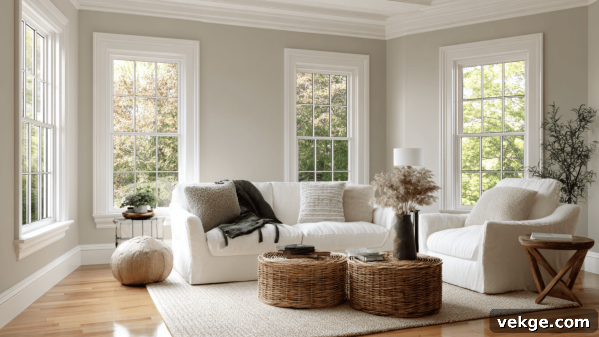
The short answer is No, Pale Oak (OC-20) is not a Sherwin-Williams color. It is, in fact, one of the most universally adored neutral paint colors from Benjamin Moore. Hailing from their esteemed Off-White Collection, Pale Oak has earned its reputation as a versatile chameleon, capable of looking stunning in nearly any setting, from cozy bedrooms to expansive open-concept living areas.
Understanding Pale Oak’s Core Characteristics (OC-20)
To truly appreciate Pale Oak and find its perfect match, it’s essential to understand its fundamental properties:
- HEX Code: #DED8CD
- LRV (Light Reflectance Value): 68.64
- Color Family: Warm greige / soft taupe
- Undertones: A complex, subtle blend of slight pink-violet and taupe-beige
Pale Oak distinguishes itself as a warm, exquisitely muted off-white. Its unique composition ensures it reads more as a sophisticated greige than a creamy off-white. With an LRV of 68.64, it’s a light and airy color, but it possesses just enough depth and warmth to prevent it from ever appearing stark or cold. This delicate balance makes it an ideal choice if you’re seeking a light neutral that offers softness, sophistication, and a welcoming ambiance without being overtly colorful or overwhelmingly beige.
Top Sherwin-Williams Equivalents to Pale Oak
Since Benjamin Moore’s Pale Oak isn’t available through Sherwin-Williams, the goal is to identify colors that closely mimic its unique tone, depth, and undertone complexity. Based on careful analysis of their Light Reflectance Values (LRV) and underlying hues, the following three Sherwin-Williams colors stand out as the closest alternatives.
1. Drift of Mist (SW 9166)

Drift of Mist (SW 9166, #DCD8D0) is perhaps the most universally suggested Sherwin-Williams alternative to Pale Oak. It’s a highly versatile neutral that shares many of Pale Oak’s appealing qualities.
- LRV: 69 (very close to Pale Oak’s 68.64)
- Undertones: Predominantly a soft, warm gray, often showing subtle green-beige leanings, particularly in natural light.
- Ideal Usage: It performs exceptionally well in bedrooms, open-concept living spaces, and rooms with mixed lighting conditions where it can adapt beautifully.
Why it’s similar: Drift of Mist’s LRV is almost identical to Pale Oak’s, meaning it reflects a very similar amount of light, contributing to a comparable sense of lightness and airiness. It also shares a calm, muted warmth, making it a great option for those seeking a subtle, soft backdrop.
Why it’s different: The primary difference lies in its undertones. While Pale Oak has those faint pink-violet and taupe nuances, Drift of Mist leans slightly cooler and earthier, with discernible green-gray or green-beige undertones. It lacks the subtle violet shift that sometimes appears in Pale Oak, making it feel a touch less complex or sophisticated in certain lights, but often more straightforwardly neutral for many.
2. Egret White (SW 7570)

Egret White (SW 7570, #DFD9CF) is another strong contender, particularly for those who appreciate the delicate pink-taupe undertones present in Pale Oak.
- LRV: 70 (slightly higher than Pale Oak)
- Undertones: Features subtle taupe undertones, often accompanied by a distinct whisper of pink, which can become more prominent in certain lighting.
- Ideal Usage: This color truly shines in dining rooms, hallways, and spaces where rich wood accents or furniture are present, as its warmth complements them beautifully.
Why it’s similar: The key similarity here is the pink-taupe undertone. In specific lighting conditions, particularly warmer natural light, Egret White can capture the same soft, almost blushing quality that makes Pale Oak so appealing. It’s a light, versatile neutral with a clear sense of warmth.
Why it’s different: Despite its similar undertone, Egret White can sometimes present a slightly darker or more saturated feel compared to Pale Oak. Its pink undertones tend to be more evident and can flash more strongly, especially in dimmer lighting or when paired with cool-toned elements. Where Pale Oak’s pink is often elusive, Egret White’s is a bit more assertive, which can be either a pro or a con depending on your preference.
3. First Star (SW 7646)

First Star (SW 7646, #DAD9D4) offers a slightly cooler perspective while still aligning with the muted softness of Pale Oak, especially for those who prefer a less overtly warm greige.
- LRV: 69 (very close to Pale Oak)
- Undertones: Primarily a light gray, but with a noticeable cool violet shift, giving it a sophisticated, almost ethereal quality.
- Ideal Usage: Excellent for modern spaces, north-facing rooms that naturally receive cooler light, or kitchens with crisp white cabinetry where a clean, soft look is desired.
Why it’s similar: First Star shares a comparable level of softness and lightness with Pale Oak, making it feel equally subtle and refined. Its subtle purple-gray base echoes Pale Oak’s violet nuances, especially in cooler light, creating a similar understated complexity.
Why it’s different: The most significant distinction is its overall temperature. First Star is decidedly cooler than Pale Oak. It lacks the inherent warmth that Pale Oak exudes, particularly in sunlit areas. While Pale Oak can warm up to a soft beige, First Star maintains its cool gray character, making it a better fit for environments that embrace cooler palettes or need a neutral that won’t flash too much warmth.
Pale Oak vs. Other Popular Sherwin-Williams Neutrals
Pale Oak occupies a unique sweet spot, gracefully balancing warm gray and greige. However, it’s not the only paint color striving for this perfect equilibrium. Let’s compare it against some of Sherwin-Williams’ most beloved and commonly used neutrals to help you understand their differences and find your ideal match.
Pale Oak vs. Drift of Mist (SW 9166)
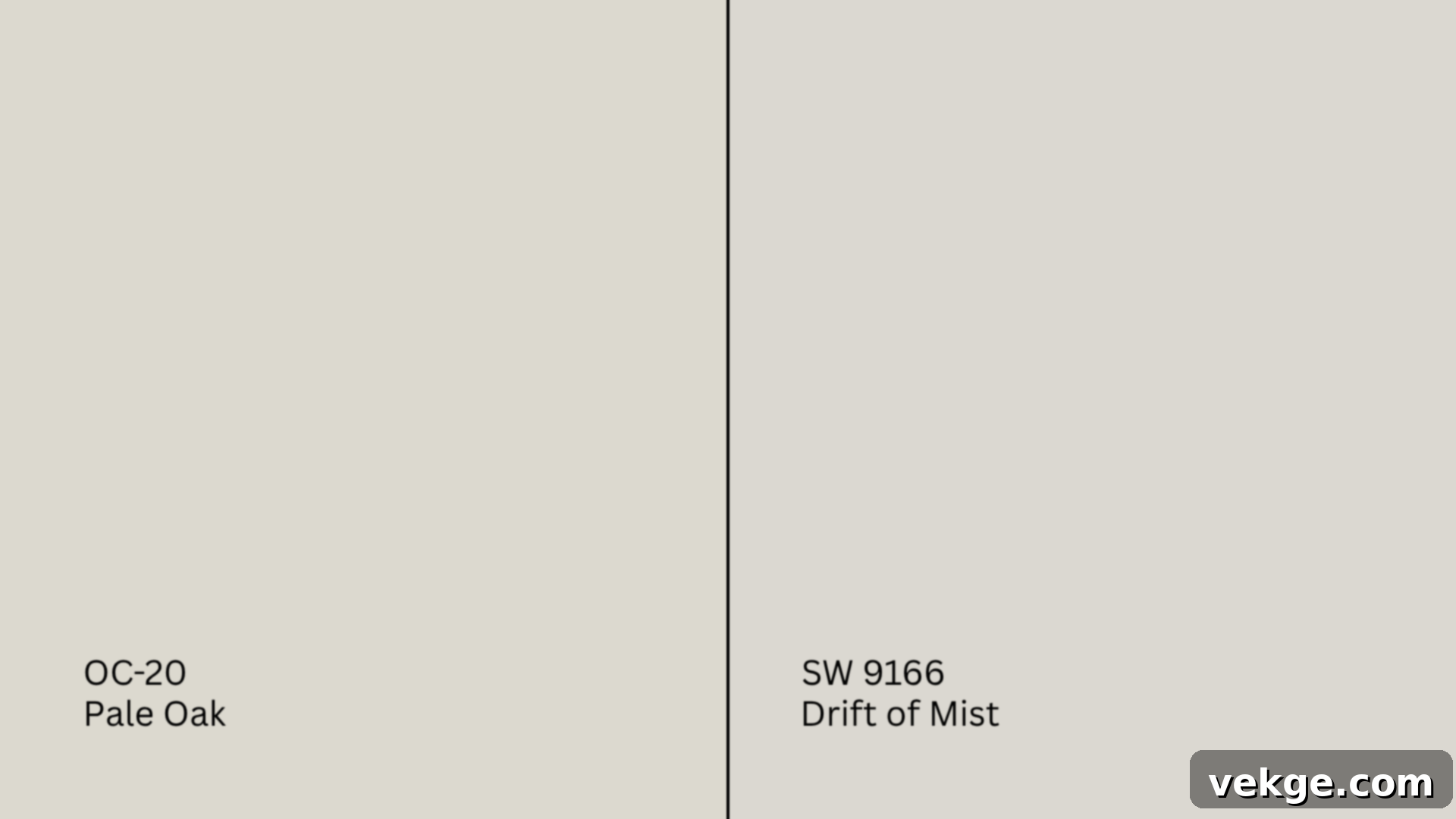
Similarities: Both colors boast a very close LRV, resulting in a similar light and airy feel. They both present as calm, quiet, and wonderfully soft neutrals in bright light, making them excellent choices for creating a serene atmosphere.
Differences: Drift of Mist leans distinctly cooler than Pale Oak. While Pale Oak has a delicate dance of pink-violet and taupe undertones, Drift of Mist tends to reveal more pronounced green-gray undertones. This makes Drift of Mist feel a bit crisper and sometimes more straightforwardly gray. Pale Oak retains a slightly warmer, more inviting glow, even in varied lighting.
When to choose Drift of Mist: Drift of Mist excels in warmer climates or rooms with abundant natural light, where its green-gray undertones can read as fresh and natural. However, be cautious in shadowy rooms or those with limited light, as it may appear a bit too cool or starkly gray, losing some of its soft neutral appeal compared to the subtle warmth Pale Oak offers.
Pale Oak vs. Egret White (SW 7570)
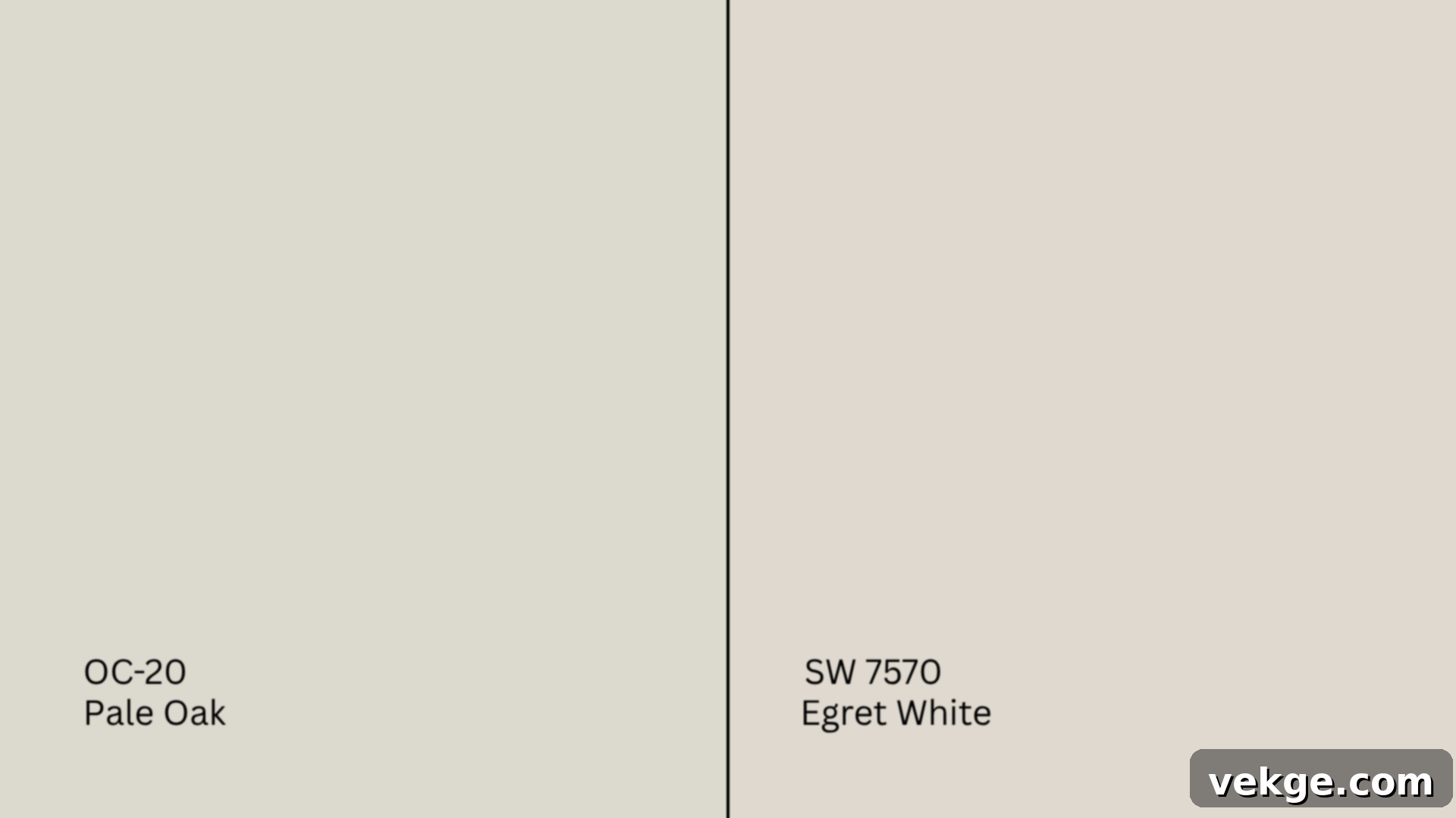
Similarities: Both Pale Oak and Egret White are undeniably warm neutrals that share subtle taupe and pink undertones. They both aim for a sophisticated, gentle warmth that feels inviting and soft on the walls.
Differences: The primary distinction lies in the intensity and presentation of their pink undertones. Egret White’s pink can be more assertive and often flashes more prominently, especially under artificial light or in north-facing rooms. Pale Oak’s pink-violet undertone is typically more subdued and elusive, giving it a more complex, less overtly pink appearance. Egret White can also feel slightly heavier or more saturated than the lighter, airier Pale Oak.
When to choose Egret White: Egret White is a fantastic choice if you specifically want to bring out warm wood tones, brass hardware, or other earthy elements in your decor. Its more pronounced warmth can create a cozier atmosphere. However, it’s important to test it with your existing finishes, as its stronger pink leanings might clash with cooler gray flooring or fixtures.
Pale Oak vs. Accessible Beige (SW 7036)
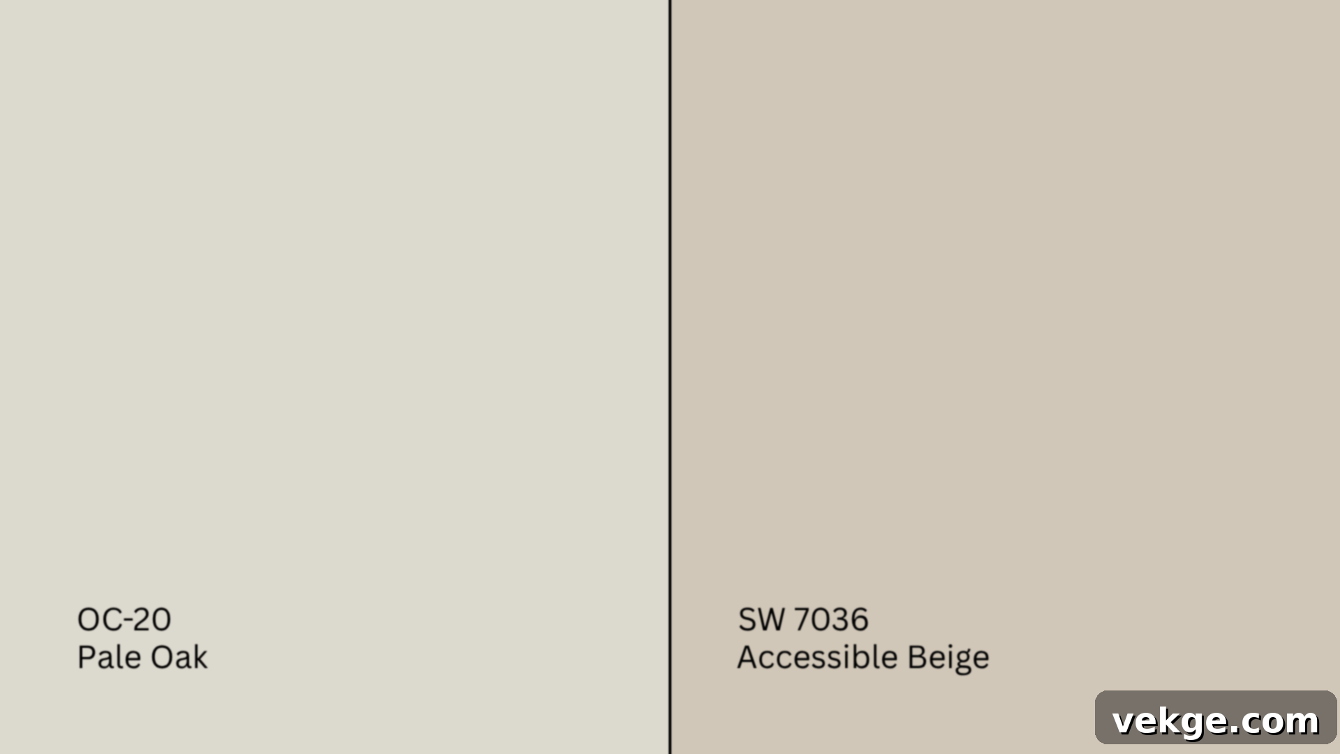
Similarities: Both colors are warm, muted, and grounded neutrals, offering a comforting and timeless aesthetic. They are both incredibly versatile and can adapt to a wide range of interior styles, from traditional to modern rustic.
Differences: Accessible Beige (SW 7036, #D1C7B8) is noticeably darker, earthier, and leans much more towards tan than Pale Oak. With an LRV of 58, it reflects significantly less light than Pale Oak (68.64). Pale Oak reads as a light greige, while Accessible Beige is a true, rich greige with strong beige roots and a touch of gray to keep it from being too yellow or orange.
When to choose Accessible Beige: Accessible Beige is perfect if you’re aiming for a cozier, more grounded feel in larger spaces, or if you have a lot of natural light that might wash out a lighter color. It offers more depth and a slightly more traditional appeal. However, it fundamentally lacks Pale Oak’s airy softness and delicate, almost ethereal quality, so it’s not a direct ‘dupe’ but rather a warmer, deeper alternative in the same neutral family.
Pale Oak vs. Agreeable Gray (SW 7029)
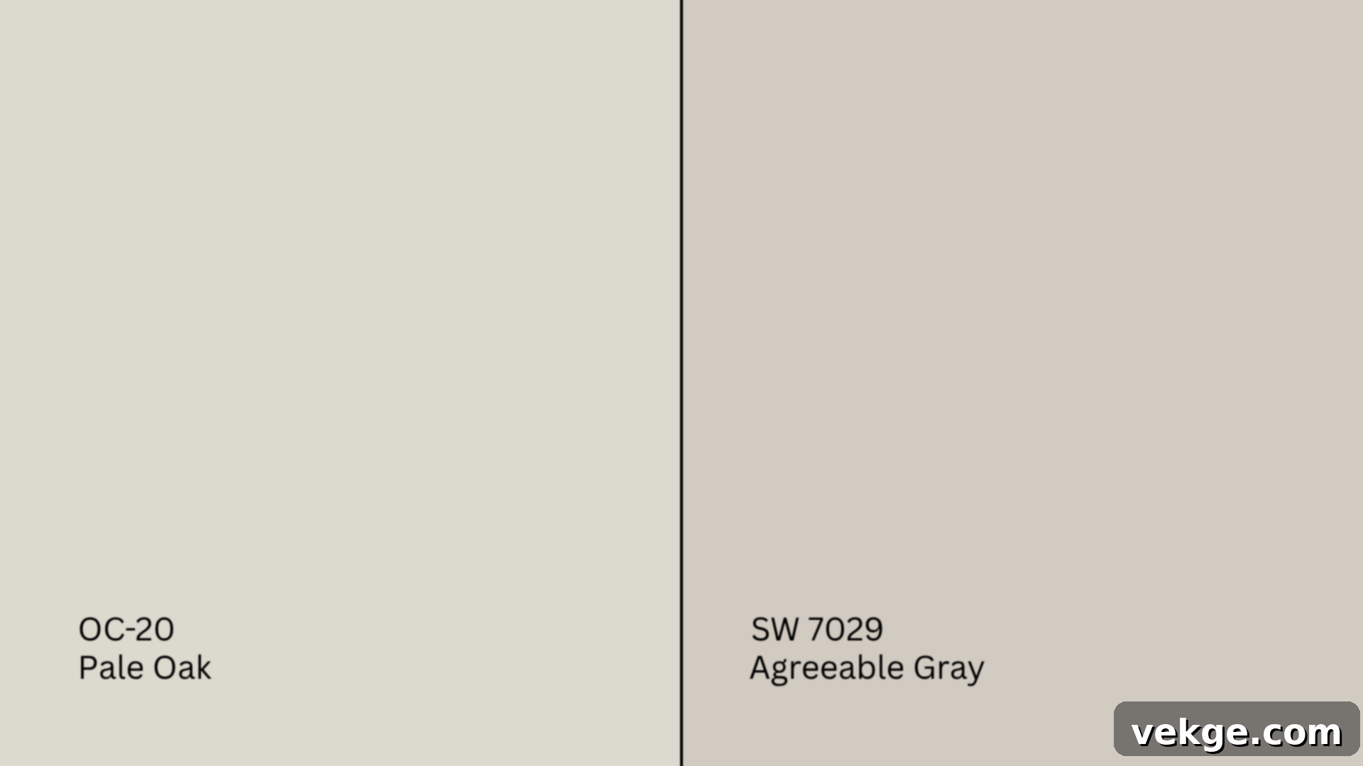
Similarities: Both Pale Oak and Agreeable Gray (SW 7029, #D1CBC1) are exceptionally versatile and widely popular neutrals that sit firmly in the greige category. They offer a balanced backdrop that works well with various decor styles and color schemes.
Differences: The main difference is their leanings: Agreeable Gray (LRV 60) leans more distinctly toward gray, making it feel generally cooler than Pale Oak. While Pale Oak retains its subtle pink-violet warmth, Agreeable Gray’s undertones are more green-gray or beige-gray, giving it a more classic greige appearance. Pale Oak feels a bit lighter and more ethereal, whereas Agreeable Gray has more depth and body.
When to choose Agreeable Gray: Agreeable Gray is incredibly flexible and pairs well with almost any decor. It’s a go-to for many who want a true greige that isn’t too warm or too cool. However, in rooms with very low light, Agreeable Gray might appear somewhat flat or too gray compared to Pale Oak’s ability to retain a soft, subtle warmth and complexity, preventing it from feeling lifeless.
How Lighting Affects Pale Oak and Its Sherwin-Williams Equivalents
One of the most crucial aspects of selecting any paint color, especially subtle neutrals like Pale Oak and its close Sherwin-Williams matches, is understanding how dramatically lighting conditions can alter their appearance. These are truly light-responsive neutrals, meaning their perceived tone and depth will shift significantly depending on both natural and artificial light sources.
- North-facing rooms: Rooms that face north typically receive cooler, indirect light throughout the day. In such settings, Pale Oak will lean more into its gray and muted taupe undertones, appearing perhaps a touch less warm than anticipated. Drift of Mist will likely emphasize its cool green-gray aspects, while First Star will look its truest gray-violet self.
- South-facing rooms: These rooms are bathed in bright, warm light for most of the day. Here, Pale Oak truly shines, warming up beautifully to reveal its beige and creamy notes, feeling incredibly soft and inviting. Egret White’s subtle pinks will glow softly, and Drift of Mist will appear at its warmest and most balanced.
- East-facing rooms: Morning light in east-facing rooms is warm and yellow, which will enhance the inherent warmth in Pale Oak, Egret White, and even bring out the beige in Drift of Mist. However, as the day progresses into the afternoon, the light fades and cools, causing these colors to shift back towards their more neutral or even slightly cooler interpretations.
- West-facing rooms: Afternoon and evening sunlight in west-facing rooms can be intense and often carries an orange or yellow tint. This strong, warm light can dramatically highlight Pale Oak’s delicate pink or violet undertones. Similarly, Egret White’s pink will be most apparent here, and even Drift of Mist might show its warmer, beige side.
For artificial lighting:
- Warm bulbs (2700K-3000K): These types of bulbs, often labeled “soft white,” will naturally bring out the warmer, creamier, and beige undertones in Pale Oak and its equivalents. They will enhance any pink or taupe notes and minimize cooler grays.
- Cool bulbs (3500K-5000K): Labeled “bright white” or “daylight,” these bulbs emphasize the cooler aspects of a color. They will highlight gray and green undertones in colors like Drift of Mist and First Star, potentially making Pale Oak appear more gray and less warm.
In general, Pale Oak’s inherent warmth and subtle complexity make it a safer, more universally appealing choice for cozy spaces like bedrooms, inviting hallways, and comfortable living areas. Cooler matches like First Star, with their crisp, modern appeal, are often better suited for kitchens or contemporary homes with sleek finishes where a clean, sophisticated look is desired.
Best Color Pairings for Pale Oak and Its Equivalents
The beauty of versatile neutrals like Pale Oak and its Sherwin-Williams counterparts lies in their adaptability. However, selecting the right coordinating colors for trim, ceilings, and accents is crucial to ensure your chosen paint feels polished, intentional, and cohesive within your home’s overall design scheme.
Trim Colors
The right trim color provides a crisp contrast or a soft blend, depending on your desired aesthetic:
- Extra White (SW 7006, #EEEFEA): This is Sherwin-Williams’ cleanest, brightest white. It creates a stark, crisp contrast against the soft depth of Pale Oak or its equivalents, making the wall color pop and providing a very defined, modern edge. It’s excellent for contemporary or minimalist styles.
- Alabaster (SW 7008, #EDEAE0): A beloved creamy, soft white, Alabaster is perfect for those who want a harmonious, cozy palette. It offers a gentle contrast without feeling harsh, enhancing the warmth of Pale Oak and creating a subtle, inviting transition between walls and trim. Ideal for farmhouse, traditional, or transitional styles.
- Pure White (SW 7005, #EDECE6): This is a beautifully balanced and clean white that serves as a versatile all-rounder. It’s brighter than Alabaster but softer than Extra White, providing enough contrast to make the trim stand out without overpowering the wall color. Pure White works seamlessly with virtually any decor style, offering a fresh and timeless appeal.
Accent Colors
Accent colors allow you to pull out specific undertones from Pale Oak or introduce complementary hues to enhance the room’s mood:
- Softer Greiges/Off-Whites: For a monochromatic or subtly layered look, consider accent colors that are slightly lighter or darker variations of greige. Examples include SW Shoji White (SW 7042, #E6DFD3), which is warmer and earthier, or SW Incredible White (SW 7028, #E3DED7) for a touch more depth. These work wonderfully for furniture, built-ins, or even accent walls in a slightly different finish.
- Deeper Taupes: To add grounding and sophistication, deeper taupes create a rich contrast. SW Loggia (SW 7506, #C4B7A5) is an excellent choice, providing a more saturated, earthy complement that can highlight Pale Oak’s warmer undertones.
- Benjamin Moore Favorites: Don’t limit your accents to Sherwin-Williams. Familiar Benjamin Moore favorites like BM Revere Pewter (HC-172, #CCC4B8) can also be used effectively for deeper contrast or in adjacent spaces, given its status as a classic greige.
- Pops of Color: If you desire to introduce actual color, think muted and earthy tones.
- Muted Greens: Sage greens, olive greens, or even muted teal can bring out the subtle green undertones sometimes present in Pale Oak or its equivalents, creating a connection to nature and a sense of calm.
- Dusty Mauves/Blush Tones: These hues beautifully complement Pale Oak’s inherent pink-violet undertones, adding a sophisticated, romantic, and slightly feminine touch without being overtly bright.
- Warm Terracotta Accents: Earthy terracotta, burnt orange, or rust tones can enhance the warmth in Pale Oak, creating a rich, inviting, and grounded atmosphere, especially effective in Bohemian or Mediterranean-inspired spaces.
These carefully selected accents not only bring out different facets of Pale Oak and its Sherwin-Williams equivalents but also help define the overall mood and style of your space, moving beyond just a neutral canvas to a thoughtfully designed environment.
Alternatives If Pale Oak Isn’t Quite Right
While Pale Oak is undeniably beautiful, it might not be the absolute perfect fit for every home or every vision. If its unique balance of warmth, greige, and subtle undertones doesn’t quite resonate with you or your space, there are numerous other fantastic options to explore. Here are a few curated selections from both Benjamin Moore and Sherwin-Williams, offering variations in warmth, coolness, and depth.
Other Benjamin Moore Options to Consider
If you love the Benjamin Moore aesthetic but want a slight tweak from Pale Oak, try these:
- Classic Gray (OC-23, #E3DFD5): With an LRV of 74.78, Classic Gray is a touch lighter and more purely soft gray than Pale Oak, making it feel even softer and more subtle. It still has warmth but without the pink-violet leanings. It’s an excellent choice if Pale Oak felt a little too deep or had too much noticeable undertone.
- Balboa Mist (OC-27, #DAD5CC): Sitting at an LRV of 67.37, Balboa Mist is very close to Pale Oak in depth but leans more distinctly into cool violet-gray undertones. If you liked the softness of Pale Oak but wished it was a little cooler and had a more pronounced purple-gray hint, Balboa Mist might be your ideal match.
- Edgecomb Gray (HC-173, #DAD1C4): With an LRV of 63.88, Edgecomb Gray is slightly darker and more visibly earthy and beige than Pale Oak. It’s a true warm greige that leans more heavily into its beige side, making it feel cozier and more grounded. If Pale Oak was too light or too cool for your taste, Edgecomb Gray offers a richer, warmer alternative.
Additional Sherwin-Williams Picks
If you’re committed to Sherwin-Williams but want to broaden your search beyond the direct equivalents, consider these popular choices:
- Shoji White (SW 7042, #E6DFD3): A beautiful, warm, and slightly richer off-white with clear beige undertones (LRV 71). Shoji White is an excellent alternative if you desire a paint that is distinctly warmer and creamier than Pale Oak, yet still incredibly soft and elegant. It offers more substance than a pure white without becoming overly yellow.
- Greek Villa (SW 7551, #F0ECE2): This is a brighter, creamier white (LRV 84), making it a much lighter option than Pale Oak. If Pale Oak felt a bit too muted or deep and you prefer a true, soft white with just a hint of warmth and no strong undertones, Greek Villa is a fantastic choice to brighten up any space.
- Modern Gray (SW 7632, #D6CEC3): With an LRV of 62, Modern Gray is a beautifully balanced greige that tends to be less pink than Egret White and less green than Agreeable Gray. It offers a straightforward, sophisticated greige without strong, distracting undertones. If you liked the idea of greige but found Pale Oak’s nuances a bit too tricky, Modern Gray provides a very dependable, versatile option.
Crucial Tip for Selection: Before making a final decision, take some time to reflect on what precisely you liked or disliked about Pale Oak. Did you want something with more warmth or a cooler touch? Did you prefer it softer and lighter, or a bit bolder and more saturated? Use these insights to narrow down your choices. Always remember to obtain large peel-and-stick samples of your top contenders and observe them on your walls in various lighting conditions throughout the day. This is the only truly reliable way to see how these nuanced tones will behave in your unique environment and with your specific decor.
Conclusion: Finding Your Perfect Greige Match
The journey to finding the ideal paint color can be challenging, but if your heart is set on the exquisite softness and subtle sophistication of Benjamin Moore’s Pale Oak, you now possess a clear and comprehensive roadmap to its closest Sherwin-Williams equivalents. We’ve meticulously explored the defining characteristics of Pale Oak, from its warm greige nature to its elusive pink-violet undertones, setting the stage for an informed comparison.
You’ve been introduced to the top Sherwin-Williams matches—Drift of Mist, Egret White, and First Star—each offering a unique interpretation of Pale Oak’s charm, whether leaning slightly cooler, more pink-taupe, or with a hint of violet-gray. We’ve also stacked Pale Oak against other popular Sherwin-Williams neutrals like Accessible Beige and Agreeable Gray, illuminating how it stands apart in depth, warmth, and undertone complexity.
Understanding how lighting dramatically influences these light-responsive neutrals is paramount. From the cool light of north-facing rooms to the warm glow of afternoon sun, you now know what to expect and how different light sources can bring out various facets of your chosen hue. Furthermore, our guide has provided essential pairing suggestions, from crisp trim whites to thoughtful accent colors, ensuring your selected greige feels perfectly integrated and intentional within your home.
Should Pale Oak or its immediate Sherwin-Williams twins not perfectly align with your vision, a curated selection of additional alternatives from both brands offers paths to warmer, cooler, softer, or bolder expressions of neutral beauty.
The final, indispensable step in this journey remains yours: start with a few peel-and-stick samples. This practical approach is the only foolproof method to truly witness how these nuanced tones interact with your home’s unique natural light, artificial lighting, and existing decor. Observing them throughout the day will reveal their true character and ensure you make a choice you’ll love for years to come.
For more detailed insights and confident paint selections, explore our other in-depth color comparison guides and resources on the website. Happy painting!
