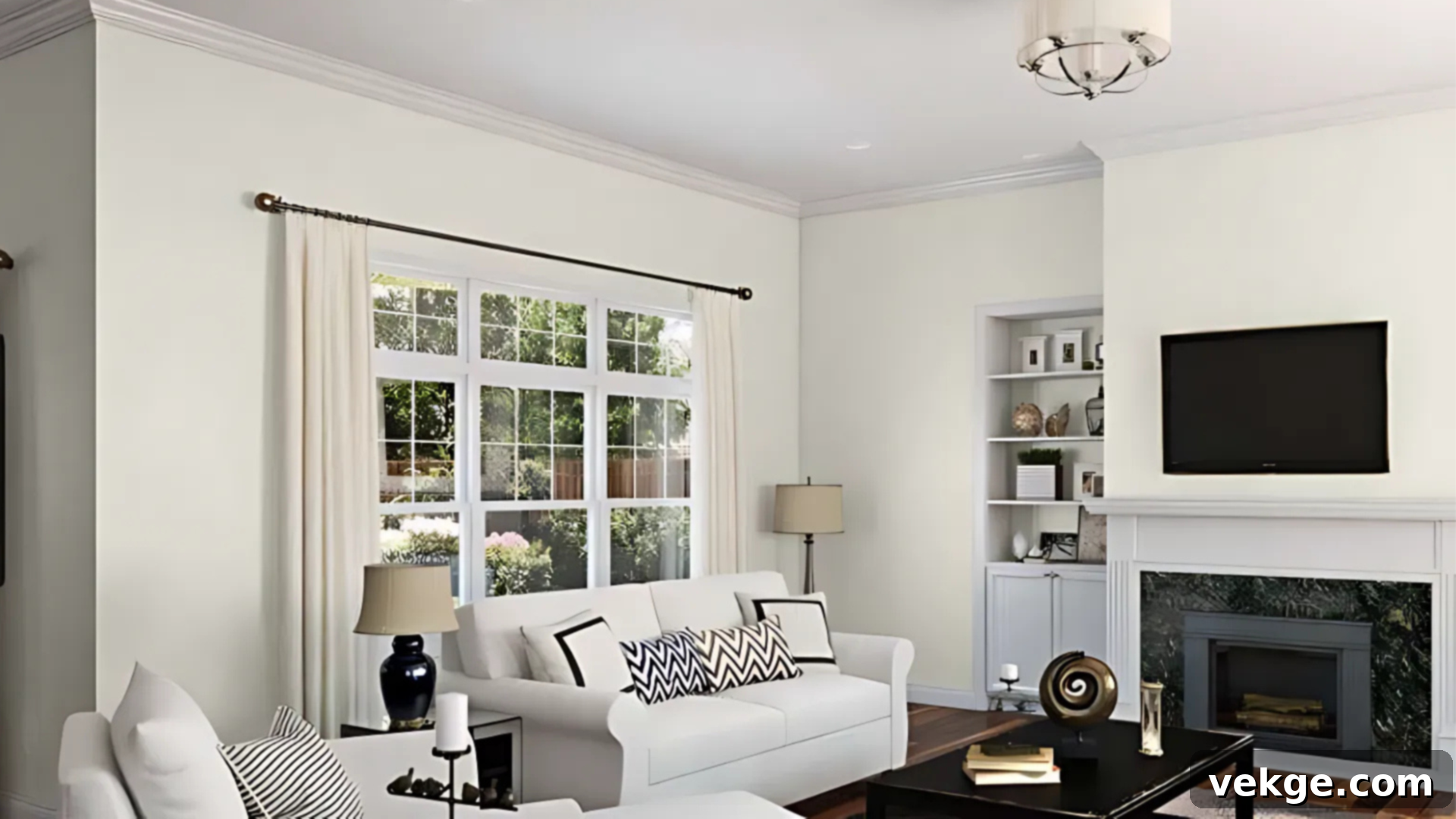
The Ultimate Guide to Behr Alabaster Equivalents: Finding Your Perfect Sherwin-Williams Match
Choosing the perfect white paint for your home can be surprisingly challenging. With countless shades available, each with its own subtle undertones, it’s easy to feel overwhelmed. Sherwin-Williams’ Alabaster (SW 7008) has long been a beloved classic, cherished for its warm, inviting glow that avoids feeling too yellow or stark. However, if you’re a fan of Behr paints or simply looking for an alternative that offers a similar aesthetic, you’re in luck! Behr offers several beautiful white shades that come remarkably close to Alabaster’s coveted charm.
In this comprehensive guide, we’ll dive deep into Sherwin-Williams Alabaster, then thoroughly compare it with its closest Behr equivalents. You’ll discover how these popular white paints differ, understand the nuances of their undertones, and learn how various lighting conditions and room types can dramatically alter their appearance. By the end, you’ll have all the insights you need to confidently select the ideal warm white paint to transform your space, whether it’s for walls, trim, or cabinetry.
Getting to Know Sherwin-Williams Alabaster (SW 7008)

Sherwin-Williams Alabaster (SW 7008) consistently ranks as one of the most popular white paint colors, and for good reason. It strikes a beautiful balance, resting comfortably in the middle of the warm-white spectrum. This versatility makes it an excellent choice for a wide array of interior design styles, from modern farmhouse to classic traditional, creating a light, airy, and undeniably cozy atmosphere without ever feeling stark or overtly yellow.
Basic Color Profile of SW Alabaster
- HEX code: #EDEAE0
- LRV (Light Reflectance Value): 82
- Color Family: A soft, off-white with distinct warm undertones.
Alabaster is a proud member of Sherwin-Williams’ highly regarded neutral collection. Its defining characteristic is its warm, creamy base, which effortlessly brightens any space. With an LRV of 82, it reflects a significant amount of light, contributing to a luminous and open feel, yet it avoids the harshness that can sometimes accompany purer, brighter whites.
Alabaster’s Undertones Explained
What truly gives Alabaster its beloved character are its subtle undertones of soft beige and greige (a blend of gray and beige). These undertones are masterfully balanced, ensuring the color maintains a welcoming warmth without veering into overly creamy or yellow territory. The beauty of these undertones lies in their adaptability, shifting slightly based on the unique lighting conditions of your room.
- In Abundant Natural Daylight: Alabaster appears incredibly clean, crisp, and invitingly warm, maintaining its sophisticated neutrality without showing strong yellow hues.
- Under Soft White or Incandescent Bulbs: The creamy beige warmth becomes more pronounced, enhancing the cozy and comfortable ambiance of the space.
- Adjacent to Cool Finishes (e.g., cool gray tiles, chrome fixtures): Its subtle greige undertones might emerge slightly, offering a hint of cool balance against dominant cool elements.
This chameleon-like quality is precisely why Alabaster is so widely adored. It harmonizes with diverse decor elements and adapts gracefully to different rooms and lighting scenarios. However, as with any paint choice, we strongly recommend testing large samples on your own walls to observe its true character throughout the day before making a final commitment.
Closest Behr Equivalents to Sherwin-Williams Alabaster
For those who prefer Behr paints or are looking for alternatives, several Behr white shades offer a similar appeal to Sherwin-Williams Alabaster. While no two paints are ever identical, these options capture the essence of Alabaster’s warm, soft white. Each Behr color has its own distinct tone and subtle nuances, meaning the “best” match will ultimately depend on your room’s unique lighting, existing decor, and personal design preferences.
1. Behr Silky White (PPU7-12)

Undertones: Subtle beige with a barely-there hint of gray
Warmth Level: A beautifully balanced soft warm white
Behr Silky White (PPU7-12) is often hailed as the closest Behr match to Sherwin-Williams Alabaster. It shares Alabaster’s coveted creamy warmth, offering an inviting feel that never tips into overly yellow territory. With an LRV of 83, it’s very close to Alabaster’s reflectivity, contributing to a bright yet gentle ambiance.
In actual rooms, Silky White radiates the same calm, soft, and sophisticated look that has made Alabaster so popular. Its versatile undertones allow it to pair seamlessly with various decor styles. It performs exceptionally well on walls, trim, and even kitchen cabinets, making it an excellent all-around choice. If you’re seeking a nearly identical feel to SW Alabaster using a Behr paint, Silky White is undoubtedly your top contender.
2. Behr Blank Canvas (DC-003)

Undertones: A beautifully balanced warm white with creamy hints
Warmth Level: Slightly warmer and creamier than Silky White, but still perfectly soft
Behr Blank Canvas (DC-003) is an excellent choice if you’re seeking a white that’s a touch richer and perhaps leans more towards a classic, inviting off-white than Silky White. With an LRV of 84, it’s a very bright white that still manages to feel incredibly soft. Its inherent warmth makes it an ideal companion for natural wood tones, traditional furnishings, and decor schemes that prioritize comfort and coziness.
In brightly lit spaces or under abundant daylight, Blank Canvas appears clean, soft, and highly reflective, creating an expansive feel. However, as the light diminishes, its creamy warmth becomes more evident, offering a slightly stronger warm-white presence than Alabaster. Opt for Blank Canvas when you desire a beautifully balanced, inviting white that offers a little more depth and a genuinely welcoming character to your living areas, bedrooms, or dining rooms.
3. Behr Snowy Pine (HDC-NT-21)

Undertones: A crisp, cool white with subtle gray hints
Warmth Level: A soft, refreshingly cool white
Behr Snowy Pine (HDC-NT-21) offers a distinctly cooler feel compared to the warmer Alabaster. With an impressive LRV of 86, it’s one of the brightest options on our list, making spaces feel expansive and airy. Its underlying gray hints prevent it from appearing stark or sterile, instead providing a clean and fresh look.
Snowy Pine is particularly well-suited for north-facing rooms, which often receive cooler, indirect light throughout the day. In such spaces, where other whites might appear dingy, Snowy Pine can help balance out the inherent coolness and prevent the room from feeling too cold. It’s also an excellent choice for balancing warmth in heavily lit, south-facing rooms or in spaces with existing warm-toned materials that you wish to tone down. If your design goal is a crisp, clean aesthetic that isn’t overly stark, Snowy Pine delivers a beautifully soft, cool white solution for bathrooms, laundry rooms, or modern kitchens.
4. Behr Swiss Coffee (12 Swiss Coffee)

Undertones: Pronounced creamy beige with a subtle yellow hint
Warmth Level: A rich, deeply warm white
Behr Swiss Coffee (12 Swiss Coffee) is noticeably deeper and warmer than Sherwin-Williams Alabaster. With an LRV of 84, it maintains good light reflection but brings a more saturated warmth to a space. Its dominant creamy beige undertones, often with a whisper of yellow, make it incredibly inviting and cozy, perfect for creating a truly comfortable ambiance.
This rich warm white excels in large, brightly lit rooms where you desire an extra layer of warmth on the walls. It harmonizes beautifully with Mediterranean, Tuscan, or traditional decor styles, complementing natural wood, terracotta, and antique finishes. However, it’s crucial to test Swiss Coffee diligently, as it may feel too yellow or overly creamy in dim or poorly lit rooms. But if your design goal is a sumptuously cozy, rich, and undeniably warm look, Behr Swiss Coffee is an outstanding selection.
LRV and Undertone Comparison Table for Behr Equivalents
Understanding each paint color’s LRV (Light Reflectance Value) and underlying undertones is fundamental when selecting the right match for your home. LRV indicates how much light a color reflects, with higher numbers being brighter. Undertones determine the subtle hue that emerges in different lighting conditions.
Here’s a clear comparison of Behr’s closest matches to Sherwin-Williams Alabaster, allowing you to easily assess their brightness and inherent character:
| Paint Color | LRV | Undertones | Hex Code | Best Use Cases |
|---|---|---|---|---|
| Behr Silky White | 83 | Soft beige with subtle gray | #EEEBE2 | Walls, trim, and cabinets in modern, cozy spaces; main living areas |
| Behr Blank Canvas | 84 | Balanced warm white with a creamy feel | #F1EDE1 | Open concept living, dining rooms, and areas needing a rich, soft warm tone |
| Behr Snowy Pine | 86 | Crisp, cool white with gray hints | #F0EFE3 | North-facing rooms, bathrooms, kitchens, or spaces needing a fresh, clean feel |
| Behr Swiss Coffee | 84 | Rich creamy beige with a slight yellow tint | #F1EDE0 | Large, brightly lit rooms, kitchens, and living spaces that desire profound warmth and coziness |
How These Behr Colors Look in Real Rooms
Knowing the technical specifications of paint colors is helpful, but truly understanding how these Behr equivalents to Alabaster perform in real-world settings is crucial for making an informed decision. The quality and direction of light in a room, whether natural or artificial, dramatically influence how a white or neutral shade will appear.
Below is a detailed breakdown of how each Behr color interacts with various lighting conditions and how it can transform different spaces, helping you visualize the impact on your own home.
Behr Silky White in Action
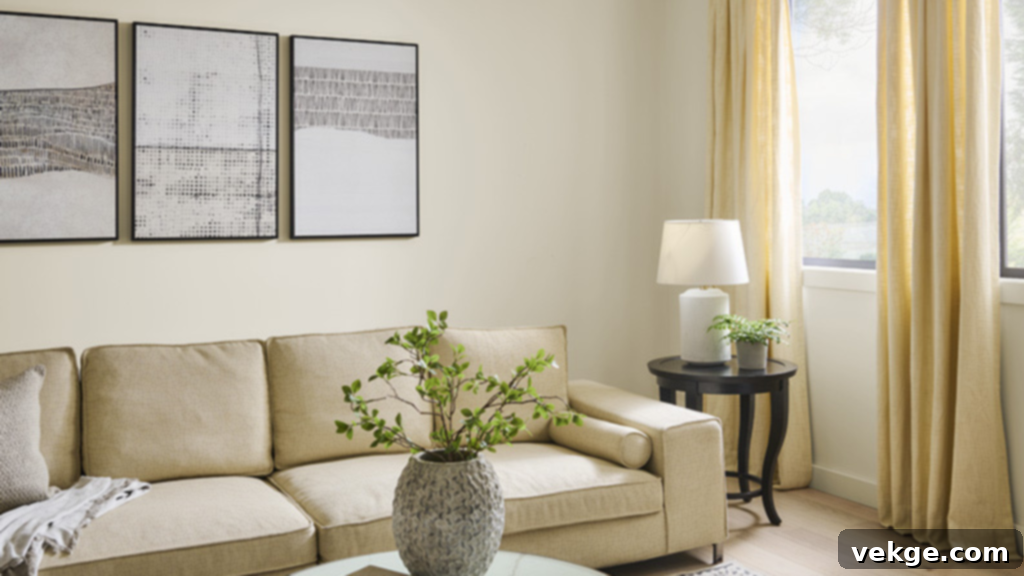
Best for: Living rooms, open-concept kitchens, bedrooms, trim, and cabinetry – essentially anywhere you desire a universally appealing, soft warm white.
Under Warm Lighting (e.g., soft white or yellow-toned bulbs, west-facing rooms in the afternoon): Silky White blossoms into a truly soft, creamy white with its subtle beige undertones providing an unmistakably cozy and inviting atmosphere. It feels warm and nurturing without ever appearing yellow or dingy.
Under Cool Lighting (e.g., natural daylight from north-facing windows, cool LED bulbs): This shade gracefully maintains its warm, subtle grayish hue. It offers a balanced and gentle feel, preventing the space from becoming too cold or stark, a testament to its remarkable adaptability.
Behr Blank Canvas in Action
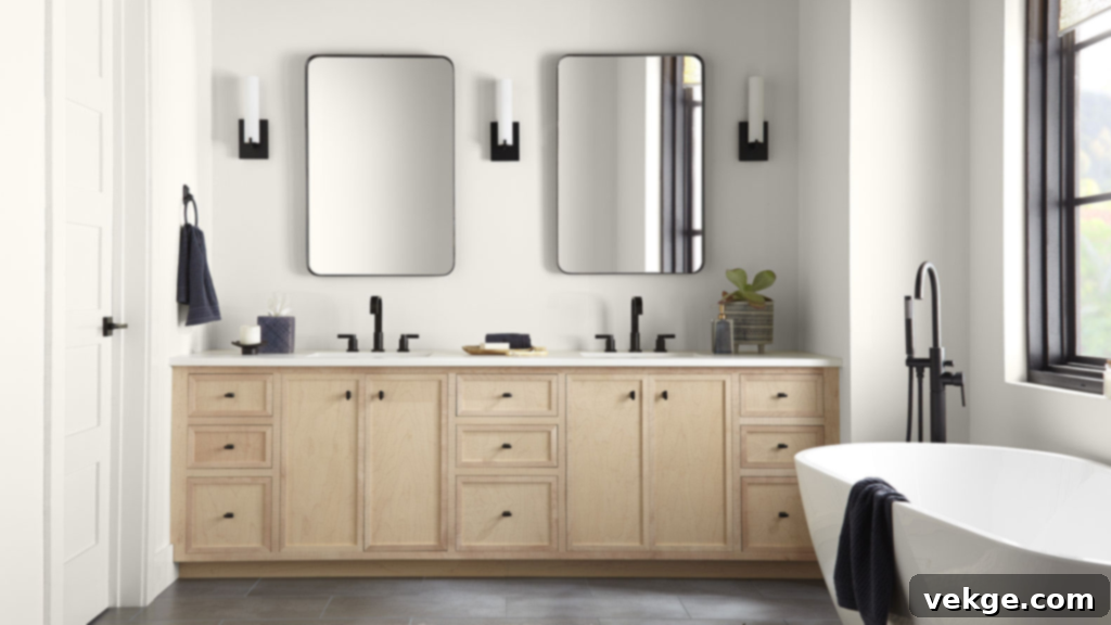
Best for: Expansive open-concept spaces, large living rooms, dining areas, and entryways where a strong, inviting warmth is desired.
Under Warm Lighting (e.g., incandescent lighting, rooms with abundant south-facing light): Blank Canvas truly shines, appearing invitingly rich and luxurious. It takes on the character of a refined, classic off-white, adding depth and sophistication to the room.
Under Cool Lighting (e.g., north-facing rooms, cooler daylight): While it maintains a creamy, neutral tone, its inherent warmth is more apparent than in Alabaster. It may look slightly warmer than initially expected, especially in rooms bathed in ample natural light, contributing to a cozy and grounded feel.
Behr Snowy Pine in Action
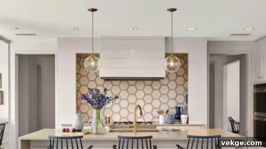
Best for: North-facing rooms, contemporary bathrooms, minimalist kitchens, and areas that benefit from a crisp, clean, and refreshing ambiance.
Under Warm Lighting (e.g., soft yellow bulbs, late afternoon sun): Snowy Pine retains its cool and soft characteristics, providing a calm, clean effect. It acts as a subtle counterpoint to warm light, preventing the space from feeling overly saturated or heavy.
Under Cool Lighting (e.g., direct northern light, cool-toned LED fixtures): Its inherent cool undertones become more prominent, making this shade appear exceptionally crisp and fresh. This characteristic is perfect for spaces that require a luminous, airy, and lighter feel, making it an excellent choice for a modern aesthetic.
Behr Swiss Coffee in Action
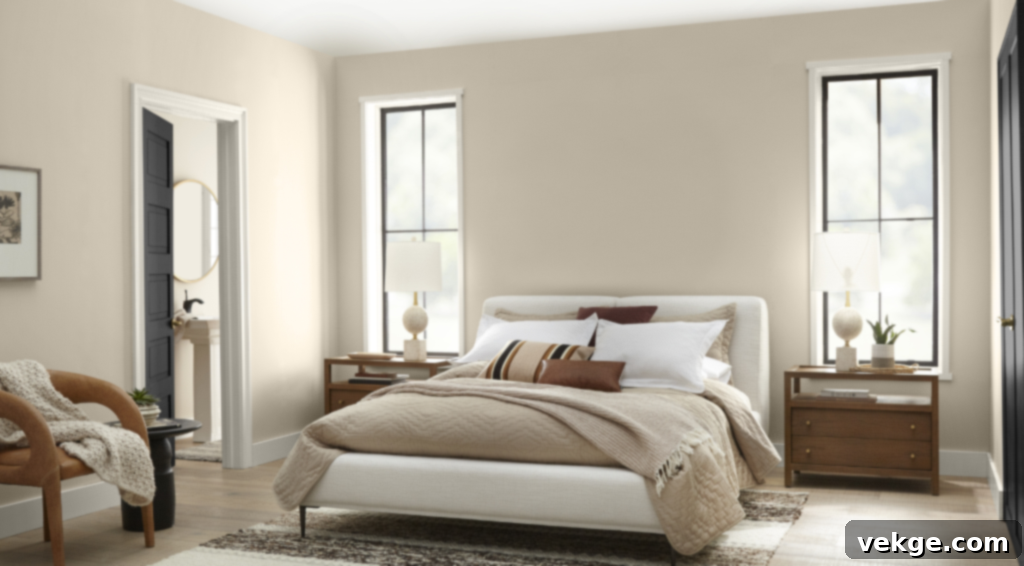
Best for: Larger rooms, cozy kitchens, traditional living spaces, and any area where you want a rich, profoundly warm, and inviting ambiance to envelop the room.
Under Warm Lighting (e.g., warmer artificial lights, south-facing windows with direct sun): Swiss Coffee deepens in tone, truly bringing out its creamy beige and soft yellow undertones. This creates a remarkably cozy, luxurious, and welcoming feel that can make a large room feel more intimate and comfortable.
Under Cool Lighting (e.g., cooler daylight, north-facing rooms): While the cool light may temper some of its intensity, Swiss Coffee still maintains a strong presence of warmth. It becomes more of a neutral, yet still noticeably rich, off-white with a subtle yellow tint that prevents it from looking cold or flat. Its substantial warmth can still shine through, giving it a more textured and substantial feel than a pure white.
How to Pick the Right Shade for Your Home
Choosing the absolute perfect white paint can feel daunting, but by following a systematic approach, you can make an informed decision that you’ll love for years to come. The goal is to find a shade that not only looks beautiful on its own but also complements your home’s unique characteristics and your personal style.
Here are some enhanced tips to guide you through the selection process:
- Analyze Your Room’s Lighting: This is arguably the most critical step. Pay close attention to how much natural light your room receives and from which direction (north, south, east, west). Also, consider the type of artificial lighting you use (warm, cool, or neutral bulbs). Paint large swatches of your chosen options on different walls and observe them throughout the entire day and evening. Colors can appear drastically different under various light conditions.
- Utilize Paint Samples and Swatches Religiously: Never skip this step! Buying sample pots or large adhesive swatches is a small investment that prevents potentially costly mistakes. Paint generous swatches (at least 1-foot by 1-foot) on several walls in the room you intend to paint. This allows you to see how the color interacts with varying light and shadows. Live with these samples for a few days, observing them in morning light, afternoon sun, and under your evening artificial lighting.
- Define Your Room’s Purpose and Desired Mood: The function of a room can influence your paint choice. For communal areas like living rooms, dining rooms, and open-concept spaces, a softer, neutral warm white like Behr Silky White or Blank Canvas can foster a warm, welcoming, and relaxed vibe. For functional spaces like kitchens, bathrooms, or laundry rooms, a slightly crisper white like Behr Snowy Pine might be preferred to maintain a fresh, clean, and invigorating feel.
- Consider Interior vs. Exterior Use:
- For Interiors: Softer, more nuanced tones like Silky White or Swiss Coffee are excellent for walls, trim, and cabinetry. They create a sense of warmth, harmony, and depth within a controlled environment.
- For Exteriors: Sunlight is far more intense outdoors, often washing out colors. A slightly cooler or more saturated white, such as Snowy Pine, can appear crisp and clean without looking too stark in direct sun. Warmer whites outdoors can sometimes look overly yellow or creamy, so choose with caution.
- Understand and Work with Undertones: Be aware of the undertones in your chosen paint and how they interact with existing elements in your room. Warm-toned whites (like Swiss Coffee) will beautifully complement and enhance rooms featuring rich wood tones, exposed brick, or warm-colored textiles. Conversely, cooler whites (like Snowy Pine) tend to harmonize best with spaces that incorporate more neutral, gray, or blue-toned elements, creating a fresh and modern contrast.
- Test with Your Chosen Sheen: The sheen (or finish) of paint significantly impacts how the color appears. A flat or matte finish absorbs more light, making a color look richer and softer, while higher sheens like satin or semi-gloss reflect more light, making the color appear brighter and sometimes slightly lighter. Test a small section with your chosen color in the specific sheen you plan to use for an accurate representation.
- Integrate with Fixed Elements and Furnishings: Before committing, consider how your chosen white works with existing fixed elements like flooring, countertops, tiles, and major furniture pieces. Hold your paint samples up against these items to ensure a cohesive and harmonious palette throughout your space.
By diligently following these steps, you can confidently navigate the world of white paints and select a Behr shade that not only looks fantastic but truly elevates and complements your unique home environment.
Where to Buy These Behr Alternatives
Finding these fantastic Behr paint colors for your next home improvement project is straightforward, as they are widely available through major retailers and online platforms. Behr is known for its accessibility and quality, making it a popular choice for DIY enthusiasts and professionals alike.
Here are the primary places where you can purchase these Behr paint shades:
- Home Depot: As the exclusive retailer for Behr paints, Home Depot’s website and physical stores are your go-to destination. You can conveniently order your Behr paint online for curbside pickup, in-store collection, or home delivery. Keep an eye out for their frequent discounts and promotions, especially during holiday weekends, which can help you save on larger projects.
- Behr’s Official Website: For comprehensive product information and color inspiration, visit Behr.com. Their official website provides a complete selection of all Behr paints, detailed specifications for each shade, and invaluable virtual tools like room visualizers to help you plan and preview your project before even stepping into a store. While you’ll ultimately purchase through Home Depot, Behr’s site is excellent for research.
Sheen Recommendations for Optimal Results
Beyond color, selecting the appropriate paint sheen is crucial for both aesthetic appeal and practical durability. The sheen affects how light reflects off the surface, how easily it cleans, and how well it conceals imperfections.
When choosing the right sheen for your paint, consider the specific use and traffic level of the surface:
- Eggshell: This finish is a widely popular choice and ideal for walls in living rooms, bedrooms, dining areas, and hallways. It offers a soft, low-luster finish that gently reflects light, creating a warm and inviting look. Eggshell is also excellent at hiding minor wall imperfections and is more durable and easier to clean than a flat finish.
- Satin: A step up in reflectivity and durability from eggshell, satin is perfectly suited for high-traffic areas that require frequent cleaning, such as kitchens, bathrooms, laundry rooms, and children’s rooms. Satin provides a smooth, velvety appearance with a soft sheen, making it both elegant and highly practical for busy households.
- Semi-Gloss: This highly durable and reflective finish is the go-to choice for trim, baseboards, doors, and cabinetry. Semi-gloss is exceptionally easy to clean and withstands heavy wear and tear, making it perfect for areas prone to fingerprints and scuffs. Its sleek, shiny finish also adds a touch of polish and contrast when paired with flatter wall finishes.
Always align your chosen sheen with the functionality and desired aesthetic of your space for the best long-term results.
Behr Alabaster vs. Sherwin-Williams Alabaster: A Crucial Distinction
Important Confusion Alert: It’s essential to address a common point of confusion for paint shoppers. While Sherwin-Williams has its widely celebrated Alabaster (SW 7008), Behr also offers a color named “Alabaster” (Behr BXC-62). Despite sharing the same name, these two paints are not interchangeable. They possess distinct differences in their core tone, undertones, and how they ultimately appear on your walls.
Side-by-Side Comparison: Behr Alabaster (BXC-62) vs. SW Alabaster (SW 7008)
Understanding these differences is key to avoiding disappointment. Here’s a clear comparison to highlight what sets them apart:
| Feature | Behr Alabaster (BXC-62) | Sherwin-Williams Alabaster (SW 7008) |
|---|---|---|
| HEX Code | #E8E2D3 | #EDEAE0 |
| LRV (Light Reflectance Value) | 76 | 82 |
| Undertones | Noticeably warm with more pronounced beige and a hint of green | Warm, soft white with subtle beige and greige (gray-beige) hints |
| Warmth Level | Warmer, softer beige; leans more towards a true cream | A balanced warm, creamy white with a gentle, often barely perceptible grayish tone |
| Best Use Cases | Cozy living rooms, traditional kitchens, trim where a richer cream is desired; can feel more saturated in smaller spaces | Modern farmhouse, coastal decor, sophisticated traditional interiors, exteriors; universally versatile |
As the table illustrates, even though both shades are considered soft, warm whites, their LRV and undertones create a noticeable difference. Behr’s Alabaster (BXC-62), with its lower LRV of 76, is less reflective and tends to carry a slightly stronger, more saturated beige and sometimes a hint of green, making it lean more into a classic cream. Sherwin-Williams Alabaster (SW 7008), with its higher LRV of 82, is brighter, offering a purer, creamy white feel with those subtle, adaptable greige undertones.
This distinction means that while Behr’s Alabaster is beautiful, it might not provide the exact same luminous, adaptable quality as SW Alabaster. Always, always test samples of both on your walls if you’re comparing, as lighting conditions and room size will undoubtedly influence their final appearance in your home.
Conclusion
Embarking on the journey to select the perfect white paint for your space can feel like a complex task, but with the detailed insights provided, you now have a much clearer understanding of the best Behr paint equivalents to Sherwin-Williams Alabaster (SW 7008). We’ve explored the nuances of popular Behr shades like Silky White, Blank Canvas, Snowy Pine, and Swiss Coffee, comparing their distinct undertones, LRVs, and how they beautifully transform various rooms.
The key takeaway remains consistent: the magical interplay of light is paramount in how any paint color appears. A warm white like Alabaster or its Behr counterparts can appear different from morning to night, and even from one wall to another. Therefore, always prioritize testing large samples directly in your space, observing them throughout the day to truly gauge their character and ensure they align with your vision.
Whether your goal is to infuse your home with a cozy, rich warmth, achieve a balanced and adaptable soft white, or create a crisp, refreshing ambiance, there’s a Behr white out there that can help you achieve the perfect atmosphere. By considering your room’s light, purpose, existing decor, and using our comprehensive comparisons, you’re well-equipped to make a confident and beautiful paint choice.
If you found this guide to Sherwin-Williams Alabaster and its Behr equivalents helpful, we encourage you to explore our other blogs for more expert painting tips, interior design inspiration, and valuable home improvement advice to make your decorating journey a success!
