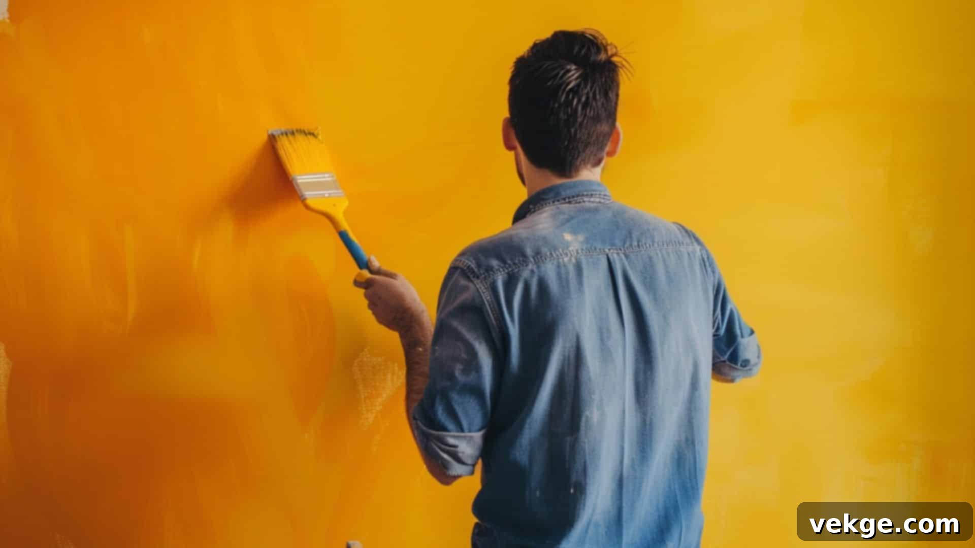
Unlock Yellow’s Radiance: The Ultimate Guide to 30 Perfect Color Combinations
Yellow, the color of sunshine, happiness, and optimism, possesses an undeniable ability to brighten any space and uplift spirits. Its vibrant energy is contagious, making it a beloved hue in everything from interior design to fashion and branding. However, harnessing yellow’s full potential can sometimes feel like a challenge. Many of us find ourselves pondering which colors truly complement its luminosity without clashing or overwhelming the eye, struggling to create color schemes that allow yellow to shine its brightest.
If you’ve ever felt uncertain about pairing this cheerful shade, don’t worry – you’re in the right place! This comprehensive guide is designed to help you unlock yellow’s complete spectrum of possibilities. We’re about to embark on a colorful journey, exploring 30 meticulously selected hues that work beautifully with yellow. From the subtle elegance of neutrals to the striking impact of bold contrasts and the calming influence of cool tones, you’ll discover a diverse range of color combinations tailored to suit any style, mood, or project.
Whether your goal is to infuse a room with warmth, craft a stunning outfit, or design eye-catching graphics, these curated pairings will provide the inspiration and confidence you need to make yellow look its absolute best. Get ready to transform your understanding of this radiant color as we explore its perfect partners. Let’s dive into the world of harmonious and dynamic yellow color combinations!
List of Colors that Go with Yellow
1. White
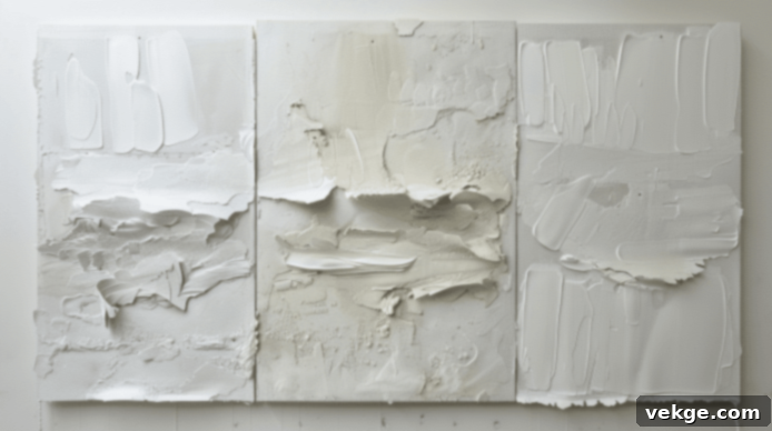
The pairing of yellow and white is a timeless classic, celebrated for its fresh, clean, and effortlessly sophisticated appeal. This luminous combination instantly infuses any space or ensemble with a sense of brightness and expansiveness, making it feel open, airy, and inviting. It’s a remarkably versatile duo, equally at home in minimalist modern interiors seeking a pristine aesthetic or in vibrant summer fashion, where it evokes sun-drenched days and cool breezes.
The magic of this combination lies in the stark yet harmonious contrast. Yellow, with its inherent warmth and cheerful energy, truly pops against the crisp, neutral backdrop of white. White acts as a perfect canvas, allowing various shades of yellow – from soft pastels to bold primary yellows – to take center stage without overwhelming the eye. This results in a lively yet impeccably balanced aesthetic, often associated with purity, optimism, and new beginnings. Consider using this palette for kitchens, nurseries, or light, airy living rooms to create an uplifting and serene environment. In branding, it communicates clarity and positive energy.
Shades
- Pure White: Provides the sharpest contrast, making yellow appear exceptionally bright and vibrant.
- Ivory: Offers a softer, slightly warmer backdrop, lending a more subdued elegance and a touch of vintage charm.
- Off-White: A versatile choice that maintains brightness while adding a hint of creaminess or subtle warmth, ideal for a gentler, more inviting transition.
2. Black
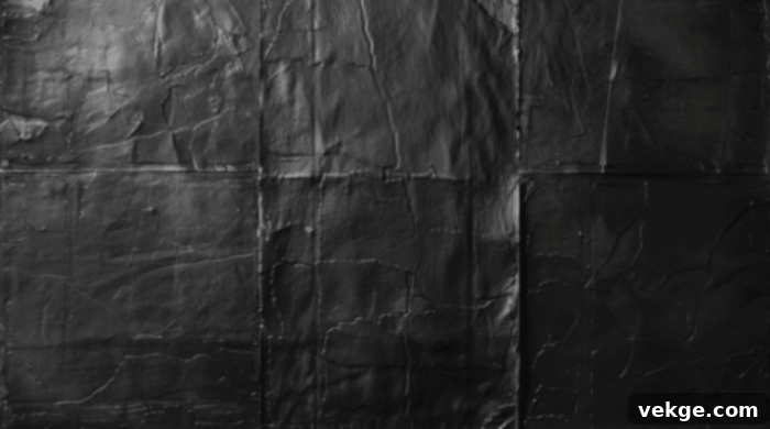
Black and yellow form a strikingly dramatic duo that commands immediate attention. This high-contrast pairing is inherently bold and assertive, frequently seen in nature’s warning colors and iconic safety signs due to its exceptional visibility. When applied in design, it creates a modern, edgy, and undeniably sophisticated look that is both eye-catching and impactful.
The inherent darkness and depth of black serve to amplify yellow’s brightness, making it appear even more vibrant and intense. This combination is often utilized in graphic design, sports branding, or contemporary fashion to convey power, energy, and a confident style. While bold, it can be incredibly chic and elegant when used thoughtfully, perhaps with smaller accents of yellow against a predominantly black background, or vice-versa, depending on the desired emphasis. It’s a powerful statement that exudes confidence and a modern aesthetic.
Shades
- Jet Black: Offers the most intense contrast, making yellow almost glow against its profound darkness.
- Charcoal: A softer, more muted black that provides a less aggressive contrast, adding sophistication without harshness.
- Ebony: A rich, dark black with a subtle warmth, creating a luxurious and deep pairing with yellow.
3. Navy Blue
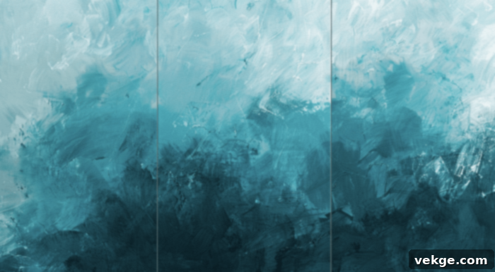
Navy blue paired with yellow offers a classic, sophisticated, and remarkably versatile combination. This elegant pairing frequently evokes a timeless nautical feel, reminiscent of maritime flags and coastal aesthetics, making it perfect for both refined fashion and classic home decor. The deep, rich quality of navy provides a grounded base that allows yellow to truly shine without overwhelming the overall palette.
The cool, steady depth of navy blue beautifully balances the vibrant warmth of yellow, creating a harmonious and visually appealing duo that feels both classic and contemporary. This combination is excellent for achieving a sense of trustworthiness and professionalism, often seen in corporate branding. In interiors, it can create a calming yet cheerful atmosphere, while in fashion, it’s a go-to for smart-casual or business looks. It’s a sophisticated choice that speaks of reliability and quiet confidence.
Shades
- Midnight Blue: A very dark navy, almost black, offering a profound depth that makes yellow pop dramatically.
- Indigo: A slightly brighter navy with a hint of purple, adding a touch of artistic flair to the combination.
- Dark Denim: A more casual, slightly textured navy shade that gives the pairing a relaxed yet stylish vibe.
4. Gray
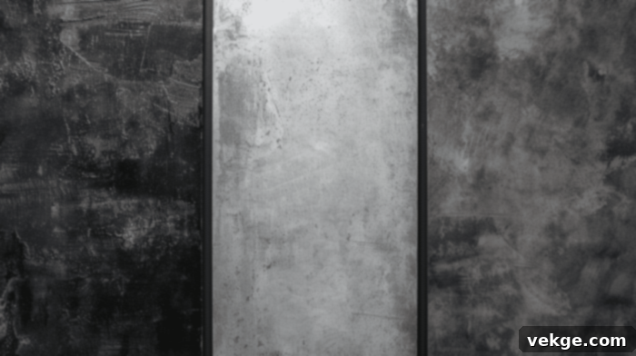
Gray serves as an exceptional neutral base that masterfully tempers and softens yellow’s inherent brightness. This sophisticated combination results in a modern, balanced, and incredibly stylish look that is both versatile and chic. The inherent coolness of gray beautifully counteracts yellow’s warmth, creating a harmonious and contemporary palette that avoids being too stark or too vibrant.
This pairing is an excellent choice for contemporary interiors seeking a calm yet uplifting atmosphere, or for professional attire where it conveys professionalism with a touch of approachable charm. Gray allows yellow to introduce a subtle pop of color and personality without dominating the space. Lighter grays create a softer, more airy feel, while darker charcoals offer a more grounded and dramatic contrast, making it adaptable to various design sensibilities and moods.
Shades
- Charcoal Gray: A deep, rich gray that provides a substantial, grounding contrast to yellow, enhancing its vibrancy.
- Silver Gray: A lighter, more reflective gray that creates a sleek, modern, and often metallic-like combination with yellow.
- Dove Gray: A soft, medium gray that offers a gentle and elegant backdrop, allowing yellow to add a subtle lift.
5. Brown
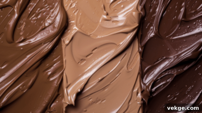
Brown, when paired with yellow, introduces a comforting sense of warmth, earthiness, and natural appeal. This combination beautifully evokes autumnal vibes, reminiscent of fallen leaves and golden fields, creating a cozy, inviting, and deeply welcoming atmosphere. The richness and grounded nature of brown provide a stable foundation, allowing yellow’s brightness to flourish without feeling overly dominant.
The blend of these two warm hues results in a balanced and comforting palette that feels organic and authentic. It’s an ideal choice for rustic, farmhouse, or traditional design schemes, adding depth and a sense of heritage. In fashion, it suggests a natural, down-to-earth elegance. Different shades of brown, from light tan to deep chocolate, can dramatically alter the mood, ranging from light and airy to rich and sumptuous, offering immense versatility for a truly natural aesthetic.
Shades
- Chocolate Brown: A deep, rich brown that offers a sophisticated and grounding contrast, making yellow feel luxurious.
- Walnut: A medium brown with a classic, refined character, creating a balanced and natural pairing with yellow.
- Caramel: A lighter, warmer brown that enhances yellow’s warmth, resulting in a sweet and inviting combination.
6. Beige
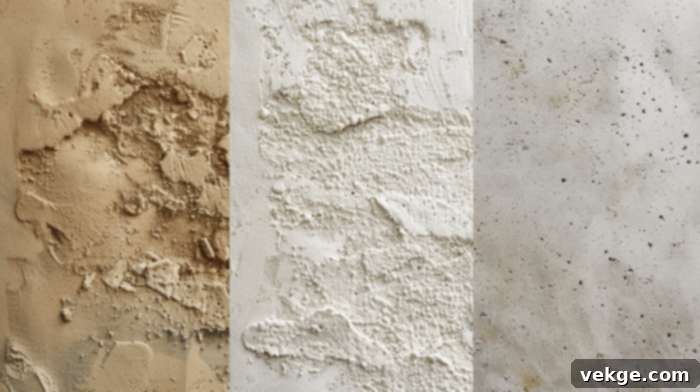
Beige creates a wonderfully soft, harmonious, and understated combination with yellow. This pairing offers a warm, neutral backdrop that allows yellow to infuse a subtle cheerfulness without ever overwhelming the space or ensemble. It’s the epitome of understated elegance, perfect for cultivating a calm, serene, and inviting atmosphere in living spaces, or for achieving a sophisticated, subtle, and effortlessly chic look in fashion.
The result is a gentle, soothing, and highly versatile palette that radiates warmth and tranquility. Beige softens yellow’s intensity, making it more approachable and adaptable for larger areas or classic designs. It works beautifully in minimalist or Scandinavian-inspired interiors, providing a warm foundation that allows yellow accents to pop delicately. This combination speaks of comfort, quiet luxury, and timeless appeal, making it a reliable choice for enduring style.
Shades
- Sand: A light, warm beige that evokes natural landscapes and offers a soft, airy feel with yellow.
- Ecru: A slightly darker, more textured beige that adds a natural, organic depth to yellow pairings.
- Taupe: A cool-toned beige with hints of gray, offering a modern and sophisticated backdrop for yellow, creating a more contemporary feel.
7. Coral
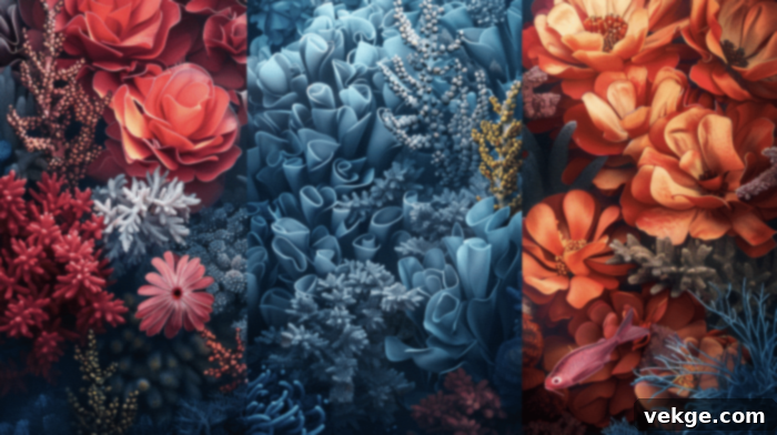
Coral, when paired with yellow, instantly injects a lively, tropical, and utterly joyful feel into any design. This vibrant combination beautifully evokes thoughts of radiant summer sunsets, exotic blooms, and sun-drenched beaches. It’s an energetic and undeniably cheerful duo, absolutely perfect for creating a fun, upbeat, and invigorating atmosphere that radiates warmth and playfulness.
The inherent warmth of both coral and yellow creates a wonderfully harmonious and inviting blend that feels refreshing and spirited. It’s a fantastic choice for summer fashion, lively party decor, or adding a burst of personality to a relaxed living space. The blend is dynamic yet cohesive, making it an excellent option for those who want to embrace bold colors without sacrificing a sense of natural harmony. This pairing promises to bring a smile to anyone who encounters it, embodying pure, unadulterated happiness.
Shades
- Salmon Coral: A softer, pinker coral that creates a gentle, warm, and inviting blend with yellow.
- Peach Coral: A light, creamy coral with strong orange undertones, enhancing yellow’s sunny disposition.
- Deep Coral: A richer, more intense coral that offers a vibrant and sophisticated contrast to yellow.
8. Teal
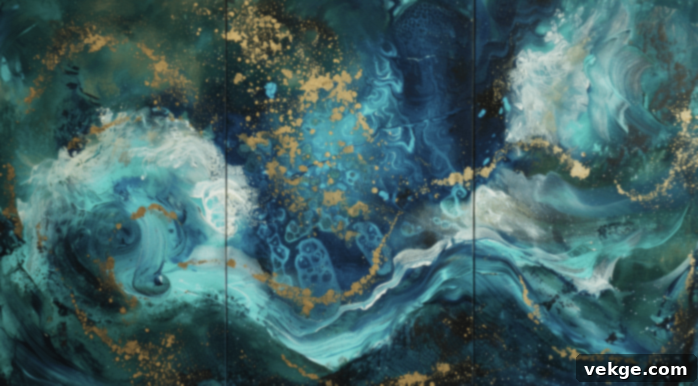
Teal and yellow create a truly vibrant, energetic, and captivating look that immediately draws the eye. This combination is bold and delightfully playful, often reminiscent of the mesmerizing hues of tropical waters meeting sun-drenched skies. The cool, deep undertones of teal provide a striking contrast that beautifully balances yellow’s inherent warmth, resulting in a dynamic, refreshing, and deeply engaging palette.
It’s a perfect choice for adding a significant splash of color and personality to any design project, whether it’s a modern living room, a statement fashion accessory, or a compelling brand identity. Teal’s richness prevents yellow from becoming too overpowering, allowing both colors to maintain their distinct vibrancy while enhancing each other. This pairing exudes a contemporary flair, suggesting creativity, sophistication, and a lively spirit, making it popular in graphic design and eclectic interiors.
Shades
- Peacock Teal: A rich, jewel-toned teal that offers a luxurious and dramatic contrast to yellow.
- Ocean Teal: A vibrant, clear teal reminiscent of deep sea waters, creating a refreshing and bright combination.
- Emerald Teal: A greener teal that adds an earthy yet sophisticated depth, perfectly complementing yellow’s natural warmth.
9. Turquoise
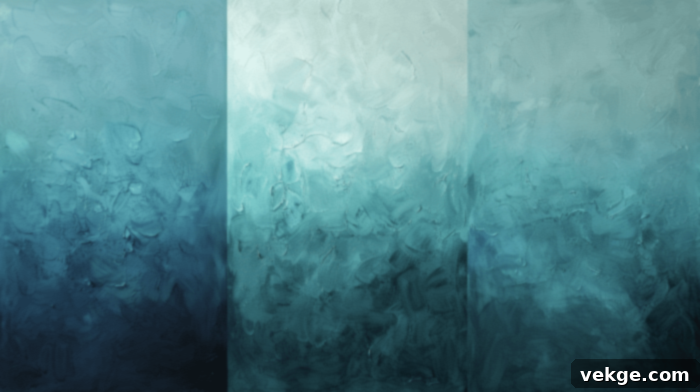
Turquoise adds a bright, refreshing, and delightfully exotic contrast to yellow. This pairing immediately conjures images of sunny beaches, crystalline waters, and clear blue skies, evoking a powerful sense of relaxation, joy, and escapism. The combination is inherently lively and invigorating, perfect for creating a cheerful, uplifting, and breezy atmosphere in both fashion and interior design.
Being a direct complementary color to yellow on the color wheel (blue-green), turquoise creates a naturally balanced and exciting visual dynamic. It’s an excellent choice for summer-themed designs, children’s rooms, or any space where you want to infuse a sense of youthful energy and serene beauty. Turquoise brightens yellow, while yellow warms turquoise, resulting in a harmonious interplay that feels both stimulating and calming. This duo is a sure way to bring a touch of paradise into your world.
Shades
- Aqua Turquoise: A lighter, more translucent turquoise that creates a soft, ethereal, and very refreshing pairing.
- Sky Turquoise: A brighter, more vivid turquoise reminiscent of clear skies, offering a lively and cheerful contrast.
- Deep Turquoise: A richer, more saturated turquoise that provides a sophisticated depth, making yellow appear even more radiant.
10. Orange
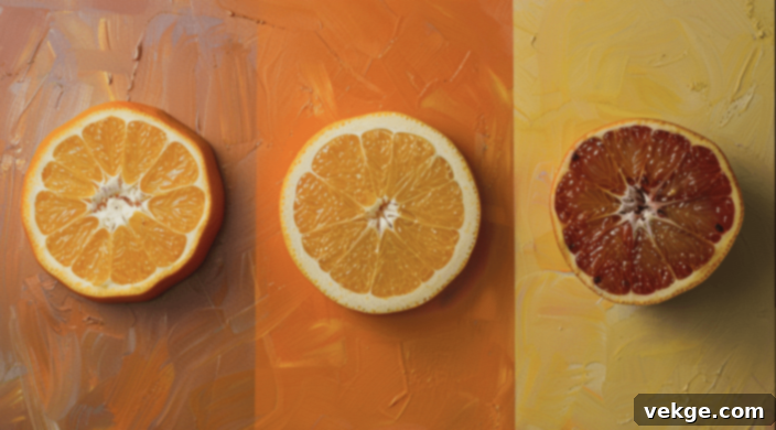
Orange is a natural complement to yellow, forming an inherently warm, sunny, and incredibly energetic palette. This combination radiates enthusiasm and vitality, creating a vibrant, dynamic look that’s bursting with life. It effortlessly evokes thoughts of delicious citrus fruits, fiery sunsets, and endless summer days, filling any space or design with an infectious sense of happiness and excitement.
While undoubtedly bold, this pairing is also beautifully balanced and harmonious, as both colors share a warm undertone. It’s perfect for creating a cheerful, welcoming, and stimulating atmosphere, making it a popular choice for playful branding, creative spaces, or lively social areas. The spectrum of shades, from soft apricot to intense tangerine, allows for versatility, enabling designers to dial up or down the intensity to match the desired mood. This sun-kissed duo is a powerful expression of joy and creativity.
Shades
- Tangerine: A bright, zesty orange that enhances yellow’s cheerfulness, creating a truly energetic and playful vibe.
- Burnt Orange: A deeper, more muted orange with earthy undertones, offering a warm and autumnal sophistication with yellow.
- Apricot: A soft, pastel orange that creates a gentle, inviting, and deliciously warm blend with lighter yellows.
11. Green
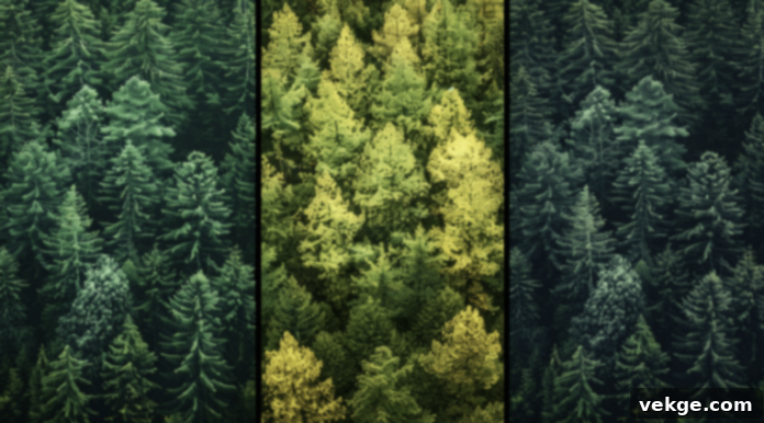
Green and yellow come together to create a profoundly natural, lively, and incredibly refreshing combination. This pairing immediately evokes the pristine freshness of spring, the lush vitality of burgeoning nature, and the cheerful optimism of a sunny garden. It’s a harmonious blend that can be both energizing and deeply soothing, depending on the specific shades of green and yellow employed.
This organic duo works exceptionally well in a wide variety of settings, from bright, cheerful interiors designed to bring the outdoors in, to outdoor-inspired fashion choices and eco-friendly branding. The blend feels inherently balanced, as yellow often represents sunlight and green represents foliage – an inseparable pair in nature. Lighter greens with yellow feel vibrant and youthful, while darker, richer greens create a more sophisticated, grounding effect, offering a versatile palette that speaks of growth, renewal, and natural beauty.
Shades
- Lime Green: A bright, zesty green that brings a vibrant, playful, and energetic punch when paired with yellow.
- Forest Green: A deep, rich green that offers a grounding, sophisticated, and natural contrast to yellow’s brightness.
- Sage Green: A muted, earthy green that creates a calm, serene, and sophisticated blend, allowing yellow to add a soft glow.
12. Olive
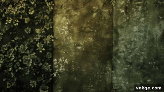
Olive green adds a distinctly muted, sophisticated, and subtly earthy touch when paired with yellow. This refined combination creates a warm, subdued palette that exudes elegance and a natural, grounded aesthetic. The rich, deep tones of olive green expertly temper yellow’s inherent brightness, resulting in a balanced, mature, and remarkably chic look that feels both classic and contemporary.
It’s a perfect choice for creating a cozy, inviting atmosphere in home decor, evoking a sense of calm and understated luxury. In fashion, it suggests an earthy sophistication and a refined sense of style. Olive and yellow work particularly well in spaces with natural materials, bringing a sense of organic harmony. This pairing is less about bold contrasts and more about a sophisticated blending of warm, earthy tones, offering a palette that is both comforting and quietly luxurious.
Shades
- Army Green: A strong, utilitarian olive that gives a robust and grounded feel to yellow.
- Moss Green: A softer, more natural olive that provides a subtle, organic backdrop for yellow, evoking forest floors.
- Khaki: A light, sandy olive that creates a casual, understated, and airy combination with yellow.
13. Mint Green
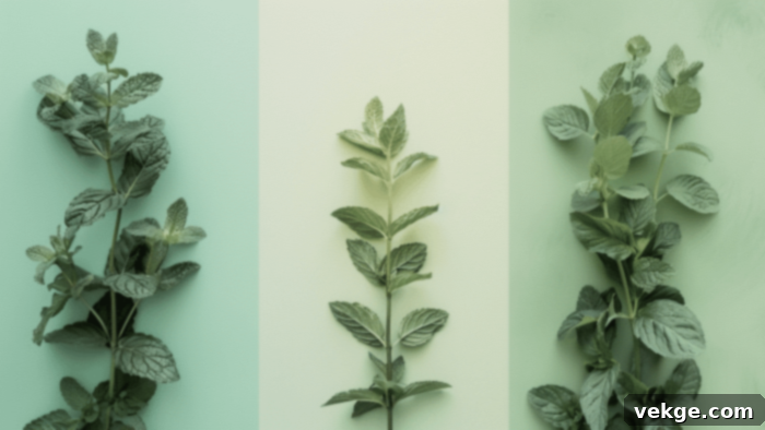
Mint green creates a wonderfully fresh, cool, and invigorating contrast with yellow. This combination is light, airy, and utterly delightful, instantly evoking thoughts of crisp spring mornings, budding flowers, and new beginnings. It’s a playful yet inherently soothing palette that works exceptionally well in modern, minimalist designs seeking a touch of whimsy and natural elegance.
The inherent coolness of mint green beautifully balances yellow’s vibrant warmth, resulting in a refreshing and invigorating look that feels both harmonious and dynamic. It’s ideal for children’s rooms, spring-themed events, or adding a gentle, uplifting touch to a bathroom or kitchen. This pairing radiates a sense of cleanliness, purity, and youthful optimism, making it a charming and perennially popular choice for designers looking to infuse a space with gentle energy and a breath of fresh air.
Shades
- Seafoam Green: A light, ethereal mint that lends a delicate and dreamlike quality when paired with yellow.
- Pastel Mint: A soft, creamy mint that creates a sweet, gentle, and utterly charming combination with yellow.
- Spearmint: A slightly more intense mint with a vibrant kick, offering a lively and refreshing contrast to yellow.
14. Purple
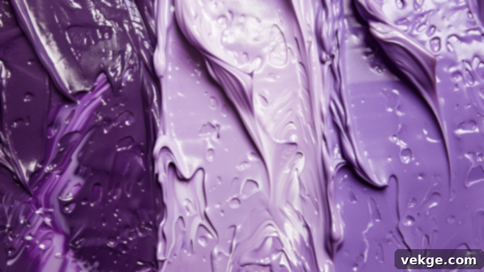
Purple, as yellow’s direct complementary color on the color wheel, offers a bold, vibrant, and incredibly impactful combination. This striking pairing is frequently observed in nature, gracing the petals of pansies, irises, and crocuses, showcasing its inherent beauty. It’s a regal and truly eye-catching duo that can create dramatic, luxurious, and deeply sophisticated looks, making a powerful visual statement.
The stark contrast between cool purple and warm yellow creates a dynamic, energetic, and visually stimulating palette that is rich in depth and personality. This combination is excellent for artistic projects, statement fashion pieces, or accent walls in a bold interior, where you want to communicate creativity, royalty, and a touch of mystique. It requires thoughtful application to maintain balance, but when executed well, it’s an unforgettable and truly sophisticated color scheme that exudes confidence and flair.
Shades
- Royal Purple: A deep, intense purple that provides a luxurious and regal contrast, making yellow feel opulent.
- Plum: A rich, dark purple with reddish undertones, offering a sophisticated and warm depth to yellow.
- Lavender: A lighter, softer purple that creates a gentle, romantic, and dreamy balance with yellow, adding a serene touch.
15. Lavender
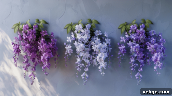
Lavender, when combined with yellow, introduces a soft, calming, and distinctly romantic effect. This gentle combination creates a soothing, dreamy, and utterly serene atmosphere, less intense than stronger purples, offering a more subtle and elegant pairing. It whispers of tranquil gardens, fragrant fields, and gentle spring breezes, creating a palette that feels both comforting and ethereal.
This harmonious duo works beautifully in bedrooms and nurseries, fostering a sense of peace and relaxation. In fashion, it’s perfect for creating serene, dreamy, and delicate looks that exude understated grace. The softness of lavender tempers yellow’s brightness, resulting in a whimsical yet sophisticated palette that avoids any harshness. It’s an ideal choice for anyone seeking to infuse their surroundings with a quiet charm, a touch of gentle femininity, and a calming visual appeal.
Shades
- Light Lilac: A very pale lavender that offers a delicate, airy, and truly ethereal feel when paired with yellow.
- Wisteria: A medium lavender with a slightly pinker hue, creating a romantic and charming blend.
- Periwinkle: A blue-toned lavender that adds a cool, fresh, and slightly whimsical touch to yellow combinations.
16. Pink
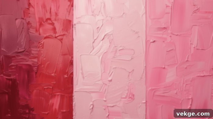
When paired with yellow, pink creates a wonderfully playful, cheerful, and incredibly vibrant look. This combination is youthful, energetic, and full of life, making it perfect for crafting fun, upbeat designs that radiate joy and positivity. The versatility of pink allows it to range from soft and sweet to bold and vibrant, depending on the specific shades used, offering a wide spectrum of moods.
This dynamic duo works exceptionally well in children’s rooms, infusing them with whimsy and happiness. It’s also a fantastic choice for spring fashion collections, festive decorations, or any project where you want to evoke a sense of lightheartedness and celebration. Whether you opt for a soft pastel pink or a vivid fuchsia, the combination with yellow promises to deliver a lively and engaging aesthetic that’s both charming and eye-catching, a true celebration of youthful energy.
Shades
- Blush Pink: A very soft, subtle pink that creates a delicate, romantic, and gentle pairing with yellow.
- Hot Pink: A bright, intense pink that offers a bold, energetic, and playful contrast to yellow.
- Salmon Pink: A warm, orange-toned pink that blends seamlessly with yellow, creating a harmonious and inviting glow.
17. Magenta
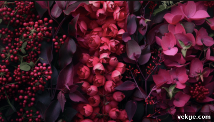
Magenta, when combined with yellow, adds a bold, dynamic, and truly electrifying touch. This vibrant pairing is undeniably attention-grabbing and bursting with raw energy, making it a favorite in contemporary design. It’s a modern, trendy combination that works exceptionally well in graphic design for impactful statements or in fashion-forward outfits designed to turn heads.
The exciting contrast between the cool, saturated magenta and the warm, bright yellow creates an exciting, lively, and incredibly striking palette. This duo exudes confidence and a sense of cutting-edge style. It’s perfect for projects that require a high degree of visual impact and a daring aesthetic. When used in interiors, even as accents, it can inject a significant dose of personality and contemporary flair, ensuring the space feels vibrant and alive with artistic energy.
Shades
- Fuchsia: A bright, vivid magenta that delivers a powerful, energetic punch, making yellow appear even more brilliant.
- Berry: A deeper, richer magenta with subtle purple undertones, offering a sophisticated and luxurious contrast.
- Deep Pink: A saturated, intense pink that leans towards magenta, creating a vibrant and bold pairing with yellow.
18. Red
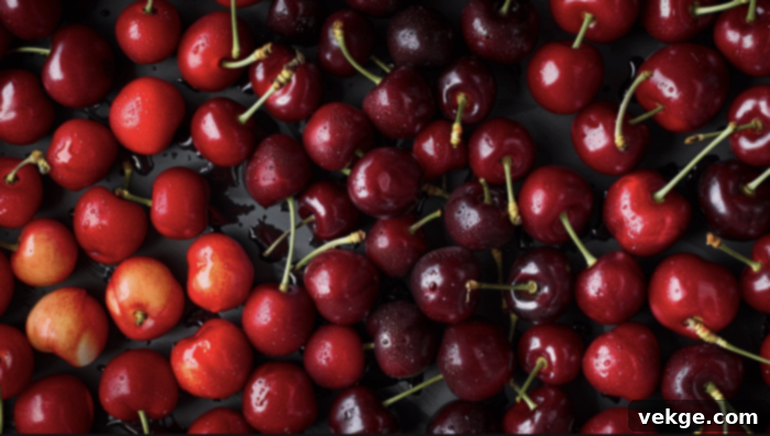
Red provides a striking, energetic, and incredibly passionate combination with yellow. This pairing is inherently bold and highly attention-grabbing, often utilized in warning signs due to its exceptional visibility and ability to demand immediate focus. In design and fashion, it creates a warm, powerful, and deeply passionate look that is full of drama and intensity.
The intensity of both colors results in a dynamic, powerful, and often festive palette. It’s frequently seen in cultural celebrations, sports teams, and branding where strength and enthusiasm are key messages. While both are warm and vibrant, red introduces a sense of urgency and passion that yellow alone cannot achieve. This duo is not for the faint of heart; it’s a confident and assertive choice that promises to make a memorable impact, radiating warmth, energy, and undeniable charisma.
Shades
- Cherry Red: A bright, classic red that creates a cheerful, energetic, and highly visible pairing with yellow.
- Crimson: A deep, rich red that adds a sophisticated, intense, and luxurious feel to yellow.
- Scarlet: A vivid, orange-toned red that blends harmoniously with yellow, enhancing its warmth and creating a fiery glow.
19. Burgundy
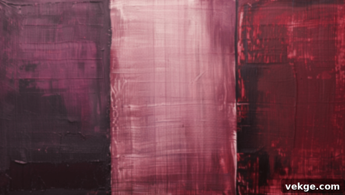
Burgundy adds significant depth and richness to yellow, creating a sophisticated pairing that exudes a warm, luxurious, and opulent look. The deep, wine-like tones of burgundy beautifully balance yellow’s inherent brightness, resulting in a mature, elegant, and refined palette that feels both grounded and exquisite. This combination speaks of timeless style and understated grandeur.
It’s an ideal choice for creating cozy, inviting spaces with a touch of old-world charm, or for adding a distinctive sense of refinement and elegance to outfits, especially during the autumn and winter months. Burgundy grounds yellow, preventing it from feeling too light or fleeting, while yellow injects a precious gleam into the rich depths of burgundy. This duo is perfect for those who appreciate a sophisticated aesthetic with a touch of warmth and enduring classic appeal.
Shades
- Maroon: A dark, brownish-red burgundy that offers a deep, earthy, and highly sophisticated contrast to yellow.
- Wine Red: A classic, rich burgundy that evokes luxury and warmth, creating a refined pairing with yellow.
- Oxblood: A very dark, almost black-red burgundy, providing a dramatic, powerful, and deeply elegant backdrop for yellow accents.
20. Sky Blue
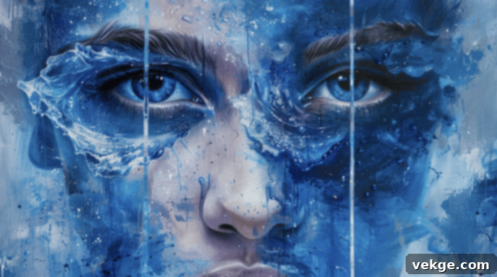
Sky blue creates a serene, calming, and effortlessly cheerful palette when combined with yellow. This delightful pairing immediately evokes images of sunny days, clear azure skies, and fluffy white clouds, bringing forth a profound sense of cheerfulness and tranquil relaxation. It’s a fresh, airy, and utterly inviting combination that feels light and optimistic.
This duo works exceptionally well in interior design, especially in spaces where you want to foster a sense of openness and calm, such as living rooms or nurseries. In fashion, it’s a perfect choice for spring and summer themes, exuding a breezy elegance and youthful charm. The cool, expansive quality of sky blue beautifully complements and balances yellow’s warmth, resulting in a harmonious interplay that is both uplifting and soothing. It’s a classic combination that always feels fresh and full of promise.
Shades
- Baby Blue: A soft, pale blue that creates a delicate, sweet, and gentle combination with yellow, perfect for nurseries.
- Powder Blue: A slightly desaturated sky blue that offers a vintage, calming, and elegant feel alongside yellow.
- Azure: A bright, vivid sky blue that provides a more intense, cheerful, and refreshing contrast to yellow.
21. Aqua
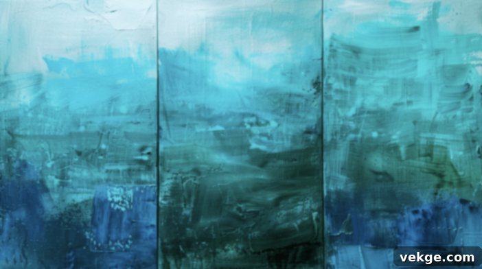
Aqua adds a bright, refreshing, and invigorating contrast to yellow, creating a truly lively and stimulating palette. This combination effortlessly evokes the enchanting imagery of tropical waters, sun-drenched beaches, and vibrant marine life, radiating a sense of joyful escapism and summer fun. It’s perfect for summer-themed designs, playful branding, or to inject a significant splash of cheerfulness into any space.
The cool, clear tones of aqua beautifully balance yellow’s inherent warmth, resulting in a vibrant yet harmonious look that feels both energetic and calming. This duo is fantastic for modern bathrooms, beach houses, or any design where you want to communicate freshness, vitality, and a sense of playful sophistication. Aqua and yellow together are a guaranteed mood booster, transforming mundane into marvelous with their bright and inviting interplay.
Shades
- Turquoise Aqua: A clear, vibrant aqua with prominent blue undertones, creating a striking and refreshing contrast.
- Sea Green: A slightly greener aqua that evokes natural ocean hues, offering a more organic and tranquil blend.
- Cyan: A pure, bright aqua-blue that delivers a powerful, modern, and high-energy pairing with yellow.
22. Peach
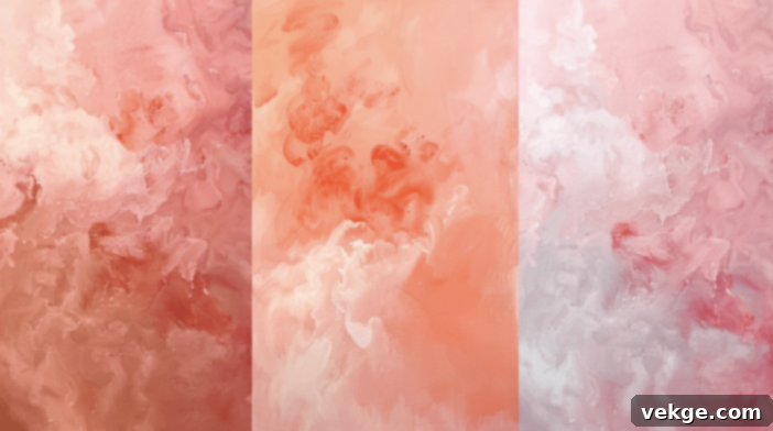
Peach and yellow offer a wonderfully soft, warm, and incredibly inviting combination. This pairing creates a gentle, tender atmosphere, reminiscent of the soft glow of summer sunsets, ripe fruits, and warm, pleasant evenings. It’s a subtle, elegant palette that works beautifully in fashion, where it suggests approachable grace, and in interior design, where it fosters a sense of comfort and serenity.
The inherent softness of peach perfectly complements yellow’s brightness, resulting in a soothing yet undeniably cheerful look. It’s an ideal choice for creating warm, comforting bedrooms, charming living spaces, or even elegant wedding decor. This duo embodies a delicate harmony, where both colors merge to create a seamless, glowing warmth that feels both natural and sophisticated. It speaks of tenderness, sweet optimism, and quiet beauty, making it a perennially appealing choice.
Shades
- Apricot: A light, warm peach with subtle orange undertones, enhancing yellow’s sunny disposition.
- Cantaloupe: A softer, creamier peach that creates a delicate, sweet, and harmonious blend with yellow.
- Coral Peach: A more vibrant peach with pinker undertones, offering a lively yet still gentle contrast to yellow.
23. Salmon
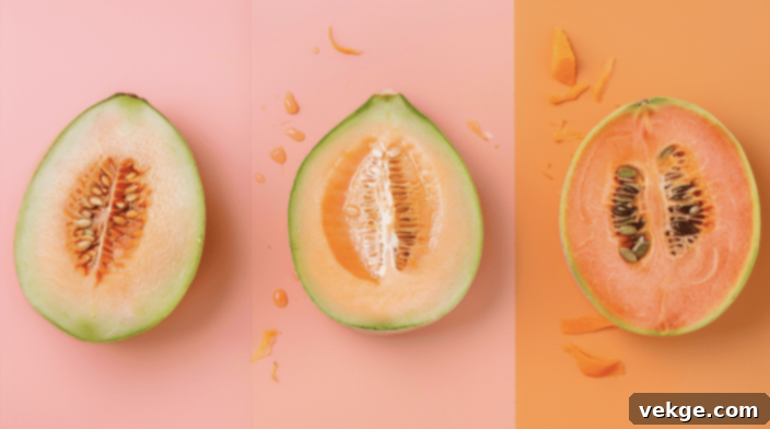
Salmon adds a soft, pastel, and subtly sophisticated contrast to yellow, resulting in a delicate and refined combination. This pairing is often seen in nature, from the blush tones of certain flowers to the tranquil hues of a fading sunset, lending it an organic charm. It’s perfect for creating a calm, elegant, and inviting atmosphere that feels both warm and composed.
The inherent warmth of both salmon and yellow creates a harmonious and refined blend that avoids being overtly bold. This duo is excellent for spring and summer fashion, where it evokes a sense of freshness and gentle allure. In interiors, it can provide a subtle pop of color in a neutral scheme, or contribute to a serene bedroom or living area. Salmon’s unique blend of pink and orange allows it to soften yellow beautifully, producing a mature and quietly charming aesthetic that speaks of grace and understated luxury.
Shades
- Light Salmon: A pale, delicate salmon that creates a very soft, ethereal, and romantic pairing with yellow.
- Coral Salmon: A slightly brighter salmon with more orange, offering a warmer and more vibrant, yet still gentle, contrast.
- Dusty Rose: A muted, desaturated salmon that lends a vintage, sophisticated, and calming feel alongside yellow.
24. Maroon
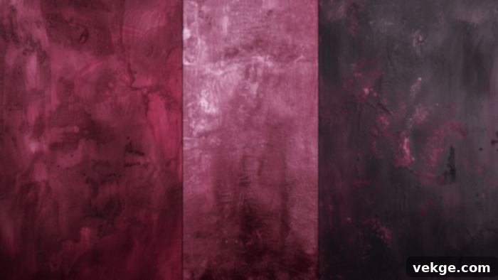
Maroon provides a rich, sophisticated, and deeply luxurious pairing with yellow. This deep, warm color, a dark brownish-red, adds significant depth and intensity to yellow’s brightness, creating a powerful visual impact. The combination is bold yet undeniably elegant, perfect for crafting a luxurious, mature, and distinguished look that exudes a sense of timeless opulence.
It works exceptionally well in both traditional and modern design schemes, adding a touch of refinement, warmth, and gravitas. Maroon acts as a grounding force, allowing yellow accents to truly sparkle and draw the eye without overwhelming the richness of the deeper tone. Think of gold embroidery on a maroon velvet, or a bright yellow throw in a maroon-themed study. This duo is ideal for spaces that aim for grandeur, comfort, and an undeniable sense of classic sophistication, making it a popular choice for libraries, dining rooms, or formal wear.
Shades
- Burgundy: A classic, rich maroon that offers a deep, wine-like elegance, perfect for sophisticated yellow pairings.
- Wine: A slightly redder maroon that evokes passion and luxury, creating a dramatic contrast.
- Deep Red: A very dark red leaning into maroon, providing an intense, powerful, and opulent backdrop for yellow.
25. Chocolate
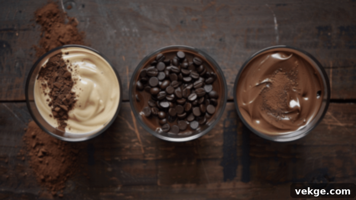
Chocolate brown adds profound depth, warmth, and an undeniable sense of grounded comfort to yellow. This earthy combination instantly creates a cozy, inviting, and deeply rustic atmosphere, strongly reminiscent of autumn landscapes, freshly baked goods, and natural wood. The richness of chocolate brown effectively grounds yellow’s vibrant brightness, resulting in a balanced, comforting, and incredibly palatable palette.
It’s an ideal choice for creating warm, welcoming spaces in interior design, such as living rooms or studies, where you want to foster a sense of security and tradition. In fashion, it suggests a natural, refined elegance that is both approachable and stylish. Chocolate and yellow together evoke a sense of wholesome charm and timeless appeal. This duo feels incredibly natural and organic, offering a warm embrace that makes any environment feel more homey and inviting.
Shades
- Dark Chocolate: A rich, intense brown that provides the most substantial and luxurious contrast to yellow.
- Milk Chocolate: A lighter, softer brown that creates a sweet, creamy, and inviting blend with yellow.
- Mocha: A brown with subtle reddish or grayish undertones, offering a modern, sophisticated, and nuanced pairing.
26. Cyan
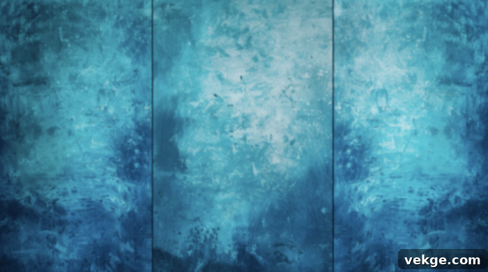
Cyan creates a truly vibrant, energetic, and highly modern look when paired with yellow. This combination is bold and delightfully playful, immediately reminiscent of the exhilarating hues of tropical waters, sun-drenched beaches, and clear, bright skies. The cool, electric tones of cyan contrast beautifully with yellow’s inherent warmth, resulting in a dynamic, refreshing, and deeply engaging palette that pulses with contemporary energy.
It’s a perfect choice for adding a significant pop of color and an ultra-modern edge to any design, from cutting-edge graphic art to athletic wear or a playful accent in a contemporary living space. Cyan’s intensity amplifies yellow’s brightness, creating a high-energy visual feast. This pairing is often associated with innovation, technology, and a youthful, forward-thinking spirit. It’s a dynamic duo for those who love bold statements and a fresh, invigorating aesthetic.
Shades
- Electric Blue: A pure, intense cyan that delivers a powerful, almost neon-like, and highly energetic pairing with yellow.
- Bright Turquoise: A slightly greener cyan that evokes tropical seas, offering a refreshing and lively contrast.
- Teal Blue: A deeper, more saturated cyan with a hint of green, providing a rich yet vibrant backdrop for yellow.
27. Royal Blue
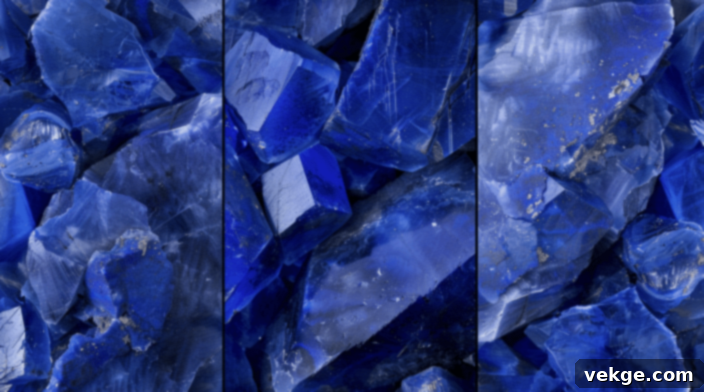
Royal blue offers a bold, regal, and deeply sophisticated contrast to yellow. This pairing is striking and undeniably elegant, frequently associated with luxury, majesty, and enduring prestige. The profound depth and intensity of royal blue allow yellow to truly shine without ever overpowering the composition, creating a balanced and visually appealing duo that speaks volumes about class and confidence.
It’s versatile enough to suit both formal and casual settings, depending on the context and the shades employed. In fashion, royal blue and yellow command attention, exuding a sense of refined power. In interiors, it can create a dramatic yet inviting space, especially when used for accents or a statement wall. This combination delivers a powerful message of authority, stability, and enduring style, making it a classic choice for those who desire a distinguished yet vibrant aesthetic.
Shades
- Sapphire Blue: A rich, jewel-toned royal blue that provides a luxurious, deep, and brilliant contrast to yellow.
- Cobalt: A vivid, intense royal blue that offers a bright, energetic, and modern pairing.
- Lapis Lazuli: A slightly desaturated royal blue with subtle purple undertones, creating an ancient, mystical, and sophisticated blend.
28. Fuchsia
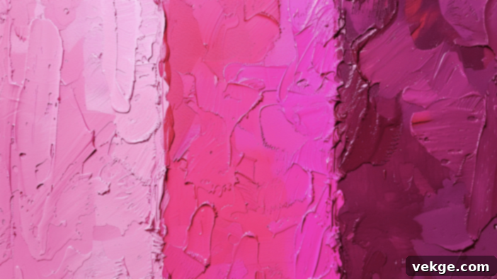
Fuchsia adds a bright, playful, and incredibly vibrant touch when paired with yellow. This energetic combination is eye-catching and full of personality, perfect for creating bold, modern designs that burst with life and confidence. The cool, intense tones of fuchsia beautifully balance yellow’s inherent warmth, resulting in a lively, dynamic, and undeniably exciting palette.
It’s an ideal choice for fashion-forward looks, adding a significant dose of excitement and contemporary flair to any outfit. In graphic design or event decor, it promises to create a memorable and impactful visual experience. This duo speaks of fun, creativity, and a fearless approach to color, making it popular in youthful branding and statement pieces. If you want to make a truly unforgettable impression with a blend that’s both daring and cheerful, fuchsia and yellow are your go-to combination.
Shades
- Hot Pink: A very bright, intense pink that leans into fuchsia, offering a playful and high-energy contrast.
- Magenta: A deeper, richer fuchsia that provides a sophisticated yet still vibrant touch.
- Deep Pink: A saturated, powerful pink that makes yellow pop with fresh, lively enthusiasm.
29. Ivory
Ivory provides a soft, elegant, and subtly sophisticated contrast to yellow, creating a warm, inviting, and inherently refined look. This understated combination feels timeless and luxurious without being overtly flashy. The creamy, gentle quality of ivory softens yellow’s brightness, resulting in a harmonious, delicate, and deeply soothing palette that radiates quiet grace.
It’s perfect for creating a classic, timeless atmosphere in fashion and interiors, where it speaks of comfort, tradition, and sophisticated taste. Ivory allows yellow to introduce a gentle warmth rather than a bold statement, making it ideal for bedrooms, formal living spaces, or elegant event decor. This duo embodies a sense of enduring beauty and calm luxury, proving that color combinations don’t always need high contrast to be utterly captivating and incredibly effective.
Shades
- Cream: A warm, buttery ivory that enhances yellow’s warmth, creating a soft and inviting glow.
- Off-White: A versatile, slightly cooler ivory that offers a clean, understated backdrop for yellow, providing gentle contrast.
- Eggshell: A subtle, textured ivory that gives a natural, organic, and sophisticated feel to yellow pairings.
30. Gold
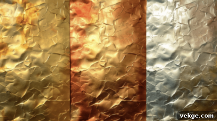
Gold adds a luxurious, harmonious, and utterly opulent touch when paired with yellow. This exquisite combination creates a rich, regal look that simply exudes warmth, elegance, and undeniable glamour. The metallic sheen and inherent brilliance of gold perfectly complement yellow’s sunny brightness, resulting in a sophisticated and deeply glamorous palette that feels both ancient and eternally chic.
It’s an ideal choice for adding a significant touch of luxury and prestige to any design or outfit, particularly for festive occasions, high-end branding, or classic interior accents. Gold enhances yellow’s cheerful spirit while elevating it to a more refined status. This duo is a symbol of prosperity, success, and timeless beauty. Whether used in delicate details or bold statements, gold and yellow together promise to create an atmosphere of unparalleled splendor and sophisticated charm, truly a match made in design heaven.
Shades
- Antique Gold: A muted, aged gold that offers a vintage, refined, and deeply luxurious pairing with yellow.
- Champagne Gold: A lighter, softer gold with a subtle rose or silver undertone, creating an elegant and delicate blend.
- Bronze Gold: A warmer, slightly coppery gold that brings an earthy richness and a sophisticated glow to yellow.
Conclusion
Yellow, with its innate cheerfulness and incredible versatility, truly stands as a powerhouse in the world of color. As we’ve journeyed through these 30 distinct pairings, it’s clear that this sunny hue can harmoniously blend with a vast spectrum of colors – from the crisp simplicity of white to the deep richness of burgundy, and everything vibrant in between. Each combination offers a unique narrative, a different mood, and a fresh perspective on how to integrate yellow into your creative endeavors.
The key to mastering yellow effectively lies in understanding the delicate art of balance. Whether you aspire to create a bold, dynamic contrast that commands attention or a subtle, harmonious blend that whispers sophisticated elegance, there’s a perfect partner for yellow waiting to be discovered. Don’t hesitate to experiment with different shades and textures within these suggested palettes; sometimes, a slight variation can completely transform the aesthetic and achieve precisely the feeling you’re aiming for.
While this guide provides a wealth of inspiration and proven combinations, remember that your personal taste is the ultimate compass. Trust your instincts and allow your unique style to guide your choices. The most perfect combination is often the one that genuinely resonates with you and brilliantly captures the atmosphere you wish to create. We hope this comprehensive exploration has sparked your imagination and empowered you to embrace new, exciting color combinations with yellow. Go forth and let this radiant color shine its brightest in all your projects!
