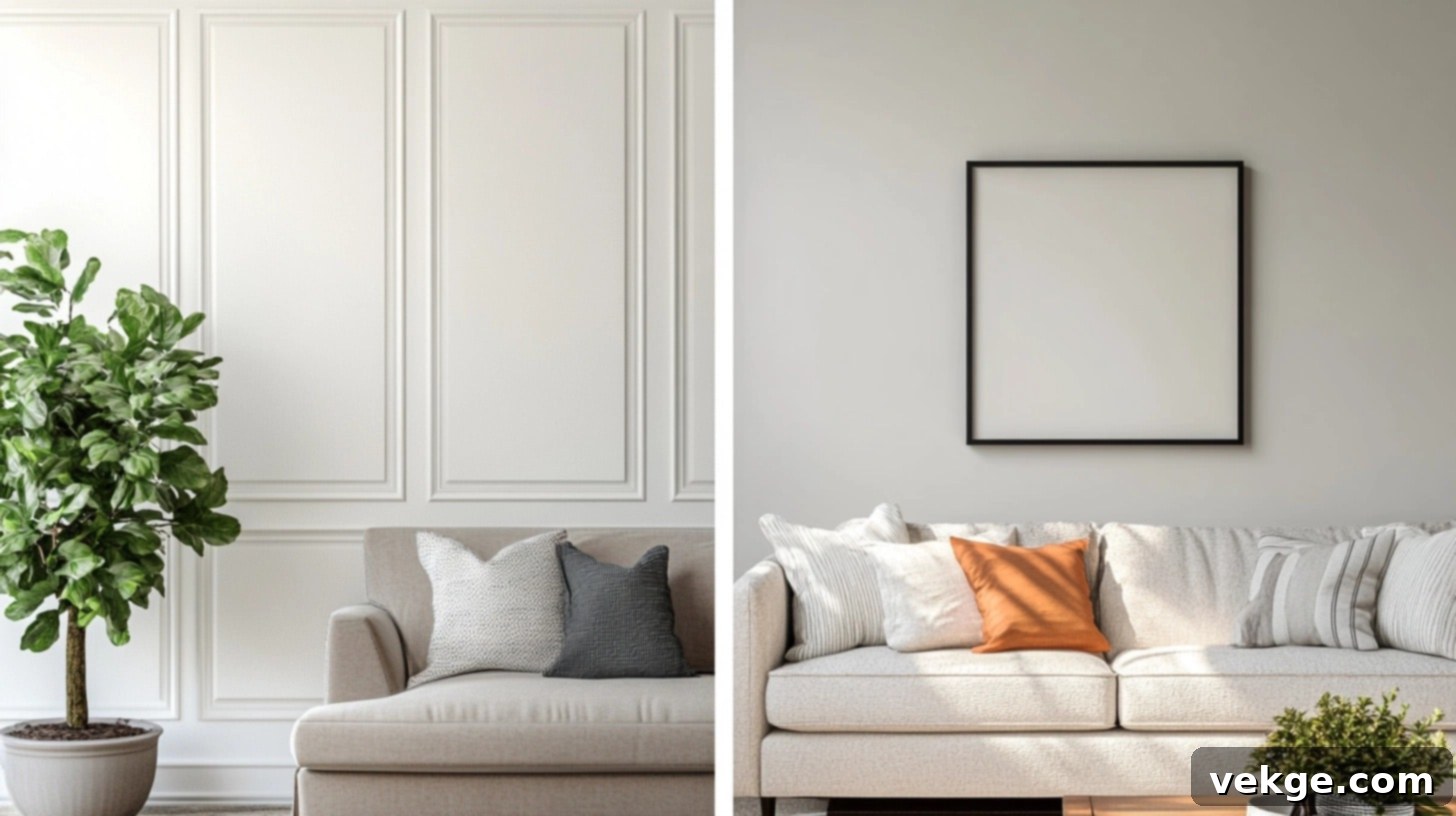
Sherwin-Williams Worldly Gray vs. Agreeable Gray: Finding Your Home’s Perfect Neutral Paint Color
Choosing the ideal paint color for your home is a significant decision that profoundly impacts its overall ambiance and aesthetic. Among the vast array of options, gray paint colors have emerged as enduring favorites, offering versatility and sophistication. Two particular shades from Sherwin-Williams – Worldly Gray (SW 7043) and Agreeable Gray (SW 7029) – consistently top the charts in home design discussions. Both are celebrated for their ability to bring warmth and a sense of calm to any interior, yet they possess distinct characteristics that make them suitable for different spaces and design preferences.
This comprehensive guide delves into the nuances that differentiate these two highly sought-after gray paints. We will explore their unique undertones, how varying lighting conditions influence their appearance throughout the day, and which rooms each shade complements best. Understanding these subtle distinctions is crucial for making an informed choice that truly enhances your home. We’ll also provide insights into compatible furniture styles, accent colors, and how these paints perform in various settings, from cozy bedrooms to bustling kitchens.
Join us as we put Worldly Gray and Agreeable Gray side-by-side, offering a detailed analysis to help you confidently select the perfect Sherwin-Williams gray that harmonizes with your home’s style and your personal taste.
Understanding Paint Undertones: The Hidden Key to Perfect Color Selection
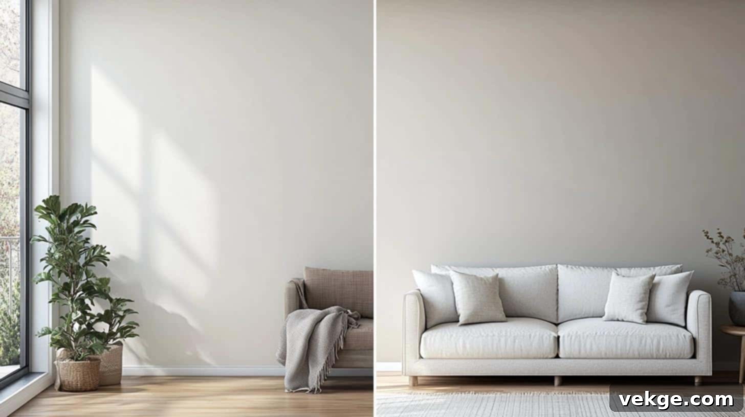
Undertones are the subtle colors beneath the main hue of a paint, and they play a critical role in how a wall color is perceived. While you might identify a paint as “gray,” its underlying cool or warm hints can drastically alter its appearance under different lighting and alongside other decor elements. Recognizing these hidden colors is essential for achieving a cohesive and appealing interior.
What Exactly Are Paint Undertones?
Every paint color possesses a primary hue that is immediately visible, such as gray, blue, or green. However, beneath this dominant color lies a secondary, more subdued color – its undertone. These undertones are faint hints of other colors mixed into the paint formula, and they are what give a seemingly simple gray its complex character. For example, one gray might lean slightly purple, while another might have a greenish cast.
Undertones are generally categorized into three main types:
- Cool Undertones: These often feature subtle hints of blue, green, or purple. Paints with cool undertones tend to create a serene, crisp, and sometimes more formal atmosphere. They can make a room feel larger and more airy.
- Warm Undertones: Characterized by touches of red, yellow, or brown, warm undertones infuse a space with coziness, comfort, and inviting energy. They can make a room feel more intimate and welcoming.
- Neutral Undertones: These undertones are balanced, showing no strong lean towards either warm or cool. While truly neutral undertones are rare, paints often described as “true grays” or “greiges” attempt to achieve this balance, making them highly versatile.
The trick to successful paint selection lies in identifying these undertones and understanding how they will interact with your home’s existing elements, such as flooring, furniture, and fixed finishes like countertops and cabinetry.
The Dynamic Effects of Lighting on Paint Undertones
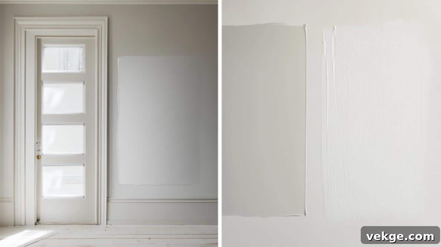
Lighting is arguably the most influential factor in how paint colors appear on your walls. A gray paint that looks perfectly balanced in a showroom might transform entirely in your home due to natural and artificial light sources. The direction of natural light, the time of day, and even the type of light bulbs you use can all bring out or subdue certain undertones.
To ensure you make the best choice, follow these essential paint sampling tips:
- Test on Multiple Walls: Paint large samples (at least 2 feet by 2 feet) on different walls within the same room. This accounts for variations in light exposure, as one wall might receive more direct sunlight than another.
- Observe at Various Times of Day: View your samples in the morning, midday, and evening. Morning light (often cooler) might emphasize blue or green undertones, while warmer afternoon or evening light could bring out reds and yellows.
- Assess Under Natural and Artificial Light: Check the color under both natural daylight and your home’s artificial lighting (lamps, overhead fixtures). Different light temperatures (warm vs. cool bulbs) will dramatically affect the paint’s perceived hue.
- Use Large Sample Areas: Small swatches don’t provide a true representation. Larger samples give you a better feel for how the color will truly look once applied to an entire wall. Consider using peel-and-stick samples for ease of testing.
Choosing the Right Undertones for Your Space
When selecting paint undertones, consider the room’s function, its size, and the direction it faces:
- Room Size and Undertones: Smaller rooms often benefit from cooler undertones, as they tend to recede and create a sense of more openness and spaciousness. Larger spaces, conversely, can comfortably accommodate warmer undertones without feeling cramped, making them feel cozier and more inviting.
- North-Facing Rooms: These rooms typically receive cooler, indirect light throughout the day. To counteract this and add warmth, opt for paints with warm undertones (red, yellow, brown).
- South-Facing Rooms: Bathed in bright, warm light for most of the day, south-facing rooms are highly versatile and can handle a wide range of undertones. Both warm and cool grays can look stunning here.
- East-Facing Rooms: These rooms get bright, warm light in the morning and cooler light in the afternoon. A balanced gray or one with subtle warm undertones can work well to maintain warmth throughout the day.
- West-Facing Rooms: Receiving warm, intense afternoon light, west-facing rooms can benefit from cooler grays to balance the warmth, or embrace the warmth with a greige.
Briefing the Two Colors: Undertones and Characteristics
Worldly Gray (SW 7043): The Earthy Neutral
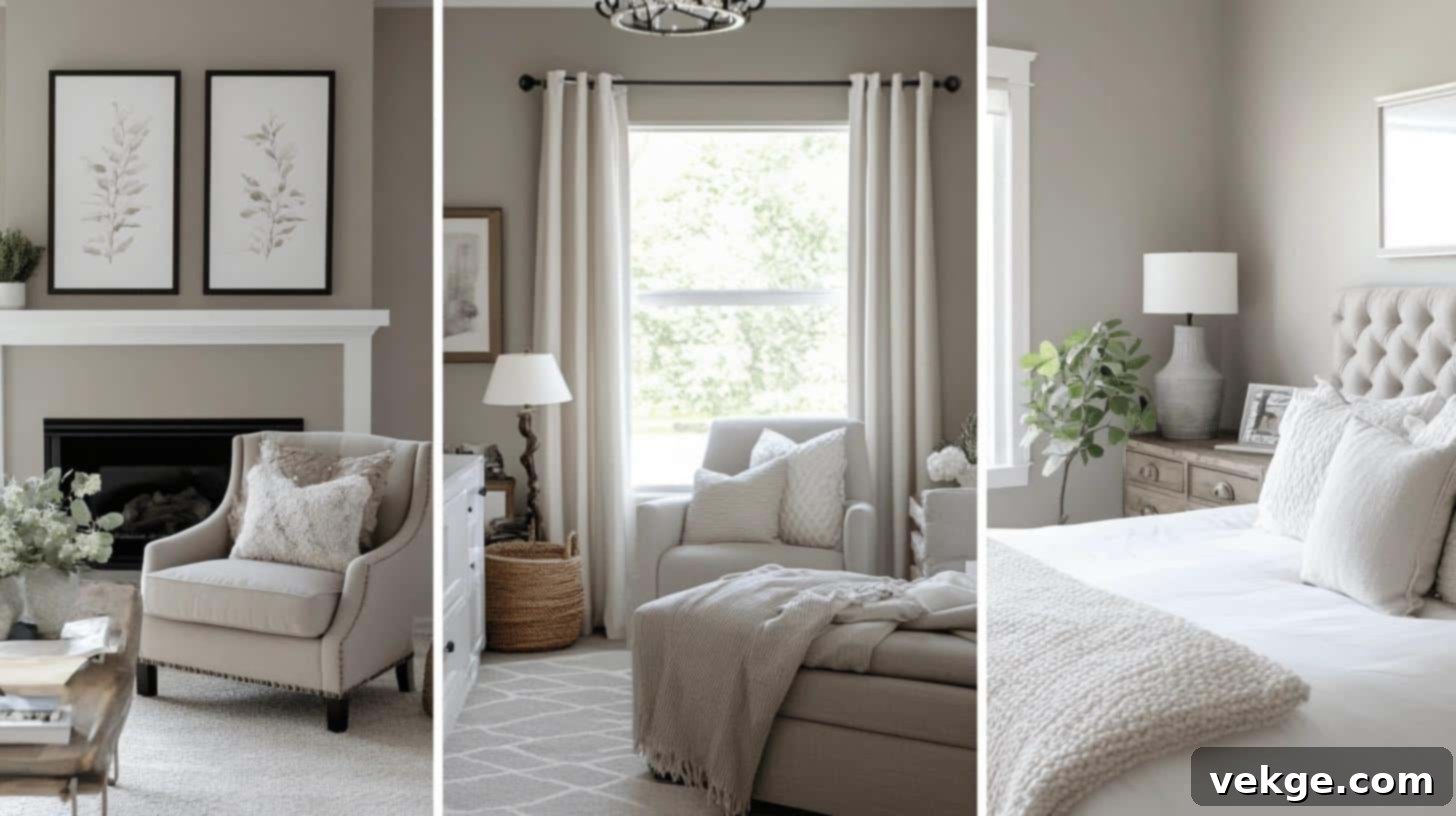
Sherwin-Williams Worldly Gray (SW 7043) is a sophisticated mid-tone gray that exudes a soft, grounded warmth. It’s not a stark, cold gray; instead, it offers a gentle balance, often perceived as a “greige” with a clear lean towards its unique undertones. Its Light Reflectance Value (LRV) typically places it in the mid-range, meaning it reflects a moderate amount of light, preventing it from feeling too dark or too stark.
What sets Worldly Gray apart are its distinct green-brown undertones. These earthy hints prevent it from ever appearing cold, instead lending it a sense of organic elegance. This makes it an excellent choice for creating a natural, calming, and inviting atmosphere.
The color’s appearance can gracefully shift with the changing light conditions throughout the day:
- Morning Light: As the day begins with cooler morning light, Worldly Gray’s subtle green notes become more apparent, giving it a fresh, slightly muted character reminiscent of natural landscapes.
- Midday Sun: Under bright, direct midday sun, the true gray base of Worldly Gray reveals itself more strongly, offering a clean and balanced neutral that showcases its versatility.
- Evening Light: In the warmer, softer glow of evening light or under artificial illumination, the brown undertones of Worldly Gray come to the forefront. This enhances its warmth and coziness, making a room feel more intimate and inviting.
Worldly Gray is an excellent choice for those seeking a gray that feels rooted in nature, offering a sophisticated backdrop without ever feeling sterile.
Agreeable Gray (SW 7029): The Universally Loved Greige

Sherwin-Williams Agreeable Gray (SW 7029) is celebrated as one of the most versatile and popular light-to-medium grays on the market. Its widespread appeal stems from its perfectly balanced “greige” composition – a harmonious blend of gray and beige. With a higher LRV than Worldly Gray, it reflects more light, contributing to a brighter and more open feel in any space.
Agreeable Gray’s genius lies in its truly balanced warm undertones, primarily beige with a hint of taupe. This balance ensures it never appears too cool or too warm, making it an incredibly adaptable neutral that complements a vast array of design styles and existing finishes. It’s often chosen for its ability to create a clean, fresh backdrop that is still inherently welcoming.
Its undertones present themselves subtly, influenced by the light and surroundings:
- Natural Light: In the presence of ample natural light, Agreeable Gray’s warm beige notes are gently emphasized, making the room feel bright, airy, and inviting. It often leans more towards its warm side here.
- Artificial Light: Under various types of artificial light (especially cooler-toned bulbs), Agreeable Gray maintains its sophisticated gray appearance, preventing it from looking too beige or washed out. It appears slightly cooler and truer gray.
- Shadow Areas: In areas with less direct light or in shadows, Agreeable Gray retains its neutral and balanced essence, showcasing its reliable versatility without drastic color shifts.
Agreeable Gray is frequently recommended for its exceptional ability to bridge the gap between warm and cool palettes, providing a beautiful foundation that works well in almost any home.
Worldly Gray VS. Agreeable Gray: A Detailed Comparison
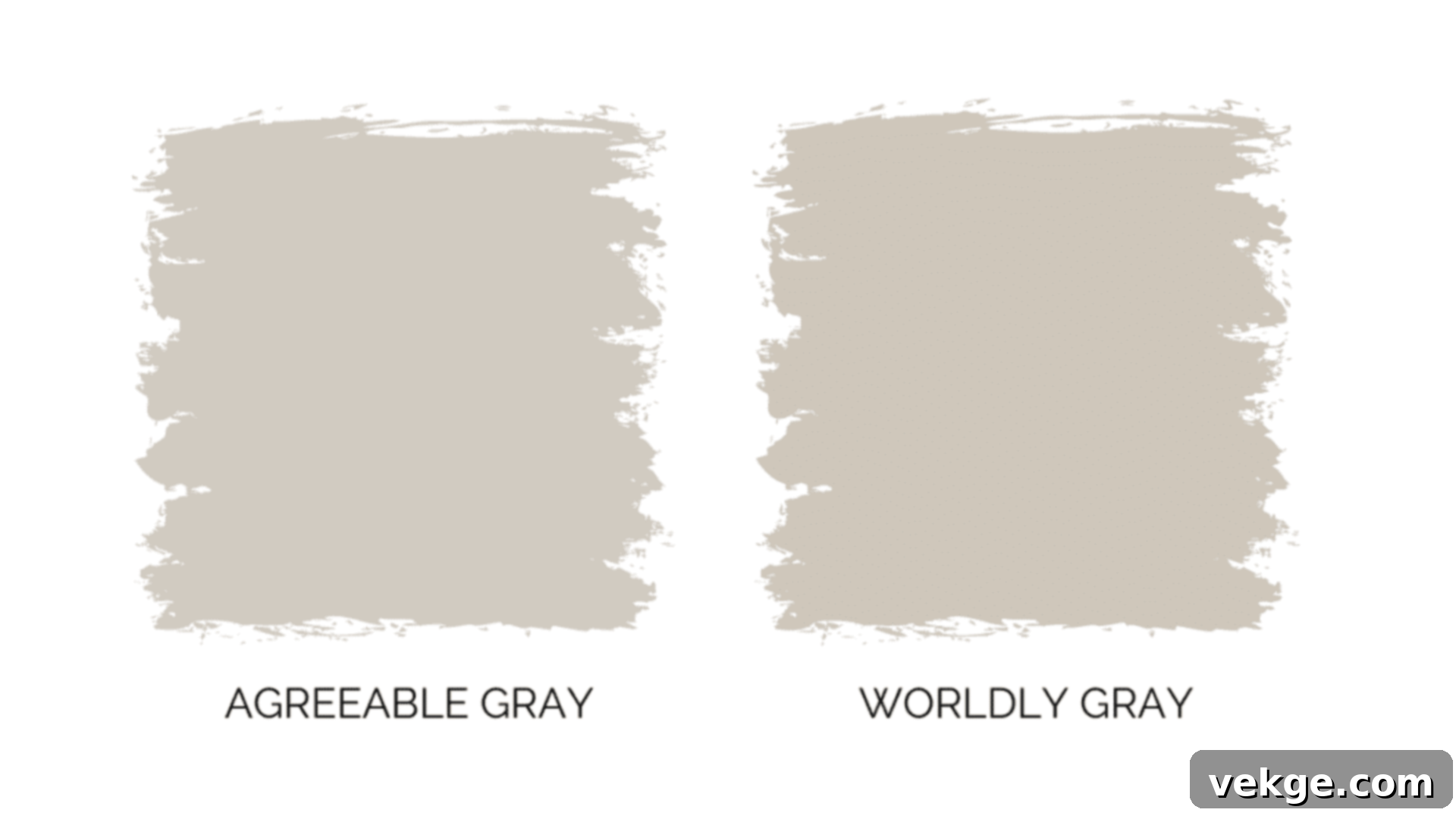
While both Worldly Gray and Agreeable Gray are highly popular neutral paint choices, their distinct undertones and characteristics lead to different aesthetic outcomes and suitability for various design schemes. Let’s break down their core differences.
1. Aesthetic and Mood Influences
- Worldly Gray (SW 7043): This mid-tone greige offers a profound sense of stability and grounding. Its green-brown undertones evoke an organic, earthy feel, making spaces feel connected to nature. It creates an atmosphere of serene sophistication, perfect for environments where a calm, structured yet gentle presence is desired. It lends itself well to spaces needing focus, tranquility, and an understated elegance. This color is excellent for achieving a spa-like retreat or a focused study area.
- Agreeable Gray (SW 7029): A lighter greige, Agreeable Gray is renowned for its welcoming warmth and fresh appeal. Its balanced beige undertones prevent it from ever feeling cold or stark, instead creating spaces that feel clean, crisp, and inherently cozy. It’s the quintessential choice for homes aiming for a polished, put-together look without sacrificing comfort and approachability. This paint brings a bright, airy feeling while maintaining a soft, inviting touch.
In terms of specific design styles:
- Worldly Gray: Harmonizes beautifully with Modern Farmhouse aesthetics, highlighting natural wood elements and rustic textures. It also complements traditional and transitional styles, providing a timeless backdrop. Its earthy nature makes it a perfect fit for organic modern and Scandinavian-inspired interiors.
- Agreeable Gray: Fits seamlessly into a broad spectrum of designs, from contemporary and minimalist to classic and traditional. Its balanced nature makes it a go-to for open-concept homes where flow and continuity are key. It’s equally at home in coastal-inspired spaces, transitional designs, and even a refreshed colonial aesthetic.
2. Versatility and Coordination
Both colors are highly versatile, but their ideal pairings differ due to their underlying tones.
- Worldly Gray: Its earthy undertones make it a superb partner for natural materials and deeper hues.
- Trims and Ceilings: Pairs beautifully with crisp, pure white trims (like Sherwin-Williams Pure White SW 7005) or soft ivory hues, which help its depth stand out.
- Wood Tones: Looks particularly strong and sophisticated next to dark wood furniture, rich walnut, or reclaimed wood pieces, enhancing its organic appeal.
- Metal Accents: Black, oil-rubbed bronze, and antique brass metal accents pop beautifully against Worldly Gray, adding a touch of drama and warmth.
- Fabrics and Textures: Complements textured fabrics like linen, wool, and jute. Earth-toned fabrics (moss green, terracotta, deep blue) create a harmonious palette.
- Agreeable Gray: Its balanced warmth makes it exceptionally easy to coordinate with a wide range of colors and materials.
- Trims and Ceilings: Shines brightest with bright white trims (e.g., Sherwin-Williams Extra White SW 7006 or High Reflective White SW 7757), which emphasize its clean, fresh quality.
- Wood Tones: Looks excellent with light wood furniture (like maple or natural oak), creating an airy and modern feel. It also works well with medium-toned woods, offering flexibility.
- Metal Accents: Brushed nickel, chrome, and polished brass fixtures complement Agreeable Gray by adding subtle gleam and contemporary elegance.
- Fabrics and Textures: Pairs well with smooth, crisp fabrics and a variety of textures. It’s a fantastic backdrop for both light and medium-toned accent pieces in almost any color family.
3. Durability and Maintenance of Sherwin-Williams Paints
The durability and ease of maintenance for both Worldly Gray and Agreeable Gray depend less on the specific color and more on the chosen paint finish and quality of the Sherwin-Williams product line. Sherwin-Williams offers a range of finishes, each suited for different functional requirements of a room.
- Paint Finishes Explained:
- Flat/Matte: Offers a non-reflective, soft look, excellent for hiding surface imperfections. Best for low-traffic areas like formal dining rooms or ceilings where durability is less of a concern. Less washable.
- Eggshell: A popular choice for living areas and bedrooms, providing a subtle sheen that is more durable and washable than flat, while still offering a refined appearance.
- Satin: Features a smooth, velvety sheen, offering enhanced durability and moisture resistance. Ideal for moderate to high-traffic areas like family rooms, hallways, and children’s bedrooms. Very easy to clean.
- Semi-Gloss: Highly durable and very washable, with a noticeable sheen. Commonly used for trim, doors, and cabinets, and in high-moisture areas like kitchens and bathrooms.
- Gloss: The most durable and reflective finish, used for specific architectural details or furniture.
- General Maintenance Tips:
- Cleaning Marks: For minor scuffs or marks, gently clean the affected area with a soft cloth dampened with mild soap and water. Always test on an inconspicuous spot first. Avoid abrasive cleaners or scrubbing, especially with lower sheen finishes, as this can damage the paint.
- Touch-Ups: Keep a small amount of leftover paint from your project. For small nicks or scratches, a quick touch-up can make a big difference. Ensure the surface is clean and dry before applying. For best results, use the same application method (brush, roller) as the original coat.
- Storing Paint: Store touch-up paint in a cool, dry place, away from direct sunlight and extreme temperatures, to preserve its quality for future use. A well-sealed can of paint can last for several years.
- Major Repairs: For larger areas of damage, it’s often best to clean, lightly sand, prime the area, and then repaint to ensure a smooth, blended finish that doesn’t show patchiness.
Both Worldly Gray and Agreeable Gray, when applied in the appropriate finish, will offer excellent durability and ease of maintenance, making them practical choices for busy households.
Which Room Do They Suit Best In?
Worldly Gray (SW 7043): Best Applications

Worldly Gray’s warm, earthy undertones make it an exceptional choice for creating a grounded and serene atmosphere in various rooms.
| Room Type | Mood/Effect | Ideal Decor & Pairings |
|---|---|---|
| Living Room | Cultivates a welcoming, sophisticated, and earthy ambiance for relaxation and entertaining. Its balanced nature makes it universally appealing. | Tan leather sofas and chairs, cream-colored linen sofas, deep brown wooden coffee tables, textured throws (e.g., knit, faux fur), natural fiber rugs (jute, sisal), muted green or blue accent pillows. |
| Bedroom | Sets a tranquil and restful mood, conducive to sleep and calm. The green-brown undertones create a comforting, cocoon-like feeling. | Crisp white or cream bedding sets, soft blue or sage green accents for a peaceful touch, light, flowing curtains, natural wood furniture (oak, maple), cozy reading lamps. |
| Home Office | Helps maintain focus and concentration while providing a sophisticated, professional backdrop. It feels serious yet inviting. | Solid wood desks (dark or medium tones), ergonomic task lighting, dark metal fixtures, simple window treatments (wooden blinds, natural fabric shades), shelves filled with books and plants. |
| Dining Room | Creates an elegant and inviting setting for meals and gatherings. Its warmth encourages lingering conversation. | Rich wood dining tables, upholstered chairs in neutral tones (greige, cream), delicate chandeliers, accent art with natural themes, white wainscoting for contrast. |
Agreeable Gray (SW 7029): Best Applications
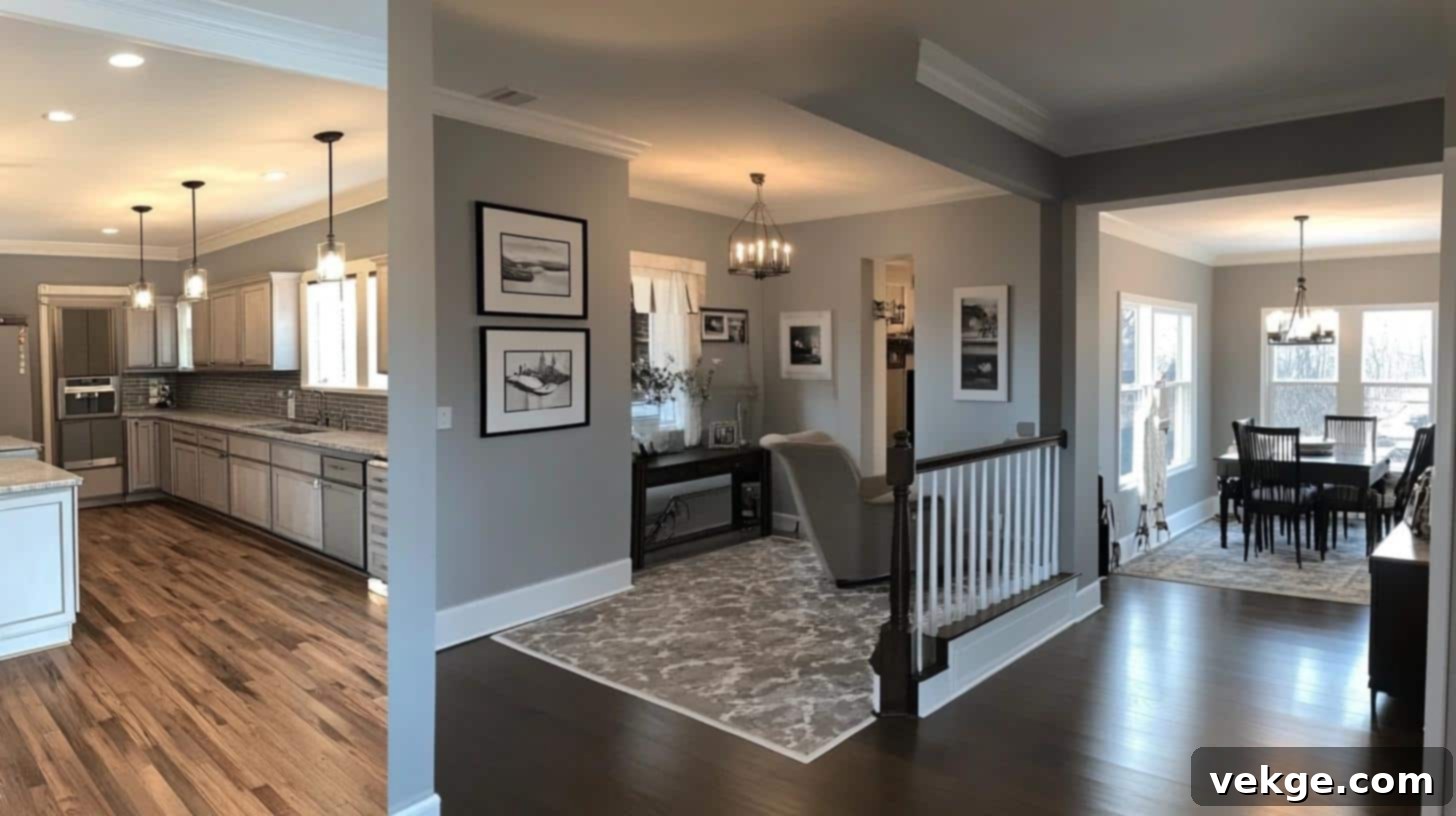
Agreeable Gray’s balanced warm undertones and lighter appearance make it incredibly adaptable, particularly where a fresh, clean, and universally appealing neutral is desired.
| Room Type | Mood/Effect | Ideal Decor & Pairings |
|---|---|---|
| Kitchen | Promotes a fresh, clean, and spacious look. Its lighter tone can make smaller kitchens feel larger and more open, while also effectively concealing minor marks. | White or light gray cabinets, stainless steel or brushed nickel appliances, white subway tiles for backsplashes, light stone or quartz countertops, chrome fixtures, light-colored wooden or ceramic flooring. |
| Bathroom | Creates a serene, spa-like atmosphere, maintaining a clean and fresh aesthetic. It pairs beautifully with classic bathroom finishes. | White porcelain fixtures, fluffy white towels, glass accessories, chrome or brushed nickel hardware, simple mirrors (frameless or light wood frame), subtle greenery. |
| Dining Room | Provides an elegant and airy backdrop for meals and social events. It makes the space feel sophisticated yet comfortable, allowing decor to shine. | Glass chandeliers or modern metal light fixtures, crisp white trim, patterned curtains in soft blues or greens, mixed metal accents, contemporary dining sets. |
| Hallways & Entryways | Establishes a smooth, continuous flow throughout the home, making transitional spaces feel inviting and open. Its brightness helps lighten often windowless areas. | Entryway console tables in light wood or painted finishes, decorative mirrors, simple gallery walls, durable runners, accent lighting to enhance its brightness. |
Additional Design Ideas for Worldly Gray and Agreeable Gray
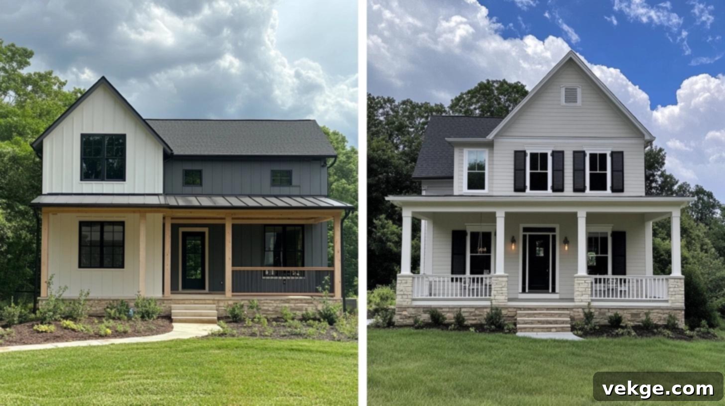
Indoor Color Pairings and Accent Walls
For Worldly Gray (SW 7043):
To maximize the impact of Worldly Gray, consider how it interacts with other colors in your interior palette.
- Trim and Ceiling Options:
- Soft Ivory Trim: Using an off-white or soft ivory trim creates a gentle contrast, allowing Worldly Gray’s depth to truly stand apart and enhancing its warm, organic feel.
- Off-White Ceilings: Pairing with an off-white ceiling helps rooms feel taller and more expansive, maintaining a cohesive, warm envelope.
- Natural Wood Trim: For a truly organic and earthy aesthetic, natural stained wood trim adds an extra layer of warmth and texture, harmonizing with Worldly Gray’s undertones.
- Accent Wall Ideas: Worldly Gray provides an excellent foundation for a variety of accent wall choices, allowing for personalization and dramatic effect.
- Navy Blue: A rich navy blue creates a sense of sophisticated depth and calm, working beautifully in living spaces or master bedrooms for a touch of refined drama.
- Deep Forest Green: Bringing nature indoors, a deep green accent wall beautifully complements Worldly Gray’s green-brown undertones, fostering a balanced and serene environment.
- Charcoal Gray: For a bolder, monochromatic look, a charcoal gray accent wall makes a strong, contemporary statement without clashing with the main wall color. It adds intensity and modern flair.
- Warm Terracotta: To lean into its earthy warmth, a soft terracotta or burnt orange accent can add an unexpected but harmonious pop of color, especially in a living room or dining area.
For Agreeable Gray (SW 7029):
Leverage Agreeable Gray’s versatility to create bright, inviting, and effortlessly chic spaces.
- Trim and Ceiling Options:
- Pure White Trim: Crisp, pure white trim (such as Sherwin-Williams Extra White) provides a clean, sharp border, emphasizing Agreeable Gray’s fresh and luminous quality.
- Bright White Ceilings: A bright white ceiling makes spaces feel exceptionally open, airy, and maximizes light reflection, enhancing the overall brightness of the room.
- Light Wood Trim: For a modern yet warm touch, light-toned wood trim (e.g., natural oak or birch) can complement Agreeable Gray beautifully, adding texture without overwhelming the space.
- Accent Wall Ideas: Agreeable Gray’s neutral backdrop allows for a broad range of accent colors, from soft and subtle to rich and vibrant.
- Soft Blush Pink: A gentle blush pink adds a touch of subtle warmth and elegance, working wonderfully in bedrooms, nurseries, or even a sophisticated dining room.
- Rich Chocolate Brown: To introduce depth and coziness, a rich chocolate brown accent wall brings an inviting warmth, perfect for a living room or study.
- Slate Blue: A muted slate blue helps create a smooth, calming flow between rooms, offering a sophisticated contrast that feels both refreshing and serene.
- Emerald Green: For a touch of luxury and vibrancy, a deep emerald green can provide a stunning focal point, especially when paired with metallic accents.
Exterior Uses of the Colors
Worldly Gray (SW 7043) for Exteriors:
Worldly Gray extends its natural charm to exterior applications, providing a sophisticated and grounded presence.
- Architectural Styles:
- Modern Farmhouse: This color shines on modern farmhouse exteriors, lending an authentic, simple charm that harmonizes with natural wood accents and clean lines.
- Craftsman Homes: It suits Craftsman homes perfectly, highlighting their intricate architectural details and providing a timeless, earthy foundation.
- Ranch-Style Houses: On ranch-style homes, it creates a classic and enduring look that blends seamlessly with various landscaping styles.
- Traditional Homes: Provides a subtle yet strong presence, offering a contemporary update without sacrificing classic appeal.
- Complementary Exterior Elements:
- Trim: Pairs beautifully with crisp white window frames and door trim, creating a clean contrast.
- Stone/Brick: Natural stone details, light-colored brick, or stacked stone facades look exceptionally harmonious against Worldly Gray.
- Accents: Dark metal light fixtures, matte black hardware, and dark wood doors stand out elegantly, adding depth and character to the facade.
- Roofing: Works well with charcoal gray, black, or even certain brown-toned shingle colors.
Agreeable Gray (SW 7029) for Exteriors:
Agreeable Gray offers a fresh, inviting, and highly versatile option for home exteriors, enhancing curb appeal with its balanced neutral tone.
- Architectural Styles:
- Colonial Style Homes: On colonial-style homes, this color creates a strong yet gentle presence, updating traditional buildings while preserving their classic elegance.
- Traditional and Transitional: Offers a fresh, contemporary look to traditional homes and is a popular choice for transitional architecture, bridging classic and modern.
- Ranch Houses: Ranch homes receive a sophisticated uplift with Agreeable Gray, especially when paired with modern updates like dark window frames or updated landscaping.
- Coastal Homes: Its light, airy quality makes it an excellent choice for coastal homes, evoking a sense of calm and natural beauty.
- Complementary Exterior Elements:
- Shutters: Black shutters create a sharp, elegant contrast against these walls, providing a classic and sophisticated look.
- Brick: Red brick (especially with warmer undertones) looks warm and inviting next to this versatile shade, creating a harmonious blend.
- Front Doors: Front doors in bold colors like navy blue, forest green, or even a vibrant red make a striking first impression against the neutral backdrop.
- Trim: White trim (e.g., Pure White) highlights its clean lines and brightens the overall appearance.
- Roofing: Works well with black, charcoal, or even lighter gray roofing materials.
Conclusion: Making Your Final Choice
The journey to selecting the perfect gray paint for your home often leads to Sherwin-Williams Worldly Gray and Agreeable Gray. While both are celebrated neutrals, understanding their distinct characteristics is paramount to making a choice that truly resonates with your home’s character and your personal style. Worldly Gray, with its earthy green-brown undertones, brings a profound sense of grounded warmth and sophisticated calm, making it ideal for creating serene living rooms, peaceful bedrooms, and focused home offices. Its organic feel connects interiors to nature, fostering a truly harmonious environment.
On the other hand, Agreeable Gray, distinguished by its balanced beige undertones, offers a clean, fresh, and universally appealing charm. Its brighter disposition and exceptional versatility make it a perfect fit for bustling kitchens, spa-like bathrooms, and elegant dining rooms, where a light, airy, yet inviting atmosphere is desired. It’s the quintessential “greige” that beautifully bridges the gap between warm and cool palettes, ensuring it remains a timeless choice.
The most crucial step in your decision-making process is to thoroughly test samples of both colors in your actual space. Observe how they interact with your home’s unique lighting conditions throughout the day – from the cool morning light to the warm evening glow, and under both natural and artificial illumination. Consider the primary function of each room; Worldly Gray might foster better concentration in a study, while Agreeable Gray could brighten a busy family area.
Ultimately, both Worldly Gray and Agreeable Gray offer lasting style and remarkable adaptability, capable of complementing a vast array of decor choices. Take your time to test, observe their subtle transformations, and trust your instincts. The perfect gray for your home is the one that makes you feel most comfortable and inspired in your beautifully curated space.
FAQ (Frequently Asked Questions)
Are These Colors Suitable for Open Floor Plans?
Absolutely. Both Worldly Gray and Agreeable Gray are exceptionally well-suited for open floor plans. Their neutral bases allow for smooth and cohesive transitions between different functional areas, such as the living room, dining room, and kitchen. They create a connected, expansive feel without jarring breaks in color, promoting a sense of flow and spaciousness throughout your home. Agreeable Gray, being slightly lighter, can contribute to an even more airy feel, while Worldly Gray provides a consistent, grounded warmth across large open spaces.
Can These Colors Make a Small Room Look Larger?
Yes, both shades can effectively contribute to making a small room feel more expansive. As light-to-medium tones, they reflect a significant amount of light, which helps to visually push back walls and brighten a space. When paired with crisp white trim, ample natural light, and strategic artificial lighting, these colors create an illusion of greater depth and openness, making small rooms feel larger and more inviting rather than cramped.
Is Agreeable Gray Outdated in Current Design Trends?
No, Agreeable Gray is far from outdated. Its enduring popularity stems from its perfectly balanced greige tone, which allows it to remain relevant and blend seamlessly with evolving modern color trends. It acts as a versatile canvas, pairing effortlessly with both warm and cool palettes that cycle through design. Its timeless appeal and adaptability ensure it remains a go-to neutral for designers and homeowners alike, proving that classic balance never truly goes out of style.
What is the LRV (Light Reflectance Value) of Worldly Gray and Agreeable Gray?
While specific LRV numbers can vary slightly, generally:
- Agreeable Gray (SW 7029) typically has an LRV around 60. This indicates it reflects a good amount of light, contributing to its bright and airy feel.
- Worldly Gray (SW 7043) typically has an LRV around 57. This makes it a mid-tone color, reflecting slightly less light than Agreeable Gray, giving it a bit more depth and a grounded presence.
These LRV values confirm that both are light enough to brighten a room but have enough pigment to provide discernible color and character.
Can I Use Both Worldly Gray and Agreeable Gray in the Same Home?
Yes, you absolutely can! While they have different undertones, their shared neutral base can allow them to coexist beautifully, especially if used strategically. For example, you might use Worldly Gray in areas where you desire more depth and warmth (like a cozy living room) and Agreeable Gray in spaces where you want a lighter, brighter feel (like a kitchen or hallway). It’s crucial to test them together in your home to ensure they flow harmoniously, paying attention to how they transition between spaces and complement your fixed elements.
