Embrace Serenity: The Profound Impact of Peaceful Colors on Your Well-being and Environment
Colors are more than just visual stimuli; they are powerful tools that can profoundly influence our emotions, mental states, and even our physical well-being. The right shades possess an innate ability to transform our minds and spaces, creating tranquil havens amidst the hustle and bustle of daily life. By understanding the psychology behind certain hues, we can intentionally cultivate environments that foster peace, calm, and clarity.
This article delves into the colors most strongly associated with serenity and calmness: the soothing depth of blue, reminiscent of calm skies and vast oceans; the pristine simplicity of pure white, symbolizing new beginnings and clarity; the natural healing power of green, echoing lush landscapes; and the gentle, spiritual warmth of lavender. We will explore how these colors can be effectively combined, which rooms benefit most from each specific shade, and the personality traits often linked with a preference for these tranquil tones. Furthermore, we’ll uncover practical strategies to incorporate these peaceful hues into your home decor, personal wardrobe, and even your visual communications, helping you design a life rich in serenity.
The Core Colors That Best Represent Peace
When we think of peace, certain colors instantly come to mind, evoking feelings of quietude and harmony. These foundational colors have been recognized across cultures for their calming properties.
1. Blue – The Universal Symbol of Peace and Calm
Blue is universally recognized as the color of peace, tranquility, and stability. Its connection to expansive, calm skies and deep, peaceful waters is undeniable. When our eyes perceive blue, it often triggers a physiological response: our heart rate can slow, our breathing deepens, and a sense of safety and calm washes over us. This innate response is why blue is frequently utilized in contexts promoting global harmony, such as the United Nations flag, where it signifies a desire for peaceful cooperation among nations.
Psychologically, blue promotes clear thought, concentration, and communication without emotional overload. It has a cooling effect, helping to reduce stress and foster a sense of order. This makes blue an exceptional choice for bedrooms, where it can significantly aid in relaxation and encourage restful sleep. Similarly, in office environments or study spaces, blue can enhance focus and productivity by minimizing distractions and promoting a calm, analytical mindset.
2. White – The Color of Purity, Clarity, and New Beginnings
White embodies purity, simplicity, and a fresh start, free from clutter and complications. It represents a blank canvas, offering space for the mind to clear and reset. Think of the traditional white wedding dress, symbolizing innocence and new beginnings, or the iconic white dove carrying an olive branch, a universal emblem of peace. White lacks distractions, allowing the mind ample room to relax and process thoughts without visual noise.
In interior design, white spaces feel clean, expansive, and incredibly open, promoting a sense of freedom and ease. It reflects light, making rooms feel brighter and more airy, which can uplift mood and foster clear thinking. Embracing white in your home allows for mental breathing room, creating an environment where simplicity reigns and the mind can unwind, free from the complexities of the outside world. It provides a perfect backdrop, allowing other elements, or even just the play of light and shadow, to become the focal point.
3. Green – Peace Through Nature and Rejuvenation
Green is the color of nature, growth, and rejuvenation, intrinsically linked to the peace found in healthy forests, lush gardens, and rolling hills. Our deep-seated connection to natural environments means that green inherently signals life, vitality, and safety. Studies have shown that exposure to green spaces or even just viewing the color green can lower stress hormones, reduce muscle tension, and improve overall mood.
This calming effect is so profound that hospitals often incorporate green into their designs, as patients in green-hued environments have been observed to heal faster and experience less anxiety. Green helps to restore energy, provides a sense of balance, and encourages self-reflection. It offers a visual break from the high-stimulation world, allowing the eyes and mind to rest, making it an excellent choice for any space where natural harmony and a sense of well-being are desired.
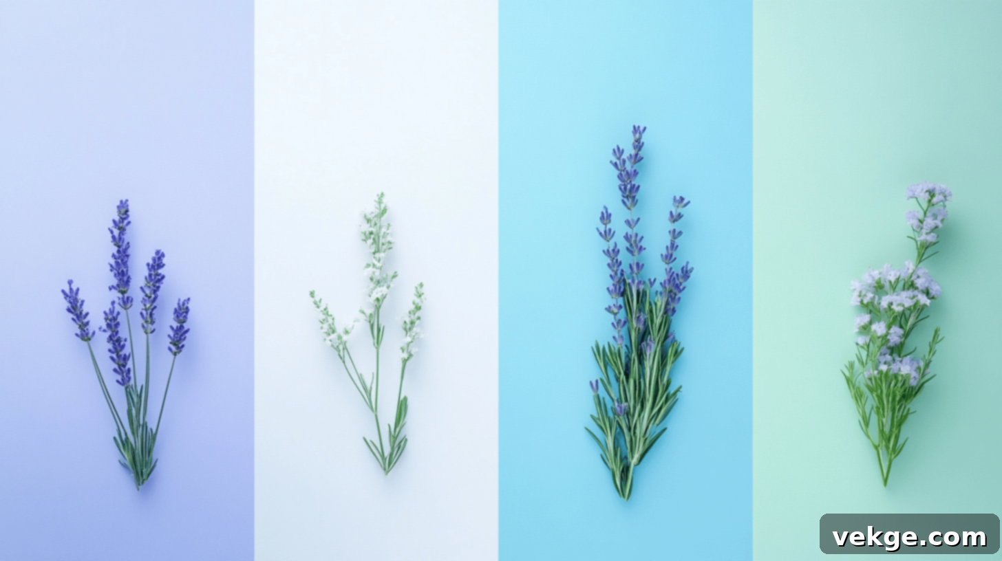
4. Lavender – Peace with a Gentle, Spiritual Touch
Lavender, a soft and delicate shade of purple, offers a unique brand of peace infused with a gentle spiritual warmth and a touch of subtle magic. Unlike its bolder purple counterparts, lavender is not demanding; instead, it provides a soothing embrace for the mind. Its connection to the fragrant lavender fields often conjures images of tranquility, making it a popular choice for guided meditations and relaxation exercises. Many people close their eyes and imagine these fields when seeking to calm their minds and release tension.
This hue is frequently used in spas, wellness centers, and meditation apps for its ability to reduce stress, promote introspection, and foster a sense of spiritual peace. Lavender encourages a gentle detachment from worries, allowing for deep relaxation and imaginative thought. It’s a color that nurtures creativity while simultaneously providing a peaceful, comforting atmosphere, perfect for unwinding after a long day or engaging in quiet contemplation.
Harmonious Peaceful Color Combinations That Work Well
While each peaceful color stands strong on its own, combining them can create even richer and more nuanced serene environments. Let’s explore some exceptional combinations that offer unique pathways to tranquility.
Blue and White: Freshness and Clarity
This classic combination feels like a fresh breath of crisp, clean air. Blue, with its inherent calm and stability, perfectly complements white’s expansive openness and purity. Together, they evoke images of seaside serenity—clear skies meeting white sandy beaches. This pair excels in spaces where rest and hygiene are paramount, such as bathrooms, creating a spa-like atmosphere, or bedrooms, promoting deep, undisturbed sleep. The blue adds depth and reassurance, while the white keeps the space feeling light, airy, and uncluttered.
Green and Beige: Natural Warmth and Grounding
Nature’s favorite mix, green and beige, effortlessly brings the soothing essence of the outdoors inside. Green infuses the space with vitality, growth, and natural harmony, while beige provides an earthy warmth, comfort, and grounding stability. This combination feels organic and inviting, fostering a sense of connection to the natural world. It works beautifully in living spaces, dining rooms, or any area where people gather to converse, relax, and feel a gentle embrace of nature’s tranquility. It’s a subtle yet powerful pairing for creating an effortlessly cozy and peaceful retreat.
Lavender and Gray: Modern Serenity with a Soft Touch
This gentle yet sophisticated mix feels both modern and incredibly soothing. Lavender introduces its soft, spiritual warmth and creative energy, while a calm gray provides a crucial balance, grounding the ethereal quality of lavender with its steadiness and neutrality. This pairing avoids being overtly feminine or cold, instead offering a refined sense of calm. It’s an excellent choice for home offices, quiet reading nooks, or meditation spaces, where it supports focused thought, gentle introspection, and a modern, understated sense of peace without being overly stimulating.
Cool Colors in Home Design: Tailoring Serenity to Your Space
Understanding how green, blue, white, and lavender specifically impact different rooms can help you intentionally design spaces that cater to various needs for peace and well-being.
Best Rooms for Green – The Restorative Retreat
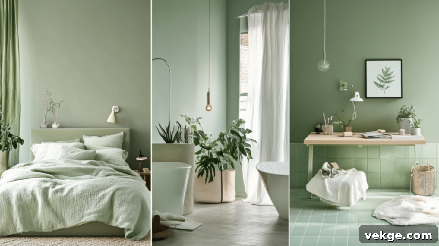
- Bedroom: Soft shades of green in the bedroom help ease you into sleep naturally. Its connection to nature signals your brain to slow down, encouraging a restorative rest after a busy day. Many individuals report better sleep quality and deeper relaxation surrounded by gentle green hues reminiscent of leaves and grass. It creates a truly calming sanctuary.
- Office/Study: Green can significantly aid focus without leading to burnout. Research suggests that people make fewer mistakes and experience less eye strain in green environments. It’s like receiving small mental breaks each time you glance away from your screen, allowing for sustained concentration and reduced fatigue, perfect for prolonged work or study sessions.
- Bathroom: Green bathrooms evoke the feeling of a natural spa or a serene forest bathing experience. The color feels inherently clean and refreshing while maintaining an inviting warmth. Starting your day with morning routines in a green space can help you feel centered and refreshed, rather than rushed or tense, setting a positive tone for the hours ahead.
Best Rooms for Blue – The Mindful and Productive Space
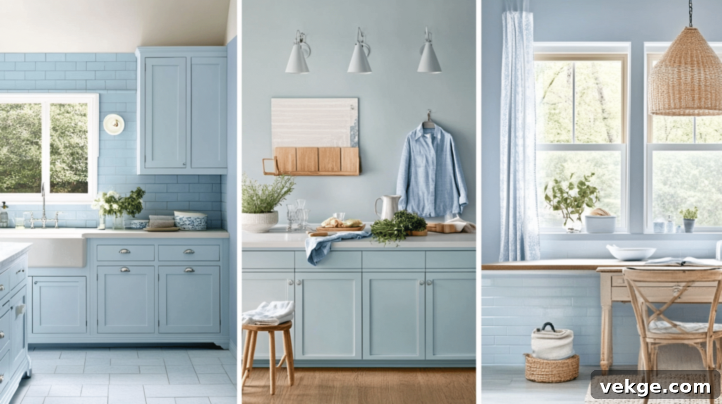
- Kitchen: Interestingly, blue is known to slightly reduce appetite, aiding in mindful eating and portion control. Food, particularly warm-toned dishes, also tends to stand out beautifully against a blue backdrop. A fun, practical fact: flies are less attracted to blue rooms, which can be a clever trick for kitchens with open windows during warmer months!
- Bathroom: Blue and water are inseparable partners. The color not only makes smaller bathrooms appear more expansive and airy but also cultivates a fresh, impeccably clean feeling. Even quick showers can transform into more relaxing moments when surrounded by gentle blue tones, enhancing the sense of a personal oasis.
- Work Areas/Home Office: Blue promotes mental clarity, enabling your mind to work through complex tasks without succumbing to stress. It is exceptionally effective in spaces where critical thinking, clear decision-making, and objective reasoning are paramount, helping to reduce emotional pressure and foster analytical thought.
Best Rooms for White – The Canvas for Clarity and Calm
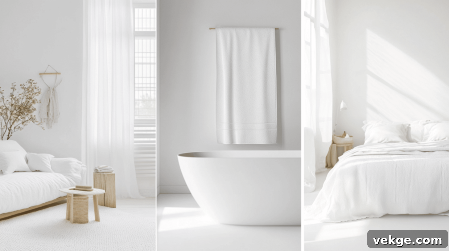
- Living Room: White living spaces are incredibly welcoming, serving as a versatile blank canvas for engaging conversations and communal relaxation. Even intimate gatherings feel more open and spacious, and your cherished decorative items or artwork become the undisputed focal points, rather than competing with vibrant wall colors.
- Bedrooms: White bedrooms are the epitome of a calm, serene retreat. They signal to your brain that it’s time to release the day’s visual and mental clutter. White sheets and bedding appear exceptionally crisp, clean, and inviting, creating a truly peaceful atmosphere conducive to deep rest and rejuvenation.
- Bathrooms: White bathrooms are timeless, elegant, and maintain a perpetual sense of cleanliness. The color’s ability to bounce light around makes morning routines brighter and more invigorating. White acts as a versatile base, equally capable of highlighting colorful towels and accessories or maintaining a minimalist, understated, and utterly calm aesthetic.
Best Rooms for Lavender – The Creative and Meditative Haven
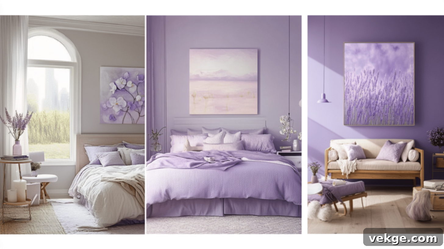
- Bedroom: Lavender has been cherished for generations for its ability to promote sleep. It gently quiets busy thoughts without the sometimes-cool sensation of blue. It is particularly effective for individuals whose minds tend to race when trying to fall asleep, offering a warm and comforting pathway to slumber.
- Teen Room/Studio: Lavender fosters creative thinking while simultaneously providing enough calm for focused homework. It’s a sophisticated, grown-up color that still retains a hint of magic—ideal for spaces where both academic pursuits and imaginative exploration seamlessly coexist.
- Entertainment Area: Lavender sets a wonderfully pleasant backdrop for engaging conversations, board game nights, or cozy movie marathons. It helps guests feel both relaxed and mentally present, leading to more meaningful and enjoyable interactions than might occur in more brightly or actively colored rooms.
Mood and Personality Traits of Peaceful Colors
Our color preferences often reveal aspects of our inner selves. The table below provides a concise overview of the mood created by these peaceful colors and the personality traits frequently associated with those who are drawn to them.
| Color | Theme | Mood Created | Personality Traits |
|---|---|---|---|
| Green | The Color of Growth and Balance | Green evokes a profound sense of calm, mirroring nature’s tranquility. It supports emotional rest, fresh perspectives, and fosters peaceful, secure environments, promoting harmony and well-being. | Individuals who are drawn to green are typically steady, thoughtful, supportive, and possess quiet leadership qualities. They deeply value personal growth, inner peace, and exhibit profound respect for others and the natural world. |
| Blue | The Color of Peace and Productivity | Blue instills a deep sense of peace and enhances mental focus. It effectively calms turbulent emotions and supports clear, logical thinking, making it ideal for work, study, or any quiet space requiring concentration. | Blue enthusiasts are known for being loyal, incredibly calm, and clear thinkers. They are excellent listeners, reliably supportive of others, and build trust through their consistent words and actions. |
| White | The Color of Peace and Purity | White offers profound stillness and mental spaciousness. It creates peaceful, open, and decluttered environments that feel pristine, quiet, and emotionally soothing, promoting a sense of clarity. | People attracted to white tend to be thoughtful, highly organized, gentle, and possess a calm demeanor. They cherish tranquility and often contribute to bringing order and serenity to their surroundings. |
| Lavender / Light Purple | The Color of Creativity and Spirituality | Lavender is soft, dreamy, and inherently soothing. It supports deep rest, calm thoughts, and nurtures creative moods, making it perfect for artistic endeavors, meditation, or quiet, imaginative reflection. | Lavender lovers are typically creative, highly sensitive, kind-hearted, and thoughtful individuals. They express their feelings eloquently and deeply appreciate peaceful, aesthetically pleasing environments. |
Using Peaceful Colors in Daily Life for Enhanced Well-being
Integrating peaceful colors into our daily lives extends beyond mere aesthetics; it’s a conscious choice to cultivate a sense of calm and positively transform our surroundings and inner state.
Home Decor: Crafting Your Sanctuary
Employing soft blues, restorative greens, and muted lavenders in your home decor creates an immediate atmosphere of calm and tranquility. These gentle shades are particularly effective in bedrooms, bathrooms, and dedicated meditation or relaxation rooms. Blue promotes profound relaxation and mental clarity; green introduces a vital sense of balance and natural healing; and lavender adds a soothing, spiritual touch. Together or individually, they help in establishing a stress-free, harmonious environment that nurtures your mental and emotional well-being, turning your living space into a true sanctuary.
Fashion and Clothing: Wearing Your Inner Peace
Choosing to wear light, peaceful shades such as soft beige, pastel blue, serene gray, or subtle green can profoundly influence your mood and how others perceive you. These colors create a relaxed, approachable, and effortlessly peaceful look. Soft tones not only contribute to a comforting personal mood but also project an aura of calm and stability, making them excellent choices for casual wear, professional settings where composure is valued, or any occasion where you wish to feel and appear grounded and serene. They encourage a sense of inner peace that radiates outwards.
Graphic Design and Branding: Building Trust and Tranquility
In the realm of graphic design and branding, the strategic use of soft blues, greens, and neutral tones like white or beige is pivotal for establishing a sense of trust, reliability, and peace. These colors help customers feel at ease, fostering a deeper connection and confidence in the brand. Light, calming shades are frequently employed in sectors such as wellness, finance, healthcare, and technology branding, where they effectively communicate integrity, security, and a user-friendly experience. They reassure the audience, building a foundation of calm trust that resonates deeply.
Conclusion
Peaceful colors are far more than just visually appealing; they are potent agents of change that profoundly impact how we feel, think, and interact with the world around us. They can significantly enhance our mental well-being, acting as silent allies in our quest for inner calm and balance. By thoughtfully introducing the serene depths of blues, the pristine simplicity of whites, the rejuvenating power of greens, and the gentle warmth of lavenders into our daily environments, we actively create spaces that consistently support calm, foster clear focus, and maintain a harmonious equilibrium.
Whether consciously chosen for our home interiors, integrated into our personal wardrobes, or strategically applied in brand designs, these gentle hues offer practical, accessible tools for effectively managing stress, alleviating anxiety, and cultivating a pervasive sense of tranquility. As you navigate your daily life and consider the colors surrounding you, remember their quiet yet profound influence on your mood, thoughts, and interactions. Embracing the power of peaceful colors is a simple yet impactful step towards a more serene and harmonious existence. Explore more insights and tips on our website to further enrich your journey to well-being.
Frequently Asked Questions
What is the National Color of Peace?
White is widely recognized as the global color of peace, prominently featured on truce flags and banners proclaiming “Peace to All Nations.”
What Color Represents Anxiety?
Darker gray shades, often associated with gloominess and uncertainty, are commonly linked to anxious feelings, negative mental states, and a sense of unease.
What Symbolizes Peace?
Beyond color, universal symbols of peace include the white dove, an olive branch, and the iconic circular peace sign, all recognized globally as emblems of harmony and goodwill.
