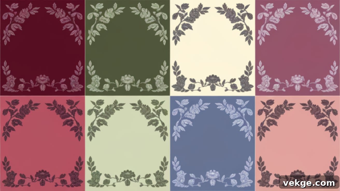
Mastering Victorian Color Schemes: A Timeless Guide to Historical Hues and Modern Revival
Victorian color schemes often get a bad rap for being difficult to get right. Many homes attempting to capture the era’s charm end up with mismatched hues that feel more cluttered than captivating. The truth is, bringing the richness and depth of 19th-century colors into your living space can seem daunting, but it doesn’t have to be.
We’re here to prove that creating a beautiful, Victorian-inspired palette is far easier and more rewarding than you might imagine. This comprehensive guide will illuminate the captivating world of Victorian colors, helping you understand their historical significance and providing actionable tips for applying them in modern settings.
Whether you’re planning a full-scale renovation or simply looking to add a touch of Victorian flair to a single room, our expert advice will make choosing the perfect shades a breeze. We’ll explore the enduring appeal of these timeless palettes and show you how to blend tradition with contemporary style seamlessly.
In this in-depth post, we’ll uncover:
- The fascinating historical context behind Victorian color schemes.
- Inspiring and popular Victorian color combination ideas for every room.
- Strategies for effectively balancing bold, rich tones with subtle nuances.
- Practical tips for seamlessly incorporating these classic palettes into your contemporary home.
Get ready to infuse your living space with the unparalleled elegance and sophisticated charm of the 19th century, creating a home that tells a story of refined taste and historical appreciation!
A Glimpse Into 19th-Century Color Schemes: The Heart of the Victorian Era
The Victorian period, a transformative era spanning Queen Victoria’s reign from 1837 to 1901, marked a pivotal shift in design aesthetics. Named after the monarch herself, this epoch was characterized by a fascinating blend of old-world traditions and burgeoning modernism. Homes during this time evolved beyond mere shelters, becoming profound expressions of personal taste, social standing, and newfound prosperity.
As the middle class grew and industry boomed, house designs became increasingly elaborate. Interiors were often lavishly decorated, featuring intricate patterns, heavy, ornate furniture, and a rich tapestry of textures. Victorians embraced a maximalist approach, filling their spaces with a multitude of items, from highly patterned wallpapers and plush detailed rugs to exotic curios and personal collections.
Color played an instrumental role in defining this distinctive look. Early Victorian palettes often gravitated towards darker, deeper, and more somber hues, reflecting the gravitas and formality of the era. However, as the century progressed and new technologies emerged, a lighter, brighter spectrum of shades began to gain popularity. This fascinating evolution in color choices offers a compelling narrative about the societal, technological, and cultural transformations that unfolded during Queen Victoria’s long and influential reign.
Technological Advancements: The Industrial Revolution’s Impact on Color
The Industrial Revolution wasn’t just about factories and steam engines; it profoundly transformed the world of home decoration, particularly in the realm of color. Before this era, paints were primarily derived from natural minerals and plant extracts, resulting in a limited range of dull, earthy tones that faded quickly and were often expensive to produce. The vibrancy and longevity of colors were constrained by the very nature of their sources.
However, the mid-19th century saw a revolutionary breakthrough with the development of new synthetic dyes and paint-making methods. The discovery of vibrant aniline dyes, such as the brilliant purple Mauveine by William Henry Perkin in 1856, ushered in an age of unprecedented color options. These new pigments allowed for the creation of vivid, lasting colors that were far more stable and resistant to fading than their natural predecessors. Moreover, the industrialization of paint production significantly reduced costs, making fashionable and visually striking colors accessible to a much broader segment of the population, from the wealthy elite to the burgeoning middle class. This democratization of color fueled a passion for elaborate and richly colored interiors, becoming a hallmark of Victorian design.
Cultural Influences: A World of Inspiration
Victorian color choices were not solely driven by technological progress; they were deeply shaped by the vibrant art movements and the expansive global explorations of the era. The Pre-Raphaelite Brotherhood, a group of English painters, poets, and critics, rejected the conventions of their time and drew inspiration from early Italian Renaissance art. Their works, characterized by intense color saturation, intricate detail, and a focus on natural forms, profoundly influenced interior design, encouraging the use of bold, jewel-toned colors within the home.
Concurrently, Britain’s vast colonial empire and its extensive global trade ventures brought an influx of exotic goods, patterns, and artistic styles from distant lands like Egypt, India, Japan, and China. These international influences sparked a fascination with diverse cultural aesthetics, leading to unique and often eclectic color mixes in Victorian homes, blending traditional European sensibilities with vibrant Eastern motifs. Later in the era, a reaction against the industrialization and perceived excesses of Victorian design emerged in the form of the Arts and Crafts movement. This movement championed a return to handcrafted goods and promoted natural, earthy tones, along with organic patterns, providing a quieter, more subdued counterpoint to the earlier, bolder Victorian palettes. These varied influences converged to create the rich, complex, and highly diverse spectrum of Victorian color schemes we admire today.
The Colors of the Victorian Era: Rich Hues and Timeless Tones Explained
The defining characteristic of Victorian interior design was its embrace of depth and richness in color. Far from being random, these palettes were carefully curated to evoke a sense of warmth, luxury, and historical gravitas. Understanding the core elements of Victorian color theory is key to successfully replicating its enduring appeal.
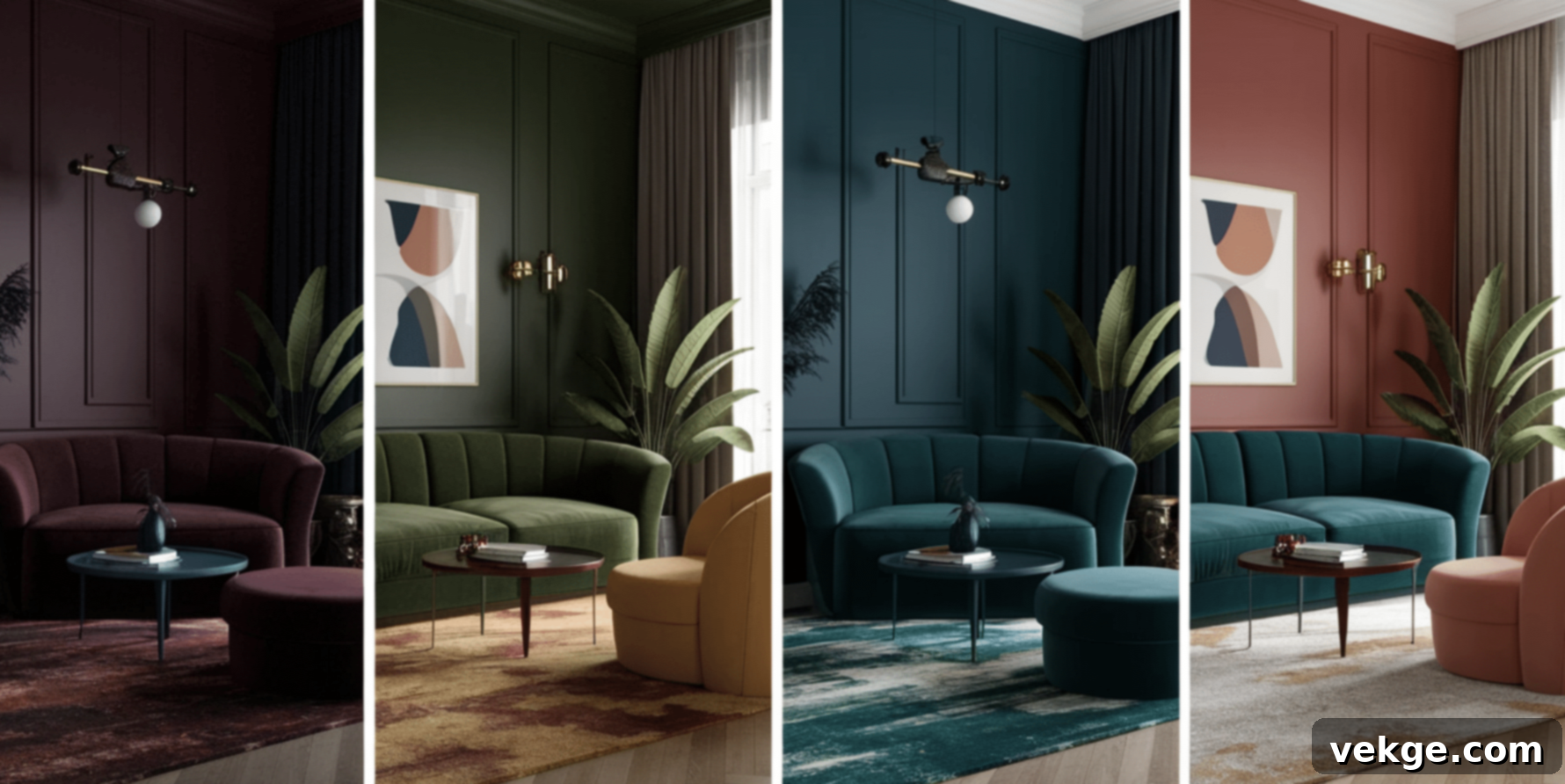
1. Deep, Rich Hues: The Foundation of Victorian Grandeur
At the heart of Victorian design lay a profound appreciation for deep, saturated colors. These were not merely shades but statements, imbuing rooms with a sense of opulence and comfort. Walls were frequently adorned in intense, bold colors that set a dramatic backdrop for the intricate furnishings and detailed decor. Popular choices included profound reds, such as burgundy, crimson, and oxblood, which evoked passion and warmth. Greens were equally favored, with shades like forest, emerald, and olive green bringing a connection to nature and a sense of tranquility. Dark blues, particularly navy and sapphire, were also common, offering a stately and dignified atmosphere. These strong, jewel-toned colors provided a warm, inviting, and often intimate feel, perfectly suited to the gaslit interiors of the era, which could otherwise feel stark.
2. Accents and Contrasts: Adding Layers of Sophistication
Victorian designers were masters of adding visual interest through strategic accents and thoughtful contrasts. To prevent rooms from feeling too monolithic, smaller touches of lighter or contrasting colors were introduced. Gold, often applied in gilding on picture frames, mirrors, furniture, and wallpaper details, was a perpetual favorite, instantly adding a touch of luxury and reflecting light beautifully. Rich purples, from deep plum to soft lavender, brought an air of royalty and sophistication. Earth tones like terracotta, russet, and various shades of brown were used to ground the space, adding natural warmth and texture. These accents created a dynamic interplay against the main, deeper colors, enhancing depth and preventing the palette from feeling flat or overwhelming.
3. Use of Complementary Colors: Dynamic Visual Harmony
A sophisticated understanding of color theory was evident in the Victorian preference for pairing complementary colors – those found on opposite sides of the color wheel. This technique creates a vibrant, eye-catching effect where each color makes the other appear more intense. For example, the Victorians frequently combined deep reds with forest greens, or rich blues with burnt oranges or golden yellows. This strategic juxtaposition created lively, yet balanced, rooms that felt dynamic and engaging. The careful mix of warm and cool colors ensured that spaces, despite their richness, maintained a harmonious and aesthetically pleasing equilibrium, reflecting a deliberate artistic intent.
4. Balancing with Neutrals: Brightening and Expanding Spaces
While deep hues dominated, the Victorians also understood the critical role of lighter, neutral colors in preventing rooms from becoming overly dark or claustrophobic. Light colors were strategically employed to brighten spaces and provide visual relief. Cream and ivory were popular choices for ceilings, elaborate cornices, and trim work, offering a crisp contrast to darker walls and reflecting what little natural light was available. Soft pastels, such as pale pinks, light blues, and delicate yellows, also found their place, especially in bedrooms and drawing-rooms, adding a touch of gentleness and airiness. These lighter shades served to balance the intensity of the deeper colors, opening up spaces and ensuring that even the most richly decorated rooms felt welcoming rather than imposing.
Victorian Color Schemes Inspirations You’ll Love for Every Room
Now that we’ve explored the foundational principles of Victorian color, let’s dive into specific, inspiring combinations that you can adapt for different areas of your home. These curated palettes capture the essence of the era while offering versatility for modern applications.
1. Victorian Color Schemes Ideas for Living Room: Grandeur and Comfort
The living room, or “parlor,” was often the showpiece of a Victorian home, designed to impress guests and provide a comfortable, refined gathering space. The color schemes here aimed for sophistication and warmth.
Deep Burgundy and Gold
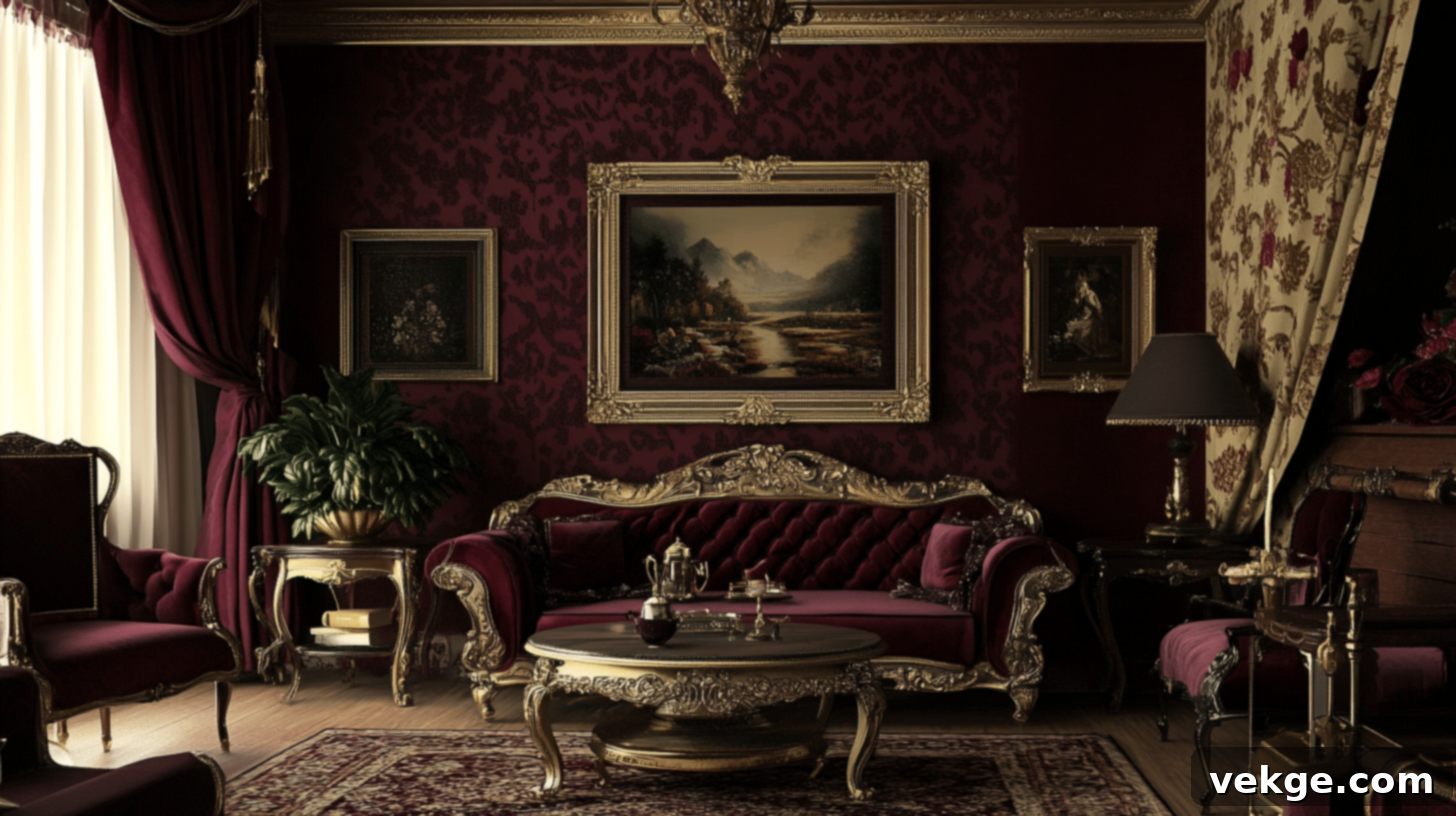
This classic combination exudes luxury and opulence, making a bold statement of refined taste.
- Walls: Rich burgundy, perhaps enhanced with subtle gold stenciling or a patterned wallpaper featuring gold accents.
- Trim: Crisp ivory to provide a striking contrast and highlight architectural details.
- Complementary Decor Elements: Gilded picture frames, sumptuous burgundy velvet drapes, and dark wood furniture (like mahogany or walnut) with elegant gold accents or hardware.
Olive Green and Cream
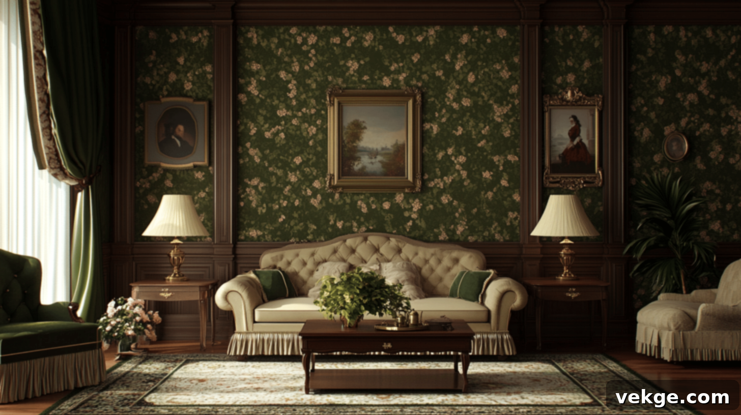
A more subdued yet equally elegant pairing, evoking nature and understated charm.
- Walls: Deep olive green, perhaps with a subtle floral or damask wallpaper pattern to add texture.
- Trim: Soft cream for a gentle, brightening effect against the rich green.
- Complementary Decor Elements: Polished brass lamps and fixtures, heavy dark green drapery, and mahogany wood furniture often paired with cream upholstery to lighten the overall feel.
Warm Taupe and Plum
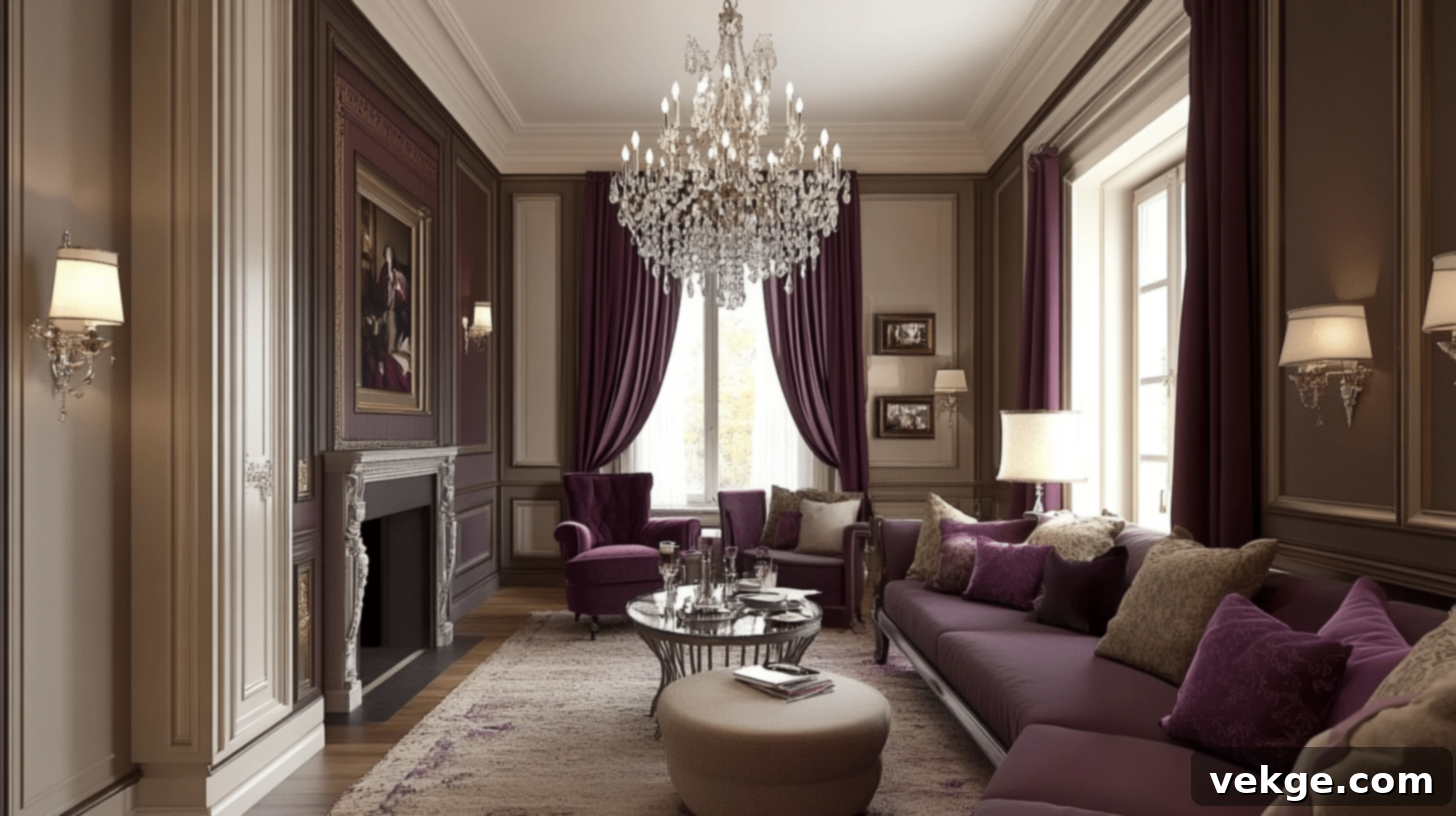
This combination offers a sophisticated and slightly more contemporary take on Victorian warmth, blending earthy tones with a touch of royal elegance.
- Walls: Inviting warm taupe, complemented by a lower wainscoting painted in a deep plum for visual interest.
- Trim: Antique white, adding a subtle aged elegance.
- Complementary Decor Elements: Sparkling crystal chandeliers, flowing plum curtains, and dark-stained wood furniture balanced with neutral upholstery for comfort.
Forest Green and Rich Brown
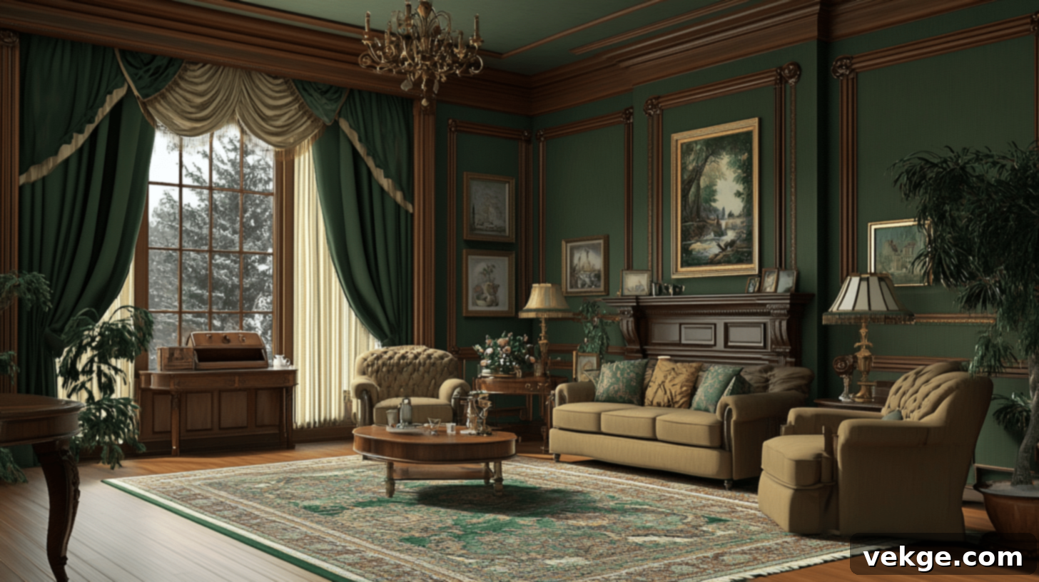
A deeply grounding and masculine palette, perfect for a library or study, radiating a sense of history and quiet strength.
- Walls: Luxurious forest green, enhanced with rich brown decorative molding or wood paneling.
- Trim: A warm beige, offering a gentle transition between the dominant colors.
- Complementary Decor Elements: Vintage brass fixtures, heavy rich brown drapery, and robust walnut furniture often with forest green upholstery to tie the room together.
2. Victorian Color Schemes Ideas for Bedroom: Serenity and Romance
Victorian bedrooms were private sanctuaries, often reflecting a softer, more intimate side of the era’s aesthetic. Comfort and a touch of romance were key.
Lavender and Ivory
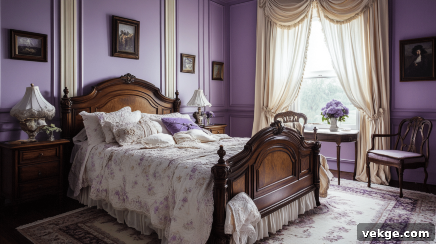
This delicate pairing creates a truly serene and romantic atmosphere, perfect for a restful retreat.
- Walls: A soft, ethereal lavender, complemented by clean ivory trim.
- Trim: Light beige or ivory, enhancing the gentle nature of the room.
- Complementary Decor Elements: Flowing lavender drapes, exquisite vintage ivory bed linens, and a dark wood bed frame adorned with subtle floral bedding.
Dusty Rose and Gray
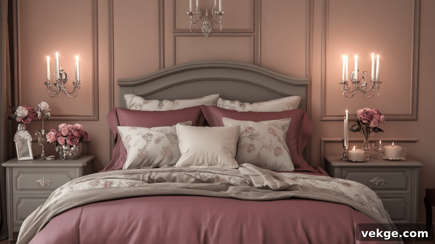
A sophisticated and slightly more muted option, offering a blend of antique charm and contemporary subtlety.
- Walls: Elegant dusty rose, featuring subtle gray detailing in wallpaper patterns or a chair rail.
- Trim: A light gray, providing a modern edge while remaining complementary.
- Complementary Decor Elements: Polished silver candleholders, matching rose bedding, and painted gray furniture with delicate rose accents.
Pale Yellow and Olive
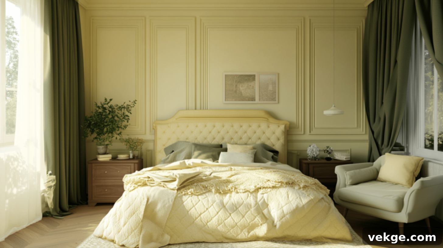
A warm and inviting combination that feels both historical and naturally refreshing, reminiscent of a sunlit garden.
- Walls: Cheerful pale yellow, balanced by an olive wainscoting for depth and earthiness.
- Trim: Cream, maintaining a soft and harmonious overall look.
- Complementary Decor Elements: Coordinating olive green drapes and bedding, and natural oak furniture with pale yellow upholstery.
Soft Blue and Beige
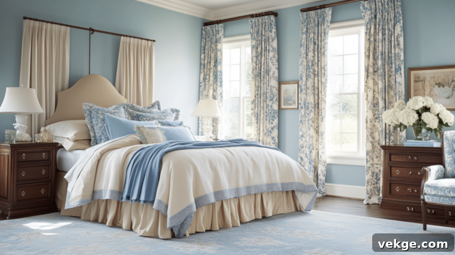
Creating a tranquil and classic bedroom sanctuary, this pairing offers calm and timeless elegance.
- Walls: Gentle soft blue, with subtle beige accents in wallpaper or fabric.
- Trim: Crisp white, enhancing the clean and airy feel.
- Complementary Decor Elements: Comfortable beige linens, blue floral drapes for a touch of pattern, and rich mahogany furniture paired with cream and blue bedding.
3. Victorian Color Schemes Ideas for Kitchen: Functional Charm
Victorian kitchens were primarily functional, but that didn’t stop them from exuding charm through robust materials and thoughtfully chosen colors.
Moss Green and Charcoal Gray
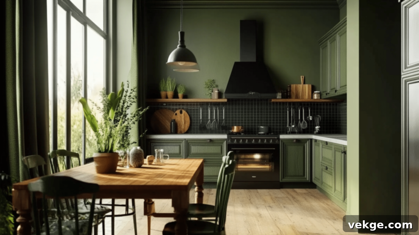
A sophisticated and grounded combination that brings a touch of nature and contemporary strength to the kitchen.
- Walls: Earthy moss green, complemented by a chic charcoal gray backsplash, possibly in subway tiles.
- Trim: Bright white, providing a clean and fresh contrast.
- Complementary Decor Elements: Black iron hardware on cabinets, dark green curtains, and a sturdy wooden table paired with green chairs.
Rust and Cream
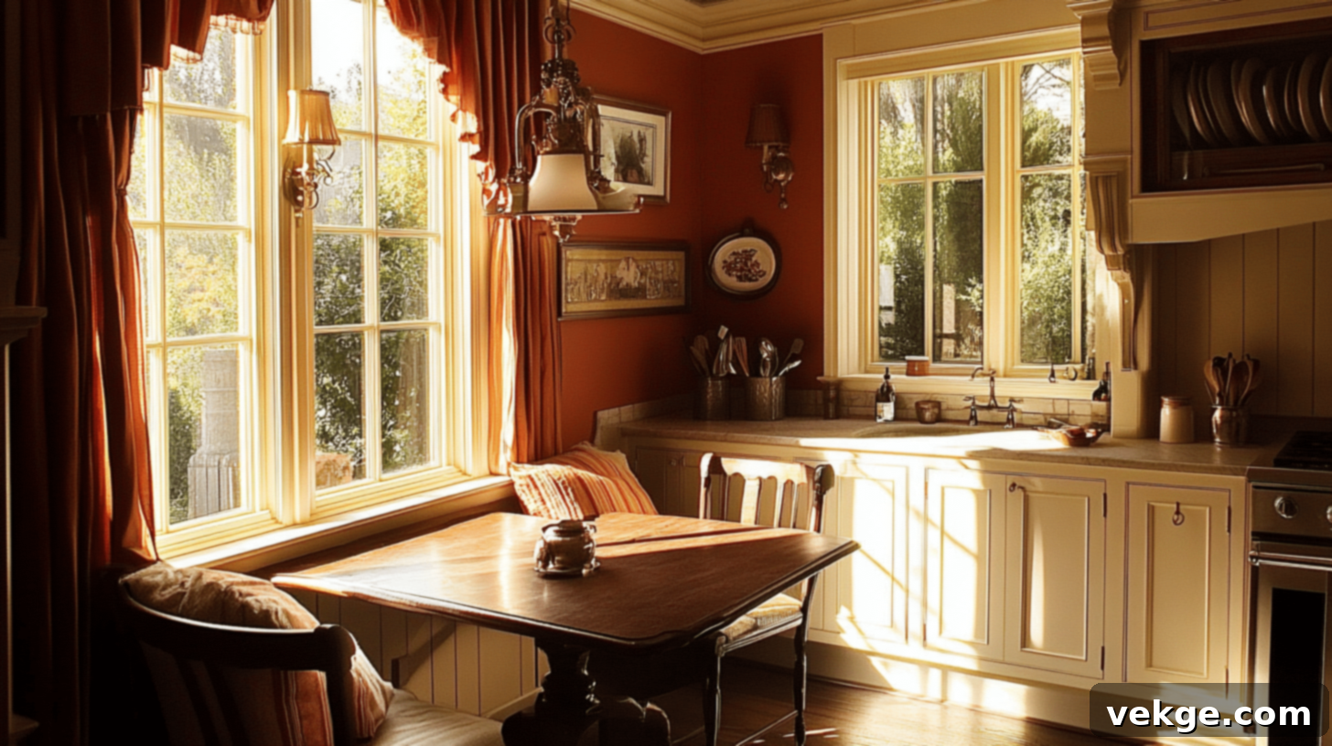
This warm and inviting palette evokes the rustic charm of old-world kitchens, full of character and comfort.
- Walls: Rich rust-colored walls, balanced by classic cream wainscoting for a traditional look.
- Trim: Matching cream, ensuring a cohesive and bright finish.
- Complementary Decor Elements: Polished brass fixtures, rust-red curtains, and an antique oak table with comfortable cream cushions.
Burnt Orange and Warm Brown
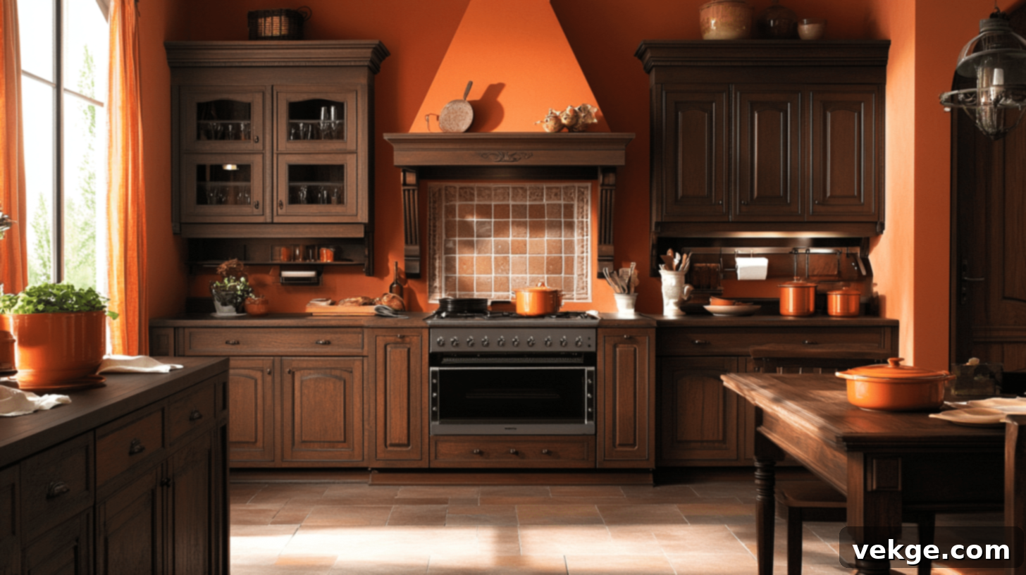
A wonderfully vibrant and autumnal scheme that adds warmth and an almost Mediterranean richness to the kitchen.
- Walls: Energetic burnt orange, complemented by classic warm brown cabinets.
- Trim: Dark wood, seamlessly integrating with the cabinetry.
- Complementary Decor Elements: Displayed copper pots, burnt orange curtains, and a robust dark wood table often with terracotta tiles.
Hunter Green and Cream
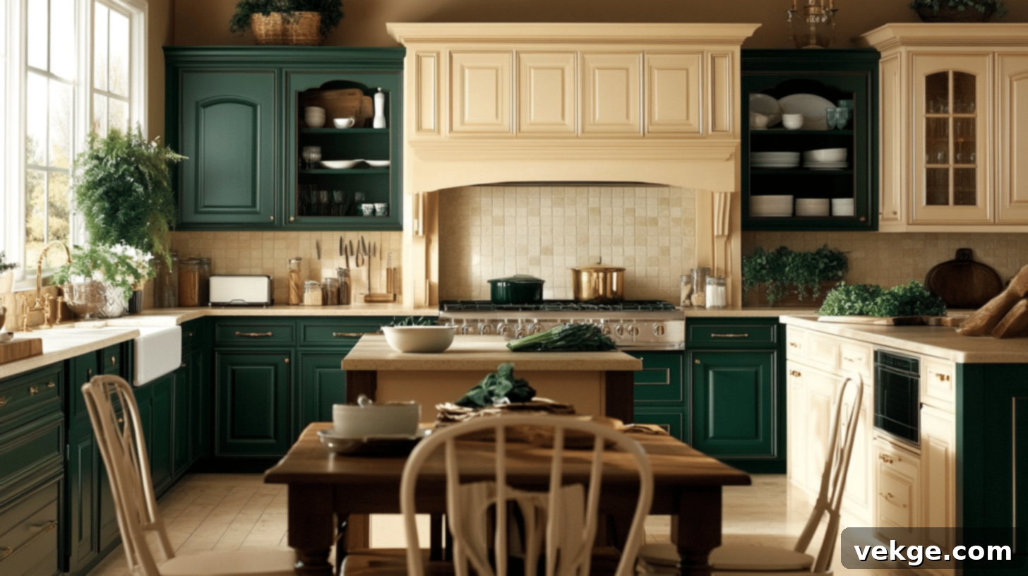
A classic and enduring combination, offering a sophisticated and slightly formal ambiance perfect for a traditional kitchen.
- Walls: Deep hunter green, paired with a clean cream tile backsplash for a fresh and durable surface.
- Trim: Cream, tying into the backsplash and brightening the space.
- Complementary Decor Elements: Elegant brass hardware on cream cabinetry, and a sturdy dark wood table with matching cream chairs.
4. Victorian Color Schemes Ideas for Bathroom: Retreat and Refreshment
Victorian bathrooms, especially later in the era, became spaces of personal hygiene and often featured bright, clean colors contrasted with rich details.
Sapphire Blue and White
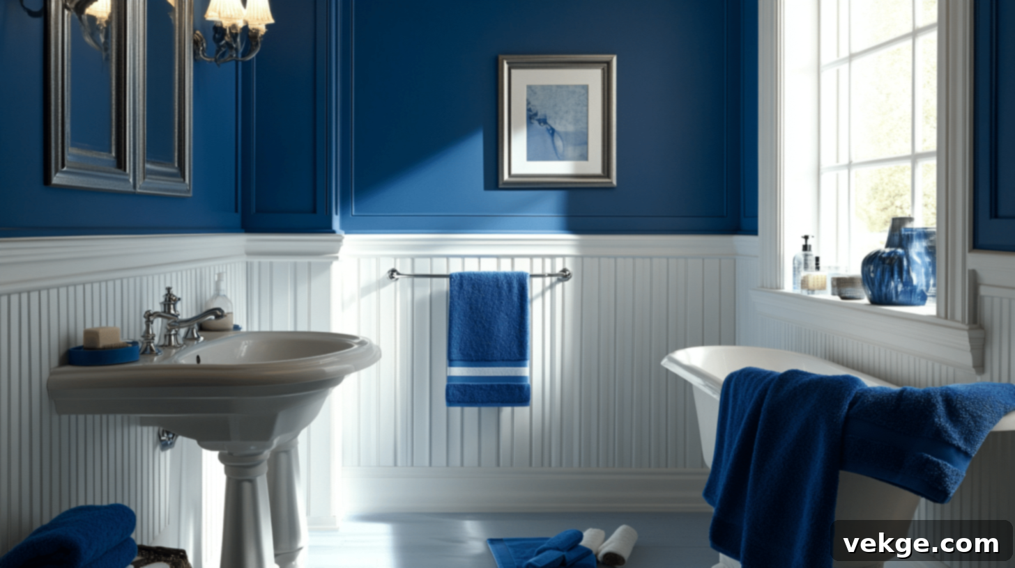
A refreshing and crisp combination that evokes cleanliness and a touch of nautical elegance, timelessly appealing.
- Walls: Vibrant sapphire blue, beautifully contrasted with traditional white beadboard wainscoting.
- Trim: Clean white, emphasizing the architectural features and creating a bright contrast.
- Complementary Decor Elements: Polished silver fixtures, soft blue towels, and a classic white porcelain sink with thoughtful blue cabinetry.
Rose Pink and Cream
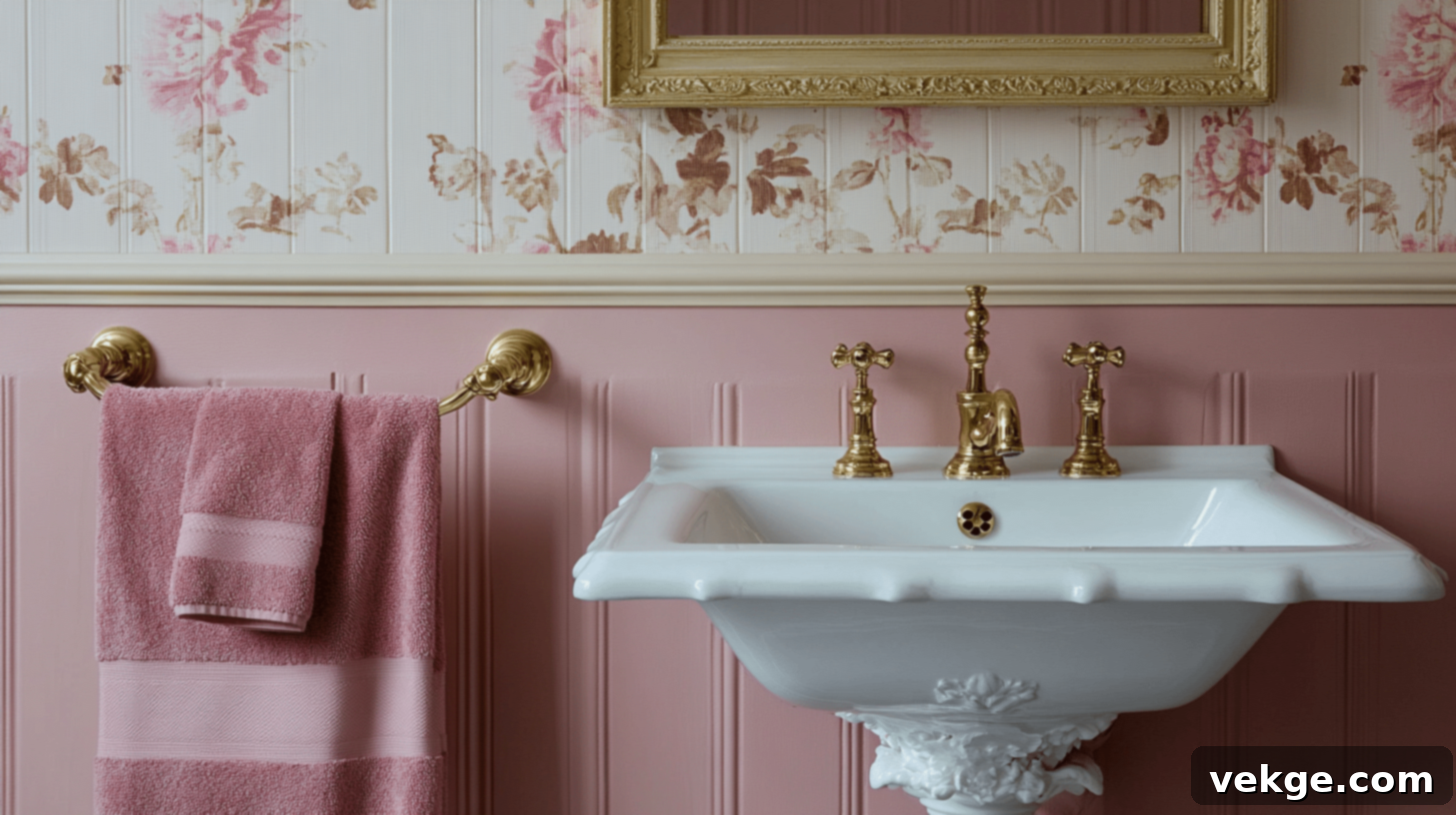
This charming and feminine palette brings a soft, romantic touch to the bathroom, creating a delicate and inviting space.
- Walls: Gentle rose pink, framed by soft cream trim.
- Trim: Matching cream, enhancing the light and airy feel.
- Complementary Decor Elements: Elegant gold fixtures, delicate pink floral towels, and a classic white porcelain sink with matching gold handles.
Soft Beige and Emerald Green
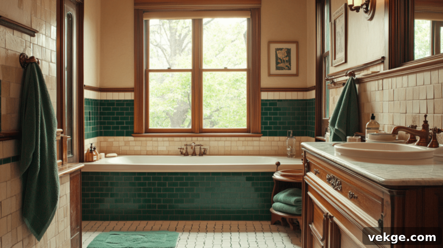
A sophisticated and natural combination that offers a sense of calm luxury, blending earthy neutrality with a jewel-toned accent.
- Walls: Calming soft beige, accented with striking emerald green tile borders.
- Trim: Crisp white, providing a fresh and clean break.
- Complementary Decor Elements: Warm bronze fixtures, plush green towels, and a sturdy wood vanity with tasteful green accents.
Ivory and Olive
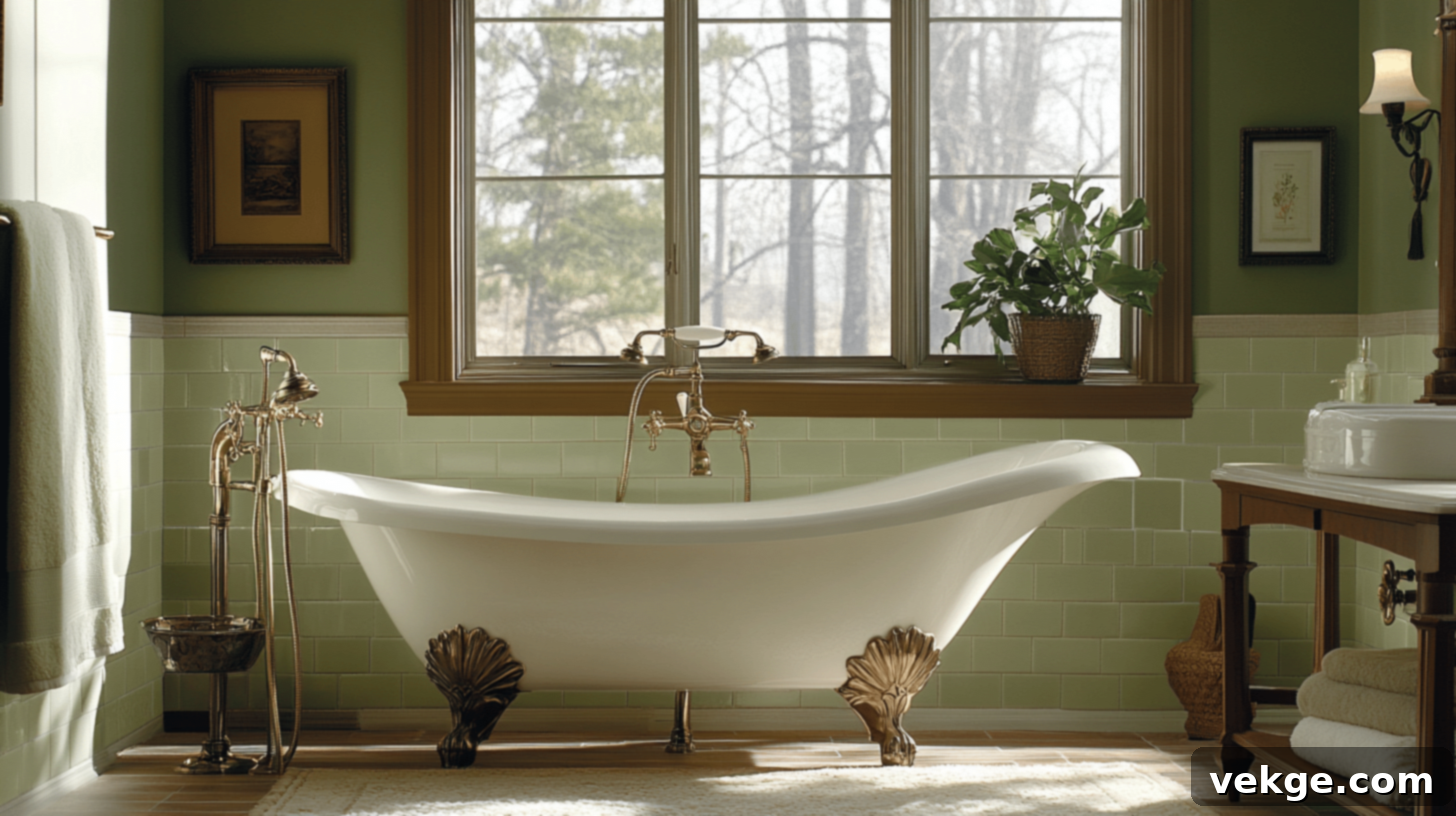
A very elegant and organic pairing, delivering a natural yet refined look for a serene bathroom experience.
- Walls: Classic ivory, complemented by subtle olive green tile accents for a touch of earthy richness.
- Trim: Dark wood, adding a traditional and grounding element.
- Complementary Decor Elements: Antique brass fixtures, soft olive towels, and a pristine clawfoot tub in white with a refined olive trim.
Tips for Blending Victorian Hues with Modern Style: A Harmonious Mix
Integrating the rich, historical beauty of Victorian colors into a contemporary home can create a unique and highly personalized aesthetic. The key is to achieve balance, preventing the space from feeling dated or overwhelming. Here are some actionable tips to help you blend these timeless hues with modern style effortlessly:
- Start Small and Thoughtfully: Instead of committing to an entire room, introduce Victorian colors through accent pieces. Think about rich jewel-toned throw pillows, a luxurious velvet blanket, or a piece of artwork featuring a deep, historical palette. This allows you to experiment without a full overhaul.
- Choose One Bold Focal Point: Select a single dominant Victorian shade to anchor your design. A deep emerald green, sapphire blue, or burgundy accent wall can make a dramatic statement, while the rest of the room maintains a more modern, neutral scheme.
- Pair with Contemporary Neutrals: To prevent deep Victorian colors from feeling heavy or dark, always balance them with lighter, modern neutrals. Shades of light gray, crisp white, or warm beige will provide visual relief and make the bold colors pop without overwhelming the space.
- Incorporate Modern Patterns: Give Victorian colors a fresh update by applying them to contemporary geometric designs, abstract art, or streamlined patterns. This fusion of old and new creates an intriguing visual dialogue.
- Optimize Lighting: Victorian homes often relied on gaslight, which softened colors. In a modern setting, bright, natural lighting is crucial to temper the intensity of darker Victorian shades. Use sheer curtains, strategically placed mirrors, and ample artificial lighting to illuminate your space effectively.
- Introduce Diverse Textures: Layering various textures can add depth and richness to a room without relying solely on color. Combine luxurious velvet, raw linen, polished wood, and metallic finishes to create a tactile and visually interesting environment.
- Go for the 60-30-10 Rule with a Twist: Apply the classic design rule by using 60% of a neutral base (e.g., light gray walls), 30% of a secondary modern color (e.g., a contemporary sofa), and then infuse the remaining 10% with a bold Victorian accent color (e.g., deep ruby throw pillows or an antique armchair).
- Modernize with Metallics: While brass was traditional, consider incorporating brushed nickel, matte black, or polished chrome fixtures and hardware. These modern metallics offer a sleek contrast to the richness of Victorian hues.
- Embrace Color Blocking: Create visual intrigue by blocking areas with Victorian colors alongside more modern, contrasting hues. This technique can define zones in an open-plan space or highlight architectural features in an unexpected way.
- Prioritize Simplicity and Clean Lines: To offset the inherent richness and ornate nature of Victorian colors, embrace a minimalist approach to furniture and decor. Opt for clean lines and avoid clutter to allow the colors and a few carefully chosen antique pieces to truly shine.
Victorian Color Schemes for Exterior Design: 5 Unique Combinations
The exterior of a Victorian home is often its most striking feature, a canvas for architectural storytelling. The era’s diverse styles—each with unique characteristics—offer distinct opportunities for color expression. Understanding these styles is crucial for selecting an authentic yet appealing palette.
Queen Anne homes, popular in the late 1800s, are renowned for their asymmetrical facades, turrets, towers, decorative spindles, and often expansive wrap-around porches. These intricate details provide multiple surfaces and layers for contrasting colors, allowing for a vibrant, multi-hued approach.
Italianate styles, earlier in the period, showcase low-pitched or flat roofs, wide eaves supported by decorative brackets, tall, narrow windows, and often ornate cornices. Their more blocky, elegant forms allow for creative coloring that emphasizes architectural grandeur rather than whimsical detail.
Choosing an exterior Victorian color scheme means selecting colors that not only complement the architecture but also stand the test of time, exuding classic elegance and curb appeal.
1. Deep Olive, Cream, and Burgundy
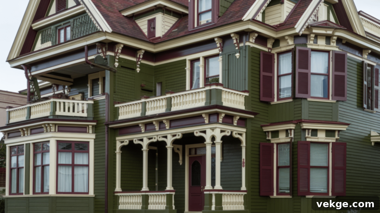
This combination evokes a sense of deep-rooted heritage and natural sophistication, making the home feel established and grand.
- Main Color: Deep Olive – Sherwin-Williams, “Garden Sage” (SW 7736) – A grounding and classic choice for the primary siding.
- Trim: Cream – Benjamin Moore, “Simply White” (OC-117) – Provides a crisp, inviting contrast that highlights architectural details.
- Accents: Burgundy – Behr, “Cinnabark” (PPU2-02) – Used for doors, window sashes, or decorative elements to add a touch of rich drama.
2. Slate Blue, White, and Charcoal
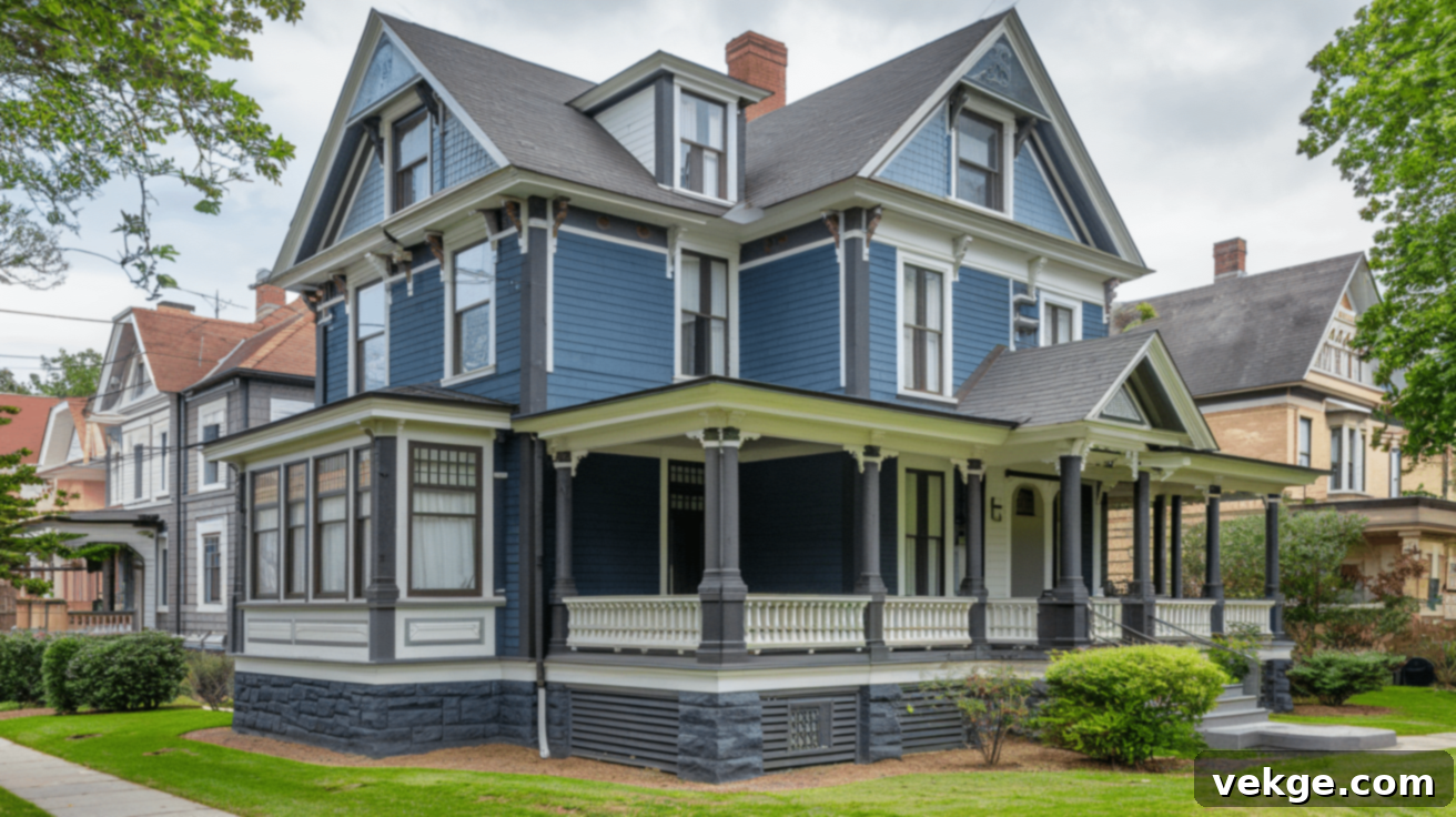
A cool, refined, and historically accurate palette that offers a calming yet distinctive presence on the street.
- Main Color: Slate Blue – Benjamin Moore, “Van Deusen Blue” (HC-156) – A deep, elegant blue for the body of the house.
- Trim: White – Sherwin-Williams, “Extra White” (SW 7006) – A clean, bright white for all trim, windows, and decorative elements.
- Accents: Charcoal – Behr, “Black Pearl” (PPU24-05) – Ideal for shutters, porch railings, or foundation, adding depth and a strong anchor.
3. Muted Mustard, Sage Green, and Brick Red
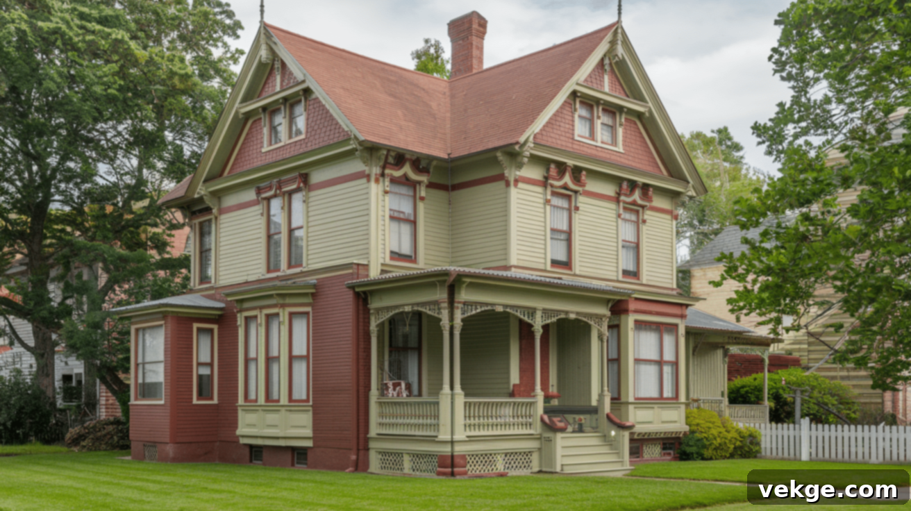
This vibrant yet earthy palette captures the whimsical spirit of Queen Anne Victorians, exuding warmth and character.
- Main Color: Muted Mustard – Benjamin Moore, “Hawthorne Yellow” (HC-4) – A cheerful yet historic yellow for the primary siding.
- Trim: Sage Green – Sherwin-Williams, “Clary Sage” (SW 6178) – A soft, natural green that harmonizes beautifully with the yellow.
- Accents: Brick Red – Behr, “Burnt Red” (S-H-180) – Perfect for highlighting intricate details, doors, or decorative shingles.
4. Navy Blue, Cream, and Warm Taupe
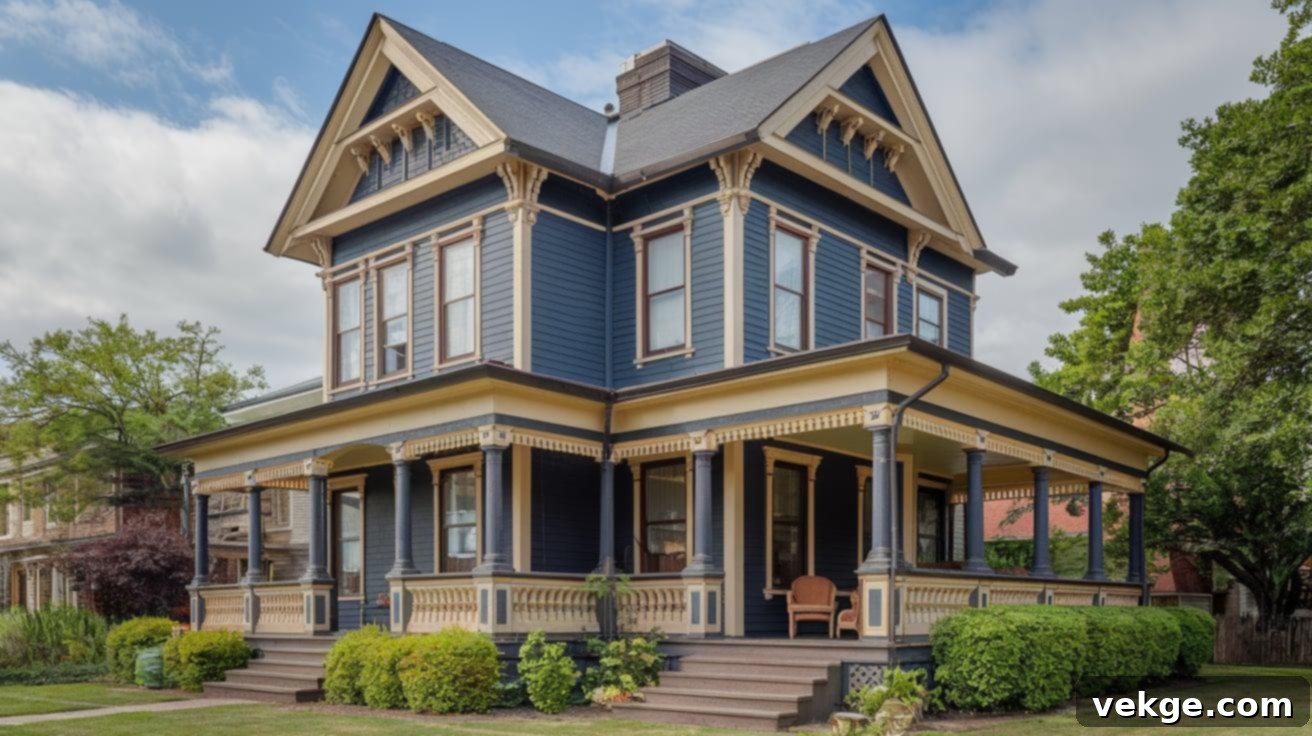
A sophisticated and stately combination that offers a timeless elegance and strong visual appeal, suitable for more formal Victorian styles.
- Main Color: Navy Blue – Sherwin-Williams, “Naval” (SW 6244) – A classic, deep blue that provides a strong, sophisticated base.
- Trim: Cream – Behr, “Creamy Mushroom” (PPU5-13) – A soft, inviting cream for contrasting trim and porch elements.
- Accents: Warm Taupe – Benjamin Moore, “Taos Taupe” (2111-40) – Used for secondary architectural features or as a complementary accent color to add depth.
5. Hunter Green, Soft Gold, and Antique White
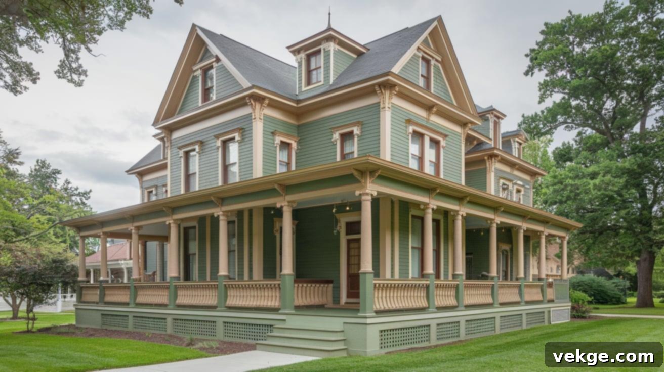
This regal and luxurious scheme evokes the grandeur of a country estate, offering a rich and inviting exterior.
- Main Color: Hunter Green – Benjamin Moore, “Hunter Green” (2041-10) – A rich, deep green that feels both traditional and commanding.
- Trim: Soft Gold – Sherwin-Williams, “Humble Gold” (SW 6380) – A muted, elegant gold for trim work, adding a touch of understated luxury without being overtly flashy.
- Accents: Antique White – Behr, “Cottage White” (13A) – Used for subtle contrast on window sashes, decorative elements, or porch ceilings to brighten the overall look.
Conclusion: Embracing the Enduring Charm of Victorian Colors
As we conclude our journey through the opulent and historically rich world of Victorian color schemes, it becomes abundantly clear that these palettes offer far more than just a nostalgic glimpse into the past. They represent a vibrant, enduring source of inspiration for modern homes, providing an unparalleled opportunity to blend historical charm with contemporary style, creating spaces that are both unique and deeply personal.
Remember, the goal of incorporating Victorian colors isn’t about meticulously recreating a museum piece. Instead, it’s about finding that exquisite balance – leveraging deep, rich hues to create warmth and drama, while simultaneously employing lighter tones and neutral backdrops to maintain an airy, welcoming atmosphere. The Victorian era, with its embrace of both bold statements and subtle elegance, offers a versatile framework for design.
Whether your ambition is to transform your home’s exterior with a multi-hued historical palette or simply to infuse a living room with a touch of 19th-century elegance, the key lies in making these incredible colors work for you and your lifestyle. This guide has aimed to demystify the process, sparking your creativity and equipping you with the confidence to experiment with these timeless, sophisticated palettes.
Why not embark on your next color adventure today? Start small and observe the transformative power of these historical hues. Perhaps a striking burgundy accent wall, a pair of plush olive green throw pillows, or a rich sapphire blue rug could be the perfect starting point to introduce enduring elegance into your home. Your home’s next chapter in color awaits!
Frequently Asked Questions About Victorian Color Schemes
What Were Popular Victorian Color Schemes?
Popular Victorian color schemes were predominantly characterized by deep, rich, and saturated hues. Common choices included opulent reds (like burgundy, crimson, and oxblood), profound greens (such as forest, emerald, and olive), and stately blues (including navy and sapphire). These primary colors were frequently accented with shimmering golds, luxurious purples, and grounding earth tones like terracotta and various browns. This preference for depth reflected the era’s appreciation for wealth, opulence, and ornate decor, creating interiors that felt warm, intimate, and often quite grand.
How Can I Incorporate Victorian Colors Into My Modern Home?
Incorporating Victorian colors into a modern home involves a balanced approach. Start by introducing them in smaller accent pieces such as throw pillows, rugs, drapes, or artwork to test the aesthetic. Consider painting a single accent wall in a bold Victorian shade like deep teal or plum. Pair these rich hues with contemporary neutrals like light grays, crisp whites, or warm beiges to prevent the space from feeling too heavy. Embrace modern patterns, optimize natural lighting, and maintain an overall uncluttered look to blend the historical charm with current design sensibilities seamlessly.
Are There Specific Paint Brands that Offer Victorian Colors?
Yes, several reputable paint brands offer collections or specific shades that are deeply inspired by or directly replicate Victorian-era colors. Some popular options include:
- Sherwin-Williams: Their “Historical Collection” or specific heritage-inspired colors often feature rich, muted tones reminiscent of the Victorian era.
- Benjamin Moore: Their extensive “Historical Color Collection” is a fantastic resource, featuring a wide array of colors that capture the essence of various historical periods, including Victorian.
- Farrow & Ball: Known for their deeply pigmented and traditional shades, Farrow & Ball offers many colors that align perfectly with Victorian aesthetics, often with evocative names.
- Valspar: Their “National Trust” range, inspired by historical properties, also provides excellent options for authentic Victorian palettes.
- Behr: Offers a wide spectrum of colors, and with careful selection, many of their deeper, more saturated tones can fit a Victorian scheme.
When selecting, look for colors described as “historic,” “heritage,” “traditional,” or “deeply saturated” to find the most authentic Victorian-inspired shades.
What Kind of Lighting Works Best with Victorian Colors?
Victorian colors, especially the deeper hues, truly come alive with thoughtful lighting. In modern homes, a combination of natural and artificial light works best. Maximize natural light with sheer window treatments or by keeping windows unobstructed during the day. For artificial lighting, layer different sources: ambient (e.g., chandeliers, flush mounts), task (e.g., reading lamps), and accent (e.g., picture lights, sconces). Use warm-toned bulbs (around 2700K-3000K) to enhance the richness of the colors and create a cozy, inviting atmosphere, mirroring the soft glow of gaslight from the era.
Are There Specific Patterns Associated with Victorian Color Schemes?
Absolutely! Victorian design was synonymous with intricate and abundant patterns. When incorporating Victorian colors, consider adding patterns like:
- Damask: Elaborate, reversible patterns often seen on wallpaper and upholstery.
- Floral: Rich, detailed botanical motifs, from sprawling roses to delicate wildflowers.
- Paisley: Intricate, curved teardrop patterns with Persian origins, popularized during the era.
- Toile de Jouy: Pastoral scenes typically in a single color on a white or cream background, offering a romantic touch.
- Stripe and Plaid: Both formal and informal stripes, as well as complex plaids, were common for fabrics and wallpapers.
- Gothic Revival: Patterns inspired by medieval architecture, featuring pointed arches and trefoils.
These patterns, combined with the rich color palettes, created the layered and luxurious aesthetic so characteristic of Victorian interiors.
