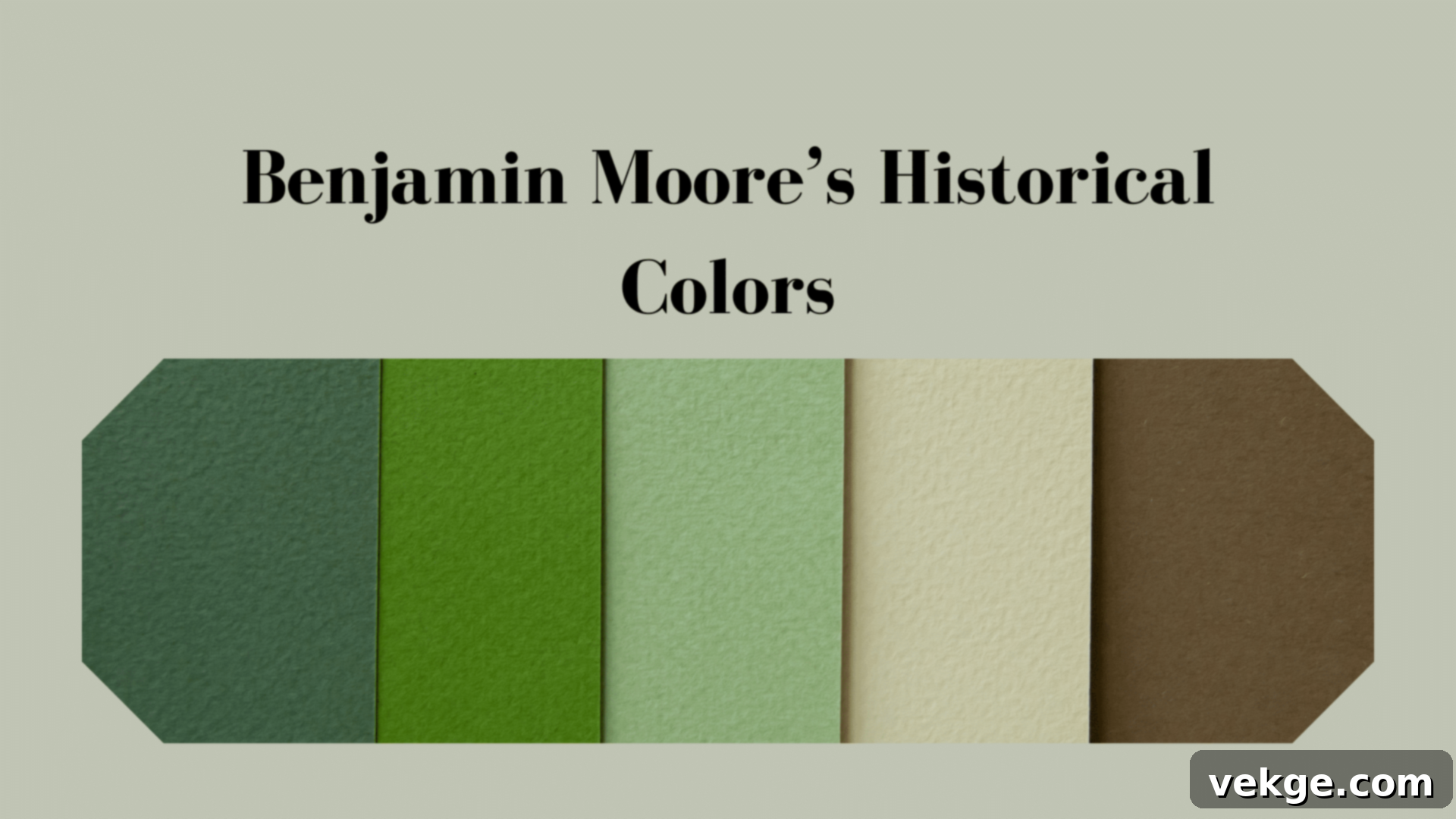
The Ultimate Guide to Benjamin Moore’s Historical Colors: Timeless Paint for Modern Homes
Are you searching for paint colors that offer more than just a momentary trend? Do you desire shades that exude character, tell a story, and stand the test of time? Look no further than Benjamin Moore’s Historical Colors collection – a carefully curated palette designed to bring enduring elegance and warmth to any space.
Many homeowners often feel overwhelmed when faced with countless paint swatches, struggling to choose colors that are both classic and fresh, yet deeply personal. The good news is, Benjamin Moore has meticulously selected these historical shades, drawing inspiration from early American homes and buildings, ensuring they work beautifully in today’s contemporary living environments.
These colors are not just paints; they are narratives woven into the fabric of American design, offering a unique blend of heritage and modern appeal. They provide a stable, comforting backdrop that adapts to various decorating styles, making them a wise and beautiful choice for any home transformation.
In this comprehensive guide, crafted by a paint specialist with 15 years of experience, you will discover:
- Expert advice on how to select the perfect Benjamin Moore historical color for your unique space.
- In-depth insights into the stories and characteristics behind 25 of these time-tested shades.
- Practical tips and innovative ideas for seamlessly integrating these classic colors into modern interiors and preserving their charm in older homes.
I’ve had the privilege of helping countless homeowners navigate the world of color, finding their ideal historical match. Let me show you how to harness the power of these enduring shades to create a home that feels both timeless and uniquely yours.
Top Classic Neutrals from Benjamin Moore
Neutrals form the backbone of any timeless design, providing a versatile canvas that complements a wide array of furnishings and decor. Benjamin Moore’s Historical Collection offers a range of sophisticated neutrals that are anything but boring.
1. Revere Pewter HC-172
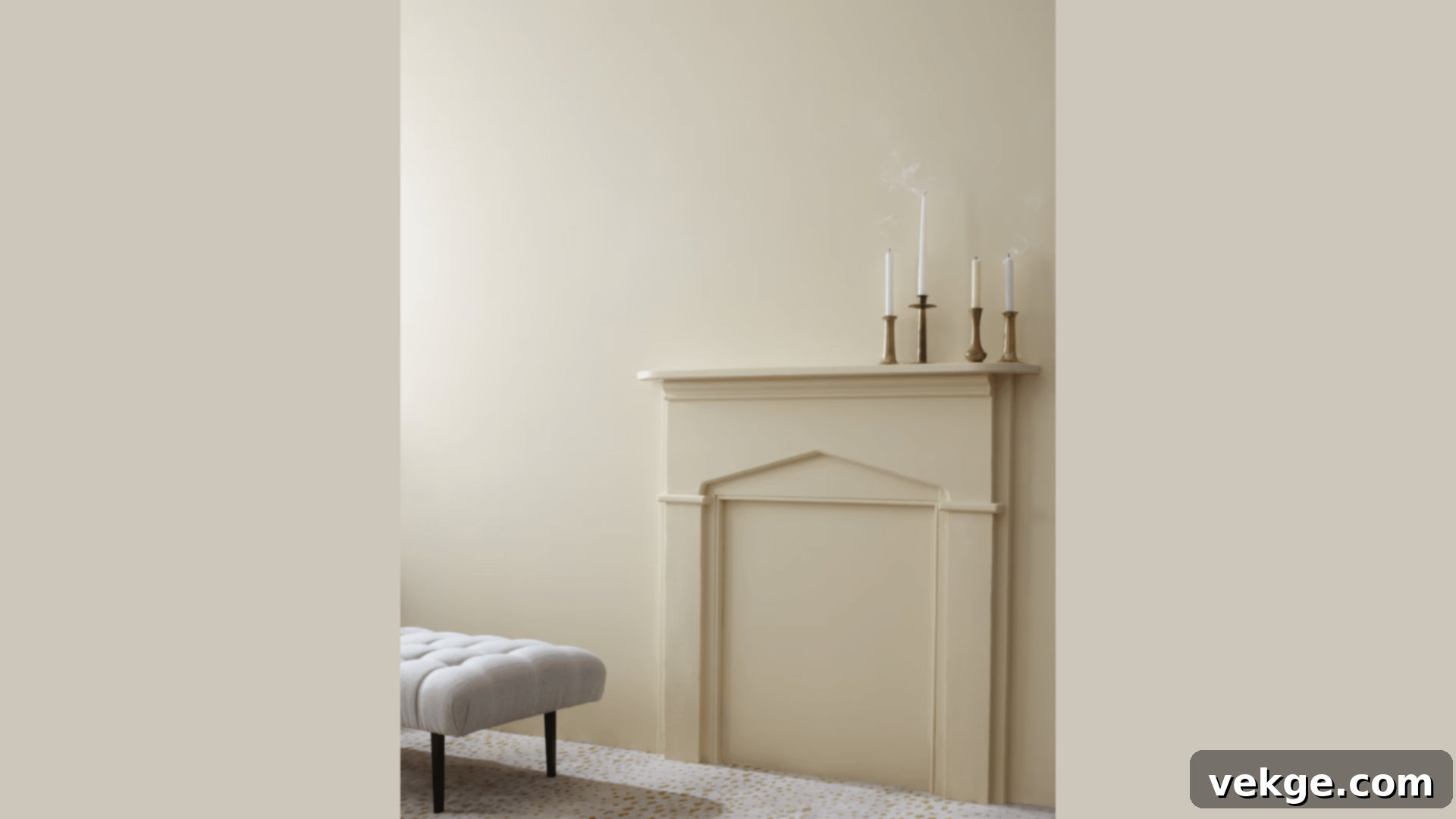
Revere Pewter stands as one of Benjamin Moore’s most beloved and versatile greige colors. This warm gray paint masterfully balances beige and gray tones, creating a sophisticated hue that brightens any space without feeling stark. Its chameleon-like quality allows it to adapt beautifully to changing light conditions, appearing warmer and more beige in natural sunlight, and cooler or grayer under artificial lighting. From my experience, Revere Pewter has the remarkable ability to make smaller rooms feel more expansive and open, while simultaneously adding a cozy, inviting depth to larger areas. It’s a true go-to for designers and homeowners alike.
- Achieves a perfect balance of warm and cool undertones, making it incredibly adaptable.
- Maintains an ideal lightness – never too dark to weigh down a room, nor too light to wash out.
- Pairs exquisitely with crisp white trim, creating a clean, defined look.
- Offers excellent coverage, often achieving full opacity and richness in just two coats.
Perfect for:
- Living rooms: Creates a welcoming and flexible backdrop for various decor styles.
- Home offices: Promotes a calm yet productive atmosphere.
- Hallways: Brightens transitional spaces and connects different rooms seamlessly.
- Open floor plans: Provides a cohesive neutral foundation that flows beautifully throughout connected areas.
2. Chantilly Lace OC-65
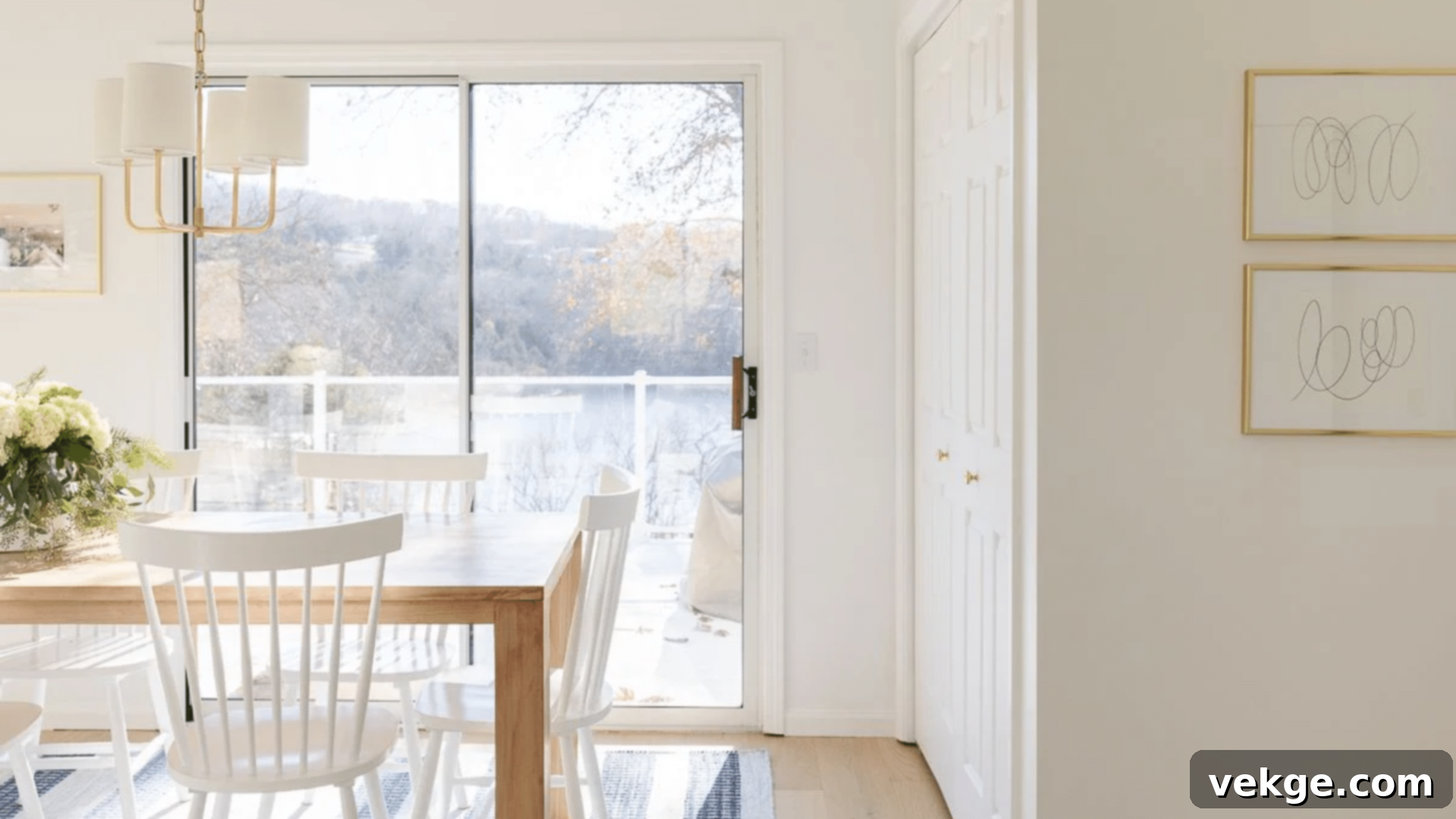
For those seeking the purest expression of white, Chantilly Lace is an unparalleled choice. This crisp, pristine white is renowned for its absolute lack of discernible yellow or blue undertones, making it a truly clean and unadulterated shade. When applied, walls bathed in Chantilly Lace appear immaculately clean and fresh, yet remarkably, it never feels cold or overly stark. This pure white acts as a brilliant canvas, allowing artwork, colorful textiles, and furniture to truly pop and shine against its luminous backdrop. It reflects light beautifully, enhancing the sense of space and airiness in any room.
- Possesses truly neutral undertones, ensuring a clean and consistent white.
- Boasts a high light reflectance value (LRV), maximizing natural light and brightening spaces.
- Highlights the authentic colors and textures of artwork and furnishings placed against it.
- Effectively makes rooms feel significantly larger and more open.
Perfect for:
- Kitchens: Creates a bright, hygienic, and modern feel.
- Bathrooms: Enhances cleanliness and spa-like tranquility.
- Art studios: Provides an ideal, unbiased backdrop for creative work.
- Modern bedrooms: Contributes to a minimalist, serene, and spacious aesthetic.
3. Manchester Tan HC-81
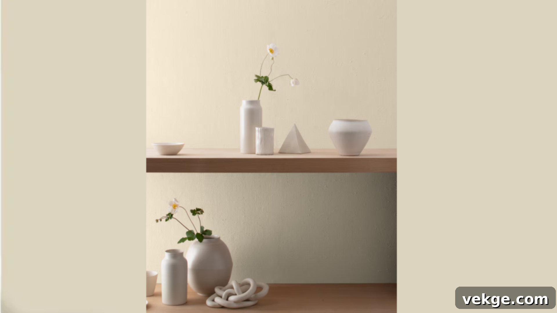
Don’t let the “tan” in its name fool you; Manchester Tan is a sophisticated light beige with subtle gray nuances that prevent it from leaning too yellow. It creates an atmosphere of serene calm, much like the gentle hues of morning mist filtering through a window. This paint offers a unique depth, with slight, often elusive, green-gray undertones that may emerge in specific lighting conditions, yet it consistently maintains its warm, balanced beige foundation throughout the day. It’s an incredibly versatile color that provides a comforting envelope for any room without ever feeling dated.
- Features subtle green-gray notes that add complexity and prevent it from being a flat beige.
- Performs exceptionally well in varying light, from sun-drenched rooms to shaded nooks.
- Harmonizes beautifully with a wide spectrum of wood tones, from light oak to rich mahogany.
- Known for its lasting finish and ability to anchor a room with understated elegance.
Perfect for:
- Dining rooms: Fosters an inviting and elegant setting for gatherings.
- Master bedrooms: Cultivates a peaceful and sophisticated retreat.
- Reading nooks: Encourages relaxation and quiet contemplation.
- Home libraries: Provides a classic, scholarly backdrop.
4. Edgecomb Gray HC-173
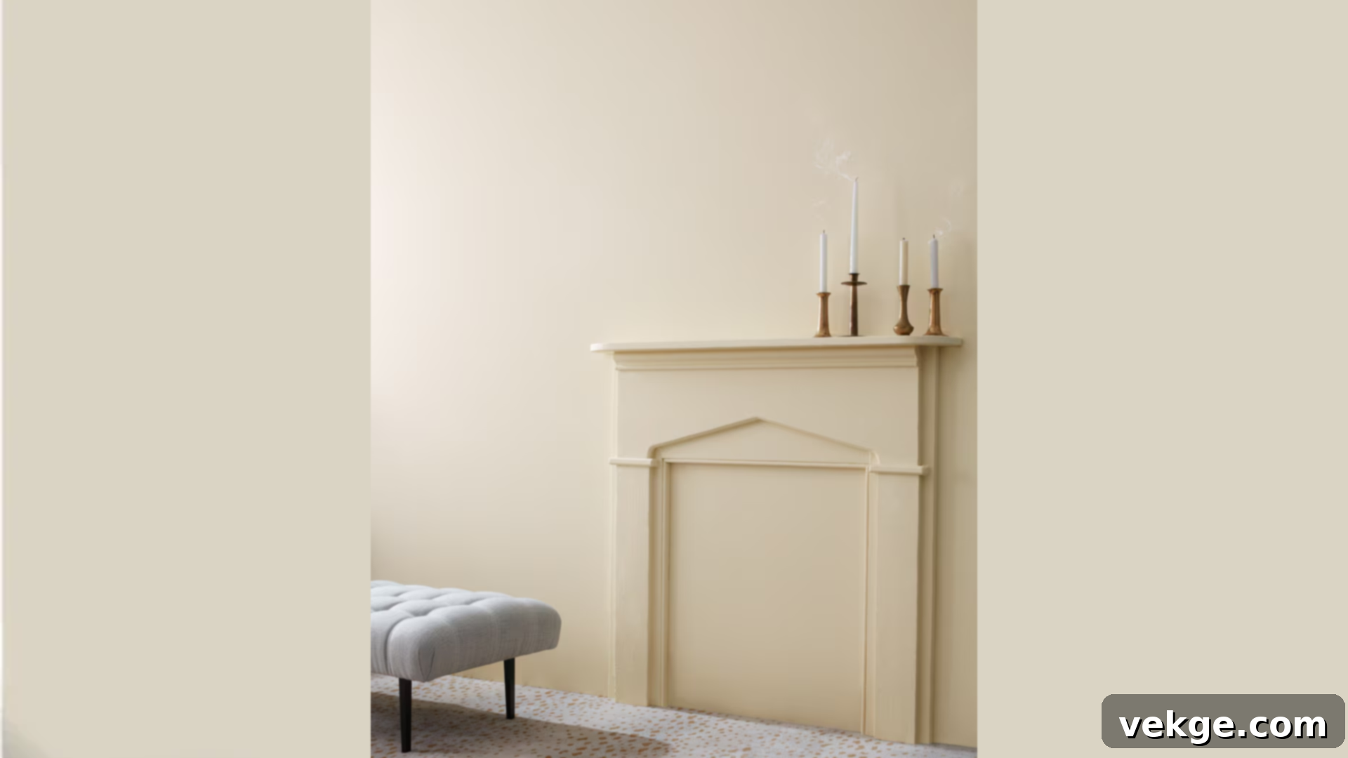
Edgecomb Gray is the quintessential greige, perfectly poised between the warmth of beige and the coolness of gray. This balanced blend ensures it works harmoniously in virtually any setting or with any existing decor. I consistently recommend Edgecomb Gray for its ability to create a wonderfully welcoming and inviting atmosphere while maintaining a sense of modern freshness. It’s a color that never feels too warm or too cool, providing a comfortable neutrality that is both sophisticated and approachable. It’s often praised for its ability to complement various wood finishes and accent colors without competing for attention.
- Achieves the ideal “greige” balance, making it incredibly versatile.
- Excellent at camouflaging minor wall imperfections, providing a smooth finish.
- Highly durable and easy to clean, ideal for high-traffic areas.
- Looks consistently beautiful and balanced in all types of lighting conditions.
Perfect for:
- Family rooms: Creates a relaxed, comfortable, and durable family hub.
- Entryways: Offers a warm and gracious welcome to guests.
- Guest bedrooms: Provides a serene and universally appealing space.
- Home offices: Fosters a calm and focused environment without feeling sterile.
Benjamin Moore’s Most Popular Soft Blues and Greens
Introducing tranquility and nature-inspired serenity, these soft blues and greens from Benjamin Moore’s Historical Collection evoke a sense of calm and freshness, perfect for creating restful sanctuaries within your home.
5. Van Courtlandt Blue HC-144
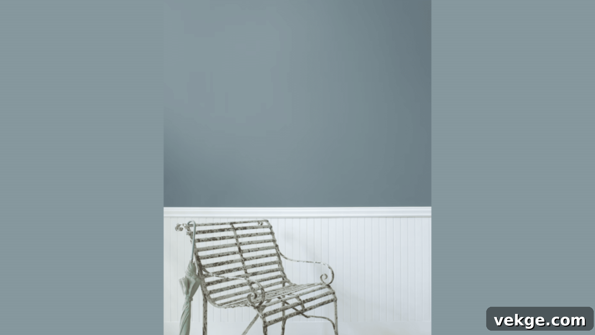
Van Courtlandt Blue is a gentle, sophisticated blue paint infused with subtle green notes that gracefully shift throughout the day, creating a profound sense of peace in any room. When I work with this color, it evokes the soft, tranquil quality of a morning sky, yet it retains a steady and true presence as daylight evolves. This exquisite blend of blue and green pigments effectively bridges the gap between indoor spaces and the natural world outside, offering a calming retreat. It’s a historical color that feels both deeply rooted and refreshingly current.
- Displays subtle shifts and nuances in color depending on the light source and time of day.
- Instills a profound sense of calm and serenity in any living space.
- Complements various wood tones beautifully, enhancing their natural warmth.
- Effectively conceals minor wall flaws, providing an even and refined finish.
Perfect for:
- Bedrooms: Creates a peaceful, dream-like atmosphere conducive to rest.
- Sunrooms: Enhances the connection to the outdoors with its nature-inspired hues.
- Study areas: Fosters concentration and a serene mental space.
- Meditation spaces: Supports tranquility and mindfulness.
6. Palladian Blue HC-144
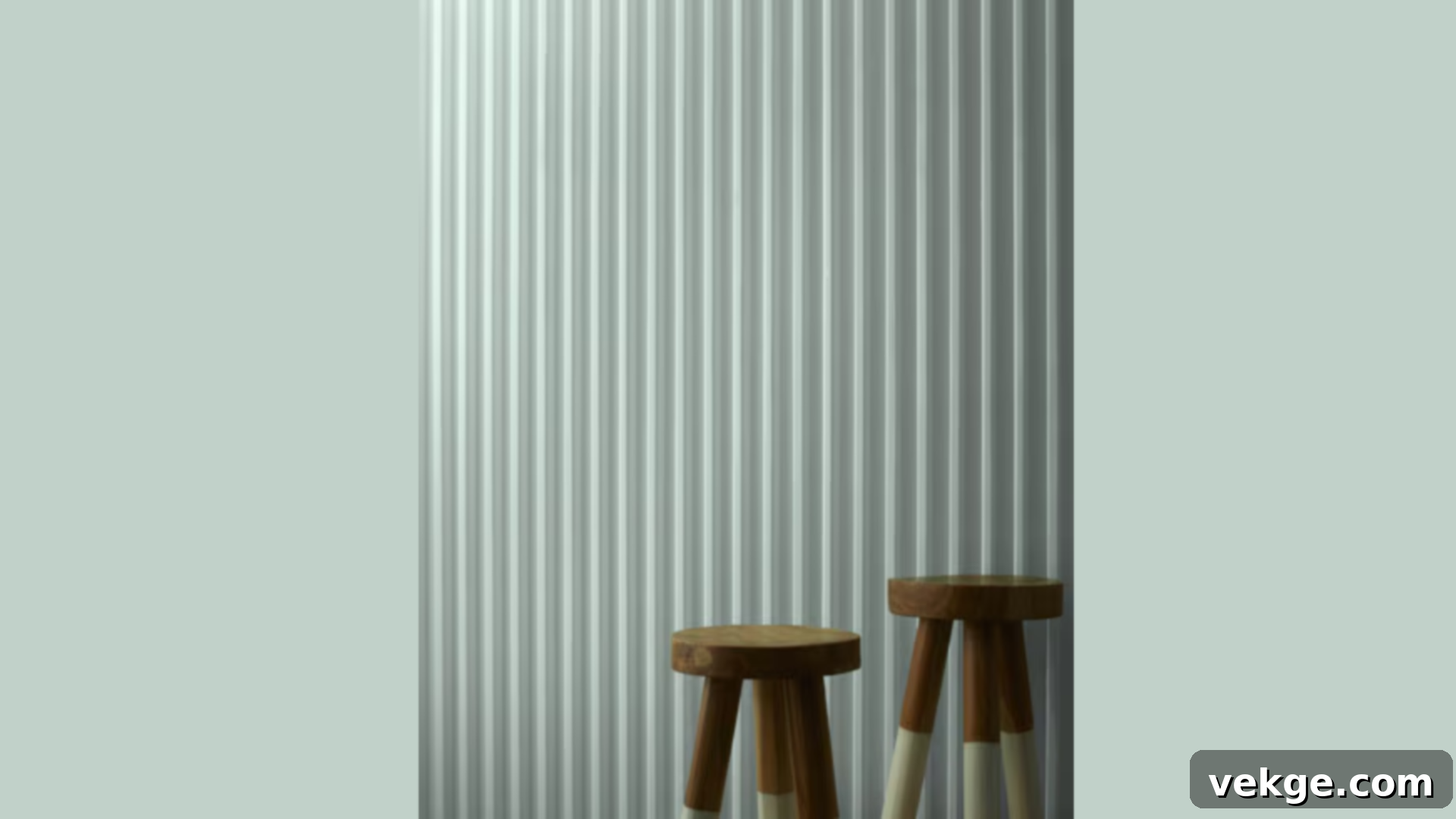
Palladian Blue is a breath of fresh air, a light and ethereal color that instantly infuses a room with an expansive, bright, and invigorating feel. Every time I apply this paint, the space transforms, appearing more open and illuminated. It possesses just the right amount of color to make a distinct yet soft statement, allowing it to serve as a perfect backdrop for a diverse range of art and furniture. Its slight green undertone keeps it from feeling cold, offering a soothing balance that is both elegant and inviting. This color is frequently chosen for its ability to lighten and uplift a room without being overpowering.
- Significantly contributes to making rooms feel larger, brighter, and more airy.
- Exhibits delightful variations and depth as it interacts with natural light throughout the day.
- Adapts seamlessly to complement most decor styles, from coastal to traditional.
- Provides a durable and long-lasting finish that retains its beauty over time.
Perfect for:
- Master bathrooms: Creates a serene, spa-like sanctuary.
- Home offices: Fosters a clear-headed, calm, and productive environment.
- Breakfast nooks: Brightens morning routines with a cheerful and fresh feel.
- Guest rooms: Offers a welcoming and tranquil space for visitors.
7. Woodlawn Blue HC-147
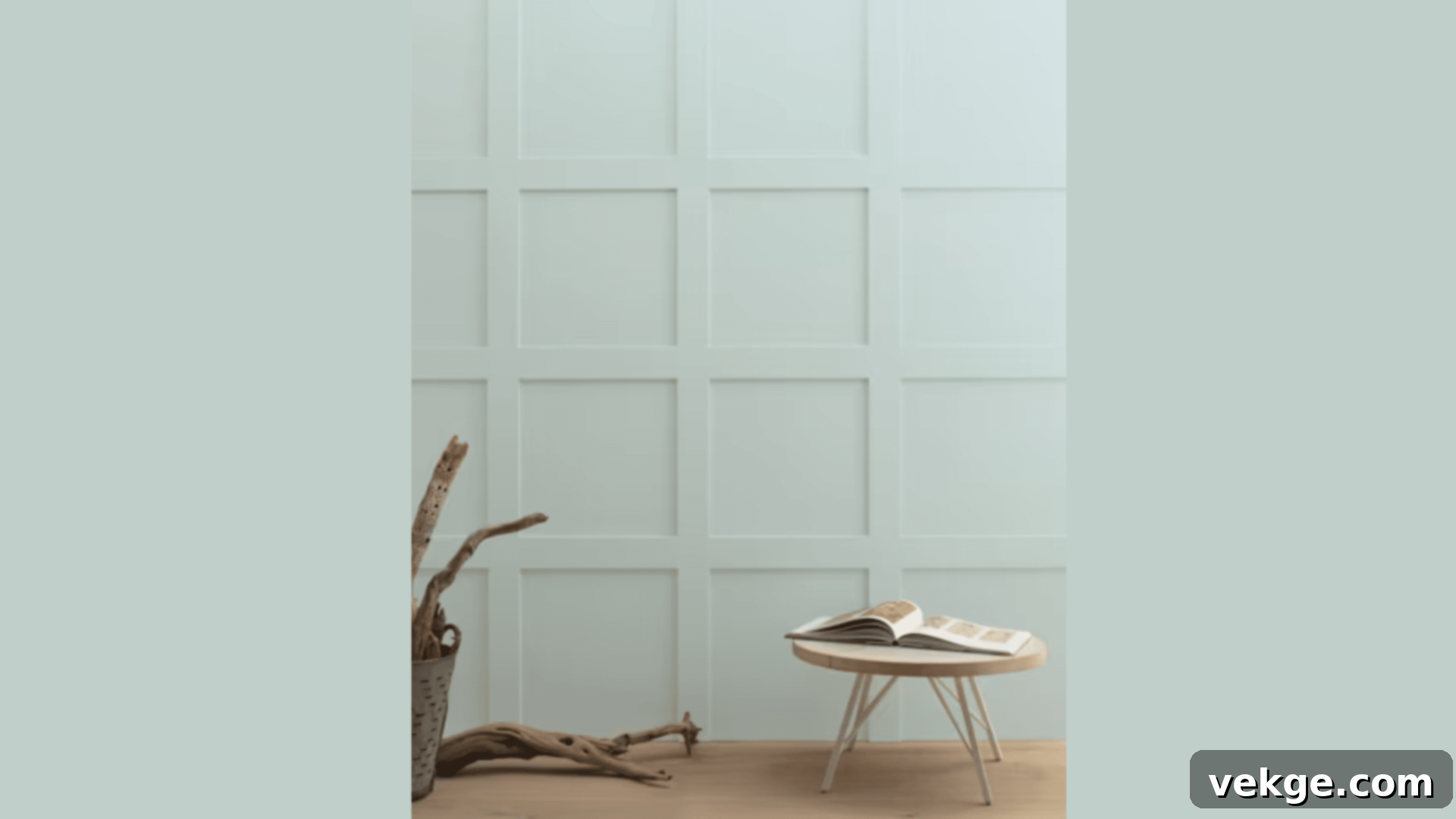
Woodlawn Blue is a captivating mid-tone blue that evokes the tranquil essence of a cloudy sky – steady, grounding, and endlessly intriguing. This paint color brings a reassuring and stable presence to any room, offering a backdrop that is both subtly complex and profoundly calm. Its underlying gray notes are key to its balance, ensuring it holds its composure beautifully under various lighting conditions, from bright daylight to soft artificial illumination. It’s a sophisticated choice that adds depth without overwhelming the space, making it a favorite for creating focal points or entire room envelopes.
- Offers a rich depth of color that is substantial but never feels excessively dark or heavy.
- Maintains its true character consistently, even when viewed under artificial light.
- Integrates gracefully with a wide array of color schemes and design aesthetics.
- Boasts good resistance to dirt and marks, making it practical for active households.
Perfect for:
- Dining rooms: Creates an elegant and inviting atmosphere for entertaining.
- Studies: Promotes focus and a sense of quiet sophistication.
- Powder rooms: Adds a touch of unexpected charm and depth to small spaces.
- Bedrooms: Cultivates a serene and refined personal sanctuary.
8. Whitestone 2134-60
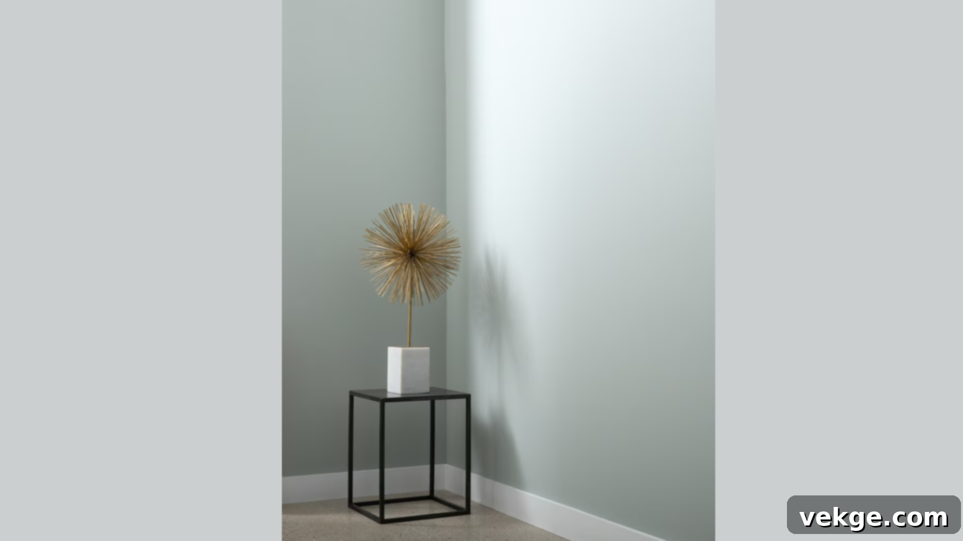
Whitestone is a truly uplifting light blue paint that has the magical ability to make spaces feel like a deep, cleansing breath. When I paint with it, rooms seem to visibly expand, feeling more open, airy, and profoundly peaceful. It strikes a perfect balance: light enough to undeniably brighten any area, yet possessing just enough color to make a gentle, yet impactful, statement. Whitestone avoids the pitfalls of being too cold or too vibrant, settling into a comfortable, serene lightness that is both refreshing and comforting. It’s an ideal choice for creating an atmosphere of calm and clarity.
- Effectively brightens and invigorates even the darkest corners or spaces.
- Maintains a gentle warmth, ensuring it never feels excessively cold or sterile.
- Blends beautifully and effortlessly with standard white trim for a polished look.
- Known for its exceptionally smooth application, resulting in a flawless finish.
Perfect for:
- Nurseries: Creates a soft, tranquil, and nurturing environment for infants.
- Reading corners: Fosters a peaceful and inviting spot for quiet contemplation.
- Bathrooms: Enhances the feeling of cleanliness and a refreshing escape.
- Home yoga spaces: Supports a calm, centered atmosphere for wellness activities.
Benjamin Moore’s Most Popular Warm Earth Tones
Embrace the comforting embrace of nature with Benjamin Moore’s selection of warm earth tones. These historical colors bring a grounded, inviting richness to interiors, evoking a sense of enduring charm and coziness.
9. Shaker Beige HC-45
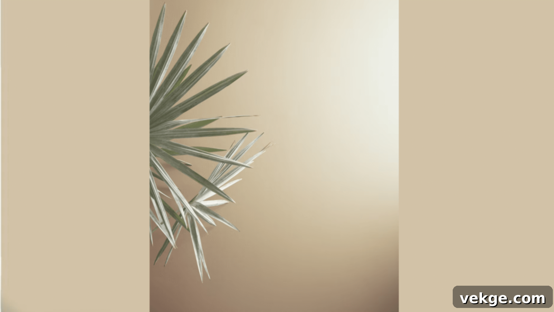
Shaker Beige is a masterful paint color that brings substantial warmth to any room without ever feeling oppressive or heavy. When I use it, spaces immediately feel more welcoming, relaxed, and utterly comfortable. The subtle touch of gray in its undertone is what keeps this classic beige feeling relevant and current, preventing it from leaning too yellow or gold, while its core beige base provides a deep sense of comfort and tradition. It’s one of those exceptional colors that allows your furniture and artwork to truly shine and take center stage, all while providing a pleasingly sophisticated and unobtrusive background.
- Achieves a harmonious balance between warm beige and delicate gray tones.
- Performs exceptionally well in a full spectrum of lighting conditions, adapting beautifully.
- Remarkably effective at concealing everyday wall marks and minor imperfections.
- Offers easy touch-up capabilities, making maintenance simple and straightforward.
Perfect for:
- Living rooms: Creates an inviting, comfortable, and highly adaptable social space.
- Family rooms: Provides a durable and welcoming foundation for daily life.
- Foyers: Extends a warm and gracious welcome into the home.
- Dining spaces: Fosters an atmosphere of relaxed elegance for meals.
10. Georgian Green HC-115
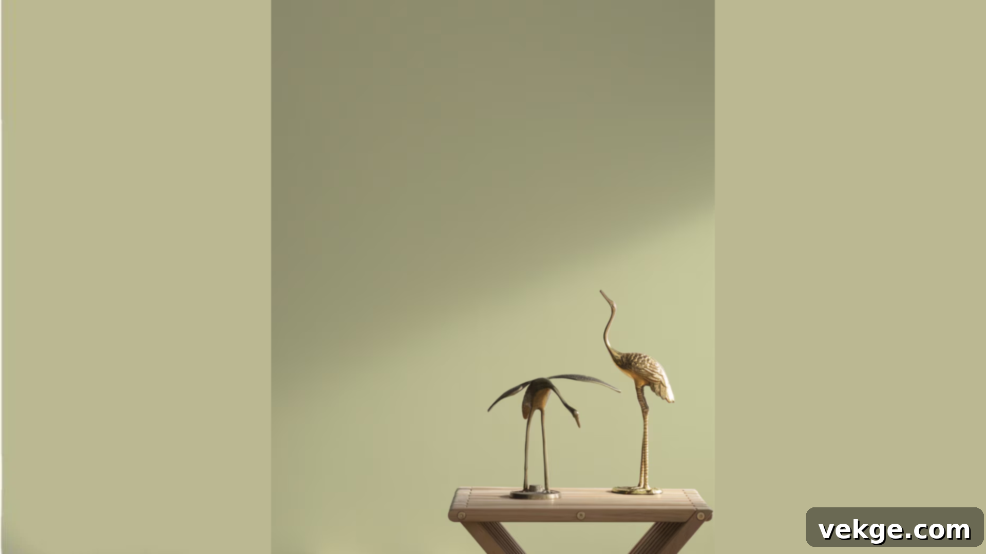
Georgian Green is a deep, rich, and wonderfully evocative green paint that transforms rooms into spaces reminiscent of old-world libraries or luxuriously cozy studies. I’ve witnessed this color elevate plain walls into stunning statement pieces, imbued with history and sophistication. It strikes an exquisite balance, offering significant depth without ever appearing overly dark, and possessing a captivating richness without being loud or ostentatious. This color is perfect for creating an enveloping, intimate atmosphere, especially when paired with natural wood tones and classic furnishings. It’s a nod to historical elegance that feels incredibly luxurious today.
- Boasts exceptional rich color depth, creating a sophisticated and enveloping effect.
- Demonstrates good light absorption, contributing to a cozy and intimate ambiance.
- Pairs magnificently with both light and dark wood finishes, enhancing their natural beauty.
- Offers strong, consistent coverage, achieving a profound color in fewer coats.
Perfect for:
- Studies: Cultivates a distinguished and contemplative environment.
- Dining rooms: Sets an opulent and memorable stage for entertaining.
- Reading nooks: Creates a deep, comfortable haven for literary escapes.
- Powder rooms: Adds a dramatic, jewel-box effect to small spaces.
11. Roxbury Caramel HC-42
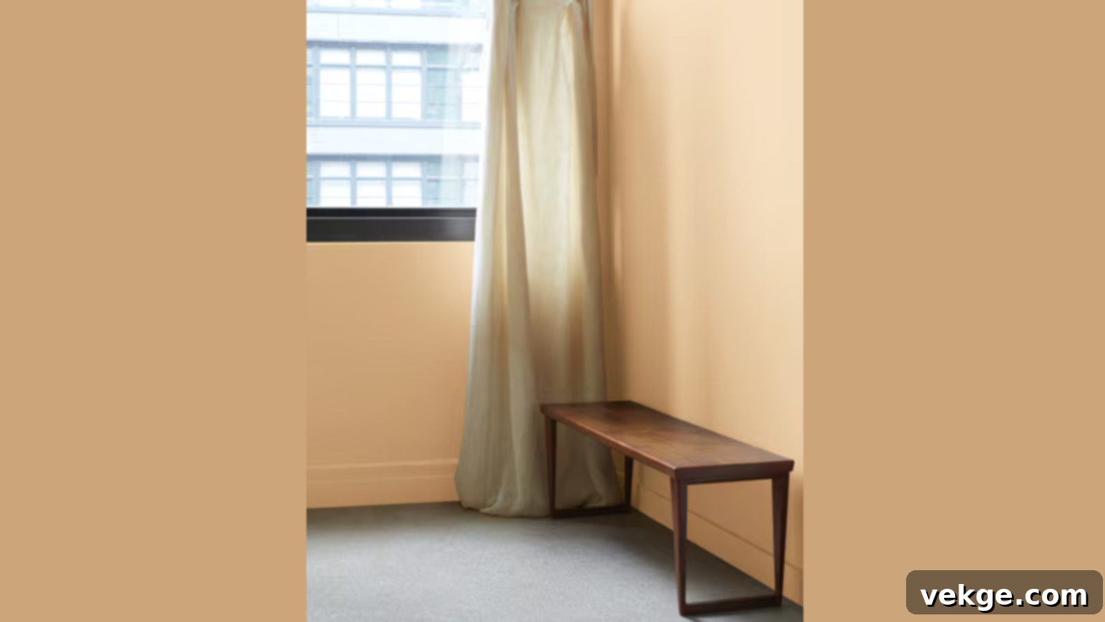
Despite its name, Roxbury Caramel is a wonderfully subtle and light hue, reminiscent of morning fog kissed by the first hint of sun. This paint brings a gentle, understated warmth and presence to any space. When I paint with it, rooms immediately feel larger and notably brighter, yet they retain a comforting, inviting warmth. The nuanced green hint within its composition adds a touch of organic life without ever being overtly green, making it a unique and adaptable neutral. It’s a sophisticated choice for those who desire a light, warm, and inviting atmosphere with an intriguing depth.
- Displays captivating shifts and nuances as it interacts with natural light throughout the day.
- Consistently contributes to making spaces feel more expansive and open.
- Harmonizes gracefully with a vast spectrum of other colors, making it highly versatile.
- Ensures a beautifully smooth and even finish upon application.
Perfect for:
- Bedrooms: Cultivates a soothing, warm, and restful personal retreat.
- Living areas: Creates an inviting and flexible backdrop for social gatherings.
- Home offices: Fosters a calm and focused yet comfortable workspace.
- Hallways: Brightens and extends transitional areas with a gentle warmth.
12. Chestertown Buff HC-9
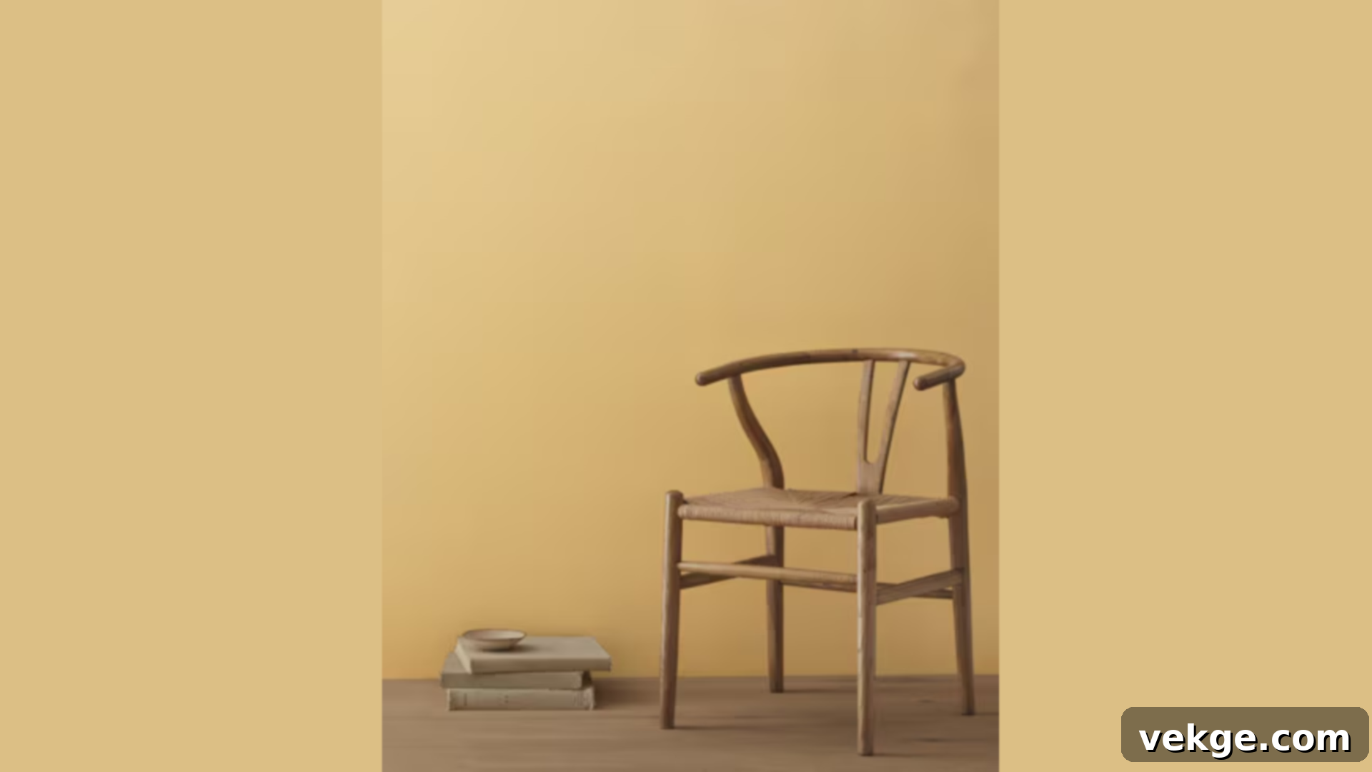
Chestertown Buff is a delightful golden beige paint that envelops rooms in a gentle warmth, much like the soft glow of late afternoon sunlight. This inviting hue creates spaces that feel welcoming and cheerful at any time of day, instantly lifting the mood. It possesses enough depth of color to be genuinely interesting and characterful, yet it remains subtle enough to serve as a versatile foundation that effortlessly complements any decorating style, from traditional to eclectic. It’s a fantastic choice for those looking to infuse their home with a touch of sunny optimism and historical charm.
- Imparts a distinctively sunny, cheerful, and inviting feel to any room.
- Works harmoniously with all wood tones, enhancing their natural beauty and warmth.
- Performs exceptionally well in rooms with lower light levels, adding brightness.
- Known for its lasting durability, ensuring a beautiful finish for years to come.
Perfect for:
- Kitchens: Brightens and energizes the heart of the home.
- Entryways: Provides a warm and cheerful greeting upon entering.
- Living rooms: Creates a bright, welcoming, and comfortable social space.
- Dining areas: Fosters an uplifting and convivial atmosphere for meals.
13. Hampshire Gray HC-101
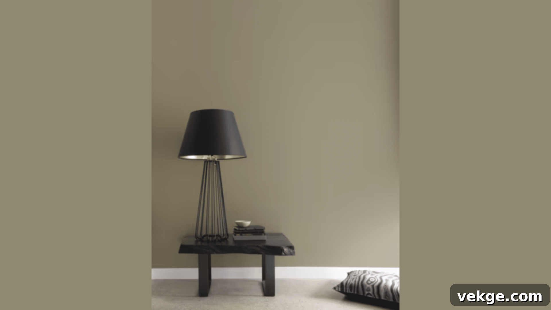
Hampshire Gray is a sophisticated paint that beautifully blends subtle blue and green notes within a soft gray base, creating spaces that feel simultaneously fresh and wonderfully settled. I’ve consistently observed its ability to infuse a profound sense of calm into a room, while the gentle color shifts ensure it remains interesting and dynamic. It moves gracefully with changing light, revealing different facets of its character, yet always staying true to its soft, earthy nature. This is an excellent choice for creating a refined, tranquil, and slightly understated backdrop that supports a wide range of interior aesthetics.
- Exhibits gentle color shifts, adding depth and intrigue as light changes.
- Pairs harmoniously with a diverse palette of accent colors and textures.
- Ensures even, consistent coverage, resulting in a flawless and professional finish.
- Offers ease of cleaning, making it a practical choice for everyday living.
Perfect for:
- Master bedrooms: Creates a serene, spa-like, and refined sanctuary.
- Sitting rooms: Fosters a quiet, comfortable, and elegant space for relaxation.
- Home offices: Promotes a calm, focused, and professional environment.
- Guest rooms: Provides a universally appealing and tranquil retreat for visitors.
Benjamin Moore’s Rich Reds and Browns
For those seeking depth, warmth, and a touch of traditional grandeur, Benjamin Moore’s historical collection of rich reds and browns offers a palette of inviting and sophisticated hues that evoke a sense of heritage and comfort.
14. Concord Ivory HC-26
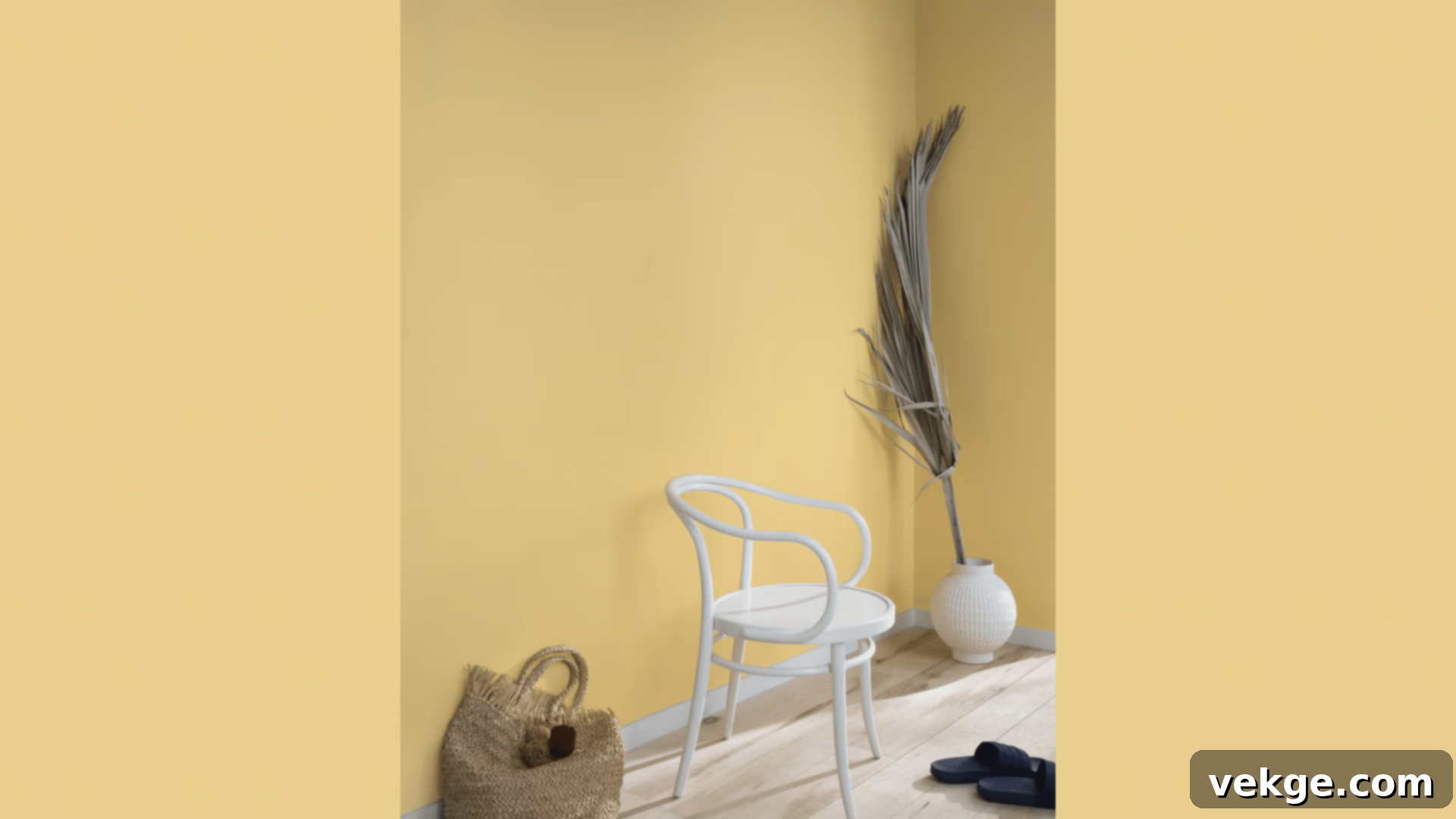
Concord Ivory is a truly radiant paint color that effortlessly fills rooms with a soft, inviting glow, much like the gentle warmth of early morning sunshine. When I apply this shade, spaces immediately feel bright, cheerful, and profoundly welcoming without ever leaning into an overly yellow or garish territory. It masterfully creates a perfect, luminous base that allows both light and dark furniture, as well as various decor elements, to look their absolute best. This historical ivory is not just a background color; it actively enhances the atmosphere of a room, making it feel both classic and comfortably chic.
- Radiates a soft, buttery glow that enhances the warmth and light of a room.
- Performs beautifully in a wide range of lighting, from dimly lit to brightly illuminated spaces.
- Complements all types of wood, from light birch to dark walnut, with grace.
- Provides excellent coverage, typically achieving a rich, opaque finish in just two coats.
Perfect for:
- Living rooms: Creates a bright, convivial, and always welcoming social hub.
- Breakfast nooks: Infuses morning meals with a cheerful, sunny disposition.
- Home libraries: Offers a warm, traditional, and inviting backdrop for books.
- Formal dining rooms: Sets an elegant and warm stage for sophisticated entertaining.
15. Standish White HC-32
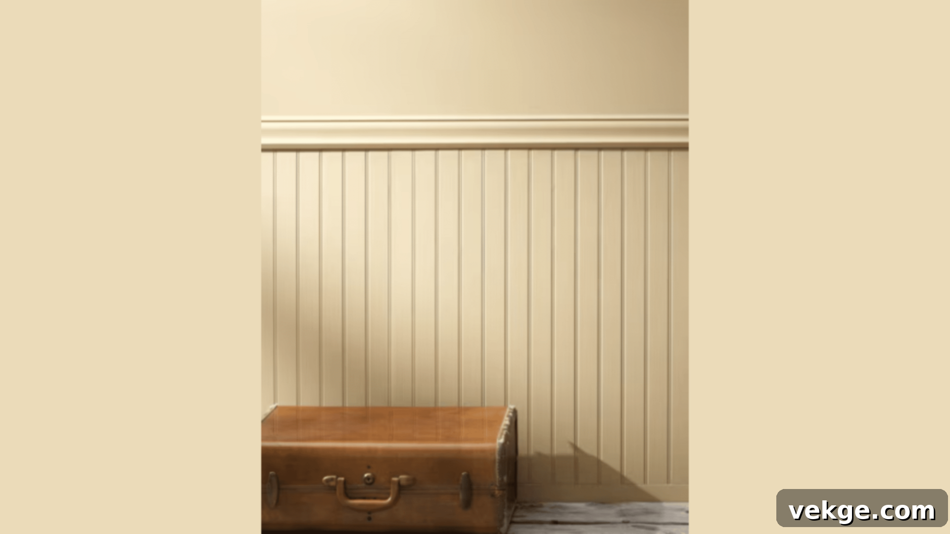
Standish White, despite its name, is a deeply complex and sophisticated paint color, a rich beige with strong, comforting undertones that bring a steady, grounded presence to any room. I’ve often seen this color transform simple spaces into areas of profound maturity and settled elegance. Its remarkable depth, combining the richness of brown with the subtle sophistication of gray, ensures it works equally well in both ultra-modern and classically traditional settings. This is a color that speaks of quiet confidence and understated luxury, perfect for creating an enveloping and contemplative atmosphere.
- Offers rich color depth, creating a profound and enveloping aesthetic.
- Possesses excellent qualities for both absorbing and reflecting light, creating dynamic interplay.
- Effectively conceals various wall flaws, providing a smooth and unblemished surface.
- Known for its easy maintenance, ensuring long-lasting beauty with minimal effort.
Perfect for:
- Home offices: Fosters a serious, focused, and sophisticated workspace.
- Media rooms: Creates a cozy, enveloping atmosphere ideal for movie watching.
- Dens: Provides a warm, intimate, and inviting retreat.
- Master bedrooms: Cultivates a serene, grounded, and luxurious personal sanctuary.
16. Gardenia AF-10
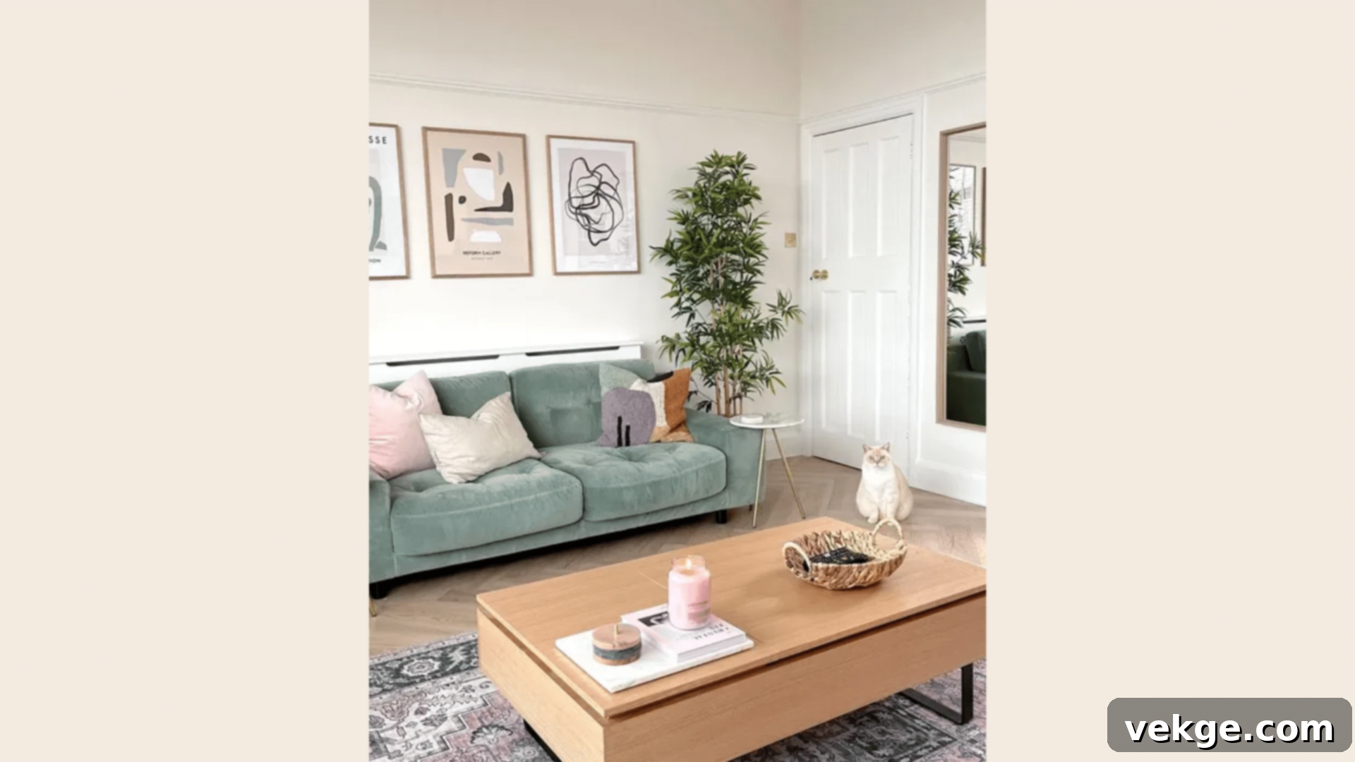
Gardenia is a wonderfully soft and warm paint color, evoking the comforting richness of fresh cream. This delightful hue makes rooms feel instantly cozy, bright, and utterly inviting. When I paint with Gardenia, spaces achieve a beautiful balance, feeling expansive and open yet intimately personal and welcoming. Its subtle golden hints truly blossom in natural light, infusing the room with a gentle radiance, while under artificial lighting, it maintains a consistent, comforting warmth. It’s a versatile, sophisticated off-white that offers more depth and character than a stark white, making it a perfect foundation.
- Expertly brightens even the darkest corners, transforming them into inviting spaces.
- Beautifully showcases the textures of furnishings and architectural details.
- Pairs effortlessly with virtually any accent color or decor style, offering immense flexibility.
- Ensures a smooth, consistent application for a flawless and professional finish.
Perfect for:
- Kitchens: Creates a bright, clean, and warmly inviting culinary space.
- Living areas: Fosters a comfortable, cheerful, and adaptable social hub.
- Bedrooms: Cultivates a soft, serene, and cozy personal retreat.
- Dining spaces: Establishes a pleasant, light-filled, and welcoming atmosphere for meals.
17. Middlebury Brown HC-68
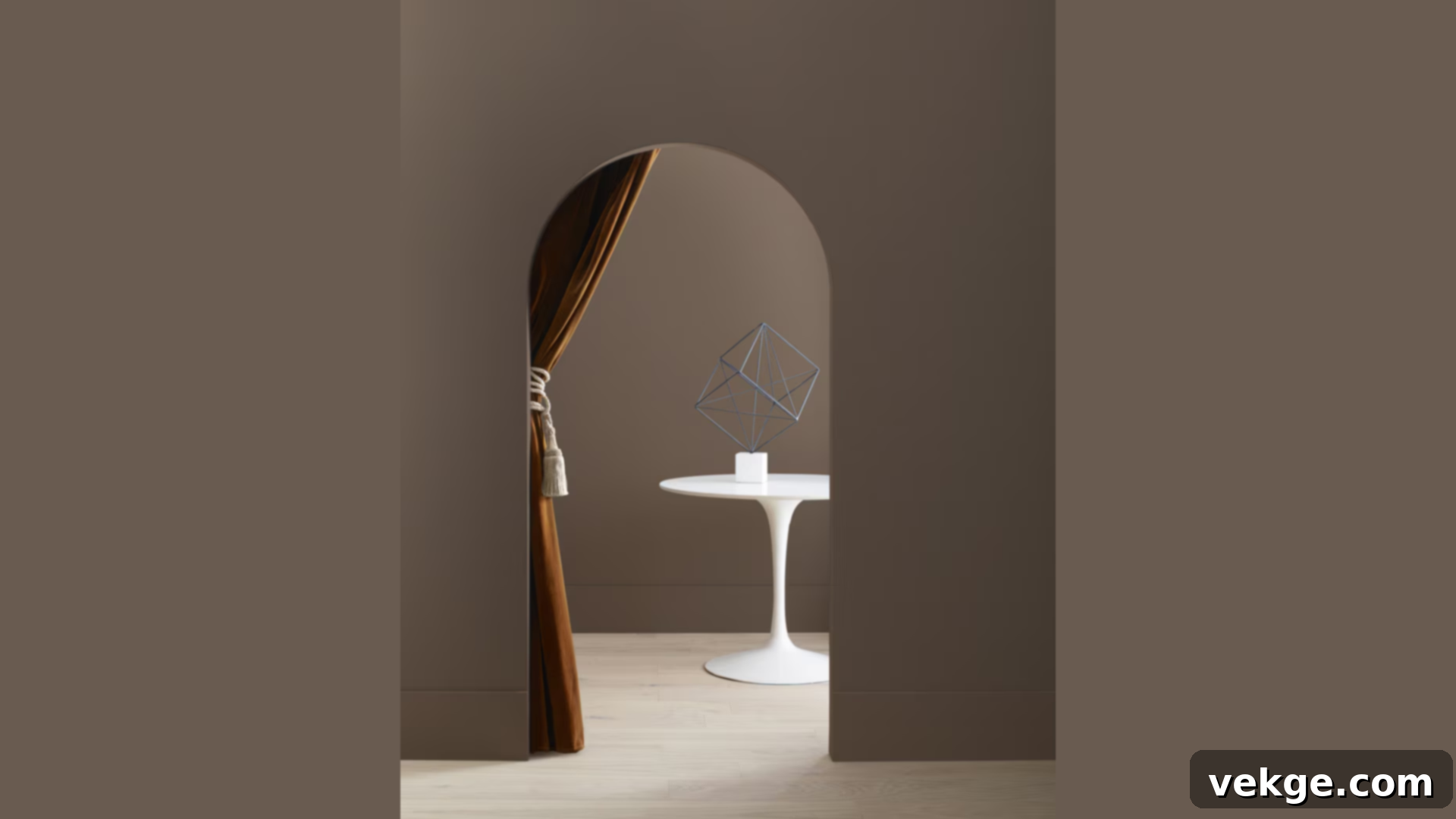
Middlebury Brown is a profoundly deep and rich paint color that brings an undeniable sense of warmth, grounding, and sophistication to any space it inhabits. It creates rooms that feel like a comforting, enveloping hug – secure, inviting, and deeply satisfying. The subtle red hints embedded within its brown base are crucial; they inject a vibrant life and complexity, ensuring the color feels both classically enduring and remarkably current. This is a powerful choice for creating intimate, character-filled spaces that exude a sense of history and luxurious comfort. It’s truly a connoisseur’s brown.
- Boasts deep color saturation, creating a rich, opulent, and enveloping effect.
- Harmonizes beautifully with natural materials such as wood, leather, and stone.
- Offers good stain resistance, making it a practical choice for active areas.
- Provides a long-lasting, durable finish that maintains its depth and beauty.
Perfect for:
- Studies: Cultivates a distinguished, contemplative, and warm intellectual space.
- Game rooms: Creates an exciting, yet grounded, atmosphere for entertainment.
- Accent walls: Adds dramatic depth and a luxurious focal point.
- Cozy corners: Transforms small nooks into intimate, inviting retreats.
18. Norwich Brown HC-19
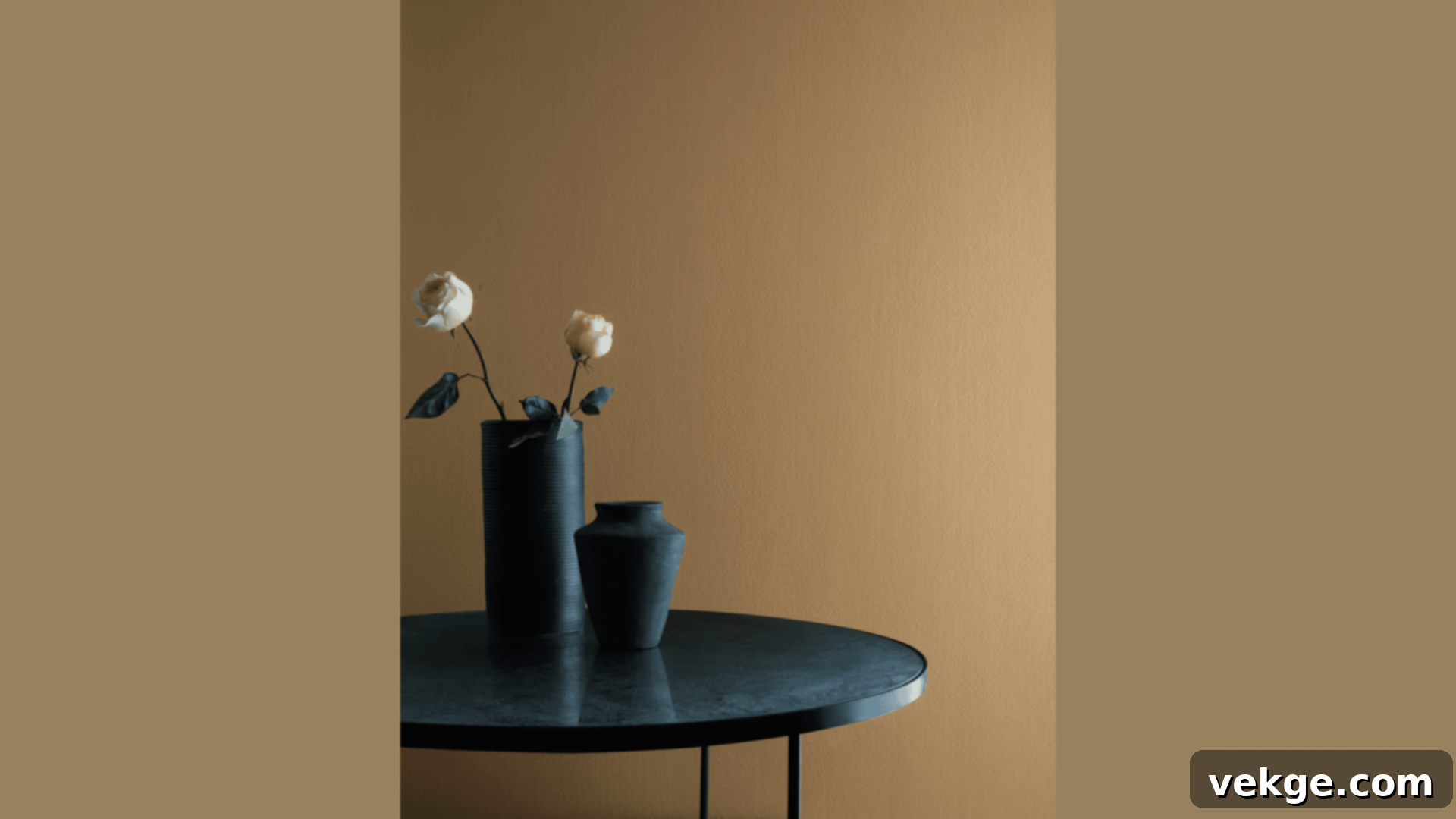
Norwich Brown is far from a basic beige; it’s a sophisticated paint color designed to infuse spaces with genuine character and warmth. Every time I use it, rooms feel established, grounded, and incredibly welcoming. It possesses a greater depth and complexity than a standard, flat beige, preventing it from feeling bland, yet it remains light enough to ensure spaces feel open and inviting rather than closed off. Its ability to shift subtly with light adds an engaging dimension, making it a versatile choice for a foundational color that truly elevates the overall design of a room.
- Offers a rich, nuanced depth that avoids being overly dark or heavy.
- Displays beautiful variations and shifts in tone as light conditions change throughout the day.
- Pairs harmoniously with most other colors, making it an excellent base.
- Provides good, reliable coverage, ensuring a consistent and appealing finish.
Perfect for:
- Family rooms: Creates a comfortable, resilient, and inviting space for daily life.
- Entryways: Extends a warm, sophisticated, and character-filled welcome.
- Guest rooms: Offers a universally appealing, cozy, and refined retreat.
- Sitting areas: Fosters a relaxed, intimate, and elegant space for conversation.
Deep, Moody Tones By Benjamin Moore
For those daring enough to embrace drama and introspection, Benjamin Moore’s deep, moody historical tones offer an unparalleled opportunity to create spaces that are both powerfully sophisticated and incredibly intimate.
19. Buckland Blue HC-151
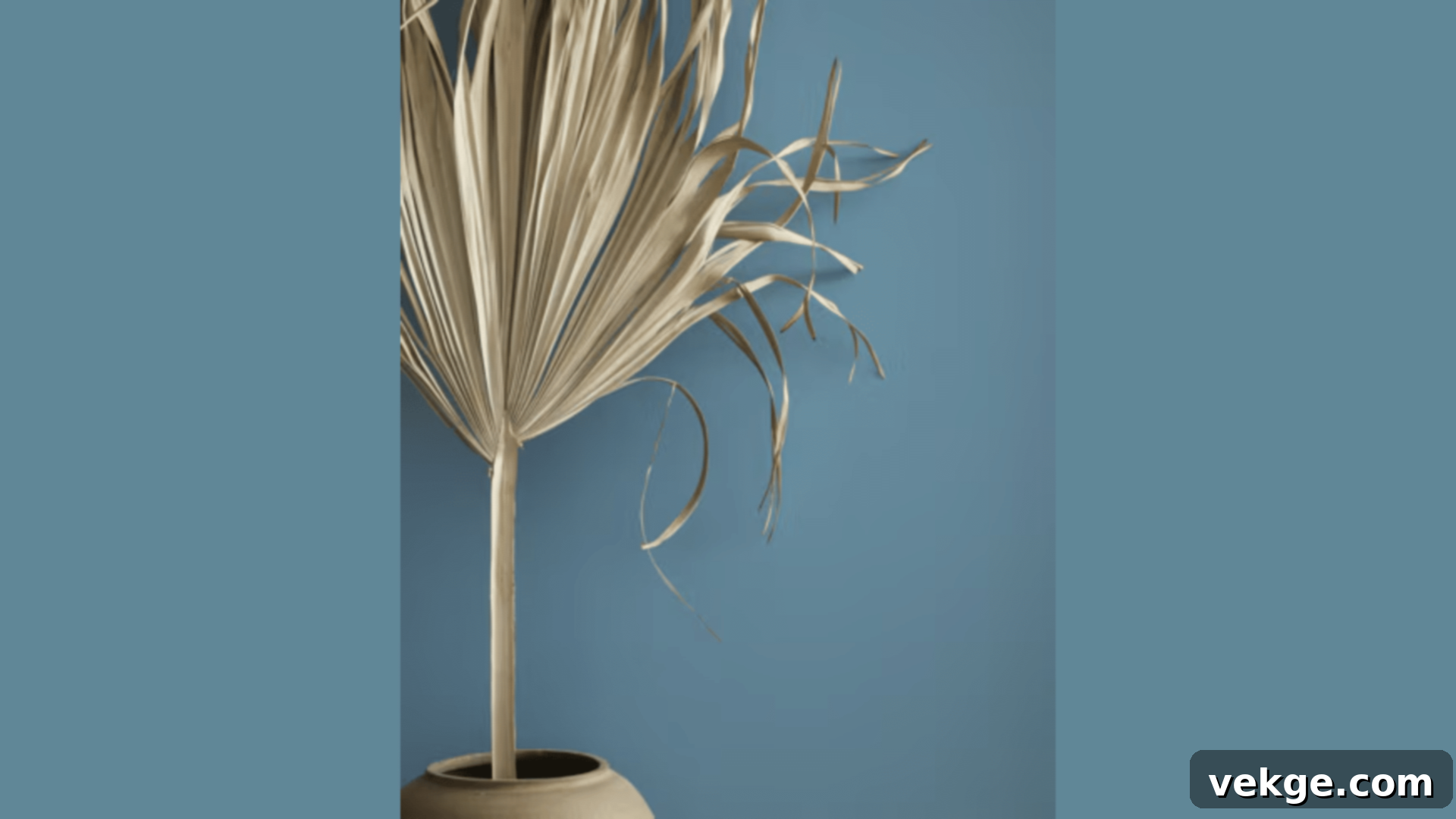
Buckland Blue is a deeply sophisticated and enveloping paint color that transforms rooms into wonderfully sheltering and intimate spaces. When I work with this hue, walls take on a rich, profound depth that subtly shifts and reveals new nuances depending on the light. While it might appear as a dark gray at first glance, the underlying blue notes are key; they peek through at different times of day, injecting life and preventing it from becoming merely a plain, flat dark color. It creates an atmosphere of quiet luxury and profound calm, ideal for creating a truly unique and personal sanctuary.
- Exhibits captivating changes in depth and tone with varying light angles.
- Masterfully creates cozy, intimate, and deeply comforting spaces.
- Adds significant depth and perceived dimension to any room.
- Offers strong, consistent coverage for a rich and impactful finish.
Perfect for:
- Theater rooms: Enhances the immersive experience with a dark, enveloping atmosphere.
- Private offices: Fosters a serious, focused, and sophisticated workspace.
- Master bedrooms: Cultivates a luxurious, intimate, and deeply restful sanctuary.
- Reading rooms: Creates a profound and contemplative haven for literary escape.
20. New London Burgundy HC-61
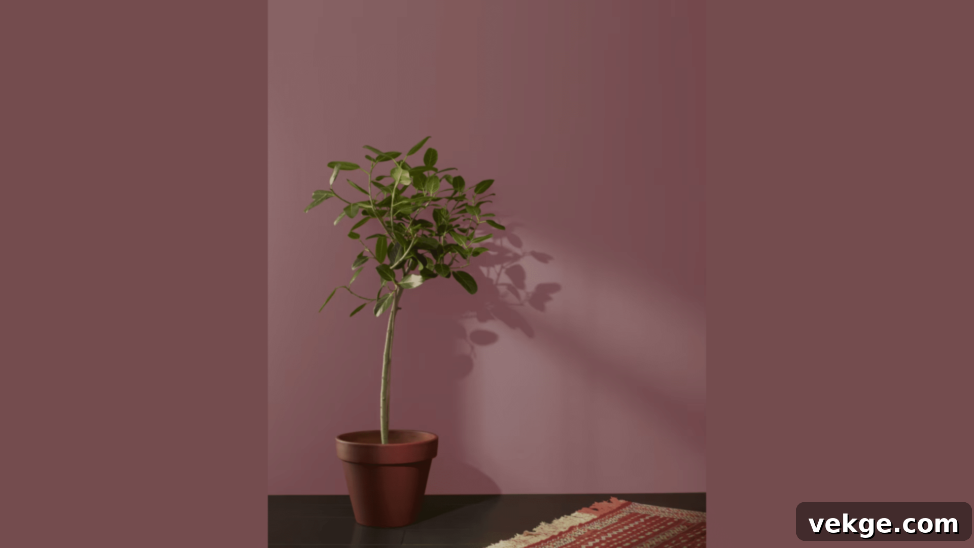
New London Burgundy is a deep, sumptuous red paint that brings an immediate sense of warmth, strength, and old-world grandeur to any room. It creates spaces that feel both boldly defined and wonderfully comforting, like a cherished heirloom. This color possesses the profound richness and complexity of a fine red wine, yet it avoids being overly bright or loud, maintaining a sophisticated restraint. It’s an exceptional choice for adding a dramatic flair and historical gravitas, perfect for formal areas or intimate nooks where you want to make a lasting impression.
- Offers rich color layering and depth, creating a truly luxurious effect.
- Maintains a good balance of light absorption, preventing it from overwhelming the space.
- Remains consistently true and vibrant, even in shadowed areas.
- Ensures an even, uniform application for a flawless and impactful finish.
Perfect for:
- Dining rooms: Sets an opulent and memorable stage for elegant entertaining.
- Libraries: Cultivates a distinguished, scholarly, and cozy intellectual retreat.
- Wine rooms: Enhances the ambiance of a dedicated space for connoisseurship.
- Formal living areas: Creates a grand, inviting, and sophisticated social space.
21. Webster Green HC-130
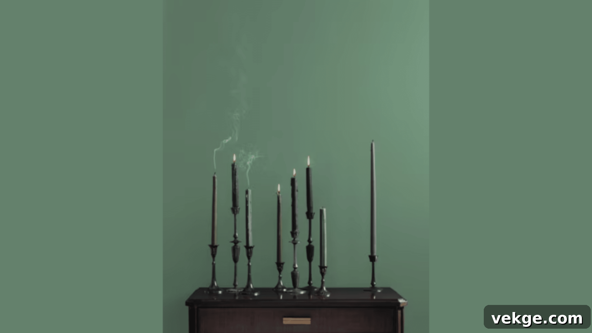
Webster Green is a profound, earthy green paint that evokes the timeless feeling of walking through an ancient, whispering forest. When I use it, rooms take on a remarkable sense of age, character, and untold stories. It masterfully creates spaces that feel deeply grounded and profoundly peaceful, while maintaining visual interest through its subtle, organic color shifts. This is not a bright green, but a rich, muted tone that invites contemplation and calm, making it a perfect backdrop for natural materials and a cherished, lived-in feel. It’s a sophisticated choice for those seeking a connection to nature with a historical depth.
- Offers natural color depth and organic variations, creating an authentic feel.
- Performs exceptionally well in low-light conditions, maintaining its richness.
- Pairs exquisitely with brass accents, dark wood, and other natural textures.
- Ensures a smooth and elegant finish upon application.
Perfect for:
- Studies: Cultivates a serene, intellectual, and grounded workspace.
- Dens: Creates a cozy, intimate, and contemplative retreat.
- Sitting rooms: Fosters a comfortable, elegant, and peaceful gathering space.
- Accent walls: Adds a dramatic, nature-inspired focal point.
22. Wethersfield Moss HC-62
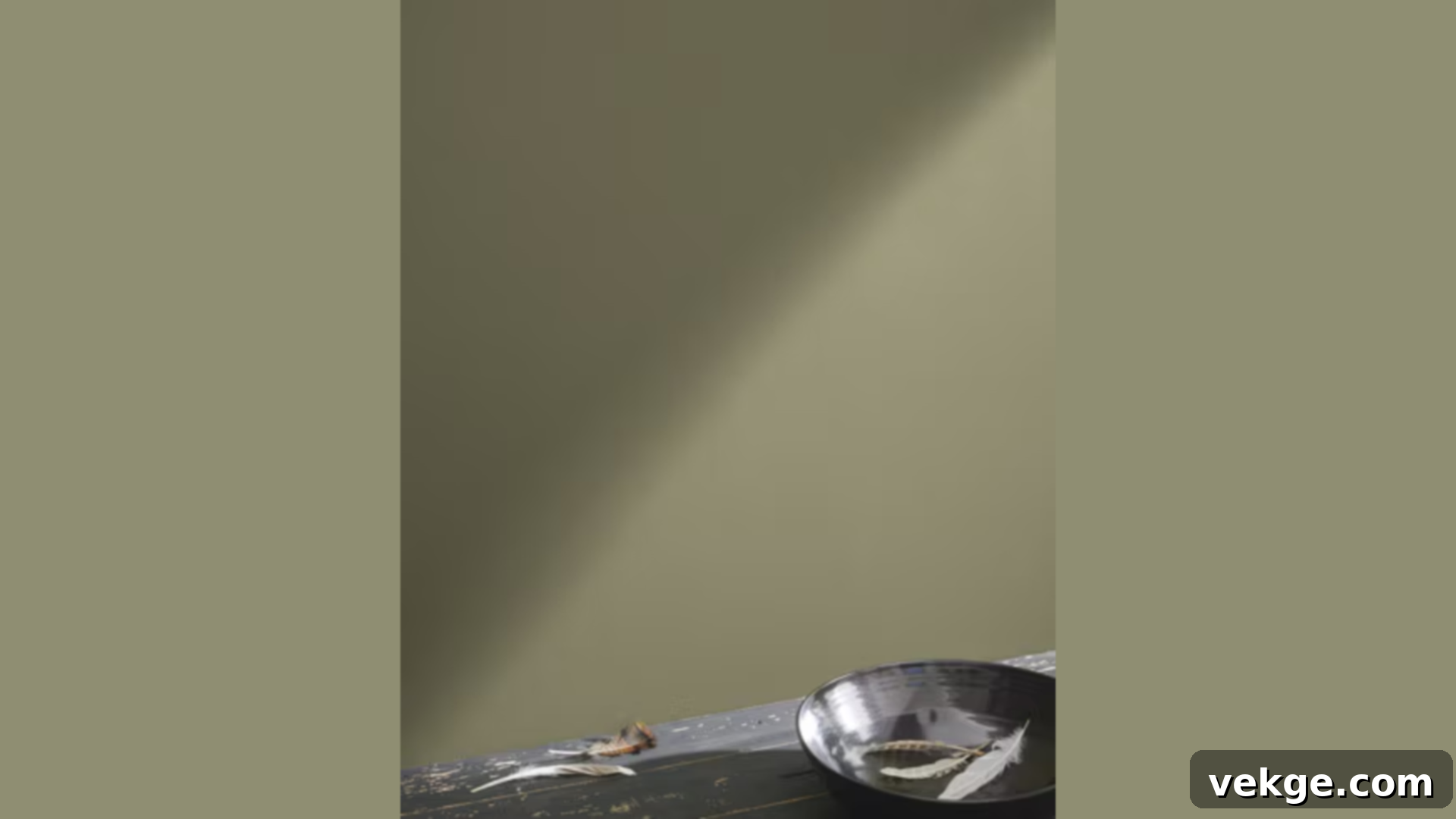
Wethersfield Moss is a captivating green paint that effortlessly brings the calming and restorative essence of nature indoors. It creates spaces that feel deeply connected to the outside world, yet remain wonderfully warm, inviting, and intimate. This hue strikes a beautiful balance, incorporating just enough gray to soften its intensity and ensure versatility, while consistently maintaining its vibrant, natural green heart. It’s an ideal choice for those who desire a color that feels organic and lively, without being overly bright or overwhelming. Wethersfield Moss provides a sophisticated link to the natural landscape.
- Displays natural, subtle color shifts, adding organic depth and interest.
- Performs exceptionally well in bright natural light, showcasing its nuances.
- Harmonizes beautifully with natural materials such as stone, wood, and linen.
- Provides a durable and resilient finish, suitable for active living spaces.
Perfect for:
- Garden rooms: Enhances the connection between indoor and outdoor living.
- Living rooms: Creates a fresh, inviting, and nature-inspired social space.
- Breakfast areas: Brightens morning routines with an organic, cheerful feel.
- Home offices: Fosters a calm, focused, and naturally inspiring workspace.
Bright and Lively Colors By Benjamin Moore
For those who love to infuse their homes with energy and cheer, Benjamin Moore’s historical collection also offers a selection of bright and lively colors. These shades, while historically inspired, feel fresh and invigorating, perfect for awakening any space.
23. Regent Green 2136-20
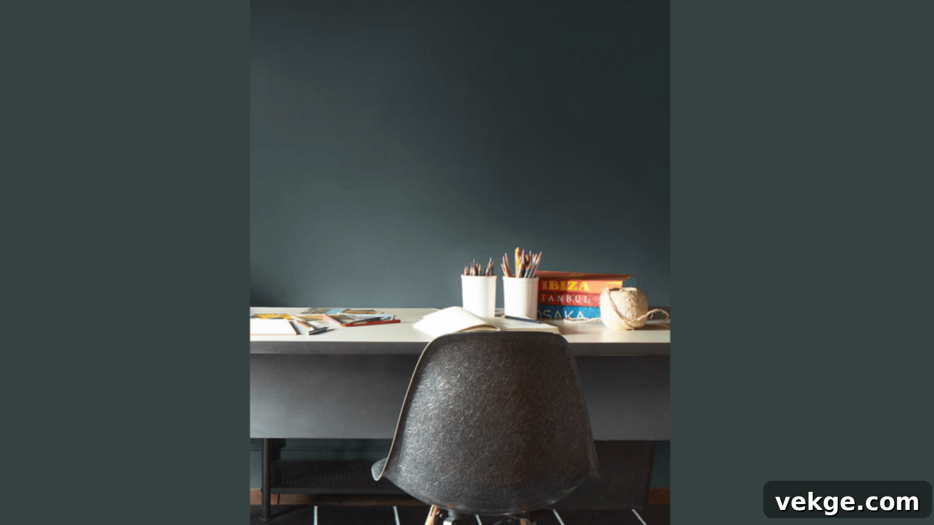
Regent Green is a vibrant, yet deeply refined green paint that injects life and undeniable strength into any room. When I paint with this striking hue, spaces immediately feel full of energy and character, all while maintaining an air of classic sophistication. It possesses a remarkable ability to catch and play with light in different ways throughout the day, ensuring rooms feel fresh, dynamic, and alive from dawn till dusk. This is a bold but balanced green, perfect for creating a statement without overwhelming the senses, adding a touch of historical grandeur with a contemporary twist.
- Offers a strong visual presence without being overly bright or garish.
- Looks consistently excellent and dynamic throughout all hours of the day.
- Mixes exceptionally well with various neutral tones, creating harmonious palettes.
- Provides full and robust coverage for a rich, impactful, and lasting finish.
Perfect for:
- Living rooms: Creates an energetic, sophisticated, and engaging social space.
- Sunrooms: Enhances natural light and brings the outdoors in with vibrancy.
- Dining areas: Sets a lively, memorable, and elegant stage for meals.
- Home offices: Fosters a stimulating, yet refined, environment for productivity.
24. Golden Straw 2152-50
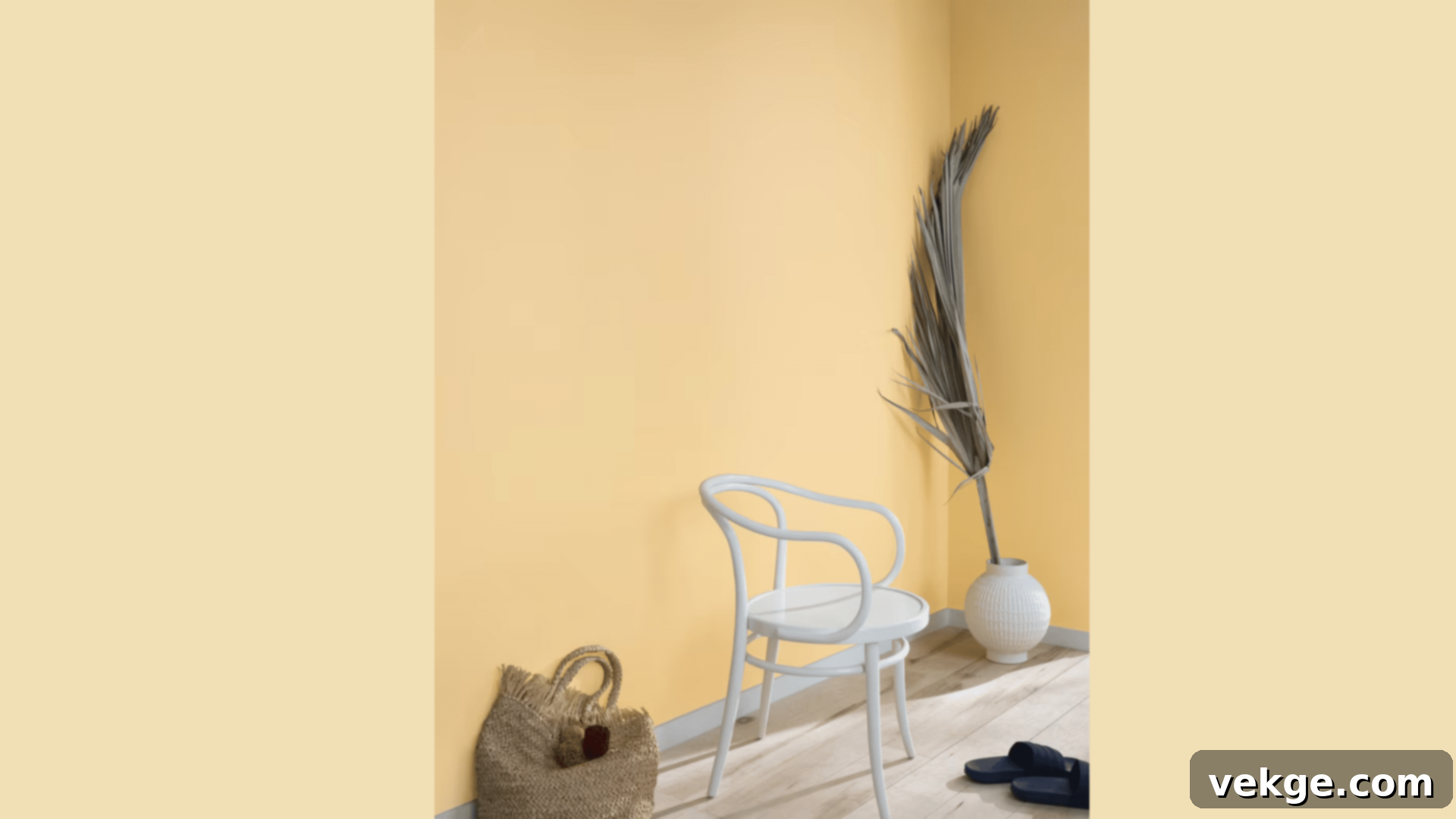
Golden Straw is a truly luminous yellow paint that fills rooms with the radiant, cheerful light of morning sunshine. I’ve witnessed its transformative power, turning even the darkest or most somber spaces into bright, happy, and inviting areas. This hue contains just the right amount of warmth to make rooms feel genuinely sunny and optimistic, without ever crossing the line into being too bold or overwhelming. It’s a delightful choice for anyone looking to infuse their home with joy, energy, and a timeless, optimistic glow. Golden Straw brings a touch of historical charm with a vibrant, fresh appeal.
- Remarkably effective at brightening and invigorating dark or dim spaces.
- Looks consistently beautiful and cheerful in virtually any lighting condition.
- Provides a clean, fresh finish that enhances the overall brightness of a room.
- Offers easy touch-ups, making it convenient to maintain its vibrant appearance.
Perfect for:
- Kitchens: Brightens and energizes the heart of the home with a cheerful disposition.
- Breakfast nooks: Infuses morning routines with a sunny and uplifting start.
- Craft rooms: Creates an inspiring, lively, and creative workspace.
- Children’s spaces: Fosters a happy, stimulating, and warm environment for play and growth.
25. Saybrook Sage HC-114
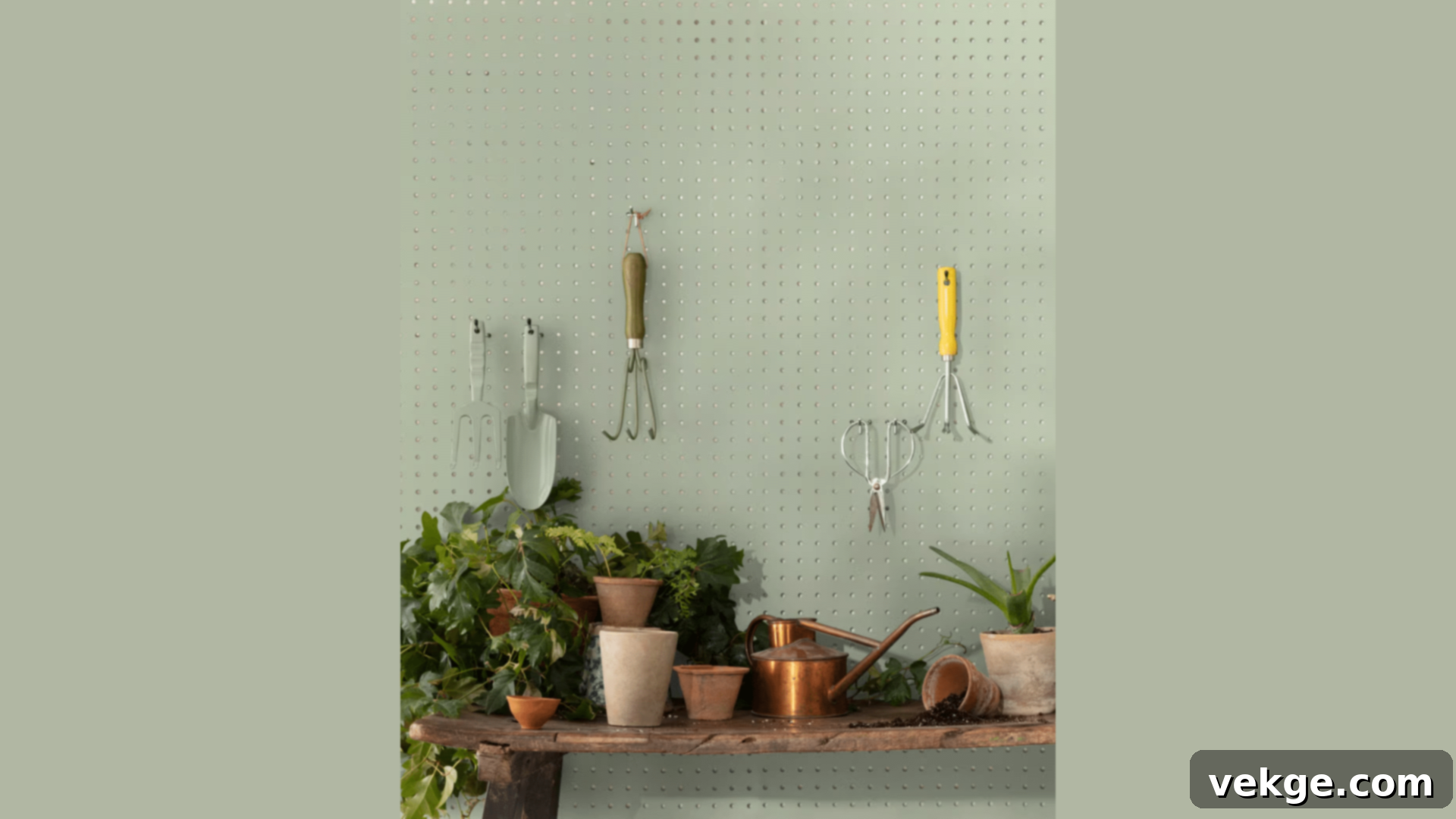
Saybrook Sage is a beautiful yellow-green paint that introduces a gentle, yet undeniable liveliness to any room it graces. When I use this color, spaces immediately feel fresh, organic, and profoundly calm all at once. It strikes a remarkable balance: possessing enough inherent color to gently “wake up” a room and add character, yet remaining soft and muted enough to be exceptionally livable for everyday comfort. Its subtle complexity makes it a versatile choice for creating serene, nature-inspired interiors that feel both classic and effortlessly current. Saybrook Sage is a true testament to the enduring appeal of thoughtful, balanced color.
- Achieves a perfectly balanced brightness, feeling both fresh and soothing.
- Displays delightful variations and depth, subtly changing with the seasons and light.
- Pairs beautifully with a wide range of natural wood tones, enhancing their warmth.
- Ensures a smooth, inviting look, contributing to a refined aesthetic.
Perfect for:
- Family rooms: Creates a comfortable, fresh, and inviting hub for daily life.
- Studies: Fosters a calm, focused, and naturally inspiring workspace.
- Guest rooms: Provides a welcoming, serene, and universally appealing retreat.
- Reading corners: Cultivates a peaceful, intimate, and comforting spot for relaxation.
How to Select the Ideal Historical Color for Your Space?
Choosing the perfect paint color can feel like a daunting task, but with Benjamin Moore’s Historical Colors and a few expert strategies, you can select a shade that truly transforms your home. Here’s my professional approach to guiding clients through this exciting process:
1. Start With Room Purpose and Mood
The first step in color selection is to consider the primary function and desired mood of each room. Different activities and times of day call for different atmospheres:
- Living rooms and family rooms: These communal spaces thrive with warm, inviting shades like Shaker Beige HC-45 or Powell Buff HC-35, which encourage conversation and comfort.
- Bedrooms: For restful sanctuaries, opt for calming and serene hues such as Van Courtlandt Blue HC-144 or Palladian Blue HC-144, promoting relaxation and sleep.
- Kitchens: Functional and often bustling, kitchens shine with clean, bright, and invigorating tones like Chantilly Lace OC-65 or Edgecomb Gray HC-173, fostering a fresh and energetic environment.
- Home offices and studies: To maintain focus and a sense of sophistication, consider grounded colors like Richmond Gray HC-96 or Georgian Green HC-115, which provide a stable and inspiring backdrop.
2. Check Your Light: Natural and Artificial
Lighting is arguably the most critical factor in how a paint color appears. Natural light changes throughout the day, and artificial light can drastically alter a shade’s undertones. Here’s what I consistently advise my clients:
- North-facing rooms: These rooms receive cooler, indirect light. To counteract this, pick warmer historical colors with yellow or red undertones, like Chestertown Buff HC-9, to add a much-needed sense of warmth and coziness.
- South-facing rooms: Blessed with abundant, warm natural light throughout the day, south-facing rooms are highly versatile. Almost any historical color will work well here, but cooler tones like Palladian Blue HC-144 can feel particularly refreshing.
- East-facing rooms: Colors look brightest and most vibrant in the morning light. Consider how the color will appear as the day progresses and the light shifts to a cooler tone. Soft greens or blues can be lovely.
- West-facing rooms: These rooms receive intense, warm light in the afternoon. Colors will warm up significantly in the late day, so be mindful of how a shade might intensify. Gray-based colors with subtle blue undertones can help balance the warmth.
- Artificial Lighting: Always assess how a color looks under your typical evening lighting (incandescent, LED, fluorescent) as these can pull out unexpected undertones.
3. Size and Scale Matter
The perceived size and intimacy of a room can be dramatically influenced by your color choice:
- Small rooms: To make spaces feel more expansive and open, opt for lighter historical colors such as Concord Ivory HC-26 or Whitestone 2134-60. These shades reflect light, creating an illusion of greater space.
- Large rooms: For grander rooms that might feel a bit cavernous, deeper shades like Hamilton Blue HC-146 or Buckland Blue HC-151 can make them feel more intimate, cozy, and luxurious, bringing the walls in.
- Medium tones: Versatile and adaptable, medium-toned neutrals like Hancock Gray HC-174 or Edgecomb Gray HC-173 work well in almost any size room, providing a balanced and comfortable feel.
4. Test Before You Paint: The Golden Rule
This is, without a doubt, the single most important step in the entire paint selection process. Never skip it! Here’s my recommended method for testing colors:
- Get Sample Cards, then Samples: Start with small physical paint chips to narrow down your choices. Once you have a few favorites, invest in actual paint samples (small cans).
- Paint Large Squares: Instead of just a small swatch, paint large squares (at least 2 feet by 2 feet, or even larger) on multiple walls in the room. This helps you see how the color interacts with varying light and shadows. Alternatively, paint samples on large poster boards that you can move around.
- Observe Throughout the Day: Crucially, live with these samples for at least 24-48 hours. Observe them at different times of the day – morning, noon, and evening – and under both natural and artificial light.
- Check with Furnishings: See how the sample colors look against your existing furniture, flooring, window treatments, and artwork. A color might look great on its own but clash with your sofa.
- Wait and Reflect: Give yourself time. Don’t rush the decision. Often, the color you initially loved might not be the one that truly sings in your space.
5. Consider Your Personal Style and Existing Decor
Your current furniture, decor, and architectural style should significantly guide your color choice. Benjamin Moore’s Historical Collection is versatile, but conscious pairing yields the best results:
- Traditional or classic furniture: Often pairs beautifully with deeper, more saturated historical tones like Georgian Green HC-115 or Middlebury Brown HC-68, enhancing a sense of heritage and formality.
- Modern or contemporary pieces: These can truly pop and achieve a striking contrast against lighter, cleaner historical shades such as Chantilly Lace OC-65 or Edgecomb Gray HC-173, creating a fresh and crisp aesthetic.
- Mixed styles or eclectic decor: For homes that blend various styles, medium-toned neutrals like Manchester Tan HC-81 or Revere Pewter HC-172 provide a versatile and grounding backdrop that allows different elements to coexist harmoniously.
Remember: Paint samples will almost certainly look different on your walls than they do on a small chip or in the store. This investment in time and samples is invaluable. Take your time making this decision—it’s worth getting it right the first time to create a home you’ll love for years to come.
Effective Tips for Using Benjamin Moore’s Historical Colors
Drawing from years of experience, I’ve compiled the most useful and impactful tips for working with Benjamin Moore’s Historical Colors. These simple yet powerful ideas will empower you to use these enduring shades with confidence and creativity, transforming your home with a touch of timeless elegance.
1. Mastering Light and Space with Color
Subtle adjustments in how you apply color can dramatically alter the perception of light and space within a room:
- Subtle Depth with Trim: For an elegant and sophisticated look, paint your trim one shade lighter than your walls. This creates a gentle contrast and adds a nuanced depth that enhances the architectural features without being stark.
- Elevate Ceilings: Use lighter, airier colors above eye level, especially on ceilings or the upper portions of walls. This technique draws the eye upwards, making ceilings feel higher and rooms more expansive. Consider a softer shade of your wall color or a classic white like Chantilly Lace.
- Ground Your Space: Apply darker, more grounding shades below chair rails or on wainscoting. This anchors the room, adding a sense of stability and traditional charm, particularly effective in dining rooms or studies.
- Muted Tones for Evening Rooms: For rooms primarily used at night, such as formal dining rooms or media rooms, opt for muted, richer tones like New London Burgundy HC-61 or Buckland Blue HC-151. These colors create an enveloping, intimate atmosphere that is perfect for evening relaxation or entertaining.
2. Make Colors Work Harder: Strategic Application
Every historical color has unique qualities. Use these tips to leverage their strengths for specific effects:
- Brighten Shadowy Corners: Paint a warm, reflective greige like Edgecomb Gray HC-173 in naturally shadowy corners or areas that receive less light. Its balanced undertones will help bounce light around, making these spots feel brighter and more inviting.
- Cool Down Sun-Drenched Rooms: In south-facing rooms or those with abundant warm light, use a color with cool undertones like Wythe Blue HC-143 (a popular companion to the historical collection, known for its calming properties) to create a refreshing counterbalance and prevent the room from feeling too hot or over-saturated.
- Reflect Light in Dark Hallways: Apply a light, luminous color such as Powell Buff HC-35 or Concord Ivory HC-26 in dark hallways or transitional spaces. These shades possess a warm glow that will reflect available light, making these areas feel more open and less confined.
- Highlight Architectural Features: Choose a strong, contrasting historical color like Hamilton Blue HC-146 or Georgian Green HC-115 to make a fireplace, built-in shelving, or an accent wall truly stand out, turning it into a dramatic focal point.
3. Balance Your Colors for Harmony
Achieving a cohesive and harmonious palette is key to successful interior design. Follow these simple rules for better results:
- Warm with Cool: Always strive to match warm colors with cool ones within your overall scheme. For example, a warm beige wall pairs beautifully with cooler blue accents, creating a balanced and dynamic look.
- Brighter for Small Areas: Use brighter, more vibrant historical shades for smaller accents or areas. A pop of Golden Straw 2152-50 in a powder room or on a piece of furniture can be invigorating without overwhelming a larger space.
- Softer for Large Walls: For expansive walls, lean towards softer, more muted historical tones. These prevent the color from becoming too intense and allow the eye to rest, creating a sense of calm and spaciousness.
- Repeat Colors: To tie rooms together and create a sense of flow, repeat a specific historical color or a similar tone in different areas or through various elements (e.g., paint, textiles, artwork).
4. Integrating Historical Colors in Modern Homes
Benjamin Moore’s Historical Colors are surprisingly versatile and can infuse contemporary spaces with depth and character:
- Feature Walls: Paint one striking feature wall in a dramatic historical color like Van Courtlandt Blue HC-144 or Webster Green HC-130. This adds a focal point and a sense of history to an otherwise minimalist room.
- Clean Lines with White Trim: Pair a sophisticated neutral like Hancock Gray HC-174 or Revere Pewter HC-172 with crisp white trim (e.g., Chantilly Lace OC-65) for clean, defined lines that complement modern architectural elements.
- Simple Furniture, Rich Backdrops: Let simple, modern furniture pop against the rich, nuanced backdrop of a historical color like Richmond Gray HC-96. The contrast creates visual interest and sophistication.
- Open Floor Plans: For open-concept living, choose a unifying, light historical neutral like Concord Ivory HC-26 or Edgecomb Gray HC-173 to ensure a harmonious flow between distinct living zones.
5. Respecting and Renewing Older Homes
When working with historical properties, the goal is often to honor their past while updating them for modern living:
- Preserve Original Trim: Whenever possible, keep original trim colors. Many historical homes feature unique trim colors that are integral to their character. Matching new wall paint to these existing features can create a cohesive and authentic look.
- Match New Paint to Features: Select new paint colors that complement existing historical architectural features, such as fireplaces, built-ins, or molding. For example, a deep wood mantel might be beautifully enhanced by a historical green or blue.
- Period-Correct Main Rooms: Use period-correct colors (or those closely inspired by the era) in main, formal rooms. This pays homage to the home’s heritage and enhances its authentic charm. Benjamin Moore’s Historical Collection is perfect for this.
- Updated Shades in Additions: For modern additions or renovated spaces within an older home, feel free to introduce updated historical shades or even contemporary colors that still complement the overall palette, creating a subtle dialogue between old and new.
Remember: Excellent lighting, both natural and artificial, is paramount for truly appreciating paint colors. Always test your paint samples extensively at different times of the day and under various lighting conditions before making your final, confident choice.
Conclusion
Benjamin Moore’s Historical Colors offer something truly invaluable in the ever-evolving world of home design: a collection of colors that look beautiful today and possess an inherent, unwavering quality that ensures they will continue to impress for many years to come. In my extensive experience working with these exceptional paints, they consistently simplify the decorating process precisely because they are designed to work so harmoniously together.
Think of these colors not just as paint, but as trusted, enduring friends for your home. They have the remarkable ability to inject profound comfort and character into sleek, modern spaces, while simultaneously breathing fresh, vibrant life into older, cherished homes. Whether your personal aesthetic gravitates towards the gentle, embracing warmth of Shaker Beige HC-45 or the quiet, commanding strength of Buckland Blue HC-151, you are making a choice for a color that has unequivocally proven its worth through the passage of time.
I sincerely hope this comprehensive guide empowers you to feel more confident and inspired about exploring and embracing these classic, time-tested shades. Begin your journey with a single room, diligently test your samples, and then prepare to witness the profound and beautiful transformation these colors can bring to your living space. Your perfect historical color, waiting to infuse your home with enduring beauty, is just a brushstroke away.
Do you have specific questions about integrating these exquisite colors into your unique home environment, or perhaps you’re seeking a personalized recommendation? Please don’t hesitate to leave a comment below. I’m here to help you navigate your options and choose the ideal shade that perfectly resonates with your vision for your space.
Frequently Asked Questions
Are Benjamin Moore’s Historical Colors More Expensive Than Regular Paint?
No, the Historical Colors collection does not typically carry a higher price tag than other Benjamin Moore paints within the same product line and finish (e.g., Regal Select, Aura, etc.). The cost is determined by the quality and specific type of Benjamin Moore paint you choose, not by the historical designation of the color itself. You are investing in Benjamin Moore’s renowned quality and the carefully developed pigment blends, regardless of whether the color comes from the historical palette or another collection.
Can I Use Historical Colors in a House Built After 1900?
Absolutely, yes! Benjamin Moore’s Historical Colors are incredibly versatile and are designed to complement homes of any age or architectural style, not just those built in specific historical periods. While their inspiration is rooted in early American homes, these colors have been carefully selected for their timeless appeal and ability to integrate seamlessly with today’s styles and contemporary living spaces. They provide a classic foundation that can feel traditional, transitional, or even modern depending on the furnishings, lighting, and other design elements you pair them with.
Will Historical Colors Make My House Look Old-Fashioned?
Not at all. This is a common misconception! Benjamin Moore’s Historical Colors have endured precisely because they are fundamentally versatile, useful, and aesthetically pleasing shades that adapt beautifully to virtually any interior design style. Their timeless quality means they avoid fleeting trends. Depending on how you incorporate them into your home – whether with antique furniture, sleek modern pieces, or a mix of both – these colors can feel deeply traditional, charmingly rustic, or strikingly contemporary. They provide a rich backdrop that enhances, rather than dictates, your home’s unique personality and style.
