Sherwin-Williams Cyberspace (SW 7076): The Ultimate Deep Blue-Gray Paint Color Guide
There’s a unique sense of grounded sophistication that comes with Sherwin-Williams Cyberspace (SW 7076). It’s a color that asserts its presence with quiet confidence, a bold statement without being overwhelming, and a deep, rich tone that adds depth without making a room feel heavy or draining. Its allure lies in its ability to be simultaneously dramatic and comforting, offering a versatile foundation for a myriad of design styles.
Having experienced its transformative power firsthand on various surfaces—from elegant kitchen cabinets and inviting accent walls to a striking front door—I can attest to its consistent delivery of quiet strength and refined character. Each application has unveiled a new facet of its charm, adapting beautifully to different contexts and light conditions.
This comprehensive guide is designed to take you beyond mere paint swatches and into the reality of Sherwin-Williams Cyberspace in actual living spaces. We’ll delve into its intricate color profile, exploring its behavior under diverse lighting conditions, and offering practical advice on choosing the perfect finish for every room. Moreover, you’ll discover ideal color pairings and comparable shades from other popular brands, empowering you to make informed decisions for your next home decor project. Every insight shared here is rooted in real-world application, ensuring practical and reliable guidance.
Getting to Know Sherwin-Williams Cyberspace (SW 7076)
Cyberspace (SW 7076) is more than just a dark paint; it’s a deep, moody, and profoundly balanced hue that effortlessly blends strong blue and gray influences. It’s often celebrated as a modern navy, but with a unique twist: a sophisticated quietness that makes it suitable for both making a grand, bold statement and crafting a serene, cozy retreat. Its nuanced depth offers an alternative to a pure navy, presenting a more complex and versatile character.
Basic Color Profile of SW 7076 Cyberspace
- HEX code: #44484D
- LRV (Light Reflectance Value): 6
- Color family: Deep Navy Blue with Prominent Gray Undertones
With an LRV of 6, Cyberspace sits near the darkest end of the color spectrum. However, what sets it apart is its remarkable ability to avoid feeling flat or overly dramatic. This low LRV contributes to its rich depth, yet the intelligent combination of cool blue and grounding gray ensures it remains inviting and harmonious. This balance allows Cyberspace to be seamlessly integrated into a wide range of interior styles, from classic and traditional to sleek and contemporary. It can anchor a space with its deep tone or serve as a dramatic backdrop that lets other elements shine.
Cyberspace Undertones Explained
The magic of Cyberspace truly lies in its subtle yet impactful undertones. It is fundamentally rooted in blue, providing that signature navy feel, but it is beautifully tempered by a clear, consistent gray undertone. This particular blend is crucial as it prevents the color from appearing too bright, too vibrant, or overtly “blue.” Instead, it delivers a more muted, smoky, and sophisticated effect that feels incredibly intentional and polished.
- In abundant natural daylight, the blue undertone tends to take the lead, revealing a clearer, truer navy shade. The light allows the blue to fully express itself, giving the color a fresh and expansive feel.
- In artificial or lower light conditions, the gray base comes to the forefront, softening the color and deepening its moody character. This shift creates a cozier, more intimate atmosphere, making the space feel enveloped and grounded.
This dynamic balance is what makes Cyberspace significantly more versatile than a pure navy. It skillfully avoids the common pitfalls of dark blues, such as unexpectedly shifting into purple or teal tones, ensuring a consistent and refined appearance regardless of the lighting. It’s this steadfast nature that makes it a trusted choice for designers and homeowners alike.
Sherwin-Williams Cyberspace in Real Spaces: Design Applications
One of Cyberspace’s most impressive qualities is its adaptability across various areas of the home. Its deep, balanced nature allows it to create distinct moods, from serene and sophisticated to bold and dramatic, depending on its application. Here’s how this versatile color typically performs and transforms different rooms:
Bedrooms: Creating a Calm and Restful Retreat

In bedrooms, Sherwin-Williams Cyberspace excels at creating a deeply calm and restful atmosphere. Its dark, enveloping quality mimics the tranquility of a night sky, fostering an environment conducive to relaxation and sleep. When paired with crisp white trim, the contrast is sharp and clean, making the walls pop with defined elegance. Incorporating warm wood tones, such as a natural oak bed frame or bedside tables, introduces an organic warmth that beautifully complements the cool depth of Cyberspace. Soft, layered fabrics—think plush throws, textured rugs, and linen bedding—enhance the cozy and inviting feel. When natural light streams into the room, it gently highlights the gray undertones, preventing the color from feeling too intense during the day.
To further enhance the aesthetic, consider metallic accents. Brass or gold fixtures, such as lamp bases or decorative mirrors, infuse the space with a touch of luxurious warmth, contrasting beautifully with the cool blue-gray. For a cooler, more contemporary style, silver or brushed nickel accents can maintain a sleek and understated elegance. Cyberspace is truly perfect for those seeking to create a sophisticated, grounded, and ultimately serene bedroom sanctuary.
Kitchens and Cabinets: Adding Depth and Modern Contrast

In the heart of the home, Cyberspace brings unparalleled contrast and sophisticated depth to kitchens and cabinetry. It transforms ordinary kitchen elements into striking design features. Imagine lower cabinets painted in Cyberspace, creating a strong anchor, beautifully paired with gleaming white quartz or marble countertops for a crisp, high-contrast look that feels both classic and contemporary. Brushed metals—such as stainless steel appliances, brushed nickel pulls, or even a copper range hood—add a layer of texture and subtle shine that complements the paint’s depth. Simple, clean-lined hardware allows the color of the cabinets to speak for itself, maintaining a sleek aesthetic.
This color is particularly effective on base cabinets, a central kitchen island that becomes an immediate focal point, or even pantry doors for an unexpected touch of drama. To skillfully avoid making the space feel too dark, especially in kitchens with less natural light, balance Cyberspace with ample open shelving, light-colored upper cabinets, or bright white walls. This strategy ensures the kitchen remains airy and inviting while still benefiting from the color’s bold presence. Cyberspace effortlessly bridges the gap between classic Shaker-style kitchens and ultra-modern designs, offering a flexible solution for various tastes.
Bathrooms: Sharp Contrast and Spa-like Elegance
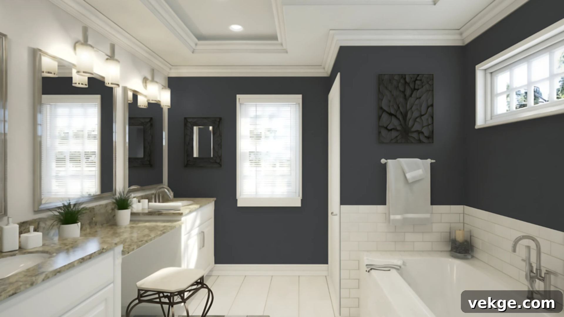
In bathrooms, Cyberspace introduces a sharp, elegant contrast to bright, often monochromatic finishes. It harmonizes beautifully with pristine white subway tiles or large-format porcelain, creating a clean and sophisticated backdrop. For a dramatic and contemporary look, pair it with matte black fixtures, such as faucets, showerheads, and towel bars. Alternatively, natural wood vanities, with their inherent warmth and texture, can soften the depth of Cyberspace, creating a balanced and organic feel reminiscent of a luxurious spa. Consider rich walnut or light oak for different effects.
In smaller bathrooms or powder rooms where space is at a premium, a full application of Cyberspace might feel too intense. Instead, use it strategically on a single vanity, a feature wall behind the toilet, or even the ceiling for an unexpected design statement. Crucially, good lighting is paramount in a Cyberspace bathroom. Layered lighting—including bright overheads, vanity sconces, and perhaps even LED strip lighting—is essential to counteract the color’s depth, preventing the space from feeling dim or confined. When properly illuminated and balanced with light-reflective surfaces, Cyberspace can transform a bathroom into a striking and intimate sanctuary.
Living Rooms and Accent Walls: Grounded Drama and Sophistication

For living rooms, Sherwin-Williams Cyberspace is an excellent choice for crafting a grounded, yet dramatic and sophisticated aesthetic. It serves as an incredible backdrop for various design elements, enhancing their presence. Imagine it behind open shelving units, allowing displayed books and decorative objects to pop with vivid clarity. It creates a stunning focal point when applied to a fireplace wall, making the hearth feel more grand and inviting. As a canvas for artwork, its deep, neutral quality allows vibrant colors to truly sing, making any gallery wall or single statement piece look more curated and gallery-worthy.
To successfully balance its inherent depth, incorporate lighter furniture pieces, such as a cream linen sofa or light gray armchairs. Soft, inviting textiles—think cashmere throws, velvet pillows, or chunky knit blankets—add layers of comfort and visual interest. Introducing various wood tones, from light maple coffee tables to dark walnut shelving, brings warmth and natural texture to the space. Whether your living room enjoys abundant natural light or relies more on layered lamps and sconces, careful illumination helps maintain an open and airy feel, preventing the deep color from overpowering the room. Cyberspace is a solid, impactful pick for feature walls, built-ins, or even a sophisticated library nook.
Exteriors: Bold Curb Appeal and Timeless Elegance

On exteriors, Sherwin-Williams Cyberspace offers a commanding presence and an undeniable sense of curb appeal. Its deep, neutral quality provides a bold, yet timeless contrast when paired with classic white trim, the earthy tones of natural brick, or light-colored siding. This versatility makes it suitable for a wide array of architectural styles, from modern farmhouses to traditional colonials. As a front door color, Cyberspace adds an immediate touch of sophistication and warmth without feeling overly loud or trendy. It’s a welcoming yet impactful statement that suggests elegance and substance.
One of its practical benefits for exterior use is its ability to handle direct sunlight exceptionally well. Its balanced undertones help it resist fading, maintaining its rich color depth even under prolonged sun exposure. To complete the exterior look, pair Cyberspace with simple, clean-lined metal hardware—such as matte black door handles or brushed nickel lighting fixtures—for a crisp, polished finish. The color’s inherent strength and stability make it an outstanding choice for an exterior that aims for both elegance and enduring appeal.
How Lighting Affects Sherwin-Williams Cyberspace
The nuanced beauty of Cyberspace is profoundly influenced by the lighting it receives. Understanding how different light conditions—both natural and artificial—interact with this deep blue-gray is crucial for predicting its appearance and optimizing its use in your home. The same wall can look dramatically different throughout the day, and even more so under various types of light bulbs.
Directional Lighting: How Natural Light Shapes Cyberspace
The direction from which natural light enters a room plays a significant role in how Cyberspace manifests:
| Room Direction | Effect on Cyberspace | Best Use |
|---|---|---|
| North-facing | Receives cooler, indirect light, enhancing Cyberspace’s gray undertones. The color will appear more muted, shadowy, and a deeper, truer gray-blue. | Ideal for creating a sophisticated, cozy atmosphere in offices, studies, or intimate bedrooms where a calming, slightly cooler tone is desired. |
| South-facing | Bathed in warm, intense light for most of the day. This light brings out the blue more prominently, making Cyberspace appear brighter, slightly lighter, and more vibrant. | Excellent for living rooms, kitchens, or any high-traffic area where you want the blue to be more evident and the color to feel more expansive and dynamic. |
| East-facing | Receives bright, warm, and somewhat yellow light in the morning, making the blue tones of Cyberspace pop. By noon, as the sun moves, the light dulls, making the color appear flatter. | Great for breakfast nooks, morning reading rooms, or bathrooms where you appreciate the refreshing blue in the AM. Be mindful of its shift later in the day. |
| West-facing | Light is often flat and cooler midday, but transforms into a rich, golden, and intense glow at sunset. This evening light can make Cyberspace appear exceptionally rich and warm, enhancing its depth. | Perfect for dining rooms, entryways, or evening entertainment areas where you want to capitalize on that dramatic, warm evening ambiance. |
Light Type: Artificial Illumination and Color Impact
The type of artificial light source (color temperature) also significantly impacts how Cyberspace is perceived:
| Light Source | Color Impact | Best Use |
|---|---|---|
| Cool white LED (4000K-5000K) | Enhances the gray undertones, making Cyberspace feel cooler, crisper, and more formal. It can bring out a steely quality. | Best for task-oriented areas like modern kitchens, laundry rooms, or home offices where clear, bright light is desired. |
| Warm white LED (3000K-3500K) | Softens the overall feel and helps bring out the blue undertones more gently. It creates a more inviting and balanced tone. | Ideal for bedrooms, living spaces, and dining rooms, contributing to a cozy and welcoming atmosphere. |
| Daylight (5000K+) | While great for natural light, artificial “daylight” bulbs can sometimes make Cyberspace look overly cool or even slightly flat, accentuating its intensity. | More suited for workspaces, art studios, or utility areas where color accuracy under a natural light spectrum is crucial, rather than for aesthetic warmth. |
| Soft white (2700K) | This is a classic, slightly yellowish warm light. It provides a balanced tone that lends a gentle, almost smoky appearance to Cyberspace, enhancing its depth without pushing it too cool. | Highly recommended for most rooms, especially living areas, bedrooms, and dining rooms, where a comforting and inviting ambiance is paramount. |
Crucial Tip: Given these variations, always, always test large paint samples (at least 12×12 inches) directly on your walls in your actual space. Observe them throughout the day and under both natural and artificial lighting to truly understand how Cyberspace will play out in your home before committing to a full paint job.
Cyberspace vs. Other Sherwin-Williams Neutrals: A Detailed Comparison
When selecting a dark paint color, it’s easy to get lost in the subtle differences between similar shades. Sherwin-Williams offers a beautiful array of deep neutrals, and understanding how Cyberspace stands apart from its popular counterparts like Naval, Peppercorn, and Iron Ore is key to choosing the perfect hue for your project. Each has its own unique character, influenced by its primary color and underlying tones.
1. Cyberspace vs. Naval (SW 6244)
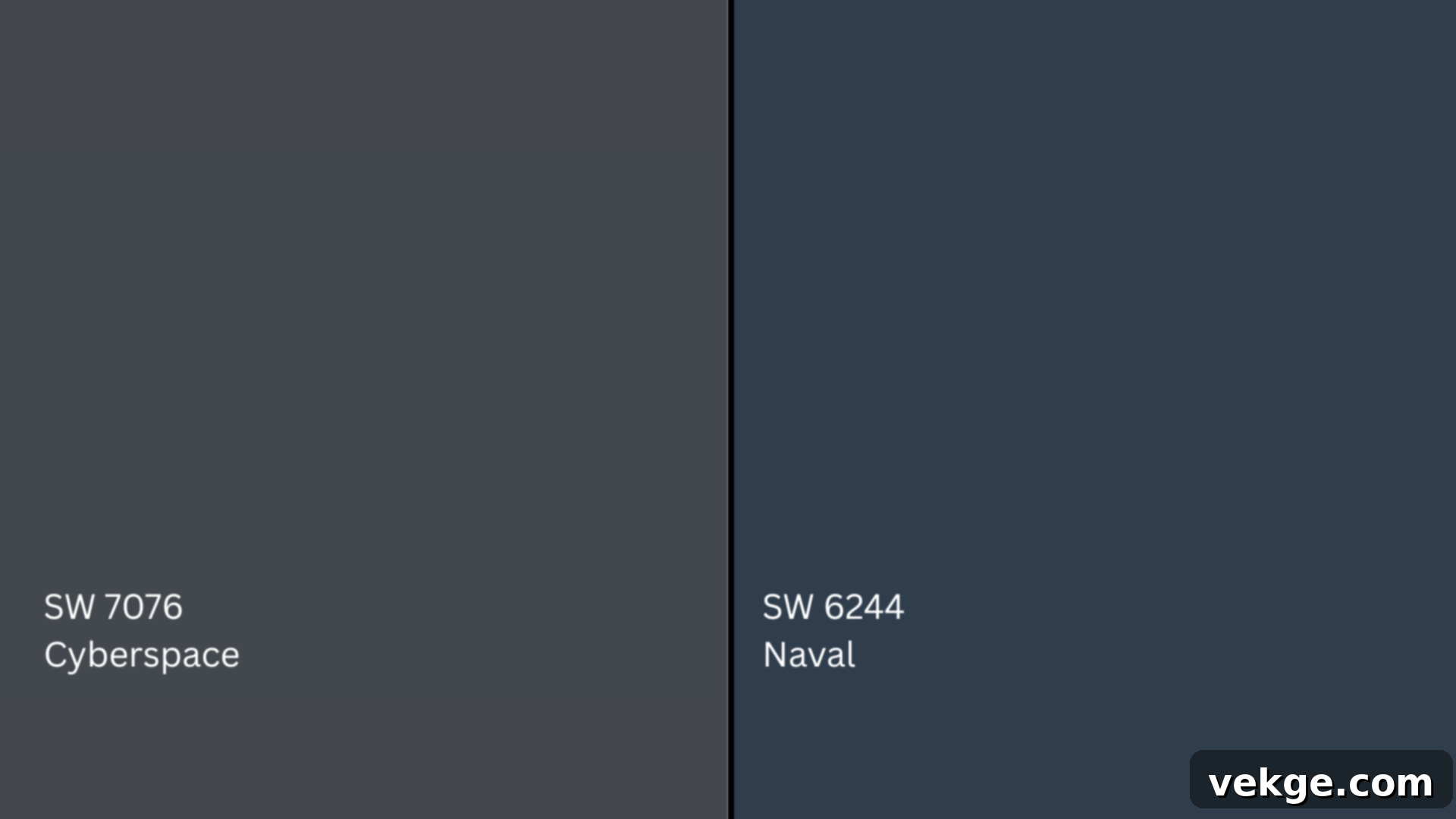
Naval (SW 6244, HEX #2F3D4C) is a highly popular, classic navy blue that is noticeably brighter and more overtly blue than Cyberspace. With an LRV of 4, it’s actually darker in its pure pigment value, but its minimal gray content makes it feel more saturated and traditionally “navy.” Naval leans less gray, giving it a more straightforward, vibrant blue presence. In contrast, Cyberspace, with its LRV of 6, feels more grounded, smoky, and modern due to its prominent gray undertone. If you’re looking for a clear, deep blue that makes a statement, Naval is a strong contender. But if you prefer a more muted, sophisticated, and slightly subdued blue-gray that feels highly contemporary, Cyberspace is the superior choice.
2. Cyberspace vs. Peppercorn (SW 7674)
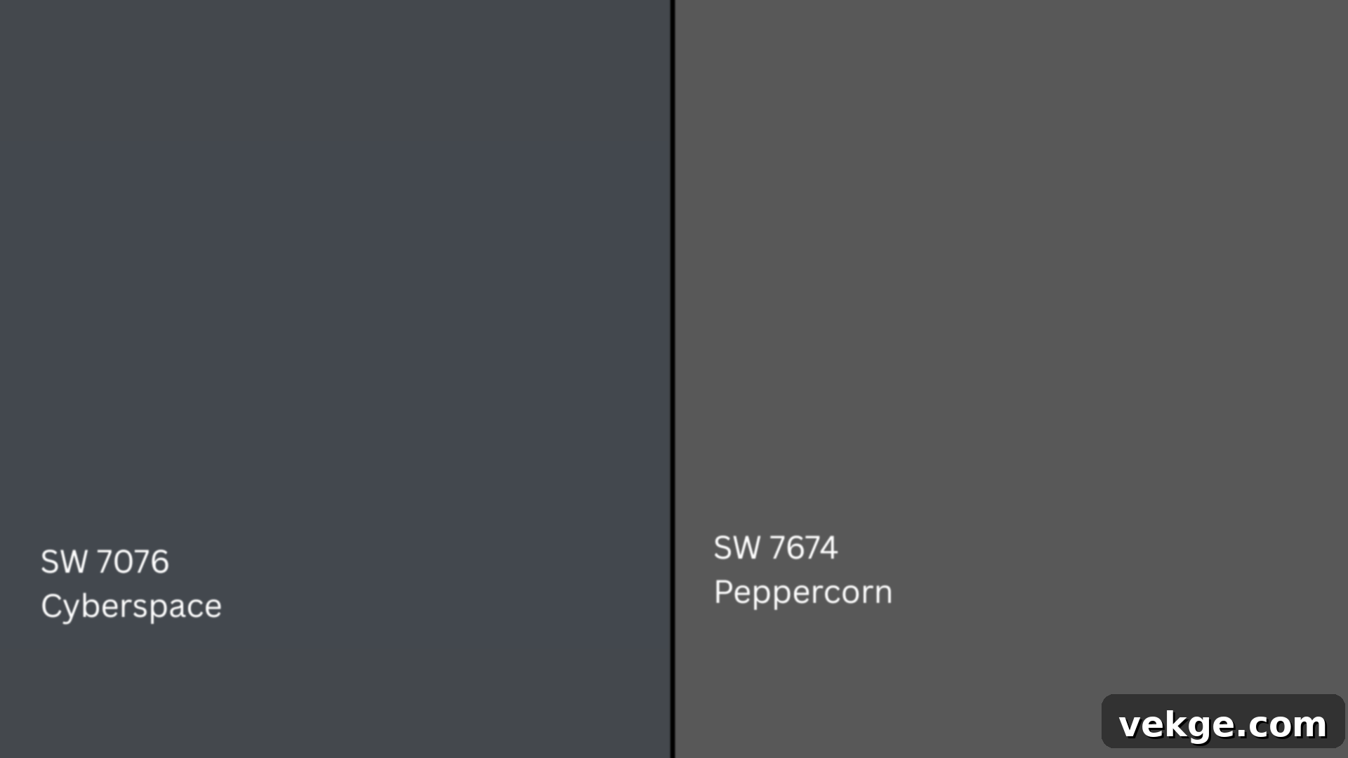
Peppercorn (SW 7674, HEX #585858) is a versatile, deep charcoal gray. Its primary characteristic is its strong gray base, which often carries a subtle, barely-there brown undertone, giving it an overall warmer feel compared to Cyberspace. Peppercorn’s LRV of 10 makes it notably lighter than Cyberspace, offering a softer, more approachable dark neutral. Cyberspace, on the other hand, reads distinctly cooler, anchored by its clear blue base and that signature smoky depth. While both are excellent dark neutrals, Peppercorn offers a sophisticated, soft charcoal that pairs well with warmer palettes, whereas Cyberspace delivers a more modern, cool-toned elegance with its blue-gray character.
3. Cyberspace vs. Iron Ore (SW 7069)
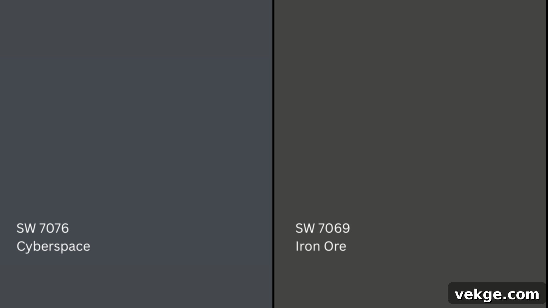
Iron Ore (SW 7069, Hex #434341) is often described as a soft black, or a very deep charcoal. It boasts significant charcoal undertones, which give it a much heavier, more grounded, and slightly industrial feel. Crucially, Iron Ore completely lacks the blue cast that defines Cyberspace. This absence of blue makes Iron Ore a more neutral dark color, leaning into a slightly brownish-black or dark gray, depending on the light. With an LRV of 6, it shares the same light reflectance value as Cyberspace, indicating a similar depth. However, its overall tone is less complex; it’s a solid, assertive dark neutral. If you’re seeking a near-black with a sophisticated, matte finish, Iron Ore is superb. But for a more dynamic, smoky blue-gray with a distinct personality, Cyberspace is the clear winner.
Undertone and LRV Comparison Table
This table offers a quick visual reference to distinguish Cyberspace from its close relatives in the Sherwin-Williams family:
| Paint Color | Undertone | LRV | Overall Tone |
|---|---|---|---|
| Cyberspace (SW 7076) | Blue with prominent gray base | 6 | Cool, grounded, smoky blue-gray |
| Naval (SW 6244) | True navy, minimal gray, slightly purple in some lights | 4 | Deep, classic, vibrant blue |
| Peppercorn (SW 7674) | Gray with subtle brown warmth | 10 | Warm, soft charcoal, approachable dark gray |
| Iron Ore (SW 7069) | Charcoal with subtle brown/green-black | 6 | Neutral, soft black, very deep charcoal |
Understanding these subtle yet significant differences in undertone and LRV allows you to confidently choose the dark neutral that perfectly aligns with your desired aesthetic and the existing elements in your space.
Best Color Pairings for Sherwin-Williams Cyberspace (SW 7076)
The beauty of a sophisticated color like Sherwin-Williams Cyberspace is truly amplified when paired with complementary shades and finishes. Its versatility allows it to harmonize with a wide spectrum of colors, from crisp whites to earthy greens and bold bronzes, creating diverse moods and styles. Thoughtful pairings can enhance its depth, highlight its undertones, or provide a necessary visual break.
Trim and Ceiling Suggestions for Cyberspace
Choosing the right trim and ceiling color is crucial for defining the edges of a room and influencing its perceived size and brightness:
- Extra White (SW 7006, HEX #EEEFEA): This is Sherwin-Williams’ purest, brightest white. When paired with Cyberspace, Extra White creates a high-contrast, ultra-crisp edge that makes the deep blue-gray stand out dramatically. It’s the ideal choice if you’re aiming for a modern, stark, and very clean aesthetic where every line is defined. It truly allows Cyberspace to pop.
- Pure White (SW 7005, HEX #EDECE6): A slightly softer white than Extra White, Pure White has a subtle hint of warmth without leaning creamy. It balances the coolness of Cyberspace beautifully, creating a more gentle contrast that doesn’t feel overly stark. This makes it a versatile choice that comfortably fits both contemporary and more traditional room designs, offering a refreshing yet approachable pairing.
- Alabaster (SW 7008, HEX #EDEAE0): Known for its creamy, soft warmth, Alabaster offers a lower-contrast pairing that softens the depth of Cyberspace. This combination creates a more welcoming, relaxed, and cozier atmosphere. It’s perfect for settings where you want to embrace Cyberspace’s deep tone but temper its intensity with a gentle, inviting glow.
Accent Wall and Furniture Colors to Complement Cyberspace
Beyond trim, specific accent colors can elevate your design, creating visual interest and harmony:
- Repose Gray (SW 7015, HEX #CCC9C0): This immensely popular soft, warm gray acts as an excellent bridge between the deep blue-gray of Cyberspace and lighter, more neutral tones. Its subtle warmth and balanced nature allow for a gentle transition, making it perfect for adjacent walls, upholstery, or accent furniture that provides a cohesive yet distinct visual element.
- Oyster Bay (SW 6206, HEX #AEB3A9): A serene green-blue, Oyster Bay brings a calming, natural element to the palette. It works beautifully alongside Cyberspace for creating coastal, spa-like, or nature-inspired spaces. Its subdued tone adds a refreshing contrast, enhancing the feeling of tranquility and connection to the outdoors, particularly effective on accent walls or upholstered pieces.
- Urbane Bronze (SW 7048, HEX #54504A): As a strong, deep brown-gray, Urbane Bronze offers serious depth and a rich, earthy contrast to Cyberspace. It’s a sophisticated pairing that deepens the overall palette, creating a luxurious and grounded feel. Ideal for built-ins, an entertainment center, or accent furniture, it contributes to a robust and highly stylized interior.
Hardware and Flooring Compatibility with Cyberspace
The right hardware and flooring choices can complete the look, tying all design elements together:
Cyberspace works exceptionally well with hardware in specific finishes that either complement its cool tones or introduce a contrasting warmth:
- Matte Black: Creates a sleek, modern, and striking contrast, emphasizing Cyberspace’s cool, sophisticated edge. It’s ideal for contemporary and minimalist designs.
- Brushed Brass/Gold: Adds a beautiful, luxurious warm touch that softens the boldness of Cyberspace and introduces a hint of traditional charm or art deco flair.
- Satin Nickel/Chrome: With its neutral, muted tone, satin nickel bridges both warm and cool palettes while maintaining a refined and understated look, suitable for transitional styles.
For flooring, careful consideration can significantly impact the room’s overall feel:
- Light Oak: Light-colored wood flooring, such as natural or white-washed oak, provides crucial brightness and keeps the room feeling open and airy. It offers a clean, organic counterbalance to Cyberspace’s weight and depth, preventing the space from feeling enclosed.
- Patterned Tile: Especially in neutral palettes of black, white, or various shades of gray and clay, patterned tile offers visual interest and layers. It highlights the deep complexity of Cyberspace without overwhelming the space, adding texture and a sense of curated design to bathrooms, kitchens, or entryways.
Paint Finish Recommendations for Sherwin-Williams Cyberspace
The paint finish you choose for Sherwin-Williams Cyberspace is just as important as the color itself, as it dramatically influences both the aesthetic appeal and the durability of the painted surface. Each finish offers a distinct look and level of practicality:
- Matte or Flat: This finish has virtually no sheen, offering a rich, velvety, and sophisticated appearance. It’s excellent for hiding minor wall imperfections and diffusing light beautifully, making Cyberspace feel incredibly deep and luxurious. It’s best suited for ceilings and low-traffic rooms like bedrooms, formal dining rooms, or home offices where durability and washability are less critical.
- Eggshell: A soft, low-sheen finish that offers a subtle glow without being overtly reflective. Eggshell is a popular choice for walls in dining rooms, hallways, and living rooms, providing a touch of polish and better durability than flat, making it more washable and forgiving. It strikes a good balance between aesthetics and functionality.
- Satin: This is a highly popular middle-ground option, known for its smooth, slightly lustrous finish. Satin provides good durability and is notably washable, making it perfect for moderate- to high-traffic areas such as living rooms, bathrooms, and kitchens. It offers a subtle sheen that enhances the color’s depth without being too shiny, making it a versatile and practical choice for most applications.
- Semi-gloss: More reflective and significantly more durable, semi-gloss is engineered for high-contact areas that require frequent cleaning. This finish is the go-to for cabinets, doors, trim, baseboards, and other architectural details. It provides a crisp, easy-to-clean surface that can withstand moisture and wear, allowing Cyberspace to look sharp and maintained.
- High-gloss: This ultra-shiny, highly reflective finish creates a dramatic, almost lacquered look, making Cyberspace appear incredibly bold and intense. While stunning, it requires meticulous surface preparation as it highlights every imperfection. High-gloss is best reserved for statement pieces like furniture, interior doors, or small accent areas where you desire a high-contrast, mirror-like effect and don’t mind the extra effort in prep and application.
Paint Equivalents in Other Brands: Cyberspace Alternatives
While Sherwin-Williams Cyberspace (SW 7076) holds a unique spot in the deep blue-gray spectrum, you might be working with a different paint brand or looking for a slightly varied interpretation of its sophisticated character. Here are some close matches from other popular paint companies that capture a similar deep, moody, and grounded feel, though each will have its own subtle nuances in undertone and saturation.
Behr Alternatives to Cyberspace
- Cracked Pepper (PPU18-01, HEX #4F5152): This is a smoky charcoal-black from Behr that carries soft blue-gray hints. It offers a similar profound depth but is generally a bit lighter and leans more neutral, with less pronounced blue than Cyberspace. It provides a sophisticated dark gray option that can work if you find Cyberspace slightly too blue.
- Nocturne Blue (HDC-CL-28, HEX #344D58): A rich, deep blue-gray blend with a subtle softness. Nocturne Blue offers a very similar muted navy feel, capturing the essence of Cyberspace’s balanced blue and gray. However, it tends to be slightly more blue-forward, making it a great alternative if you prefer the blue to be a bit more noticeable without losing the gray grounding.
Benjamin Moore Alternatives to Cyberspace
- Hale Navy (HC-154, HEX #434B56): A well-known and highly acclaimed dark navy, Hale Navy boasts a solid balance of blue and gray, making it a beloved choice. It is generally a touch brighter and slightly more overtly blue than Cyberspace, offering a classic, grounded navy that is incredibly versatile. If you want a timeless navy with a strong presence, Hale Navy is a fantastic option, though Cyberspace offers a smokier, slightly more muted take.
- Soot (2129-20, HEX #373C41): Benjamin Moore’s Soot is a near-black with noticeable cool undertones, leaning into a deep charcoal. It is less blue than Cyberspace and more distinctly charcoal-black, but it still maintains a rich and dramatic quality. It’s an excellent choice if you’re seeking a very deep, almost-black color that still has depth and complexity without the pronounced blue cast of Cyberspace.
Valspar Alternatives to Cyberspace
- Indigo Streamer (4010-4 HEX #22394a): This is a bold, dark navy from Valspar that undeniably leans more blue than Cyberspace. It’s a powerful choice for creating high-contrast spaces and delivering a strong statement of deep blue. If your preference is for a more intense blue with less gray influence, Indigo Streamer could be an excellent alternative.
- Cobalt Cannon (5001-2C, HEX #4b5558): Valspar’s Cobalt Cannon presents a steely blue-gray with significant cool depth. It is quite close in feel to Cyberspace’s unique blend of blue and gray, offering a similar sophisticated and grounded presence. This shade is a strong contender if you’re aiming for that balanced, deep blue-gray character found in Cyberspace within the Valspar palette.
Pro Tip: Due to the subtle variations between brands and the impact of individual room lighting, always purchase paint samples and test them in your space. Observe how each alternative interacts with your natural and artificial light sources throughout the day. This crucial step will ensure that your chosen shade delivers the exact look and feel you envision for your home.
Conclusion: Embracing the Sophisticated Depth of Sherwin-Williams Cyberspace
Sherwin-Williams Cyberspace (SW 7076) truly stands out as a consistently reliable and profoundly beautiful paint color, one that I find myself returning to time and again. Its unique ability to strike a balance between a bold, deep presence and an inviting, grounded feel is what makes it so exceptional. Whether applied to the modern lines of kitchen cabinets, the welcoming expanse of a front door, or as the enveloping backdrop of an entire wall, it invariably introduces a sense of substantial weight and sophistication without ever making a room feel confined or overwhelming.
Through this comprehensive guide, you now possess a detailed understanding of this remarkable hue: its appearance in real-world settings, the dynamic ways it shifts under different lighting conditions, and the ideal palette of colors, finishes, and materials that harmonize with it. You’ve explored its nuanced undertones, compared it to other popular dark neutrals, and discovered suitable alternatives should you wish to explore other brands.
If you’ve been contemplating a deeper shade for your home but are wary of anything too stark, overly cool, or visually distracting, Sherwin-Williams Cyberspace might just be the perfect solution. Its elegant blue-gray character offers a refreshing take on dark interiors, promising a sophisticated and enduring aesthetic. For those still on the journey of discovering their ideal color palette, continue to explore. There are countless inspiring shades waiting to transform your space, and I encourage you to delve into other resources for more detailed insights and creative ideas.
