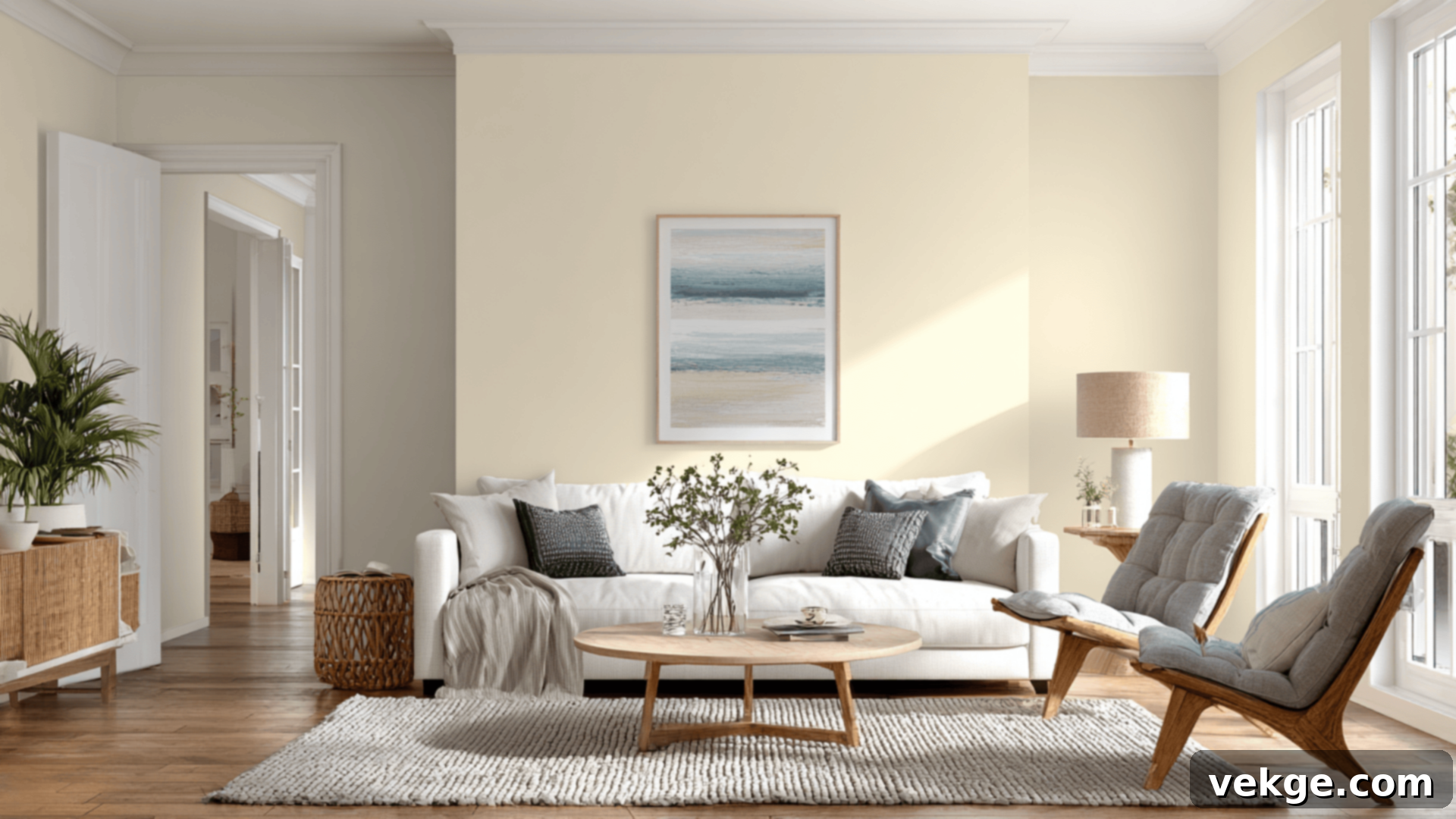
Sherwin-Williams Gossamer Veil (SW 9165): The Perfect Warm Gray Paint Color Guide
Finding the ideal paint color for your home can often feel like a never-ending quest. Many of us have experienced the frustration of selecting a “light gray” only to see it transform into an unexpected green, purple, or an icy blue once applied to the walls. The challenge lies in discovering that elusive neutral shade that provides warmth and sophistication without any unwelcome surprises.
That’s precisely why this comprehensive guide has been created: to assist you in determining if Sherwin-Williams Gossamer Veil (SW 9165) is the quintessential warm gray you’ve been searching for to enhance your living space. This particular hue, while seemingly simple at first glance, reveals remarkable depth and character once it graces your walls, making it a designer favorite.
Within this detailed review, we’ll explore how Gossamer Veil truly appears in various real-world room settings, delve into its nuanced undertones, and compare it against other highly popular Sherwin-Williams gray and greige paints. You’ll also learn about the best complementary colors and finishes, practical sampling tips, convenient buying options, and close equivalents from other leading paint brands. Let’s embark on a deeper dive into this captivating neutral.
Getting to Know Sherwin-Williams Gossamer Veil (SW 9165)

Gossamer Veil (SW 9165, #D3CEC4) is an exquisitely soft, warm gray originating from Sherwin-Williams’ esteemed Neutral Paint Colors Collection. It masterfully occupies the sweet spot between a light greige and a soft taupe, distinguishing itself as a top choice for those seeking a contemporary neutral that still offers a subtle, inviting hint of warmth. This makes it incredibly adaptable across various design aesthetics.
Basic Color Profile of Gossamer Veil
- HEX code: #D3CEC4
- LRV (Light Reflectance Value): 62
- Color family: Warm gray / greige
With an LRV of 62, Gossamer Veil strikes a remarkable balance. It’s not so light that it washes out, nor is it so dark that it feels heavy. It achieves a perfect equilibrium, avoiding the pitfalls of being overly beige or excessively gray. This harmonious blend of characteristics renders it an exceptional candidate for expansive open-concept floor plans and for crafting a cohesive, harmonious whole-home color palette that flows effortlessly from one room to another.
Gossamer Veil Undertones Explained
One of Gossamer Veil’s most compelling attributes lies in its nuanced undertones. It primarily features warm taupe undertones, which are often complemented by a delicate suggestion of green or beige, depending entirely on the unique lighting conditions of a room.
- In abundant natural daylight, particularly in south- or west-facing rooms that receive warm, direct light, Gossamer Veil leans distinctly warm and soft, exuding a comforting glow.
- Conversely, in more shadowed areas or north-facing spaces where light is typically cooler and indirect, it can adopt a more muted, slightly greige tone, offering a sophisticated and understated appearance.
The principal reason for this color’s widespread popularity stems from the fact that its undertones are both subtle and remarkably flexible. They very rarely shift too intensely in any single direction, which makes Gossamer Veil exceptionally easy to integrate into diverse decorating schemes and pair with a wide array of existing finishes and furnishings, ensuring a consistently refined look.
Sherwin-Williams Gossamer Veil in Real Spaces
This chameleon-like shade possesses enough neutrality to be utilized almost universally, yet it consistently manages to infuse character and a sophisticated touch into any environment. Here’s a closer look at what you can anticipate when incorporating Gossamer Veil into different areas of your home:
How Gossamer Veil Looks in Different Rooms
Kitchens
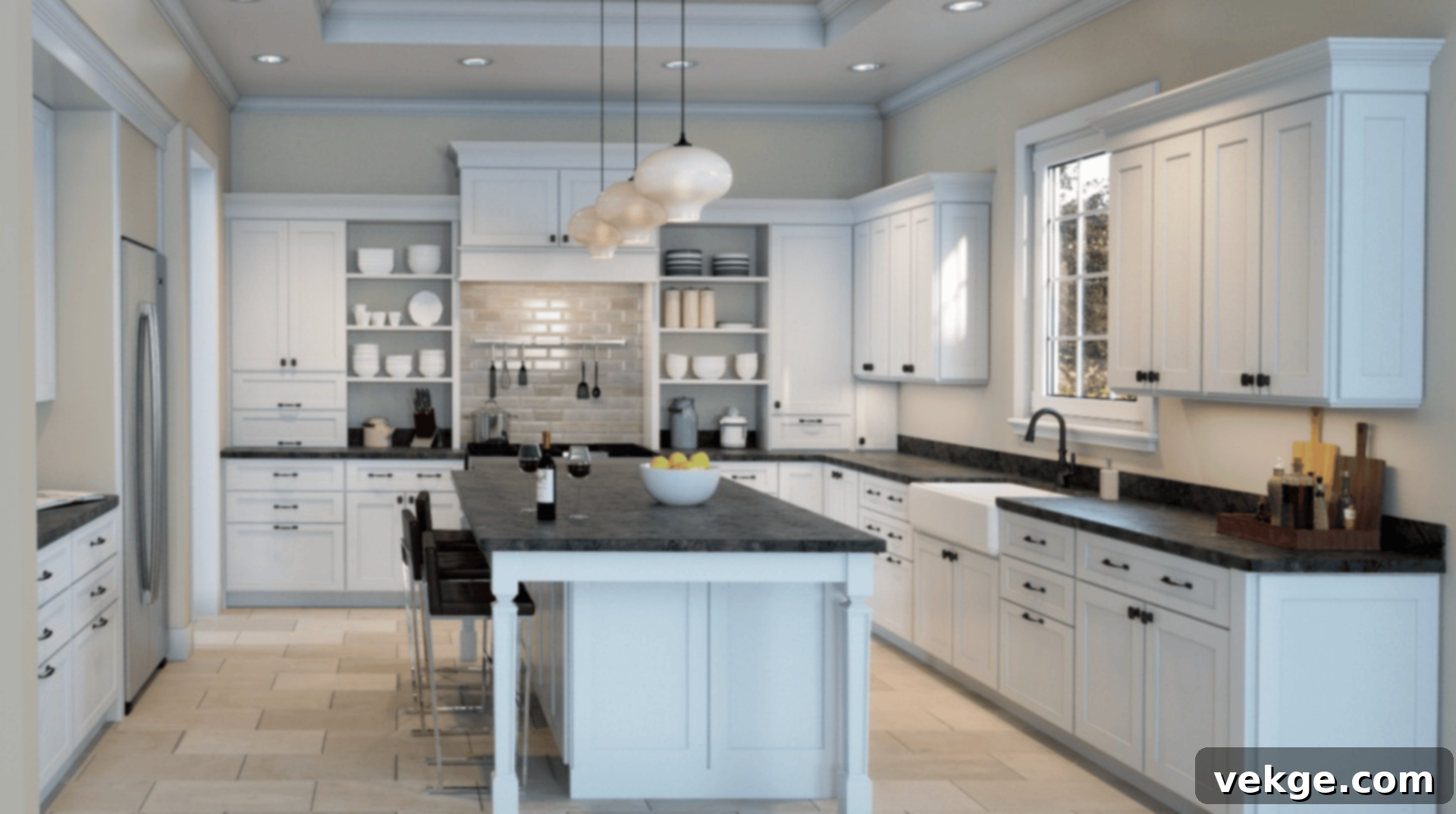
Gossamer Veil stands out as a prime selection for kitchen walls or cabinetry. It skillfully softens the crispness of white countertops, creating a harmonious balance, and pairs exceptionally well with a range of elements such as brushed nickel hardware, natural wood tones, and sleek stainless steel appliances. Its ability to read as warm yet distinctly not beige makes it an impeccable choice for achieving that coveted transitional kitchen design that feels both modern and inviting. Consider using it on lower cabinets with a brighter white on uppers for a layered effect.
Bathrooms
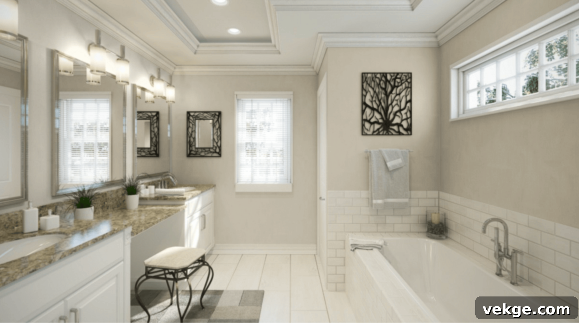
In bathrooms, this color masterfully imparts a gentle, serene, and almost spa-like ambiance, transforming the space into a tranquil retreat. It maintains a clean and fresh appearance when contrasted with white tile and luxurious marble, crucially avoiding the overly cold or sterile sensation that some grays can evoke. In more compact bathrooms lacking natural light, Gossamer Veil might lean a subtle touch more towards its beige undertones, adding to its cozy appeal.
Living Rooms
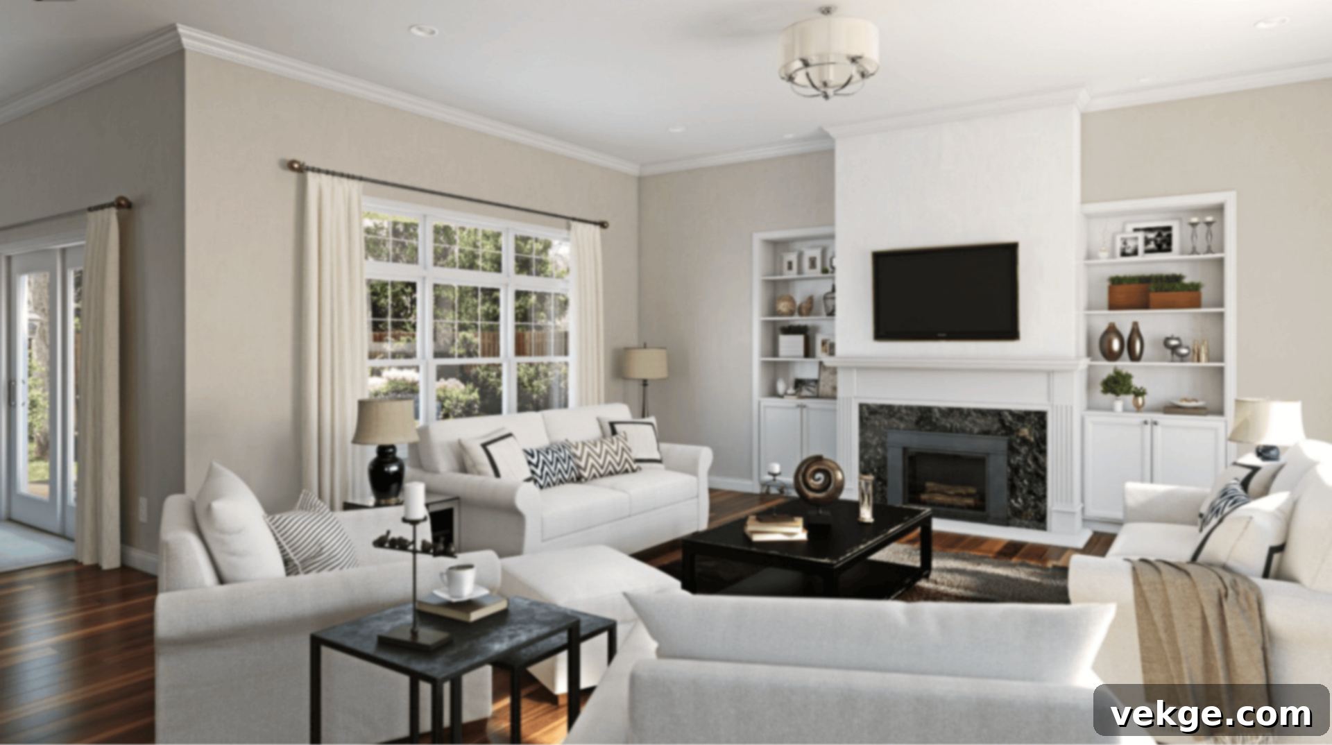
Gossamer Veil performs beautifully in living rooms, serving as an adaptable backdrop that complements nearly any interior style, from contemporary to farmhouse. It cultivates a calm and sophisticated atmosphere without ever making the space feel washed out or bland. It looks particularly stunning when combined with richly layered textures, such as linen or wool, and soft, natural wood furniture, enhancing its inherent warmth and inviting appeal.
Bedrooms
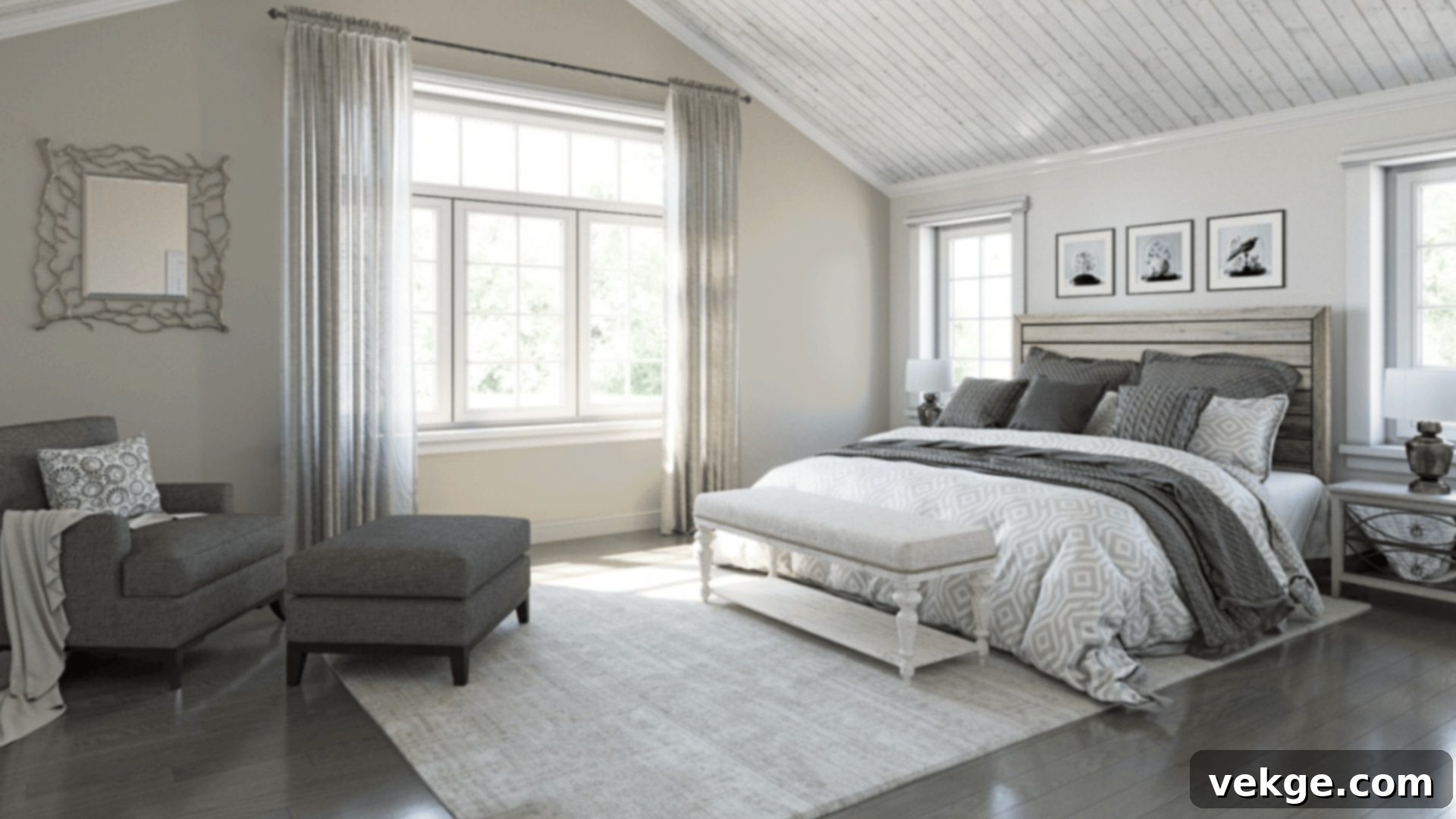
For those aspiring to create a truly cozy and neutral bedroom sanctuary, Gossamer Veil emerges as an exceptionally strong contender. It harmonizes effortlessly with crisp whites, other subtle greige tones, and delicate dusty pastels, allowing for a diverse range of accent colors. The underlying soft taupe warmth is key, preventing the room from feeling either too cool or oppressively dark, thus ensuring a perpetually inviting and restful environment suitable for all ages.
How Lighting Affects Gossamer Veil
Gossamer Veil’s Light Reflectance Value (LRV) of 62 signifies that it possesses an excellent capacity to reflect a significant amount of light, while simultaneously retaining sufficient depth and contrast to be noticeable on the walls. Its appearance is wonderfully dynamic, shifting subtly throughout the day and depending on the room’s orientation:
- North-facing rooms: Characterized by cooler, indirect light, these spaces tend to make Gossamer Veil appear more muted and lean towards a sophisticated gray-taupe, especially pronounced during early morning hours or on overcast days. Consider warmer artificial lighting to balance this out.
- South-facing rooms: Benefiting from consistent, warm light throughout the day, Gossamer Veil in these rooms typically presents as softer, significantly warmer, and can sometimes even lean towards a light, welcoming beige tone, enhancing its inherent creaminess.
- East-facing rooms: The gentle morning light in east-facing rooms brings out the creamy side of Gossamer Veil, making it look fresh and bright. However, as the day progresses into the afternoon, the light fades, and the color may subtly gray down, offering a different, quieter mood.
- West-facing rooms: These rooms are bathed in the rich, warm glow of the afternoon sun, which intensifies Gossamer Veil’s inherent richness. This lighting orientation gives the color a slightly deeper, exceptionally cozier feel compared to other exposures, making it ideal for evening relaxation.
Understanding these lighting nuances is crucial for predicting how Gossamer Veil will truly behave in your specific space, allowing you to choose complementary decor and artificial lighting accordingly.
Gossamer Veil vs. Other Sherwin-Williams Grays
Sherwin-Williams boasts an impressive array of warm neutrals, making the selection process both exciting and challenging. Here’s a comparative analysis of Gossamer Veil against some of the brand’s most popular and frequently chosen options:
Gossamer Veil vs. Agreeable Gray (SW 7029)
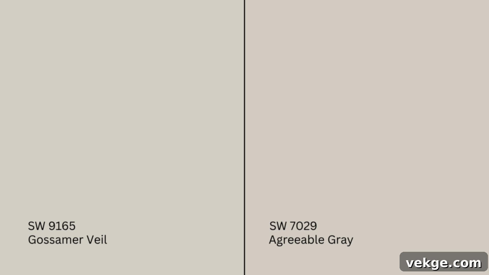
Agreeable Gray (SW 7029, #D1CBC1) holds the distinction of being one of the most widely utilized greiges within the entire Sherwin-Williams paint catalog. While both are fantastic neutrals, they have distinct differences:
- Agreeable Gray generally appears warmer and possesses more prominent beige undertones, giving it a slightly cozier, more traditional feel.
- Gossamer Veil, in comparison, is slightly lighter and carries a subtle coolness, lending itself to a more airy and modern aesthetic.
Recommendation: Opt for Agreeable Gray if your aim is to create cozy, traditional, or farmhouse-style spaces. Conversely, choose Gossamer Veil for achieving lighter, more contemporary interiors that benefit from a fresher, yet still warm, neutral backdrop.
Gossamer Veil vs. Repose Gray (SW 7015)
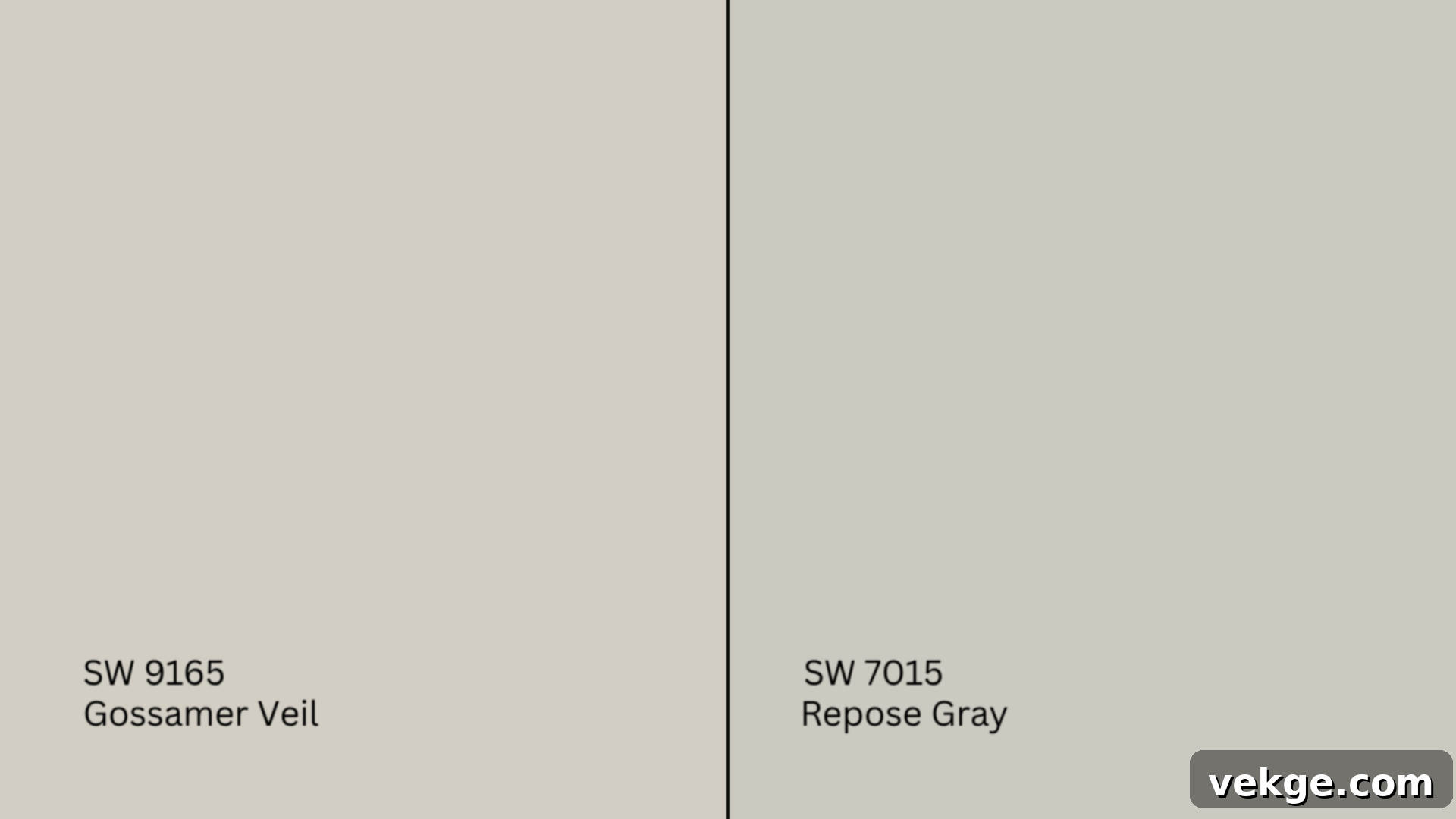
Repose Gray (SW 7015, #CCC9C0) is a highly sought-after greige that consistently leans slightly cool and is known for its discernible violet undertone, which can become more apparent in certain lighting conditions.
- Repose Gray has a distinctively grayer feel and often appears more distinctly modern, especially when paired with cooler accents.
- Gossamer Veil consistently reads as warmer and softer in the vast majority of rooms, offering a more gentle, inviting ambiance.
Recommendation: Repose Gray integrates beautifully with crisp whites and cooler-toned decor elements. Gossamer Veil, with its more balanced warmth, offers greater versatility for interiors that favor warmer furnishings and accessories.
Gossamer Veil vs. Drift of Mist (SW 9166)
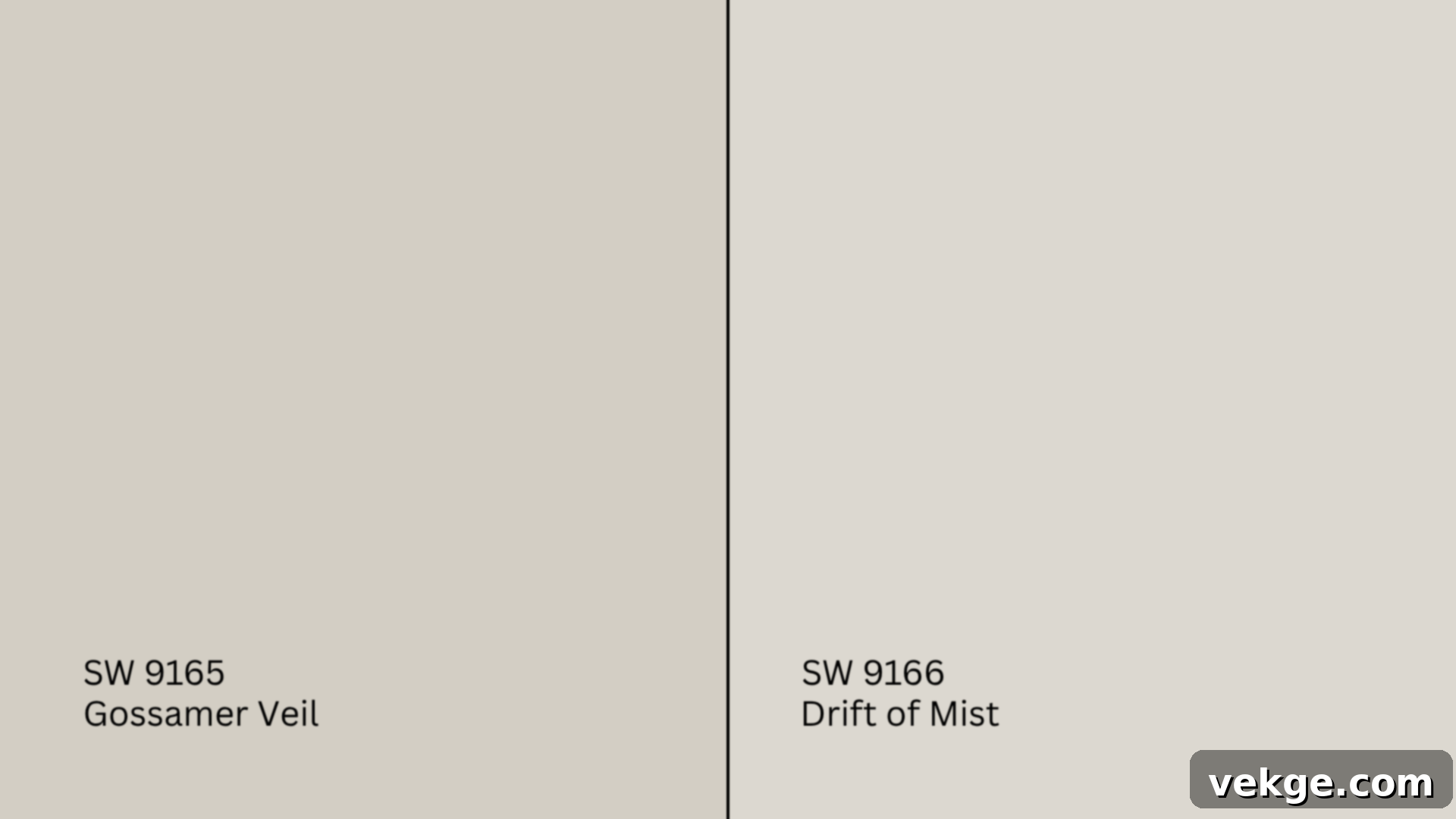
Drift of Mist (SW 9166, #DCD8D0) is conveniently the next shade lighter on the very same color strip as Gossamer Veil, making them closely related yet distinct.
- Drift of Mist appears cooler and is much closer to a true off-white, providing a lighter and airier feel.
- Gossamer Veil provides more depth and body, making a more noticeable statement without being overpowering.
Recommendation: Utilize Drift of Mist when your goal is a brighter, almost ethereal backdrop for your space. Conversely, Gossamer Veil is the superior choice if you desire a bit more contrast and a noticeable, yet soft, color on your walls.
Gossamer Veil vs. Alpaca (SW 7022)
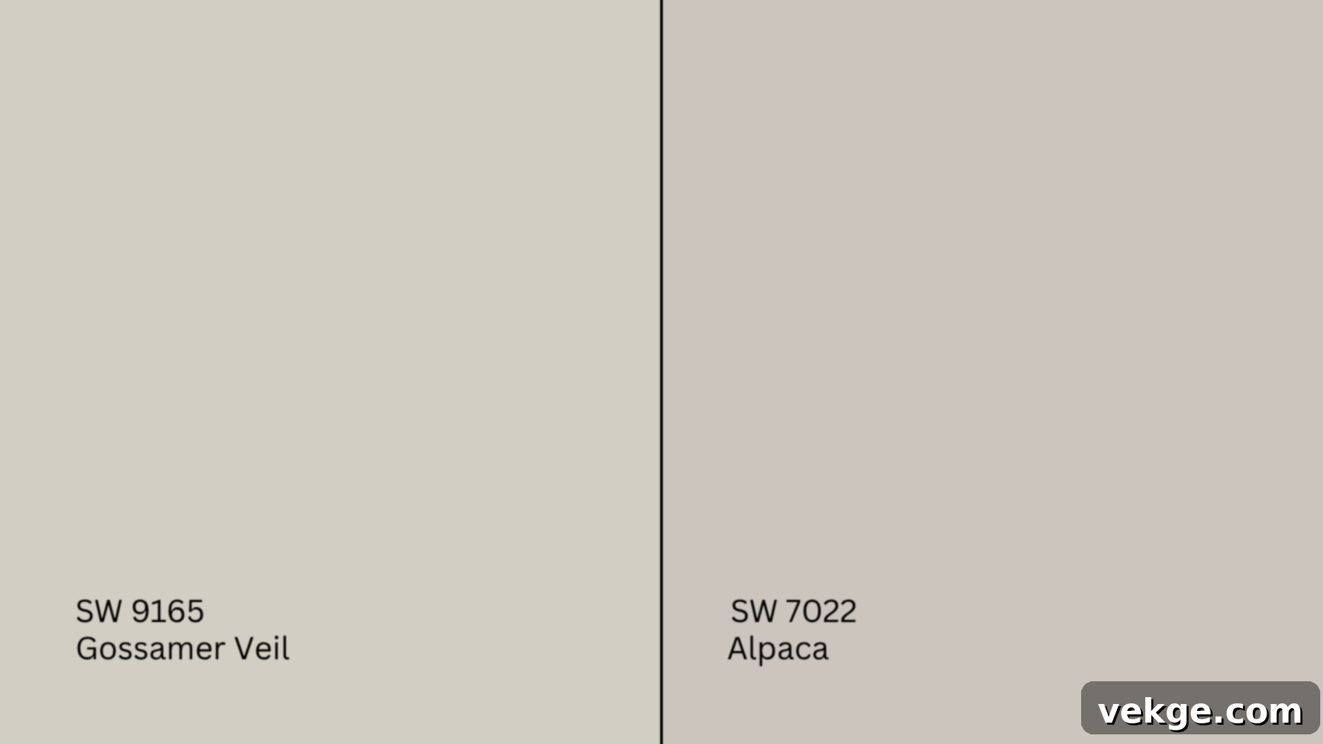
Alpaca (SW 7022, #CCC5BD) is another popular warm greige, but it is characterized by a more pronounced violet-pink undertone that demands careful consideration, particularly in specific lighting.
- Alpaca, due to its undertones, can occasionally flash purple or pink in cooler light conditions, requiring a specific color palette.
- Gossamer Veil is considerably more balanced and generally easier to pair with a broader range of colors and materials, thanks to its more subtle undertones.
Recommendation: Select Alpaca if your interior design palette intentionally incorporates rosy, mauve, or berry tones, where its unique undertones can be celebrated. Stick with Gossamer Veil if you prioritize a highly flexible, go-to neutral that adapts readily to various decorative elements.
Undertone and LRV Comparison Table
| Paint Color | Undertones | LRV | Warm or Cool |
|---|---|---|---|
| Gossamer Veil (SW 9165) | Taupe, subtle beige-gray | 62 | Warm |
| Agreeable Gray (SW 7029) | Beige-gray | 60 | Warm |
| Repose Gray (SW 7015) | Gray, violet | 58 | Cool-Neutral |
| Drift of Mist (SW 9166) | Light gray, hint of green-taupe | 69 | Neutral-Cool |
| Alpaca (SW 7022) | Greige, violet-pink | 57 | Warm |
Important Note: It is absolutely essential to sample all of these colors on your actual walls before making a final decision. Undertones, which may appear very similar on a small paint chip, can dramatically shift and become more pronounced once applied to a larger surface and exposed to your home’s unique lighting conditions.
Best Color Pairings for Sherwin-Williams Gossamer Veil
This soft greige hue possesses an incredible ability to either seamlessly blend into the background or gracefully stand out, entirely depending on how thoughtfully you pair it with other colors and materials. Here’s an exploration of the combinations that consistently yield the most aesthetically pleasing results:
Trim and Ceiling Suggestions for Gossamer Veil
Choosing the right trim and ceiling color is crucial for defining the sophistication of Gossamer Veil. These popular whites create a polished look:
- Pure White (SW 7005, #EDECE6): This crisp, bright white offers a clean, distinctly modern edge. Its minimal competing undertones ensure that Gossamer Veil’s inherent warmth can truly shine without any distraction. It creates a sharp, well-defined contrast.
- Alabaster (SW 7008, #EDEAE0): A wonderfully soft, warm white that perfectly complements Gossamer Veil’s gentle warmth. Alabaster offers a harmonious blend, adding a subtle richness without ever overpowering the delicate nature of Gossamer Veil. It’s excellent for a cohesive, natural feel.
- Greek Villa (SW 7551, #F0ECE2): This creamy, inviting white provides a more noticeable contrast than Alabaster, adding significant depth and contributing to a cozy, classic, and slightly aged look in the room. It’s perfect for spaces desiring an understated elegance.
For a truly polished and intentional finish, the standard combination of flat ceilings, with satin or semi-gloss trim, will make Gossamer Veil feel elevated and thoughtfully designed, enhancing the architectural features of your home.
Accent Wall and Furniture Colors with Gossamer Veil
Gossamer Veil offers a flexible canvas for a variety of accent colors, allowing you to tailor the mood of your space:
- To maintain a calm and cozy atmosphere: Explore soft sage greens, additional warm greiges for layered neutrality, creamy whites to brighten, or gentle dusty blush tones for a touch of subtle color and serenity. These choices foster a relaxed and inviting environment.
- For impactful contrast and added depth: Consider bolder choices such as deep navy blues, sophisticated charcoal grays, rich olive greens, or even striking black accents. These darker hues provide a dramatic counterpoint, making Gossamer Veil feel even more vibrant by comparison.
In terms of textures and materials, Gossamer Veil truly comes alive when paired with natural wood tones (like oak, maple, or walnut), luxurious linen textures, and a variety of organic elements. Enhance visual interest and tactile appeal with woven baskets, handcrafted matte pottery, or thoughtfully layered textiles and throws. These elements echo the natural, understated beauty of the paint color.
Hardware and Flooring Compatibility
The choice of hardware and flooring can significantly influence the overall perception of Gossamer Veil:
- This versatile color pairs exceptionally well with brushed brass or soft gold finishes for an infusion of elegant warmth and a touch of luxury. Alternatively, opt for sleek black hardware if your goal is a more striking contrast in a modern, industrial, or contemporary farmhouse-inspired space.
- Polished nickel remains a timeless and safe choice, consistently offering a clean, classic, and understated look, particularly in kitchens and bathrooms where durability and a fresh aesthetic are paramount.
- For flooring, light-toned woods such as white oak or ash are excellent for maintaining a bright, open, and airy feel. Medium-tone woods like walnut or natural maple introduce beautiful warmth and depth, perfect for creating a grounding effect in bathrooms and kitchens. For tile, beige, taupe, or greige stone options pair naturally and harmoniously with Gossamer Veil, creating a seamless and sophisticated foundation.
Paint Finish Recommendations for Sherwin-Williams Gossamer Veil
The ideal paint finish for Gossamer Veil will largely depend on the specific room’s function, its expected foot traffic, and the amount and type of lighting it receives. Each finish offers distinct benefits:
- Matte: This finish is best suited for ceilings and serene, low-traffic bedrooms. Its ability to absorb light helps to conceal minor surface imperfections and provides a soft, velvety appearance. However, it scuffs relatively easily and isn’t recommended for messy or high-traffic areas where durability is key.
- Eggshell: Representing a perfectly balanced finish, eggshell is an excellent choice for living rooms, dining rooms, or hallways. It features a soft, subtle sheen that offers a degree of resistance to minor dirt and smudges, reflecting just enough light to add dimension without appearing overly shiny. It’s a great all-rounder for general living spaces.
- Satin: Highly recommended for busy areas like kitchens, bathrooms, or children’s play spaces. Satin is notably durable, easy to wipe down and clean, and effectively highlights Gossamer Veil’s inherent warmth under both natural daylight and artificial lighting, providing a gentle glow.
- Semi-Gloss: This finish is exceptionally well-suited for doors, trim, and cabinetry. Semi-gloss is highly washable, extremely durable, and imparts a crisp, clean edge to painted surfaces with a noticeable, yet not overwhelming, shine that enhances architectural details.
- High-Gloss: Typically reserved for bold furniture pieces, accent items, or dramatic architectural statements. High-gloss finishes are super reflective and can be visually stunning, but they demand meticulous surface preparation and flawless application, as every single flaw or brushstroke will be highly visible.
To ensure you make the best choice, it’s always wise to test multiple finishes on a hidden section of your wall or on a large sample board. This hands-on approach will reveal which finish truly makes Gossamer Veil feel just right in your unique home environment.
Sampling and Buying Options for Gossamer Veil
Testing paint colors in your home environment is arguably the most critical step to ensure satisfaction. Don’t skip it!
Where to Get Peel-and-Stick Samples
Peel-and-stick samples are an invaluable tool for testing paint colors without the mess and commitment of painting directly on your walls:
- Samplize: Offers large, repositionable peel-and-stick samples made with authentic Sherwin-Williams paint. These are incredibly convenient as you can move them around different walls and observe the color under various lighting conditions throughout the day.
- Sherwin-Williams stores: Provide traditional paint chips (ideal for initial screening) and small sample pots of actual paint, allowing you to paint larger swatches on a poster board.
- Local hardware stores: Some independent or chain hardware stores may offer small custom samples or color-matching services if you bring in a Gossamer Veil paint chip.
Expert Tip: Always apply your samples to multiple walls within a room, and be sure to check them consistently in natural daylight, varying artificial light (warm, cool), and during different times of the day. This comprehensive evaluation makes all the difference in understanding how the color truly behaves.
Where to Buy Sherwin-Williams Gossamer Veil Paint
Once you’re confident in your color choice, purchasing Gossamer Veil is straightforward:
- Sherwin-Williams.com: You can conveniently order your paint online for home delivery or opt for in-store pickup at your nearest Sherwin-Williams location.
- Sherwin-Williams retail locations: These dedicated stores carry all available finishes, a full range of colors, and helpful painting tools. Their staff are also excellent resources for expert advice.
- Authorized paint retailers: Some hardware stores and independent paint shops are authorized to carry Sherwin-Williams products or offer precise color-matching services for specific hues like Gossamer Veil.
Money-Saving Tip: Keep an eye out for Sherwin-Williams’ frequent seasonal 30–40% off sales. These are fantastic opportunities to purchase gallons for your project at a significantly reduced price, making your renovation more budget-friendly.
Paint Equivalents in Other Brands
While an exact duplication of Sherwin-Williams Gossamer Veil in another brand is virtually impossible due to proprietary formulations and pigment combinations, you can find very close matches that capture a similar essence. These options are often quite similar in their overall warm gray or greige appearance:
- Benjamin Moore: Consider Edgecomb Gray (HC-173, #DAD1C4) or Balboa Mist (OC-27, #DAD5CC). Both are beloved warm grays with greige undertones, offering similar versatility.
- Behr: Check out Silver Drop (790C-2, #DCD8CF) or Wheat Bread (720C-3, #CBC3B8). These offer a comparable soft, muted gray warmth that could serve as a good alternative.
- Valspar: Explore Filtered Shade (4003-1B, #CDCBC4) or Gravity (4005-1B, #C7C9C8). Both present as gentle, versatile grays with subtle warmth.
While these alternatives will be quite close in appearance, they will not be identical. Even minute shifts in undertone, pigment, or finish can create a noticeable difference on your walls. Therefore, it is strongly recommended that you still acquire and test samples of these equivalent colors alongside Gossamer Veil in your home to ensure the chosen shade perfectly aligns with your vision.
Conclusion: Is Sherwin-Williams Gossamer Veil Right for You?
If your quest is for a sophisticated warm gray paint color that feels inherently soft, undeniably modern, and remarkably easy to integrate into a variety of interior design styles, then Sherwin-Williams Gossamer Veil (SW 9165) is not just worth considering, but truly deserves a top spot on your shortlist.
By now, you possess a comprehensive understanding of how this adaptable color gracefully presents itself in different rooms and under varying lighting conditions. You’re also equipped with insights into how it stands up against other popular neutral shades from Sherwin-Williams, helping you make an informed comparison. Furthermore, you’re aware of which finishes, hardware choices, and complementary color pairings will best enhance its nuanced beauty, allowing you to curate a cohesive and inviting space.
Before making your final commitment to gallons of paint, the single most valuable piece of advice is to grab a large peel-and-stick sample or a sample pot and test Gossamer Veil extensively in your actual home environment. This personal evaluation is the definitive way to confirm if this particular warm gray delivers the precise balance of warmth, light, and understated elegance you envision for your space.
Are you still exploring other paint options or perhaps seeking more inspiration for your next home transformation project? We’ve compiled a wealth of in-depth guides, much like this one, on various captivating paint colors on our website. Take the time to explore them thoroughly; it’s always best to be completely confident in your color choice before you even think about opening that first can of paint!
