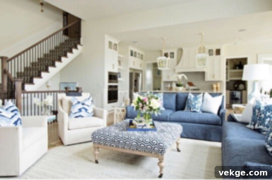
Unveiling Sherwin Williams Alabaster (SW 7008): The Ultimate Guide to This Beloved Warm White Paint
Sherwin Williams Alabaster (SW 7008) stands out as one of the most cherished and widely-used paint colors in modern interior and exterior design. This exquisite shade has captured the hearts of homeowners and design professionals alike, soaring to widespread popularity across social media and throughout the nation. Alabaster offers a unique take on white: it’s a soft, inviting white infused with a subtle yellow undertone. Unlike stark, clinical whites, or cooler, grayish tones, Alabaster strikes a perfect balance, providing brightness without feeling cold or austere. It’s not as crisp as Benjamin Moore’s Super White, nor does it carry the discernible gray notes often found in colors like Benjamin Moore White Dove.
Choosing the right white paint can be a daunting task, but Alabaster presents an exceptional option for those seeking a home that feels bright, airy, and undeniably warm. If your goal is to infuse your living spaces with an inviting and cozy atmosphere without committing to a strong color, then SW Alabaster might be your ideal match. Before embarking on any painting project, it’s crucial to thoroughly understand the characteristics, advantages, and potential considerations of a paint color. This comprehensive guide compiles expert insights and real-world feedback, gathering all the essential information about Sherwin Williams Alabaster (SW 7008) in one convenient place, including its stunning application in areas like the living room.
What is Sherwin Williams Alabaster (SW 7008)?
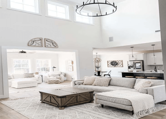
Sherwin Williams Alabaster, officially designated as SW 7008, is more than just a paint color; it’s often considered the flagship off-white of the brand. Its remarkable luminosity and broad appeal have earned it numerous accolades, most notably being named the Sherwin Williams Color of the Year in 2016. This recognition solidified its status as a timeless and versatile choice for contemporary design. Alabaster is classified as an off-white color, meaning it’s not a pure, unadulterated white. Instead, it carries subtle nuances that prevent it from appearing too sterile, creating a softer, more inviting ambiance.
At its core, Sherwin Williams Alabaster is a warm white. This warmth is attributed to its delicate yellow undertone. Unlike cooler whites that might lean towards blue or gray, Alabaster’s creamy hint creates a soothing and welcoming feel. This characteristic makes it an excellent choice for crafting cozy living spaces, serene bedrooms, or bright and inviting kitchens. Its ability to adapt to various lighting conditions and complementary colors is a testament to its expertly balanced composition.
Understanding Alabaster’s LRV (Light Reflectance Value)

The Light Reflectance Value (LRV) is a crucial metric in paint selection, measuring the percentage of visible and usable light that a paint color reflects. The LRV scale ranges from 0 (absolute black, absorbing all light) to 100 (pure white, reflecting all light). Understanding a paint’s LRV helps predict how bright or dark a room will feel when painted with that color.
Sherwin Williams Alabaster (SW 7008) boasts an impressive LRV of 82 out of 100. This high LRV indicates that Alabaster is an excellent light reflector, making rooms feel larger, brighter, and more open. While it doesn’t reach the absolute reflectiveness of a pure white (which would have an LRV closer to 100), its score of 82 is notably high for an off-white. This high LRV, combined with its warm yellow undertone, allows Alabaster to perfectly reflect light without feeling stark or cold. Instead, it diffuses light gently, creating a soft glow that enhances the mood of any room. This balance makes Alabaster a go-to choice for homeowners looking to brighten their space while maintaining a cozy and inviting ambiance.
Is Sherwin Williams Alabaster Warm or Cool?
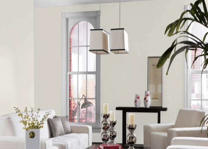
Without a doubt, Sherwin Williams Alabaster (SW 7008) is categorized as a warm white. Its distinct yellow undertone is the primary characteristic that imparts this warmth, setting it apart from cooler whites that often carry blue or gray nuances. This inherent warmth is precisely why Alabaster is so beloved by those seeking a bright yet comforting paint color for their homes.
However, it’s essential to understand how natural light influences Alabaster’s appearance throughout the day and in different rooms. The direction a room faces plays a significant role in how its warmth is perceived:
- North-Facing Rooms: In rooms with northern exposure, which typically receive cooler, indirect light, Alabaster’s warmth truly shines. It helps to counteract the cool light, preventing the room from feeling chilly or drab, instead bringing a much-needed sense of coziness and brightness.
- South-Facing Rooms: In contrast, rooms bathed in abundant warm, direct light from a southern exposure will amplify Alabaster’s yellow undertone. The paint will appear even creamier and warmer, exuding a deep sense of comfort and sunlit radiance.
- East-Facing Rooms: East-facing rooms receive bright, warm light in the mornings, which will highlight Alabaster’s creamy qualities. As the day progresses and the light softens, Alabaster will maintain its inviting warmth without becoming dull.
- West-Facing Rooms: In the afternoons, west-facing rooms are flooded with intense, warm light. This can make Alabaster appear even more golden and inviting, perfect for evening gatherings.
Beyond natural light, artificial lighting also impacts Alabaster’s look. Warm-toned light bulbs (2700K-3000K) will enhance its creamy yellow undertones, making the room feel even cozier. Cooler-toned bulbs (4000K-5000K) can subtly neutralize some of the yellow, making it appear slightly crisper, but its inherent warmth will always be present. If you’re looking for a white that consistently provides a soft, welcoming glow without being overly yellow or stark, Alabaster is an exceptional candidate.
The Unmatched Versatility of SW Alabaster
One of the most compelling attributes of Sherwin Williams Alabaster (SW 7008) is its incredible versatility. It’s a chameleon-like white that adapts beautifully to almost any application, both indoors and out. Its balanced warmth makes it a stellar choice for various surfaces, consistently delivering a sophisticated and harmonious look.
Alabaster on Walls: Creating a Serene Backdrop
As a primary wall color, Alabaster excels at creating a serene and expansive backdrop. Its soft, off-white hue brightens rooms without overwhelming them, allowing furniture, artwork, and decorative accents to truly pop. It’s particularly effective in open-concept living spaces, where it can provide a cohesive flow from one area to another. The gentle warmth ensures that even large, sparsely furnished rooms feel inviting rather than stark.
Alabaster for Trim, Doors, and Ceilings
While many opt for a brighter white for trim, Alabaster works beautifully in this role, especially when paired with a darker wall color or if you desire a softer contrast. It creates a subtle, harmonious blend rather than a sharp division. Used on ceilings, Alabaster contributes to an airy feel, reflecting light gently to make the room appear taller and more spacious. When Alabaster is used on both walls and trim, it creates a seamless, enveloping effect, perfect for minimalist aesthetics or creating a truly cocooning environment.
Perfect for Kitchen Cabinets
Sherwin Williams Alabaster is an incredibly popular choice for kitchen cabinets, and for good reason. It provides a timeless, classic look that brightens the kitchen while maintaining a welcoming warmth. White cabinets are often desired for their clean and fresh aesthetic, and Alabaster delivers this without feeling cold. When paired with rich wood tones, granite, or marble countertops, the yellow undertone of Alabaster recedes, making the cabinets appear as a beautiful, bright white. This creates a sophisticated and enduring kitchen design, whether you’re aiming for a traditional farmhouse style or a more contemporary elegant space. A “tuxedo kitchen” with contrasting dark lower cabinets and Alabaster upper cabinets exudes an unparalleled sense of class and style.
Elevating Exteriors with Alabaster
Beyond interiors, Alabaster is also a fantastic exterior paint color. When applied to a home’s exterior, it creates a welcoming and sophisticated facade. The natural sunlight, especially bright direct light, tends to make any color appear lighter. On an exterior, Alabaster retains its soft warmth but often reads as a more traditional, brighter white, avoiding any yellow-ish appearance. It pairs beautifully with natural stone, dark trim colors, and lush greenery, enhancing curb appeal and creating a timeless aesthetic that will look stunning for years to come. Its ability to look clean and fresh without being blindingly stark makes it a top choice for homes seeking a classic, elegant finish.
Pairing Sherwin Williams Alabaster with Other Colors
The beauty of Sherwin Williams Alabaster (SW 7008) lies not only in its standalone appeal but also in its remarkable ability to harmonize with a vast array of other colors and materials. Its gentle warmth makes it an excellent partner for creating diverse design palettes.
Contrasting Colors and Dark Accents
When paired with dark, contrasting colors, Alabaster truly comes alive, creating dynamic and sophisticated spaces. Imagine Alabaster walls alongside deep charcoal grays, rich navy blues, or even a classic black. The soft white creates a crisp contrast that highlights the depth of the darker shade, adding a contemporary edge while maintaining warmth. This combination works wonderfully for accent walls, furniture, or dramatic trimwork. For instance, a dark kitchen island against Alabaster cabinets makes for a striking focal point.
Complementary Earth Tones and Naturals
Alabaster’s warm undertone makes it an ideal companion for earthy and natural hues. Think of light browns, creamy beiges, terracotta, and soft greens. These pairings create a grounded, organic feel, perfect for bohemian, rustic, or even minimalist natural aesthetics. When combined with elements like jute rugs, linen fabrics, and clay pottery, Alabaster helps cultivate a serene and comfortable environment that celebrates the beauty of nature.
Harmonizing with Grays, Blues, and Greens
While Alabaster is a warm white, it can beautifully bridge the gap between warm and cool palettes. When paired with warm grays, like Sherwin Williams Agreeable Gray, it enhances the cozy feeling. It also works surprisingly well with certain blues and greens. Soft, muted blues (think dusty blues or sky blues) create a tranquil, coastal-inspired vibe, while sage greens or olive greens lend an organic, sophisticated touch. Alabaster prevents these cooler colors from feeling too cold, injecting a gentle warmth that balances the overall scheme.
The Magic of Stained Wood and Alabaster Living Room Ceilings
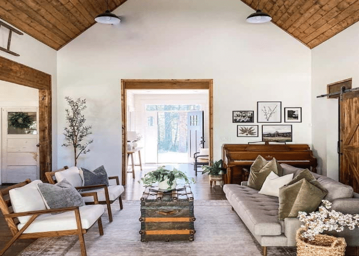
One of the most visually stunning combinations for Sherwin Williams Alabaster is with stained wood. The rich, deep tones of wood (whether on floors, beams, furniture, or feature walls) create a beautiful, earthy contrast with Alabaster’s soft white. The warmth of the wood enhances the subtle creaminess of the paint, resulting in a cozy yet refined aesthetic. For instance, an Alabaster living room with stained wood ceilings and exposed beams exudes unparalleled peace and tranquility. This combination makes the space feel grounded and fresh, while the warm white keeps the room feeling airy, clutter-free, and expansive. It’s a classic pairing that never goes out of style, offering timeless elegance and a deeply welcoming atmosphere.
Real-World Reviews and Expert Insights
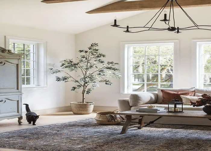
The widespread adoration for Sherwin Williams Alabaster (SW 7008) is echoed in countless reviews from both design professionals and everyday homeowners. Its consistent performance and beautiful finish have cemented its status as a top-tier choice for virtually any space.
- Kylie Mawdsley, Founder and Lead Decorator, often champions SW Alabaster, stating: “Sherwin Williams’ Alabaster is hands down one of the best whites I’ve ever encountered. The incredible hype around this paint is entirely justified because of its extraordinary versatility. You can use it virtually anywhere – on walls, exteriors, cabinets, trims, ceilings, and even furniture. Its consistent warmth and brightness make it a no-fail option for creating cohesive and inviting spaces.” Her endorsement highlights Alabaster’s adaptability, making it a reliable choice for achieving a unified look throughout a home.
- Tasha. A, a seasoned Interior Designer, emphasizes Alabaster’s transformative power: “For any house, Alabaster is simply the ideal paint. It has this incredible ability to transform any space into a true haven. Its versatility is unmatched; you can seamlessly carry it from a bustling living room to a tranquil bathroom. The inherent warm color adds an instant sense of coziness and, importantly, helps to reduce the reliance on artificial lighting during the day by beautifully reflecting natural light.”
- Doki. A., a delighted customer, shares his personal experience: “Sherwin Williams Alabaster is the perfect off-white color for any living room. This elegant color truly makes our home decor stand out, providing a soft backdrop that enhances everything else. If your walls, trim, or even existing furniture pieces are in need of a refreshing and sophisticated coat of paint, Sherwin Williams Alabaster is absolutely the one for you. It never disappoints.”
These testimonials underscore a common theme: Alabaster’s ability to create warm, inviting, and highly adaptable environments. Its popularity isn’t just a trend; it’s a testament to its enduring quality and aesthetic appeal.
Sherwin Williams Alabaster vs. Similar Paint Colors
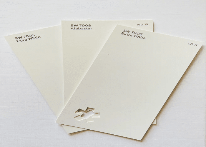
While Sherwin Williams Alabaster (SW 7008) holds a unique position, it’s often compared to other popular whites and off-whites. Understanding these distinctions can help you make an informed decision for your specific needs.
SW Pure White (SW 7005): A Slightly Brighter Alternative
Sherwin Williams Pure White (SW 7005) is another highly versatile white, often chosen for its crisp, clean appearance. Like Alabaster, it possesses a very subtle yellow undertone, which prevents it from feeling too stark. However, Pure White’s LRV is slightly higher at 84, meaning it reflects a bit more light than Alabaster. This makes Pure White a fantastic option for trims, doors, and ceilings where you desire a clean, bright contrast without venturing into cold territory. It works well when you want to highlight architectural features or if your overall palette leans slightly cooler than Alabaster would typically allow.
SW Extra White (SW 7006): The Crisper Choice
Sherwin Williams Extra White (SW 7006) is a much crisper white compared to Alabaster. With an LRV of 86, it reflects even more light and has a subtle cool undertone, often reading as slightly blue or gray in certain lights. This high reflectivity makes it stand out, giving a very clean and modern feel. Extra White is frequently used for trims, doors, and ceilings, especially when paired with cooler wall colors, as it provides a sharp, bright contrast. If you’re aiming for a very contemporary, minimalist, or gallery-like aesthetic, Extra White might be preferred over Alabaster’s softer warmth.
Alabaster vs. Benjamin Moore White Dove (OC-17)
Benjamin Moore White Dove (OC-17) is another incredibly popular off-white, often cited in the same breath as Alabaster. While both are warm whites, there are subtle differences. White Dove typically has a slightly more noticeable gray undertone than Alabaster’s creamy yellow, especially in certain lighting conditions. This gives White Dove a touch more sophistication and a slightly softer, almost greige-like quality in some lights. Alabaster, on the other hand, leans more purely into its creamy warmth, offering a brighter, more overtly inviting feel. Both are excellent choices, but Alabaster will generally feel warmer and brighter, while White Dove might offer a touch more depth and subtlety.
Pros and Cons of Using Sherwin Williams Alabaster
No paint color is universally perfect, and understanding the advantages and disadvantages of Sherwin Williams Alabaster (SW 7008) can help you decide if it’s the right fit for your home.
Pros of SW Alabaster:
- Warm and Inviting: Its primary appeal is its gentle, creamy warmth that makes any space feel cozy and welcoming, avoiding the starkness of pure whites.
- High LRV: With an LRV of 82, it effectively reflects light, making rooms feel larger, brighter, and more open without being blinding.
- Exceptional Versatility: Alabaster is suitable for almost any surface – walls, trim, ceilings, cabinets, and exteriors – creating a cohesive and harmonious look throughout the home.
- Timeless Appeal: As a classic off-white and a former Color of the Year, it offers an enduring aesthetic that transcends fleeting trends.
- Adapts to Lighting: While consistently warm, Alabaster beautifully adapts to different light exposures, revealing subtle nuances that enhance the room’s mood.
- Pairs Well with Many Colors: It serves as an excellent backdrop for a wide range of coordinating colors, from dark contrasting hues to natural earth tones, blues, and greens.
Cons of SW Alabaster:
- Yellow Undertone Can Be Prominent: In intensely warm lighting (strong southern or western exposure, or certain artificial lights), its yellow undertone can become more pronounced, potentially appearing too creamy or even slightly yellow for those desiring a crisper white.
- Can Look Dingy in Poor Light: In rooms with very low natural light or only cool artificial light, Alabaster might lose some of its luminosity and appear a bit dull or “dirty” compared to brighter, cooler whites.
- Not for True Cool Palettes: If your decor leans heavily into cool grays, blues, and crisp whites, Alabaster’s warmth might clash or soften the desired cool aesthetic too much.
- Requires Testing: Like all nuanced whites, it is crucial to test Alabaster with large paint samples on your walls, observing it throughout the day in various lighting conditions before committing.
Final Thoughts: Why Sherwin Williams Alabaster Remains a Favorite
Throughout this comprehensive guide, we’ve delved into the myriad reasons why Sherwin Williams Alabaster (SW 7008) has achieved such enduring popularity among homeowners and design experts alike. We’ve explored its unique position as a warm off-white with a gentle yellow undertone, distinguishing it from starker or grayer alternatives. The article has highlighted its impressive Light Reflectance Value (LRV) of 82, showcasing its ability to brighten spaces while maintaining a soft, inviting glow.
We’ve discussed how Alabaster beautifully interacts with different light exposures, revealing its versatile character, and how it can be employed across virtually every surface imaginable – from tranquil living room walls and elegant kitchen cabinets to welcoming exterior facades and pristine ceilings. Furthermore, we’ve examined how this beloved shade harmonizes with a vast palette of coordinating colors, including deep contrasting tones, earthy neutrals, and even specific blues and greens, offering endless design possibilities. Real-life experiences and invaluable feedback from seasoned interior designers and satisfied customers have added a tangible dimension to the notion of investing in this exceptional paint.
By comparing Alabaster to similar popular whites like SW Pure White, SW Extra White, and Benjamin Moore White Dove, we’ve provided context for its unique qualities, helping you understand its subtle differences. We’ve also addressed common questions and provided a balanced overview of its pros and cons, ensuring you have a complete picture before making your paint choice.
In essence, Sherwin Williams Alabaster embodies practical functionality, aesthetic versatility, and timeless appeal. It is more than just a paint color; it’s a foundation for creating spaces that feel both elegant and profoundly comfortable. We are confident that this detailed exploration provides the answers you seek, empowering you to confidently choose Alabaster for your next home transformation.
