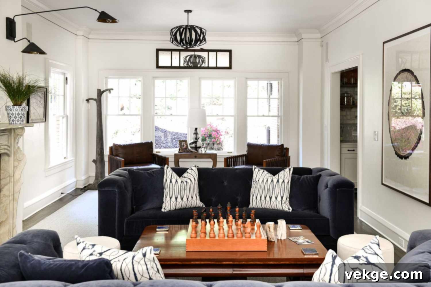
The Ultimate Guide to Choosing the Best Off-White Paint Colors for Your Home
Off-white paint colors have cemented their status as a timeless and versatile choice in interior design, consistently topping the list for homeowners and professional designers alike. Their ability to create a serene, inviting, and sophisticated atmosphere makes them incredibly popular. Unlike stark white, off-whites possess subtle nuances and undertones that add depth and warmth, preventing a space from feeling cold or sterile. However, navigating the vast spectrum of off-white shades can be surprisingly challenging. What might look perfect in a swatch can transform dramatically under different lighting conditions or against existing furnishings. Understanding these nuances is key to making the right choice.
This comprehensive guide aims to simplify that process. We’ve curated a list of some of the most celebrated and sought-after off-white paint colors from leading brands, each with its unique character and charm. We’ll delve into their undertones, ideal applications, and how they interact with light to help you find the perfect shade that aligns with your personal taste and the unique characteristics of your living space.
Some of the most famous and demanding off-white paint colors include:
1. Benjamin Moore Silver Satin (OC-26)
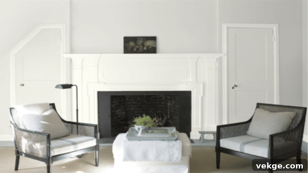
Benjamin Moore Silver Satin is a sophisticated off-white that gracefully balances warmth with a hint of cool elegance. While it falls into the category of warm off-white paint colors, it’s notably less intensely warm than shades like Classic Gray, offering a more understated approach. This particular off-white features delicate undertones of crisp lavender-gray, which become more apparent in certain lighting conditions, particularly in north-facing rooms. With a Light Reflectance Value (LRV) of 74.9, Silver Satin has a good ability to reflect light, making rooms feel brighter and more expansive without being stark. It provides a subtle, refined backdrop that pairs beautifully with both modern and transitional decor, creating a serene and inviting atmosphere without overwhelming the space. It’s an excellent choice for living rooms, bedrooms, and even kitchens where a soft, adaptable neutral is desired.
2. Farrow & Ball Off-White (No. 3)
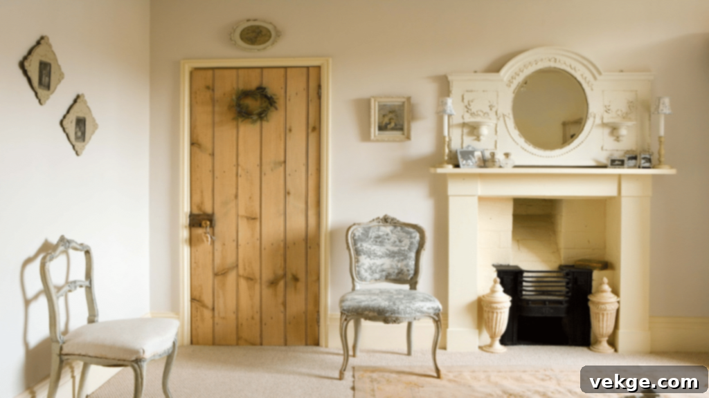
Farrow & Ball’s “Off White” is more than just a name; it’s a testament to its status as a timeless classic in the world of paint. This shade is renowned for its inherent ability to blend seamlessly with traditional neutrals, making it a cornerstone for creating harmonious palettes. It pairs exceptionally well with other heritage colors like Old White, Slipper Satin, and Lime White, forming a cohesive and elegant backdrop. What sets this particular off-white apart is its gentle, almost ethereal quality, which allows it to subtly shift in appearance throughout the day. It’s not just for walls; applying this paint color to your floors can have a transformative effect. When used on floorboards, it helps to bounce natural light upwards onto the walls, amplifying the sense of space and brightness, and imparting an incredibly soft, warm, and comforting feel to the entire room. This makes it an ideal choice for creating inviting and historically sympathetic interiors, from quaint cottages to grand period homes.
3. Farrow & Ball School House White (No. 291)
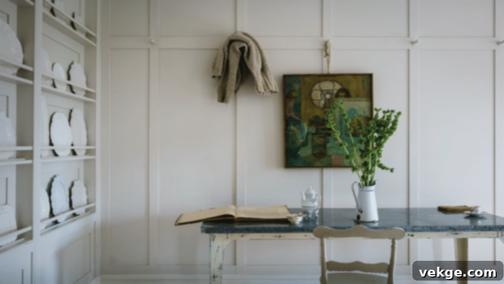
Farrow & Ball’s School House White is a remarkably clean and crisp off-white paint color, distinguished by its subtle, almost imperceptible green undertone. This particular nuance is what prevents it from feeling stark, instead imbuing it with a wonderfully fresh and bright quality. The green undertone lends a unique character, evoking a gentle “citrus feel” that instantly enlivens any space. It’s an excellent choice for rooms that benefit from a light, airy, and refreshing finish. Depending on the light, School House White can appear as a soft, bright white, while in cooler light, its green undertone may become more pronounced, adding a touch of sophisticated complexity. This makes it particularly suitable for spaces where you want to create a sense of calm and clarity, such as home offices, kitchens, or bathrooms. Its ability to look both historic and contemporary ensures its appeal across various interior design styles.
4. Sherwin Williams Snowbound (SW 7004)
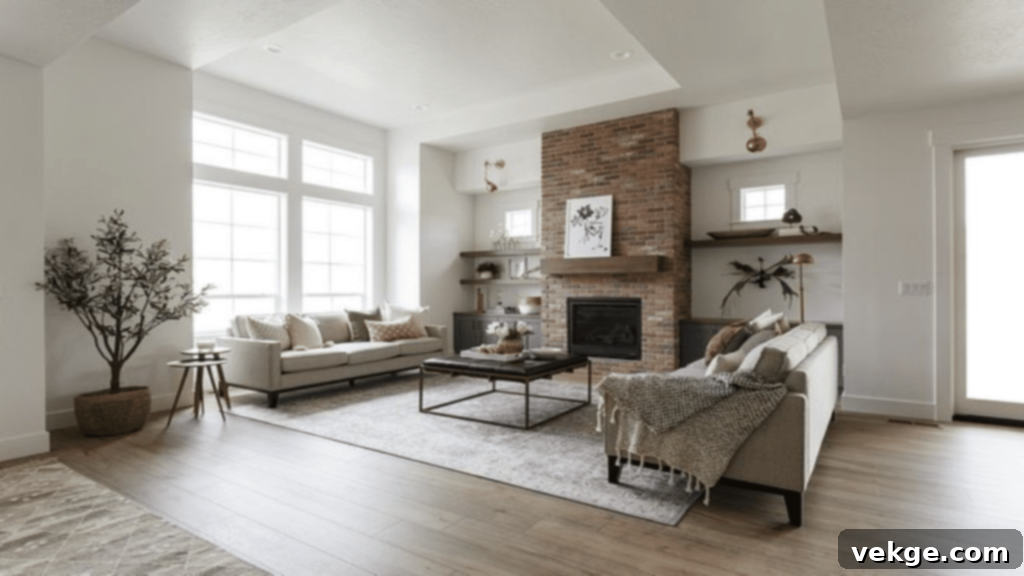
Sherwin Williams Snowbound is a wonderfully versatile and neutral off-white, making it an incredibly popular choice for a wide array of home applications. With an impressive Light Reflectance Value (LRV) of 83, it is one of the brighter off-whites, yet it retains a soft quality that prevents it from feeling too stark. Snowbound is often characterized by its very subtle greige or barely-there pink/taupe undertones, which become apparent in specific lighting but generally maintain a clean, crisp appearance. It’s an exceptional option for trim work, where its clean hue beautifully frames walls painted in other colors, making them pop. However, Snowbound is also close to perfect as a whole-room color, creating a bright, inviting, and sophisticated backdrop for any decor style. Its inherent gorgeousness and appealing softness are sure to catch the eye of every person visiting your home, providing a fresh and timeless foundation that homeowners adore. It performs well in both natural and artificial light, adapting gracefully without becoming overly yellow or blue.
5. Benjamin Moore Linen White (OC-146 / 912)
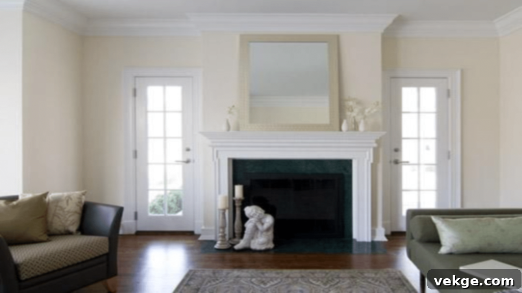
Benjamin Moore Linen White is a beloved off-white that exudes a soft, creamy, and inherently inviting aura, much like the natural fabric from which it draws its name. It features discernible warm undertones, primarily yellow, which contribute to its cozy and relaxed atmosphere without making it appear overtly yellow on the walls. This is a truly timeless color, renowned for its ability to create a sense of comfort and tranquility in any room. The specialty of Linen White lies in its remarkable versatility; it complements both traditional and modern interiors with equal grace. In traditional settings, it enhances classic architectural details and natural wood finishes. In contemporary spaces, it provides a soft contrast to clean lines and minimalist aesthetics. Its adaptability makes it a superb option for whole-home schemes, living areas, and bedrooms where a welcoming and sophisticated warmth is desired. Linen White is particularly effective in spaces with north-facing light, where it helps counteract cool tones and bring in a much-needed glow.
6. Benjamin Moore White Dove (OC-17)
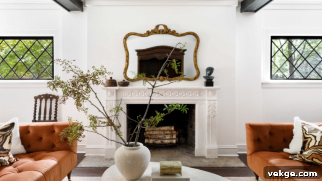
Benjamin Moore White Dove is unequivocally one of the most beloved and frequently specified off-white paint colors in the design world. It’s cherished for its clean, classic appeal and its subtle yet discernible warm undertones. White Dove masterfully walks the line between a pure white and a creamy off-white, making it incredibly versatile. It features delicate greige undertones, meaning it has a tiny amount of gray pigment infused, which is precisely what prevents it from ever looking too yellow or overly stark. This touch of gray ensures it remains a sophisticated and balanced neutral. Furthermore, White Dove also possesses creamy undertones, which is a key reason it’s considered an off-white rather than a pure, brilliant white. This creamy quality adds a softness and depth that makes any room feel welcoming and elegant. It’s a consistently favorite choice for molding, trim, and ceilings, providing a gentle contrast to deeper wall colors, but it also shines as a beautiful, calming wall color in its own right, perfect for creating a serene backdrop in any home.
7. Behr Campfire Ash (N320-1)

Behr Campfire Ash is a unique and intriguing off-white that leans into a soft, dusty gray territory, offering a delicate balance between warm and cool undertones. This paint color is celebrated for its remarkable adaptability, fitting seamlessly into almost any space and style due to its nuanced character. Campfire Ash primarily features subtle brown or pink undertones, which emerge under different lighting conditions. In brighter, natural light, it can appear as a sophisticated light gray with a hint of warmth, while in dimmer or artificial light, those brown or pink nuances might become more prominent, adding a cozy, inviting depth. This chameleon-like quality makes it an excellent choice for creating a serene and sophisticated backdrop in living rooms, dining rooms, or bedrooms. It can complement both warm wood tones and cooler metallic accents, making it a highly versatile neutral for those seeking an off-white with a bit more character than a typical plain white. It’s a testament to how an off-white can be far from boring.
8. Dunn Edwards Warm White (DEW380)
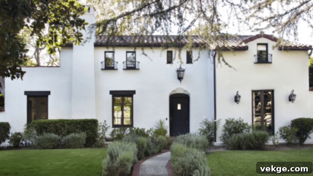
Dunn Edwards Warm White stands out on this list as one of the brightest and most invigorating off-whites available, yet it maintains a gentle warmth that keeps it from appearing stark. This color is an exceptionally versatile choice, acting as a superb foundation for virtually any design palette you wish to build upon. Its inherent ability to create a crisp, airy, and expansive base makes it ideal for transforming spaces, making them feel larger and more open. While it excels when applied to cabinetry and trim, where it provides a clean and polished look, Dunn Edwards Warm White is also an outstanding option for a whole-home color. When used throughout an entire residence, it establishes a cohesive flow and a consistent bright, welcoming ambiance. Its subtle warmth ensures that even though it’s bright, it never feels cold or uninviting, making it a perfect backdrop for layered textures, natural materials, and pops of accent colors. This color is particularly effective in spaces that receive ample natural light, where it truly comes to life, enhancing the room’s overall luminosity.
Why Choose Off-White Paint Colors?
The enduring popularity of off-white paints is no accident. They offer a unique blend of benefits that pure white often lacks and colorful paints can’t always achieve. Off-whites bring inherent softness and warmth, creating a more welcoming atmosphere than stark whites. Their subtle undertones (whether warm, cool, or neutral) allow them to complement a vast range of decor styles, from modern minimalist to rustic farmhouse. They reflect light beautifully, making rooms feel brighter and more spacious, yet they hide imperfections better than brilliant white. Moreover, off-whites act as the perfect canvas, allowing your furniture, artwork, and textiles to truly shine without competing for attention. This timeless quality ensures your home remains stylish and relevant for years to come, providing a sophisticated backdrop that adapts as your personal style evolves.
Factors to Consider When Selecting Your Off-White
Choosing the perfect off-white is a nuanced decision that goes beyond simply liking a swatch. Several critical factors influence how a color appears in your home:
- Natural Light: The direction your room faces dramatically impacts paint color. North-facing rooms often have cooler, bluer light, making off-whites with warm undertones appear more balanced. South-facing rooms receive warm, yellow light, which can amplify yellow undertones in paint. East-facing rooms get bright morning light, while west-facing rooms are bathed in warm afternoon light.
- Artificial Lighting: Different light bulbs (incandescent, LED warm white, LED cool white, fluorescent) cast different color temperatures. Always test your paint samples under the artificial lighting you’ll primarily use in the room.
- Existing Furnishings and Finishes: Your flooring, cabinetry, upholstery, and artwork all have existing undertones. A successful off-white will harmonize with these elements, not clash. Look for common undertones that connect these pieces.
- Room Size and Purpose: Brighter off-whites can make small rooms feel larger and more open. Warmer, creamier off-whites can make a large, airy room feel cozier and more intimate, ideal for bedrooms or living areas.
- The Importance of Samples: Never commit to a color based solely on a small swatch. Purchase sample pots and paint large swatches (at least 2’x2′) on different walls in your room. Observe them throughout the day and night under various lighting conditions. This is the single most important step to avoid disappointment.
Tips for Styling Rooms with Off-White Paint
Once you’ve chosen your ideal off-white, consider how to enhance it through styling:
- Layer Textures: Off-whites thrive with texture. Incorporate natural fibers like linen, cotton, wool, and jute. Think textured throws, area rugs, decorative pillows, and woven baskets to add depth and interest.
- Incorporate Natural Materials: Wood tones (from light maple to dark walnut), stone, ceramics, and indoor plants bring warmth and life to an off-white palette. These elements prevent the room from feeling flat.
- Add Pops of Color: While off-white is a neutral, it provides a fantastic backdrop for accent colors. Use vibrant artwork, colorful cushions, or statement furniture pieces to introduce personality. Jewel tones, earthy greens, or soft pastels can all work beautifully.
- Metallic Accents: Gold, brass, silver, and matte black metals can add a touch of glamour or an industrial edge, creating visual contrast and sparkle against the soft off-white walls.
- Don’t Forget the Ceiling and Trim: Often, the same off-white or a slightly lighter/whiter version of it is used for trim and ceilings to maintain a cohesive and expansive feel. Consider a subtle shift in sheen (e.g., eggshell walls, satin trim) for added architectural interest.
Conclusion
Choosing the perfect off-white paint color is an art, but with the right guidance, it becomes an enjoyable journey to a beautifully transformed home. The shades we’ve highlighted from Benjamin Moore, Farrow & Ball, Sherwin Williams, Behr, and Dunn Edwards represent some of the most versatile and beloved options available. Each possesses a unique charm, ready to infuse your space with warmth, elegance, and a timeless appeal.
Remember, the golden rule of paint selection remains: always do a sample test before finalizing your choice. Observing how the color interacts with your home’s unique lighting and existing elements is crucial for finding that truly perfect shade. And while off-whites provide a clean canvas, they can also show dirt more easily. Implement regular cleaning routines and choose durable, washable paint finishes to keep your walls looking pristine.
Will an off-white paint color be the next transformation for your house? If so, what qualities are you hoping to achieve with it – a brighter feel, a cozy ambiance, or a sophisticated backdrop for your decor? We’d love to hear your thoughts and choices in the comment section below!
Frequently Asked Questions About Off-White Paint Colors
How Many Shades of Off-White Paint Colors Are There?
The number of off-white paint colors available on the market is truly vast, easily exceeding 150 unique shades across various brands. Major paint companies like Benjamin Moore, Sherwin Williams, Farrow & Ball, Behr, and Dunn Edwards each offer extensive collections of off-whites, each with its distinct blend of undertones and Light Reflectance Values (LRVs). This incredible variety ensures that homeowners have an abundance of options to choose from, allowing them to find the precise hue that perfectly matches their specific aesthetic, lighting conditions, and design preferences. This abundance can feel overwhelming, which is why understanding undertones and sampling are so important.
Is White Paint in Style?
Yes, white paint, including its many off-white variations, is undeniably and perpetually in style. Far from being a fleeting trend, white and off-white paint colors have been a cornerstone of interior design for decades, consistently remaining a first choice for home designers and buyers. Their enduring appeal stems from their timeless and versatile nature. They provide a clean, fresh, and bright foundation that can adapt to virtually any decor style, from traditional to contemporary, minimalist to bohemian. The inherent ability of white paint to reflect light, create a sense of spaciousness, and serve as a perfect backdrop for other colors and textures ensures its lasting relevance and popularity in the world of home aesthetics.
What Is Warm Off-White Paint?
A warm off-white paint color is characterized by the presence of warm undertones, typically yellow, red, or orange. These subtle hints of color give the off-white a softer, cozier, and more inviting feel compared to cooler whites, which might have blue or gray undertones. Warm off-whites are incredibly versatile and can complement a wide range of decor styles, making them a popular choice for creating a comfortable and welcoming atmosphere. They pair exceptionally well with natural wood furnishings, earthy tones, rich textiles, and traditional decor, helping to tie these elements together and prevent a room from feeling sterile. Examples of warm off-whites often include shades with hints of cream, beige, or subtle peach.
Which Color Is Best to Pair with Off-White Paint Colors?
The “best” color to pair with off-white paint truly depends on the mood and style you wish to create in your home or room. Off-white’s versatility means it can handle a wide spectrum of complementary colors. For a soft, airy, and gentle ambiance, consider pairing off-white with delicate pastel colors such as mint green, soft blues (like sky blue or dusty blue), or pale pinks. If you’re aiming for a more vibrant or dramatic look, off-white acts as an excellent neutral canvas for bold accent colors like cheerful yellow, vibrant coral, or refreshing teal. For a sophisticated and deep aesthetic, rich hues like navy blue, charcoal gray, or even deep forest green can create a striking contrast and add significant depth to a room. Ultimately, the choice is personal, but off-white provides a stable and elegant foundation for almost any color pairing.
What’s the Difference Between Pure White and Off-White?
The primary difference between pure white and off-white lies in their undertones and light reflectance. Pure white (sometimes called brilliant white or stark white) contains very few, if any, discernible undertones. It reflects nearly all light, resulting in a crisp, bright, and often intense appearance. While pure white can create a very modern and clean look, it can also feel cold or sterile in certain environments. Off-white, on the other hand, is a white that has been “tinted” with a tiny amount of another color, introducing subtle undertones of yellow, gray, beige, pink, or green. These undertones reduce the intensity of the white, making it softer, warmer, and more nuanced. Off-whites still reflect a lot of light but create a more inviting and less stark atmosphere, often appearing more sophisticated and adaptable to various decor styles.
How Do Undertones Affect Off-White Paint Colors?
Undertones are the subtle colors beneath the dominant hue of an off-white paint, and they significantly affect how the color appears and interacts with its surroundings. These underlying tints dictate whether an off-white leans warm (yellow, peach, pink, beige), cool (blue, gray, green), or perfectly neutral. For instance, an off-white with a yellow undertone will appear creamier and warmer, ideal for cozy spaces or balancing cool natural light. An off-white with a gray undertone will look cleaner and slightly cooler, offering a sophisticated neutral. Green undertones can make an off-white feel fresh and organic, while pink or taupe undertones add a subtle warmth without being overtly yellow. Understanding these undertones is crucial because they determine how the paint will look under different lighting conditions and how it will harmonize with your existing furniture, flooring, and other decor elements. A “wrong” undertone can make your walls appear dingy, too yellow, or too blue, which is why testing samples is so important.
