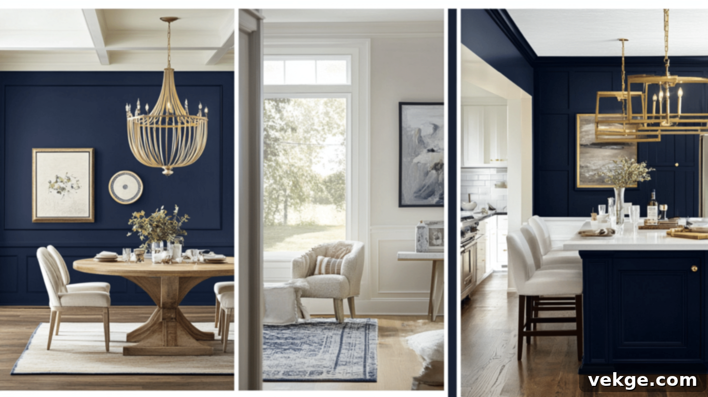
Benjamin Moore Hale Navy: Your Definitive Guide to This Timeless Deep Blue Paint Color
After incorporating Hale Navy by Benjamin Moore into my kitchen cabinets during a recent home makeover, I instantly recognized its exceptional appeal. This striking deep blue paint delivers a finish that is not only modern and stunning but also wonderfully timeless and surprisingly adaptable to a myriad of color palettes.
In this comprehensive guide, I’ll delve into the unique qualities that make Hale Navy a designer favorite, offer practical advice on how to seamlessly integrate it into various spaces within your home, and share valuable insights gleaned from my personal experience to help you achieve professional-looking results. Whether you’re contemplating a full room transformation or a subtle accent, prepare to unlock the full potential of this magnificent hue.
What truly sets Hale Navy apart is its remarkable chameleon-like nature. In my living room, bathed in natural daylight, it presents as a sophisticated, profound blue, providing an exquisite backdrop for cherished family photos and vibrant artwork. As dusk descends, this same color undergoes a magical transformation, evolving into an incredibly cozy, almost black-blue hue that elevates movie nights into a private cinematic experience. This unique paint possesses an extraordinary ability to be both bold and understated simultaneously, much like that quintessential pair of dark jeans that effortlessly complements any outfit.
Where to Embrace Benjamin Moore Hale Navy in Your Home
Having lived with Hale Navy throughout my home for several months now, I can confidently attest to the transformative power of this remarkable color. Let me take you on a tour of the spaces where it has made the most profound impact, detailing exactly how I’ve used it and why it excels in each application.
1. Living Rooms and Bedrooms: Creating Depth and Serenity
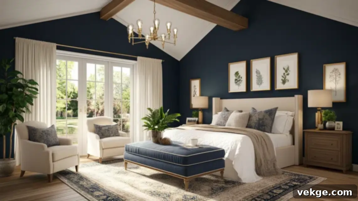
Transitioning from the ubiquitous all-white walls of my previous home, I harbored some reservations about introducing such a deep hue into my primary living spaces. However, painting my living room in Hale Navy proved to be one of the most inspired decisions I’ve made. The color envelops the room, creating an incredibly comforting, cocoon-like atmosphere that makes our evening family gatherings feel exceptionally warm and intimate.
My cream-colored sofa and elegant brass light fixtures truly come alive, popping brilliantly against the rich navy backdrop. Surprisingly, instead of feeling smaller as I had initially feared, the room actually feels more expansive and grand. The depth of the color allows the walls to recede, creating an illusion of greater space and sophisticated drama. For a subtle touch of luxury, consider an eggshell or satin finish on the walls to give a soft sheen that catches the light beautifully.
In the master bedroom, I opted for a single accent wall behind the bed in Hale Navy, and the effect is nothing short of a luxurious hotel suite right at home. The profound richness of the color instantly elevates the look of my bedding, making it appear more plush and opulent, and imbues the entire room with a serene, restful ambiance. Even my husband, who was initially skeptical about dark colors, now declares he can’t imagine our sanctuary any other way. This application demonstrates Hale Navy’s power to create a focal point and introduce sophisticated tranquility.
2. Kitchen Cabinets and Islands: Modern Elegance and Practicality
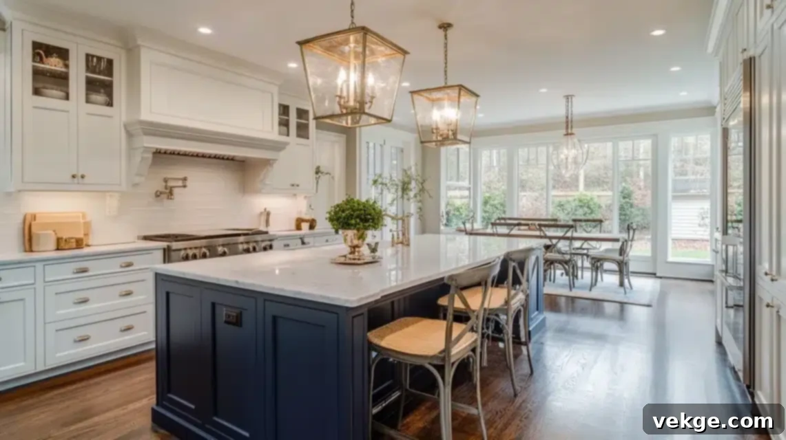
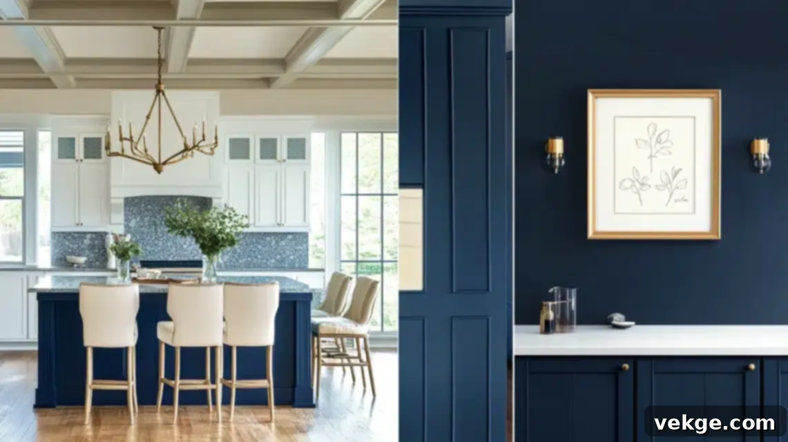
Our previous home owners had opted for standard white cabinets, but I bravely decided to plunge into color by painting my kitchen island in Hale Navy. This choice transformed it into the undeniable anchor of my kitchen, imbuing the space with an air of sophistication without ever feeling overwhelming. The stark yet harmonious contrast between the deep navy island and the surrounding white perimeter cabinets creates a beautiful visual tension, making the entire kitchen feel more thoughtfully designed and intentionally curated. Consider pairing it with crisp white quartz or marble countertops for an elevated look.
Pro Tip for Kitchens: If you’re considering navy cabinets, Hale Navy is a fantastic choice for busy households. Its deep pigmentation is incredibly forgiving when it comes to concealing fingerprints, minor smudges, and everyday cooking splatters, which has been an absolute blessing with my active family. For optimal durability and a smooth, professional finish, I highly recommend using Benjamin Moore’s Advance Interior Paint in a pearl or satin finish for cabinets and islands.
3. Accent Walls: Striking Focal Points for Any Room
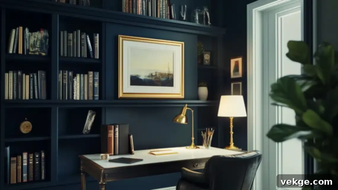
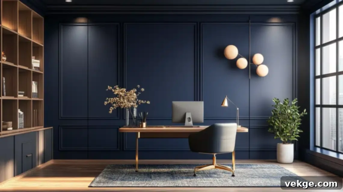
When it came to designing my home office, my goal was to create a space that felt professional and polished for virtual meetings, yet simultaneously warm and inviting. Painting the wall directly behind my desk in Hale Navy achieved this balance perfectly. It has become an ideal backdrop for work calls – looking professional without feeling overly stuffy, and rendering beautifully on camera. The most delightful aspect is how it makes my crisp white bookshelves and elegant gold-framed art pieces dramatically stand out, creating the impression of a meticulously curated gallery wall. An accent wall can redefine a space without the commitment of painting an entire room, making it an excellent entry point for exploring dark colors.
4. Exterior Spaces: Boost Curb Appeal with Timeless Sophistication
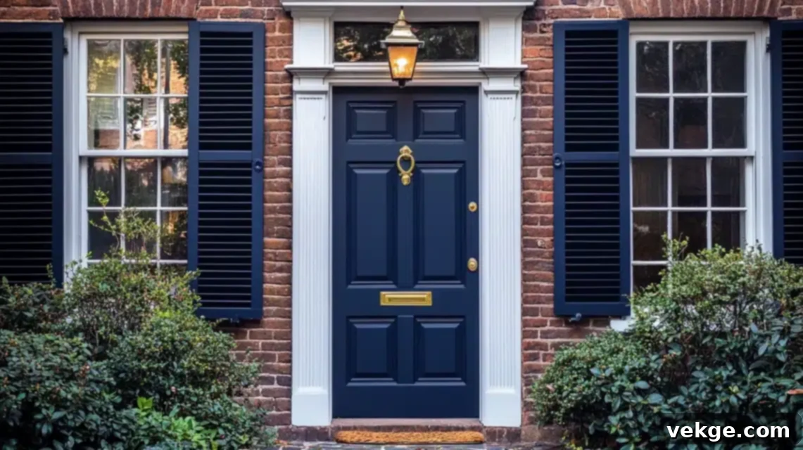
Perhaps my boldest and most rewarding decision was painting my front door in Hale Navy. In a neighborhood predominantly featuring traditional and muted colors, my door now commands attention in the most distinguished way possible. The color’s appearance subtly shifts throughout the day – sometimes presenting as an almost black, profound hue, other times revealing its true rich navy character – but always maintaining an air of undeniable elegance. I was so captivated by the result that I extended the color to my exterior shutters, and the enhancement to our home’s curb appeal has been nothing short of dramatic. It creates a welcoming yet stately entrance that makes a lasting impression.
It’s crucial to reiterate that lighting plays an exceptionally critical role in how Hale Navy manifests itself. In direct natural sunlight, its authentic navy tones shine through with clarity and vibrancy. Conversely, as evening light diminishes, it deepens into a moody, intimate backdrop that makes every room feel more exclusive and cozy. If you’re contemplating Hale Navy for any space, whether interior or exterior, I cannot stress enough the importance of thoroughly testing it at various times of the day. Observe how it interacts with your specific lighting conditions, both natural and artificial, to ensure it aligns perfectly with your vision.
5. Furniture Transformations: Giving Old Pieces a New Life
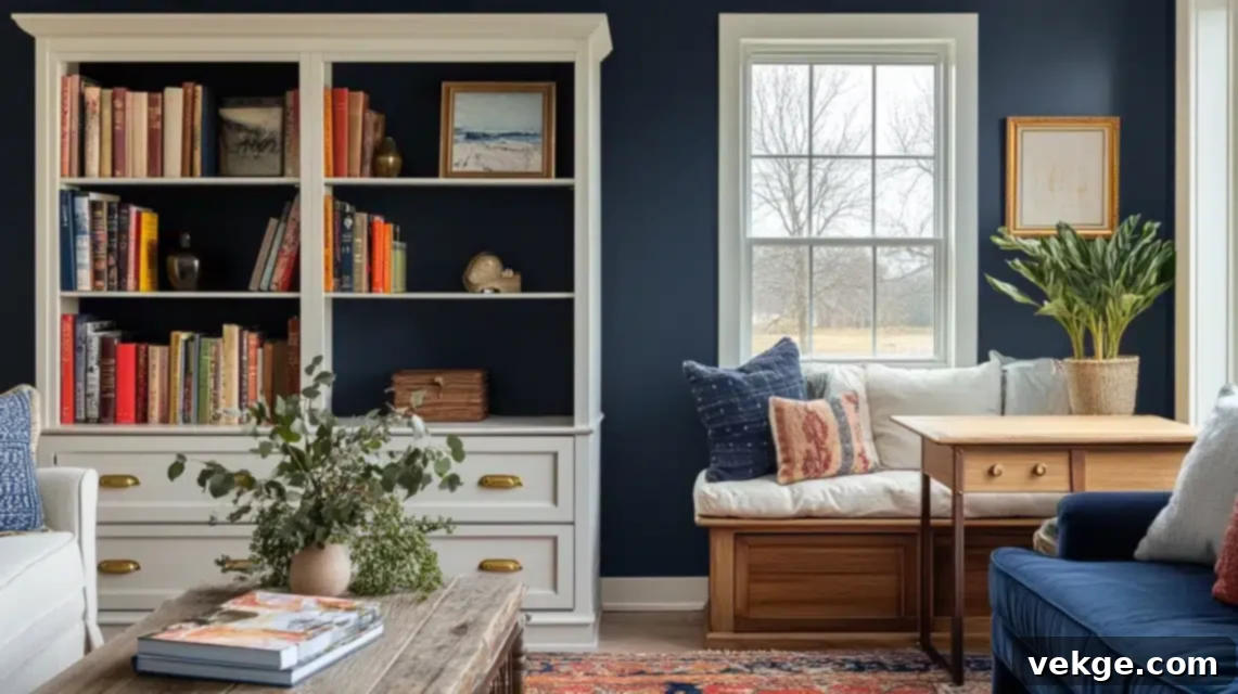
Within the confines of my home, Hale Navy has quickly become my preferred color for breathing new life into tired furniture pieces. My inaugural project was an old pine bookshelf that had definitely seen better days. With just two coats of Hale Navy (applied using Benjamin Moore’s Advance paint for its superior durability and smooth finish), it transitioned from dated to distinctly designer. This successful transformation sparked a cascade of other projects, including:
- An inherited dresser, reimagined as a sophisticated buffet in my dining room.
- A charming pair of vintage side tables, now elegantly flanking my sofa.
- A built-in window seat, transformed into a stunning focal point within our living area.
My key takeaway from using Hale Navy on furniture is its incredible adaptability; it functions almost as a high-end neutral. It beautifully complements a wide spectrum of wood tones, from light oak to dark mahogany, and possesses a unique ability to make brass hardware truly pop and gleam. In my daughter’s room, I painted her study desk in Hale Navy and paired it with chic gold handles, creating a timeless piece that will gracefully evolve with her through her teenage years and beyond.
Pairing Benjamin Moore Hale Navy with Other Colors for Impact
One of Hale Navy’s most appealing attributes is its exceptional versatility when paired with other colors. Its depth provides a stable foundation, allowing other hues to truly sing. Let me share the harmonious combinations that have worked beautifully in my home and might just ignite inspiration for your own color journey.
1. Neutrals: The Foundation of Sophistication
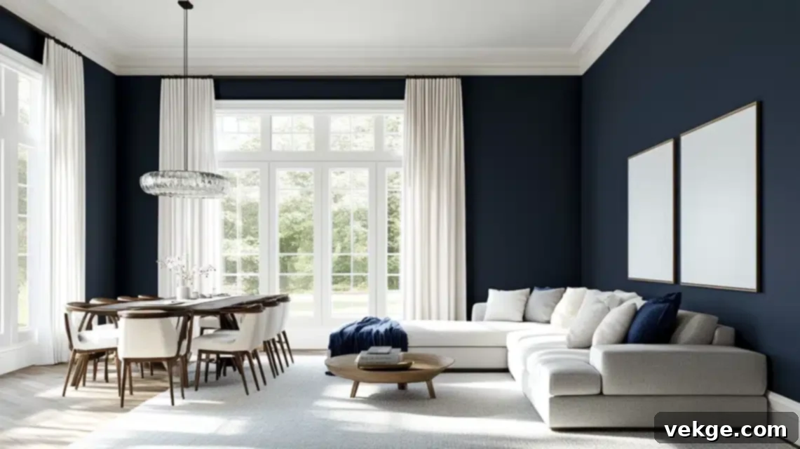
In my living room, I coupled the Hale Navy walls with Benjamin Moore’s Chantilly Lace on the trim and ceiling, and the resulting contrast is absolutely breathtaking. The crisp, clean white of Chantilly Lace makes the navy feel even richer and more profound, while simultaneously ensuring the space remains fresh, bright, and airy. My ivory linen curtains softly diffuse the incoming light against the deep navy walls, creating a captivating interplay of light and shadow, depth and lightness, that evolves beautifully throughout the day.
What truly surprised me was the seamless way Hale Navy harmonized with my existing greige furniture. I possess a generously sized sectional in a warm gray tone (reminiscent of Benjamin Moore’s Revere Pewter), and far from clashing, the combination feels incredibly sophisticated and thoughtfully designed. In my dining room, I introduced natural linen-colored upholstery, and the inherent warmth of these beige tones cultivates an inviting, elevated atmosphere that is absolutely perfect for entertaining guests.
2. Bold Accents: Injecting Personality and Drama
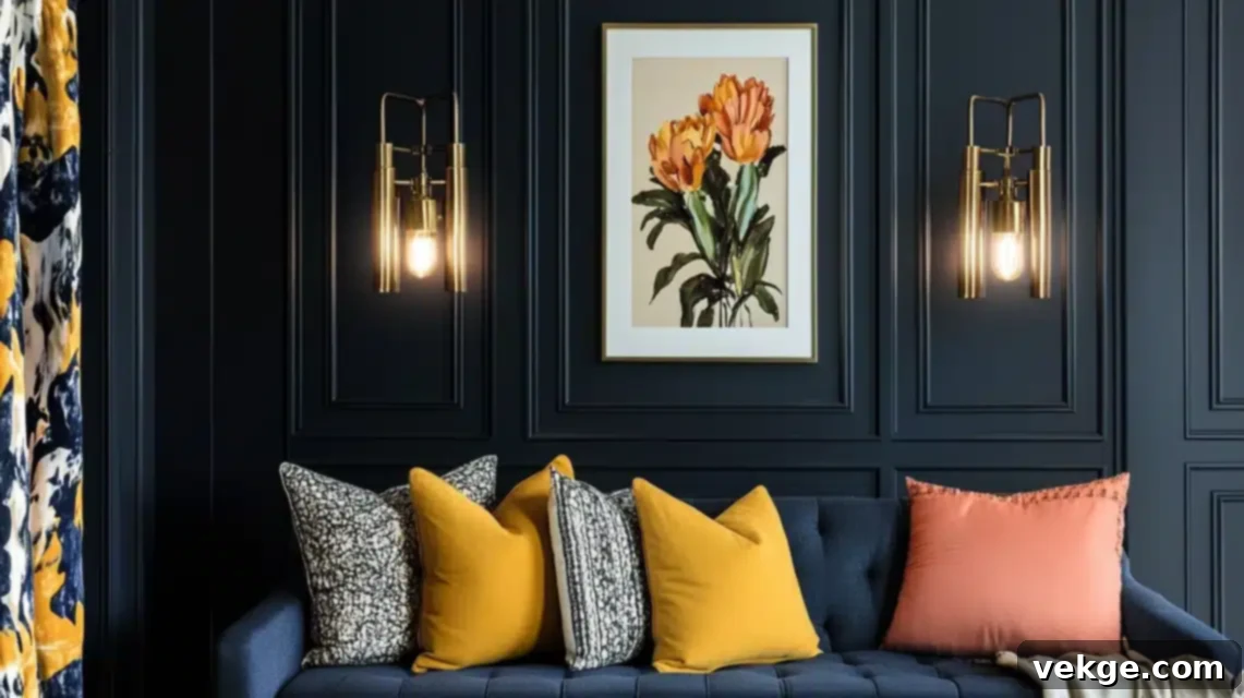
The true magic of Hale Navy reveals itself when you begin to introduce bold accent colors into the space. The vintage brass light fixtures in my entryway absolutely gleam and “sing” against the navy walls; there’s an inherent warmth in the metal that elevates both colors, making them appear even more luxurious and expensive. In my guest room, I took a delightful risk with mustard yellow throw pillows and captivating artwork, and the resulting combination is unexpectedly dramatic, playful, and utterly charming.
One of my most cherished discoveries was the exquisite harmony between coral and blush tones with Hale Navy. In my powder room, I integrated soft coral hand towels and a vintage art print featuring delicate blush hues, and the space now feels both highly sophisticated and refreshingly modern. The deep navy provides the perfect, grounding backdrop for these warmer, vibrant hues without ever overwhelming them, allowing each color to shine in its own right.
3. Coordinated Color Palettes: Curated Harmony for Every Style
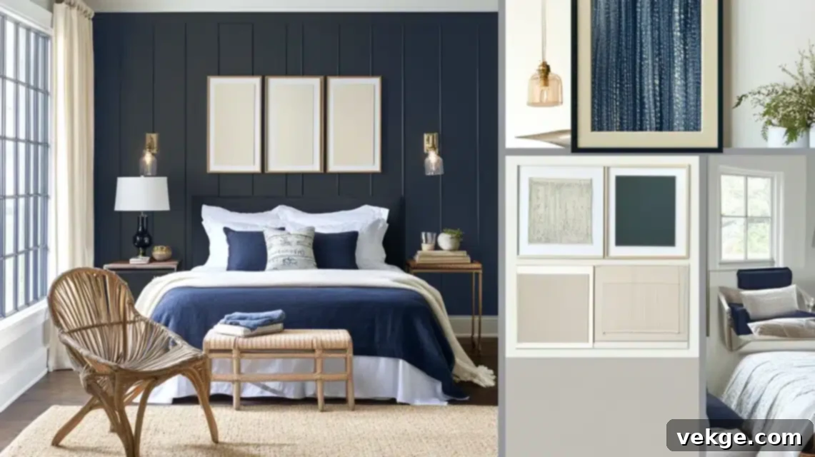
Through careful experimentation, I’ve identified several foolproof color combinations that integrate beautifully with Hale Navy across a spectrum of design styles. These palettes offer a cohesive and aesthetically pleasing foundation for any room:
- For a Modern and Contemporary Space:
- Hale Navy + Chantilly Lace + Brushed Gold + Charcoal Gray. This quartet delivers a sleek, contemporary edge while maintaining an inviting warmth, perfect for urban lofts or minimalist designs.
- For a Coastal-Inspired Guest Room:
- Hale Navy + Sandy White + Sea Glass Green + Natural Linen. The effect is profoundly serene and gently evocative of the ocean, achieving a sophisticated coastal vibe without resorting to overt nautical themes.
- For a Timeless Traditional Dining Room:
- Hale Navy + Ivory + Warm Bronze + Deep Red (or Burgundy). This classic combination exudes an air of enduring elegance and rich sophistication, ideal for formal dining or stately libraries.
I’ve learned that the secret to success with Hale Navy lies in treating it almost as a sophisticated neutral. It possesses enough substance and presence to powerfully anchor any room, yet remains incredibly versatile, capable of supporting almost any color story you wish to weave. This exceptional color has a remarkable gift for making all other hues within a room appear more refined, intentional, and thoughtfully chosen.
Expert Tips and Insights for Designing with Hale Navy
Leveraging insights from design professionals and learning from common project pitfalls can significantly enhance your Hale Navy experience. Here’s what I’ve gathered:
1. Interior Designer Advice: Harnessing the Power of Deep Blue
During my home renovation, I had the privilege of consulting with Sarah Mitchell, a renowned local interior designer celebrated for her masterful application of navy in home aesthetics. “Hale Navy is akin to a perfectly tailored suit,” she insightful remarked during our consultation. “It’s robust enough to make a definitive statement yet sufficiently refined to remain eternally in style.” She strongly advocated for observing the color under at least three distinct lighting conditions before committing – advice that proved absolutely invaluable in my home office design decision. This practice ensures you understand its true undertones and how they react to your unique environment.
Another brilliant designer, James Rodriguez, who assisted with my kitchen transformation, offered an equally compelling perspective: “What truly elevates Hale Navy is its remarkable chameleon-like quality.” He elaborated, “Unlike many other navy blues, it strikes a flawless balance of warm and cool undertones, rendering it extraordinarily adaptable to diverse spaces and varying light conditions.” He was absolutely correct – I have consistently observed how beautifully the color modulates and shifts throughout the day within my own spaces, revealing subtle hints of gray, green, or even black depending on the light source and time. This unique balance is what prevents it from feeling too cold or too bright.
2. Common Mistakes To Avoid When Using Hale Navy
Even with the best intentions, certain pitfalls can derail a successful paint project. Here are some common mistakes to sidestep:
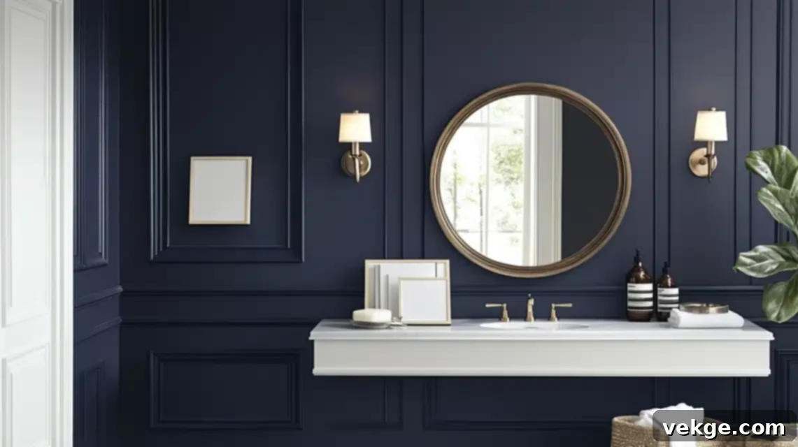
- The Small Space Misconception: Initially, I hesitated to apply Hale Navy in my compact powder room, fearing it would make the space feel claustrophobic. However, after carefully testing it on a single wall, I discovered that its depth actually created an illusion of greater expanse, making the room feel more intentional and dramatic, rather than cramped. The secret lies in strategic balance: pairing it with ample white trim and incorporating a large mirror to reflect light and expand the visual area. Don’t shy away from dark colors in small spaces; they can be incredibly effective when used thoughtfully.
- The Sample Testing Game-Changer: My biggest near-miss occurred when I almost painted my entire living room based solely on a tiny paint chip. Thankfully, I heeded my designer’s invaluable advice and painted large sample boards (at least 2’x2′) first. The way the color presented itself in my south-facing room was profoundly different from its appearance in the store. This crucial step allowed me to understand its interaction with my unique lighting and led to an adjustment in my lighting plan, including adding extra sconces to create the perfect, inviting ambiance. Always test a generous sample on your walls before committing to the full project.
- Neglecting Surface Preparation: Darker paints, like Hale Navy, can be less forgiving of imperfections. Failing to properly clean, spackle, sand, and prime your surfaces can result in an uneven finish or highlight existing wall texture. Invest time in preparation; it’s the foundation of a truly professional result.
- Choosing the Wrong Sheen: The paint sheen significantly impacts how Hale Navy looks. A matte or flat finish offers a rich, velvety look, ideal for walls where you want to minimize imperfections. Eggshell or satin finishes add a subtle glow and are more durable, great for living areas. Semi-gloss or pearl finishes are excellent for trim, doors, and cabinets as they are highly durable and easy to clean, adding a touch of elegance.
3. Hale Navy Success Stories: Transformations That Inspire
Witnessing the dramatic transformations Hale Navy can achieve is truly inspiring. Here are a few personal success stories that highlight its power:
- The Dining Room Grandeur: My most dramatic interior transformation unfolded in the dining room. What once was a bland, builder-beige box is now a sophisticated and inviting entertaining space. I applied Hale Navy to all walls, carefully maintaining a crisp white ceiling to prevent it from feeling too enclosed. Introducing elegant brass light fixtures and plush cream upholstered chairs created a stunning contrast, imbuing the space with both dramatic flair and a welcoming embrace. It’s now a room where guests linger and conversations flow freely.
- The Kitchen Island Upgrade: My kitchen island transformation quickly became the highlight of my recent housewarming party. The previous blonde wood island had practically disappeared against the flooring, offering no visual interest. However, painted in Hale Navy, it now serves as a breathtaking focal point, effortlessly anchoring the entire open-concept space. The key to this resounding success was not only using Benjamin Moore’s high-quality Advance cabinet paint but also dedicating ample time to meticulous preparation – three days of careful work for a result that looks utterly professional and custom-built.
- Home Office Victory: Perhaps my most celebrated application of Hale Navy was in my husband’s home office. I strategically painted the wall behind his desk, creating an impeccable backdrop for video conferences that garners constant compliments from his colleagues. The color registers beautifully on camera, projecting an image of professionalism and thoughtful design, while also maintaining a serene and focused atmosphere for his daily work.
Conclusion: Embracing the Timeless Allure of Hale Navy
Moving into my new home was an exhilarating journey, yet it presented the exciting challenge of imbuing the space with my personal style and making it truly feel like “mine.” Hale Navy by Benjamin Moore played an instrumental role in this transformative process. From revitalizing our kitchen cabinets, as shared in my previous blog, to thoughtfully adding depth and character to numerous other areas, this timeless deep navy blue has introduced a profound sense of elegance, sophistication, and warmth that my home genuinely craved.
The kitchen makeover, in particular, has emerged as the vibrant centerpiece of our family’s daily life. Hale Navy’s rich, multifaceted tone lends the cabinets a modern yet unmistakably classic appeal, while its inherent durability makes it an ideal choice for our high-traffic, family-filled kitchen. When meticulously paired with the right accents and strategic lighting, it has created a space that feels both inherently cozy and effortlessly stylish—a place where we genuinely love to gather, create, and share moments.
If you find yourself contemplating a bold color choice but desire something exceptionally versatile, sophisticated, and enduring, I wholeheartedly recommend Hale Navy. It is far more than just a paint color; it is a profound design statement that possesses the power to elevate any space it graces. Trust me, every single brushstroke is unequivocally worth it.
Frequently Asked Questions About Benjamin Moore Hale Navy
Does Hale Navy Make Rooms Feel Smaller?
This was indeed my biggest concern initially. However, based on my firsthand experience, I can confidently tell you it’s quite the opposite. In my living room, the profound depth of Hale Navy actually makes the walls appear to recede, creating a surprising illusion of more expansive space rather than less. The fundamental key to achieving this effect is thoughtful balance; I paired it with crisp white trim and strategically placed lighting fixtures to maintain an overall sense of brightness and airiness, preventing any feeling of confinement.
How Does Hale Navy Look in Rooms with Little Natural Light?
I successfully navigated this common challenge in our north-facing home office, which receives limited natural light. While Hale Navy undeniably appears darker and more saturated in low-light conditions, we discovered that it beautifully cultivates a cozy, intimate, and deeply sophisticated atmosphere rather than a gloomy one. The effective solution was layering artificial lighting – we meticulously installed a combination of overhead fixtures and wall sconces to ensure sufficient illumination and to highlight the true beauty and subtle nuances of the color, allowing its complex undertones to shine even in dimmer settings.
Is It Hard to Coordinate Furniture and Decor with Hale Navy?
This has been one of the most delightful surprises of all! We’ve consistently found that Hale Navy performs like a highly sophisticated and incredibly adaptable neutral. In my home, it pairs exquisitely with an astonishing array of elements, from our plush cream-colored sofa to gleaming brass fixtures and even vibrant, multi-colored art pieces. Its versatility is truly remarkable, making it incredibly forgiving and easy to integrate into existing decor schemes or entirely new designs.
Does Hale Navy Show Imperfections in The Walls?
Like virtually any deep, saturated paint color, Hale Navy can, to some extent, highlight existing wall imperfections or textures if the surface isn’t adequately prepared. I learned the critical importance of carefully prepping my walls first – filling holes, sanding smooth, and priming thoroughly. However, in our dining room, I actually chose to embrace the slight, natural texture of the walls, as it unexpectedly added another layer of depth and visual interest to the space, contributing to its rich, inviting character. Proper preparation is key, but sometimes a subtle texture can enhance the desired effect.
