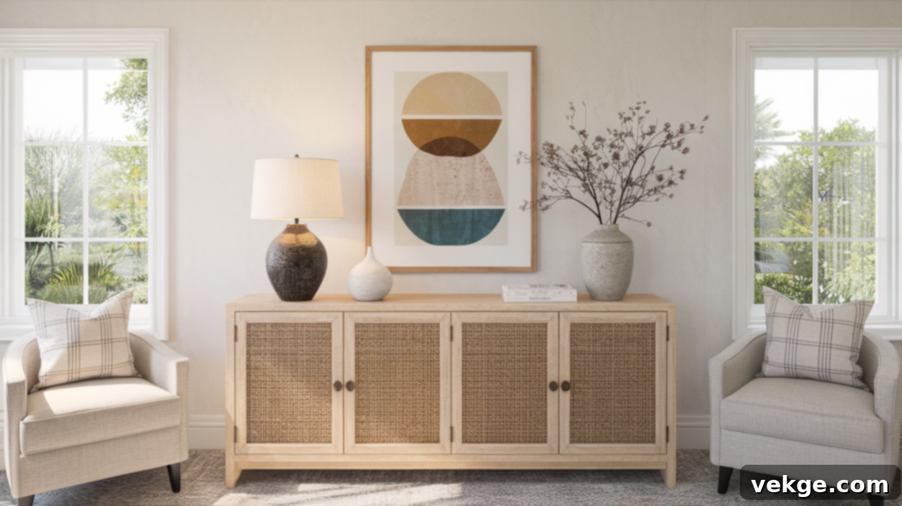
How to Hang Art Above a Console Table: The Ultimate Height and Placement Guide
Have you ever meticulously arranged a console table, only to hang a piece of art above it and feel like something is just…off? It’s a common dilemma, and often, the culprit isn’t the art itself, but its placement. Knowing how high to hang art above a console table can transform an awkward empty space into a beautifully balanced and cohesive display.
Even the most stunning frame or captivating artwork can lose its impact if it’s hung too high, appearing to float disconnectedly, or too low, making the space feel crowded and heavy. Achieving the perfect spot makes all the difference, creating a seamless visual flow that elevates your entire room. This comprehensive guide will equip you with all the essential rules and tips:
- The fundamental height range for optimal art placement.
- The crucial 4–6 inch rule for creating visual connection.
- The powerful 2/3 width rule for ideal art-to-furniture proportion.
- How to adapt your hanging strategy for different ceiling heights.
- Simple, easy ways to measure and preview placement without damaging your walls.
- Inspiration for various art arrangements and decor styles.
With these practical, easy-to-follow tips, you’ll be able to confidently transform that blank wall above your console into a clean, balanced, and stylish focal point. Let’s get it right the first time and create a space you love.
The Golden Rules for Hanging Art Above a Console Table
Achieving the right height for your artwork above a console table is more than just a measurement; it’s about creating a harmonious visual relationship that significantly impacts the overall look and feel of your space. Let’s dive into the foundational guidelines that will help you achieve perfect placement every time.
1. Stick to the 4–6 Inch Rule for a Cohesive Look
When positioning art above your console table, one of the simplest and most effective guidelines to remember is to leave approximately 4 to 6 inches of space between the top of the console table and the bottom of the artwork’s frame.
This modest gap isn’t arbitrary; it’s a design trick that works wonders for your display. This specific spacing creates a strong visual link between your console table and the artwork. Instead of appearing as two separate, unrelated items, the art and the furniture become a unified unit, enhancing the perception that they truly belong together. This connection naturally guides the eye from one element to the other, establishing a more pleasing and well-considered aesthetic in your room. If the gap is too large, the art can feel disconnected and “float” above the table. If it’s too small, the display can appear cramped and heavy.
2. Center the Art at Eye Level (57–60 Inches from the Floor)
Another crucial aspect of proper art placement, especially when the artwork is large or stands alone, is hanging it at eye level. Aim to position the center of your artwork approximately 57 to 60 inches from the floor. This height range aligns with the average person’s natural line of sight when standing.
When you place art at this height, visitors can effortlessly view and appreciate it without needing to strain by looking up or craning their necks down. This ergonomic placement ensures maximum enjoyment of the piece. While the 4-6 inch rule connects the art to the furniture, the eye-level rule ensures the art is comfortably viewed. In many cases, these two rules will naturally align, especially with appropriately sized artwork. If your art is particularly tall, you might prioritize the 4-6 inch rule to maintain the connection with the console, even if the absolute center ends up slightly higher than 60 inches.
3. Adjust Based on Artwork Size and Impact
The dimensions of your artwork are paramount and should always influence how you apply these basic rules to maintain visual equilibrium:
- Large Statement Pieces: If you have a significantly larger piece of art, you might consider hanging it slightly lower than the standard eye-level center, perhaps favoring the 4-inch gap from the console. This subtle adjustment prevents the artwork from looking too heavy, overwhelming the console, or appearing to float too high on the wall. A lower position helps ground the large piece, maintaining visual balance and ensuring it feels anchored to the furniture below, rather than dominating the entire wall space.
- Smaller Artworks or Collections: Conversely, smaller artworks often benefit from more breathing room above the console table to give them presence. You might comfortably increase the gap to 7 or 8 inches, or even slightly more, to ensure the small piece doesn’t appear too crowded, insignificant, or “lost” when placed above the table. This extra space gives smaller art a greater sense of importance and allows it to stand out, making its display feel more intentional rather than accidental. When displaying a collection of small pieces, treat the entire grouping as a single unit and apply the 4-6 inch rule to the bottom edge of the lowest frame.
Consider Your Console Table Size: The Foundation for Your Art
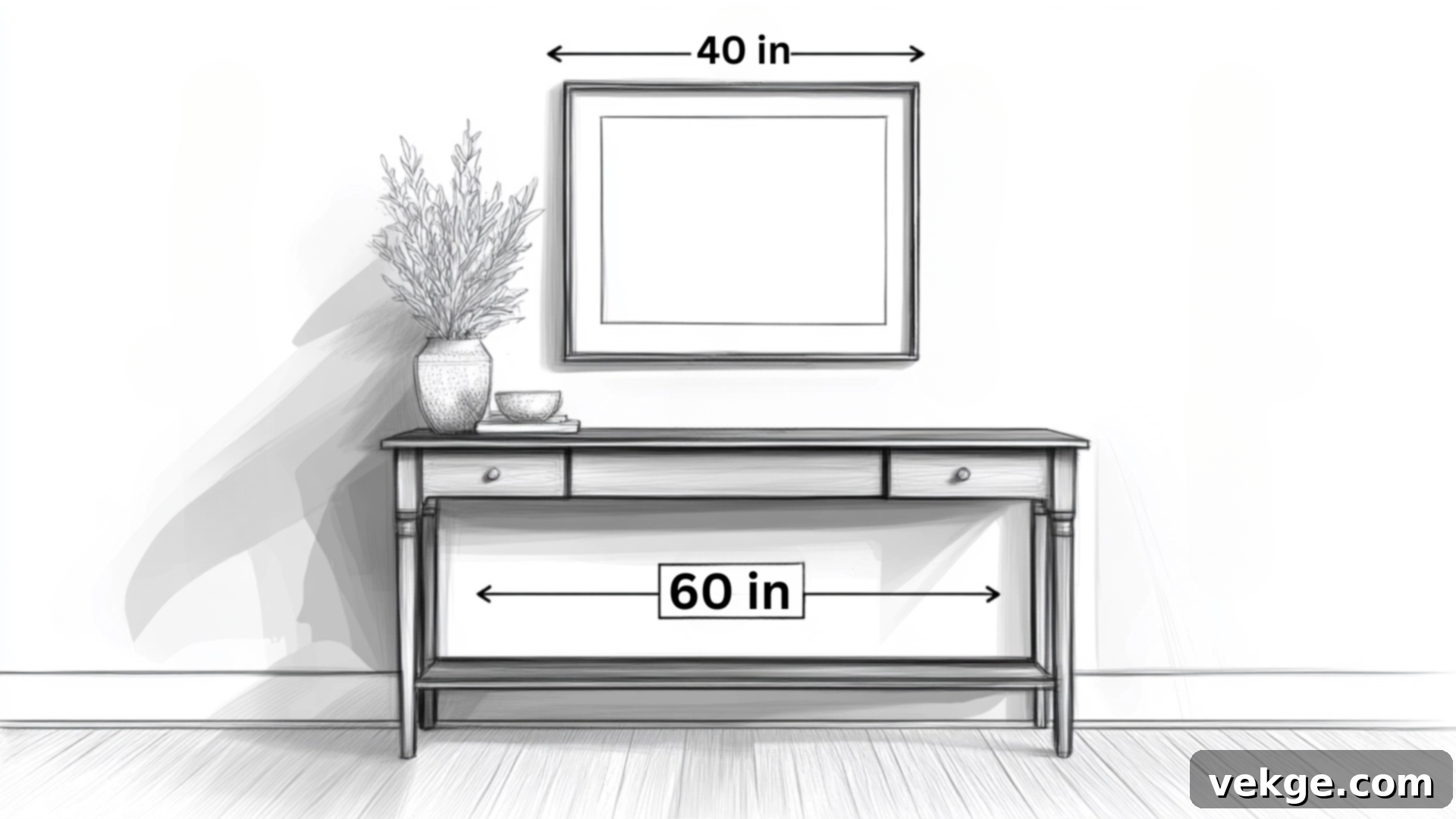
The dimensions and style of your console table are critical in determining what artwork will look best above it. Achieving the right balance between these two elements is key to creating a clean, sophisticated, and well-planned look in your space. The console table isn’t just a surface; it’s the base from which your artwork’s story begins.
1. Apply the 2/3 Width Rule for Perfect Proportions
A widely adopted and highly effective guideline for selecting artwork is the 2/3 width rule: your artwork (or the collective width of a gallery wall) should be approximately two-thirds the width of your console table. This simple yet powerful ratio creates an inherently pleasing visual balance that feels naturally right to the eye.
For example, if your console table measures 48 inches wide, you should seek out artwork that is around 32 inches wide. This proportion ensures your art doesn’t look dwarfed and lost above the table, nor too expansive and heavy, overwhelming the furniture beneath it. It creates a harmonious relationship where neither element competes for attention, but rather, they complement each other perfectly. Deviating too much from this rule can make the arrangement feel off-kilter; an artwork that’s too wide can make the console seem flimsy, while one that’s too narrow can make the console appear overly dominant.
2. Ensure Your Art Has Room to Breathe: Avoid Crowding
Beyond just the 2/3 width rule, it’s essential to always leave enough negative space around your artwork so it can truly stand out. The frame needs ample breathing room on all sides, but especially on the left and right, extending beyond the edges of the artwork itself. This surrounding space allows the artwork to command attention without feeling squeezed or suffocated into its spot.
Furthermore, be highly mindful of the items you plan to display on the console table itself. Tall lamps, vases, or decorative objects should be carefully selected and placed so they won’t block, compete with, or visually merge with the artwork above. The ultimate goal is a balanced arrangement where each piece—the console, the art, and the decor—has its own defined space and contributes to the overall aesthetic without creating visual clutter. If your table decor is particularly tall, you might need to adjust the height of your artwork slightly higher to ensure clearance and prevent a crowded look.
Ceiling Height and Room Proportions Matter
The vertical dimensions of your room – specifically, the height of your ceiling and the overall scale of the space – should significantly influence how you approach hanging artwork above your console table. These often-overlooked factors play a crucial role in creating a balanced, harmonious look that fits seamlessly into your room’s unique architectural context.
What to Do with High Ceilings: Embrace the Vertical Space
If your room boasts impressive high ceilings, you have more flexibility and opportunity to leverage the vertical wall space. In such rooms, you can judiciously increase the gap between the console table and the bottom of the artwork’s frame, potentially extending it up to 8–10 inches if needed. This slightly larger space works exceptionally well in taller rooms because:
- It helps to effectively fill more of the expansive vertical wall space, preventing the artwork from looking small and lost.
- It prevents the entire arrangement (console + art) from feeling compressed or too “grounded” in a grand, tall room, allowing it to feel more proportional to the room’s scale.
- It maintains a proper visual proportion between the furniture piece and the larger wall canvas it occupies, ensuring the display doesn’t appear awkwardly low.
In rooms with high ceilings, this extra space above the console table helps the artwork feel more in tune with the architectural grandeur of the room, contributing to a sense of sophisticated airiness rather than a cramped display.
Low Ceilings? Keep It Tight and Grounded
For rooms with lower ceilings, take the exact opposite approach to prevent the artwork from appearing to float awkwardly towards the ceiling or making the ceiling feel even lower. In these spaces, the objective is to keep the display more grounded and cohesive:
- Stick closer to the minimum 4-inch gap rather than stretching to 6 inches or more between the console and the bottom of the frame. This tighter spacing helps to anchor the art to the console.
- Make sure the artwork, especially its top edge, doesn’t creep too close to the ceiling line. An uncomfortable proximity to the ceiling can visually “chop” the wall and emphasize its low height.
- Consider artwork with a more horizontal orientation if possible. Horizontal pieces tend to make a room feel wider and can be more forgiving in terms of vertical space than very tall, narrow pieces.
This tighter arrangement effectively grounds the artwork to the console table and keeps the entire display feeling anchored and proportional to the room’s more intimate scale. It also cleverly avoids the awkward look of artwork that seems to be pushed too high on the wall, a common pitfall when standard hanging heights are blindly applied in rooms with lower ceiling heights.
Style Tips for Different Art Arrangements Above Your Console
The beauty of decorating with art is its versatility. There are countless ways to display art above your console table, from a single, impactful piece to an eclectic arrangement of multiple framed works. Each approach creates a distinct feel and contributes differently to your room’s overall aesthetic. Here’s how to make each style work seamlessly and beautifully.
1. Hanging a Single Statement Piece: Bold and Focused
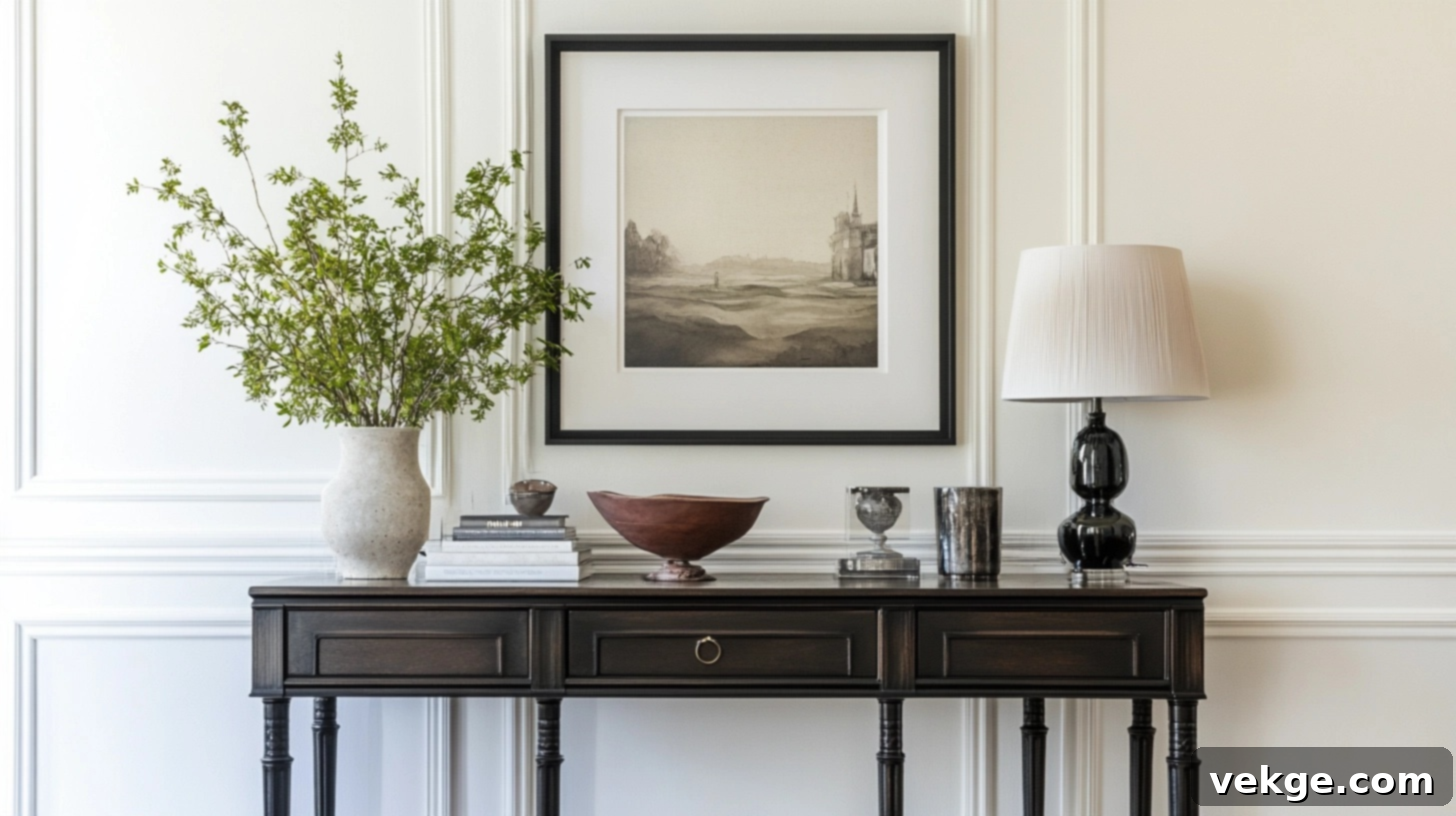
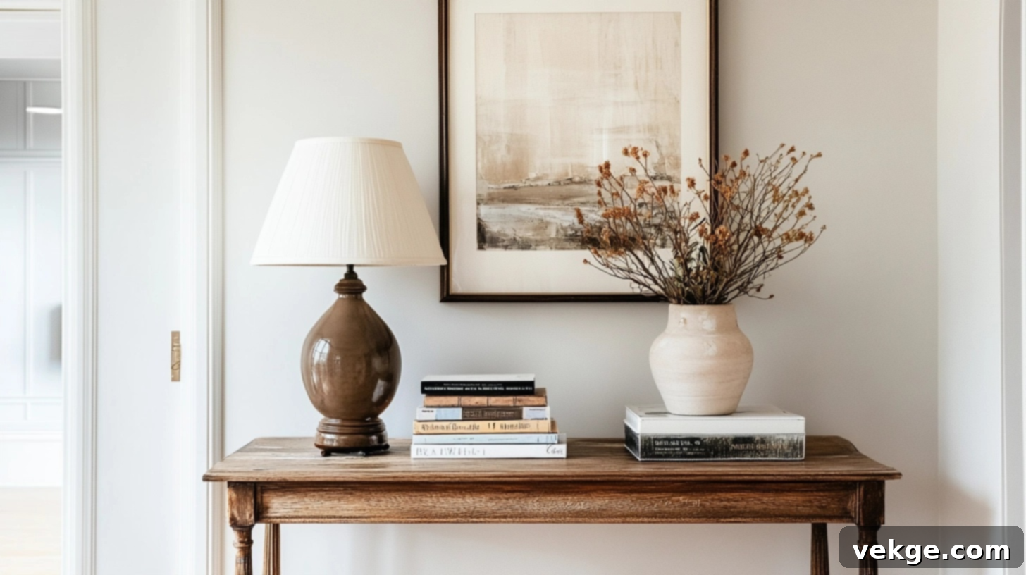
Opting for a single statement piece above your console table is a classic choice that exudes confidence and sophistication. The key is to select artwork that not only complements your room’s existing color palette and style but also possesses enough visual weight and intrigue to naturally draw attention. To ensure the art remains the undisputed star of the arrangement, keep console table accessories minimal and low-profile. Think a simple sculptural object, a stack of elegant books, or a pair of understated vases. This approach creates a clean, striking, and impactful look that’s particularly effective in smaller spaces where clutter is best avoided, or when you want to showcase a truly special, high-impact piece of art.
2. Building a Gallery Wall: Curated and Dynamic
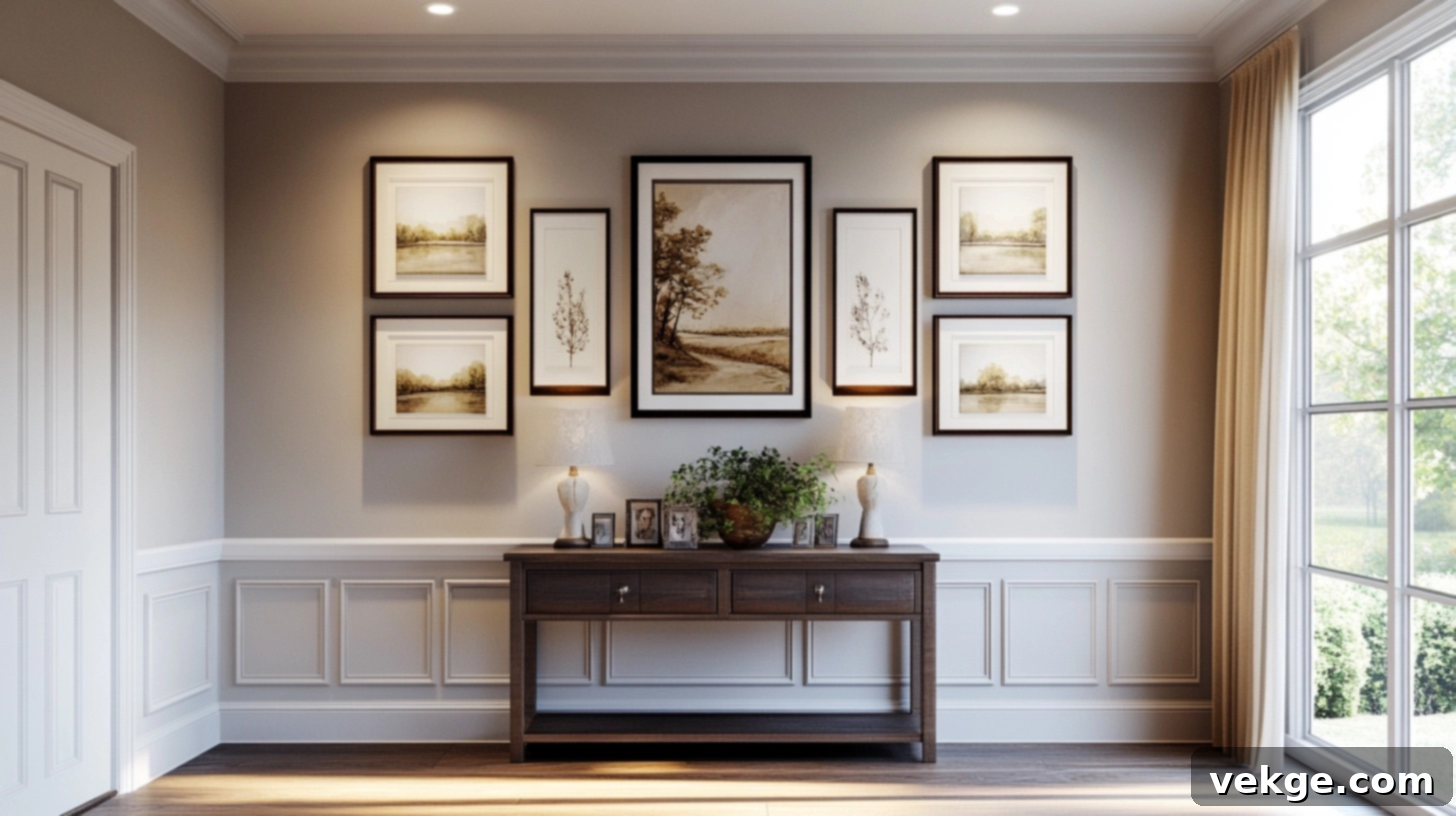
A gallery wall above a console table offers a fantastic opportunity to display multiple pieces, tell a story, or add a dynamic layer of texture and interest. When creating a gallery, remember to treat the entire collection as a single, cohesive unit for balance. The center of this entire grouping should ideally be positioned around eye level (57-60 inches from the floor), and the bottom edge of the lowest frame within your gallery should adhere to the 4-6 inch rule above your console table for proper grounding.
For spacing between individual frames, aim for 1-2 inches for a tight, more formal, and cohesive grouping, or allow 3-4 inches for a more relaxed, eclectic, and organic arrangement. You can mix various frame styles, materials, and artwork types for a bohemian or collected look, or match them for a sense of formality and order. The crucial element is visual cohesion within the grouping itself.
3. Layered Look: Art and Decor Together for Depth
The layered look is perfect for creating a relaxed, lived-in appearance that feels both organized and effortlessly chic. In this style, art pieces are typically leaned against the wall rather than hung. Start with a larger piece as your base, then layer smaller frames, mirrors, or even decorative objects in front. The key to success is to vary the heights and depths of the items to create visual movement and interest that draws the eye towards the wall.
Maintain balance by giving each item its own space, even within the layered effect, consciously avoiding any sense of clutter. Step back occasionally to assess the arrangement from a distance and ensure nothing appears too crowded or lost. This approach adds depth, texture, and a wonderfully curated feel to your console display, making it feel intentionally designed and unique.
4. Modern Console with Abstract Art: Sleek Sophistication
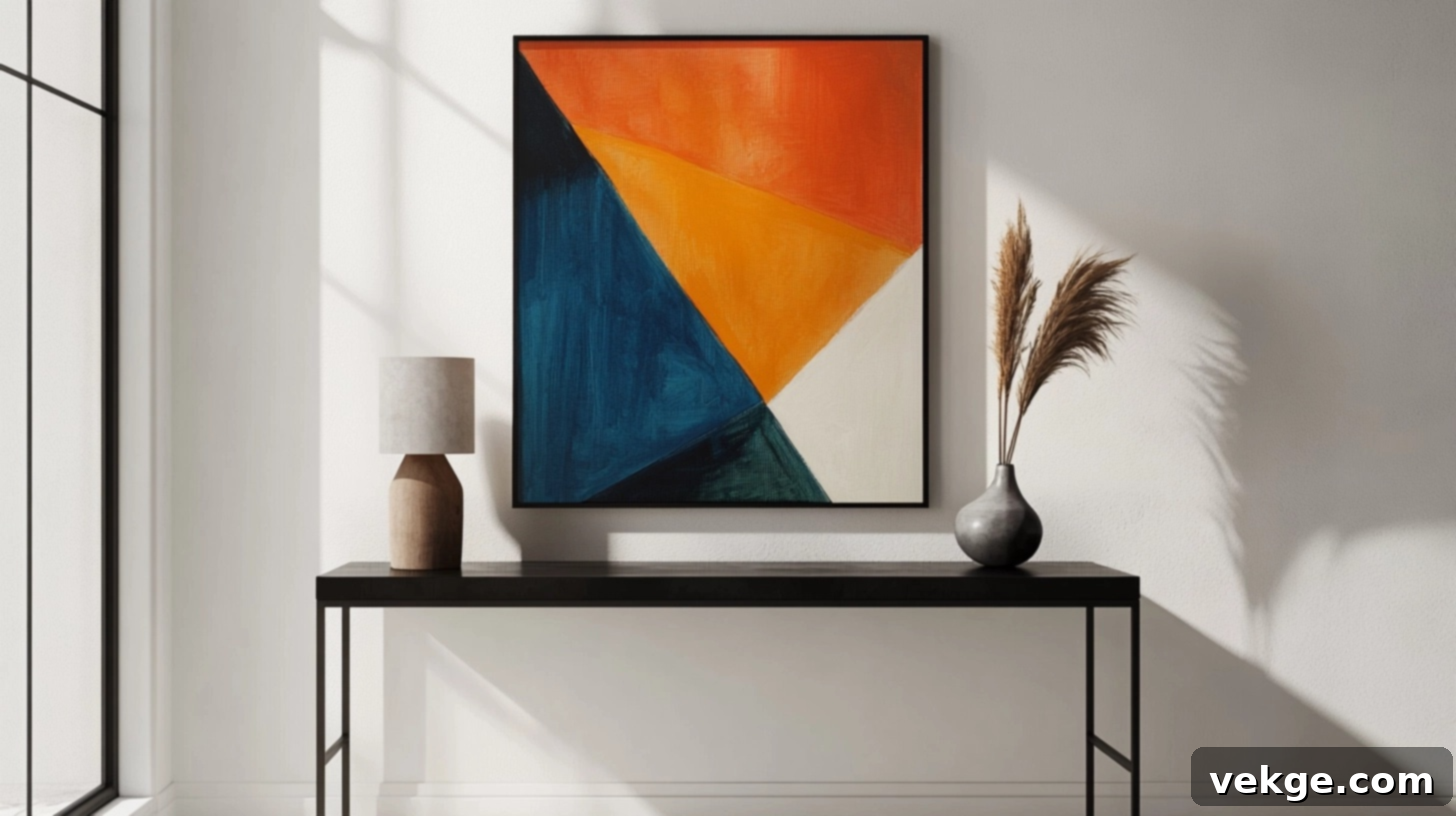
A sleek, modern console table, often characterized by clean lines, minimalist design, and materials like metal, glass, or polished wood, provides the perfect understated backdrop for bold abstract artwork. The console’s smooth surfaces and minimal detailing allow colorful, textured, or graphically compelling abstract pieces to truly become the undisputed focal point of the arrangement. This pairing works exceptionally well with large-scale abstract art featuring vibrant colors, dynamic forms, or geometric patterns that elegantly complement the console’s inherently clean and simple lines. The result is a fresh, current, and art-forward look where the artwork shines brightest against its refined and unassuming foundation.
5. Rustic Console with Landscape Prints: Natural Warmth
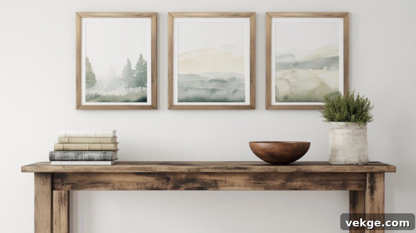
Wooden console tables with natural, distressed, or reclaimed finishes pair beautifully with landscape prints, nature photography, or botanical illustrations. This classic combination instantly brings a sense of warmth, natural beauty, and outdoor tranquility into your indoor space. Consider a series of smaller landscape prints arranged as a mini gallery, perhaps in complementary wooden frames, or a single large watercolor scene depicting serene natural settings.
The organic qualities present in both the artwork’s subject matter and the rustic console’s material create a cohesive, inviting, and grounded atmosphere. This style is particularly effective for living rooms, entryways, or even dining areas where a touch of natural charm is desired.
6. Glam Setup with Layered Mirrors and Small Art: Dazzling Depth
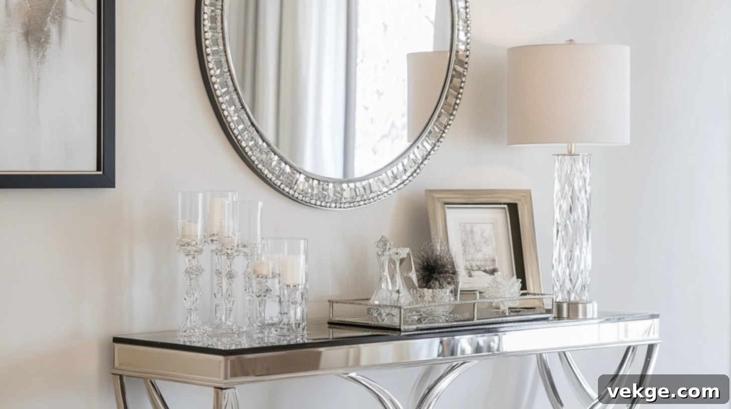
For a sophisticated and dazzling display, combine a glossy, mirrored, or metallic console table with a layered arrangement of mirrors and smaller framed artwork. Begin with a larger, perhaps ornate or statement mirror as the primary base piece, either hung or leaned against the wall. Then, add smaller art pieces, perhaps in metallic or acrylic frames, propped against the larger mirror or directly on the console. To amplify the glam effect, include metallic or crystal decorative objects (like candlesticks, vases, or sculptures) on the console to catch and reflect light beautifully. This layered approach not only adds significant depth and brightness to your space but also effectively makes smaller areas feel more expansive and luxurious, creating a truly opulent vignette.
7. Minimalist Styling with Neutral Tones: Calm Serenity
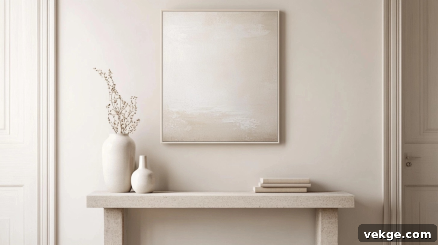
To cultivate a calm, spacious, and undeniably serene feel, pair a simple, uncluttered console table with artwork executed in neutral tones that subtly blend with your wall color. Choose art characterized by ample white space, minimal color variation, and perhaps abstract or geometric forms with soft lines. Opt for very thin frames, ideally in the same tone as your wall or the console itself, to maintain an uninterrupted flow. Keep table styling exceptionally minimal—perhaps just one or two carefully selected objects in similar neutral shades or natural textures. This minimalist approach fosters a profound sense of tranquility and allows the artwork to feel like a natural, harmonious extension of your room, promoting a peaceful and uncluttered environment.
Measuring & Hanging Like a Pro: Practical Steps for Perfection
Hanging art correctly isn’t just about aesthetics; it’s about precision and good preparation. These simple, professional steps will help you achieve a flawless look with minimal wall damage, saving you time and frustration in the long run.
1. Use Painter’s Tape to Preview Placement
Before you commit to making any holes in your wall, utilize painter’s tape to outline your artwork on the wall above your console table. This invaluable step allows you to visually experiment with different heights and positions without any permanent consequences. You can step back and see how the placement looks from various angles, from across the room, or even from a seated position. Adjust the tape until the position feels absolutely right. For complete confidence, consider leaving the tape outlines up for a day or two to ensure you are entirely happy with the chosen spot before drilling. This iterative process is a designer’s secret weapon for perfect placement.
2. Mark Your Anchors with Precision
Once you’re satisfied with the preview, it’s time for careful measurements. Start by determining the ideal height for the bottom of your frame, typically 4-6 inches above your console table. Then, measure your artwork. If using a picture wire, pull it taut and measure from the top of the frame to the apex of the stretched wire. If using D-rings or sawtooth hangers, measure directly to the hanger points. Mark these precise points clearly on the wall with a pencil. For wider or heavier pieces, it’s often best to use two hooks or anchors instead of one. Mark both the left and right anchor points to distribute weight properly, prevent tilting, and ensure your art hangs securely and straight.
3. Level It Out: The Key to Professional Finishes
A crooked picture can instantly detract from even the most perfectly planned wall arrangement. Always use a reliable level—whether a traditional bubble level or a modern laser level—when marking your anchor points to ensure they are perfectly horizontal. After hanging the artwork, double-check its level again. For heavier pieces, as mentioned, using two hooks instead of a single central one provides better stability and significantly reduces the chance of the art tilting over time. Additionally, applying small adhesive bumpers (felt or clear silicone dots) on the bottom corners of the frame can help keep it steady against the wall, preventing it from shifting or scratching the paint. These seemingly minor extra steps are what differentiate a professional installation from an amateur one, ensuring your artwork stays perfectly straight and looks impeccably hung.
4. Don’t Ignore What’s on the Table: Integrate Decor Thoughtfully
The decor placed on your console table is an integral part of the overall display and must work harmoniously with the wall art, rather than blocking or crowding it. Consider the height and bulk of your lamps, vases, books, or other decorative objects. If you plan to use tall accessories, you might need to adjust the artwork’s hanging height slightly higher to ensure there’s clear visual separation and no competition. Alternatively, you could choose a wider piece of art that extends comfortably beyond the height of your taller console accessories, visually encompassing them within the display. The goal is to create a unified vignette where every element has its space and contributes to the visual balance without obstruction or clutter.
Conclusion: Your Path to Perfect Art Placement
Hanging art above a console table might seem like a small detail, but getting it right can profoundly impact the aesthetics and harmony of your entire room. By following a few straightforward principles, you can achieve a professional and polished look with ease:
- Maintain the Visual Link: Always aim to leave 4–6 inches of space between the bottom of your artwork and the top of the console table. This creates a crucial visual connection that makes the art and furniture feel like a single, cohesive unit.
- Prioritize Viewing Comfort: Strive to center your art at an average eye level of 57–60 inches from the floor, ensuring it’s easily and comfortably enjoyed by anyone in the room.
- Respect Proportions: Select artwork sizes that are appropriate for your console table, generally adhering to the 2/3 width rule. This prevents the art from looking either too small and lost or too large and overwhelming for the space.
Before you even think about hammering in nails, harness the power of painter’s tape to test your desired spot. This simple trick can save you countless headaches, unnecessary holes, and wasted time. Whether you choose one grand statement piece, curate a vibrant gallery wall, or embrace a sophisticated layered look, always prioritize a balanced and uncluttered setup.
Getting the height and size right ensures that your wall art and console table work together in perfect synergy, creating a unified and beautiful focal point in your home, rather than competing for attention. Now go forth and hang with confidence!
