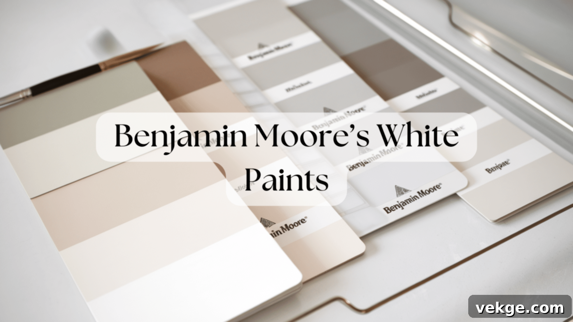
Discover the Best Benjamin Moore White Paints: Your Ultimate Guide to Choosing the Perfect Shade
Choosing the right white paint can often feel like an overwhelming task, akin to searching for a specific star in a galaxy of possibilities. With over 150 white paint options, Benjamin Moore truly stands out, backed by more than 140 years of crafting reliable, high-quality paints. This extensive selection is precisely why so many homeowners and designers consistently turn to Benjamin Moore’s whites.
What makes Benjamin Moore’s white paints so exceptional? Their collection offers subtle yet significant variations – some whites lean distinctly warm, others decidedly cool, while many present a beautiful balance. This diversity ensures there’s a perfect white for every room, every lighting situation, and every desired aesthetic, capable of transforming a space from ordinary to extraordinary.
In this comprehensive guide, we will explore the nuances of Benjamin Moore’s most popular white paint colors. You’ll gain insights into:
- A curated list of the top Benjamin Moore white paints, categorized for easy selection.
- A straightforward, proven method to help you confidently pick the ideal white for your unique space.
- Essential tips and tricks to achieve flawless painting results, ensuring your chosen white truly shines.
Having personally tested these paints across various lighting conditions and diverse spaces, I’ve gathered first-hand experience to help demystify the selection process. My aim is to equip you with the knowledge needed to make an informed decision, ensuring you select a white that perfectly complements your home.
By the end of this article, you’ll feel empowered and certain about which Benjamin Moore white will not only work best but also elevate the beauty and ambiance of your home.
Benjamin Moore’s Best All-Around White Paints
1. White Dove (OC-17)
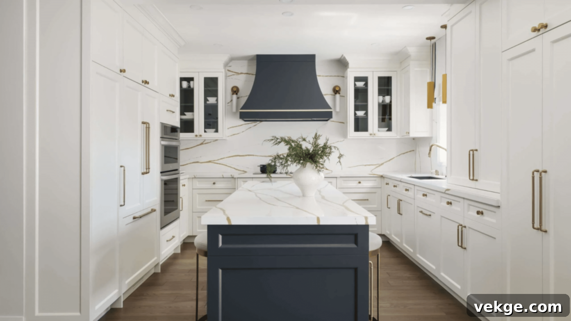
White Dove is a beloved classic, offering a gentle softness that imbues spaces with brightness without any harshness. This versatile shade beautifully combines warmth and openness, maintaining a clean yet inviting aesthetic. Its subtle hint of gray prevents it from appearing too sterile or overtly bright, making it incredibly adaptable to various design styles.
- Possesses soft, adaptable undertones that gracefully shift with changing light throughout the day.
- Expertly balances shadows, providing warmth without ever leaning yellow.
- Seamlessly integrates into both modern, minimalist settings and more traditional, classic interiors.
- Its soft nature subtly conceals minor wall imperfections, offering a forgiving finish.
Best for: Living rooms, kitchens, trim work, exterior siding, and creating a cohesive flow throughout open-plan homes.
2. Simply White (OC-117)
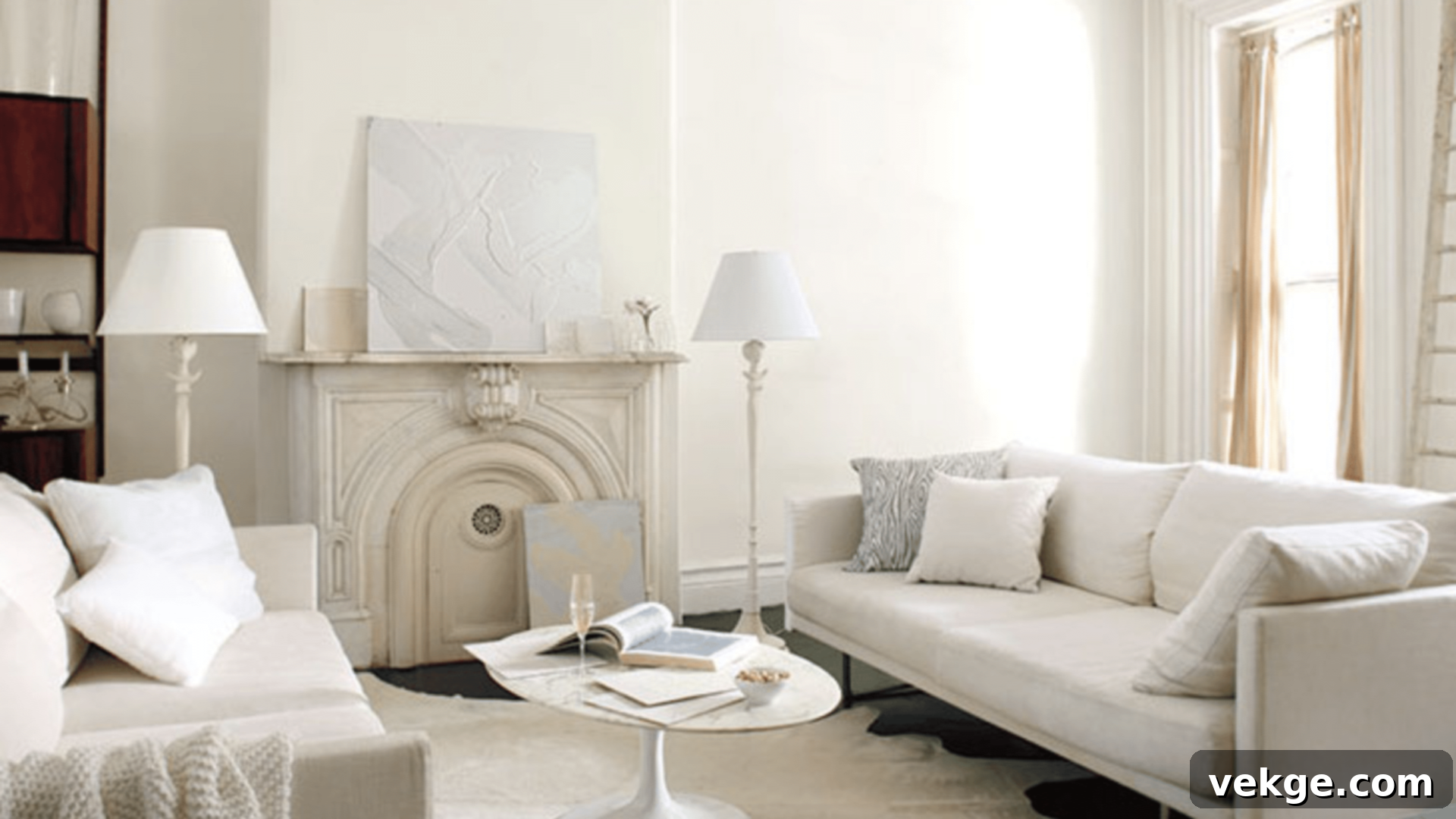
Simply White distinguishes itself with a pure, fundamental character that nonetheless feels incredibly inviting. It possesses a remarkable ability to brighten spaces significantly without introducing the cold or stark undertones often associated with very bright whites. This radiant white truly allows your furnishings, artwork, and architectural details to pop and take center stage.
- Features clear, crisp undertones that maintain their true character across various lighting conditions.
- Acts as an impeccable backdrop, making artwork and furniture stand out with enhanced vibrancy.
- Offers excellent coverage, simplifying the painting process and achieving a uniform finish.
- Naturally illuminates even the darkest corners of a room, making spaces feel larger and more open.
Best for: Home offices, art studios, hallways, dining rooms, and any space where you desire a clean, bright, and vibrant foundation.
3. Cloud White (OC-130)
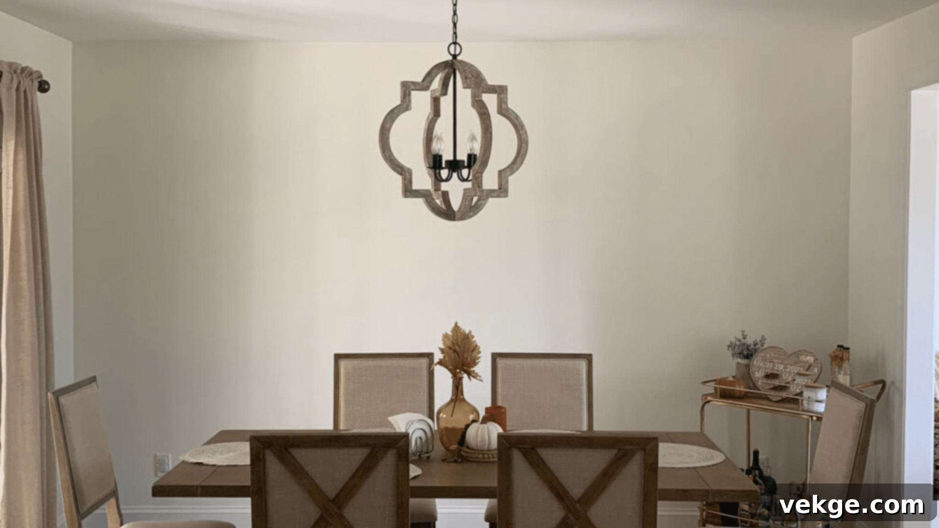
Cloud White evokes a sense of lightness and airiness, reminiscent of freshly laundered linens swaying in a gentle breeze. This nuanced shade subtly shifts throughout the day, ensuring spaces feel continually fresh, clean, and utterly serene. It’s particularly adept at making rooms feel more expansive and open without ever becoming overly bright or glaring.
- Boasts a slight, inviting cream undertone that imparts a gentle warmth to any room.
- Transforms beautifully with natural light, showcasing its delicate shifts from morning to evening.
- Lends depth and character to even the simplest of spaces, elevating their overall appeal.
- Harmonizes exceptionally well with natural wood tones, creating a cohesive and earthy palette.
Best for: Bedrooms, bathrooms, laundry rooms, mudrooms, and any area where a soft, comforting, and refreshing atmosphere is desired.
Benjamin Moore’s Top Cool Whites
4. Chantilly Lace (OC-65)
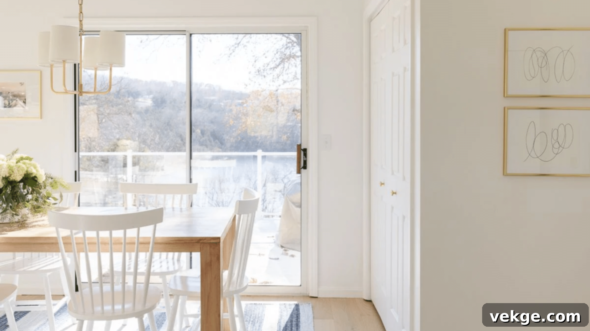
Chantilly Lace delivers an undeniably crisp and impeccably clean feel, instantly refreshing any space it adorns. This bright white is celebrated for creating sharp lines and clear, defined shadows, making it a favorite among photographers and those seeking a precise aesthetic. It excels at making rooms feel significantly larger and more open, completely devoid of any yellow or creamy undertones.
- Features virtually no visible undertones, appearing as a true, unadulterated white.
- Possesses a very high light reflection value, maximizing natural light and brightness.
- Effectively takes on color cues from surrounding furnishings and decor, allowing them to shine.
- Maintains its consistent, pure white appearance throughout the entire day, regardless of light changes.
Best for: Modern kitchens, art galleries, contemporary bathrooms, professional spaces, and minimalist interiors.
5. Decorator’s White (CC-20)
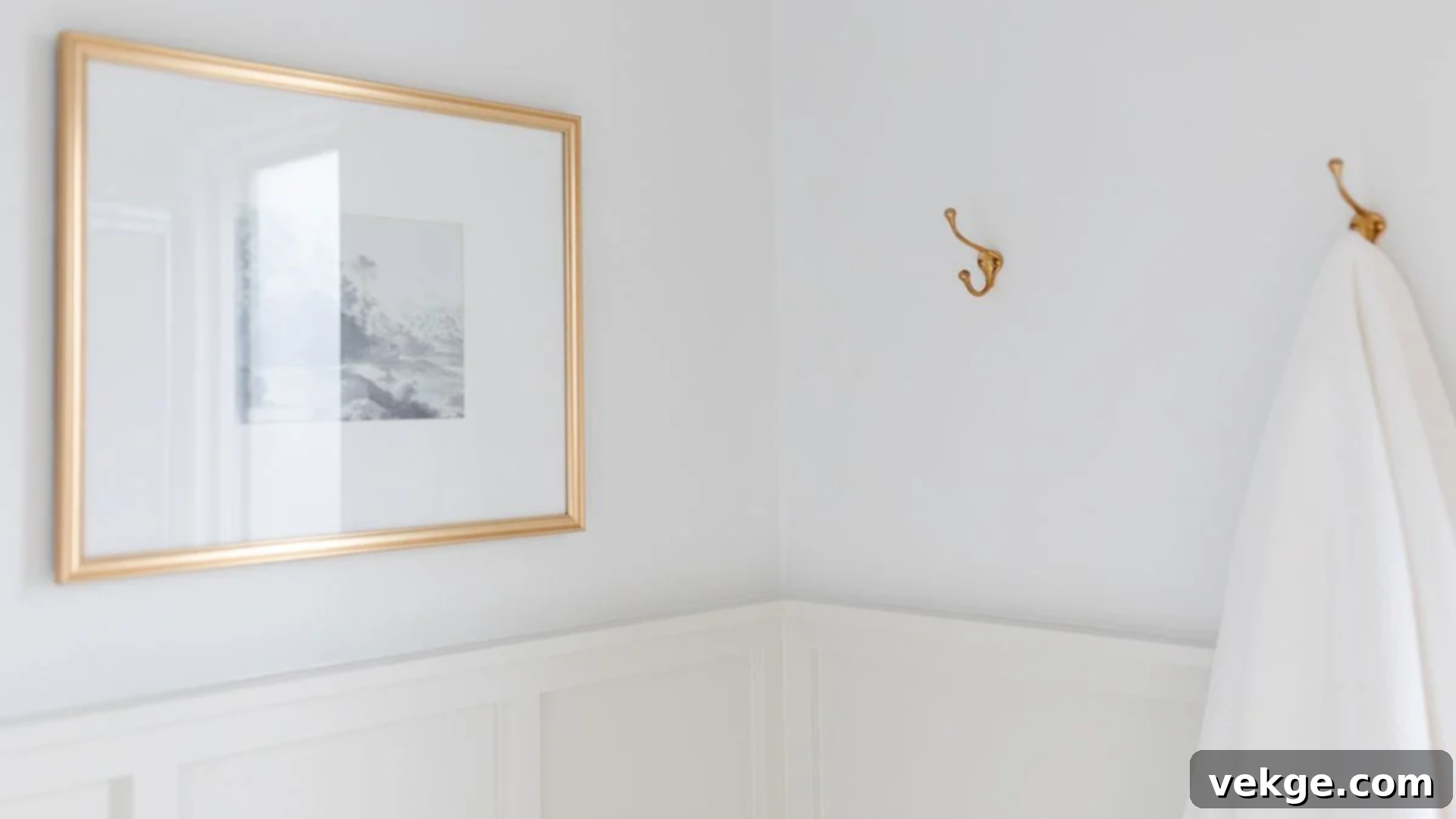
Decorator’s White distinguishes itself with a subtle blue-gray undertone that exudes sophistication and refinement. It is an excellent choice for spaces that require a clean, polished look without veering into sterile territory. This particular white is highly effective in making trim work appear exceptionally sharp and precisely defined, adding architectural interest.
- Incorporates subtle gray undertones, providing a contemporary edge and softness.
- Helps to reduce glare in brightly lit rooms, creating a more comfortable visual experience.
- Makes adjacent colors pop and appear more vibrant, enhancing the overall color scheme.
- Absolutely perfect for trim details, doors, and ceilings, where definition is key.
Best for: Trim work, ceilings, home offices, craft rooms, and any area seeking a refined and intelligently cool white.
6. Frostine (CC-50)
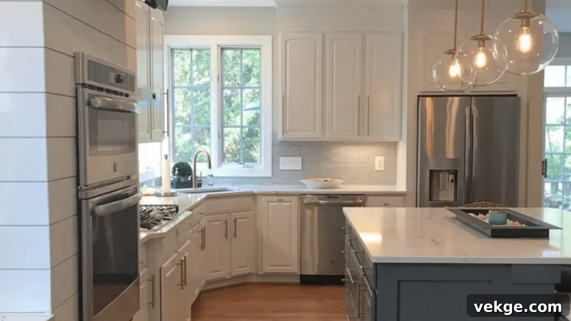
Frostine delivers a bright, incredibly clear atmosphere, courtesy of its delicate blue undertone. This particular white is remarkably effective in making north-facing rooms, which often feel dark or cool, appear more open, spacious, and welcoming. It brings a crisp, fresh feeling to any space without ever looking excessively cold or clinical.
- Features subtle blue hints that contribute to a fresh, invigorating ambiance.
- Performs exceptionally well in low-light conditions, helping to brighten otherwise dim areas.
- Contributes to making spaces feel noticeably larger and more expansive.
- Aids in neutralizing the yellow cast sometimes emitted by artificial light bulbs, ensuring true color representation.
Best for: North-facing rooms, bathrooms, laundry rooms, sunrooms, and any space that could benefit from a crisp, refreshing lift.
Benjamin Moore’s Best Warm Whites
7. Navajo White (OC-95)
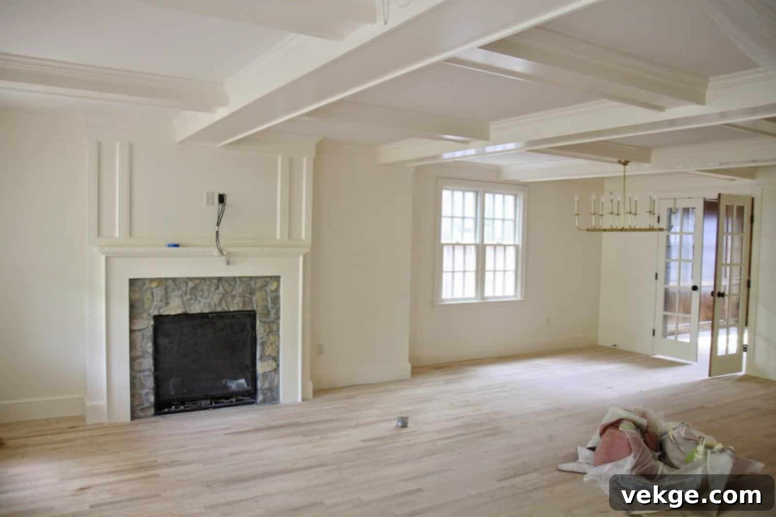
Navajo White introduces a rich, creamy tone that instantly makes spaces feel snug, inviting, and wonderfully welcoming. It’s an impeccable choice for rooms that require an extra layer of warmth without straying into overly yellow territory. This timeless white creates a soft, flattering glow that enhances skin tones, making it ideal for living spaces where people gather.
- Boasts distinct warm cream undertones, adding depth and comfort.
- Effectively reduces harsh shadows, creating a softer, more diffused light quality.
- Beautifully complements natural materials such as wood, stone, and woven textures.
- Creates inherently cozy and intimate atmospheres, perfect for relaxation and comfort.
Best for: Living rooms, dining rooms, master bedrooms, powder rooms, and any space where a warm, embracing environment is desired.
8. Capri Coast (OC-87)
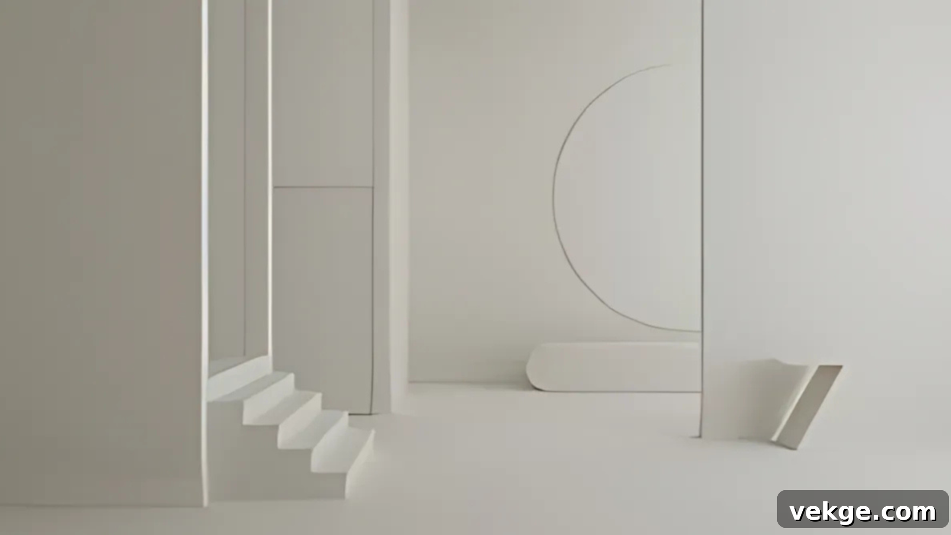
Capri Coast (formerly known as Buttercream in some contexts, though Capri Coast is its official Benjamin Moore designation) infuses a sunny warmth that naturally brightens any space. It has a transformative effect, turning cold or uninviting rooms into cheerful and welcoming havens. This delightful white breathes life into north-facing rooms, providing a sunny disposition without appearing too yellow or overly intense.
- Features soft, subtle yellow undertones that mimic natural sunlight.
- Effectively warms up cool natural light, making spaces feel more inviting.
- Provides a lovely balance to dark furniture, preventing rooms from feeling too heavy.
- Instantly makes spaces feel brighter and more optimistic, as if bathed in sunshine.
Best for: North-facing rooms, kitchens, breakfast areas, playrooms, and any area craving a cheerful and radiant warmth.
Benjamin Moore’s Best Off-Whites
9. Swiss Coffee (OC-45)
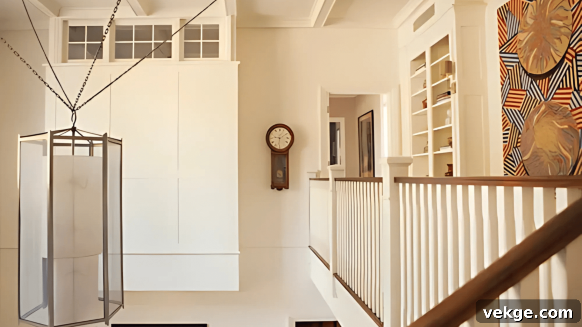
Swiss Coffee establishes a gentle, creamy base that immediately makes a home feel comfortable and lived-in. This inviting shade has a remarkable ability to soften harsh artificial light while simultaneously maintaining a bright and airy ambiance. It’s a sophisticated off-white that feels both timeless and perfectly contemporary, adapting effortlessly to various decor styles.
- Characterized by subtle, comforting cream undertones.
- Excellent for softening the sometimes stark quality of LED lighting.
- Its forgiving nature helps to minimize the appearance of minor wall imperfections.
- Reflects light evenly across surfaces, contributing to a harmonious glow.
Best for: Living spaces, home libraries, studies, guest rooms, and any area desiring a soft, enveloping warmth.
10. Butter Pecan (OC-89)
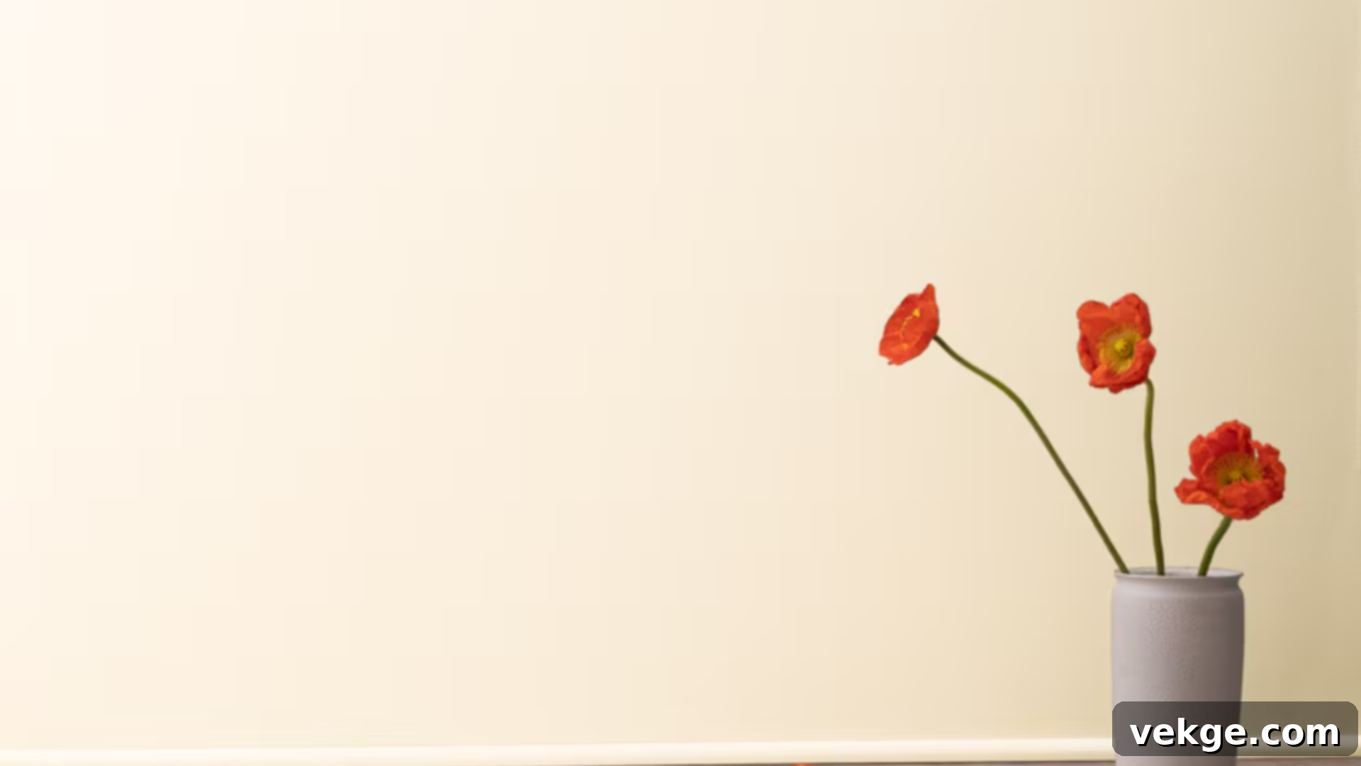
Butter Pecan masterfully blends warmth and brightness in a perfectly balanced hue. This exquisite off-white imparts a refined yet profoundly comfortable feel to any space. It creates a subtle, flattering glow that makes everyone look and feel their best, adding a touch of understated luxury without being ostentatious.
- Features gentle, earthy beige undertones that ground the color.
- Harmonizes beautifully with natural fabrics, creating a serene and organic palette.
- Naturally reduces glare, promoting a calm and inviting atmosphere.
- Provides an elegant backdrop that makes artwork appear more sophisticated and high-end.
Best for: Formal living rooms, elegant dining rooms, master suites, dressing rooms, and sophisticated sitting areas.
11. Mannequin Cream (OC-92)

Mannequin Cream offers a classic, enduring feel that truly transcends fleeting trends, making it a perennially stylish choice. It excels at creating depth and dimension without ever feeling too dark or too stark. This versatile off-white introduces a subtle, sophisticated warmth that enriches any space it graces, providing an ideal foundation for diverse decor.
- Showcases delicate pale beige undertones, adding a sophisticated neutrality.
- Its depth helps to effectively conceal minor wall imperfections.
- An incredibly versatile shade that pairs seamlessly with virtually any decor style, from traditional to contemporary.
- Maintains a consistently clean and fresh appearance over time.
Best for: Hallways, entryways, studies, formal dining rooms, and areas where timeless elegance is paramount.
Benjamin Moore’s Best Bright Whites
12. Super White (OC-152)
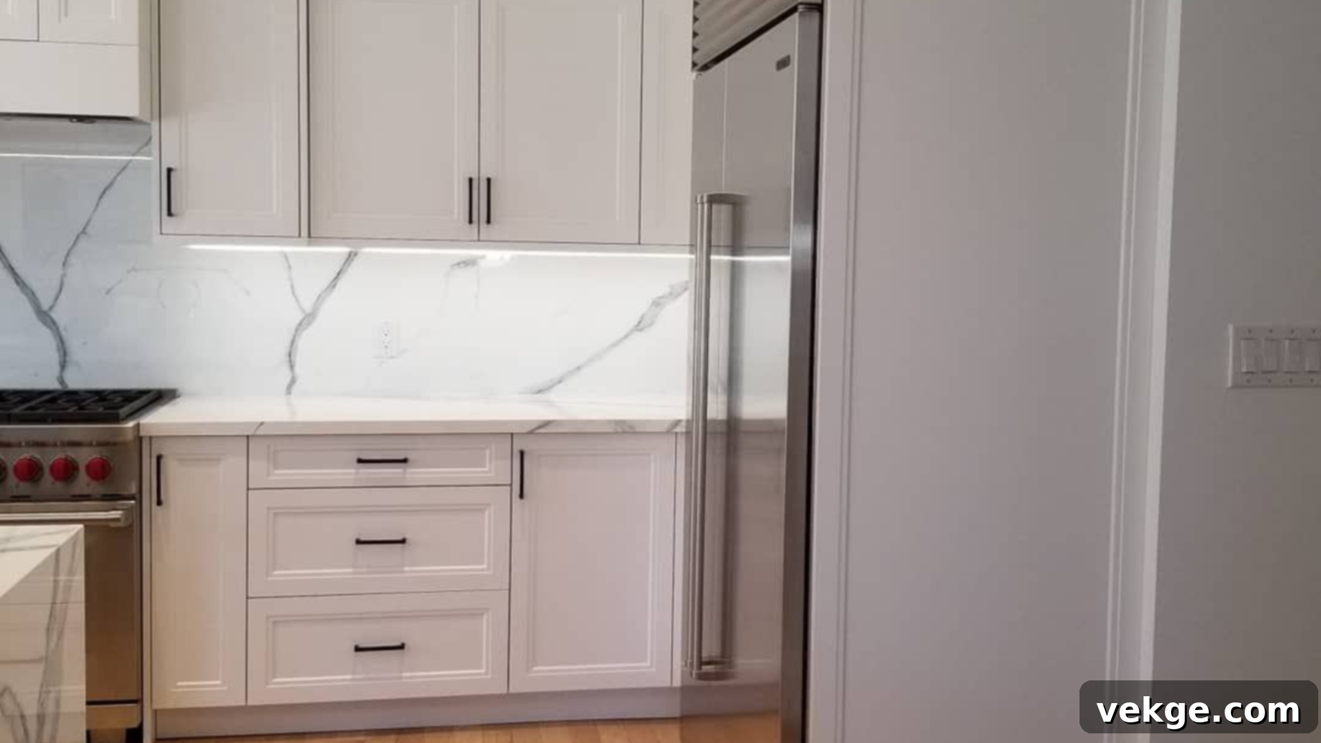
Super White delivers an unparalleled pure brightness, creating an incredibly clean and fresh aesthetic. This crisp white serves as the perfect backdrop for showcasing art, modern furniture, and bold design statements. It powerfully makes spaces feel significantly larger, more expansive, and vibrantly open, embodying minimalist perfection.
- Features absolutely zero discernible undertones, presenting as the purest white.
- Boasts the highest possible light reflection value, maximizing illumination in any room.
- Makes surrounding colors pop with incredible intensity and clarity.
- Creates sharp, dynamic contrasts that highlight architectural features and decor.
Best for: Art galleries, modern kitchens, minimalist spaces, design studios, and areas demanding ultimate clarity and brightness.
13. Ultra White (CC-10)

Ultra White brings an exceptional level of clarity and crispness to any environment. It is the quintessential choice for rooms that demand maximum brightness and a genuinely fresh appeal. This brilliant white ensures that every other element in the room stands out with enhanced definition and vibrancy, acting as a powerful neutral anchor.
- Provides a bright, truly neutral base that anchors any color scheme.
- Creates incredibly clean and sharp lines, perfect for architectural precision.
- Ensures that true colors are rendered accurately, without any altering undertones.
- Ideal for highlighting specific features, trim, or areas that require extra emphasis.
Best for: Modern offices, retail spaces, display areas, bathrooms, and any setting requiring an energetic and highly illuminated atmosphere.
14. Pure White (OC-64)
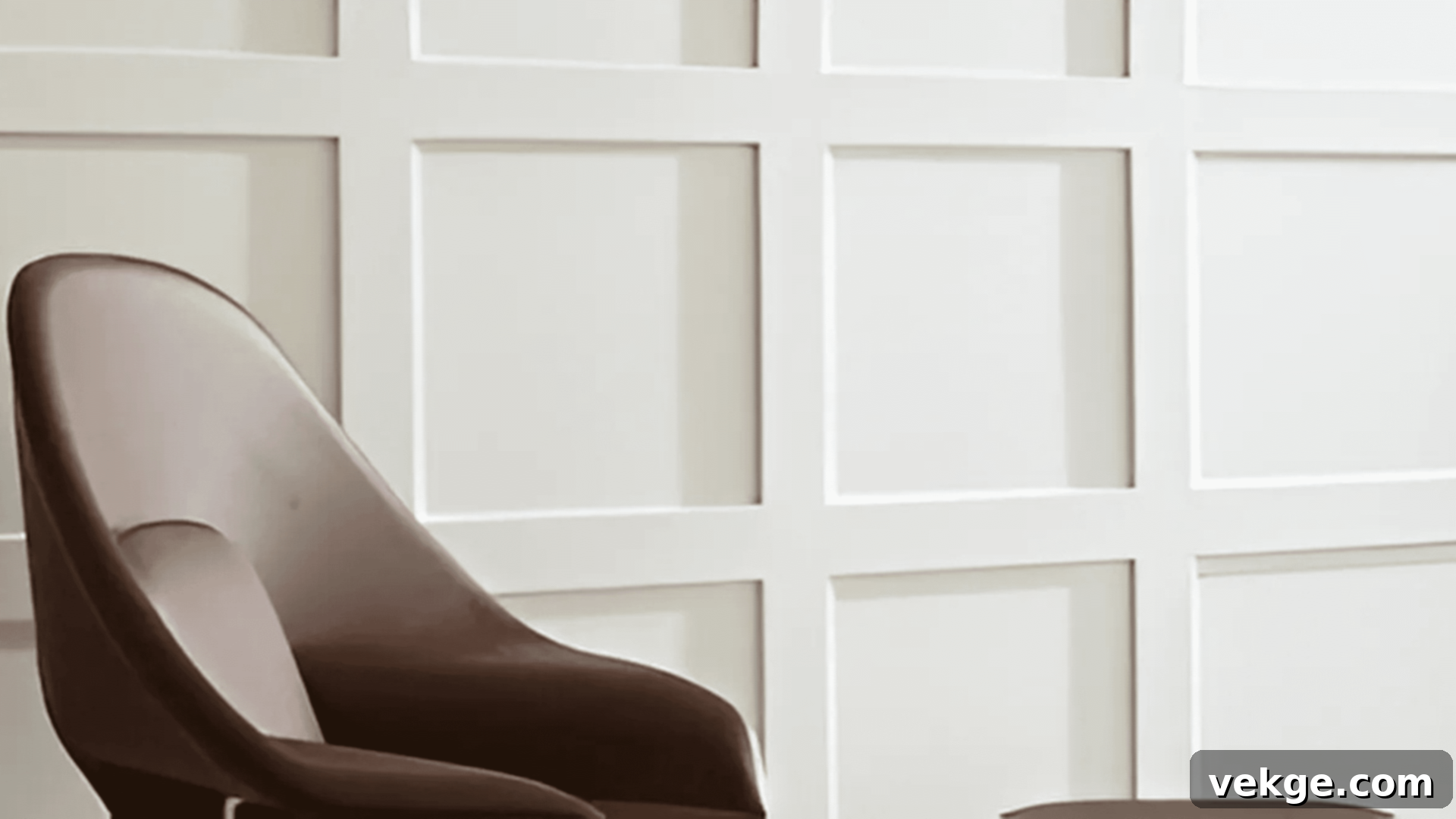
Pure White cultivates spaces that feel inherently fresh, clean, and invigorating. It possesses a remarkable ability to transform even the darkest rooms into bright, welcoming, and lively areas. This versatile white breathes life into any space without ever feeling cold or stark, making it a reliable choice for a consistently uplifting environment.
- Offers a clear, straightforward white base that is easy to work with.
- Effectively brightens dark corners and areas that receive less natural light.
- Contributes significantly to making rooms feel larger and more open.
- Performs consistently well in virtually any lighting condition, maintaining its true character.
Best for: Home offices, craft rooms, kitchens, workout spaces, and any area benefiting from a consistently bright and clean feel.
Benjamin Moore’s Best Soft Whites
15. Moonlight White (OC-125)

Moonlight White infuses rooms with a gentle, ethereal, and dreamy quality, creating spaces that feel incredibly calm and peaceful. This soft white has a unique way of making rooms feel both larger and yet wonderfully cozy at the same time. Its subtle charm creates an atmosphere of serene sophistication, perfect for intimate settings.
- Features soft, barely-there gray undertones that contribute to its tranquil mood.
- Instantly creates peaceful and restful atmospheres, ideal for unwinding.
- Effectively reduces the impact of harsh or direct light, softening the overall ambiance.
- Helps spaces flow seamlessly into one another, promoting a sense of continuity.
Best for: Bedrooms, meditation rooms, spa-like bathrooms, reading nooks, and any area designed for relaxation and quiet contemplation.
16. Soft Chamois (OC-13)
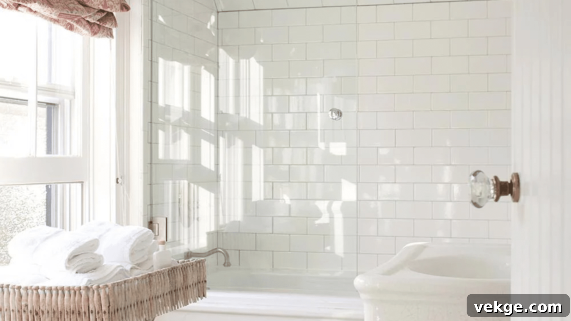
Soft Chamois brings a delicate warmth that mimics the gentle glow of morning light. It is an ideal choice for creating inviting and approachable spaces that feel inherently comfortable. This delightful white makes rooms feel naturally bright and wonderfully open, without being overly assertive or stark, embodying understated elegance.
- Contains subtle, delicate yellow undertones that evoke a cheerful warmth.
- Creates a lovely “morning glow” effect, making spaces feel bright and fresh.
- Effectively warms up inherently cool spaces, balancing their light.
- Its gentle hue beautifully flatters skin tones, enhancing the overall feeling of well-being.
Best for: Morning rooms, breakfast nooks, nurseries, sitting rooms, and any space where a comforting and gentle radiance is desired.
17. Opaline (OC-33)
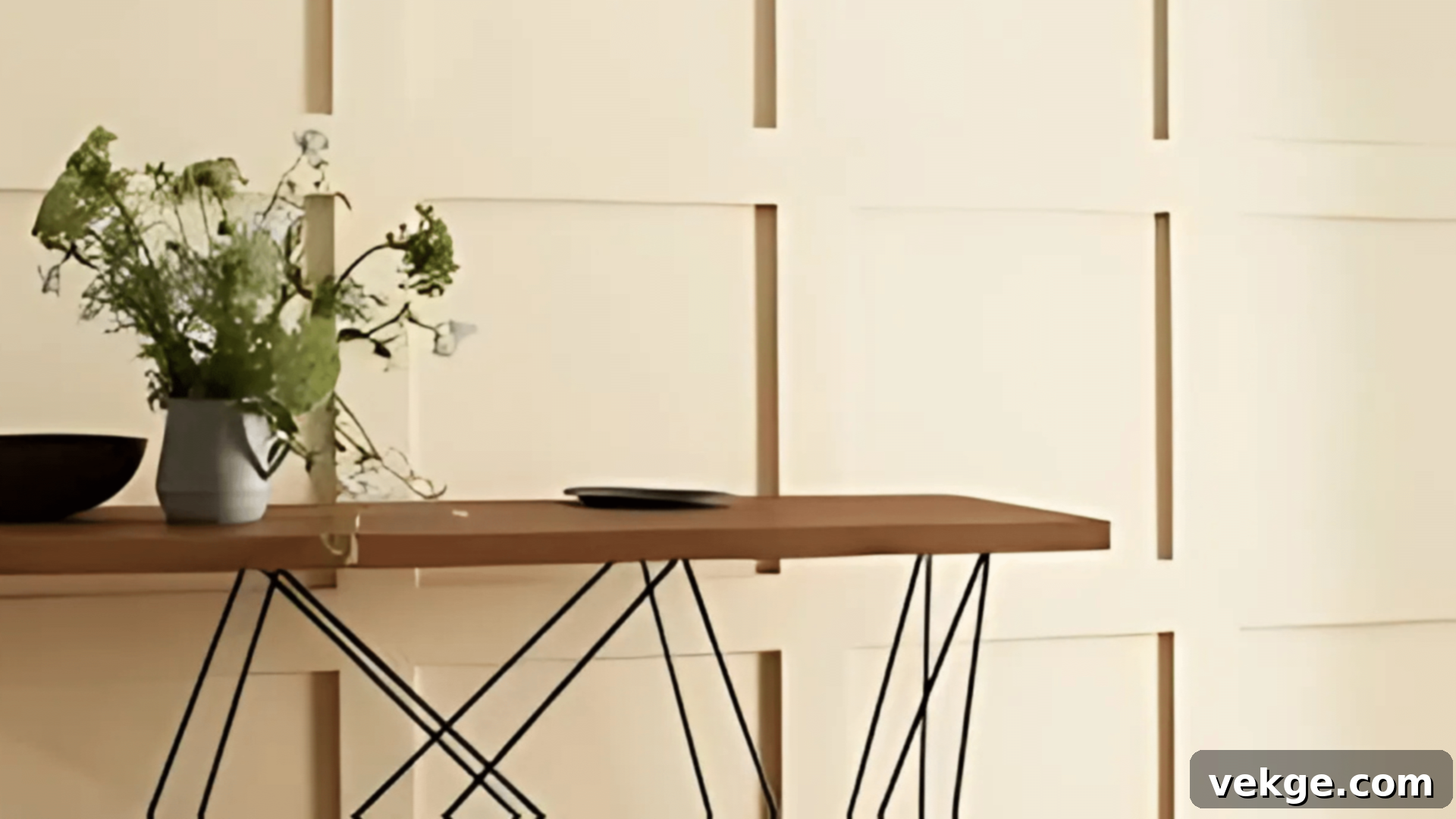
Opaline offers a gentle, refined charm that brings a sophisticated softness to any space. This versatile white serves as an impeccable backdrop for both modern and classic decor, effortlessly bridging different design eras. It infuses rooms with a subtle yet distinct sophistication, creating an atmosphere that feels both timeless and elegantly understated.
- Features soft, barely-there cream undertones that add a touch of warmth and luxury.
- Expertly enhances natural light, making the most of available illumination.
- Harmonizes beautifully with antique furnishings and traditional elements.
- Creates enduring, classic looks that remain stylish for years to come.
Best for: Rooms with southern exposure, traditional spaces, sunrooms, and any area seeking a refined and subtly inviting white.
How to Select the Ideal Benjamin Moore White Paint for Your Space?
Choosing the perfect white paint for your home can be simplified by following a few key principles. Drawing from years of experience painting hundreds of rooms, here’s what truly matters when making your selection:
Start with Your Room’s Natural Light
The type and amount of natural light a room receives are paramount in determining how a white paint will appear. White paint colors are highly reflective and will absorb nuances from their surroundings, including sunlight. Therefore, understanding your room’s orientation is crucial:
- North-facing rooms: These rooms typically receive cooler, indirect light throughout the day. To counteract this cool light and prevent the space from feeling stark, opt for warmer whites with subtle yellow, pink, or beige undertones. These will help infuse a much-needed sense of coziness and warmth.
- South-facing rooms: Bathed in abundant warm, bright sunlight, south-facing rooms can beautifully accommodate cooler whites. These whites, often with blue or gray undertones, will balance the intense warmth, creating a crisp and refreshing feel without appearing overly cold.
- East-facing rooms: These rooms get bright, warm morning light, which then transitions to cooler light in the afternoon. Versatile whites that can adapt, or slightly warmer whites, often work well.
- West-facing rooms: Experience cool morning light and intense, warm afternoon light. Whites that can handle both extremes, or slightly muted whites, are often good choices.
Consider Room Size and Function
The dimensions and intended use of a room should also influence your white paint choice:
- Small rooms: To make smaller spaces feel larger, more expansive, and openly inviting, pure, bright whites with minimal undertones are an excellent choice. They reflect light maximally, pushing walls visually outwards.
- Larger rooms: Generously sized rooms can gracefully handle whites that possess more noticeable undertones (like soft creams or gentle grays) without feeling closed in or overwhelmed. These undertones can add character and depth to larger expanses.
- High-traffic areas: In bustling zones like hallways or kitchens, consider whites that are slightly forgiving or have subtle gray undertones that can mask everyday scuffs more effectively.
- Restful spaces: For bedrooms or meditation areas, softer, warmer whites with gentle cream or beige undertones promote relaxation and tranquility.
The Non-Negotiable Step: Test Before You Buy
This is arguably the single most important piece of advice I can offer: never commit to a white paint without thoroughly testing it in your actual space. Here’s my top recommendation for effective testing:
- Paint large squares: On several walls within the room, paint large squares (at least 2×2 feet) of your top two or three white paint contenders. Do this on different walls that receive varying amounts of light.
- Observe at different times: It’s crucial to view these paint swatches throughout the day to see how they interact with changing light conditions:
- Morning light: How does it look with the fresh, often cooler light?
- Afternoon sun: Does it become too warm or too bright?
- Evening light: How does it appear as natural light fades?
- With your room’s artificial lights on: Critically, assess how the white interacts with your existing light bulbs (LED, incandescent, etc.), as these can drastically alter a white’s perceived hue.
- Look with existing decor: Also, consider how the samples look next to your furniture, flooring, and any fabrics or finishes that will remain in the room.
Room-by-Room Guide to Benjamin Moore Whites
- Living Rooms: These are often multi-functional spaces, requiring flexible whites that look appealing from morning till night. Whites with slight beige or warm gray undertones, like White Dove or Swiss Coffee, provide versatility and warmth.
- Kitchens: Given daily activity and potential for messes, choose whites that maintain a clean look. Whites with a subtle touch of gray, such as Decorator’s White or a pure bright like Chantilly Lace, tend to stay looking crisp and clean longer, and pair well with varied cabinet and countertop materials.
- Bedrooms: To foster a restful and serene environment, soft whites with gentle cream or barely-there pink undertones are ideal. Cloud White or Moonlight White create a calming, easy-on-the-eyes atmosphere perfect for waking up peacefully.
- Bathrooms: Select whites that complement your existing fixtures, tiles, and hardware. If you have warm metals like brass or gold, choose whites with warm undertones (e.g., Navajo White). For chrome or brushed nickel, cooler whites (e.g., Frostine or Chantilly Lace) will harmonize beautifully. Ensure to use paints designed for high-moisture areas.
Effective Tips for Using Benjamin Moore’s White Paints
Through years of hands-on experience, I’ve discovered what truly makes white paint shine. Here are the most useful tips to help you achieve excellent, professional-looking results and create the desired atmosphere in your home.
1. Creating the Right Mood with White
White paint is far more than just a color; it’s a powerful tool for shaping the emotional tone and mood of a space:
- For a clean, fresh, and modern look: Opt for pure, crisp whites with minimal or cool undertones like Super White or Chantilly Lace. These create a minimalist canvas.
- For a warmer, more welcoming, and traditional space: Choose cream-tinted whites or those with soft beige undertones, such as White Dove, Swiss Coffee, or Navajo White. They envelop the room in comfort.
- Layering whites for depth: Don’t shy away from using different shades of white on trim, walls, and ceilings. For instance, a slightly warmer white on walls with a purer white trim can add subtle depth and architectural interest without making the space feel busy. This layering creates sophistication without complexity.
2. Making Rooms Feel Just Right
White paint is an optical illusionist, capable of altering the perceived size and coziness of a room:
- To Make a Room Feel Bigger and More Open:
- Paint the ceiling the exact same white as your walls. This creates an uninterrupted visual flow, blurring the lines where walls end and ceilings begin.
- Keep baseboards and trim the same white color as the walls. This monochromatic scheme reduces visual breaks, enhancing the sense of spaciousness.
- Use a flat or eggshell finish on walls, as these low-sheen options hide minor wall imperfections and offer a softer light reflection.
- To Make a Room Feel Cozier and More Intimate:
- Paint the trim a slightly different shade of white (perhaps a brighter or cooler white) than the walls. This defines the room’s edges, making the space feel more contained.
- Choose whites with subtle yellow, pink, or very light beige undertones. These warmer hues can subtly “advance” visually, making walls feel closer and more embracing.
- Opt for a pearl or satin finish for walls. The slight sheen adds a touch more texture and warmth, contributing to a more luxurious and inviting feel.
3. Choosing the Right Finish (Sheen)
The paint finish, or sheen, dramatically impacts durability, cleanability, and how light reflects in a room:
- Flat: Offers a non-reflective finish that’s excellent for hiding wall imperfections. Best for low-traffic walls and ceilings.
- Eggshell: A popular choice, providing a soft, subtle sheen that’s more durable and washable than flat. Perfect for living rooms, dining rooms, and bedrooms.
- Pearl: A slightly higher sheen than eggshell, offering increased durability and washability. Works well in hallways, bathrooms, and kitchens.
- Semi-gloss: Delivers a durable, high-sheen finish that’s very easy to clean. Best for trim, doors, cabinets, and high-traffic areas where durability is paramount.
- Gloss: The highest sheen, offering a very reflective and hard finish. Use sparingly for special architectural details, furniture, or to create a dramatic, mirror-like effect.
4. Colors That Work Exceptionally Well with White Paints
White acts as a perfect canvas, allowing other colors and textures to truly shine. Consider these pairings:
- Natural wood tones: From light oaks to rich walnuts, wood adds warmth and organic texture against white.
- Soft grays: A classic pairing, soft grays create sophisticated contrast and depth.
- Navy blue accents: Introduce a timeless pop of color and elegance with navy blue textiles or decor.
- Black metal fixtures: Creates striking modern contrast and industrial chic elements.
- Green plants: Bring life, freshness, and natural vibrancy into any white space.
Common Mistakes to Skip for Flawless Results:
- Not cleaning walls before painting: Dust, grease, and grime prevent paint from adhering properly, leading to peeling or an uneven finish. Always clean walls thoroughly.
- Skipping primer on dark or new walls: Primer provides a consistent base, ensures better adhesion, and prevents previous dark colors from bleeding through, especially crucial when going from dark to white.
- Using just one white throughout the entire house: While a cohesive look is desired, different rooms have different lighting and functions. A single white might feel too cold in one room and too warm in another. Embrace the subtle variations!
- Not testing paint in all lighting conditions: As discussed, light is a game-changer. What looks perfect in daylight might be jarring under evening artificial light.
- Rushing the second coat before proper drying: Applying a second coat too soon can lead to uneven coverage, streaks, and a weaker paint film. Always follow the manufacturer’s recommended drying times between coats.
Conclusion
The journey to choosing a white paint is far more nuanced than simply picking any shade labeled “white.” Each room in your home possesses its own unique personality and needs, and Benjamin Moore, with its vast and thoughtfully curated collection, offers an array of options that truly work for every imaginable space and desired effect.
Their white paints have consistently stood the test of time, proving their reliability and enduring beauty for walls, trim, and ceilings alike. As I’ve witnessed countless times, the right white paint possesses an incredible power to make a room feel exactly as you envision it – whether that’s bright and expansive, cozy and intimate, or elegantly serene.
With careful testing, proper preparation, and the insights shared in this guide, you are well-equipped to find the Benjamin Moore white that perfectly fits your space, your style, and your vision for your home.
Remember: Your home is a reflection of your unique style and comfort. Take the necessary time to test different whites in your specific lighting conditions and against your existing decor. The rewarding results – a beautifully transformed and harmonized living space – will undoubtedly be worth every effort.
Ready to embark on the exciting journey of transforming your space with the timeless elegance of Benjamin Moore’s whites? Select your favorite contender, grab your brushes, and start painting!
Frequently Asked Questions About Benjamin Moore White Paints
Are Benjamin Moore White Paints More Expensive Than Other Brands?
Benjamin Moore paints generally have a higher upfront cost compared to many other brands. However, they are known for their superior quality, excellent coverage, and rich pigmentation, which often means you’ll need fewer coats to achieve full opacity and a beautiful finish. Typically, one gallon of Benjamin Moore paint covers approximately 400-450 square feet. This superior coverage and durability often make them a more cost-effective choice in the long run, as you may buy less paint and achieve a longer-lasting, higher-quality result.
Can I Use Benjamin Moore White Paints in High-Moisture Areas?
Absolutely. Benjamin Moore offers specific lines of paint formulated for high-moisture environments. For bathrooms, kitchens, laundry rooms, and other areas prone to humidity and moisture, it is highly recommended to choose their Aura Bath & Spa line. These paints are engineered with mildew and moisture resistance, providing exceptional durability and maintaining their beautiful color quality even in challenging conditions. Always check the product specifications for the best performance in damp spaces.
How Long Do Benjamin Moore White Paints Take to Dry?
Drying times for Benjamin Moore white paints can vary slightly depending on the specific product line, humidity, and temperature. However, most Benjamin Moore whites are typically dry to the touch within 1-2 hours after application. For optimal results and proper adhesion, it is generally recommended to wait approximately 4 hours between coats. For the paint to achieve its full durability and hardness (full cure), it usually takes around 7 days. During this curing period, it’s best to handle the painted surface gently to ensure the finish sets properly.
