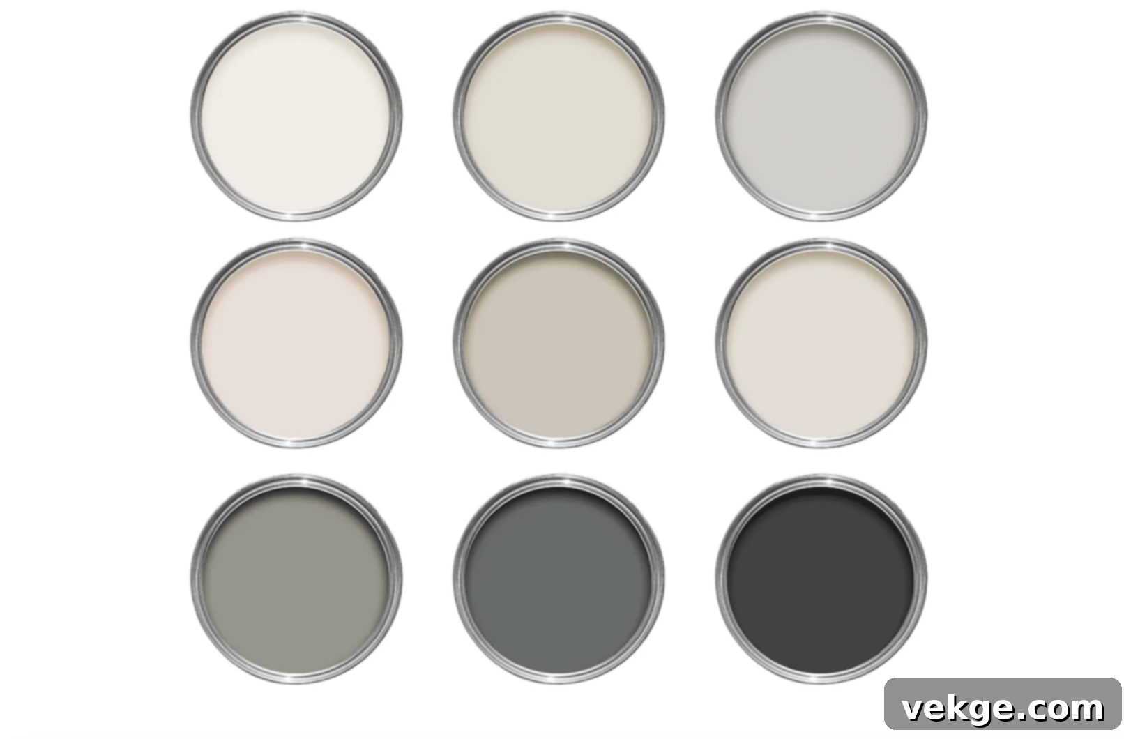
Unlock the Perfect Palette: The Ultimate Guide to Complementary Colors for Accessible Beige (SW 7036)
Navigating the vast world of paint colors can be daunting, especially when trying to find the perfect companions for a beloved neutral like Accessible Beige. As an ardent interior design enthusiast, I’ve had the pleasure of working with this remarkably versatile shade in countless projects, including my own home. Its unique ability to adapt and harmonize with various styles makes it a go-to for designers and homeowners alike.
Many homeowners initially feel a sense of apprehension when attempting to pair Accessible Beige with other colors, fearing they might dilute its charm or clash with its subtle undertones. However, the truth is quite the opposite: this warm yet balanced neutral is incredibly accommodating, playing beautifully with a wide spectrum of hues. The secret lies in understanding its inherent characteristics and knowing which combinations unlock its full potential.
In this comprehensive guide, we will delve deep into the nuances of Accessible Beige and equip you with the knowledge and inspiration to curate a stunning, cohesive living space. You’ll discover:
- The definitive list of best color matches for Accessible Beige (SW 7036).
- Practical and simple methods to achieve perfect balance and flow in your rooms.
- Insider tips for expertly mixing and matching shades to create sophisticated palettes.
- Real-world examples and insights drawn from professional design experience.
Let’s embark on this exciting journey to uncover the ideal color partners for your Accessible Beige walls, transforming your home into a sanctuary of style and comfort!
Understanding Accessible Beige: The Foundation of Your Palette
1. The Unique Color Profile of SW 7036
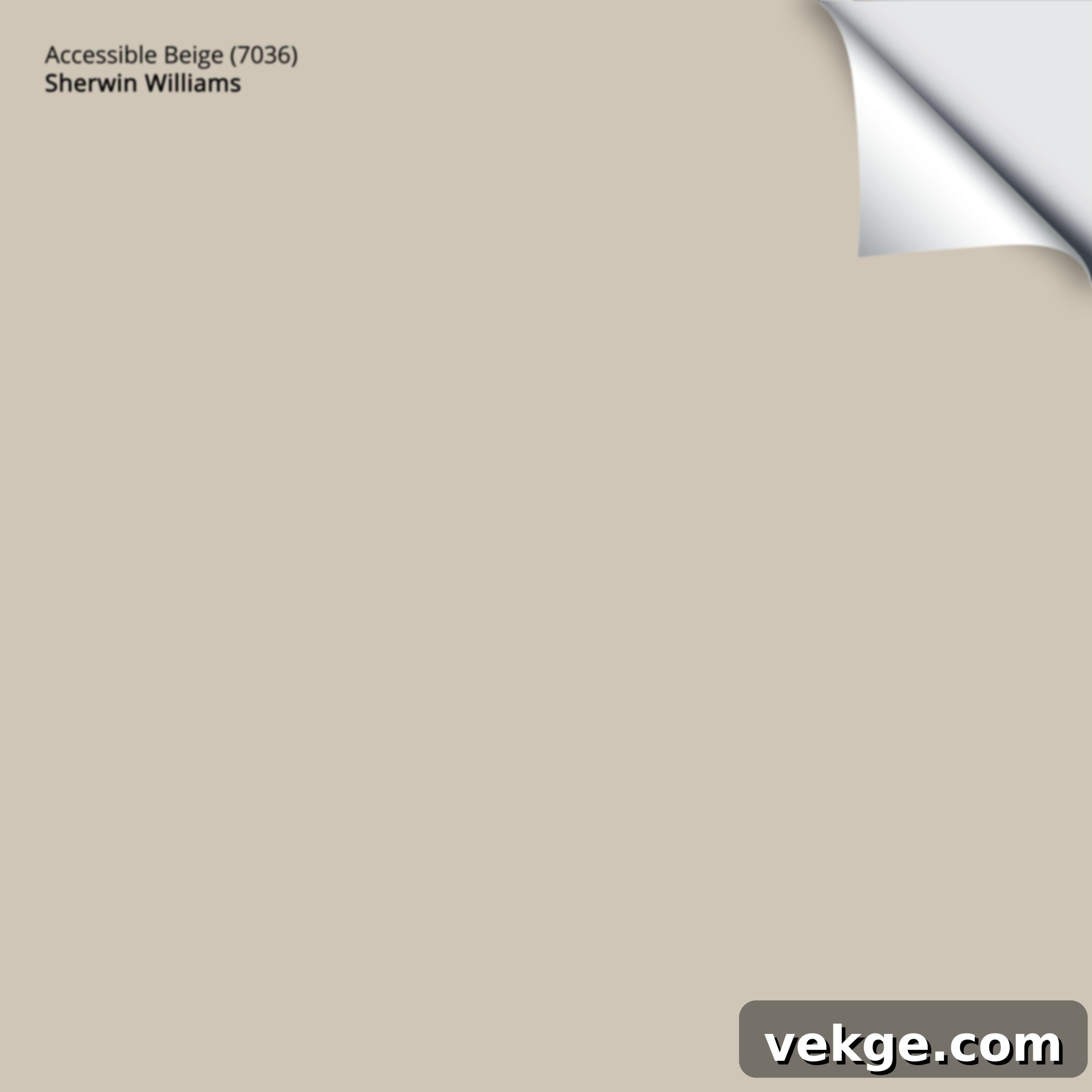
Accessible Beige (SW 7036) is more than just a beige; it’s a sophisticated “greige” that masterfully balances warmth and coolness. In my experience, it occupies a coveted sweet spot on the color spectrum, making it incredibly adaptable. Unlike many conventional beiges that lean overtly yellow or orange, Accessible Beige is infused with a delicate hint of gray, preventing it from ever appearing too stark or too muddy.
This careful blend results in a soft, inviting neutral that avoids the pitfalls of being overly dark or excessively light. It possesses a mid-range depth that makes it substantial enough to define a space, yet subtle enough to act as a perfect backdrop for diverse decor styles, from modern farmhouse to traditional elegance.
2. Unpacking Undertones and the Influence of Lighting
One of the most fascinating aspects of Accessible Beige, and a key reason for its widespread appeal, is its chameleon-like quality under different lighting conditions. I’ve observed this phenomenon firsthand in various rooms throughout my own home; it’s a color that truly lives and breathes with the changing light of the day.
In the soft glow of morning light, Accessible Beige often reveals its warmer, more classic beige characteristics, creating a cozy and inviting atmosphere. As the day progresses into afternoon, the subtle gray notes tend to become more pronounced, giving the color a slightly cooler, more contemporary edge. This dynamic interplay means it’s like having several beautiful shades in one, always offering a fresh perspective.
Here’s what I’ve consistently learned about how light profoundly affects this remarkable color:
- Morning Sun: Bathes the walls in warm, golden tints, enhancing its beige qualities and making spaces feel incredibly inviting.
- Overcast Days: Bring forth the gray undertones more prominently, lending the color a sophisticated and slightly cooler appearance.
- Evening Light: Often casts a soft, muted glow, allowing Accessible Beige to create a serene and tranquil ambiance.
- LED Lighting: Can sometimes lean cooler, making the gray in Accessible Beige more noticeable. Opt for warm white LED bulbs (2700K-3000K) to bring out its warmth.
- Natural Light: Always the best way to see the true complexity and beauty of Accessible Beige, revealing its subtle shifts.
For example, in a north-facing family room, which typically receives cooler, indirect light, Accessible Beige may appear more grayish. Conversely, in a south-facing kitchen, bathed in abundant warm light, its beige undertones will shine through. Despite these shifts, the color consistently maintains its pleasant and harmonious character, making it a reliable choice for any exposure.
My top tip for anyone considering Accessible Beige is always to test, test, test! Apply generous swatches on different walls in your room and observe them throughout the day, under various lighting conditions, and alongside your existing furniture and textiles. This crucial step will provide you with the most accurate representation of how this extraordinary color will perform in your unique space.
Choosing Complementary Colors: Crafting a Harmonious Palette
1. Rethinking Color Theory for Neutrals
From my background in design, traditional color theory often points to colors directly opposite each other on the color wheel as “complementary.” While this holds true for vibrant hues (like blue and orange), working with a sophisticated neutral like Accessible Beige opens up a much broader and more flexible approach. Instead of strict oppositions, we consider harmony and balance.
Accessible Beige, with its gentle and adaptable nature, doesn’t demand a stark contrast to shine. Instead, it thrives when paired with colors that either echo its subtle undertones or provide a pleasing, soft contrast. This allows for a vast array of pairings, from bold and dramatic to serene and understated.
2. The Profound Impact of Accessible Beige’s Undertones
The magic of Accessible Beige truly lies in its dual undertones – a warm beige base infused with cool gray hints. Understanding these undertones is paramount to successful color pairing:
- The Gray Hints: These subtle cool notes make it an excellent partner for other cool-toned colors, such as blues, greens, and grays, creating a cohesive and sophisticated feel.
- The Warm Base: Its inherent warmth ensures it remains welcoming and pairs beautifully with earthy tones, rich browns, and other warm neutrals, fostering a cozy and inviting atmosphere.
- Mixed Undertones: This unique blend is precisely why Accessible Beige is so versatile; it acts as a bridge, allowing it to adapt effortlessly to both warm and cool color schemes.
In my design projects, I’ve repeatedly witnessed how these undertones interact with their neighbors. When paired with blues or greens, the gray in Accessible Beige seems to step forward, enhancing the coolness of the overall palette. Conversely, when juxtaposed with warm wood tones or terracotta, its beige warmth becomes more pronounced, creating a sense of grounding and comfort. It’s almost as if the color “takes cues” from its surroundings, adjusting its appearance to maintain harmony.
This dynamic interaction underscores why I always advise clients to place paint samples directly next to their existing furniture, flooring, and decorative elements. This simple yet critical step allows you to observe how Accessible Beige’s undertones will play with your existing pieces, ensuring a seamless and beautiful integration into your home’s unique character.
Top Complementary Colors for Accessible Beige: Proven Pairings
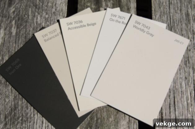
Based on years of experience and countless successful projects, here are the most effective and aesthetically pleasing complementary colors that truly make Accessible Beige sing:
1. Crisp Whites: The Foundation of Freshness

Crisp whites are a timeless and indispensable pairing for Accessible Beige, offering a clean, sharp contrast that highlights its depth and warmth. They provide a visual “breath of fresh air” that prevents the neutral from feeling flat.
Examples I’ve successfully used:
- Sherwin-Williams Alabaster (SW 7008): A soft, warm white that feels gentle and inviting, creating a seamless, creamy transition.
- Sherwin-Williams Pure White (SW 7005): A truer, more neutral white that provides a crisp, clean contrast without feeling stark or cold.
Usage Tips for a Polished Look:
I consistently use Pure White for all trim work – baseboards, door frames, and window sills. This creates a beautiful, defined edge that makes the Accessible Beige walls truly pop. For ceilings, I often gravitate towards Alabaster; its subtle warmth helps to connect the ceiling to the walls, preventing the room from feeling disjointed and creating a soft, ethereal quality.
Integrate white in these key areas to maximize impact:
- Door and window frames for definition.
- Elegant crown molding and baseboards for architectural detail.
- Ceilings to enhance brightness and height.
- White linens, sheer curtains, or ceramics for soft accents.
2. Soft Grays: Modern Serenity
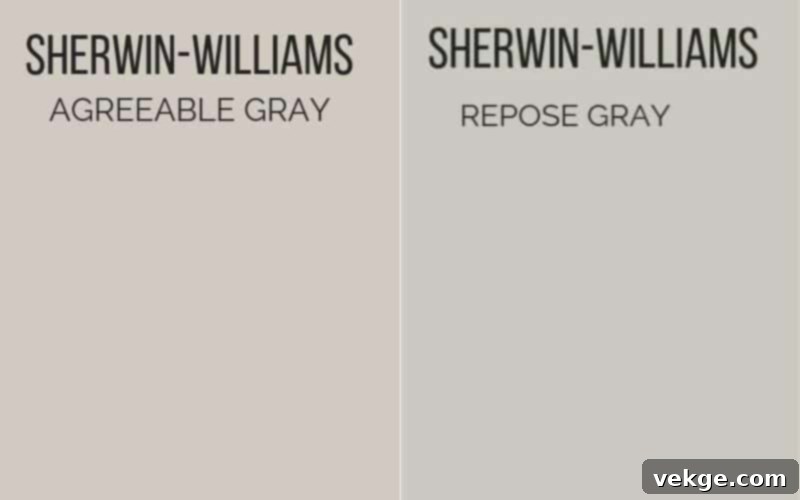
The gray undertones in Accessible Beige make it an ideal companion for soft grays, creating a sophisticated and harmonious greige palette. This pairing feels contemporary and serene, offering subtle depth without overwhelming the space.
Examples I enthusiastically recommend:
- Sherwin-Williams Repose Gray (SW 7015): A fantastic greige itself, offering subtle depth and a sophisticated link to Accessible Beige.
- Sherwin-Williams Agreeable Gray (SW 7029): Another popular greige that provides a gentle, welcoming contrast, maintaining a consistent warmth.
Usage Tips for a Balanced Feel:
When aiming for a modern and refined aesthetic, I frequently incorporate these soft grays. They work beautifully as an accent wall, in an adjoining room to create a gentle transition, or on built-in cabinetry to add a touch of understated elegance. Even furniture pieces in these gray tones can anchor a room with Accessible Beige walls.
Consider using soft grays in these applications:
- Accent walls for subtle visual interest.
- In connected rooms to ensure a cohesive flow.
- On built-in shelves or kitchen island bases.
- For upholstery, rugs, or decorative accessories.
3. Earthy Greens: Nature’s Embrace

Introducing earthy greens brings a refreshing, natural element to spaces with Accessible Beige, evoking a sense of calm and connection to the outdoors. These muted greens perfectly complement the balanced warmth of the beige.
Examples from my design work:
- Sherwin-Williams Sea Salt (SW 6204): A light, airy green-blue-gray that makes spaces feel incredibly peaceful and light.
- Sherwin-Williams Rainwashed (SW 6211): A slightly more saturated, soothing green with a touch of blue, reminiscent of tranquil waters.
Usage Tips for a Serene Ambiance:
I often turn to these earthy green tones to imbue rooms with a sense of tranquility and a spa-like atmosphere. They are particularly effective in bathrooms, where they enhance relaxation, or on kitchen cabinets for a touch of organic charm. Even painted interior doors or carefully chosen accent pieces can make a significant impact.
Incorporate earthy greens into your scheme:
- Bathroom walls or vanity cabinets for a calming retreat.
- Kitchen island or lower cabinet paint.
- Interior doors for a delightful pop of color.
- Through plants, artwork, or decorative textiles.
4. Warm Browns: Grounded Richness
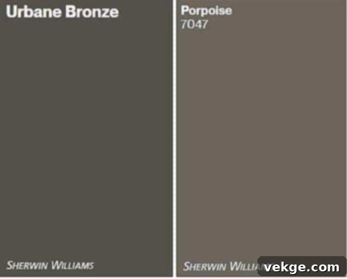
Warm browns naturally resonate with the beige undertones of SW 7036, creating a cozy, grounded, and richly layered interior. This combination provides a sense of stability and classic comfort.
Examples I consistently trust:
- Sherwin-Williams Porpoise (SW 7064): A deep, earthy brown-gray that adds cozy depth and sophistication.
- Sherwin-Williams Urban Bronze (SW 7048): A rich, deep brown with a hint of gray, perfect for creating strong, elegant accents.
Usage Tips for Depth and Comfort:
To inject warmth and a feeling of rootedness into a space, I leverage these inviting brown tones. They are excellent for kitchen islands, providing a striking contrast to lighter cabinets, or for accent beams that add architectural interest. Of course, natural wooden furniture and rich textiles like wool rugs or velvet throw pillows are also fantastic ways to integrate these hues.
Consider warm browns for:
- Kitchen islands or built-in shelving.
- Architectural elements like exposed beams or paneling.
- Sturdy wooden furniture pieces and flooring.
- Layering through textiles, leather, or rugs.
5. Muted Blues: Calm and Refreshing
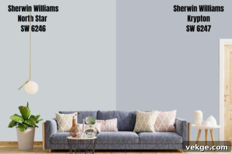
Muted blues introduce a serene coolness that beautifully complements Accessible Beige, creating a balanced and refreshing atmosphere. The gray in Accessible Beige ensures these pairings feel harmonious rather than jarring.
Examples I frequently work with:
- Sherwin-Williams North Star (SW 6246): A subtle, light blue-gray that brings a delicate coolness without being overwhelming.
- Sherwin-Williams Krypton (SW 6247): A slightly deeper, yet still muted, blue-gray that adds gentle depth and tranquility.
Usage Tips for Tranquil Spaces:
These muted blues are my go-to for designing calm and restorative spaces. They are particularly well-suited for bedrooms, promoting relaxation, or for bathroom vanities, creating a fresh, clean feel. Incorporating them through accent pillows, throws, or framed wall art allows you to introduce these cool tones in measured doses.
Employ muted blues thoughtfully:
- In bedrooms for a peaceful and restful environment.
- On bathroom vanities or feature tiles.
- Through soft furnishings like throw pillows and blankets.
- As striking elements in wall art or decorative ceramics.
6. Soft Creams: Effortless Elegance
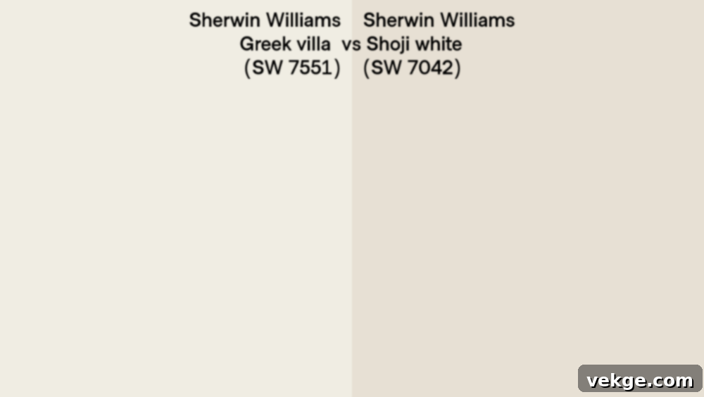
Pairing Accessible Beige with soft creams creates a luxurious, monochromatic, and incredibly elegant palette. This combination enhances the warmth of the beige, resulting in a sophisticated and inviting space.
Examples I prefer for seamless transitions:
- Sherwin-Williams Shoji White (SW 7042): A warm, off-white with subtle greige undertones, ensuring smooth, almost imperceptible transitions.
- Sherwin-Williams Greek Villa (SW 7551): A clean, gentle cream that adds warmth without leaning too yellow, offering a delicate contrast.
Usage Tips for Harmonious Layering:
I find these soft creams indispensable for blending connected living spaces, creating a sense of expansive flow. They work beautifully on kitchen cabinets for a timeless look or on dining room walls to cultivate an intimate ambiance. Layering with cream-colored curtains, upholstery, or textured rugs also adds visual interest and depth.
Integrate soft creams effectively:
- In open-concept living spaces for a seamless look.
- On kitchen cabinets for a classic, bright appearance.
- Dining room walls or wainscoting.
- Through luxurious curtains, drapes, or linen upholstery.
7. Rich Blacks: Dramatic Accents
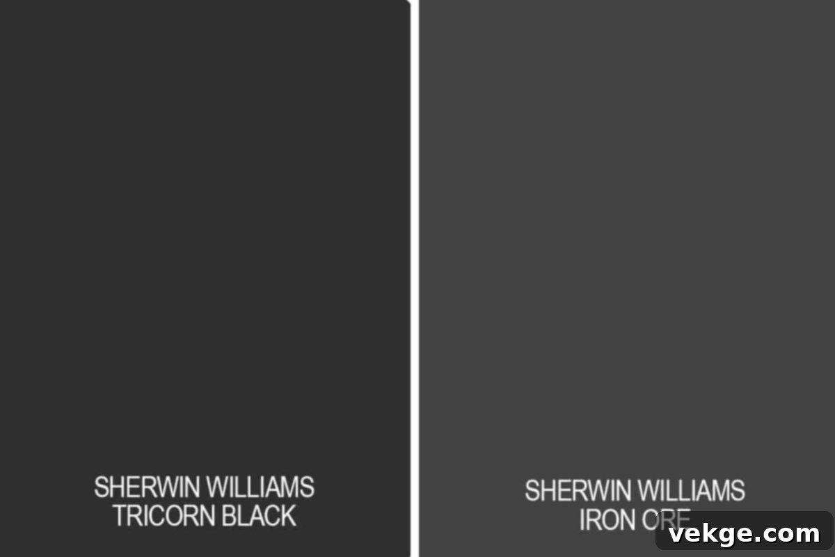
While used sparingly, rich blacks provide a striking, modern contrast that allows Accessible Beige to truly stand out. They introduce an element of drama and sophistication, grounding the neutral and adding definition.
Examples I consistently rely on:
- Sherwin-Williams Iron Ore (SW 7069): A deep, soft black with strong charcoal undertones, offering a subtle yet impactful contrast.
- Sherwin-Williams Tricorn Black (SW 6258): A true, unadulterated black that makes clear, bold statements and adds crisp definition.
Usage Tips for Bold Statements:
I approach the use of black with Accessible Beige thoughtfully, using it as a deliberate accent to create high-impact moments. It’s perfect for defining window frames, drawing attention to light fixtures, or highlighting architectural hardware. Small decor pieces like picture frames, planters, or unique sculptures in black can also tie a room together and add a contemporary edge.
Incorporate rich blacks strategically:
- For crisp window frames or interior doors.
- On light fixtures, ceiling fans, or sconces.
- Through cabinet hardware, door handles, or plumbing fixtures.
- In small, impactful decor pieces and graphic artwork.
All these curated colors, from the brightest whites to the deepest blacks, pair exceptionally well with Accessible Beige. I’ve witnessed their transformative power in both expansive open-plan spaces and intimate, smaller rooms. The overarching principle for success is balance – employing bolder, richer colors in smaller, deliberate doses, while letting the gentler hues provide a harmonious foundation.
Price Range of Every Complementary Color You Should Know
Understanding the potential costs involved is a practical aspect of any design project. Here’s an overview of the typical price ranges for quality Sherwin-Williams paints in the recommended complementary colors, based on my recent project experiences. Note that these are per gallon estimates and can fluctuate.
| Complementary Color | Paint Option | Cost per Gallon (USD) | Notes |
|---|---|---|---|
| Crisp Whites | SW Alabaster | $35-$70 | Prices vary based on finish (flat, eggshell, semi-gloss) and product line. |
| SW Pure White | $35-$70 | Premium lines for durability or specific sheens may cost more. | |
| Soft Grays | SW Repose Gray | $35-$70 | Higher-traffic areas often benefit from more durable finishes, impacting cost. |
| SW Agreeable Gray | $35-$70 | Consider different product lines (e.g., Duration, Emerald) for varied performance. | |
| Earthy Greens | SW Sea Salt | $35-$70 | Specialty paints for bathrooms (mildew resistance) or kitchens (washability) may incur higher costs. |
| SW Rainwashed | $35-$70 | Some colors might require tinting base, which is factored into the price. | |
| Warm Browns | SW Porpoise | $35-$70 | Darker colors often require an extra coat for full coverage, which means more paint. |
| SW Urban Bronze | $40-$75 | Premium dark colors can sometimes fall into a higher price tier. | |
| Muted Blues | SW North Star | $35-$70 | Deeper blues, like some vibrant shades, might benefit from a tinted primer, adding to cost. |
| SW Krypton | $35-$70 | Always check for current promotions at your local Sherwin-Williams store. | |
| Soft Creams | SW Shoji White | $35-$70 | Light colors typically require fewer coats, potentially saving on paint quantity. |
| SW Greek Villa | $35-$70 | Often a more budget-friendly choice due to less pigment required for tinting. | |
| Rich Blacks | SW Iron Ore | $40-$75 | Dark colors demand excellent prep work and often multiple coats for a flawless finish. |
| SW Tricorn Black | $40-$75 | Due to its intensity, ensure you have enough paint to achieve desired opacity. |
Smart Money-Saving Tips for Your Paint Project:
- Shop During Sales Events: Sherwin-Williams frequently offers 30-40% off sales, especially around holidays.
- Invest in Samples First: Small samples ($5-$10 each) are crucial. They save you from buying gallons of a color you might not love.
- Inquire About Discounts: Ask about contractor or designer discounts, or sign up for their Pro program if applicable.
- Leverage Rewards Programs: Join the Sherwin-Williams Paint Perks program for exclusive deals and notifications.
- Calculate Accurately: Use online paint calculators to estimate the exact amount of paint you need, reducing waste.
NOTE: The prices listed reflect general ranges based on recent projects and may fluctuate significantly depending on your specific location, current promotions, the type of paint product (e.g., basic vs. premium), and the time of purchase. Always confirm current pricing with your local Sherwin-Williams retailer.
Strategies to Create Cohesive Color Palettes with Accessible Beige
Achieving a harmonious and well-thought-out color scheme requires more than just picking pretty colors. It involves a strategic approach that ties every element of your home together. Here are proven strategies I use to create cohesive palettes with Accessible Beige as the foundation:
| Strategy Name | Key Steps for Success |
|---|---|
| 1. The Main Color Strategy | – Designate Accessible Beige as your primary wall color for most shared living spaces (living room, hallways, open-concept areas). |
| – This establishes a consistent, calming base throughout your home, ensuring visual continuity. | |
| – It serves as the ultimate starting point for introducing other colors in individual rooms. | |
| – Consider it your home’s signature neutral, appearing on 60-70% of your walls. | |
| 2. The Connection Method | – Paint all connecting hallway walls and transitional spaces in Accessible Beige to create a seamless flow. |
| – Maintain a consistent color for all interior doors (e.g., Pure White) to unify the look. | |
| – Use the exact same trim shade (e.g., SW Pure White) on all baseboards, window frames, and crown molding throughout the entire home. | |
| – Matching window frames to the trim helps integrate exterior views with interior design. | |
| 3. The Color Flow Plan | – Begin your color planning at the main entry point of your home, considering what colors are visible from each vantage. |
| – Carefully observe sight lines through doorways and open archways between rooms. | |
| – Note which colors are seen simultaneously and ensure they complement each other harmoniously. | |
| – Plan your room-to-room colors to transition smoothly, perhaps with increasing or decreasing intensity. | |
| 4. The Balance Technique (60-30-10 Rule) | – Use Accessible Beige (or a similar calm neutral) as your dominant color (60% of the room). |
| – Choose a complementary mid-tone (like a soft gray or earthy green) for 30% of the room (e.g., on furniture, one accent wall). | |
| – Introduce a brighter or richer accent color for the remaining 10% (e.g., small decor items, throw pillows, artwork). | |
| – Aim for a maximum of three primary shades per room to maintain visual harmony and avoid clutter. | |
| 5. The Testing Steps | – Paint large, movable poster board squares (at least 2×2 feet) with your chosen colors, including Accessible Beige. |
| – Move these samples around the room, observing them in morning, afternoon, and evening light. | |
| – Check how the colors appear with both natural light and your artificial room lighting activated. | |
| – Place samples directly next to your furniture, flooring, and fixed elements (e.g., countertops) to assess their interaction. | |
| 6. The Repeat Method | – Consistently use the same white trim color (e.g., SW Pure White) throughout your entire home. |
| – Select one or two metal finishes (e.g., brushed brass and matte black) and repeat them in hardware, lighting, and decor. | |
| – Match wood tones where possible (e.g., flooring, furniture, cabinetry) or ensure they complement each other. | |
| – Repeat accent colors in at least three different spots within a room (e.g., a blue pillow, a blue vase, a blue detail in artwork) for cohesion. |
NOTE: These strategies are not merely theoretical; they are battle-tested in real homes and consistently yield beautifully planned, aesthetically pleasing, and comfortable living spaces. They provide a roadmap for avoiding common design pitfalls and creating a home that feels effortlessly put together.
Practical Tips for Mastering Accessible Beige in Your Home
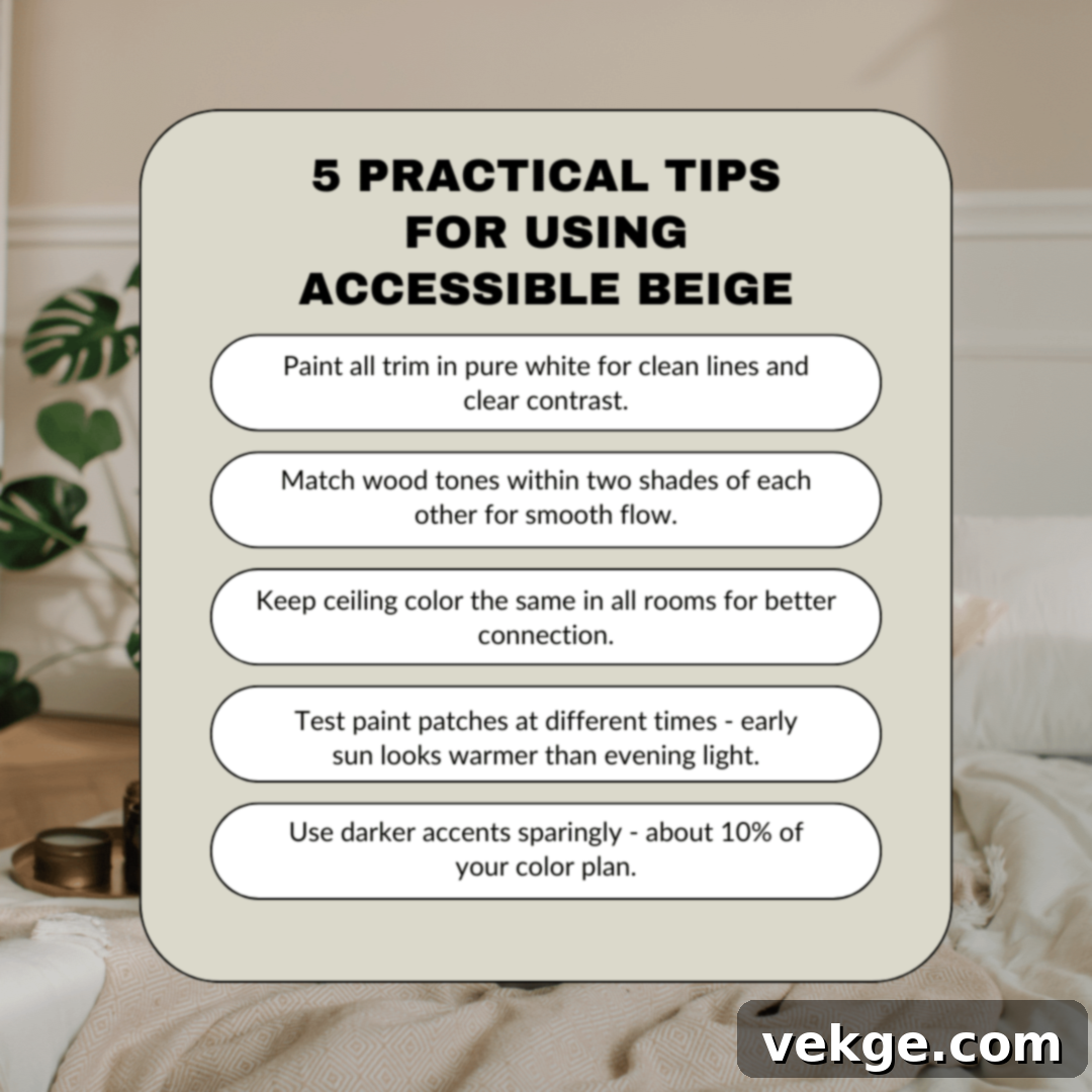
Beyond simply choosing complementary colors, there are several practical considerations and design tricks that will help you maximize the beauty and versatility of Accessible Beige in your home. These tips, refined through years of design experience, will guide you in creating truly exceptional spaces:
- Embrace Texture: Accessible Beige, as a neutral, truly comes alive when paired with varied textures. Think chunky knit throws, linen curtains, velvet pillows, woven rugs, and raw wood furniture. These textures add depth and interest, preventing the neutral backdrop from feeling flat.
- Layer Your Lighting: Since Accessible Beige changes dramatically with light, thoughtful lighting is key. Incorporate multiple light sources: overhead for ambient light, task lighting (like reading lamps), and accent lighting (like picture lights). Use bulbs with a warm color temperature (2700K-3000K) to highlight its cozy undertones.
- Warm vs. Cool Balance: While Accessible Beige is versatile, be mindful of over-indexing on either warm or cool elements. If your room features cool-toned furniture or blues/grays, introduce warm elements through wood accents, gold hardware, or orange/red undertones in your decor. Conversely, with warm wood tones, a touch of cool green or blue can provide a refreshing balance.
- Consider Architectural Details: Use Accessible Beige to highlight or recede architectural features. On walls with beautiful crown molding, it can make the white trim pop. If you have interesting built-ins, painting them a complementary color (like a soft gray or earthy green) can create a focal point against the beige walls.
- Don’t Forget the Fifth Wall (Ceiling): While often overlooked, the ceiling plays a crucial role. Painting it a crisp white (like SW Pure White or Alabaster) can make the room feel taller and brighter. For a cozier, more enveloping feel, consider painting the ceiling the same Accessible Beige, especially in smaller rooms.
- Integrate Existing Elements: Before choosing new colors, take stock of your home’s fixed elements: flooring, kitchen cabinets, countertops, and large furniture pieces. Accessible Beige is forgiving, but ensure your chosen complementary colors work harmoniously with these existing finishes. Always test samples next to them!
- Use Black as an Anchor: Even a small amount of black can ground a room and add sophistication. Consider matte black hardware on doors or cabinets, a black picture frame, or a sleek black light fixture to provide a modern edge and prevent the neutral palette from feeling monotonous.
- Create Visual Interest with Artwork: Accessible Beige provides an excellent canvas for artwork. Choose pieces with vibrant colors to introduce pops of intensity or opt for subdued, monochromatic art for a sophisticated, understated feel. The wall color will allow your art to truly shine.
- Vary Sheens for Subtle Contrast: Even when using the same color, varying paint sheens can add subtle interest. For instance, use a flat or matte finish on walls for a soft, velvety look, and a semi-gloss or satin finish on trim for durability and a slight sheen that catches the light.
- Live with Your Choices: After you’ve applied test swatches, live with them for a few days. Observe them at different times, in different weather conditions, and with your actual furnishings. This “real-world” testing is the most reliable way to confirm your choices before committing to painting an entire room.
Conclusion: Your Journey to a Beautifully Coordinated Home
I understand that finding the “perfect” color matches can initially feel like an overwhelming task. However, after extensive experience working with Accessible Beige (SW 7036) in countless homes, I can confidently tell you that this remarkable Sherwin-Williams neutral is one of the most accommodating and beautiful colors you can choose. It truly is a color that plays well with others, offering endless possibilities for creating a serene, stylish, and cohesive home.
Let’s recap the essential takeaways from this guide, empowering you to move forward with confidence:
- Always Test Colors: Observe samples on your walls throughout the day and under various lighting conditions to truly understand how Accessible Beige and its companions will appear in your unique space.
- Start with Foundation Neutrals: Begin by pairing Accessible Beige with crisp whites for trim and soft grays for adjoining rooms or accents to establish a clean, harmonious base.
- Layer with Depth: Introduce richness and personality with earthy greens, warm browns, and muted blues for a balanced and inviting palette.
- Maintain Consistency with Trim: Using the same trim color throughout your home creates a professional, unified, and polished look.
- Strategic Use of Darker Shades: Reserve rich blacks and deeper browns for small, impactful doses to add drama, definition, and a touch of modern sophistication.
- Embrace Texture and Lighting: Don’t underestimate the power of varied textures and well-layered lighting to bring your Accessible Beige palette to life.
Are you feeling inspired and ready to transform your space? The next step is simple yet crucial: head to your local Sherwin-Williams store, pick up some paint samples of Accessible Beige and your favorite complementary colors, and test them on your walls. Watch how they interact, how they shift with the light, and how they make you feel.
Your journey to a beautifully coordinated home, anchored by the timeless elegance of Accessible Beige, is just beginning. And if you find yourself needing more guidance or have specific questions about your color project, please don’t hesitate to comment below. I’d genuinely love to hear about your experiences and see how your stunning color scheme unfolds!
