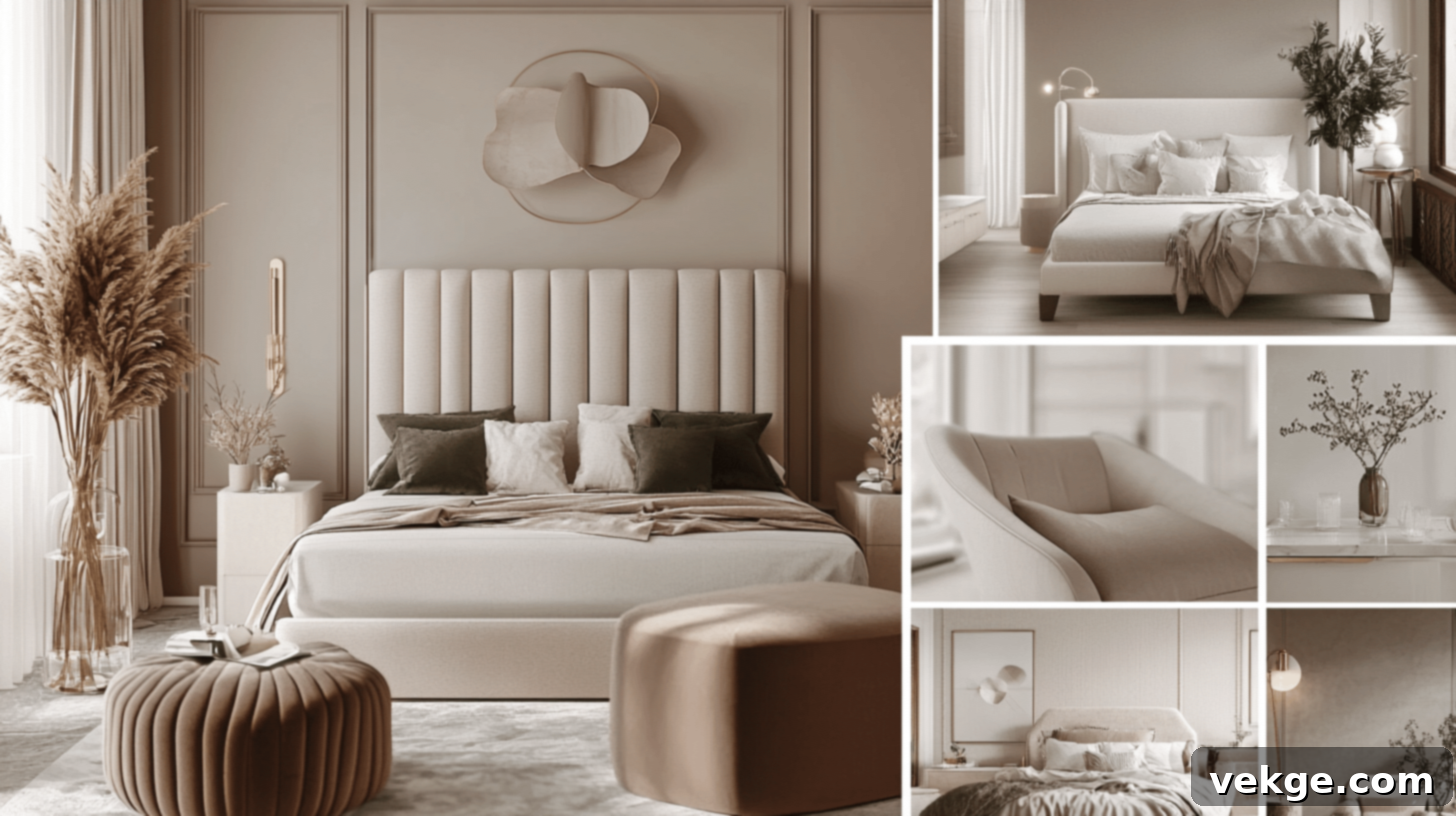
The Ultimate Guide to Taupe: Mastering the Timeless Neutral in Interior Design
As an interior designer with over 15 years of experience, I’ve always considered Taupe to be the quintessential neutral. It’s a color that consistently delivers timeless elegance, remarkable versatility, and an effortlessly chic appeal to any space. Taupe strikes that perfect balance between warm and cool tones, allowing it to adapt seamlessly to virtually any room, design aesthetic, or existing decor palette.
Whether your goal is to craft a cozy, inviting living room, a serene and calming bedroom retreat, or a sophisticated and focused home office, taupe provides an exquisite, subtle backdrop. It’s a foundational color that enhances the beauty of your furnishings, artwork, and personal touches without ever overpowering the space.
One of the most fascinating qualities of taupe is its dynamic nature. It possesses a unique ability to transform under varying light conditions throughout the day, offering incredible depth and character. From the soft, earthy nuances perceived in morning light to the sophisticated, almost gray tones that emerge in the evening, there truly is a shade of taupe perfectly suited for every home and every mood.
In this comprehensive guide, I will share my expert insights and practical tips for selecting the ideal taupe shade for your project. We’ll explore the most impactful ways to incorporate this magnificent color into your home, from walls and furniture to accent pieces. Furthermore, I’ll reveal which colors create the most harmonious and striking pairings with taupe. Join me as we delve into the world of this perfect neutral, empowering you to create spaces that feel both stylishly curated and wonderfully welcoming.
What is Taupe?
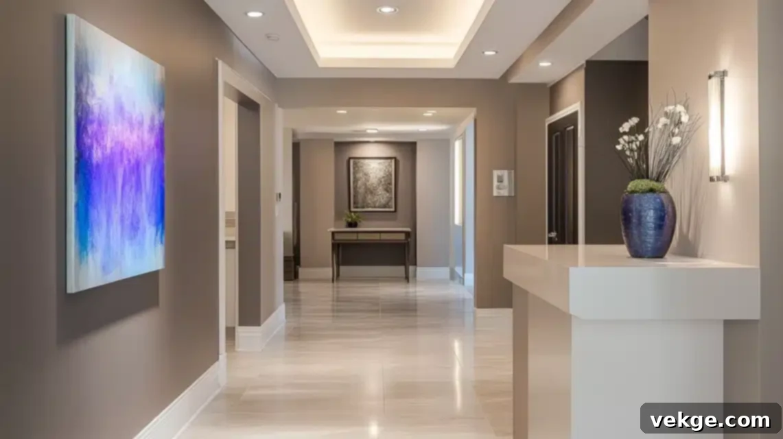
After more than a decade and a half of working with countless clients and designing beautiful spaces, I’ve found taupe to be one of the most intriguing and, at times, misunderstood colors in the designer’s palette. This gorgeous chameleon truly graces the most elegant and inviting spaces I’ve ever had the pleasure of creating.
1. Defining Taupe: The Harmonious Blend of Gray and Brown
Taupe is a true marvel in the world of color – imagine the perfect, sophisticated marriage between gray and brown. This unique combination creates an incredibly refined neutral that I absolutely adore for its complexity and depth. In my projects, I’ve seen taupe shape-shift from a warm, earthy hue that evokes coziness, to a cool, contemporary tone that feels utterly modern, simply by responding to different lighting conditions. It’s like having multiple colors rolled into one versatile shade!
When I’m carefully selecting taupe for my clients’ homes, I always look for these distinctive characteristics:
- Base: A harmonious and balanced blend of both brown and gray pigments, forming its core identity.
- Undertones: This is where taupe’s chameleon quality truly shines. Its undertones can range dramatically, from subtle pinks and soft violets to hints of green and cool blues. These nuances are crucial in determining how a specific taupe will interact with the light and other colors in a room.
- Depth: Taupe isn’t a single color; it’s a spectrum. It varies significantly in depth, from very light, airy mushroom shades that whisper sophistication, to deep, rich granite-like tones that make a bold, grounding statement.
2. Why Choose Taupe for Your Interiors?
In my extensive career spanning over 15 years in interior design, I’ve consistently found taupe to be one of the most inherently versatile neutrals available. What I genuinely love most about this color is its incredible ability to bridge diverse design styles, making it equally at home in both traditionally classic and strikingly contemporary spaces. It serves as a unifying element that allows different aesthetics to coexist beautifully.
When I’m designing living spaces, whether it’s a bustling family room or a quiet reading nook, I frequently recommend taupe because it cultivates a wonderful sense of calm and sophistication. It manages to be far more interesting and dynamic than a plain beige or a stark gray, offering more character and warmth. I recall a recent project where I used a specific taupe shade in a client’s main living room.
The taupe walls provided a flawless, elegant backdrop that allowed their vibrant blue velvet sofa and gleaming brass accessories to truly pop. The color itself absorbed and reflected natural and artificial light beautifully throughout the day, ensuring the space consistently felt fresh, inviting, and dynamic without ever becoming overwhelming. This adaptability makes taupe an ideal choice for:
- Living Rooms: Creating a sophisticated, adaptable canvas for showcasing artwork, statement furniture, and decorative accents.
- Bedrooms: Its inherently calming properties are perfect for promoting relaxation and a tranquil atmosphere conducive to rest.
- Home Offices: Offering a professional yet warm presence that aids in maintaining focus and productivity, while still feeling comfortable.
- Open-Plan Areas: Seamlessly connecting different zones within an open concept, ensuring flow and cohesion.
- Hallways and Entryways: Providing a welcoming and refined first impression that withstands daily traffic.
Tip: When selecting any taupe paint color, always test it diligently in your specific space at different times of day. The way it interacts with your unique lighting conditions—natural and artificial—can dramatically impact its final appearance, revealing its true undertones and depth.
Choosing the Right Shade of Taupe
1. Warm vs. Cool Taupe: Tailoring to Your Room’s Light
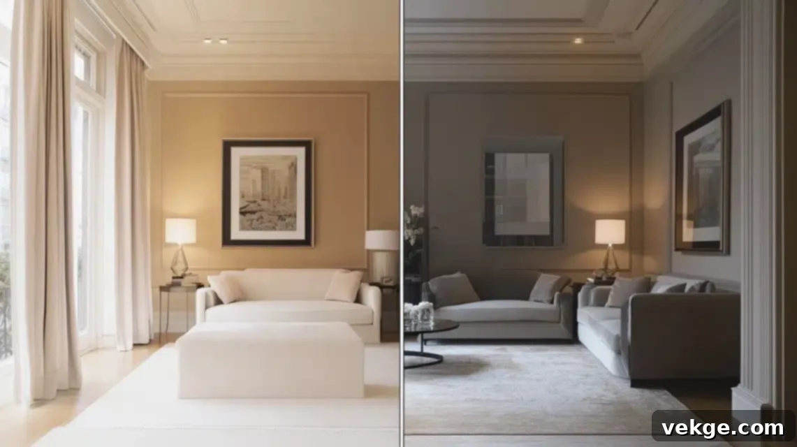
Having collaborated with countless clients over the years, I’ve come to understand that choosing between a warm or cool taupe isn’t merely a matter of personal taste. It’s a strategic decision deeply influenced by the natural light and orientation of the room. This choice can profoundly impact the overall ambiance and success of your design.
For rooms that are primarily north-facing, which tend to receive cooler, bluer natural light throughout the day, I consistently recommend opting for warm-toned taupes. These shades often carry subtle pink, yellow, or even slightly green undertones. These warmer nuances effectively counteract the inherent coolness of the light, creating a far more inviting, cozy, and balanced atmosphere. In a recent project, transforming a particularly chilly north-facing living room, I carefully selected a warm taupe. The result was truly remarkable; the space instantly felt incredibly snug and welcoming, defying the cool natural light it received.
Conversely, for south-facing rooms that are generously bathed in abundant, often intensely warm sunlight, I frequently suggest cool-toned taupes. These variants often feature gray, blue, or subtle purple undertones. These cooler elements help to beautifully balance the warmth of the strong sunlight, preventing the room from feeling overheated or washed out, while still maintaining that sophisticated and grounding taupe appeal. I particularly appreciate how cool taupes can make a sun-drenched room feel more refreshing, crisp, and elegantly understated.
2. Popular Taupe Paint Colors: My Go-To Recommendations
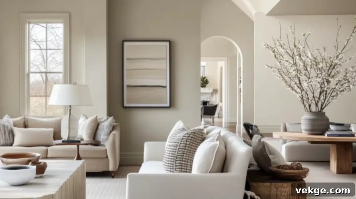
From my extensive experience working with numerous paint lines and countless color swatches, here are some standout taupe shades that I frequently recommend to my clients. These have consistently proven their worth in a variety of design contexts:
- Benjamin Moore’s Revere Pewter (HC-172): This is truly my go-to, “never fails” taupe. It’s a beautifully light, warm-leaning taupe that exhibits a fascinating complexity, reading differently throughout the day under changing light but always maintaining a sophisticated and harmonious appearance. I recently utilized it in a transitional-style home, and it flawlessly united traditional architectural elements with more modern furnishings, creating a cohesive and elegant flow.
- Sherwin-Williams Perfect Greige (SW 6073): Despite its somewhat misleading name, this is, in fact, a wonderfully balanced taupe. Its nuanced blend of gray and brown undertones makes it work exceptionally well in spaces with mixed lighting conditions, where other colors might falter. I’ve found it particularly effective in large, open-plan living areas, where it provides a consistent, soothing backdrop.
- Behr’s Natural Taupe (N220-4): For clients seeking a truly neutral taupe—one that doesn’t lean too heavily warm or too cool—this is my top recommendation. Its balanced composition makes it incredibly versatile, acting as a perfect canvas. In my last project, it created an impeccable backdrop that allowed both cool blue accents and rich, warm wood tones to shine without clashing, proving its adaptability.
- Farrow & Ball Elephant’s Breath (No. 229): For a more designer-grade option, this taupe offers a beautiful contemporary feel with subtle magenta undertones that reveal themselves in certain lights. It’s chic and sophisticated, perfect for adding a touch of understated luxury.
- Valspar Sinai Desert (6006-1B): This is a rich, warm taupe that leans more towards the brown side, creating an incredibly grounding and cozy atmosphere. It pairs beautifully with natural wood tones and earthy accents, ideal for a welcoming aesthetic.
3. Testing Taupe in Your Space: The Non-Negotiable Step
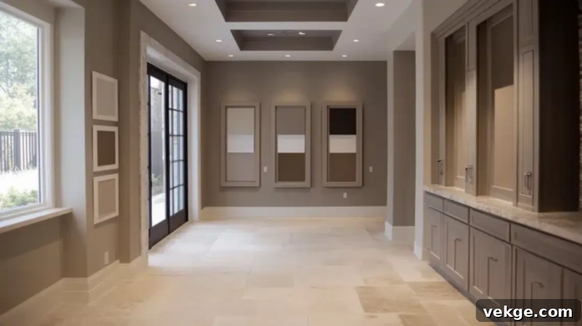
Testing taupe shades effectively is perhaps the most crucial step in ensuring your chosen color looks perfect in your home. From my professional perspective, small paint chips are simply insufficient with a color as complex and nuanced as taupe – its subtle undertones demand to be seen in context. Here are some indispensable professional methods for testing taupe shades:
- Paint Generous Swatches: Always paint at least a 2′ x 2′ (60cm x 60cm) swatch on each wall you plan to paint. This larger area gives you a much better sense of how the color will truly appear across a wider surface. Consider applying two coats for a truer representation.
- Observe Under Varied Lighting: Taupe’s character shifts dramatically with light. It is imperative to observe these swatches at multiple times of day to fully understand its transformative nature:
- Morning Light: Often the coolest, revealing any blue or gray undertones.
- Midday Sun: The strongest and brightest light, which can wash out or intensify certain hues.
- Evening Light: Typically warmer and softer, highlighting red or yellow undertones.
- Under Artificial Lighting: How you’ll see it most during darker months or evenings. Test with the actual bulbs you plan to use (e.g., warm LEDs, cool fluorescents) as different light temperatures significantly alter color perception.
- Consider Existing Elements: Critically assess how the taupe interacts with your home’s existing fixed elements. This includes your flooring (wood, tile, carpet), cabinetry, countertops, and even large pieces of furniture you plan to keep.
Pro Tip: I once had a client who was absolutely smitten with a specific taupe shade they discovered on Pinterest. However, when I insisted on testing it directly in their home, we discovered it had a subtle pink undertone that clashed terribly with their travertine flooring, creating an unwelcome orange tint. This diligent testing process undoubtedly saved them from an expensive and disappointing mistake, proving that context is everything when working with taupe.
Where to Use Taupe for Maximum Impact
1. Walls and Ceilings: Creating an Enveloping Atmosphere
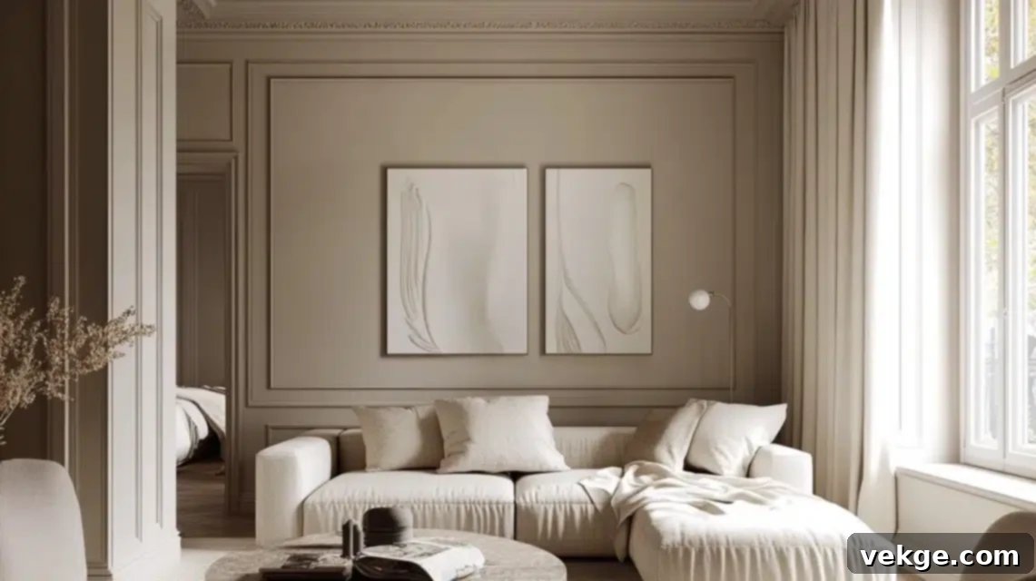
In my professional practice, I’ve found taupe to be exceptionally powerful when applied to walls and ceilings, transforming a room into a truly enveloping and sophisticated space. Just last month, I transformed a client’s living room by using a warm taupe on the walls, meticulously paired with crisp, clean white trim. The outcome was absolutely stunning; the taupe created a gorgeous, understated backdrop that not only made their vibrant artwork pop but also maintained an atmosphere of elegant tranquility.
For ceilings, I particularly love employing taupe in creative and unexpected ways. In a recent master bedroom project, I painted the ceiling a shade lighter than the walls, producing a cohesive and utterly cozy cocoon effect that my clients absolutely adore. This technique softens the boundaries of the room, making it feel more intimate and inviting.
My Secret: In rooms with lower ceilings, using a lighter taupe shade on the ceiling than on the walls can actually create an optical illusion, making the space feel taller and more expansive. Conversely, using a slightly darker taupe on the ceiling in a very tall room can bring the ceiling down visually, making the room feel more proportionate and cozy.
2. Furniture and Upholstery: The Foundation of Lasting Style
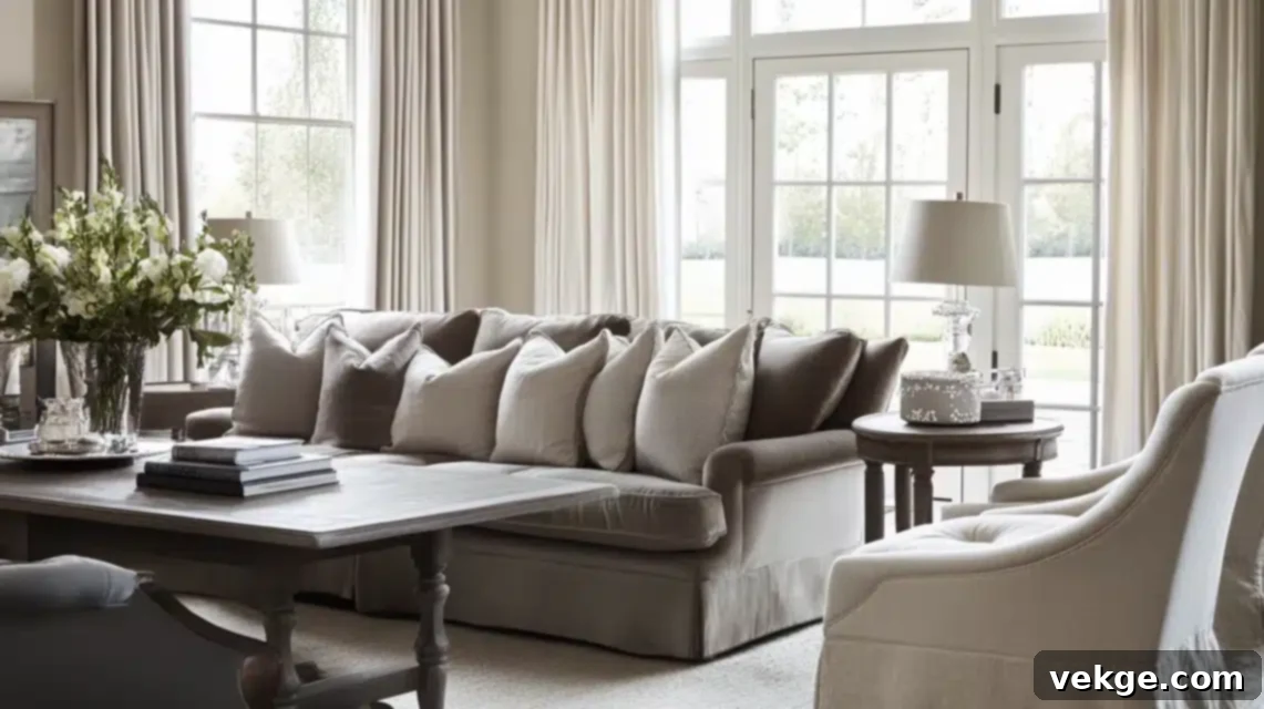
When it comes to selecting furniture, especially investment pieces, taupe is truly my secret weapon for ensuring longevity and enduring style. I frequently recommend taupe upholstery for significant items like sofas, armchairs, and dining chairs for several compelling reasons:
- Timeless Appeal & Durability: Taupe ages beautifully. Its inherent depth and complex undertones are far more forgiving than lighter neutrals, effectively camouflaging daily wear and tear, minor smudges, and the inevitable signs of life in a busy home.
- Warmth and Versatility: It provides a level of warmth that pure grays often lack, while still maintaining the incredible versatility to pair with almost any accent color or material. This makes it an ideal choice for pieces you expect to keep for many years.
- Adaptability to Changing Trends: A taupe sofa works seamlessly with evolving accent colors, seasonal decor changes, and shifting design trends. You can update the look of your room simply by swapping out throw pillows or artwork, without needing to replace your core furniture.
In my more recent projects, I’ve been particularly fond of incorporating taupe velvet for dining chairs. It introduces a luxurious texture and beautiful depth to the dining area while remaining surprisingly practical and resilient. For window treatments, I often opt to layer taupe linen curtains with sheer white panels. This creates a sophisticated, layered look that filters light beautifully, adding privacy and softness without making the room feel heavy.
3. Accent Pieces: Layering Depth and Interest
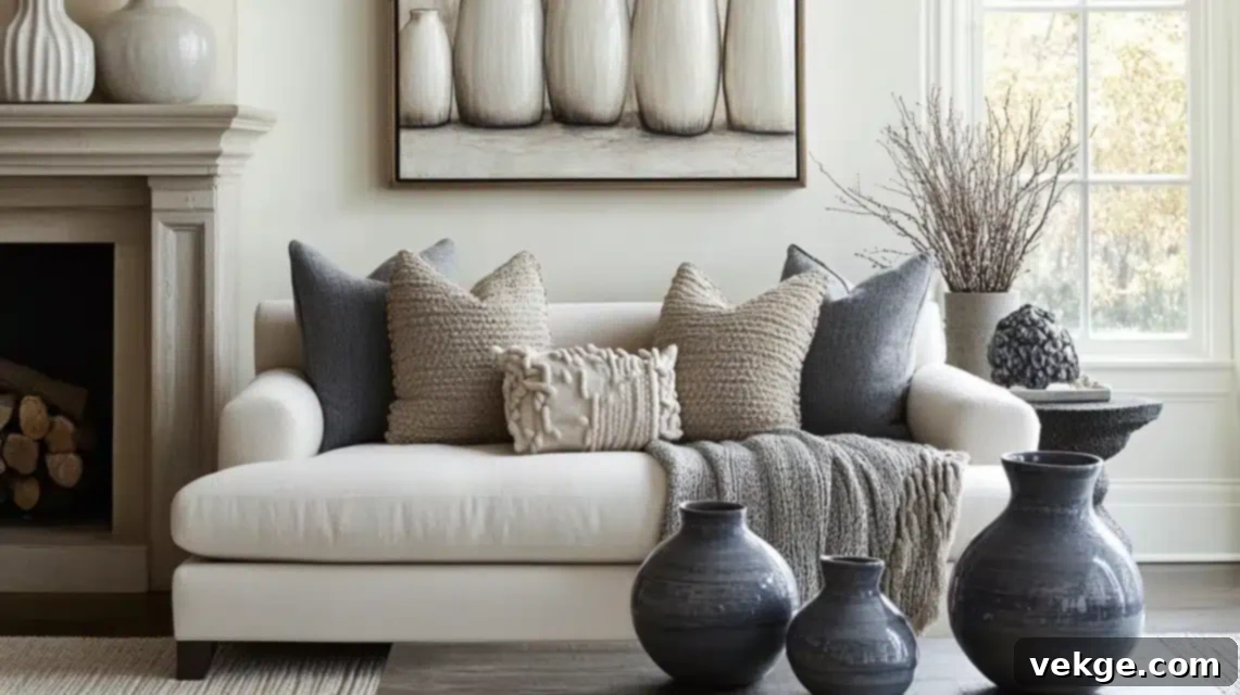
As for accessories and accent pieces, this is truly where I have the most fun with taupe! It’s an incredible color for building subtle yet rich depth and visual interest through layering. I achieve this by deliberately mixing different taupe tones and a variety of textures. For instance:
- A chunky knit taupe throw draped over a lighter taupe sofa creates a subtle yet inviting textural contrast.
- A collection of taupe ceramic vases in varying heights and finishes (matte, glossy, or ribbed) adds sophisticated dimension to a mantelpiece or bookshelf.
- A hand-knotted wool rug featuring subtle taupe patterns can anchor a room, providing warmth and texture while maintaining its overall neutral and refined appeal.
- Taupe velvet cushions against a linen sofa or a sheer taupe scarf draped over a console table introduce luxurious soft touches.
One of my favorite recent installations showcased a meticulously curated collection of taupe ceramic vessels. These pieces varied not only in size and form but also in their finishes—some were beautifully matte, others had a subtle gloss, and a few boasted interesting textures. The monochromatic display generated stunning visual interest and complexity while effortlessly preserving the room’s serene and sophisticated atmosphere.
Pro Tip: When incorporating taupe into accents, I always emphasize the importance of mixing textures. Think about juxtaposing smooth surfaces with rough, matte finishes with glossy sheens, and soft textiles with hard materials. This strategic layering is key to creating visual richness and preventing a neutral space from feeling flat or one-dimensional, while perfectly maintaining the cohesive, sophisticated color story that taupe executes so well.
Remember, the inherent beauty of taupe lies in its subtlety and complexity. In my design practice, I’ve consistently found that it works best when you allow it to build gradually through different elements, rather than introducing it all at once in a uniform manner. This thoughtful, layered approach results in a look that feels both intentionally designed and effortlessly chic.
Colors That Pair Perfectly with Taupe
1. Neutral Pairings: A Symphony of Serenity
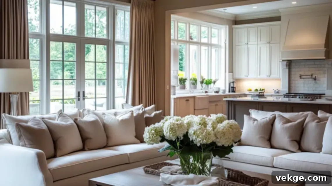
In my design practice, I’ve discovered that taupe’s true magic often radiates most intensely when it’s thoughtfully layered with other complementary neutrals. Just last week, I completed a living room where I artfully paired warm taupe walls with crisp white trim and soft, creamy upholstery. The harmonious result was absolutely breathtaking, demonstrating the profound elegance that subtle variations in neutrals can achieve.
My go-to neutral palette when working with taupe typically includes:
- Pure White: Utilized for architectural details like trim, crown molding, and doors, it creates beautiful definition and a crisp contrast that allows the taupe to truly sing.
- Soft Cream: Ideal for larger furniture pieces such as sofas or rugs, it adds undeniable warmth and a gentle richness without competing with the taupe.
- Light Gray: Incorporated through accent pieces, textured throws, or subtle patterns, it introduces an additional layer of depth while maintaining an overarching sense of serenity and sophistication.
- Ecru or Beige: These provide a slightly deeper, warmer contrast to taupe, especially if the taupe leans cooler, offering a comforting, organic feel.
I especially love leveraging a nuanced mix of whites and creams with taupe in kitchen designs. In a recent kitchen remodel, I designed taupe cabinetry, which I then paired with pristine white marble countertops and a creamy subway tile backsplash. This sophisticated layering technique created an incredible depth and visual richness that my client absolutely adores, proving that a neutral kitchen can be anything but boring.
2. Bold Accents: A Canvas for Vibrant Expression
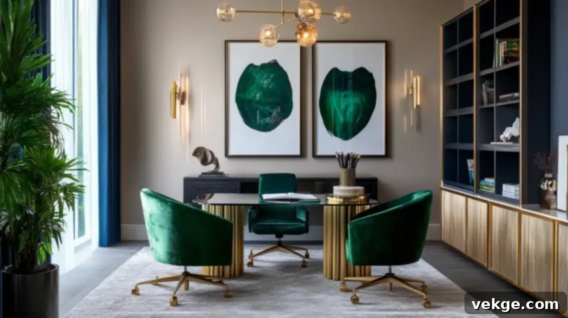
This is precisely where taupe truly showcases its exceptional versatility and power. In my professional experience, taupe acts as an incredibly sophisticated and grounding canvas, allowing bold, saturated colors to truly sing and come alive. It provides the necessary contrast and stability for vibrant hues without ever clashing or competing. I recently designed a home office where I paired elegant taupe walls with plush emerald green velvet chairs and gleaming brass accents – the resulting space was absolutely stunning, exuding both luxury and a vibrant sense of personality!
My absolute favorite bold pairings with taupe include:
- Deep Emerald Green: Introduces a dramatic sense of luxury and depth, perfect for statement furniture pieces or rich textiles.
- Rich Sapphire Blue: Creates an atmosphere of serene sophistication and timeless elegance, fantastic for accent walls, artwork, or throw pillows.
- Deep Aubergine (Eggplant Purple): Brings an unexpected warmth and regal richness, adding a touch of exotic flair and complexity.
- Classic Navy Blue: Offers timeless elegance and a grounding contrast, especially effective in tailored upholstery or large area rugs.
- Burnt Orange or Terracotta: Provides a pop of earthy warmth and energy, excellent for accent cushions, ceramic decor, or abstract art.
One of my favorite design tricks is to use these bold colors strategically in captivating artwork or abstract paintings against a taupe wall. This creates a gallery-like effect, allowing the colors to pop with striking intensity while maintaining the room’s inherent sophistication and balance. The taupe backdrop ensures the bold color enhances, rather than overwhelms, the space.
3. Earthy Combinations: Bringing Nature Indoors
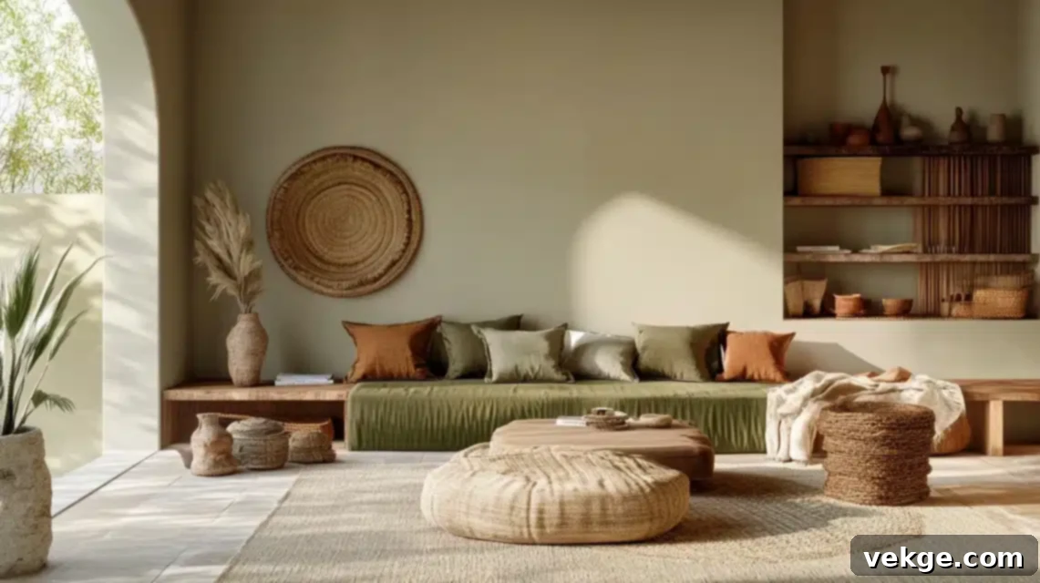
When clients express a desire for a nature-inspired, organic, and truly calming space, I absolutely love working with taupe as the foundational color. Its inherent warmth and connection to natural elements make it an unparalleled base for earthy palettes. Taupe pairs exquisitely with organic tones, effortlessly creating a grounded, serene, and wonderfully inviting atmosphere that feels deeply connected to the outdoors.
My tried-and-true earth-tone combinations that beautifully complement taupe include:
- Sage Green: Brings in a gentle, soothing, and undeniably natural element, perfect for evoking a sense of tranquility and growth.
- Warm Terracotta: Adds a beautiful touch of Mediterranean warmth, rustic charm, and an artisanal feel, especially through pottery or accent tiles.
- Rich Tobacco Brown: Creates luxurious depth, profound coziness, and a grounded, comforting ambiance, ideal for leather, wood, or textiles.
- Sandy Beige: Offers a subtle, sun-kissed contrast that enhances warmth and light, perfect for layering in various textures.
- Deep Olive Green: Provides a more dramatic, sophisticated take on green, offering a stronger contrast while maintaining an organic feel.
I recently completed a sunroom where I seamlessly combined warm taupe walls with sage green upholstery on accent chairs and incorporated an abundance of natural woven textures—think jute rugs, wicker baskets, and rattan light fixtures. The space now feels like a constant breath of fresh air, incredibly tranquil and utterly refreshing! The key to this success was varying the textures significantly while keeping the colors subtle, organic, and deeply rooted in nature.
Tip: When combining taupe with these beautiful earthy tones, I always, always recommend incorporating actual natural materials. Think about investing in solid wooden furniture, adding polished or raw stone accents, selecting natural fiber rugs, or strategically placing woven baskets and clay pottery. This commitment to natural materials grounds the entire color palette and makes the space feel genuinely authentic and timeless, rather than merely following a passing trend.
Styling Tips for a Taupe Space
1. Lighting Matters: Illuminating Taupe’s Nuance
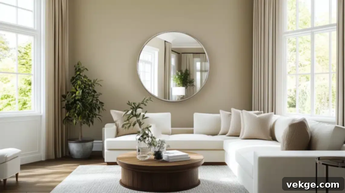
This is precisely where I observe many of my clients initially grappling with the intricacies of taupe. Its chameleon-like quality means that the right lighting can make or break the perception of the color. Let me share a fascinating transformation from a recent project: I had designed a gorgeous taupe living room that, in the early morning, appeared somewhat flat. However, by strategically installing a multi-layered lighting plan, I created an amazing depth and vibrancy that beautifully evolved throughout the entire day.
My professional approach to optimizing lighting in taupe spaces involves a combination of natural and artificial light sources:
- Maximize Natural Light: Position mirrors strategically to amplify and bounce daylight deeper into the room. Be thoughtful with placement; I recently placed a large, unframed mirror directly opposite a north-facing window, and it completely transformed how the taupe walls read, adding brightness and perceived warmth. Keep windows minimally dressed or use sheer, light-filtering fabrics.
- Layer Artificial Lighting: Implement a layered lighting scheme using ambient, task, and accent lighting.
- Ambient Lighting: Use warm LED bulbs (typically 2700K-3000K, often referred to as “soft white” or “warm white”) in ceiling fixtures or floor lamps. These warm color temperatures will enhance taupe’s inherent warmth and prevent it from appearing too cool or stark.
- Task Lighting: For reading nooks or workspaces, ensure task lamps also use warm-toned bulbs to maintain consistency and comfort.
- Accent Lighting: Install dimmers on all light sources, especially accent lights directed at artwork or architectural features. Dimmers are crucial for adjusting the mood and precisely controlling how the taupe appears at different times, allowing you to fine-tune its depth and character.
- Consider Fixture Finishes: The finish of your light fixtures can also play a role. Brass or gold fixtures can emphasize warmer taupe undertones, while brushed nickel or chrome can complement cooler taupes.
2. Layering Textures: The Soul of a Neutral Space
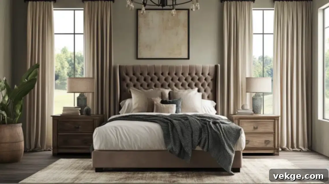
This truly is my absolute favorite aspect of working with taupe, and it’s a principle I impart to all my clients: texture is the vital element that prevents any neutral space from falling flat or feeling monotonous. It’s what breathes life, interest, and a sense of luxury into a monochromatic or subtle color scheme. In a recent bedroom project, I created a magical and incredibly inviting space by meticulously combining a diverse array of textures, all within a beautiful taupe palette:
- A plush taupe velvet headboard, offering a soft, opulent sheen and deep tactile pleasure.
- Nubby linen drapes in a slightly lighter taupe, providing an organic, relaxed texture that filters light gently.
- Hammered metal light fixtures with a rich taupe-bronze finish, introducing an industrial yet refined metallic texture.
- Weathered wood side tables, adding a rustic, natural element and grounding the space with a sense of history.
- A high-low wool rug featuring subtle taupe patterns, creating dynamic visual and physical texture underfoot.
- Smooth ceramic vases, juxtaposed with rougher stone sculptures, for varied decorative elements.
- Soft cashmere throws and crisp cotton sheets, layering comfort and luxury on the bed.
The key to mastering this technique is to maintain visual interest and depth while staying cohesively within your chosen taupe color family. I once had a client who expressed concern that their space might feel “boring” with predominantly taupe tones. However, after I meticulously layered these distinct textures throughout their room, they were utterly amazed at how rich, inviting, and sophisticated it felt, proving the transformative power of texture in a neutral palette.
3. Balancing Warmth and Coolness: The Art of Harmonic Design
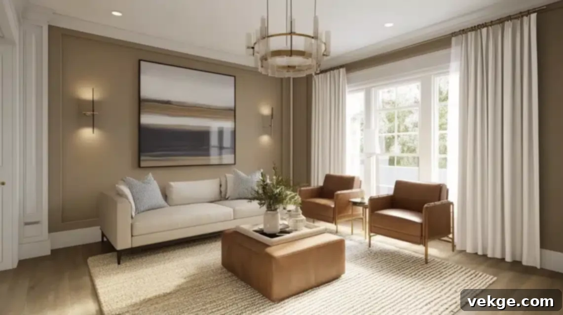
This is precisely where taupe truly reveals its most sophisticated side, demonstrating its ability to create a perfectly balanced and nuanced environment. From my extensive experience, the secret lies in accurately identifying your base taupe’s specific undertone (is it leaning warm or cool?) and then thoughtfully introducing contrasting elements to achieve a harmonious balance within the space.
For predominantly Warm-Toned Taupe spaces (those with pink, yellow, or green undertones):
- Incorporate brushed silver, polished chrome, or cool-toned glass accents to inject a necessary touch of coolness and sparkle.
- Use clear glass elements, such as vases or tabletops, to create bright, reflective spots that prevent the space from feeling too heavy.
- Add crisp white trim or architectural details for a clean, refreshing contrast that defines the edges of the room.
- Layer in blue-toned textiles (like denim, navy, or sky blue cushions) or cool-hued artwork for a balancing visual counterpoint.
- Consider black metal accents for a sophisticated, grounding contrast without adding more warmth.
For predominantly Cool-Toned Taupe spaces (those with gray, blue, or violet undertones):
- Bring in warm brass, antique gold, or copper fixtures and decorative objects to introduce a comforting glow and prevent the space from feeling stark.
- Integrate natural wood elements, such as furniture, shelving, or flooring, to add organic warmth and texture.
- Include textiles with inherently warm undertones like creamy off-whites, rich camels, soft beiges, or terracotta hues to soften the coolness.
- Opt for cream, ivory, or soft off-white rather than stark white for trim and accents, as this provides a gentler, more inviting contrast.
- Introduce elements with a subtle red or orange tint, such as rust-colored pottery or a piece of art with warm ochre tones.
One of my most successful recent projects involved a cool taupe living room where I balanced its serene base perfectly with a thoughtful selection of warmer elements:
- Gleaming warm brass light fixtures, adding immediate visual warmth and a touch of luxury.
- Rich cognac leather accent chairs, providing deep, inviting warmth and a classic, natural texture.
- A natural jute rug, grounding the space with organic texture and a gentle, earthy warmth.
- Creamy white linen curtains, softening the windows and adding a layer of subtle warmth against the cool walls.
My Secret: I always strive to include at least one element that subtly bridges the warm-cool divide within a taupe space. In that same living room project, I used a stunning piece of abstract artwork that featured both warm golds and cool blues. This strategic choice helped to visually unite all the disparate warm and cool elements, creating a cohesive, sophisticated, and perfectly harmonious whole.
Purchasing Guide: Sourcing the Perfect Taupe for Your Home
As an interior designer who regularly sources taupe products for a diverse range of projects, allow me to share my insider knowledge on where and how to acquire the best taupe items for your space, ensuring both quality and style.
Where to Buy Taupe Products?
Having cultivated strong relationships with numerous suppliers, here are my most trusted sources for a variety of taupe products, from paint to furniture:
Paint Retailers:
- Benjamin Moore’s Signature Stores: Their color matching capabilities are unparalleled, and their premium paints offer exceptional depth and durability. A go-to for high-quality taupe shades.
- Sherwin-Williams Retail Locations: Excellent for both standard and custom mixing. They frequently offer sales, making premium paint more accessible. Their color consultants are also very knowledgeable.
- Home Depot’s Behr Collection: Offers great value while maintaining commendable quality, especially for larger projects or if you’re on a tighter budget. Their color selection for taupe is surprisingly robust.
- Fine Paints of Europe: A luxury option known for exceptional depth of color, superior finishes, and incredible longevity. Perfect for those seeking a truly bespoke and high-end taupe application.
- Farrow & Ball: Known for their unique, chalky finishes and complex colors with rich pigments. A fantastic choice for a more artisanal and historic feel.
For Taupe Furniture and Decor:
- Room & Board: Excellent for high-quality, modern taupe upholstery pieces, often with customizable fabrics and durable construction.
- Crate & Barrel: A reliable source for stylish taupe accent furniture, including chairs, console tables, and a wide array of decorative objects.
- West Elm: Great for contemporary and globally inspired taupe accessories, smaller furniture pieces, and unique textiles like throws and rugs.
- RH (Restoration Hardware): Known for their premium taupe textiles, large-scale furniture, and luxurious finishes that lean towards a refined, understated aesthetic.
- Pottery Barn: Offers classic and comfortable taupe furniture and home decor, particularly good for upholstered pieces and bedding.
- Etsy: A wonderful platform for discovering unique, handmade, or vintage taupe decorative pieces, often supporting independent artisans.
Online-Specific Options for Wider Selection:
- Wayfair: Provides an extensive range of taupe products across virtually all categories and price points, from furniture to lighting and rugs.
- Article: Offers modern, well-designed taupe furniture with a focus on good quality and direct-to-consumer pricing.
- Burke Decor: Features a curated selection of designer-quality taupe accessories, lighting, and unique furniture pieces.
- Lulu and Georgia: Excellent for upscale, trend-forward taupe rugs, textiles, and decorative items.
Product Options: Finishes and Sizes
Understanding the different paint types and finishes is crucial for achieving the desired look and durability for your taupe application:
Common Paint Finishes:
- Flat/Matte: My go-to for sophisticated walls in low-traffic areas. It hides imperfections beautifully and offers a rich, velvety appearance, making colors look their deepest.
- Eggshell: Perfect for high-traffic areas like living rooms and hallways. It offers a subtle sheen and is more durable and easier to clean than flat finishes.
- Satin: Excellent for trim, doors, and millwork, providing a slightly higher sheen than eggshell. It’s very durable and wipes clean easily.
- Semi-Gloss: Great for doors, cabinets, and kitchens where durability and easy cleaning are paramount. It offers a noticeable sheen.
Available Sizes for Paint:
- Sample Pots (8 oz – 1 quart): Absolutely essential for testing. Never skip this step!
- Quarts: Good for small projects, accent walls, or touch-ups.
- Gallons: The standard size for painting most rooms.
- 5-Gallon Buckets: Ideal and more cost-effective for large projects, entire homes, or open-plan areas.
Special Finishes I Often Recommend:
- Chalk Finish for Furniture: Creates a beautiful, matte, and slightly aged look on taupe furniture, perfect for vintage or farmhouse styles.
- Metallic-Infused Taupe: For accent walls or decorative elements, a subtle metallic shimmer can add an unexpected layer of luxury and depth.
- Zero-VOC Options: For environmentally conscious clients or those with sensitivities, these formulations offer excellent performance with minimal off-gassing.
- Cabinet-Specific Formulations: Engineered for superior durability and adhesion, ensuring your taupe cabinets look pristine and last for years.
Pricing and Samples: Smart Budgeting for Taupe
Navigating paint pricing can be tricky, but here’s an approximate range to help you budget for your taupe project:
Paint Pricing (approximate ranges, per gallon):
- Premium Brands (Benjamin Moore, Farrow & Ball):
- Gallons: $50-85
- Samples: $8-15
- Mid-Range Brands (Sherwin-Williams, Behr, Valspar):
- Gallons: $35-65
- Samples: $5-10
- Budget-Friendly Options (Store Brands, entry-level):
- Gallons: $25-45
- Samples: $3-7
Getting Samples – Your Best Investment:
Investing in samples is non-negotiable for taupe:
- Order Color Chips Online: Usually free, these are good for initial narrowing down but not for final decisions.
- Purchase Sample Pots from Stores: The most common method; allows you to paint swatches.
- Request Large-Format Swatches: Available at most premium paint retailers, these are bigger and provide a better visual.
- Use Peel-and-Stick Samples: My preferred method for clients! These are color-accurate, easy to reposition, and leave no mess. Brands like Samplize offer great options.
Pro Tips for Sampling:
- Always Get Actual Paint Samples: Color chips are deceptive. You need to see the actual paint on your wall.
- Buy Multiple Samples of Similar Shades: Taupe has endless variations. Test several that seem close to your ideal.
- Take Advantage of Store Promotions: Many stores offer reduced sample costs or “buy X, get Y free” deals, especially on weekends.
- Consider Ordering Sample Boards: Some services provide pre-painted large sample boards, saving you the effort of painting swatches.
- Look for Combo Sample Kits: Some brands offer kits that include multiple finishes or complementary colors.
Designer Tip: Many paint stores offer designer discounts – don’t hesitate to inquire about their trade programs if you’re embarking on a large project. Additionally, many paint companies now provide virtual color consulting services. This can be a highly cost-effective way to receive professional guidance and refine your selection before committing to your final taupe shade, saving you potential headaches and expenses down the line.
Conclusion: Embracing the Timeless Elegance of Taupe
Taupe is far more than just another neutral; it is a timeless classic, a truly sophisticated chameleon that brings unparalleled warmth, profound depth, and incredible versatility to any space it inhabits. Whether you’re drawn to its cooler, more refined undertones for a contemporary aesthetic or prefer its warmer, cozier hues for an inviting ambiance, taupe adapts beautifully, harmonizing effortlessly with your personal style and the unique lighting conditions of your home.
From becoming the elegant backdrop on your walls and ceilings, to forming the foundation of your furniture and upholstery, and adding intriguing layers through carefully selected accent pieces and textures, taupe consistently creates a strong, flexible foundation. This allows your creativity to truly shine, giving you the freedom to experiment with other colors and styles without ever losing cohesion.
Successfully incorporating taupe into your home is ultimately about finding that perfect balance—it’s about thoughtfully layering textures, choosing complementary colors that enhance its complexity, and skillfully using lighting to draw out and celebrate its rich character. As we’ve explored throughout this guide, taupe serves as a magnificent canvas, equally adept at supporting bold, vibrant accents, grounding earthy combinations, or creating serene, monochromatic neutral schemes. It is, without a doubt, a designer’s dream.
Ready to introduce the understated elegance of taupe into your own home? Begin with manageable updates, perhaps by painting a single accent wall, refreshing your throw pillows, or investing in a new taupe area rug. Alternatively, for those feeling more adventurous, dive all in with a complete taupe-inspired room makeover. Whatever path you choose, taupe’s enduring charm and adaptable nature will undoubtedly elevate your space, proving definitively that neutral never, ever has to mean boring.
Frequently Asked Questions About Taupe in Interior Design
Is Taupe More Brown or Gray?
Taupe is a sophisticated and unique blend of both brown and gray, making it a true chameleon color! Think of it as the elegant middle ground between these two classic neutrals. Its specific undertones are what dictate whether a particular taupe shade will lean more towards the warmth of brown or the coolness of gray. In my design practice, I’ve observed that most taupes achieve a near 50-50 balance of brown and gray, but this proportion can shift slightly, giving each taupe its distinct character and charm.
Can I Use Taupe in a Small Room?
Absolutely, yes! I frequently use taupe in smaller spaces, and it can be incredibly effective. The key is to select a lighter shade of taupe that reflects light well, and crucially, pair it with an excellent, well-planned lighting scheme. A lighter taupe can actually make a small room feel more expansive and airy, while still providing more depth and interest than a stark white. In fact, I recently designed a compact home office using a soft, warm taupe, and it created this beautiful, cozy, and highly productive atmosphere while maintaining a refined and professional look.
Are Taupe Walls Easy to Clean?
The ease of cleaning taupe walls largely depends on the paint finish you choose. For high-traffic areas like hallways, kitchens, or children’s rooms, I strongly recommend opting for an eggshell or satin finish taupe paint. These finishes have a slightly higher sheen, making them significantly more durable and easier to wipe clean without damaging the paint. Conversely, flat or matte finishes, while offering a beautiful, velvety aesthetic that hides wall imperfections, are generally less resistant to scuffs and marks and are better suited for low-traffic areas like formal dining rooms or master bedrooms.
How Often Will I Need to Repaint Taupe Walls?
With a high-quality paint application, taupe walls typically maintain their beauty and integrity for 5-7 years before genuinely needing a refresh. However, this lifespan can vary considerably depending on several key factors:
- Amount of Daily Wear and Tear: Rooms with high activity will naturally show signs of wear faster.
- Quality of the Initial Paint Job: Proper surface preparation and application techniques significantly extend paint life.
- Specific Finish Used: As mentioned, satin and eggshell finishes are more durable than flat.
- Amount of Direct Sunlight Exposure: Intense, prolonged direct sunlight can cause any paint color to fade over time.
- Household Habits: Frequent wiping or cleaning can also impact the finish over the years.
What’s the Most Cost-Effective Way to Incorporate Taupe into My Home?
To incorporate taupe without a large initial investment, my advice is always to start small and experiment! This allows you to gauge how the color feels in your space before committing fully. I often suggest these cost-effective approaches:
- Start with Taupe Accessories: Introduce throw pillows, blankets, ceramic vases, or decorative objects in various taupe shades and textures.
- Test with Removable Wallpaper: If you’re hesitant about painting, consider peel-and-stick taupe wallpaper for a small section or an accent wall.
- Paint a Single Accent Wall: Choose one wall in a room to paint in your desired taupe shade. This provides a significant visual impact without the cost of painting the entire room.
- Incorporate Taupe Through Textiles: Update your curtains, an area rug, or bedding in taupe to see its effect on the overall ambiance.
- Repurpose or Paint Existing Furniture: Give an old dresser or side table a new life with a coat of taupe chalk paint.
