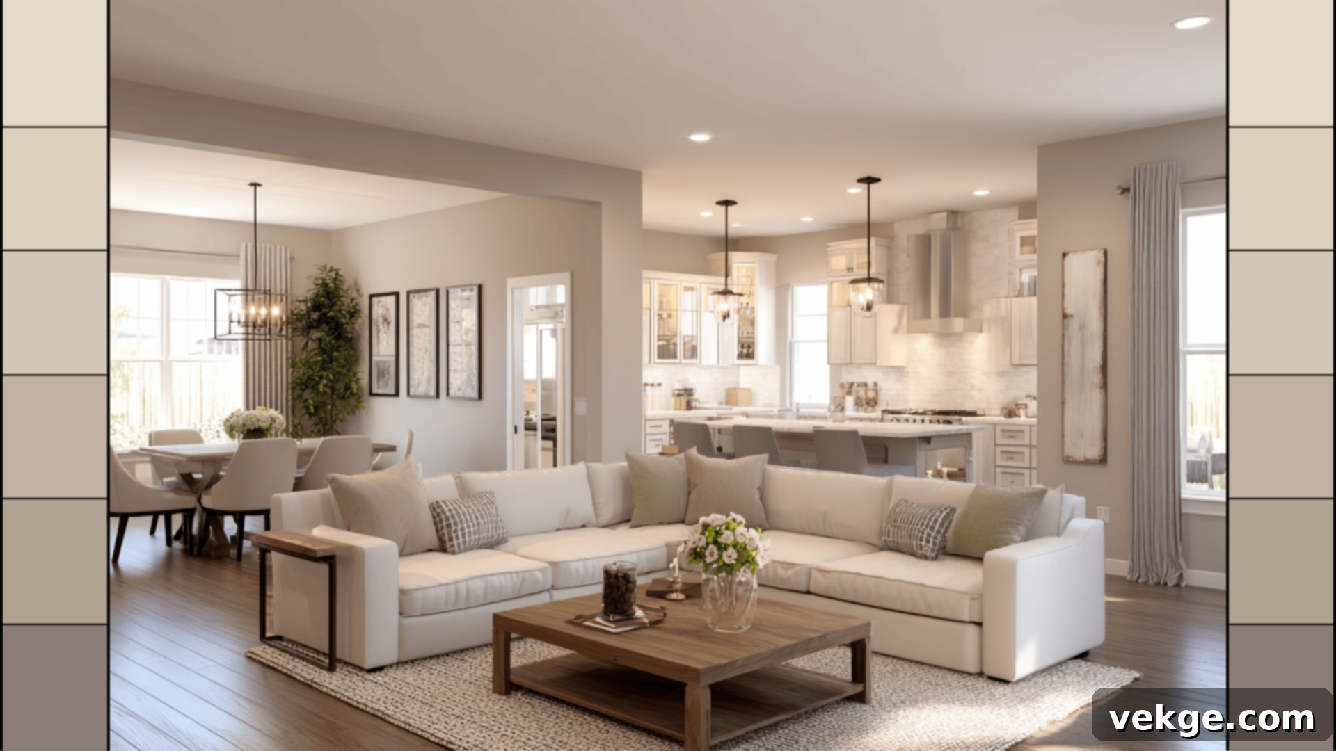
Sherwin-Williams Accessible Beige (SW 7036) Color Strip: Your Guide to Versatile Warm Neutrals
Navigating the vast world of neutral paint colors can often feel overwhelming, but Sherwin-Williams simplifies this journey with their intelligently designed color strips. Among their most beloved and versatile offerings is the Accessible Beige Color Strip. Renowned for its inviting warmth, natural feel, and exceptional flexibility, Accessible Beige (SW 7036) strikes a perfect balance, gracefully avoiding the pitfalls of being either too gray or excessively yellow.
If Sherwin-Williams Accessible Beige has captured your attention, this comprehensive guide is designed to walk you through its entire color strip. You’ll gain a deeper understanding of what colors pair beautifully with each shade, how each hue subtly transforms under different conditions, and where they perform best within your living spaces. We’ll delve into the nuances of each color, from the lightest to the deepest, offering insights into their undertones and ideal applications.
Beyond exploring the palette itself, you’ll also discover invaluable tips for sampling paint, convenient buying options, and easy color combinations to effortlessly integrate into your home. Prepare to transform your space with the timeless elegance of these warm neutrals. Let’s explore this celebrated collection.
Understanding the Sherwin-Williams Accessible Beige Color Strip
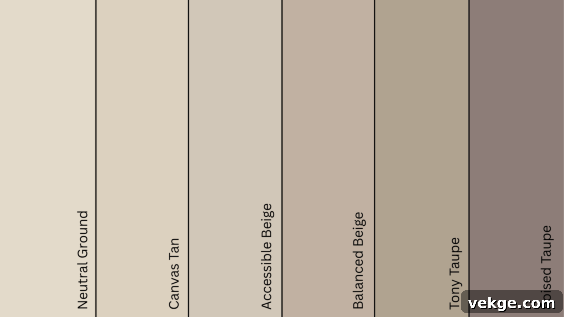
A Sherwin-Williams color strip is more than just a collection of paints; it’s a meticulously curated set of shades that belong to the same overarching color family, yet offer a smooth progression in terms of depth and saturation. The Accessible Beige color strip exemplifies this concept beautifully, presenting a harmonious gradient of warm neutrals. This palette ranges from soft, airy tones that feel almost ethereal to rich, grounding shades that add significant presence to a room. This thoughtful coordination ensures that every color on the strip naturally complements the others, making design choices intuitive and cohesive.
Here’s a detailed look at the colors typically included in this highly versatile strip, along with their key characteristics:
| Paint Color | SW Code | HEX | LRV | Undertone |
|---|---|---|---|---|
| Neutral Ground | SW 7568 | #E2DACA | 70 | Warm cream-beige |
| Canvas Tan | SW 7531 | #DCD1BF | 64 | Soft warm tan |
| Accessible Beige | SW 7036 | #D1C7B8 | 58 | Balanced beige-gray (greige) |
| Balanced Beige | SW 7037 | #C0B2A2 | 46 | Warm, slightly deeper beige |
| Tony Taupe | SW 7038 | #B1A290 | 37 | Earthy, grounded taupe |
| Poised Taupe | SW 6039 | #8C7E78 | 27 | Muted purple-gray taupe |
The inherent beauty of this strip lies in its effortless coordination. Each shade transitions seamlessly into the next, allowing you to layer them within a single space for subtle depth, or use them individually throughout your home to maintain a cohesive yet varied aesthetic. This natural progression makes interior design projects much simpler and more enjoyable.
Deep Dive into Accessible Beige (SW 7036) by Sherwin-Williams
Accessible Beige (SW 7036) truly forms the cornerstone of this color strip, embodying a harmonious blend of warmth and sophisticated greige undertones. It’s celebrated for its unique ability to remain perfectly balanced, ensuring it never appears overtly cold or excessively yellow. Its Light Reflectance Value (LRV) of 58 positions it as an ideal mid-tone neutral. This LRV means it’s light enough to create an open and airy atmosphere, yet grounded enough to infuse any room with a comforting warmth and substantial body. It effectively brightens a space without feeling stark, offering a welcoming embrace.
The magic of Accessible Beige often reveals itself through changing light conditions. In abundant daylight, the color radiates an airy, clean, and beautifully balanced presence, feeling fresh and inviting. As the light softens or dims, particularly in the evenings or in rooms with less natural light, its subtle warmth becomes more pronounced, transforming the room into a cozy, intimate retreat. This adaptability makes it a favorite for diverse environments.
Accessible Beige’s versatility extends far beyond just walls. It performs equally well on kitchen cabinets, where it can offer a modern yet classic touch, on exterior sidings for a welcoming curb appeal, or even on ceilings when paired with a contrasting trim, adding a refined, cohesive look to the entire space. It’s a true chameleon, capable of adapting to various architectural elements and design styles.
Strategic Applications for the Accessible Beige Color Strip in Your Home
This meticulously crafted palette is an exquisite choice for homes that favor a warm, relaxed, and timeless aesthetic. Each distinct color within the strip serves a specific purpose, contributing to the overall harmony of your design, whether it’s by softening overly bright rooms or by creating inviting, grounded corners. Let’s explore how to effectively utilize each shade to maximize its potential:
Neutral Ground (SW 7568)
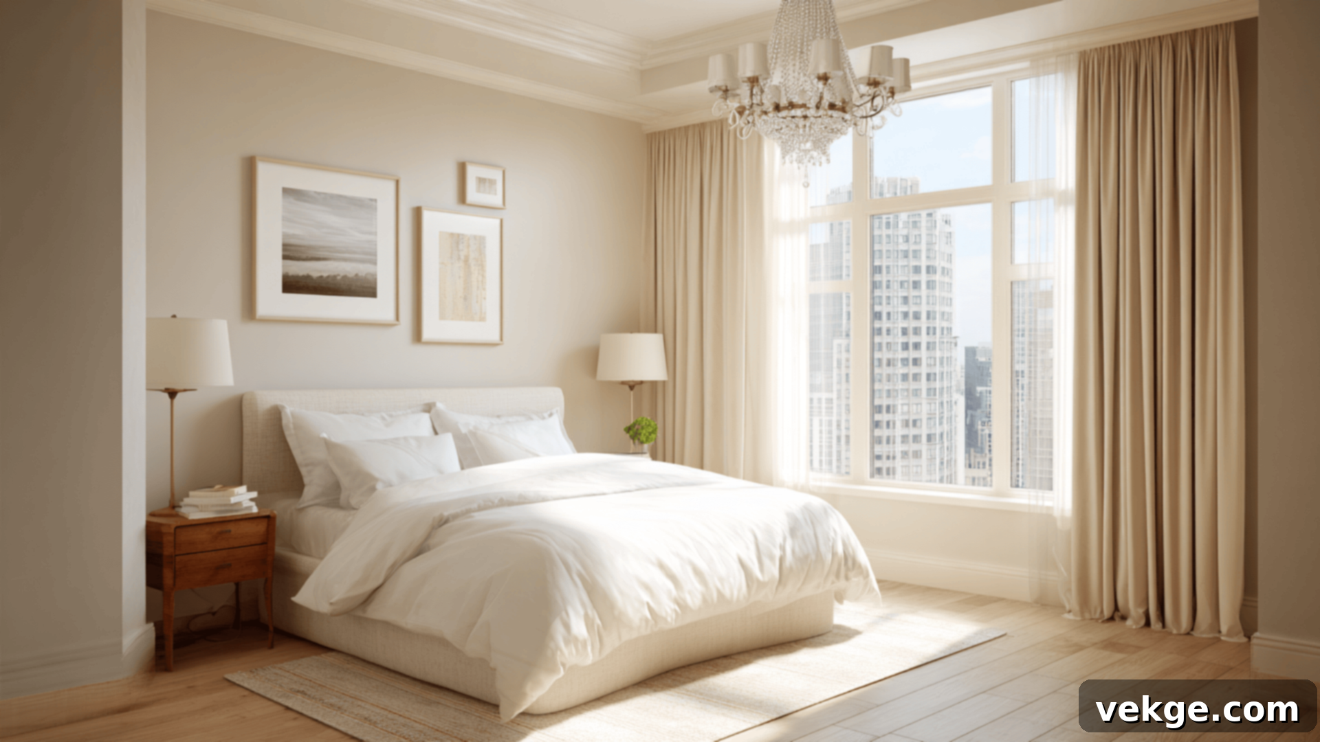
Best for: Ceilings, trims, low-contrast walls, bright rooms.
As the lightest shade on the strip with an LRV of 70, Neutral Ground is a beautifully understated cream-beige that offers a softer, more nuanced alternative to stark white. Its gentle warmth prevents it from feeling cold, making it an excellent choice for ceilings and trim, where it can provide a subtle definition without harsh contrast. It excels on entire walls in sun-drenched spaces where a pure white might feel too intense or glaring. In bedrooms or guest rooms, Neutral Ground creates an exceptionally calm and natural backdrop, promoting a sense of tranquility and restfulness. It’s the perfect whisper of color for a serene atmosphere.
Canvas Tan (SW 7531)
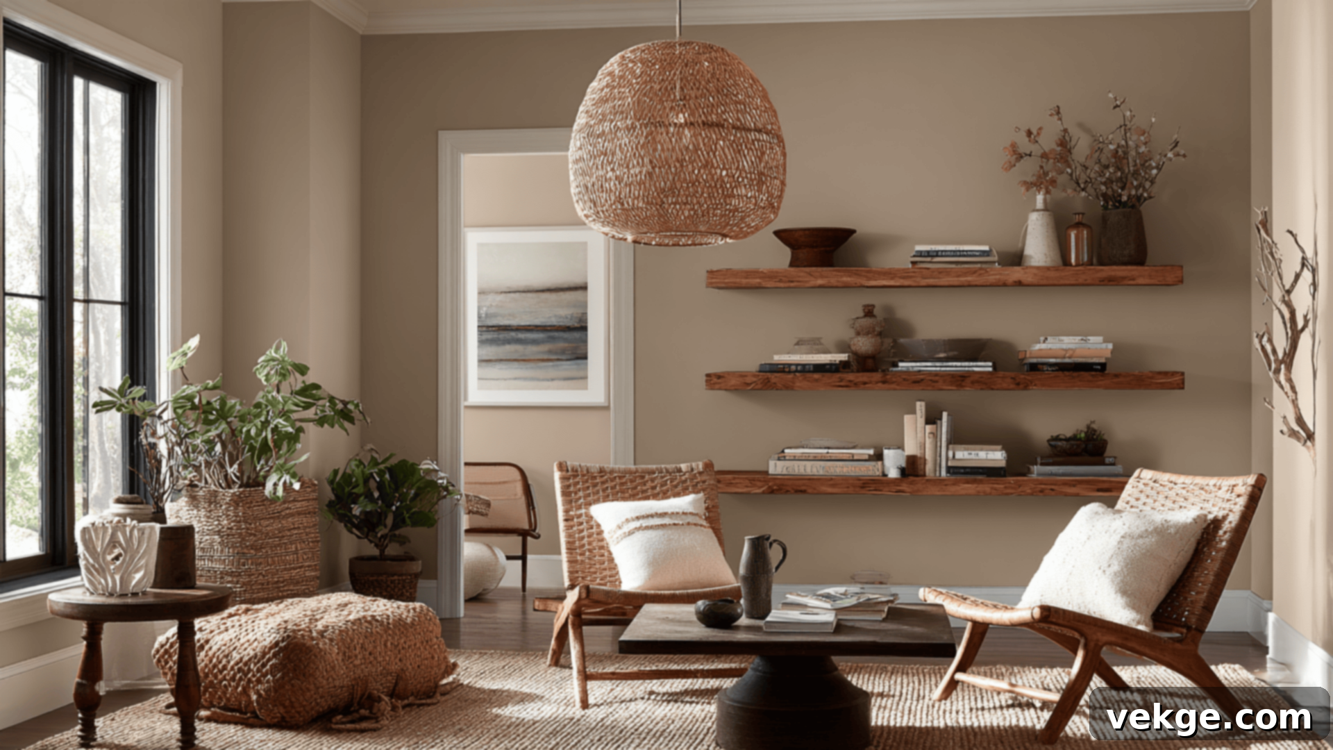
Best for: Main living rooms, bustling kitchens, transitional hallways, open-concept spaces.
With an LRV of 64, Canvas Tan is a welcoming and soft warm tan that is anything but boring. It introduces a touch more color and warmth than Neutral Ground, without losing its subtle appeal. This shade looks particularly stunning in main living areas, where it pairs harmoniously with natural materials like rich woods, cozy textiles, and warm metallic accents. It’s an ideal choice for creating continuity between adjoining rooms or for gracefully anchoring an open-concept space, ensuring a seamless flow and an inviting ambiance throughout your home. Canvas Tan provides a comforting embrace without overpowering the decor.
Accessible Beige (SW 7036)
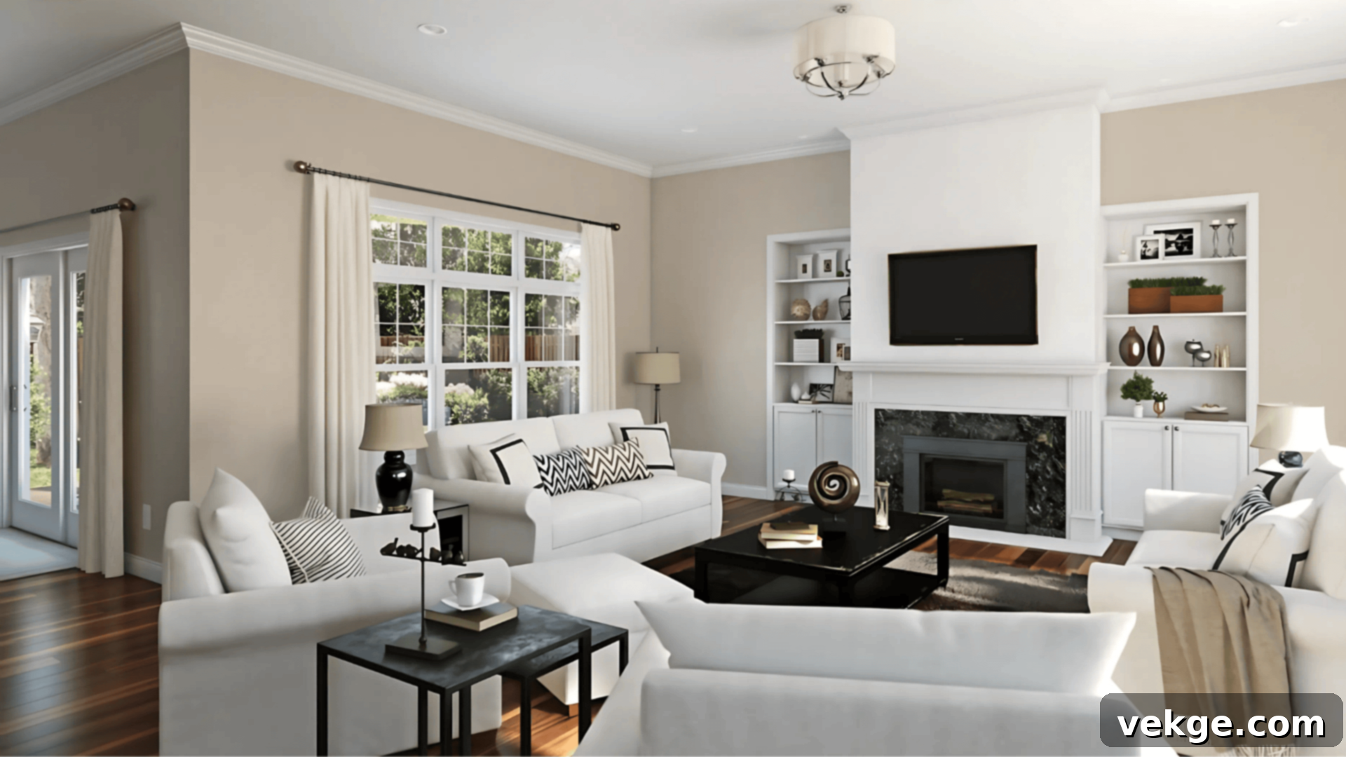
Best for: Master bedrooms, active living rooms, versatile open-plan layouts, exteriors.
As the protagonist of this strip, Accessible Beige, with its LRV of 58, offers an unparalleled balance and versatility that makes it suitable for virtually any space. Its coveted greige quality means it adeptly handles various lighting conditions, holding its true character whether bathed in bright sunshine or softened by evening lamps. It is especially effective in areas with mixed lighting, or where you desire a consistent, reliable color presence throughout the entire day. Accessible Beige is perfect for creating a sophisticated yet approachable backdrop that allows furniture and decor to truly shine, making it a cornerstone for a cohesive home design. It’s a favorite for both interior walls and exterior facades.
Balanced Beige (SW 7037)
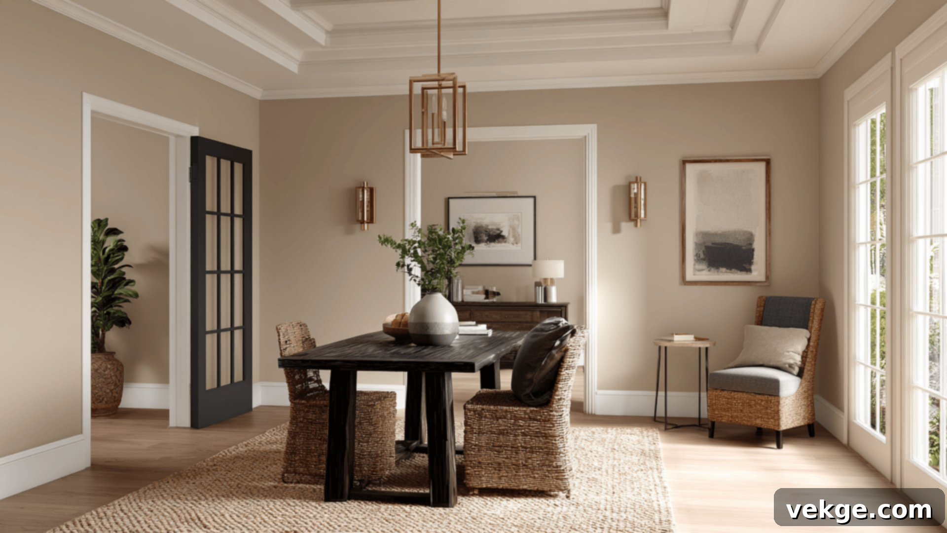
Best for: Elegant dining rooms, productive home offices, impactful feature walls, cozy dens.
Just a touch deeper than Accessible Beige, Balanced Beige (LRV 46) introduces more visual depth and a richer warmth without feeling heavy or overpowering the room. This shade is perfect for adding an element of grounded elegance to formal spaces like dining rooms, or for creating a focused and inviting atmosphere in a home office. It also serves as an excellent choice for a cozy, enveloping backdrop in bedrooms or dens, promoting relaxation and comfort. When seeking to add warmth and a subtle sense of luxury, Balanced Beige delivers with effortless charm. It’s truly a versatile mid-tone that can elevate any room.
Tony Taupe (SW 7038)
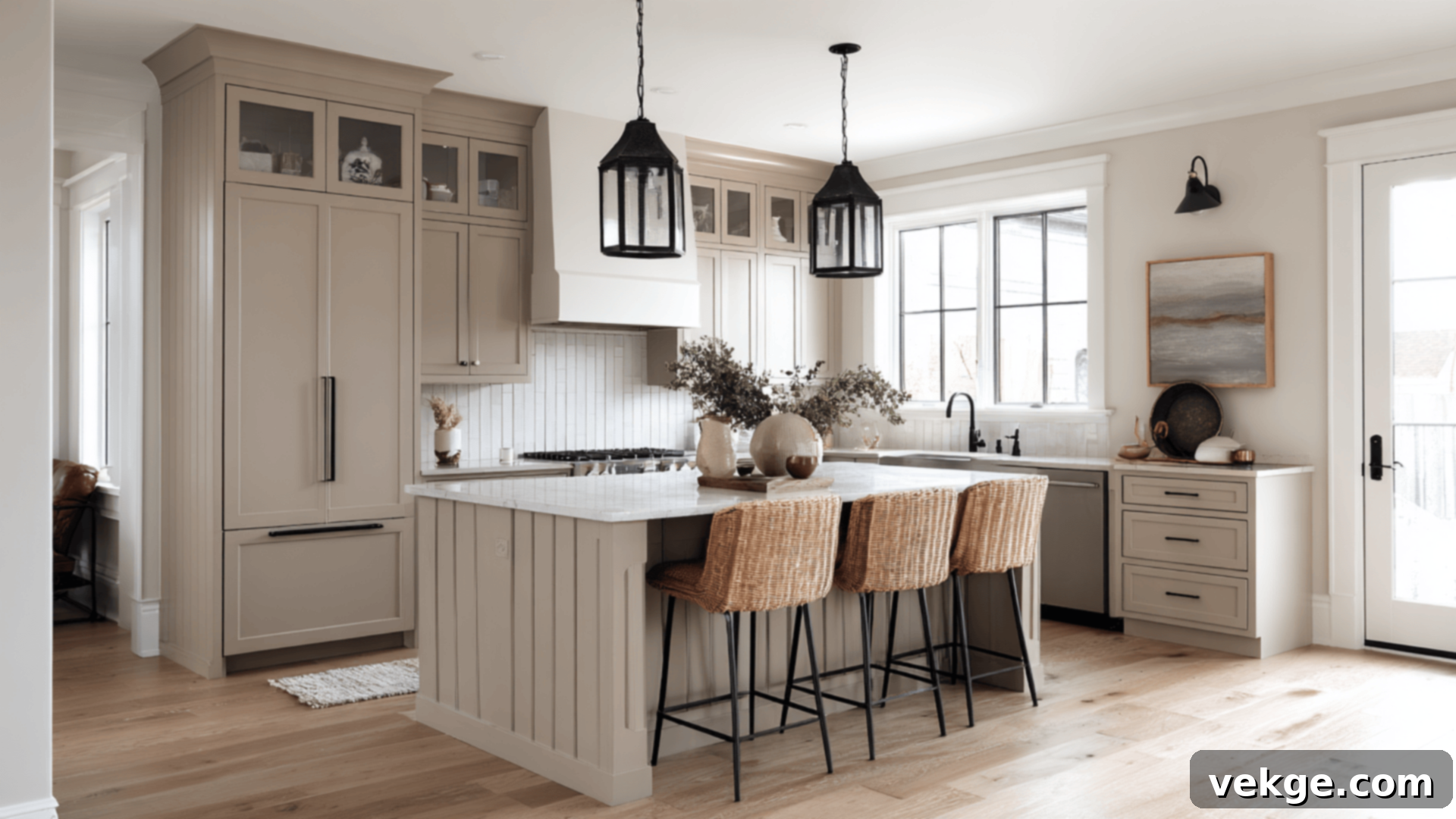
Best for: Built-in shelving, kitchen cabinetry, wainscoting, powder rooms, or accentuating smaller rooms.
This earthy, deep taupe (LRV 37) brings a significant sense of moodiness, richness, and sophistication to any space. Tony Taupe is exceptional for grounding a room when applied to lower walls, kitchen islands, or built-in office cabinetry, creating a luxurious focal point. It can transform a utilitarian space into something truly special. Additionally, it pairs beautifully with the lighter tones from the Accessible Beige strip, offering a striking yet harmonious contrast that adds dimension and interest to your interior design. Consider it for a dramatic powder room or to define an architectural feature, lending a refined, tailored look.
Poised Taupe (SW 6039)
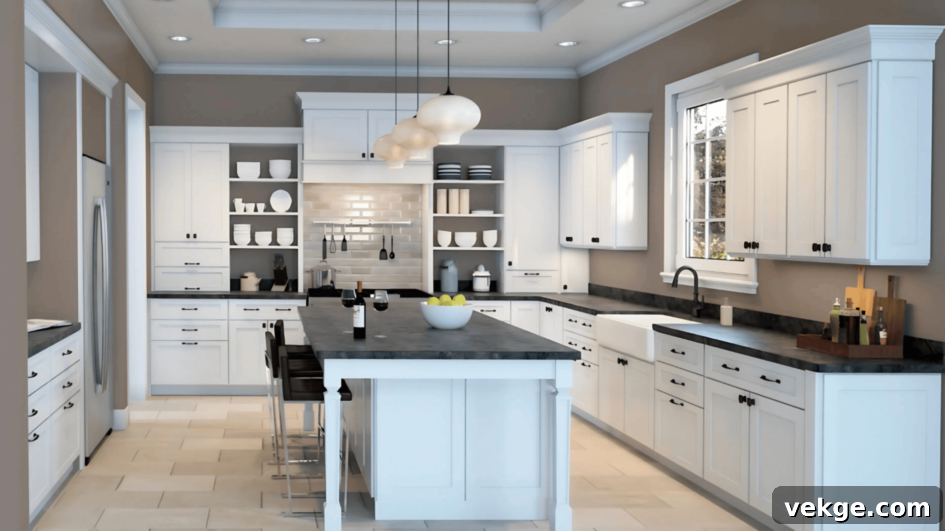
Best for: Dramatic accent walls, captivating exteriors, bold trim, or as a contrasting door color.
As the deepest and most saturated shade in the color strip, Poised Taupe (LRV 27) delivers a moody, sophisticated, and distinctly contemporary touch. Its unique muted purple-gray undertones make it stand out, offering a powerful statement without feeling overtly dark. Use it as an impactful accent color indoors to create a focal point, or embrace its depth as a bold trim or front door color on your home’s exterior. It pairs stunningly with crisp off-whites and the warmer neutrals higher up on the strip, creating a dynamic and visually engaging contrast that speaks volumes about your design sensibility. Poised Taupe is for those ready to make a confident color statement.
Optimal Pairings and Trim Suggestions for the Accessible Beige Strip
One of the remarkable qualities of the Accessible Beige color strip is its inherent versatility, allowing it to harmonize beautifully with both warm and cool tones. This adaptability means you can effortlessly steer the overall mood of your space, leaning towards cozy and traditional, or modern and sleek, simply by carefully selecting your accent colors and finishes. It’s a palette that truly responds to your personal style.
Complementary Whites and Trim Options
Choosing the right white for trim, ceilings, or even adjacent walls can significantly enhance the impact of the Accessible Beige strip. Here are some top recommendations:
- Alabaster (SW 7008): This is a highly popular, warm, and soft white that adds a layer of comfort and coziness without ever appearing yellow or creamy. It’s an exquisite choice for trim, particularly when paired with Accessible Beige and Canvas Tan, as it perfectly complements their inherent warmth, creating a seamless and inviting look.
- Pure White (SW 7005): A truly clean and neutral white, Pure White offers a crisp, subtle contrast that highlights the nuances of each shade on the strip without overpowering them. It’s an excellent choice if you desire a sharp, fresh, and contemporary aesthetic, providing a bright frame for any of the beige or taupe tones.
- Shoji White (SW 7042): This warm off-white mixes incredibly softly with the lighter tones found in the Accessible Beige strip. It’s absolutely ideal for creating a sophisticated tone-on-tone look, fostering a cohesive, comfortable, and natural vibe that feels effortlessly elegant and serene.
Dynamic Accent Colors
The right accent colors can dramatically alter the perception of the Accessible Beige palette:
- Warm accents like rich terracotta, burnished bronze, deep olive green, and delicate dusty rose beautifully draw out the inherent earthy warmth and underlying red/yellow undertones in shades such as Balanced Beige and Tony Taupe. These pairings create an inviting, organic, and harmonious atmosphere.
- Cool accents such as sophisticated slate blue, classic navy, deep charcoal, or striking matte black introduce a powerful contrast. These combinations lend the palette a more modern, grounded, and often more formal or dramatic appearance, highlighting the greige qualities within Accessible Beige.
Harmonious Wood Tones
The Accessible Beige strip boasts a remarkable compatibility with virtually all natural wood tones, allowing for a wide range of design possibilities.
- Lighter wood finishes, such as natural oak, maple, or birch, contribute to an airy, Scandinavian-inspired, or contemporary aesthetic, keeping the space feeling open and bright.
- Medium to darker wood tones, including walnut, chestnut, or driftwood, introduce a sense of depth, richness, and grounding. These heavier woods complement the warm neutrals without overwhelming the wall color, adding a layer of sophistication and tradition. The key is to ensure the wood’s undertones align with or complement the paint’s warmth.
Selecting the Perfect Paint Finish for Your Accessible Beige Palette
The paint finish you choose is not merely an aesthetic decision; it significantly impacts how these beautiful colors will appear and perform within your space. Each finish reacts differently to light and offers varying levels of durability and cleanability.
- Matte: This ultra-low sheen finish offers a soft, velvety appearance that absorbs light rather than reflecting it. It’s superb for bedrooms, formal dining rooms, and ceilings, as it minimizes imperfections and makes colors appear richer, softer, and more powdery. However, it’s less durable and harder to clean, making it best for low-traffic areas.
- Eggshell: With a slight sheen reminiscent of an eggshell, this finish is a popular choice for living rooms, hallways, and home offices. It offers a soft glow without being overly reflective, providing a good balance between aesthetics and functionality. It’s more durable than matte and easier to wipe clean, making it suitable for moderate traffic areas.
- Satin: Offering a smoother, more lustrous finish than eggshell, satin is ideal for bathrooms, kitchens, and other high-traffic zones. Its increased durability and washability make it perfect for areas prone to moisture and spills. The slight sheen can also make the paint’s undertones appear slightly clearer and more pronounced.
- Semi-gloss or Gloss: These high-sheen finishes are typically reserved for trim, doors, and cabinetry where you desire strong definition, durability, and contrast. Their reflective quality makes colors appear vibrant and sharp, and they are exceptionally easy to clean. Using them on trim against a matte or eggshell wall color creates an elegant, polished look.
If you’re unsure which finish to commit to, consider testing the same color in two different finishes. Observing how each reflects light and alters the perception of the color can fundamentally shift the entire mood of your room and guide your final decision.
Essential Sampling and Buying Tips for Your Paint Project
Making an informed paint choice requires careful consideration. It’s paramount to always sample colors in your actual space before committing to a large purchase. These warm neutral tones, in particular, can be highly influenced by existing lighting conditions, your furniture, and even your flooring color, often appearing quite different on the wall than on a small swatch card.
Where to Get Peel-and-Stick Samples
Peel-and-stick samples are a game-changer for paint selection, offering a mess-free and accurate way to test colors:
- Samplize: Known for offering large, high-quality peel-and-stick samples made with real Sherwin-Williams paint. They are removable, repositionable, and eliminate the need for messy sample pots, providing a true representation of the color in your space.
- Sherwin-Williams Stores: Your local Sherwin-Williams store will provide traditional paint chips (small cards) and, more importantly, small sample pots that allow you to paint swatches directly onto your walls.
- Online Ordering: Sherwin-Williams.com offers the convenience of ordering paint chips and sample pots online, with options for direct delivery to your home or in-store pickup.
When testing samples, place them on various walls within the room, particularly near windows, existing trim, and large furniture pieces. Observe them throughout different times of the day, under both natural and artificial light. Pay close attention to how the color shifts and interacts with your home’s unique environment.
Smart Buying Tips
- Sherwin-Williams.com and local stores reliably carry all six colors in the Accessible Beige strip, available in every desired finish and paint line.
- If you’re attempting to match an older paint job or a custom color, Sherwin-Williams often provides custom mixing services to ensure an exact match. Bring a small sample of the old paint or an item with the desired color.
- Always inquire about current discounts or sales. Sherwin-Williams frequently runs promotions, often offering 30–40% off paint products on weekends or during specific holiday periods. Planning your purchase around these sales can result in significant savings.
- Consider investing in their higher-quality paint lines. While more expensive upfront, they often offer better coverage, durability, and a more refined finish, saving you time and money in the long run.
- Don’t forget essentials like painter’s tape, brushes, rollers, and primer, especially if you’re painting over a dark color or a porous surface.
Comparable Paint Equivalents from Other Brands
While Sherwin-Williams Accessible Beige and its coordinating colors are unique, it’s common for homeowners to seek similar shades from other popular paint brands. If you’re looking for close visual matches to these Sherwin-Williams colors in Benjamin Moore or Behr, here are some excellent alternatives. Remember, exact matches are rare due to proprietary formulations and pigment differences, so always test samples first.
| Sherwin-Williams Color | Benjamin Moore Equivalent | Behr Equivalent |
|---|---|---|
| Neutral Ground (SW 7568) | Sonnet (AF-55) | Silky White (PPU7-12) |
| Canvas Tan (SW 7531) | Cedar Key (OC-16) | Sandstone Cliff (750C-3) |
| Accessible Beige (SW 7036) | Edgecomb Gray (HC-173) | Wheat Bread (720C-3) |
| Balanced Beige (SW 7037) | Pashmina (AF-100) | Perfect Taupe (PPU18-13) |
| Tony Taupe (SW 7038) | Indian River (985) | Studio Taupe (UL140-7) |
| Poised Taupe (SW 6039) | Smoked Oyster (2109-40) | Suede Gray (PPU18-17) |
It is crucial to remember that these are close visual approximations, not identical matches. The subtle nuances in undertones and the way each brand’s paint reacts to light can differ. Therefore, always obtain and test samples of any alternative color in your actual space under various lighting conditions before making your final decision.
Conclusion: Embracing the Enduring Charm of the Accessible Beige Color Strip
If your design inclinations lean towards creating spaces that feel inherently warm, inviting, and enduringly classic, the Sherwin-Williams Accessible Beige Color Strip stands as an exceptionally dependable and truly versatile choice. Through this comprehensive guide, you have now gained an in-depth understanding of how each distinct color within this remarkable palette behaves, what complementary elements they pair harmoniously with, and the myriad ways they can be artfully integrated throughout every corner of your home.
Whether your current project involves redecorating a single, cherished room, embarking on a complete open-concept makeover, or simply refreshing your home’s exterior, this thoughtfully curated palette provides unparalleled flexibility. It empowers you to maintain a cohesive and layered aesthetic, ensuring your spaces feel continuously cozy, sophisticated, and perfectly united.
Still pondering which specific shade from this exquisite strip is your ideal match? A wonderful starting point is Accessible Beige (SW 7036) itself. It represents the quintessential “sweet spot” of the strip, embodying the perfect balance of warmth and neutrality. Once you’ve experienced its adaptability, you can confidently test the lighter or deeper tones within the strip, allowing your space’s unique light and existing decor to guide you toward your absolute perfect match. Embrace the journey of discovery, and let the Accessible Beige Color Strip transform your house into a truly harmonious home.
For those eager to explore even more color options and design inspiration, I encourage you to delve into the additional color guides and articles available on the website. Don’t forget to check them out for further insights and creative ideas!
