Sherwin-Williams Anonymous (SW 7046): The Ultimate Guide to This Earthy Green-Gray Neutral Paint Color
Choosing the perfect neutral paint color can feel like an endless quest. With countless swatches blurring into one, it’s easy to feel overwhelmed, searching for a shade that’s warm but not beige, grounded yet not too dark, and inviting without being overly saturated. Many homeowners and designers share this frustration, seeking that elusive balance that provides both comfort and sophistication.
This is precisely where Sherwin-Williams Anonymous (SW 7046) distinguishes itself. It’s a deep, earthy neutral that masterfully strikes that perfect equilibrium, offering a versatile foundation for a myriad of design styles. Far from being just another gray, Anonymous introduces a layer of complexity and warmth that can transform any space.
In this comprehensive guide, we’ll delve deep into the nuances of SW 7046 Anonymous. You’ll see how this captivating color comes to life in various real-world settings, understand its unique undertones, and learn how it compares to other popular neutral paint colors from Sherwin-Williams. We’ll also explore its optimal color pairings, offer practical tips for sampling and purchasing, and provide insights into how different lighting conditions can dramatically alter its appearance. Together, let’s unlock the full potential of Sherwin-Williams Anonymous for your home.
Getting to Know Sherwin-Williams Anonymous (SW 7046)

Anonymous (SW 7046) by Sherwin-Williams is a remarkably rich, muted paint color frequently characterized as a sophisticated green-gray neutral. It’s celebrated for its ability to infuse both depth and a subtle warmth into interiors and exteriors alike. Its versatile nature means it works seamlessly across a broad spectrum of design aesthetics, from modern minimalist and rustic farmhouse to more traditional or transitional spaces, always providing a grounded and elegant backdrop.
Basic Color Profile of SW 7046 Anonymous
- HEX code: #8A8574
- LRV (Light Reflectance Value): 20
- Color family: Earthy gray with distinct green undertones
This nuanced shade is a proud member of Sherwin-Williams’ extensive Neutral Paint Colors collection. With an LRV of 20, Anonymous sits comfortably within the darker neutral spectrum. An LRV of 20 indicates that the color reflects 20% of visible light and absorbs the remaining 80%. This places it firmly in the mid-to-dark range, allowing it to create a cozy, enveloping atmosphere without making a room feel overly dark or oppressive. Instead, it reads as profoundly grounded and warm, providing a comforting and moody foundation for any room without overwhelming the existing decor.
Understanding the Undertones of Sherwin-Williams Anonymous
The magic of Anonymous lies in its complex green-gray undertone, which is not static but rather shifts subtly throughout the day and under varying light conditions. This green-gray base prevents the color from ever feeling overly cool or sterile, differentiating it significantly from a true cool gray. Instead, it consistently leans towards an earthier quality, providing a natural, organic feel that a simple taupe or beige cannot replicate.
- In abundant natural daylight, Anonymous often reveals more of its soft, almost muted green-gray base, appearing crisp and fresh while retaining its inherent warmth. The green notes become more pronounced, evoking a sense of calm and nature.
- Under warmer artificial lighting, such as incandescent or warm LED bulbs, Anonymous can take on a slightly browner or more muted appearance. The green tones might recede slightly, allowing the underlying warmth to surface, making the space feel incredibly inviting and intimate.
- In cooler, dimmer light, its gray aspects might become more dominant, yet still infused with that subtle earthen green, preventing it from feeling stark.
This captivating chameleon quality makes Anonymous incredibly flexible and adaptable to various design schemes. However, it also underscores the critical importance of thoroughly testing the color on your actual walls before making a final commitment. Seeing it in your specific environment is the only way to truly appreciate its dynamic character.
Sherwin-Williams Anonymous (SW 7046) in Real Spaces
The true beauty and versatility of Sherwin-Williams Anonymous become apparent when observed in different environments. Its character is significantly influenced by the surrounding architecture, furnishings, and, most importantly, the lighting. Here’s a detailed look at how this exceptional color typically performs in various areas of the home, transforming each space with its unique depth and warmth.
How It Looks in Different Rooms
Kitchens with SW Anonymous
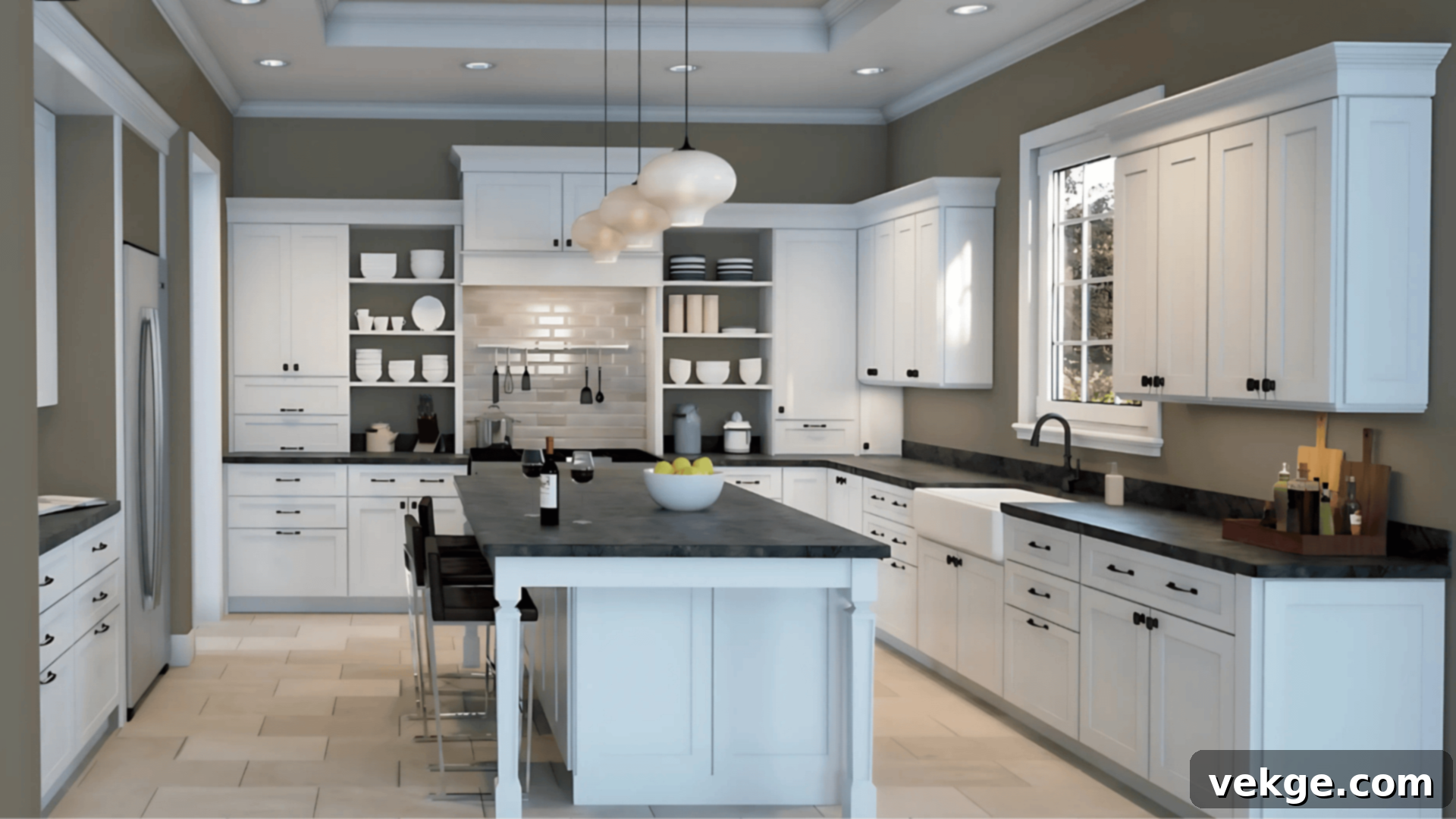
In the kitchen, Sherwin-Williams Anonymous excels at adding profound depth and sophisticated contrast, whether used on cabinetry or as a wall color. It creates a stylish backdrop that allows other elements to truly shine. Anonymous pairs exquisitely with bright white quartz or marble countertops, lending a clean, modern edge. It also harmonizes beautifully with rich, warm wood countertops or open shelving, amplifying the earthy feel. When combined with black, brass, or even brushed nickel hardware, Anonymous elevates the kitchen’s aesthetic, moving it beyond a purely functional space to one of refined design. Its muted tone ensures the space feels incredibly cozy and inviting, preventing any sense of darkness despite its depth.
Bathrooms Featuring SW Anonymous
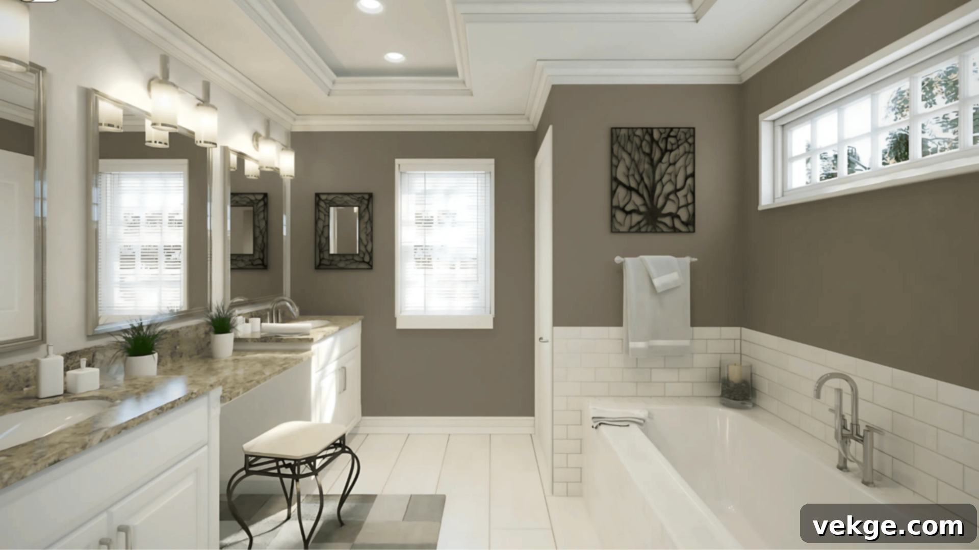
When applied in bathrooms, Anonymous bestows a wonderfully calming, spa-like quality. It envelops the space in a serene ambiance, perfect for unwinding. Paired with crisp white subway or subway-style tiles, sleek matte black fixtures, and luxurious soft linens, it feels simultaneously grounded and profoundly tranquil. Natural light streaming into the bathroom beautifully enhances its subtle green undertones, creating a fresh and restorative environment. For smaller bathrooms, integrating lighter trim colors or a lighter ceiling can effectively balance the depth of Anonymous, ensuring the space feels open and airy rather than enclosed.
Living Rooms with SW Anonymous
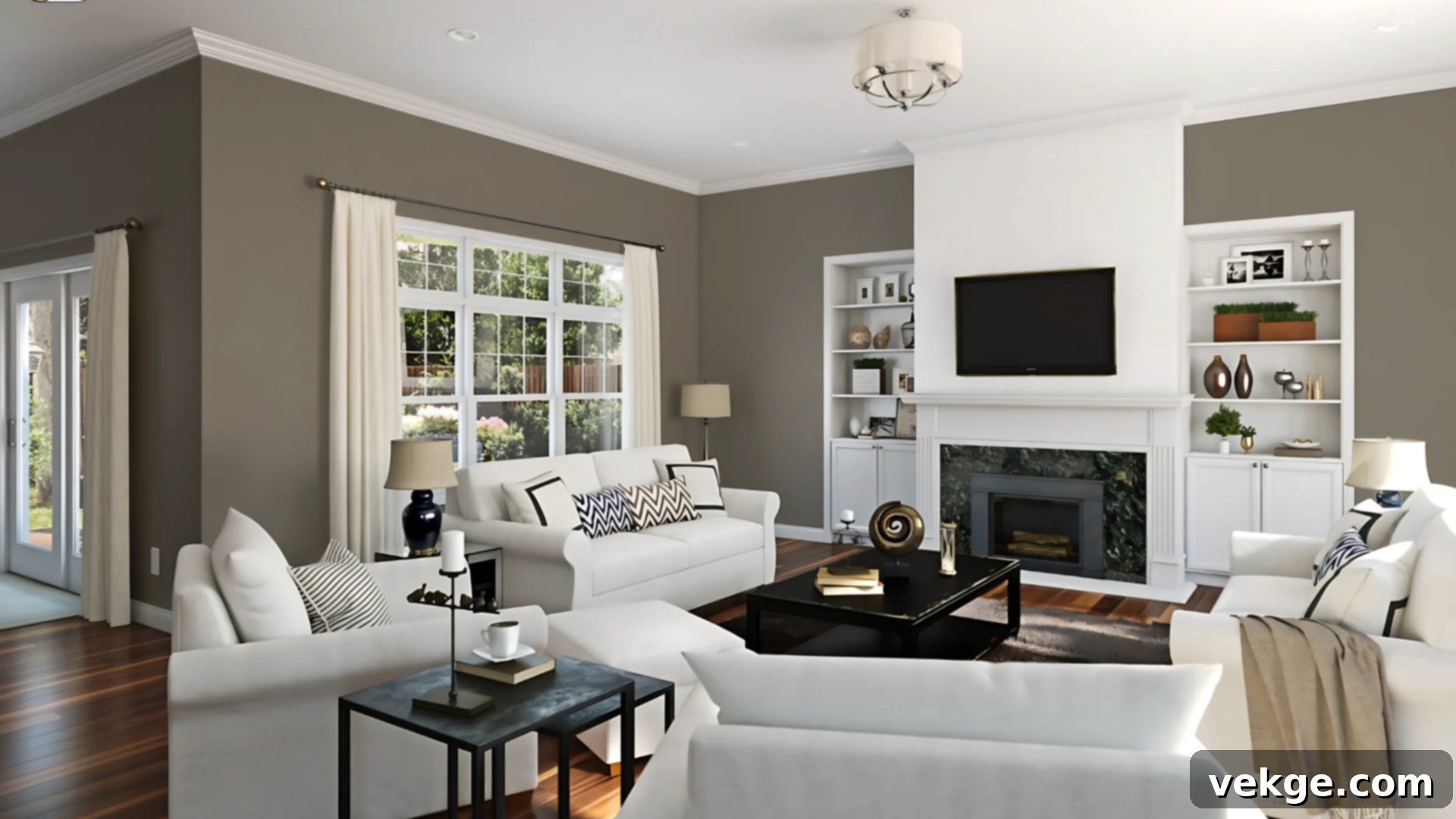
In living areas, Sherwin-Williams Anonymous truly shines, offering a cozy, inviting, and almost cocoon-like atmosphere. It creates a sense of enveloping warmth that makes a room feel instantly comfortable. This versatile shade beautifully supports both rustic and more refined decor styles. It works harmoniously with natural wood furniture, elegant metal accents (such as bronze or iron), and a variety of textured fabrics like linen, wool, or velvet. The inherent depth of Anonymous adds a sophisticated richness to the space, enhancing the overall aesthetic without ever stealing the spotlight from your carefully chosen furnishings and art.
Bedrooms Painted with SW Anonymous
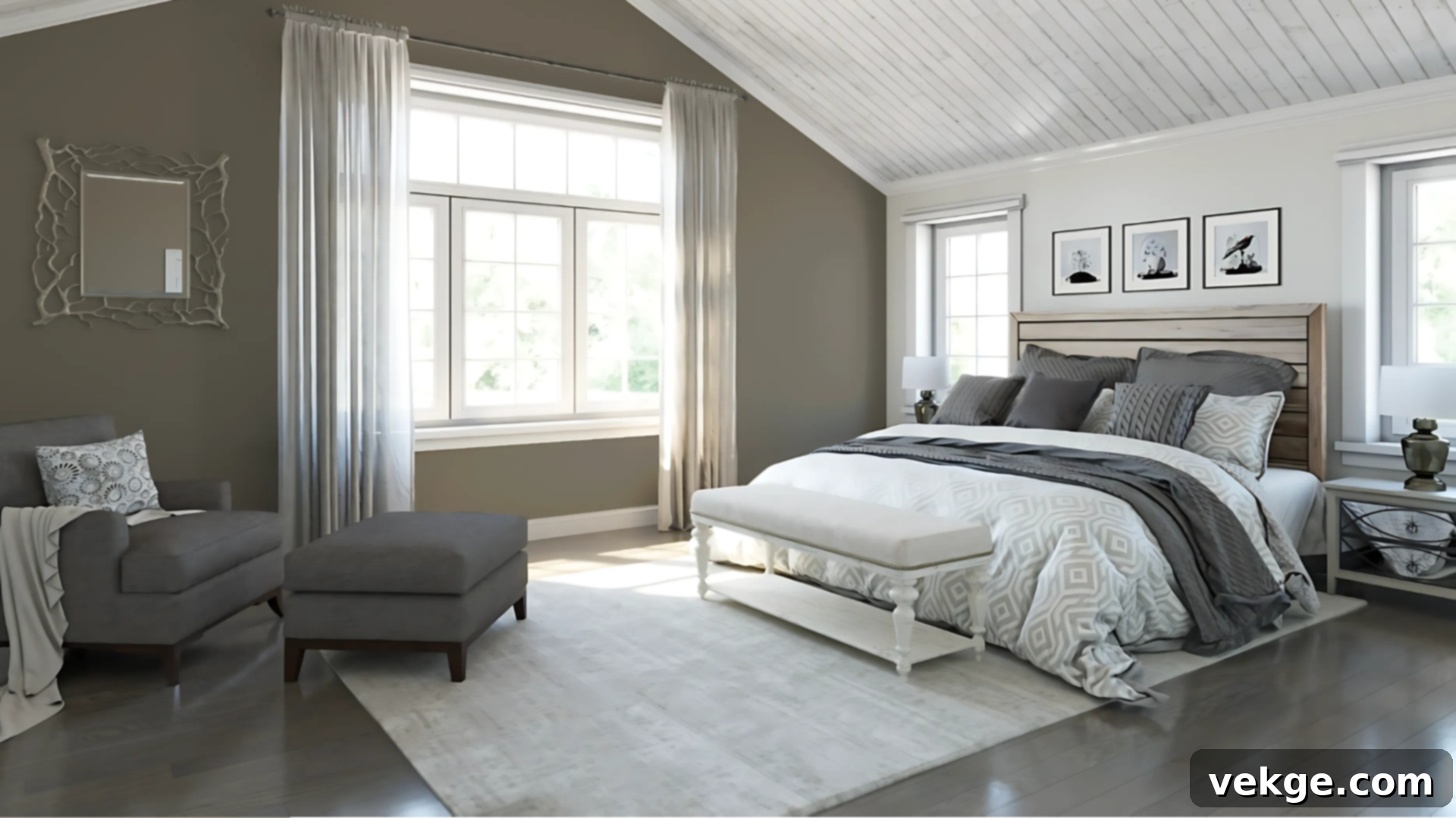
Anonymous is an exceptional choice for bedrooms, particularly if your goal is to cultivate a warm, restful, and private palette. Its soothing depth is ideal for full-room coverage, creating a truly immersive and serene sanctuary. Alternatively, it makes for a dramatic and grounding feature wall behind a bed, adding a focal point without being overly bold. Pair it with soft, off-white bedding for a serene contrast, rich walnut or dark wood furniture for added warmth, and brass lighting fixtures for a touch of elegance. The result is a cohesive, grounded, and ultimately peaceful retreat where relaxation is paramount.
Exterior Spaces Using SW Anonymous
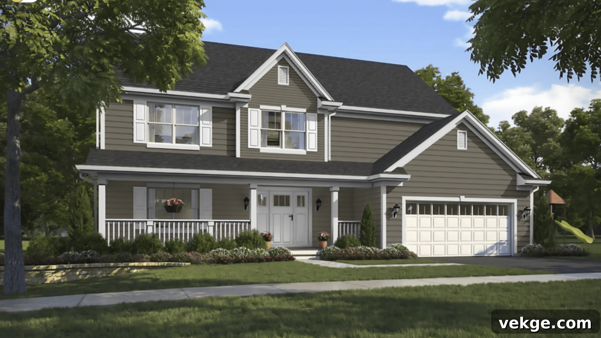
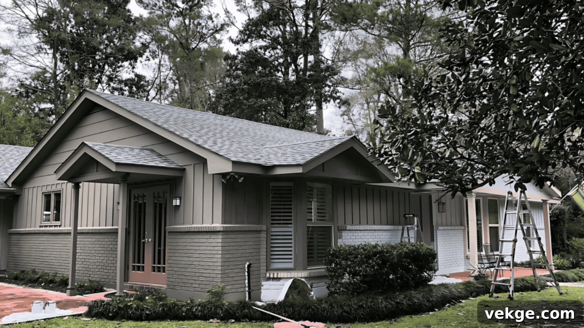
This versatile shade also translates beautifully to exterior applications, providing curb appeal with a sense of established elegance. Whether used on entire siding, charming shutters, or as a welcoming front door color, Anonymous brings both warmth and architectural structure to a home. Its appearance shifts wonderfully with the changing light outdoors: in direct sunlight, it can lean slightly warmer and more brown, exuding a welcoming glow. In shaded areas or on overcast days, its gray-green undertones become more prominent, offering a sophisticated, natural look. For a timeless and classic exterior, pair Anonymous with creamy white trim, which provides a crisp yet soft contrast.
How Lighting Affects Sherwin-Williams Anonymous (SW 7046)
Understanding how lighting impacts Anonymous is crucial for predicting its appearance in your home. This color is a true chameleon, and its character is profoundly shaped by the type and direction of light it receives:
- North-facing rooms: These rooms receive cooler, indirect light, which tends to emphasize the cooler, more muted gray tones within Anonymous. While still warm, it might appear slightly more serious and understated in these conditions, creating a sophisticated and tranquil mood.
- South-facing rooms: Abundant, bright light from south-facing windows introduces significant warmth, which helps to soften Anonymous and bring out its cozier, earthy qualities. The green undertones might feel more vibrant and welcoming, making the color appear less intense.
- East-facing rooms: Morning sun in east-facing rooms brings out a crisp, earthy balance in Anonymous. The light is bright but softens as the day progresses. In the morning, you might see a beautiful interplay of its green and gray elements, offering a refreshing start to the day.
- West-facing rooms: Evening light, particularly the warm, golden hues from west-facing windows, adds significant depth and often draws out the stronger green undertones within Anonymous. This can create a dramatic and cozy atmosphere, perfect for unwinding at the end of the day.
Due to these dynamic shifts, it is absolutely essential to always sample Sherwin-Williams Anonymous on multiple walls within your chosen space. Observe these samples at various times of day and under different lighting conditions (both natural and artificial) to truly understand how this captivating color will behave in your unique environment before making your final decision.
Sherwin-Williams Anonymous (SW 7046) vs. Other Popular Neutrals
The world of deep neutrals offers a vast array of choices, each with its own unique character. While Sherwin-Williams Anonymous stands out for its balanced warmth and green-gray depth, it’s helpful to understand how it stacks up against some other beloved neutral paint colors. This comparison will highlight what makes Anonymous distinct and help you discern if it’s the right choice for your project.
Anonymous vs. Sherwin-Williams Porpoise (SW 7047)
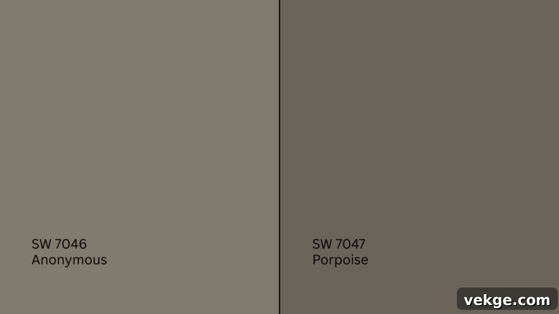
Porpoise (SW 7047, HEX #625D52) is a close relative of Anonymous but presents as noticeably deeper and more intensely brown. With an LRV of 13, Porpoise reflects significantly less light than Anonymous, making it a richer and more dramatic choice. While Anonymous carries a distinct green-gray undertone, Porpoise leans heavily into warm gray-browns. This deeper quality makes Porpoise particularly well-suited for accent walls, bold trim, or as a grounding element in specific areas where you desire a strong, dramatic statement. Anonymous, by contrast, with its LRV of 20 and more pronounced green undertone, offers greater versatility for full room applications, providing depth without the same level of intensity as Porpoise.
Anonymous vs. Sherwin-Williams Urbane Bronze (SW 7048)
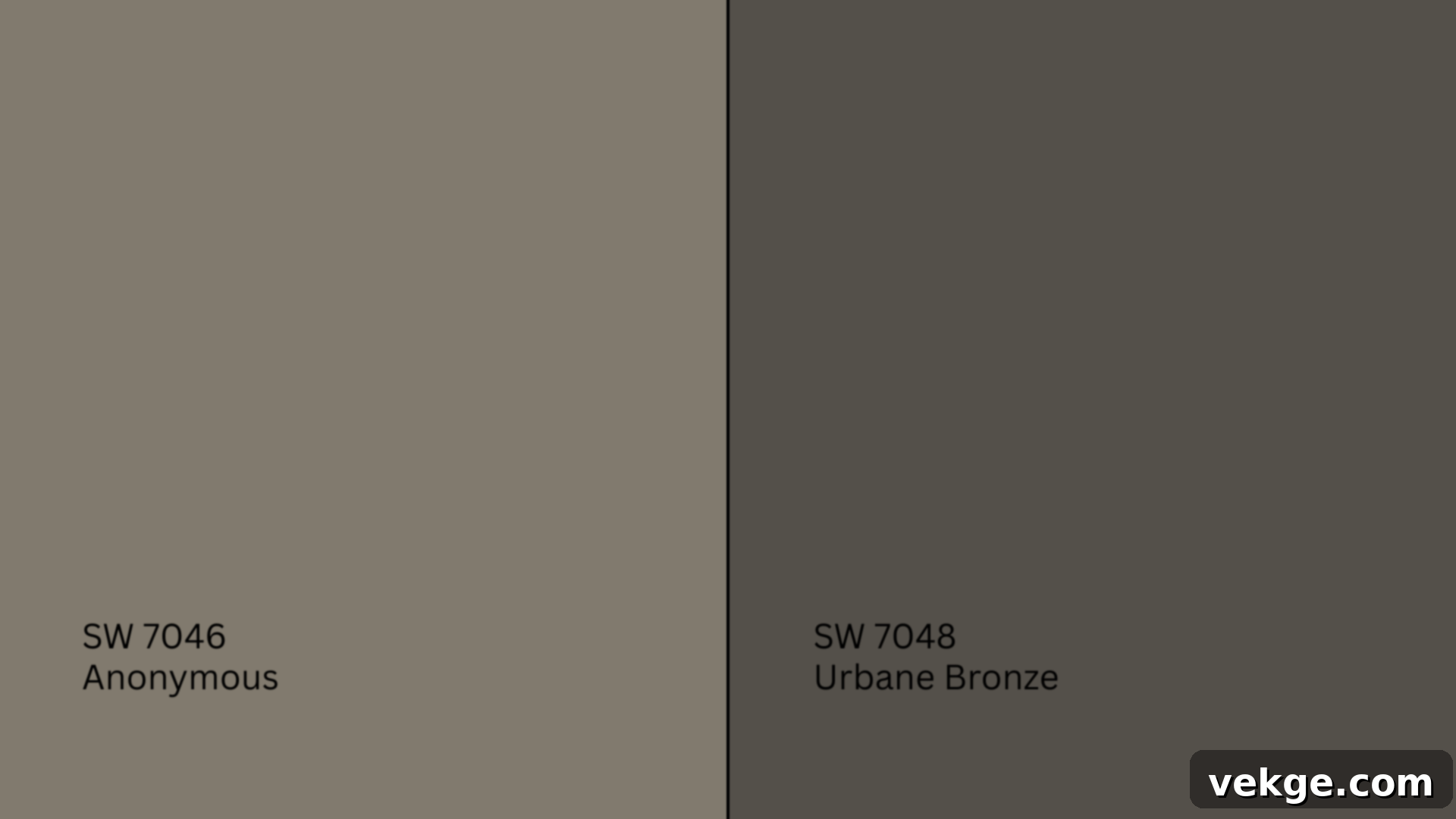
Urbane Bronze (SW 7048, HEX #5B5349) is an extremely popular, much darker shade with a deep, robust brown-gray base that feels almost black in certain lights. As Sherwin-Williams’ 2021 Color of the Year, it’s celebrated for its grounding and organic feel. With an exceptionally low LRV of 8, Urbane Bronze is best reserved for making high-contrast statements, dramatic accent walls, exterior trim, or front doors where you desire maximum impact and a sense of architectural gravitas. Anonymous, in contrast, serves as a mid-dark shade, offering substantial depth and moodiness but with a softer edge and more pronounced green undertones, making it suitable for broader use across entire rooms without feeling overwhelmingly dark.
Anonymous vs. Sherwin-Williams Repose Gray (SW 7015)
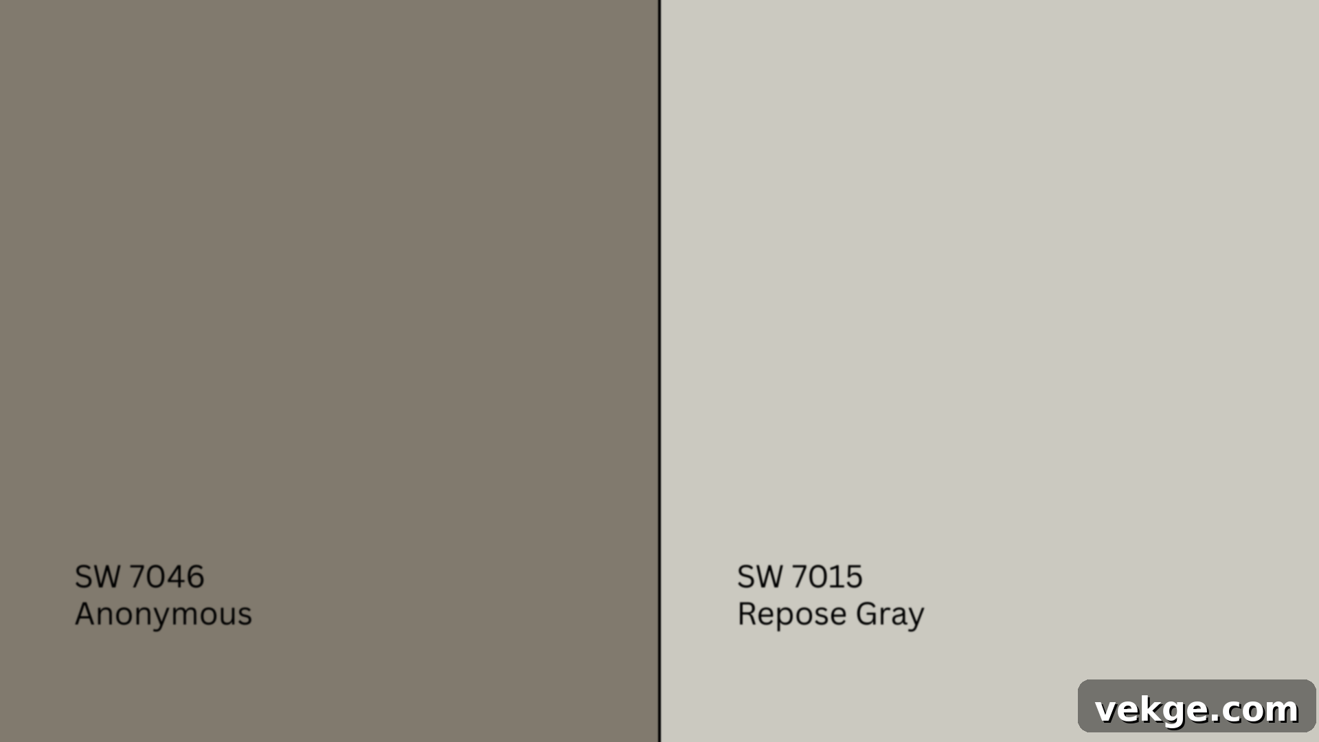
Repose Gray (SW 7015, HEX #CCC8C1) stands at the opposite end of the spectrum in terms of lightness. It is significantly lighter with a high LRV of 58, placing it firmly in the light-to-medium gray category. Repose Gray is highly praised for its ability to create bright, airy, and open rooms, offering a delicate balance of warm and cool undertones. However, it noticeably lacks the grounded depth, richness, and pronounced green character that defines Anonymous. If your preference is for a color that provides brightness and a subtle warmth, Repose Gray is an excellent choice. But if you desire a color that offers a deeper, more enveloping, and earthy foundation, Anonymous is the clear winner, providing that essential grounding presence.
Undertone and LRV Comparison Table
For a quick overview of how these popular Sherwin-Williams neutrals compare, refer to the table below:
| Paint Color | Undertones | LRV | Warm or Cool |
|---|---|---|---|
| Anonymous (SW 7046) | Green-gray | 20 | Warm |
| Porpoise (SW 7047) | Warm gray-brown | 13 | Warm |
| Urbane Bronze (SW 7048) | Deep brown-gray | 8 | Warm |
| Repose Gray (SW 7015) | Warm gray | 58 | Warm |
While each of these exceptional paints serves a distinct purpose and caters to different design needs, Sherwin-Williams Anonymous (SW 7046) truly occupies a unique and desirable sweet spot, offering the perfect balance between sophisticated depth and comforting softness, making it an incredibly versatile and appealing choice for a wide range of applications.
Best Color Pairings for Sherwin-Williams Anonymous (SW 7046)
One of the strongest attributes of Sherwin-Williams Anonymous is its remarkable flexibility. Its earthy green-gray undertones allow it to harmonize beautifully with a diverse palette of colors and finishes. To truly maximize its impact and create a cohesive, inviting space, it’s essential to pair it with complementary shades that either highlight its depth or brighten its character.
Trim and Ceiling Suggestions for Anonymous
To ensure a balanced and polished aesthetic, pairing Anonymous with soft, inviting whites for trim, ceilings, and doors is highly recommended. These whites provide a crisp yet gentle contrast that prevents the space from feeling too dark or enclosed.
- Pure White (SW 7005): This is a clean, crisp white with just a touch of warmth. It offers a straightforward, bright contrast to Anonymous, making the room feel fresh and defined without being stark. It’s an excellent choice for a contemporary or transitional look.
- Alabaster (SW 7008): As a slightly creamier and cozier off-white, Alabaster is perfect for spaces where you want to emphasize warmth and comfort. Its subtle yellow undertone beautifully complements the earthy nature of Anonymous, making it an ideal pairing for traditional, farmhouse, or more vintage-inspired interiors.
- Shoji White (SW 7042): This is a sophisticated greige white that carries a subtle warmth and a hint of gray. Shoji White perfectly complements Anonymous’s earthy tones by providing a softer, more muted contrast than a stark white, creating a harmonious and understated elegance. It’s ideal if you prefer a less high-contrast look.
Accent Wall and Furniture Colors to Complement Anonymous
To introduce visual interest, add dimension, or simply enhance the mood of a room, consider these accent colors and furniture choices that beautifully interact with Anonymous:
- Dried Thyme (SW 6186): This muted, earthy green expertly enhances Anonymous’s subtle green undertones, creating a wonderfully cohesive and sophisticated monochromatic scheme. It’s perfect for adding depth to an accent wall or cabinetry.
- Urbane Bronze (SW 7048): For a bold and deeply grounding statement, Urbane Bronze works exceptionally well as an accent wall color or for built-in shelving, providing dramatic contrast and architectural interest against the softer depth of Anonymous.
- Sea Salt (SW 6204): This soft, tranquil green-blue offers a refreshing, airy counterpoint to the depth of Anonymous. It introduces a subtle coastal or spa-like vibe when used on an adjacent wall or through decorative elements.
- Other Accent Colors: Consider deep ochres, muted terracottas, or even soft, dusty blues to create intriguing color palettes that draw out different facets of Anonymous.
These accent colors work beautifully behind beds, around fireplaces, or within built-in bookshelves, offering a thoughtful layer to your design. For furniture, natural wood tones (like oak, walnut, or teak), along with upholstery in creams, soft browns, deep greens, or charcoal grays, will complement Anonymous perfectly, enhancing its earthy appeal.
Hardware and Flooring Compatibility with Anonymous
The right hardware and flooring choices can significantly impact the overall feel of a room painted with Anonymous. Its versatile nature allows for several stunning combinations:
- Hardware: Anonymous truly shines when paired with matte black, brushed brass, antique bronze, or oil-rubbed bronze finishes. Brass hardware introduces a touch of classic elegance and warmth, creating a sophisticated contrast. Matte black fixtures provide a modern, crisp edge, adding a contemporary graphic element. Antique bronze and oil-rubbed bronze echo the earthy, grounded feel of Anonymous, creating a harmonious and rich look.
- For flooring, consider:
- Light oak or whitewashed wood floors can introduce brightness and openness, balancing the depth of Anonymous and keeping the space feeling airy and expansive.
- Medium-toned walnut or hickory will enhance the warmth and richness of Anonymous, creating a cozy and luxurious foundation, particularly in living rooms or bedrooms.
- Natural stone tiles with warm gray or subtle beige undertones can also work wonderfully in bathrooms or kitchens, echoing the organic feel of Anonymous.
Important Note: It’s generally best to avoid cool gray floors or those with strong blue undertones. These can clash with Anonymous’s inherent earthy, warm green-gray base, potentially making the room feel discordant or cold. Stick to warm woods, creamy tones, or natural stone for the most cohesive outcome.
Paint Finish Recommendations for Sherwin-Williams Anonymous (SW 7046)
The finish you choose for your paint can dramatically alter how Sherwin-Williams Anonymous appears in your space. Different sheens reflect light in various ways, affecting the color’s perceived depth, vibrancy, and even its undertones. Selecting the appropriate finish is just as crucial as choosing the color itself.
- Matte Finish: A matte finish absorbs the most light, providing a rich, velvety appearance. It effectively softens the color, making Anonymous feel incredibly deep, sophisticated, and luxurious. Matte is ideal for low-traffic areas like guest rooms, formal dining rooms, or ceilings, as it also helps to hide minor wall imperfections.
- Eggshell Finish: Offering a subtle, low-level sheen, eggshell is a popular and versatile choice for most interior walls, especially in living areas, bedrooms, and hallways. It provides slightly more durability and washability than matte while still maintaining a soft, elegant look that beautifully showcases the depth of Anonymous.
- Satin Finish: Satin finishes have a noticeable sheen that reflects more light, making them more durable and easier to clean. This makes satin an excellent choice for high-traffic areas such as kitchens, bathrooms, kids’ rooms, or for trim and doors. When used with Anonymous, satin can bring out a subtle vibrancy in its green undertones and adds a refined, polished touch.
- Semi-Gloss Finish: While typically too shiny for entire walls, a semi-gloss finish is perfect for trim, doors, and cabinets. Its higher reflectivity provides a crisp, durable contrast to the softer wall finish, making the architectural details pop and accentuating the depth of Anonymous on the main walls.
Always remember to sample your chosen finish alongside your color swatch. The interaction of the specific finish with Anonymous can highlight or mute its undertones in unexpected ways, so seeing it in situ is the best way to ensure satisfaction.
Sampling and Buying Options for Sherwin-Williams Anonymous (SW 7046)
Before you fully commit to painting your walls with Sherwin-Williams Anonymous (SW 7046), thorough testing in your actual space is an absolute must. As we’ve discussed, lighting, adjacent colors, and even the time of day can dramatically alter how this nuanced color reads. Investing in samples is a small cost that saves you from potentially costly painting mistakes.
Where to Get Peel-and-Stick Samples of Anonymous
Peel-and-stick samples are an incredibly convenient and mess-free way to test paint colors. They offer true color representation and can be easily repositioned on different walls throughout your home.
- Samplize: This popular online retailer offers large, mess-free, and repositionable paint swatches for Sherwin-Williams colors, including Anonymous. Their samples are made with real paint, providing an accurate representation of the color without the fuss of traditional paint cans.
- Sherwin-Williams stores: While not peel-and-stick, your local Sherwin-Williams retailer provides small tester cans (typically 8 oz) that allow you to brush actual paint onto your walls or large sample boards. This gives you a true sense of the paint’s texture and how it applies.
- Local hardware stores: Many larger hardware stores or independent paint shops may also carry Sherwin-Williams sample cards or be able to mix a small tester can for you to take home.
When sampling, apply the peel-and-stick swatch or paint two coats of your tester on multiple walls in the room. Observe them throughout the day, noting how the color shifts with natural light, and at night under artificial lighting. This comprehensive approach will give you the most accurate perception of Anonymous in your unique environment.
Where to Buy Sherwin-Williams Anonymous Paint
Once you’re confident that Anonymous is the perfect shade for your project, purchasing the paint is straightforward:
- Sherwin-Williams.com: You can conveniently order your paint online directly from the Sherwin-Williams website. They often offer options for home delivery or local pickup at your nearest store.
- In-store: Visit any Sherwin-Williams retail location. Their knowledgeable staff can assist you in selecting the right sheen and quantity for your project. You can find full-size cans (gallons, quarts, etc.) in most stores, along with any necessary painting supplies.
Paint Equivalents in Other Brands to Sherwin-Williams Anonymous (SW 7046)
While Sherwin-Williams Anonymous (SW 7046) offers a distinctive blend of earthy gray with green undertones, you might be looking for similar options from other major paint brands due to accessibility, preference, or existing brand loyalty. It’s important to remember that finding an exact match is almost impossible, as each brand uses unique formulations and pigment combinations. However, these alternatives offer very close aesthetic vibes and can capture a similar mood. Always, always sample before committing, as formulas and finishes can subtly vary, and colors react differently in diverse lighting conditions.
Behr Equivalents for Anonymous:
- Squirrel (790D-5, HEX #8D877A): This is a soft, deep gray that leans slightly taupe, infused with warm undertones. It shares Anonymous’s grounded quality but might appear a bit browner in some lights, offering a similar earthy richness.
- Mined Coal (PPU18-18, HEX #7A746A): A deeper, more intense option, Mined Coal presents as an earthy gray with noticeable hints of brown and a subtle olive green. It’s a fantastic alternative if you want something slightly darker than Anonymous but with a similar organic depth.
Benjamin Moore Equivalents for Anonymous:
- Chelsea Gray (HC-168, HEX #A6A29A): A widely popular, refined mid-tone gray, Chelsea Gray has a very balanced undertone that can sometimes flash green or blue depending on the light. It’s slightly lighter than Anonymous but offers a comparable level of sophistication and versatility.
- Rockport Gray (HC-105, HEX #8E8579): Rockport Gray is a grounded, slightly warm gray that carries subtle green notes, making it a very strong contender. It has a similar depth and earthy quality to Anonymous, providing a comforting and versatile backdrop.
Valspar Equivalents for Anonymous:
- Smoked Oyster (6005-1C, HEX #ACA194): This color is a warm, muted gray that, while often described as having a hint of mauve, can read as an earthy, sophisticated neutral with a comparable depth to Anonymous, especially in warmer lighting.
- Filtered Shade (4003-1B, HEX #CBC9C4): A softer, more cool-leaning gray, Filtered Shade is a good option if you want a slightly lighter contrast but still desire a balanced and sophisticated neutral that can complement warmer elements in a room, somewhat akin to Anonymous’s muted versatility.
Remember, the best way to determine if one of these alternatives works for your space is to obtain a sample and compare it directly to a Sherwin-Williams Anonymous swatch in your home. Light, existing finishes, and personal preference will always play the ultimate role in your final decision.
Conclusion: Embracing the Depth and Versatility of Sherwin-Williams Anonymous (SW 7046)
Navigating the vast world of neutral paint colors can be a daunting task, but Sherwin-Williams Anonymous (SW 7046) stands out as a truly exceptional choice. Throughout this guide, we’ve explored its unique identity – a deep, earthy green-gray neutral that manages to be both grounded and warmly inviting without overwhelming a space. Its nuanced undertones, which subtly shift with light, provide a dynamic character that prevents it from ever feeling flat or boring.
Anonymous excels at creating a sense of sophisticated calm and cozy intimacy, making it an ideal candidate for virtually any room in your home, from tranquil bedrooms and spa-like bathrooms to vibrant kitchens and elegant living areas. Its ability to anchor both modern and traditional aesthetics, coupled with its seamless integration into exterior palettes, speaks volumes about its incredible versatility. Paired with the right whites, accent colors, and finishes, Anonymous can help you curate a space that feels both profoundly rooted and effortlessly chic.
Now that you’ve gained a comprehensive understanding of how Sherwin-Williams Anonymous behaves in different environments and under various lighting conditions, and how it compares to other popular neutrals, you are well-equipped to decide if this captivating color aligns with your home’s unique personality and your design vision. It offers the perfect blend of mood, flexibility, and timeless appeal to transform your space into a sanctuary of style and comfort.
If you’re still contemplating your options or require further inspiration, I encourage you to explore my other Sherwin-Williams color guides available on this website. Each guide is crafted to provide you with the insights and confidence needed to make the perfect paint choice for your home.
