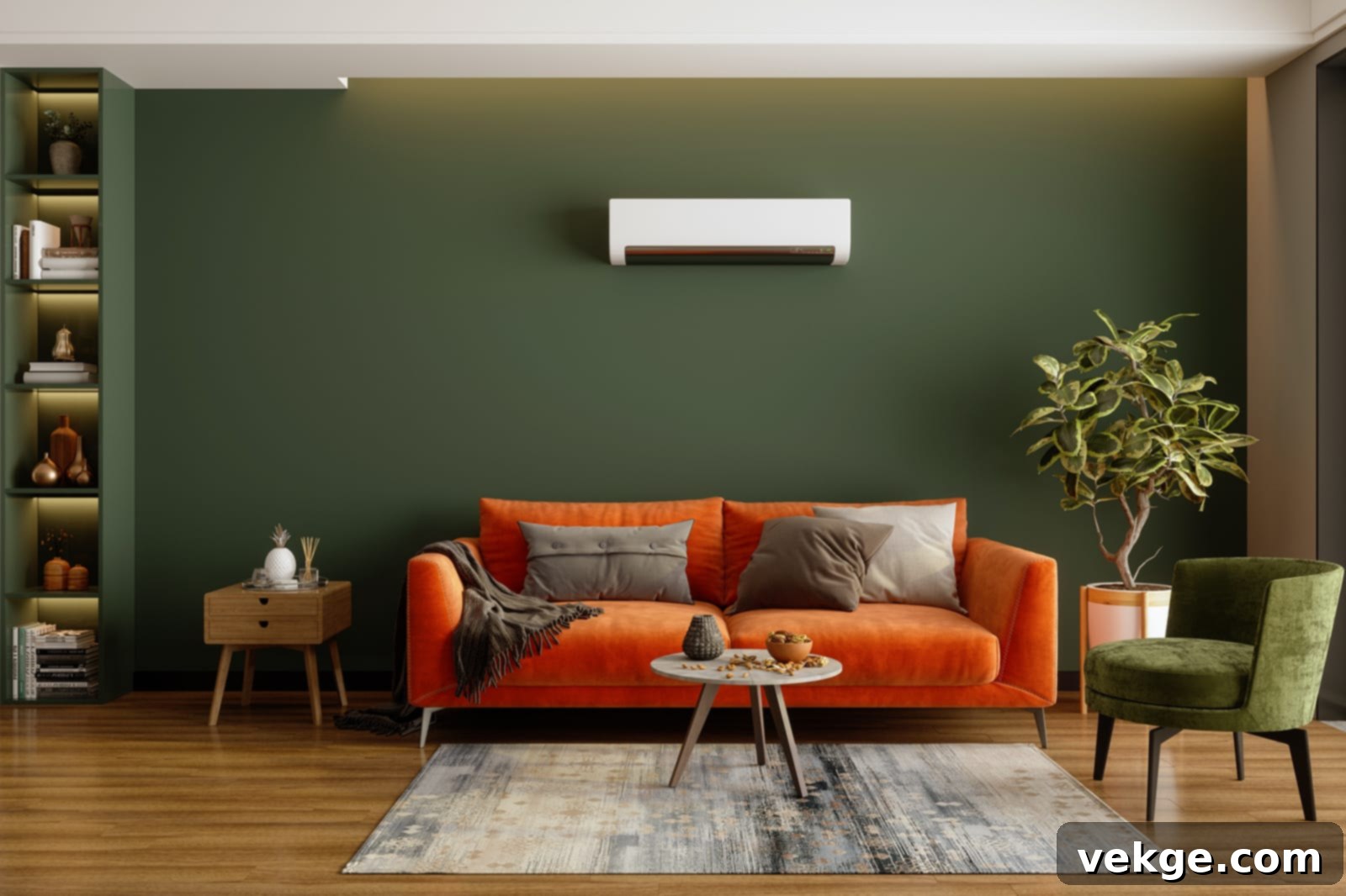
Sage Green and Neutrals: The Ultimate Guide to Harmonious Color Combinations for Your Home
In the vast and ever-evolving world of interior design, certain color pairings transcend fleeting trends to become truly timeless. Among these, the sophisticated interplay between shades of sage green and versatile neutral colors has emerged as a particularly captivating and universally appealing choice. This exquisite palette offers a serene and grounded foundation for any space, effortlessly blending nature-inspired calm with classic elegance. Whether you’re refreshing a single room or embarking on a complete home makeover, understanding how to pair sage green with neutrals can unlock a world of harmonious design possibilities.
Sage green, with its inherent calming and natural essence, has quickly ascended to a beloved status in contemporary decor. Its muted, earthy tones evoke a profound sense of tranquility, peace, and a tangible connection to the outdoors, making it a perfect antidote to the hustle and bustle of modern life. Complementing this verdant hue, neutral colors like soft beige, classic gray, creamy white, and deep brown maintain their positions as indispensable elements in any decor scheme. These shades provide stability and a canvas for other colors to shine. The harmonious contrast of these two color families reflects a calm, gentle, and incredibly adaptable aesthetic that resonates with a wide range of styles, from rustic to ultra-modern.
The enchanting name “sage green” itself is derived from the aromatic herb, sage (Salvia officinalis). This hardy plant is characterized by its woody stems and distinctively grayish-green leaves, which lend their unique color profile to the shade we admire. Beyond its aesthetic charm, the sage herb holds historical significance, often used in cooking for its distinct flavor, in aromatherapy for its soothing and purifying properties, and even in ancient practices believed to ward off negative spirits. On a more scientific note, sage has been shown to possess practical purifying qualities, capable of removing a significant percentage of airborne bacteria, further cementing its association with cleanliness, well-being, and natural vitality. This rich background adds a layer of depth to the color, infusing spaces with not just beauty, but also a sense of purity and natural goodness.
Exploring the Versatile Shades of Sage Green
Sage green is far from a singular color; it encompasses a delightful spectrum of muted greens, each possessing its own unique character and subtle undertones. Understanding these variations is crucial for successfully pairing sage green with neutral colors and achieving your desired aesthetic, as the undertones dictate how well colors harmonize or contrast.

1. Warm Shades of Sage Green
These varieties of sage green carry discernible warm undertones, often subtly reflecting hints of yellow, brown, or even a touch of red. They tend to create a cozy, inviting, and inherently earthy atmosphere, making them ideal for spaces where warmth, comfort, and a grounded feeling are prioritized. Warm sage greens work beautifully to make a room feel more intimate and welcoming.
- Olive Sage: A deeper, richer green with noticeable yellow undertones, reminiscent of actual olives or lush foliage.
- Khaki Sage: A more desaturated, brownish-green, evoking a rustic, utilitarian, or vintage feel.
- Honeydew Sage: A lighter, softer green with a delicate touch of sweetness, leaning towards a pale yellow-green, perfect for airy spaces.
- Golden Sage: Sage infused with a subtle golden glow, adding a touch of richness, luminosity, and luxury.
- Amber Sage: A warm, slightly deeper sage with a hint of orange or amber, creating a sun-drenched effect.
- Saffron Sage: A unique sage with distinct yellowish-orange spice undertones, adding an exotic warmth.
- Mossy Sage: A deeper, more saturated green with strong earthy brown undertones, resembling forest moss after a rain.
These warm hues are excellent for creating a snug ambiance in living rooms, bedrooms, or dining areas, and they pair beautifully with other warm elements like natural wood finishes, terracotta, and creamy textiles.
2. Cool Shades of Sage Green
In contrast, cool shades of sage green feature distinct cool undertones, often incorporating hints of blue or gray. These hues tend to evoke a sense of calm, freshness, and sophistication, perfect for creating tranquil, expansive, and sometimes more formal or minimalist environments. Cool sage greens contribute to an airy and refined feel.
- Mint Sage: A lighter, crisper green with a clear blue undertone, offering a refreshing and clean feel.
- Eucalyptus Sage: A silvery-green with strong blue-gray influences, known for its soothing and slightly ethereal quality.
- Silver Sage: A very pale, almost metallic sage with pronounced gray undertones, lending an elegant, airy, and sophisticated vibe.
- Slate Sage: A deeper, more subdued sage with significant gray and subtle blue undertones, providing a grounded yet cool and refined presence.
- Seafoam Sage: A light, airy sage with prominent blue undertones, reminiscent of ocean spray and coastal breezes.
Cool sage greens are particularly effective in bathrooms, home offices, or minimalist spaces where a clean, serene, and uncluttered aesthetic is desired. They pair wonderfully with cool-toned metals (like chrome or brushed nickel), crisp whites, and various shades of gray.
Understanding the Power of Neutral Colors
Neutral colors are the foundational elements of any well-designed space, providing balance, sophistication, and a timeless backdrop that allows other colors, like sage green, to truly shine. While they may appear to “lack” color at first glance, neutrals are remarkably complex, possessing various subtle underlying hues that dictate how they interact with bolder or softer shades. Their inherent calming effect is often associated with nature-inspired settings, offering a sense of stability, harmony, and effortless elegance. The most common neutral colors encompass a wide spectrum, including pure white, warm beige, rich brown, versatile gray, and deep black.

1. Warm Neutral Colors
Warm neutral colors are characterized by undertones that lean towards red, orange, or yellow, providing a cozy, inviting, and often more traditional feel without being overtly vibrant. These shades add depth and a comforting warmth, making a space feel more comfortable, intimate, and lived-in. They are excellent for creating a welcoming atmosphere.
- Beige: A classic warm neutral, ranging from light, sandy tones to deeper, more saturated tans.
- Tan: A slightly darker, richer beige with more pronounced brown or yellow notes, offering an earthy feel.
- Warm Gray: Gray with discernable yellow, brown, or red undertones, effectively softening its inherent coolness.
- Cream: A soft, off-white with a gentle yellow tint, exuding elegance, warmth, and a touch of vintage charm.
- Ivory: Similar to cream but often with a slightly more muted, richer, and more sophisticated tone.
- Camel: A mid-tone brown-yellow, reminiscent of camel hair, adding a touch of refined sophistication.
- Caramel: A warm, inviting brown with golden or orange undertones, bringing a rich, delectable quality.
- Terracotta: An earthy reddish-brown, often associated with natural clay materials and Mediterranean aesthetics.
- Deep Black: A rich, true black that absorbs light, providing a strong anchor and a sense of drama.
- Rust: A reddish-brown, often with an orange tint, adding a touch of rustic warmth and a slightly aged feel.
These hues are excellent for creating a grounded and welcoming atmosphere, pairing beautifully with natural textures like wood, rattan, and linen.
2. Cool Neutral Colors
Cool neutral colors possess undertones that lean towards blue, green, or purple, offering a crisp, clean, and often more modern or minimalist aesthetic. They can make a space feel more expansive, airy, and open, providing a sense of calm, order, and contemporary sophistication. Cool neutrals are perfect for achieving a fresh and uncluttered look.
- Slate Gray: A dark, sophisticated gray with noticeable blue undertones, lending a strong, grounded presence.
- Cool Gray: Gray with a distinct blue or green cast, creating a serene, industrial, or minimalist environment.
- Steel Blue: A muted blue-gray, reminiscent of metal, adding an industrial or sleek touch.
- Charcoal: A deep, dark gray, almost black, with cool undertones, providing a dramatic backdrop.
- Slate Blue: A softer, muted blue with strong gray influences, very calming and sophisticated.
- Clay Gray: A light to medium gray with subtle cool, earthy undertones, preventing it from feeling sterile.
- Crisp White: A pure white with no discernible warm undertones, providing a clean, bright, and expansive canvas.
- Greige (cool-toned): A versatile mix of gray and beige where the gray undertones are dominant, offering a subtle blend.
Cool neutrals are ideal for contemporary, minimalist, or coastal designs, where an open, refreshing, and uncluttered feel is desired, pairing well with sleek surfaces and cool metals.
The Striking Contrast of Sage Green with Cult-Favorite Neutrals
The true genius of sage green lies in its remarkable ability to contrast harmoniously with neutral colors, creating captivating and perfectly balanced environments. This soft, muted, and inherently versatile color serves as a gentle “pop” without ever being overwhelming or garish. When paired thoughtfully with neutrals, sage green elevates a space, adding depth, character, and a profound connection to nature without feeling monotonous or dull. The key to successful pairing lies in understanding the undertones of both your chosen sage green and your neutral shades, ensuring they complement each other to achieve the desired mood and aesthetic. Here are some popular combinations that highlight the incredible synergy between shades of green and cult-favorite neutrals, catering to a diverse range of design preferences.
1. Rustic Charm: Tan and Olive Sage
For those who appreciate the robust warmth and authenticity of rustic aesthetics, the combination of a rich tan with a deep olive sage is truly enchanting. Olive sage, with its strong yellow undertones, perfectly balances the earthiness and warmth of tan, creating an inviting, grounded, and richly textured ambiance. This pairing evokes images of sun-drenched rolling hills and lush natural landscapes, making it an ideal choice for a cozy cabin feel or a farmhouse-inspired home. Imagine olive sage walls accented by tan leather furniture, or tan linen bedding beautifully complemented by olive sage decorative pillows. This combination thrives on shared warm undertones, fostering a sense of comforting authenticity and organic beauty. Had a cooler shade like silver-green sage been used instead of olive sage, it would have created a starker, less cohesive look, potentially washing out the inherent warmth of the tan, demonstrating the importance of matching undertones for a harmonious rustic feel.
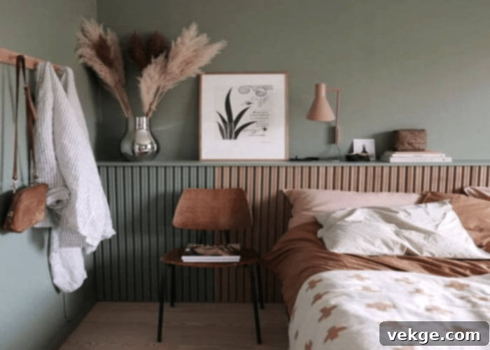
2. Soft and Serene: Light Gray or Warm Beige with Soft Sage
To cultivate an atmosphere of ultimate calm, profound serenity, and homely comfort, pair a soft, muted sage green with either a gentle light gray or a warm beige. This harmonious blend ensures that neither shade overpowers the other, resulting in a perfectly balanced and incredibly tranquil setting. Soft sage green often has subtle warm undertones, which beautifully complement the creaminess and inviting nature of warm beige, creating a comforting embrace in any room. When paired with light gray, especially a greige that leans slightly warm, the combination offers a sophisticated yet understated elegance. This palette is perfect for bedrooms, nurseries, reading nooks, or any space where promoting relaxation and peaceful contemplation is paramount. Consider soft sage walls with a plush light gray sofa, or warm beige linens beautifully accented with sage green throw blankets for an effortlessly serene appeal that soothes the senses.
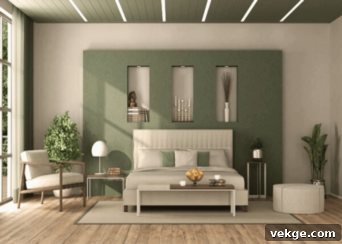
3. Modern and Elegant: Cool Mint Sage with White and Silver Green Sage with Cool Gray
Achieve a sleek, contemporary, and incredibly chic aesthetic by combining cool-toned sage greens with crisp neutrals. A cool mint sage paired with brilliant white creates an immediate impression of a clean, spotless space brimming with natural light and abundant breathing room. This combination is ideal for modern kitchens, minimalist living areas, or sophisticated bathrooms where purity and simplicity are key. Alternatively, pairing a delicate silver-green sage with a cool gray offers a refined and subtle elegance. The silvery, almost ethereal undertones of the sage resonate perfectly with the cool gray, creating a harmonious yet distinct contrast that speaks to understated luxury and contemporary design. Think of silver-green sage cabinetry against cool gray walls, or crisp white subway tiles beautifully juxtaposed with mint sage accent pieces. These pairings deliver a contemporary and sophisticated look without feeling sterile, providing a tranquil and stylish backdrop for modern living.
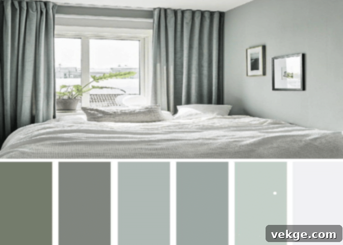
4. Coastal Retreat: Seafoam Sage with Sandy Beige or Charcoal
Transport yourself to a serene seaside escape with thoughtfully chosen coastal-inspired color combinations. Seafoam sage, with its distinct blue undertones, perfectly echoes the tranquil hues of the ocean’s shallows and the refreshing spray of the waves. When paired with sandy beige, it creates a quintessential beach house aesthetic, reflecting the natural colors of sea, sand, and sky. This combination is perfect for bedrooms, sunrooms, or any space where you desire a light, airy, and refreshing ambiance that brings the outdoors in. Imagine seafoam sage walls, sandy beige rugs, and natural driftwood accents for a quintessential coastal feel. For a slightly bolder, more dramatic coastal statement, consider combining a silvery-green sage with deep charcoal gray. This unexpected pairing evokes the dramatic beauty of a stormy beach day, with the cool gray representing stormy skies or wet rocks and the silver sage hinting at distant, misty horizons. This creates a sophisticated coastal vibe that moves beyond the traditional light and bright, offering depth, mood, and a touch of dramatic elegance.
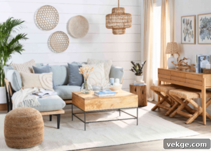
5. Minimalist Chic: Cool Sage with Deep Brown and Pale Tan
For lovers of minimalism, where simplicity, functionality, and clean lines reign supreme, a thoughtful combination of cool sage greens with carefully chosen neutrals can create a profound sense of spaciousness and understated elegance. Pairing a cool sage or silver-green sage with deep brown provides a rich, grounding contrast that feels sophisticated yet organic. The inherent coolness of the sage prevents the deep brown from feeling too heavy or imposing, while the brown adds necessary depth and definition to the minimalist palette. Alternatively, combining these cool sages with pale tan creates an airy, almost monochromatic look that emphasizes clean lines and maximizes natural light. These shades complement each other exceptionally well, aligning perfectly with the aesthetics of minimalism by promoting a sense of order, tranquility, and expansive space. Envision cool sage accents against pale tan walls, or deep brown furniture grounding a room adorned with silver-green sage textiles, for a look that is both simple and deeply luxurious.
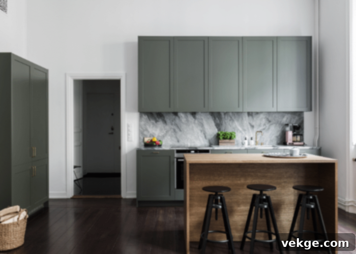
6. Subtle Contrast: Soft Sage Green with Creamy Beige
When seeking a gentle, harmonious, and deeply comforting feel, a soft sage green paired with a creamy beige delivers a subtle yet impactful contrast. Both shades possess a warm undertone, fostering a profound sense of peace, calmness, and quiet luxury. This combination avoids any sharp edges or harsh contrasts, instead creating a seamless, enveloping flow that imbues a space with unparalleled comfort and warmth. It’s an ideal choice for a master bedroom retreat, a serene nursery, or a cozy reading corner where relaxation and a nurturing atmosphere are paramount. Unlike pairing soft sage green with stark white, which would lean towards a brighter, cleaner, and more energetic setting, the creamy beige softens the overall effect, lending an air of understated elegance and serene warmth that encourages unwinding. Consider creamy beige upholstery alongside soft sage green walls, or integrate both through richly textured throws and artisanal decorative pottery.
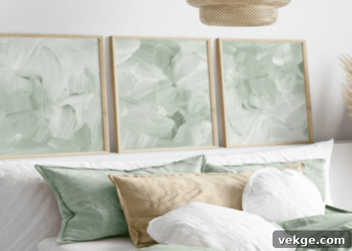
7. Bold Neutrals: Eucalyptus Sage Green with Deep Charcoal Gray
For a contemporary space seeking a high-contrast look that exudes a modern and energetic vibe, consider pairing a vibrant eucalyptus sage green with a deep charcoal gray. This combination is particularly striking and dynamic, as the cool-toned sage green pops dramatically against the rich, dark neutral, making a powerful visual statement. Eucalyptus sage, with its strong blue-gray undertones, finds a sophisticated and grounding partner in charcoal, which itself can carry cool, inky depths. This pairing is excellent for creating a compelling focal point in a living room, a dramatic and focused home office space, or a chic and intimate dining area. The inherent boldness of the charcoal provides a strong, anchoring foundation, allowing the unique, almost electric character of the eucalyptus sage to truly shine, resulting in a design that is both refined and dynamically modern. Think charcoal accent walls with eucalyptus sage furniture, or vice-versa, to define areas with confident, impactful style.
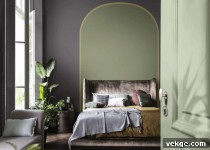
8. Industrial Edge: Grayed Sage Green with Concrete Gray and Black
Embrace a cutting-edge industrial aesthetic by combining a grayed sage green with the raw sophistication of concrete gray and strategic hints of black. This palette masterfully balances the edgy, urban vibe typically associated with industrial design with the subtle neutrality and organic sophistication of grayed sage green. The gentle green prevents the cool starkness of concrete and black from feeling too cold or uninviting, adding a touch of natural softness without compromising the raw, utilitarian character central to the industrial style. This combination is perfect for loft apartments, urban homes, or commercial spaces seeking a modern, utilitarian yet stylish appeal. Imagine exposed concrete walls beautifully softened by grayed sage accent furniture, or sleek black metal fixtures complemented by sage green textiles. It’s a daring and intentional choice that blends ruggedness with a refined sense of color, creating a space that is both strong, functional, and subtly inviting.
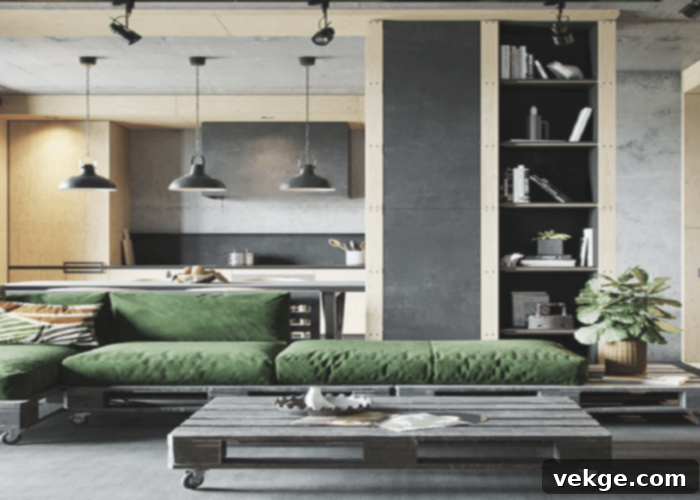
As you can observe from these diverse examples, a recurring and fundamental theme in successful interior design is the strategic use of color undertones. Modern and minimalist settings frequently leverage the crispness of cool sage green and complementary cool neutrals like silver-green sage, cool gray, or stark white. These combinations actively foster a sense of expansive space, cleanliness, and contemporary elegance, contributing to a refined aesthetic. Conversely, more homely and earthy settings, such as rustic and coastal styles, often gravitate towards warmer sage greens and harmonizing warm neutrals like soft sage, olive sage, warm beige, and tan. This deliberate choice creates a nurturing, inviting, and naturally harmonious environment that feels both grounded and deeply comfortable. Understanding this crucial interplay of warm and cool undertones is paramount to crafting a cohesive, visually pleasing, and mood-appropriate design.
Tips for Mastering Sage Green and Neutral Pairings
Beyond specific combinations for different aesthetics, here are some general tips to help you successfully incorporate sage green and neutrals into your design, ensuring a cohesive and inviting space:
- Consider the Lighting: Natural and artificial light sources can significantly alter how colors appear in a room. Always test paint samples directly on your walls at different times of the day to see how they truly look under various lighting conditions before making a final decision.
- Embrace Texture for Depth: In a largely neutral and muted color palette, introducing a variety of textures is key to adding depth, interest, and warmth without adding more color. Materials like linen, wool, natural wood, woven rattan, and brushed metals can transform your space. Imagine sage green velvet cushions, a chunky knit beige throw, or a reclaimed wood coffee table.
- Balance with Thoughtful Accent Colors: While sage green and neutrals are the stars of your palette, a small, carefully chosen pop of a complementary accent color can add dynamism and personality without disrupting the serene feel. Consider muted terracotta, a soft blush pink, a deep navy, or even a metallic gold for a touch of luxury.
- Start Small and Experiment: If you’re hesitant to commit to painting entire walls, begin with smaller elements like throw pillows, decorative vases, artwork, or smaller furniture pieces to introduce the palette. This allows you to experiment with different shades and combinations before investing in larger pieces or paint.
- Reflect Your Personal Style: Ultimately, the most successful color combination is one that truly resonates with you and makes your home feel welcoming, authentic, and comfortable. Don’t be afraid to trust your instincts and adapt these guidelines to suit your unique taste and lifestyle. Your home should be a reflection of you.
Conclusion: The Timeless Appeal of Sage Green and Neutrals
The enduring appeal of combining sage green with neutral tones, whether it’s the gentle warmth of creamy beige, the crisp sophistication of white, or the grounded elegance of various grays and browns, lies in its immense versatility and inherent beauty. This palette offers a vast spectrum of design possibilities, capable of transforming any space into a sanctuary of style, calm, and sophisticated comfort. It’s a testament to the power of thoughtful color selection in creating environments that nurture and inspire.
Sage green, deeply rooted in nature and symbolic of the ancient herb, is consistently associated with tranquility, peace, wisdom, balance, and rejuvenation. Much like the herb itself, which flourishes in a variety of hues, the color sage green also ranges from a pale, almost silvery-green to a richer, brighter shade that tips gracefully towards olive green. Each variation brings its own unique character to the table, offering endless creative avenues for interior designers and homeowners alike to explore and implement.
The masterful interplay between the organic, soothing nature of sage green and the timeless, adaptable quality of neutral colors creates an effortless flow that can beautifully reflect a myriad of styles, moods, and aesthetics. From the rustic charm of a cozy farmhouse to the sleek, minimalist lines of an urban loft, or the refreshing, airy feel of a coastal retreat, this harmonious pairing provides an unparalleled foundation for truly inspiring and livable spaces. By embracing sage green and its versatile neutral companions, you unlock a world of sophisticated design possibilities, bringing balance, serenity, and enduring style into the very heart of your home, creating a haven that feels both contemporary and timeless.
