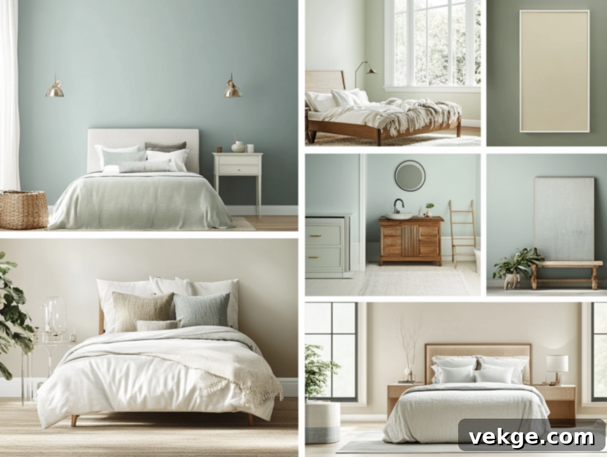
Top Benjamin Moore Paint Colors: Your Ultimate Guide to Choosing the Perfect Shade
Embarking on a home refresh or a new decorating project often starts with a single, exciting question: what paint color will transform my space? For over a century, Benjamin Moore has been the trusted name in quality paints, offering an unparalleled spectrum of shades. With thousands of options, selecting the perfect hue can feel daunting, but it doesn’t have to be.
Good news: I’ve meticulously researched and consulted with industry experts to bring you this comprehensive guide. Here, you’ll discover:
- The most popular Benjamin Moore colors homeowners and designers are choosing this year.
- Practical tips for effortlessly integrating these shades into your personal style.
- Expert advice on how to test paint colors effectively, ensuring you make a confident decision.
I’ve spoken with seasoned paint professionals and interior designers who work with Benjamin Moore paints every day. They’ve shared invaluable insights on how these colors perform in various rooms, under different lighting conditions, and with diverse decor styles. By the time you finish this article, you’ll be equipped with the knowledge to narrow down your choices and feel absolutely confident in selecting the Benjamin Moore color that’s perfect for your next project.
Why Choose Benjamin Moore Paint for Your Home?
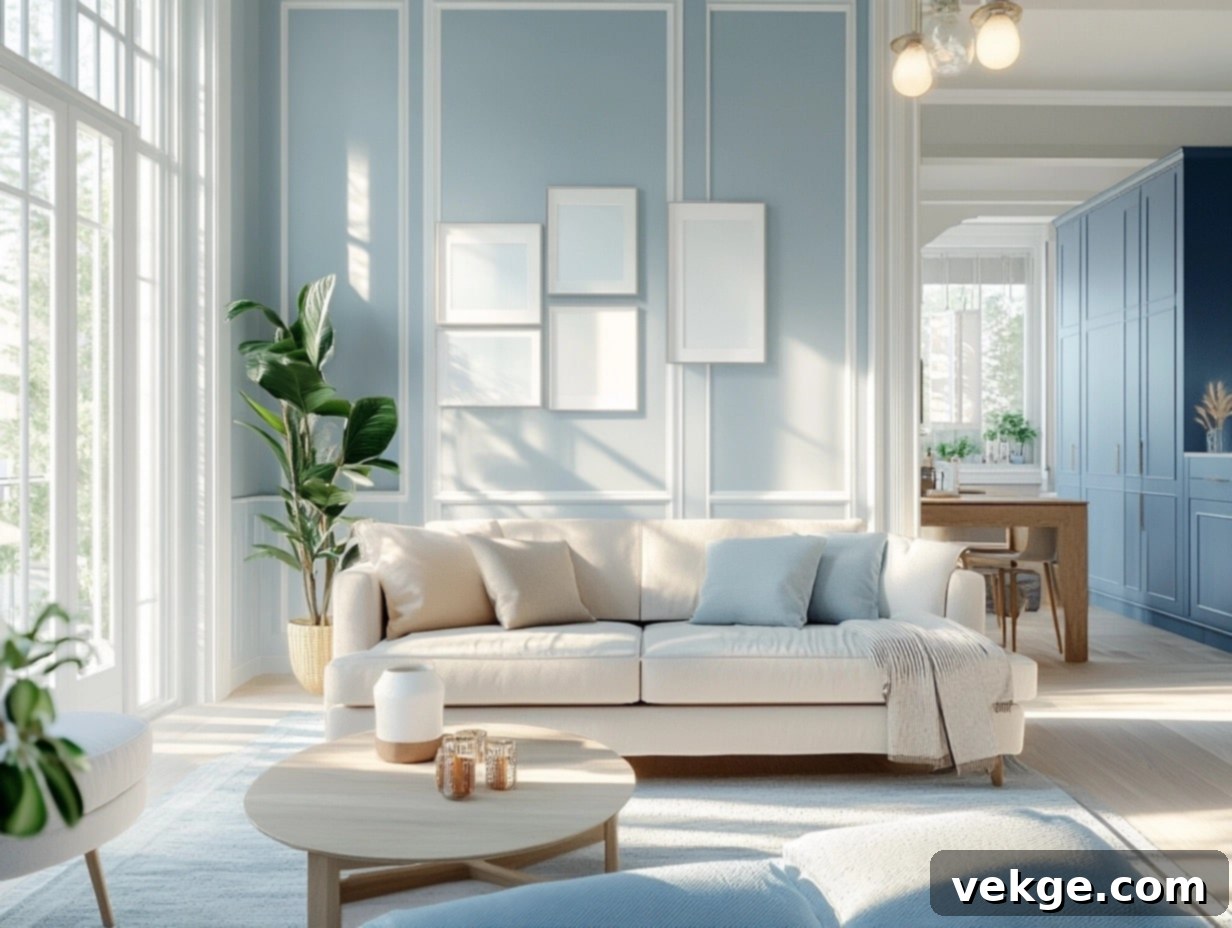
Having worked with countless paint brands over the years, I can confidently say that Benjamin Moore consistently stands out for several compelling reasons. Their commitment to excellence is evident in every can, making them a top choice for both professionals and DIY enthusiasts.
1. Unmatched Quality and Coverage
Benjamin Moore paints are renowned for their superior quality. The paint applies smoothly, offering exceptional coverage, often achieving a flawless finish in just one or two coats. This means less labor, faster project completion, and a more professional-looking result. I’ve personally witnessed walls painted with Benjamin Moore maintain their pristine appearance and vibrant color for many years, resisting the wear and tear of daily life.
2. Prioritizing Your Family’s Safety and Well-being
Many Benjamin Moore paints feature low or zero VOC (Volatile Organic Compounds) formulations. This commitment to health means significantly fewer harmful fumes, allowing you to paint a room and comfortably occupy it the same day. Their products are meticulously crafted with safety in mind, adhering to stringent standards:
- Formulated with minimal harsh chemicals.
- Virtually odorless for a more pleasant painting experience.
- Certified safe for children’s rooms and nurseries.
- Meeting and often exceeding strict environmental and safety regulations.
3. Enduring Colors That Stay True
The secret behind Benjamin Moore’s lasting beauty lies in their high-quality pigments. These pigments are engineered to retain their true color for years, resisting fading, yellowing, or dullness often seen with lesser quality paints. Your walls will continue to look fresh and the colors will remain as rich and vibrant as the day they were applied, offering long-term aesthetic satisfaction.
4. A Diverse Range of Finish Options
Benjamin Moore understands that different areas of your home require different finishes. They offer a versatile selection to meet every need and aesthetic preference:
- Flat: Ideal for ceilings and low-traffic areas, excellent for camouflaging minor wall imperfections.
- Eggshell: A popular choice for living rooms and bedrooms, offering a subtle sheen that’s easy to clean and durable.
- Pearl: Provides a slightly more luminous finish than eggshell, perfect for adding a touch of elegance.
- Semi-gloss: The go-to option for trim, doors, and cabinets, offering superior durability and a beautiful, soft sheen that’s highly washable.
- High Gloss: Creates a bold, reflective finish, perfect for accentuating architectural details or making a statement on doors and furniture.
5. A Worthwhile Investment
While Benjamin Moore paints may have a higher upfront cost compared to some alternatives, they represent a truly worthwhile investment. Cheaper paints often require more coats, take longer to apply, and fade or wear out much faster. This can lead to more frequent repainting, ultimately costing you more time, effort, and money in the long run. Benjamin Moore’s durability and superior finish mean less maintenance and a lasting beautiful result.
6. Expert Guidance from Local Paint Stores
One of the greatest advantages of choosing Benjamin Moore is the invaluable support available at their local retail stores. These aren’t just paint shops; they’re hubs of expertise where knowledgeable staff can provide personalized assistance:
- Offer tailored advice on color selection, helping you find the perfect match for your home and style.
- Recommend the ideal finish for specific rooms and surfaces, ensuring optimal performance and aesthetics.
- Provide practical painting tips and techniques, from surface preparation to application, to help you achieve professional results.
- Expertly match any color sample you bring in, expanding your design possibilities.
This personalized guidance is an invaluable resource, helping you navigate choices and avoid costly mistakes, ensuring your painting project is a success.
This Year’s Top Benjamin Moore Colors for Every Room
Navigating the vast world of paint colors can feel overwhelming, but worry not—I’ve distilled the options to bring you the crème de la crème. Here are the **most beautiful and highly sought-after Benjamin Moore colors for this year**, thoughtfully curated to complement every room in your home and elevate its aesthetic.
Living Room Favorites
1. Edgecomb Gray (HC-173)
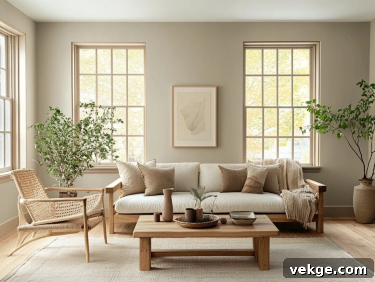
If you’re seeking a neutral that perfectly balances warmth and coolness, avoiding being too beige or overtly gray, **Edgecomb Gray** is an absolute masterpiece. This sophisticated greige boasts a soft, warm undertone that creates an instantly inviting and cozy atmosphere, making it a perennial favorite for living rooms. Its versatility shines particularly bright in **open-concept spaces**, where it effortlessly links different zones, providing a cohesive and elegant backdrop. To enhance its timeless appeal, pair it with **rich wood furniture, luxurious soft textiles like linen or velvet, and natural accents** such as potted plants or woven baskets. The result is a look that feels both modern and comfortably classic.
2. Balboa Mist (OC-27)
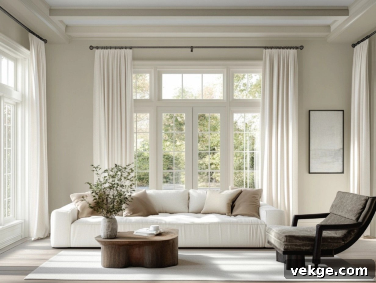
For a bright yet elegantly understated choice, **Balboa Mist** achieves a perfect equilibrium. This exquisite off-white shade, infused with subtle gray undertones, has a remarkable ability to reflect light, making your living room feel expansive, airy, and incredibly fresh. Its adaptable nature means it integrates seamlessly into both **modern minimalist designs and classic traditional settings**, offering immense flexibility in your decor choices. Create striking contrast by pairing it with **dark, rich-toned furniture**, or maintain an ethereal, unified vibe with a palette of lighter, complementary tones and metallic accents.
3. Smoke Embers (AC-28)
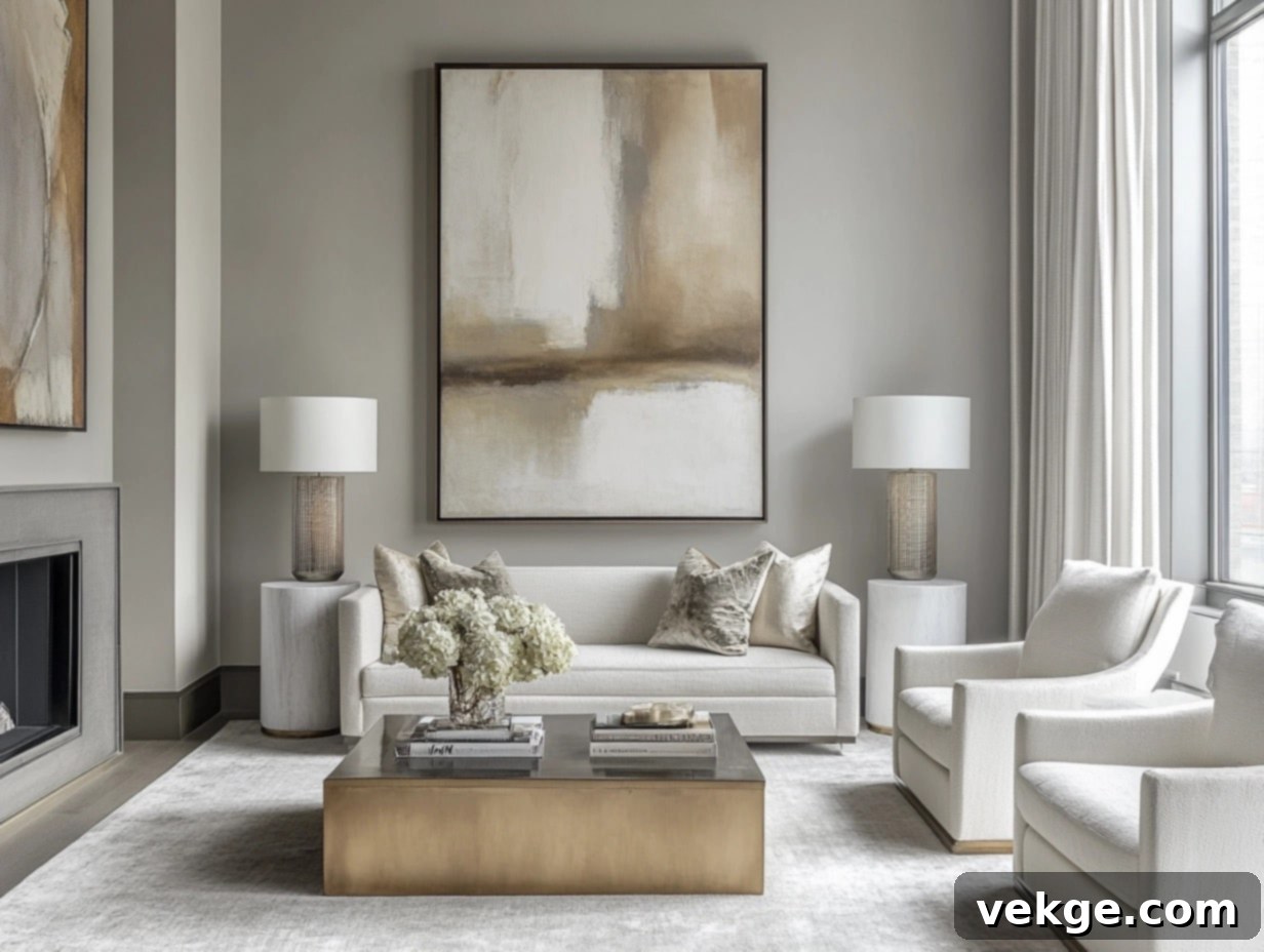
Craving something with a cooler, more profound, and slightly dramatic edge for your living space? **Smoke Embers** exudes an understated elegance with its deep, sophisticated gray tone. It’s an exceptional choice for living rooms that benefit from an abundance of **natural light**, as the shade beautifully shifts and appears dynamic throughout the day, responding to changing light conditions. For a truly contemporary and polished aesthetic, complement it with **lustrous metallic accents**, sumptuous soft furnishings, and captivating bold artwork. This combination will create a living room that feels both refined and utterly chic.
Bedroom Must-Haves
4. Palladian Blue (HC-144)
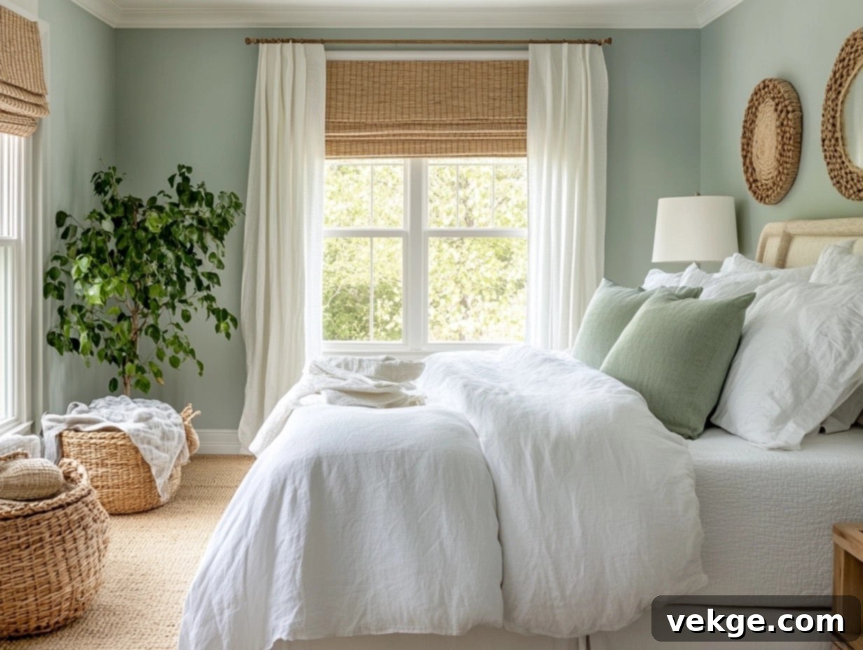
This color is a truly dreamy fusion of soft blue and subtle green, striking a perfect balance of tranquility and invigorating freshness. **Palladian Blue** possesses a unique quality that makes a bedroom feel both incredibly airy and open, yet wonderfully cozy and inviting. To amplify its serene, spa-like ambiance, pair it with crisp white linens, light-toned wood furniture, and minimalist decor. Incorporate natural elements such as woven baskets, rattan accents, or vibrant greenery to further enhance this peaceful and harmonious retreat.
5. Smoke (2122-40)
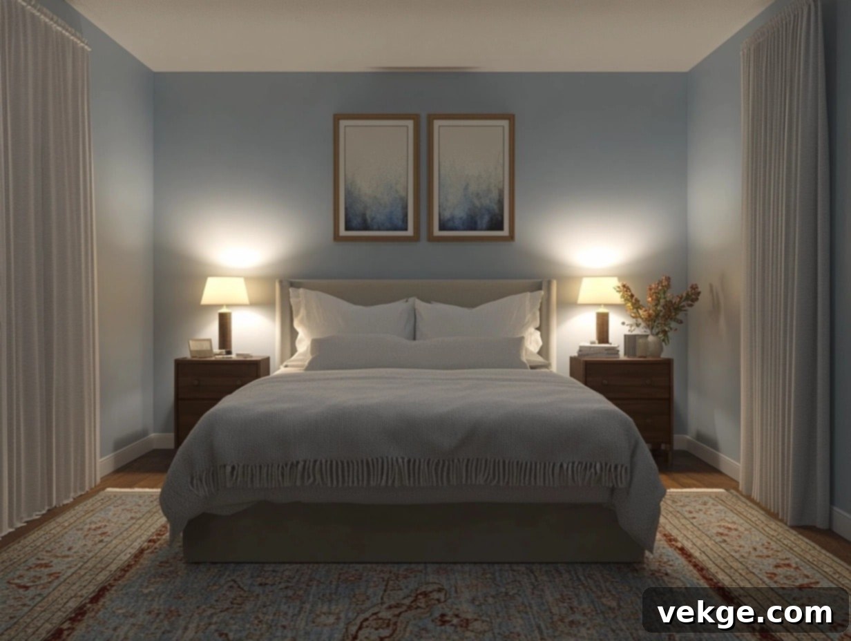
For those who gravitate towards a more understated yet deeply calming aesthetic, **Smoke** is an exceptional selection. This soft, ethereal blue, infused with delicate gray undertones, imparts a sophisticated and profoundly tranquil feel to any bedroom. It pairs exquisitely with neutral bedding, ambient soft lighting, and perhaps a touch of silver or brushed nickel accents, creating a peaceful sanctuary that feels like a gentle, comforting embrace. Smoke is particularly effective in smaller bedrooms, as its light and airy quality can visually expand the space, making it feel more open and serene.
6. Quiet Moments (1563)
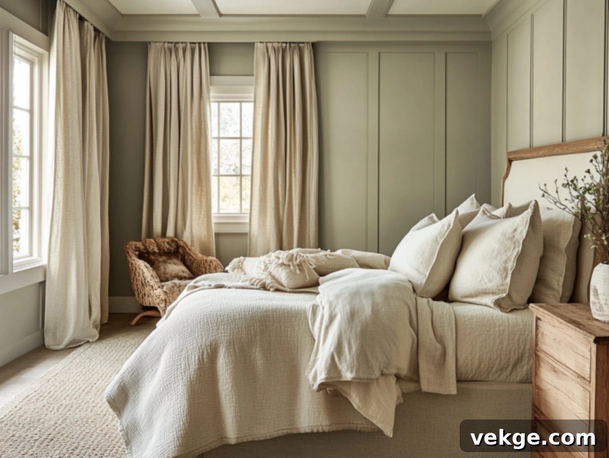
For a uniquely calming and nature-inspired option, look no further than **Quiet Moments**. This muted gray-green hue evokes a profound sense of stillness and tranquility, making it an ideal choice for minimalist, Scandinavian-inspired, or nature-themed bedrooms. To cultivate a truly grounded and cozy atmosphere, integrate earthy tones like soft beige, warm cream, or gentle taupe. Incorporate diverse textures such as organic linen, plush wool throws, or soft cotton to add depth and comfort. Quiet Moments also harmonizes beautifully with natural wood accents, fostering a serene space that feels intimately connected to the calming embrace of the outdoors.
Kitchen Standouts
7. Simply White (OC-117)
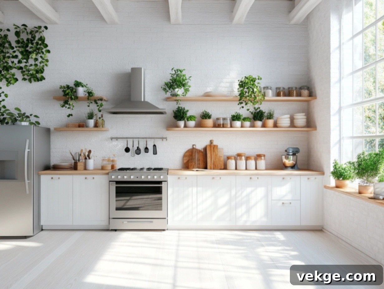
**Simply White** is a pristine, warm white that excels at creating a bright, luminous, and airy kitchen environment. Unlike cooler whites that can sometimes feel stark, Simply White introduces a subtle hint of warmth, ensuring your kitchen feels inviting and welcoming rather than sterile or clinical. It works wonders on walls, instantly creating an illusion of openness and spaciousness, or on cabinetry for a timeless, crisp, and clean style that never goes out of fashion. For a balanced and cohesive design, pair it effortlessly with sleek stainless steel appliances, rich natural wood accents, or vibrant pops of color in your kitchenware.
8. Hale Navy (HC-154)
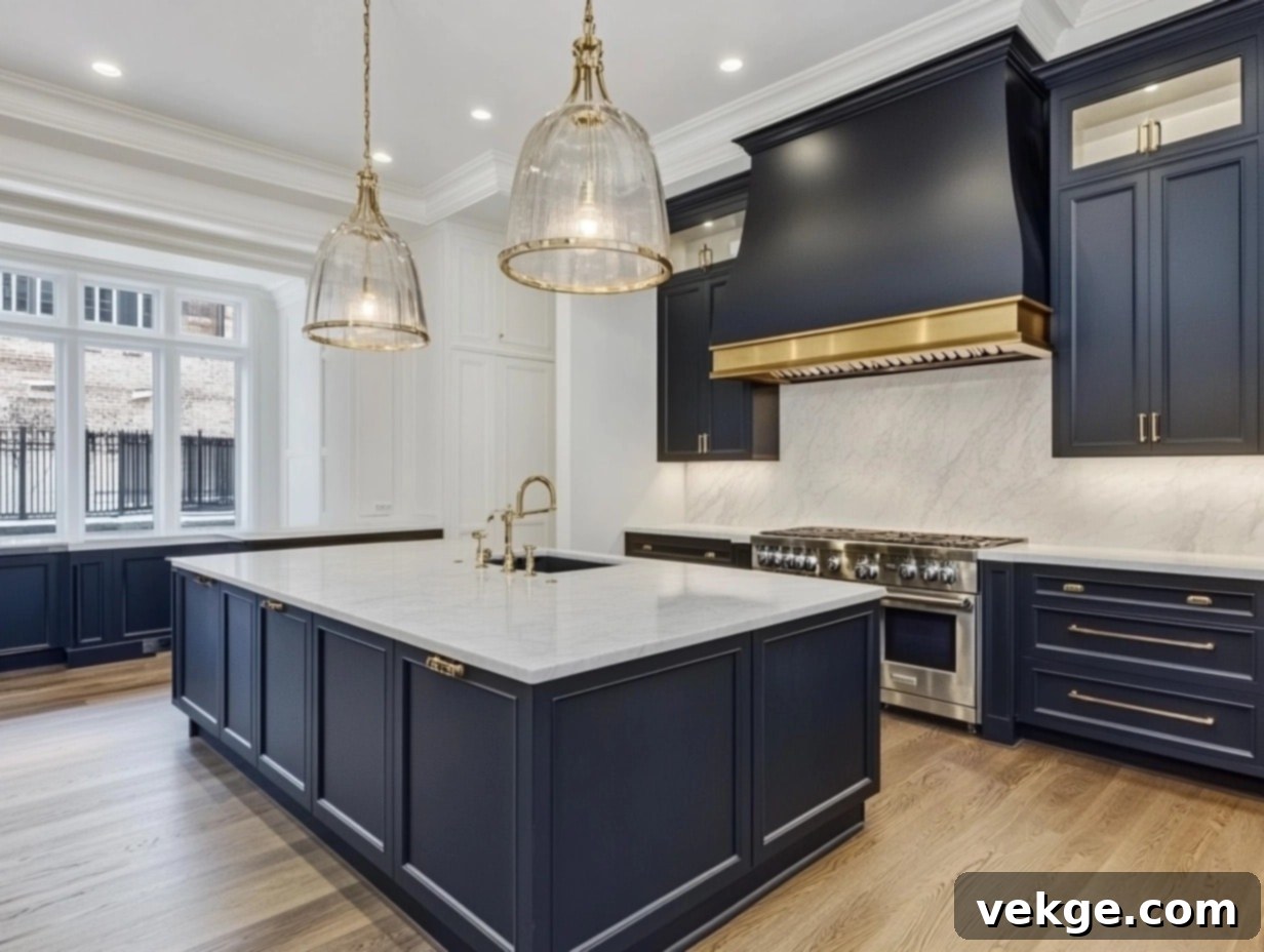
**Hale Navy** is an absolute showstopper for those daring to introduce a touch of bold sophistication and timeless drama into their kitchen. This deeply rich, classic navy hue pairs effortlessly with gleaming gold or antique brass hardware, instantly elevating the space with a luxurious and opulent touch. If your kitchen features elegant marble or sophisticated quartz countertops, the striking contrast offered by Hale Navy will magnify their beauty even further. Consider using this commanding shade to anchor the space on an accent wall, paint a statement kitchen island, or even as a vibrant choice for lower cabinets, creating an undeniably chic and memorable kitchen design.
9. Cheating Heart (1617)
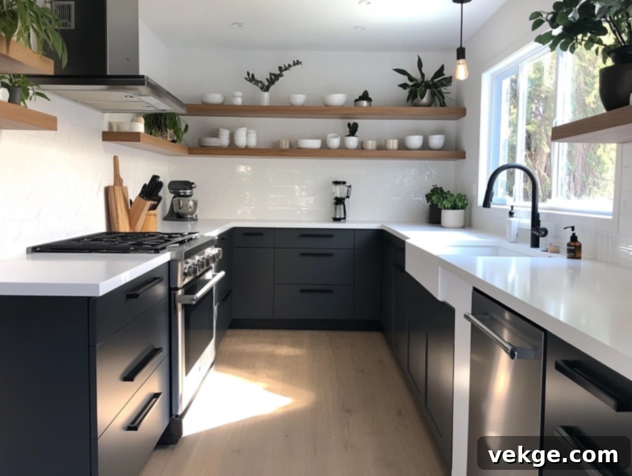
A profoundly deep charcoal shade, **Cheating Heart** offers a sleek, utterly contemporary, and sophisticated aesthetic perfect for modern kitchens. Its dramatic tone immediately adds incredible depth and gravitas, making it an ideal choice for kitchens embracing modern, industrial, or even urban-chic vibes. Utilize it to create a stunning contrast against lighter walls or gleaming countertops, forging a striking visual effect that is both bold and elegant. This versatile shade is equally impactful whether used for lower cabinets, a dramatic accent wall, or a chic, sophisticated backsplash. To soften its intensity and introduce an organic touch, pair Cheating Heart with light wood tones, warm metallics, or vibrant pops of greenery.
Bathroom Beauties
10. Sea Haze (2137-50)
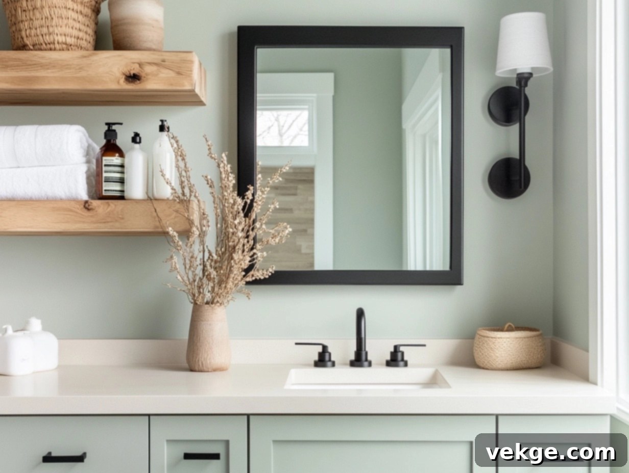
This serene greenish-gray evokes the tranquil beauty of a misty coastline, offering a palette that feels both profoundly calming and subtly sophisticated. The delicate hint of green within **Sea Haze** makes it an excellent choice for bathrooms of all sizes, especially small bathrooms or powder rooms, as it can visually expand the space, making it feel more airy, open, and incredibly inviting. For a modern yet tranquil look, pair it with natural wood accents, sleek matte black fixtures, or crisp white porcelain. Consider adding subtle ocean-inspired decor to complete the serene ambiance.
11. Swiss Coffee (OC-45)
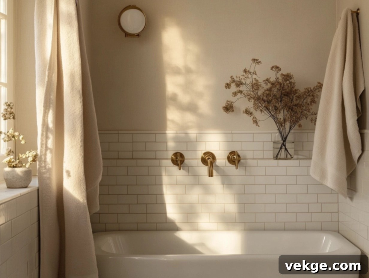
A creamy, wonderfully warm white that is both timeless and immensely versatile, **Swiss Coffee** shines beautifully in bathrooms. It’s perfect for spaces with minimalist decor, as it provides a clean, sophisticated backdrop, or for those aiming for a classic, immaculately clean aesthetic. This inviting shade softly reflects light, making even the smallest bathrooms feel significantly bigger, brighter, and more welcoming. To further enhance its inherent warmth and add a touch of understated luxury, consider incorporating elegant brass or polished gold accents, along with plush white towels and natural wood elements.
12. Silver Mist (1619)
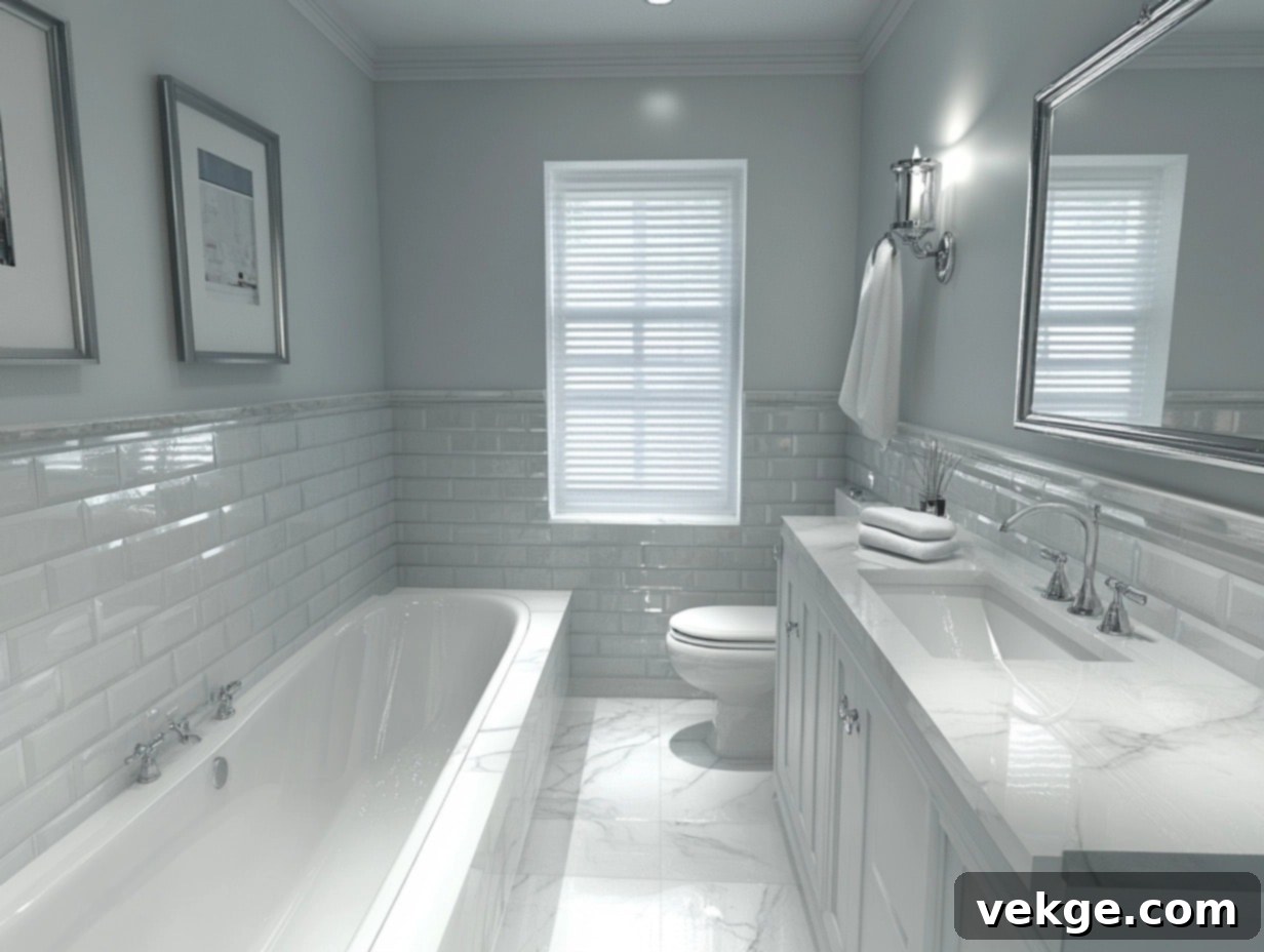
**Silver Mist** is a subtle yet captivating silver-blue hue that manages to be both refreshingly crisp and elegantly refined. It looks particularly stunning in bathrooms featuring classic white tiles, light-colored fixtures, or sparkling chrome accents, as it introduces a gentle yet discernible pop of cool color without ever overwhelming the space. For a truly luxurious and cohesive finish, combine it with polished silver hardware, glistening marble details, and perhaps some glass or mirrored elements. This combination will create a bathroom that feels both sophisticated and incredibly serene.
Versatile Accent Colors
13. Kendall Charcoal (HC-166)
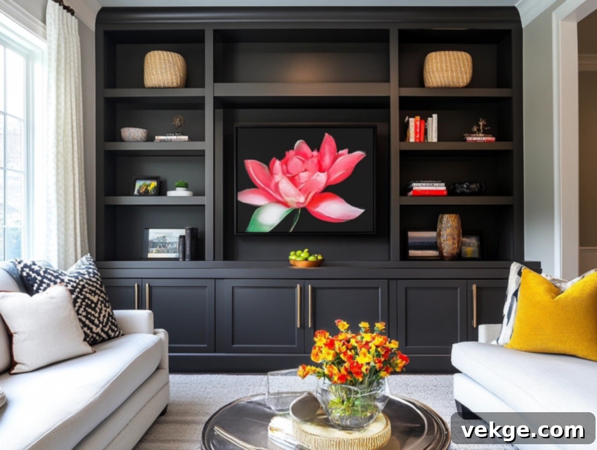
**Kendall Charcoal** is a bold, grounding gray that instantly commands attention and adds profound depth to any space. It’s exceptional for creating dramatic statement walls, highlighting architectural features like built-in shelves or intricate wainscoting, or giving interior doors a striking, modern edge. This rich, deep shade is remarkably versatile, seamlessly fitting into both contemporary minimalist settings and more traditional, classic interiors, making it a perennial favorite for introducing a sense of sophisticated gravitas and visual interest.
14. Decorator’s White (OC-149)
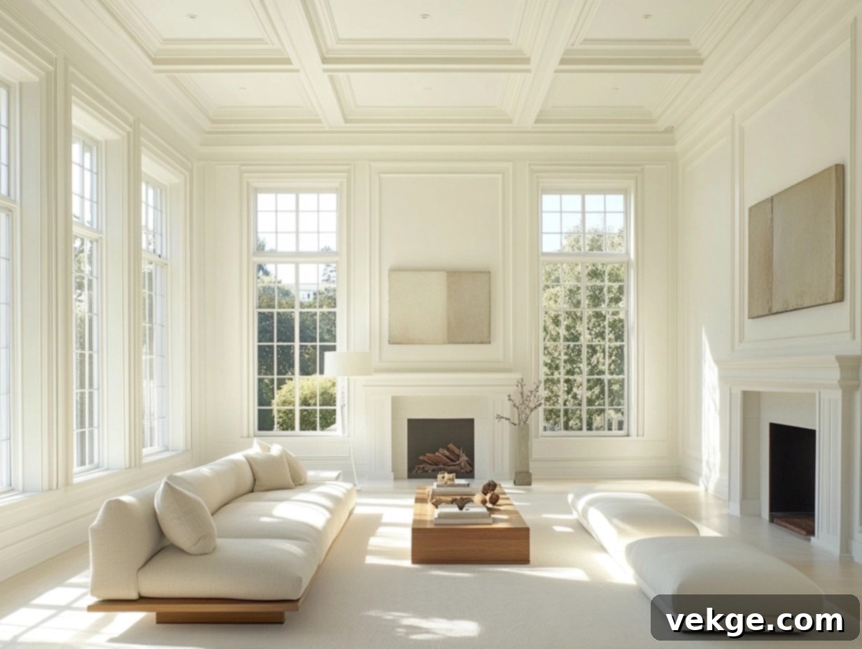
**Decorator’s White** is the quintessential crisp and clean white, making it absolutely ideal for ceilings and trim work. Its pure, bright quality provides a sharp contrast that makes other colors pop. It’s a go-to choice for creating a fresh, modern, and minimalist backdrop, but it also beautifully complements and enhances brighter or bolder wall colors by offering a pristine, neutral boundary. Its unparalleled versatility ensures it remains a foundational staple in any designer’s or homeowner’s toolkit, consistently delivering a clean and polished finish.
15. White Dove (OC-17)
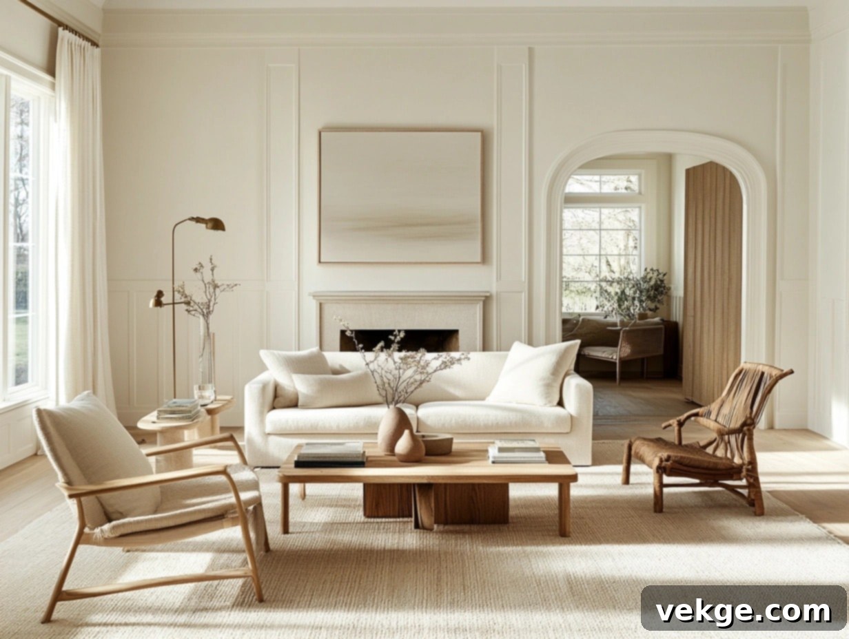
**White Dove** masterfully strikes the perfect balance between stark, cool whites and overly warm, creamy whites. Its soft, subtle undertone possesses a remarkable ability to harmoniously tie together diverse elements within a room, whether it’s bold furniture, vibrant colorful decor, or rich natural wood tones. Unlike more intensely bright whites, White Dove never overwhelms a space; instead, it provides a gentle, inviting glow that makes it a timeless and enduring choice for achieving a cohesive, elegant, and perfectly polished look in any interior.
How to Pick the Right Benjamin Moore Color for Your Space
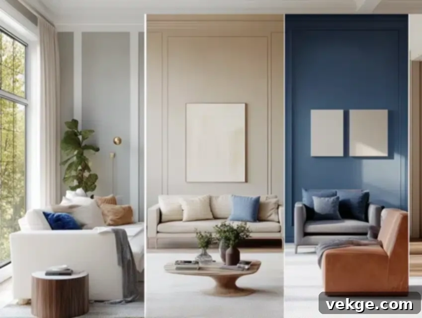
Choosing the perfect paint color involves more than just liking a shade; it’s about understanding how it interacts with your unique space. Let me share some crucial insights and simple steps I’ve gathered over the years to help you make informed decisions.
Consider Your Room Size and Architecture
The size of your room plays a significant role in how a color feels. Generally, lighter colors are recommended for smaller rooms. I’ve personally seen how a well-chosen light paint can dramatically open up tiny spaces, making them feel much more expansive and airy. However, don’t shy away from deeper hues entirely; a rich, dark color can create an incredibly cozy, intimate, and sophisticated retreat in a smaller room, especially if you embrace it fully on all walls.
For larger rooms, you have more flexibility to experiment with a wider range of shades:
- Light colors: Will amplify the feeling of spaciousness and airiness, making a large room feel even more grand.
- Medium tones: Can introduce warmth and comfort, bringing the walls in slightly to create a more inviting atmosphere without feeling confined.
- Dark colors: Can make a vast room feel more grounded and intimate, adding a sense of drama and elegance by visually bringing the walls closer.
Analyze Your Room’s Lighting Conditions
Lighting is arguably the most critical factor, as it can completely transform how a paint color appears. Natural light changes throughout the day, and artificial light sources also have different effects. Here’s a comprehensive approach to testing:
- **Test on multiple walls:** Paint a sizable swatch (at least 2’x2′) on at least two different walls in the room, as light hits each surface differently.
- **Observe in morning light:** Notice how the color looks with the soft, often cooler, light of dawn.
- **Check again at noon:** See how the color reacts to brighter, more direct midday light, which tends to reveal its truest form.
- **Evaluate in evening/night light:** Assess the color under artificial lighting (lamps, overhead lights) that you’ll typically use, as this can dramatically alter its appearance, potentially bringing out unexpected undertones.
- **Consider the direction:** Rooms facing north receive cooler, consistent light, while south-facing rooms get warmer, brighter light. East-facing rooms are brightest in the morning, west-facing in the afternoon.
Match the Color to the Room’s Purpose and Mood
Think about the primary activities and desired mood for each room. Colors have a psychological impact that can enhance or detract from a space’s function:
- Areas needing focus (e.g., home office, study): Cooler tones like blues and greens can promote concentration and a sense of calm.
- Spaces for rest and relaxation (e.g., bedrooms, quiet nooks): Soft, warm colors such as muted yellows, gentle grays, or soothing pastels create a serene and comforting environment.
- Rooms for gathering and dining (e.g., dining room, kitchen): Warm colors like reds, oranges, and some yellows can stimulate conversation and appetite, making the space feel vibrant and welcoming.
- Zones for energy and creativity (e.g., kids’ playrooms, creative studios): Brighter, more saturated shades can spark energy and imagination, but use them thoughtfully to avoid overwhelming the space.
Harmonize with Existing Elements
Your chosen paint color shouldn’t exist in isolation. It needs to complement the elements already present in your room. Take stock of:
- **Floor color and material:** Wood tones, carpets, and tiles all have undertones that interact with wall colors.
- **Furniture pieces:** Upholstery, wood finishes, and metal accents should harmonize with your paint choice.
- **Window treatments:** Curtains, blinds, and drapes are significant fabric elements that contribute to the room’s palette.
- **Art and decorative objects:** These personal touches add color and texture, and your walls should serve as a beautiful backdrop, not a competitor.
My Top Testing Tips for Confidence
Testing is non-negotiable. These steps will save you from costly mistakes and ensure you love your final choice:
- Invest in sample pots: Purchase pint-sized samples of your top 2-3 Benjamin Moore color contenders. Don’t rely solely on tiny swatches.
- Paint generous squares: Apply large squares (at least 2×2 feet) of each sample directly onto different walls in the room. This gives you a true sense of the color’s impact.
- Live with them for a few days: Resist the urge to decide immediately. Observe the samples over several days to see how they change with various lighting conditions and moods.
- Examine frequently: Look at the painted areas at different times of day and night, from various angles, and with all your lights on and off.
- Trust your gut feeling: Ultimately, choose the color that consistently makes you feel happy, comfortable, and confident in your space.
Expert Tips for Using Benjamin Moore Paints
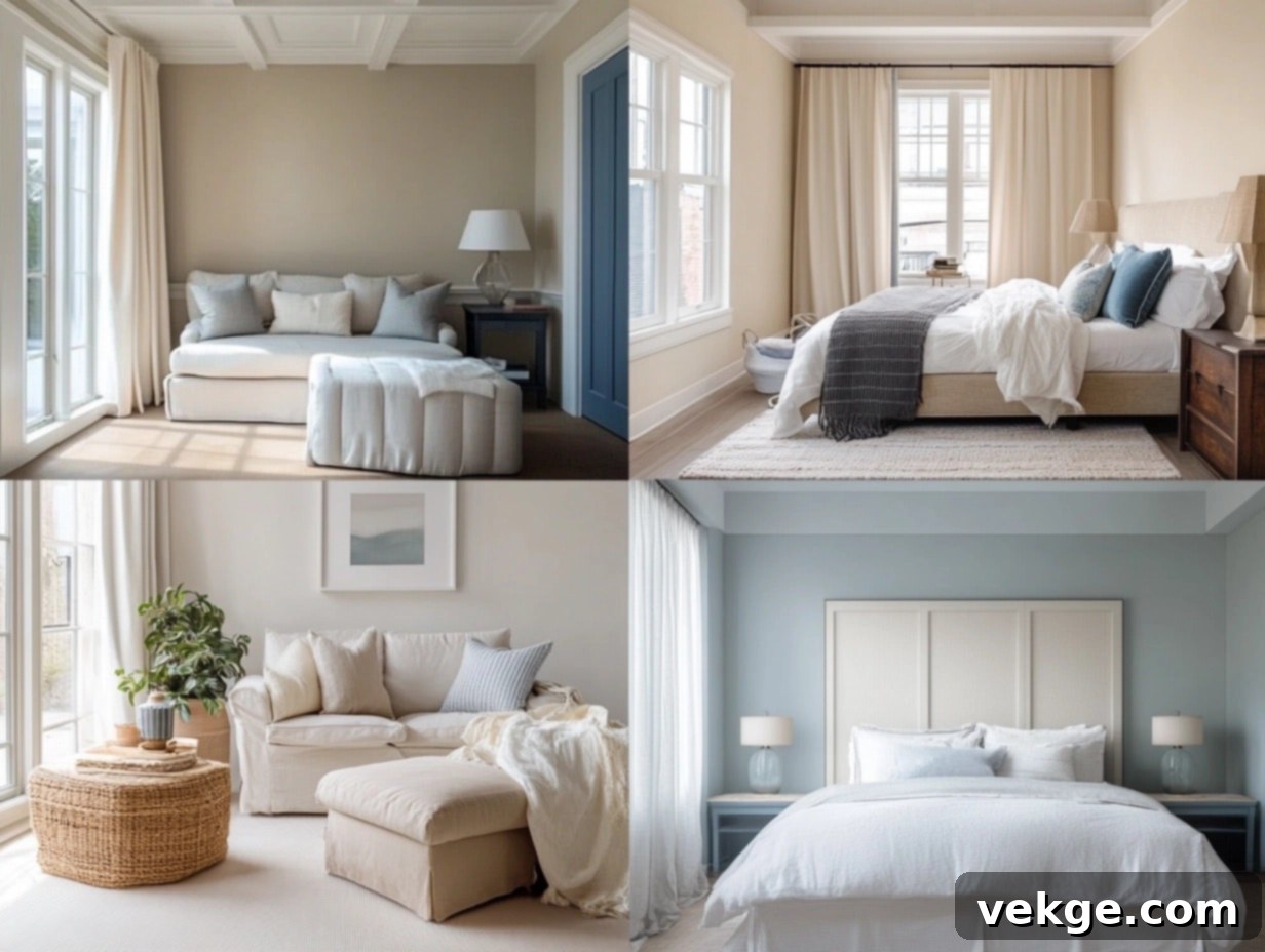
Choosing the right paint is only half the battle; applying it correctly ensures a beautiful, lasting finish. Don’t worry—these expert tips will guide you to achieve professional-looking results with your Benjamin Moore paints, making your vision a reality.
1. Always Test Paint Swatches in Your Actual Space
This cannot be emphasized enough. A paint color’s appearance can drastically change from a small chip in the store to a large surface on your wall due to light, surrounding colors, and even the texture of the wall itself. To ensure you make the right choice:
- Apply to a small, inconspicuous area: Or, better yet, use large peel-and-stick samples (if available for your chosen colors) or paint a substantial section of drywall or poster board you can move around.
- Observe in varied lighting: Crucially, check how the color looks under both bright natural daylight and the artificial light sources you’ll typically use in the room (e.g., warm LEDs, cool fluorescents).
- Allow for full drying: Paint colors often deepen or shift slightly as they cure. Give your test swatches at least 24 hours to fully dry before making your final decision.
2. Select the Appropriate Finish for Each Area
The paint finish you choose is just as important as the color itself, impacting durability, cleanability, and overall aesthetic. Benjamin Moore offers a range of finishes to suit every need:
- Flat or Matte: Offers a non-reflective, velvety appearance that excels at concealing surface imperfections. Best for ceilings and low-traffic areas like formal dining rooms or guest bedrooms.
- Eggshell or Satin: These are the most popular choices for living rooms, bedrooms, and hallways. They provide a subtle, soft sheen that’s elegant, highly durable, and easy to wipe clean, making them practical for everyday living.
- Semi-Gloss or Gloss: These finishes offer increased durability and a noticeable shine, making them ideal for high-traffic areas, moisture-prone rooms, and surfaces that require frequent cleaning. Perfect for kitchens, bathrooms, laundry rooms, trim work, doors, and cabinetry.
3. Thorough Surface Preparation is Key
While often overlooked, proper surface preparation is absolutely **critical** for achieving a smooth, long-lasting, and professional paint finish. Skimping on prep will compromise even the highest quality paint:
- Clean meticulously: Thoroughly wash walls to remove all dirt, dust, grime, and grease. A solution of mild soap and water, followed by a clean water rinse, usually suffices.
- Repair imperfections: Fill any holes, cracks, or dents with spackle or joint compound, then sand these areas smooth once dry.
- Sand and degloss: Lightly sand glossy surfaces to create a “tooth” for the new paint to adhere to. For previously painted surfaces that are in good condition, a light sanding and cleaning are often sufficient.
- Apply primer when necessary: Use a high-quality primer if you’re painting over a dark color with a lighter one, if the surface is stained, or if it’s a new, unpainted surface (like bare drywall). Primer ensures better adhesion, truer color, and a more uniform finish.
Where to Find the Most Popular Benjamin Moore Paint Colors
Ready to bring your chosen Benjamin Moore colors to life? Knowing where to purchase and how to efficiently browse options is key. Let me guide you to the best resources, from local experts to convenient online tools.
Leveraging Local Benjamin Moore Retailers
I always recommend starting your paint journey with local Benjamin Moore stores or authorized retailers. Here’s why their personalized service is invaluable:
- **Immediate color mixing:** Staff can expertly mix your desired colors on the spot, allowing you to take your paint home right away.
- **In-person color perception:** You can see large color swatches and paint chips in natural light, helping you visualize how colors truly appear beyond a screen.
- **Comprehensive product range:** These stores carry not only Benjamin Moore paints but also all the essential tools, brushes, rollers, and supplies you’ll need for a successful project.
- **Easier returns and exchanges:** Should you need to adjust your order or return unused items, a local store typically offers a smoother process.
Finding Your Nearest Store
Locating a Benjamin Moore retailer is straightforward. Simply visit the official Benjamin Moore website’s store locator. Type in your zip code, and you’ll quickly find:
- Accurate store hours and days of operation.
- Direct phone numbers for quick inquiries.
- Details on specific services offered, such as color consultations or equipment rentals.
Convenient Online Options for Exploration and Samples
If you prefer to browse and plan from the comfort of your home, the Benjamin Moore website is an excellent resource:
- **Explore the full-color range:** Dive into their extensive digital color fan deck, showcasing thousands of shades.
- **Order color samples:** Request convenient peel-and-stick samples delivered directly to your door, allowing you to test colors on your walls without committing to a full can.
- **Save your favorite shades:** Create personal project boards to save and organize your preferred colors and palettes.
- **Design color schemes:** Utilize their digital tools to visualize potential color combinations for different rooms.
Smart Paint Shopping Tips
To ensure a smooth and successful paint purchase, consider these practical tips:
- **Call ahead:** Confirm store hours, stock availability, or if they offer specific services like curbside pickup.
- **Bring room photos:** Digital photos of your room, furniture, and existing decor can help store staff provide more accurate color advice.
- **Inquire about sales:** Ask about any current promotions, discounts, or loyalty programs that might be available.
- **Purchase extra for touch-ups:** Always buy a little more paint than you estimate. Having extra on hand for future touch-ups will save you time and hassle, ensuring perfect color matching for years to come.
Real-Life Inspirations Using People’s Favorite Benjamin Moore Colors
To truly appreciate the transformative power of Benjamin Moore colors, let me share some authentic stories from clients who successfully found their perfect shades. These real-world examples can provide valuable inspiration and help you envision these beautiful colors in your own home.
Sarah’s Cozy Living Room Story with Edgecomb Gray
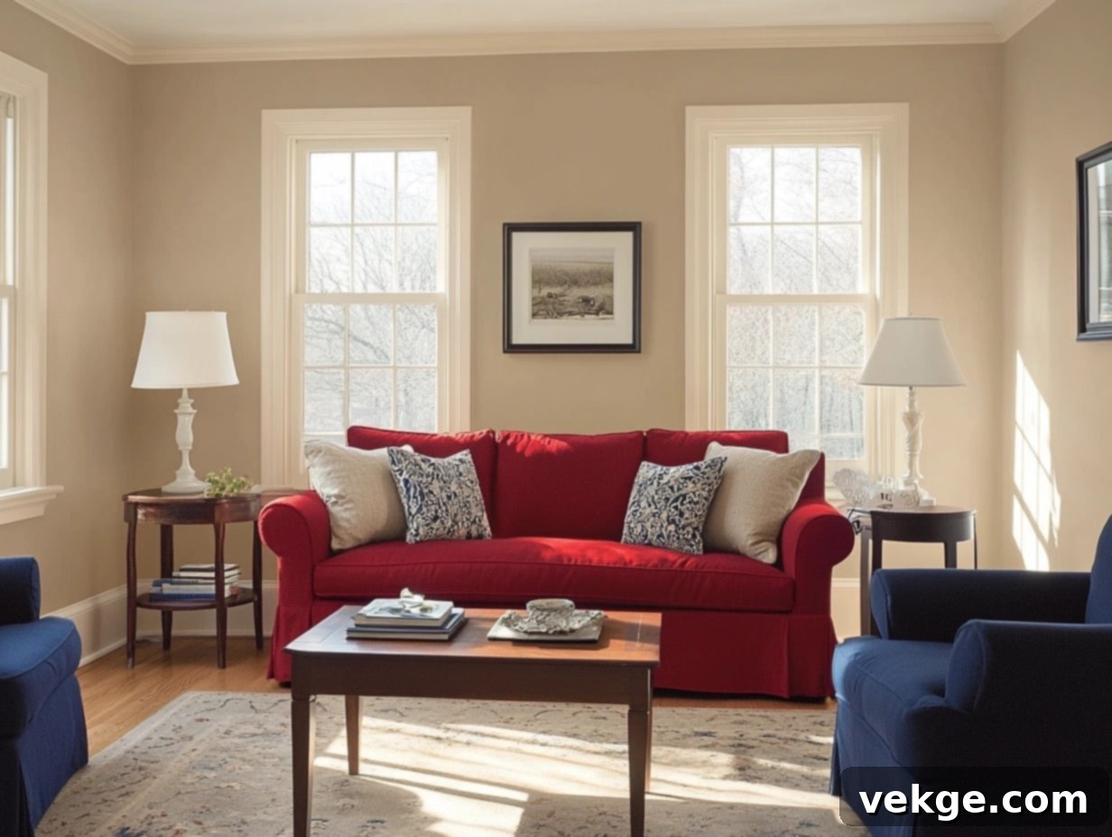
Sarah, a client with a vibrant collection of furniture, initially picked **Edgecomb Gray** for her open-concept living room. “I was scared it would be too plain and blend into the background,” she confessed. However, once the paint dried, she was delighted by how it subtly shifted with the natural light throughout the day, revealing its delicate warm undertones. Her statement red couch and unique blue accent chairs now pop beautifully against the sophisticated, chameleon-like neutral walls, creating a harmonious and inviting space that feels both balanced and dynamic.
The Smith Family Kitchen’s Fresh Makeover with Simply White
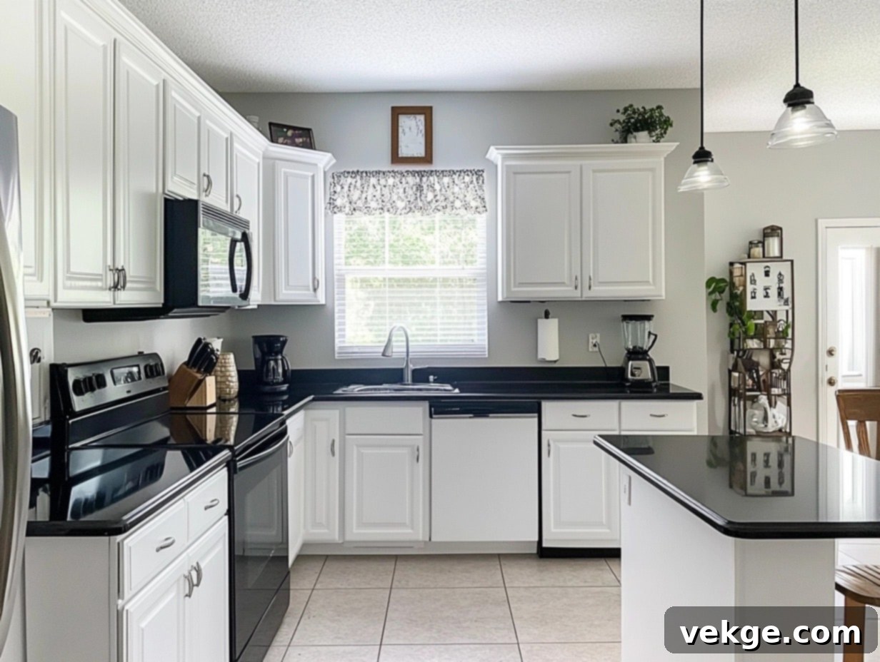
The Smith family undertook a significant kitchen renovation, opting for **Simply White** on their cabinetry and walls. They were amazed by the transformation. Here’s what made it a resounding success for them:
- Their existing dark granite countertops gained new prominence and contrast against the crisp white.
- The entire kitchen immediately felt larger, more open, and less cluttered.
- Decorative elements, like family photos and colorful dishware, appeared much brighter and more vibrant.
- The space maintained a consistently fresh and clean appearance throughout the busy day, despite heavy use.
Tom’s Productive Home Office Success with Gray Owl
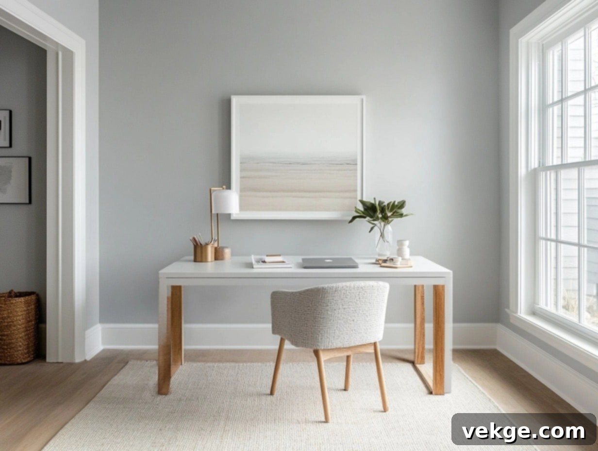
Tom, who primarily works from home, needed an office color that would foster focus without being distracting or dull. After sampling several options, he finally settled on **Gray Owl (OC-52)**. “It’s absolutely perfect,” he reported. “It’s not too dark to feel oppressive, nor too light to disappear. It’s just the right, balanced neutral for concentrating on my work without visual clutter.” The subtle green-blue undertones of Gray Owl keep the space feeling fresh and calming, ideal for long working hours.
Maria’s Serene Bedroom Makeover with Palladian Blue
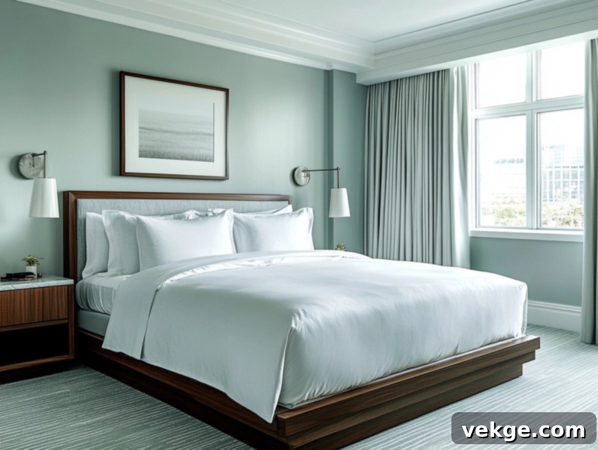
“I wanted my bedroom to feel like a luxurious, tranquil hotel retreat,” Maria explained. She achieved this by painting her walls with the ethereal **Palladian Blue**. To complete her desired aesthetic, she thoughtfully incorporated:
- Crisp, high-thread-count white bedding for a clean, inviting look.
- Soft gray curtains that beautifully complemented the blue-green walls.
- Elegant silver lamps and fixtures for a touch of refined sparkle.
- Natural, light-toned wood furniture to add warmth and organic texture.
The result was a breathtakingly serene room that now perfectly helps her unwind and relax after demanding work days, feeling truly like a personal oasis.
A Small Bathroom Win with Swiss Coffee
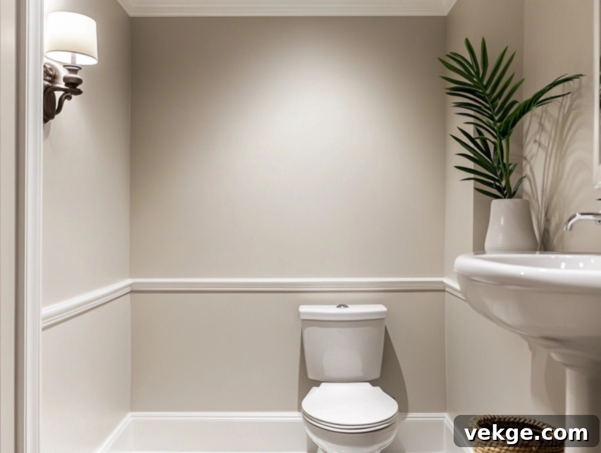
My client, Lisa, faced a common challenge: a tiny bathroom with no windows, feeling dark and cramped. She opted for **Swiss Coffee** on both the walls and the ceiling, a strategy that yielded remarkable results. Now, the space feels undeniably:
- Significantly bigger and more spacious, defying its actual dimensions.
- Brighter and more luminous, despite the lack of natural light, thanks to the warm, reflective quality of the paint.
- Cleaner and more pristine, creating a fresh and inviting atmosphere.
- Much more open and less claustrophobic, proving that the right paint can truly transform perception.
These real examples vividly illustrate how these carefully selected Benjamin Moore colors can positively impact real homes. The ultimate key lies in taking the time to observe how each shade uniquely interacts with your specific space, your existing decor, and your personal style, ensuring a truly personalized and successful outcome.
Conclusion
Selecting the perfect paint colors for your home doesn’t have to be a source of stress or uncertainty. Benjamin Moore offers an incredible palette of tried-and-true shades that consistently perform beautifully in a vast array of real homes and design styles. I’ve highlighted some of the most cherished and popular colors that countless homeowners and designers trust and adore.
As you embark on your own color journey, remember these fundamental principles:
- **Always test samples directly in your space:** This is the single most important step to prevent disappointment.
- **Observe colors under various lighting conditions:** Natural light, artificial light, and the time of day can dramatically alter a shade’s appearance.
- **Consider the intended function and mood of each room:** Let the purpose of the space guide your color choices to create a harmonious environment.
The right paint color possesses the power to transform your house into a home that feels uniquely “you” – a sanctuary that is comfortable, stylish, and inviting. Take your time with the selection process; there’s no need to rush such an impactful decision. Enjoy the creative journey!
Want to Dive Deeper? Explore my other detailed guides on specific Benjamin Moore colors for even more inspiration and expert insights:
- “Benjamin Moore Smoke: The Ultimate Guide of a Serene Shade” – Understand how this cool, sophisticated blue-gray can bring tranquility to your interiors.
- “Gray Mist Benjamin Moore: A Timeless Neutral for Every Room” – Discover the versatility and subtle warmth of this beloved greige.
Ready to start creating your dream home? Visit your local Benjamin Moore store with your ideas, sample swatches, and any questions you may have. The perfect color for your home is waiting for you to discover it.
Frequently Asked Questions About Benjamin Moore Paint Colors
What Makes Benjamin Moore’s Colors so Popular?
Benjamin Moore colors are celebrated for their exceptional quality, unparalleled durability, and remarkable versatility. They offer an expansive spectrum of over 3,500 distinct shades, meticulously crafted to cater to every conceivable style, mood, and space. Their colors are known for their timeless appeal, ensuring they remain relevant and beloved across evolving trends and years.
Can I Use Benjamin Moore Colors in Every Room of My Home?
Absolutely! Benjamin Moore’s extensive collection is designed to provide the perfect color solution for every single room in your home. Whether you’re seeking sophisticated neutral tones for bustling living rooms, profoundly calming shades for serene bedrooms, bold and impactful accents for modern kitchens, or tranquil hues for spa-like bathrooms, there’s a Benjamin Moore color perfectly suited to your style and functional needs.
How Do I Effectively Test Benjamin Moore’s Paint Colors Before Committing?
To test Benjamin Moore paint colors effectively, begin by ordering paint samples (pint-sized cans) or their convenient peel-and-stick swatches. Apply these samples to various walls in the room you intend to paint. Crucially, observe how the colors appear under both natural daylight and your typical artificial lighting throughout different times of the day before making your final, confident decision.
Where Can I Purchase Benjamin Moore Paints and Samples?
You can purchase Benjamin Moore paints and samples at any authorized local Benjamin Moore retailer or dedicated Benjamin Moore store. Additionally, their official website offers robust tools for exploring their extensive color options, creating digital palettes, and conveniently ordering peel-and-stick samples directly to your doorstep.
What Types of Finishes Does Benjamin Moore Offer for Their Paints?
Benjamin Moore provides a comprehensive range of paint finishes to match the specific demands and desired aesthetic of any room. Their options typically include matte (for a velvety, non-reflective look), eggshell (a subtle sheen, easy to clean), satin (slightly more sheen than eggshell, very durable), semi-gloss (a noticeable sheen, highly washable for trim and high-traffic areas), and high gloss (a reflective, mirror-like finish for maximum impact).
