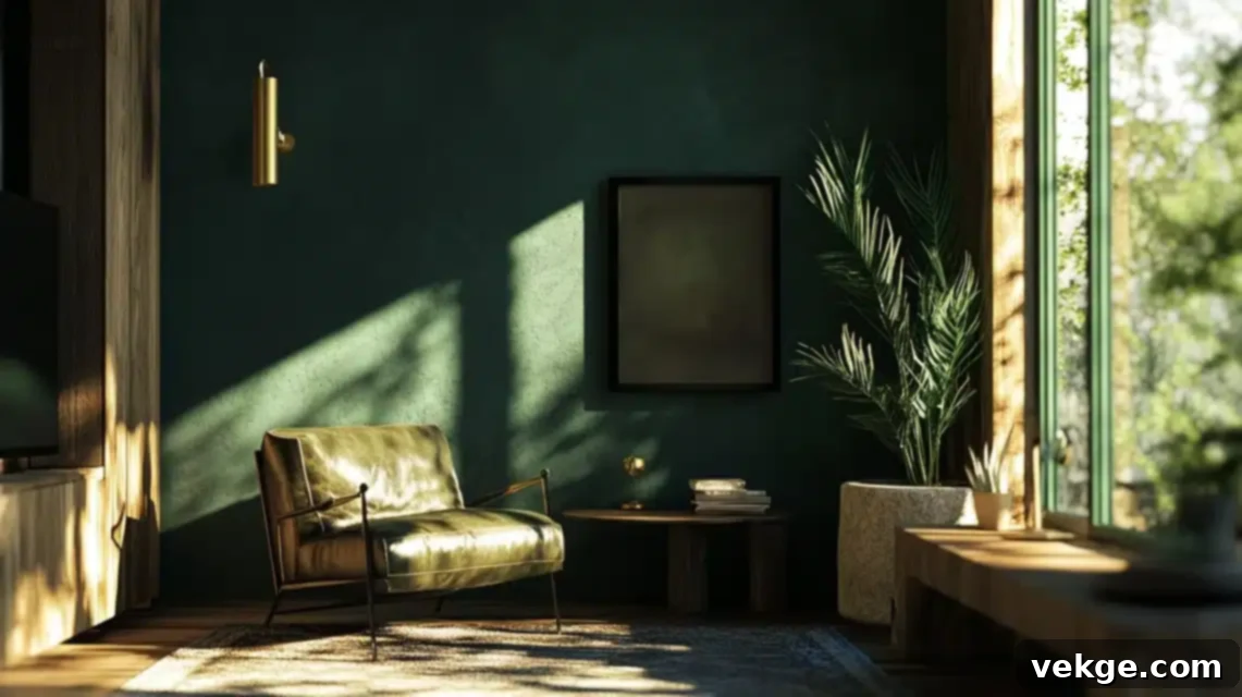
The Ultimate Guide to Dark Green Paint Colors: Discover 33 Shades for Your Home
Welcome to the definitive guide on transforming your living spaces with the timeless elegance of dark green paint. As an enthusiast for impactful interior design, I’ve had the pleasure of working extensively with a diverse spectrum of dark green hues, and I’m thrilled to share my insights to help you choose the perfect shade for your unique home. Dark green is more than just a color; it’s a statement of sophistication, a nod to nature, and a versatile backdrop that can evoke serenity, drama, or cozy intimacy. It provides a grounding presence and a touch of the natural world, making it a beloved choice for designers and homeowners alike.
In this comprehensive guide, we embark on a journey through 33 distinct dark green paint colors from some of the industry’s most respected brands: Benjamin Moore, Farrow & Ball, Sherwin Williams, Clare Paint, and Backdrop Home. Each meticulously selected color possesses its own unique character and specific qualities, making it ideally suited for particular spaces, design aesthetics, and various lighting conditions. Understanding these nuances is key to achieving your desired ambiance and ensuring your chosen green truly shines.
For every shade, I will provide an in-depth description of its visual characteristics, highlight its best applications within your home, explain how different lighting impacts its appearance, and suggest complementary colors and materials to create a harmonious and cohesive look. Whether you’re aiming for a bold feature wall, a calming bedroom retreat, a vibrant kitchen, or a sophisticated library, this guide will equip you with the knowledge to confidently select a dark green paint that truly resonates with your vision and enhances your home’s aesthetic appeal.
Best Dark Green Paint Colors from Benjamin Moore, Farrow & Ball, Sherwin Williams, and More…
Benjamin Moore’s Dark Green Paints
1. Great Barrington Green
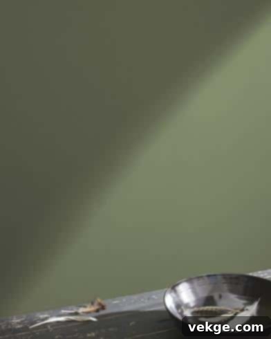
- Color Description: Great Barrington Green is a truly dramatic and profound deep green, characterized by its subtle yet distinct cool undertones. It offers a sense of depth and luxury, leaning towards a sophisticated jewel-tone rather than a bright, lively green, making it feel both classic and contemporary.
- Best Use/Applications: This striking shade is absolutely perfect for creating impactful moments in your home. It excels in smaller, intimate spaces like powder rooms, transforming them into jewel boxes of design. It’s also an exceptional choice for a statement wall in a living room, dining area, or even a home office, providing a rich backdrop without overwhelming the entire space.
- Lighting Impact: In various lighting conditions, Great Barrington Green reveals its versatility. When bathed in warm, natural light or paired strategically with gilded hardware, it develops a beautiful softening effect, appearing less stark and more inviting. In dimmer light, its dramatic depth becomes even more pronounced, creating an enveloping, sophisticated atmosphere.
- Complementary Colors: To fully enhance its allure, Great Barrington Green pairs exquisitely with gold accents and rich, metallic finishes, which draw out its inherent warmth and luxury. Consider incorporating geometric patterns in your decor, as they provide a crisp contrast that highlights the color’s elegant complexity. Warm woods and cream-colored textiles also offer a beautiful balance.
2. Mediterranean Teal
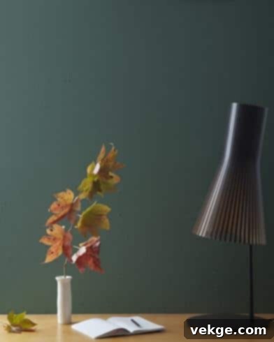
- Color Description: Mediterranean Teal is a captivating blue-leaning green that presents a deeper and more sophisticated take on standard teal shades. Its rich saturation creates a vibrant yet grounded feel, perfectly balancing the refreshing qualities of blue with the organic depth of green.
- Best Use/Applications: This inviting color is ideal for warming up spaces that might otherwise feel stark or lacking in character. Think of a minimalist dining room, a modern kitchen, or a hallway that needs an injection of color and personality. It adds a welcoming warmth without being overtly bright.
- Lighting Impact: Mediterranean Teal truly comes alive and reveals its full, mesmerizing depth in well-lit areas, particularly those with ample natural light. The light allows its blue-green fusion to shimmer, showcasing its complexity. In lower light, it deepens, offering a more mysterious and intimate ambiance.
- Complementary Colors: To highlight its serene yet warm qualities, Mediterranean Teal pairs beautifully with warm whites, such as off-white or creamy hues, which provide a crisp contrast. Incorporating natural textures like linen, jute, and light-toned wood enhances its organic feel, creating a cohesive and inviting environment.
3. Amazon Green
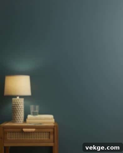
- Color Description: Amazon Green is a deeply saturated, lush green reminiscent of dense rainforest foliage. It boasts an intense vibrancy that is particularly striking when applied in a high-gloss finish, creating a luxurious and immersive color experience.
- Best Use/Applications: This bold and vivacious green is excellent for spaces designed for entertainment or focused activity. It makes a stunning impact in bar areas, transforming them into sophisticated hubs. It’s also exceptional for built-ins, cabinetry, or accent furniture, where its rich color can define a focal point and add a bespoke touch.
- Lighting Impact: The inherent glossiness of Amazon Green, when applied in a high-sheen finish, plays a crucial role in how it interacts with light. The reflective surface helps to bounce light around the room, making even a deeply saturated color feel bright and expansive rather than overwhelming, especially in well-lit rooms.
- Complementary Colors: Amazon Green looks absolutely stunning when paired with metallic accents such as brass, copper, or polished chrome, which enhance its opulent feel. Warm wood tones, neutral grays, and crisp whites also provide excellent contrast, allowing its rich depth to truly stand out.
4. Black Forest Green
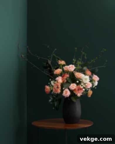
- Color Description: Black Forest Green is a profoundly deep green, masterfully infused with subtle black undertones that give it an air of mystery and sophistication. This characteristic makes it especially striking and almost jewel-like when presented in a glossy finish, revealing its complex depth.
- Best Use/Applications: This rich and luxurious shade is exceptionally beautiful in bathrooms, where it can create a spa-like retreat or a dramatic, opulent powder room. It’s also an ideal candidate for statement walls, particularly in dining rooms or studies, offering a powerful, sophisticated backdrop that commands attention.
- Lighting Impact: Black Forest Green showcases its richness and multifaceted character remarkably well in both abundant natural light and carefully curated artificial light. Natural daylight will reveal more of its green essence, while evening lighting can emphasize its deeper, near-black qualities, creating different moods throughout the day.
- Complementary Colors: To truly make Black Forest Green pop, consider pairing it with vibrant clover patterns or incorporating mirrored elements. Mirrored surfaces reflect light and contrast beautifully with the deep green, enhancing its visual impact. Gold or brass fixtures, along with crisp white trim, also provide a classic and elegant pairing.
5. Seaweed
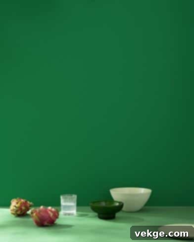
- Color Description: Benjamin Moore’s Seaweed is a distinctively rich and earthy green that carries a deep, organic quality. It is particularly well-suited for high-gloss applications, where its inherent depth can be amplified by a lustrous sheen, giving it a sophisticated and almost liquid appearance.
- Best Use/Applications: This captivating shade works exceptionally well in spaces designed for socializing and relaxation, making it a fantastic choice for home bars, entertainment rooms, or even an accent wall in a cozy den. Its depth creates an inviting and sophisticated atmosphere that encourages gathering.
- Lighting Impact: When applied with a glossy finish, Seaweed brilliantly reflects light, preventing the deep color from feeling too heavy or absorbing. This reflective quality helps to maintain a sense of openness and vibrancy, even in a highly saturated space, allowing the rich green to truly glow.
- Complementary Colors: Seaweed pairs particularly nicely with brass elements, which introduce a touch of warmth and classic elegance. Natural wood tones, crisp white trim, and subtle cream textiles also harmonize beautifully, enhancing its organic roots while providing sophisticated contrast.
6. Caribbean Teal
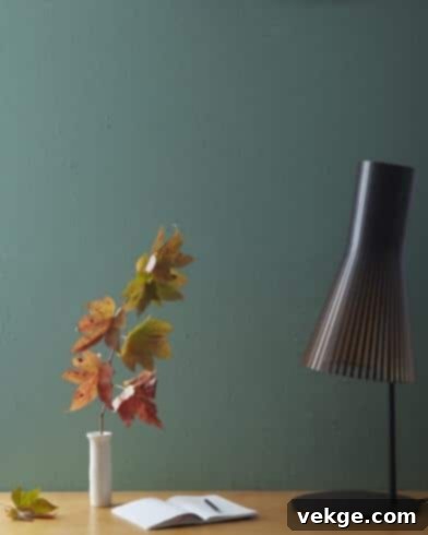
- Color Description: Caribbean Teal is a vibrant and balanced royal blue-green blend, offering a harmonious fusion that feels less blue-dominant than Mediterranean Teal. It captures the essence of tropical waters, bringing a refreshing yet rich color to any space.
- Best Use/Applications: This versatile shade is an excellent choice for living rooms, where it can provide a lively yet calming backdrop for social gatherings or quiet relaxation. It also feels perfectly at home in traditional spaces, complementing classic furnishings and architectural details with its elegant depth.
- Lighting Impact: One of Caribbean Teal’s strengths is its ability to maintain remarkable color consistency throughout the day, irrespective of varying light conditions. Its balanced blend ensures it looks appealing and true to its shade, whether bathed in bright morning sun or soft evening light, making it a reliable choice.
- Complementary Colors: Caribbean Teal works exceptionally well with traditional furnishings, including dark wood furniture and classic upholstered pieces, enhancing their stately presence. Light, neutral fabrics, brass accents, and subtle oceanic-inspired decor can further elevate its sophisticated and serene appeal.
7. Backwoods
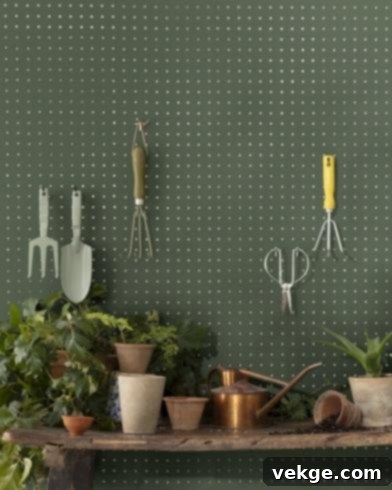
- Color Description: Backwoods is a profoundly rich, dark, and beautifully muted green, reminiscent of a deep forest canopy or ancient moss. It exudes an organic, grounding presence that feels both natural and incredibly sophisticated, striking a perfect balance between vibrancy and restraint.
- Best Use/Applications: This enveloping shade is absolutely perfect for creating wonderfully cozy and intimate spaces. Imagine it in a snug reading nook, a tranquil bedroom, or a welcoming den where you want to foster a sense of warmth and retreat from the outside world.
- Lighting Impact: Backwoods exhibits a fascinating interplay with light. In abundant natural light, it can appear as a lighter, more vibrant green, showcasing its forest-inspired depth. However, in low light conditions, its subtle brown undertones beautifully emerge, adding warmth and creating an even more enveloping and earthy ambiance.
- Complementary Colors: To enhance its natural charm, Backwoods pairs wonderfully with natural wood tones, such as oak or walnut, and other earthy elements like terracotta, stone, or woven textures. Creamy whites and soft grays can provide a lovely contrast, allowing its rich character to truly shine.
8. Essex Green
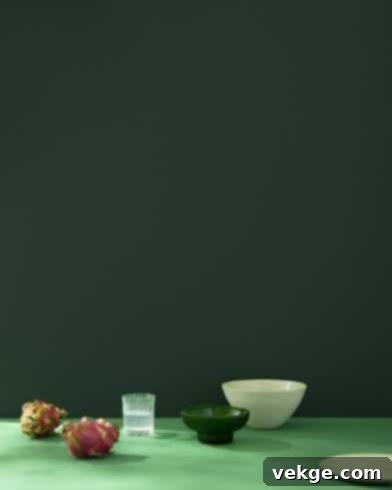
- Color Description: Essex Green is a deeply profound, dark green imbued with subtle blue undertones, which lends it an air of classic elegance and traditional charm. It’s a sophisticated shade that feels both historic and utterly timeless, offering a stately presence.
- Best Use/Applications: This distinguished color is an exemplary choice for spaces that demand a sense of gravitas and refinement, such as grand libraries, formal dining rooms, or sophisticated studies. It creates an atmosphere of quiet luxury and intellectual depth, perfect for reflection or formal gatherings.
- Lighting Impact: One of the striking characteristics of Essex Green is its dramatic transformation under varying light. In certain lighting conditions, particularly in lower light or shaded areas, its profound depth can cause it to appear almost black, adding to its mysterious and sophisticated allure. Brighter light, however, reveals its rich green essence.
- Complementary Colors: Essex Green works beautifully with classic trim colors like crisp white or creamy off-white, which provide a sharp contrast and highlight its depth. Polished brass fixtures, dark wood furniture, and rich leather upholstery are also ideal companions, enhancing its traditional and luxurious appeal.
9. Vintage Vogue
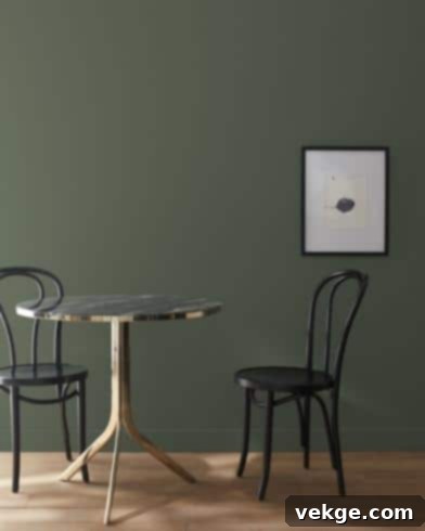
- Color Description: Vintage Vogue is a captivating deep green that distinguishes itself with subtle yet pronounced olive undertones and a wonderfully smoky, muted quality. This combination gives it a unique, aged character that feels both sophisticated and incredibly inviting, avoiding any overly bright or stark tendencies.
- Best Use/Applications: This versatile shade is remarkably adaptable, making it an excellent choice for a wide range of interior styles. It performs beautifully in both sleek, modern spaces seeking a touch of organic warmth and more traditional settings where it can enhance historical charm. It’s fantastic for living rooms, bedrooms, or even kitchen cabinetry.
- Lighting Impact: The olive undertones within Vintage Vogue become particularly pronounced and vibrant in natural light, showcasing its earthy warmth and subtle complexity. In dimmer or artificial light, its smoky quality becomes more evident, creating a cozy and enveloping atmosphere that feels both intimate and refined.
- Complementary Colors: Vintage Vogue harmonizes beautifully with warm neutrals such as creamy beiges, soft greiges, and delicate off-whites, which allow its nuanced green to truly shine. Natural wood tones, brass or antique gold accents, and organic textures like linen and wool further enhance its timeless appeal and comforting feel.
10. Dark Olive

- Color Description: Dark Olive is a profoundly rich, deep green anchored by a strong olive base, further nuanced by subtle brown and gray undertones. This complex blend results in a sophisticated, earthy shade that feels organic and utterly timeless, embodying natural elegance.
- Best Use/Applications: This color is absolutely perfect for creating natural, grounding spaces that evoke a sense of calm and connection to the outdoors. It’s an excellent choice for libraries, studies, dining rooms, or even an accent wall in a living room where you want to foster a sense of depth and tranquility.
- Lighting Impact: In natural light, Dark Olive closely resembles the deep, muted tones of actual olive leaves, revealing its full spectrum of earthy undertones and organic richness. In lower light, its brown and gray nuances become more prominent, creating a cozy, enveloping atmosphere that feels both comforting and sophisticated.
- Complementary Colors: Dark Olive works exceptionally well with warm taupes, creamy off-whites, and a variety of natural materials such as unpolished wood, stone, and leather. These pairings enhance its earthy character and contribute to a serene, grounded interior palette that feels both luxurious and inviting.
11. Goodwin Green

- Color Description: Goodwin Green is an intense, deeply saturated green that immediately brings to mind the vibrant and lush foliage of a verdant rainforest. It’s a pure, unadulterated green that exudes vitality and a sense of powerful natural beauty, making a bold statement.
- Best Use/Applications: This striking color is ideal for achieving dramatic monochromatic looks, enveloping a room in a single, immersive hue. It’s perfect for full-room coverage in spaces like bedrooms, dining rooms, or studies where you want to create a rich, enveloping atmosphere that feels both sophisticated and deeply calming.
- Lighting Impact: One of the remarkable qualities of Goodwin Green is its ability to maintain its profound depth and intense color saturation consistently across a wide range of lighting conditions. Whether under bright natural light or softer artificial illumination, it retains its lush character without washing out or appearing muddy.
- Complementary Colors: Goodwin Green pairs exceptionally well with deeper greens, creating a layered, biophilic aesthetic. Natural textures like wood, rattan, and linen also complement its organic feel beautifully. Consider contrasting it with crisp whites or warm off-whites for trim to make its depth truly pop.
12. Enchanted Forest
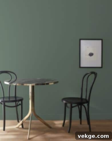
- Color Description: Enchanted Forest is a wonderfully misty green that possesses neutral-like qualities, making it incredibly adaptable. It blends the soothing essence of green with a subtle grayish undertone, resulting in a color that feels both natural and sophisticatedly understated.
- Best Use/Applications: This versatile shade serves as an excellent and refreshing alternative to more standard neutrals like taupe or gray. It’s perfect for living rooms, hallways, or bedrooms where you want a calming backdrop that isn’t bland, offering a touch of color without overwhelming the space.
- Lighting Impact: Enchanted Forest consistently creates a relaxing and serene atmosphere, regardless of the lighting conditions. Its muted quality ensures it never appears too bright or jarring, maintaining a soft, ethereal glow whether bathed in morning sunlight or softened by evening lamps.
- Complementary Colors: This flexible green works beautifully with both warm and cool color schemes. It pairs well with warm wood tones, creamy whites, and golden accents for a cozier feel. Alternatively, it harmonizes with cool grays, silvers, and crisp whites for a more modern and airy aesthetic, showcasing its remarkable adaptability.
13. Nature’s Reflection
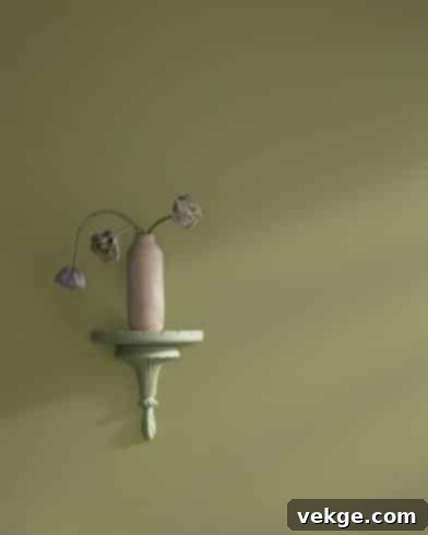
- Color Description: Nature’s Reflection is a harmonious green imbued with distinct earthy undertones, offering a balanced and grounding presence. It’s a sophisticated and mature green that evokes the quiet strength of the natural world, feeling both timeless and deeply comforting.
- Best Use/Applications: This highly versatile shade is an excellent choice for main living spaces, including living rooms, dining rooms, and even open-plan areas. Its balanced nature allows it to serve as a beautiful backdrop for various decor styles, from rustic farmhouse to modern organic.
- Lighting Impact: One of the key advantages of Nature’s Reflection is its ability to maintain impressive color consistency throughout different times of day. It holds its true character whether illuminated by bright morning light, softened by afternoon sun, or under artificial evening light, ensuring a reliable and pleasing aesthetic.
- Complementary Colors: To enhance its organic appeal, Nature’s Reflection pairs beautifully with a range of natural materials such as warm wood tones (like oak or cherry), exposed brick, and stone. Creamy whites, muted grays, and metallic accents like brass or bronze also work well, creating a refined yet welcoming palette.
14. Secret Path
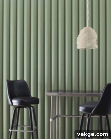
- Color Description: Secret Path is a refreshingly vibrant eucalyptus green, which manages to be both bright and incredibly sophisticated. It carries an invigorating yet serene quality, making it a unique and charming choice that stands out from more traditional dark greens.
- Best Use/Applications: This elegant green is remarkably versatile, making it suitable for a diverse array of spaces. It works beautifully in historic homes, lending a fresh perspective to classic architecture, and equally well in contemporary settings, where it can add a touch of natural brightness and subtle color. Consider it for kitchens, sunrooms, or even a child’s bedroom.
- Lighting Impact: Secret Path beautifully maintains its springy brightness and fresh quality throughout the entire day, regardless of changing light conditions. It avoids appearing dull or muted, consistently offering an uplifting and crisp presence that energizes the room.
- Complementary Colors: To enhance its inherent freshness and sophistication, Secret Path pairs wonderfully with classic whites, providing a crisp and clean contrast. Natural wood finishes, light grays, and subtle metallic accents like brushed nickel also complement its serene character, contributing to a balanced and inviting interior.
15. Waller Green

- Color Description: Waller Green is a truly sophisticated smoky green, offering a much more nuanced and complex alternative to a standard charcoal or gray. It carries a depth that hints at its green roots while providing the understated elegance of a refined neutral, making it incredibly versatile.
- Best Use/Applications: This distinguished shade is perfect for creating dignified and serene atmospheres in bedrooms, promoting restful sleep and quiet contemplation. It also shines in dining rooms, where it can provide a refined and sophisticated backdrop for entertaining, adding a touch of understated luxury.
- Lighting Impact: Waller Green cleverly reads as a more complex and interesting alternative to conventional dark neutrals. In different lighting, its green undertones can become more or less pronounced, preventing it from ever looking flat, and ensuring it maintains its sophisticated character throughout the day.
- Complementary Colors: Waller Green works beautifully with silver tones, brushed nickel, and cool whites, which emphasize its refined and slightly cooler aspects. Incorporating rich textures like velvet or silk, alongside dark wood furniture, can further enhance its luxurious and dignified appeal, creating a truly elegant space.
16. Nicolson Green
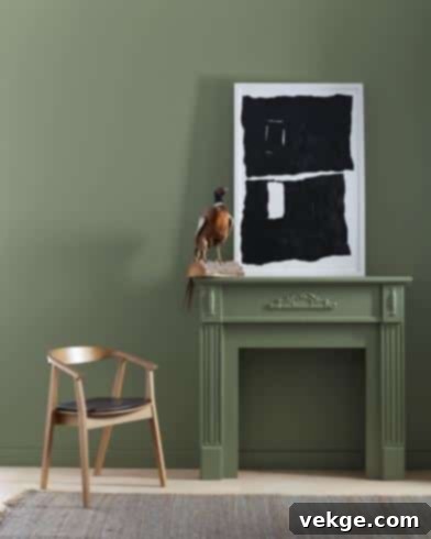
- Color Description: Nicolson Green is a deep, cool-toned green directly inspired by the rich and authentic palette of Colonial Williamsburg’s revival. It embodies historical elegance and a timeless quality, offering a stately and dignified presence that speaks of heritage.
- Best Use/Applications: This classic shade is an impeccable choice for traditional spaces and rooms designed with a historic-inspired aesthetic. It’s ideal for formal living rooms, studies, or dining areas where you wish to evoke a sense of period authenticity and sophisticated charm, providing a rich, immersive backdrop.
- Lighting Impact: Nicolson Green is celebrated for its ability to maintain its elegant and deep appearance consistently across various lighting conditions. Its inherent coolness and depth ensure that it remains true to its historic character, looking stately and refined whether in bright daylight or under the soft glow of lamps.
- Complementary Colors: To honor its historical roots, Nicolson Green pairs perfectly with traditional whites and creamy off-whites for trim and architectural details. Incorporating period-appropriate accents such as antique furniture, brass fixtures, and classic textiles will further enhance its authentic and sophisticated appeal.
Farrow & Ball’s Dark Green Paints
17. Ash Grey
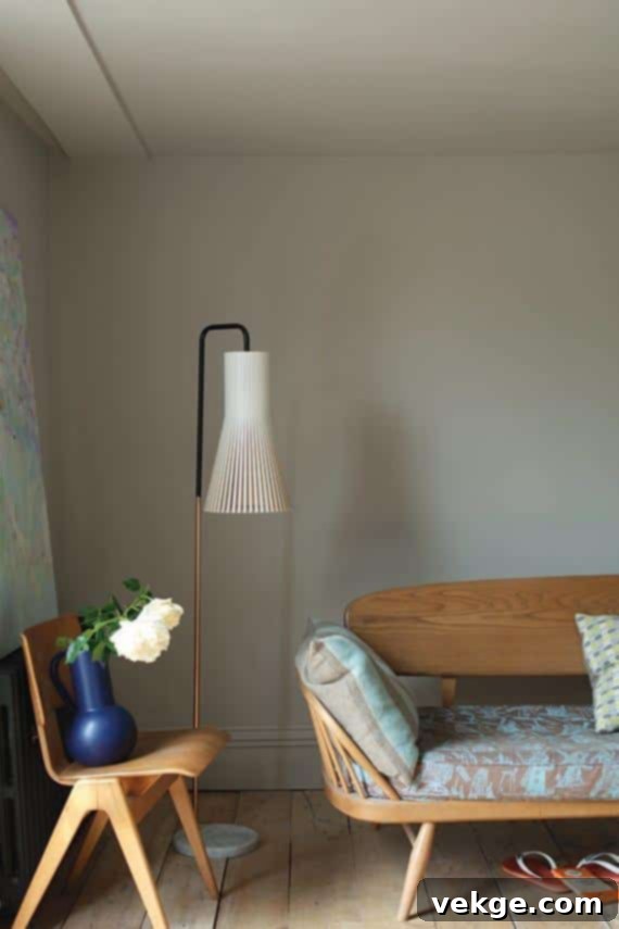
- Color Description: Farrow & Ball’s Ash Grey is a wonderfully snug green-gray blend that, despite its name, consistently reads more green than gray in most settings. It possesses a soft, muted quality that makes it feel incredibly natural and calming, striking a perfect balance between earthiness and subtlety.
- Best Use/Applications: This inviting color is perfect for creating intimate and comforting spaces such as snugs, cozy reading nooks, or serene bedrooms. Its understated charm makes it ideal for areas where relaxation and quiet contemplation are desired, creating a warm embrace.
- Lighting Impact: Ash Grey works exceptionally well when contrasted against dramatic outdoor views, such as mountains or lush gardens. The indoor green-gray hue beautifully complements the natural landscape, enhancing the connection between interior and exterior. Its muted nature prevents it from clashing with vibrant outdoor scenes.
- Complementary Colors: To amplify its natural appeal, Ash Grey pairs beautifully with other natural materials like light wood tones, stone, and wool textures. It also harmonizes with mountain-inspired palettes, including muted blues, earthy browns, and soft creams, creating a cohesive and tranquil environment.
18. Bancha
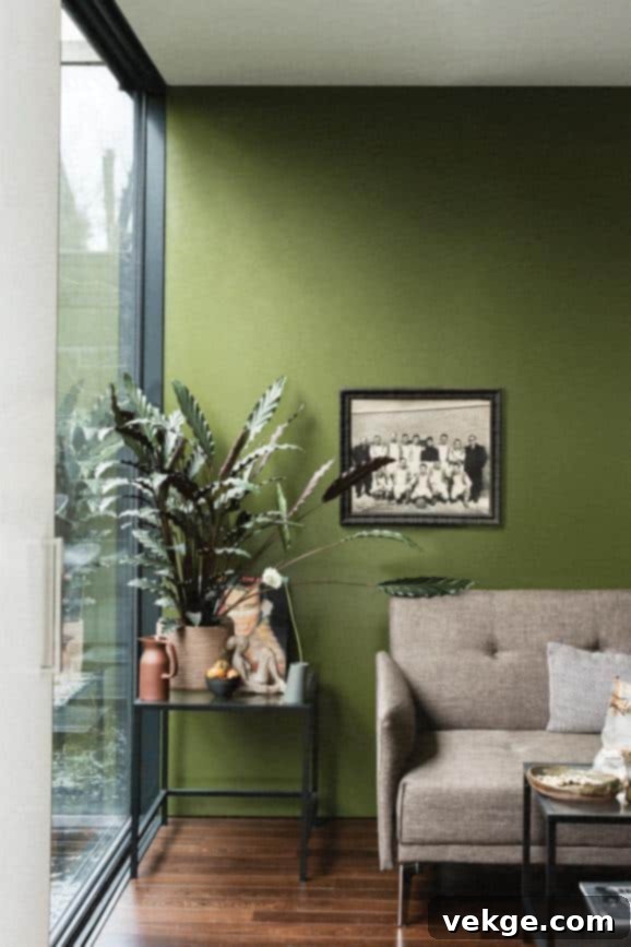
- Color Description: Bancha is a distinctive cool-toned dark green that draws its inspiration from the deep, earthy tones of Japanese tea leaves. It possesses a grounded, organic quality, acting as a sophisticated bridge that seamlessly brings the soothing elements of the outdoors inside, promoting a sense of calm and nature.
- Best Use/Applications: This elegant green is an excellent choice for formal sitting rooms, studies, or any space that benefits from a strong visual connection to outdoor views, such as a garden or courtyard. It provides a refined backdrop that grounds the room and enhances its natural surroundings.
- Lighting Impact: Bancha expertly reflects natural light while consistently maintaining its inherent depth and rich character. It prevents the color from feeling heavy or overpowering, allowing it to subtly shift and reveal its nuances without ever losing its sophisticated, cool essence, making the room feel bright yet deeply colored.
- Complementary Colors: Bancha pairs beautifully with natural oak planks, light-toned natural limestone, and the vibrant greenery of a courtyard or garden, creating a truly harmonious and biophilic design. Warm creams, soft grays, and dark metallic accents also complement its sophisticated and natural appeal.
19. Treron
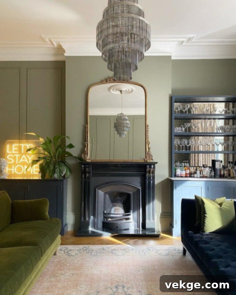
- Color Description: Treron is a wonderfully calming gray-green blend, a darker version of the popular Pigeon shade, that evokes the muted, serene colors found in coastal settings. It offers a subtle and sophisticated depth, making it feel both established and incredibly tranquil.
- Best Use/Applications: This peaceful shade is exceptionally well-suited for bedrooms, where its calming influence can promote relaxation and restful sleep. It’s also ideal for any space designated for unwinding, like a quiet sitting area or a meditation nook, creating a serene sanctuary.
- Lighting Impact: Treron shows its full, nuanced beauty particularly well in rooms adorned with shiplap or other textured walls. The interplay of light and shadow on these surfaces enhances the color’s depth and subtle variations, giving it an even richer and more inviting presence.
- Complementary Colors: To amplify its serene, coastal-inspired vibe, Treron pairs beautifully with beach-inspired neutrals such as sandy beiges, off-whites, and muted blues. Natural wood tones, woven textures, and soft linen fabrics also enhance its calming and organic appeal, creating a cohesive and tranquil environment.
20. Calke Green
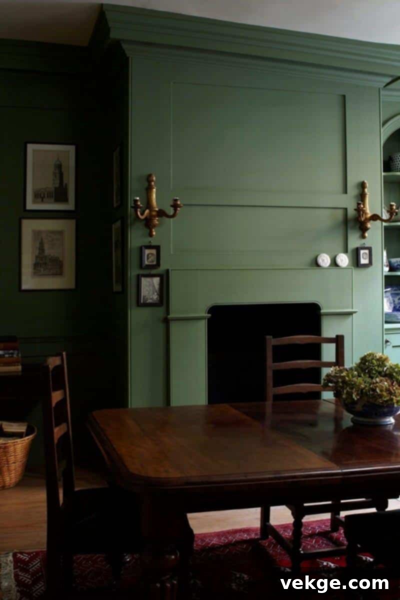
- Color Description: Calke Green is a profoundly rich basil green, offering a deeper and more intensely saturated tone than many traditional greens. It captures the essence of lush, dark foliage, providing a sophisticated and somewhat formal character that feels both vibrant and deeply rooted.
- Best Use/Applications: This invigorating shade is an excellent choice for spaces that could benefit from renewed life and a touch of grandiosity. It shines brightly in libraries, studies, or formal dining rooms, infusing them with an aristocratic charm and a sense of thoughtful contemplation.
- Lighting Impact: Calke Green adeptly adds significant depth to a room while meticulously maintaining its visibility and rich color, rather than receding into shadow. It allows its strong green character to shine through, providing a continuous sense of lushness in various lighting conditions.
- Complementary Colors: To emphasize its classic and rich nature, Calke Green pairs beautifully with traditional wood tones, such as mahogany or cherry, and classic furnishings. Gold accents, rich textiles like velvet, and crisp off-whites for trim will further elevate its sophisticated and timeless appeal, creating an opulent yet inviting space.
21. Studio Green
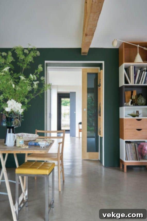
- Color Description: Studio Green is an exceptionally rich and profound shade that, in many lights, reads as almost near-black, embodying a dramatic and intense depth. It is a highly saturated, almost inky green that offers a feeling of enveloping luxury and sophisticated mystery, making a bold statement.
- Best Use/Applications: This deeply atmospheric color is perfect for creating moody bedrooms, where its intensity can foster a sense of ultimate tranquility and intimacy, ideal for unwinding. It also excels in intimate spaces like powder rooms or studies, transforming them into luxurious and enveloping sanctuaries.
- Lighting Impact: Studio Green exhibits a remarkable chameleon-like quality with light. In dim lighting, it appears almost black, creating an incredibly dramatic and intimate ambiance. However, when bathed in natural light, its hidden emerald tones beautifully reveal themselves, adding a surprising vibrancy and depth.
- Complementary Colors: To balance its intense depth, Studio Green pairs elegantly with metallic accents, particularly brass or antique gold, which provide a touch of warmth and glamour. Light, contrasting textiles like crisp whites or creamy off-whites, along with dark wood furniture, will also enhance its sophisticated and dramatic appeal.
22. Duck Green
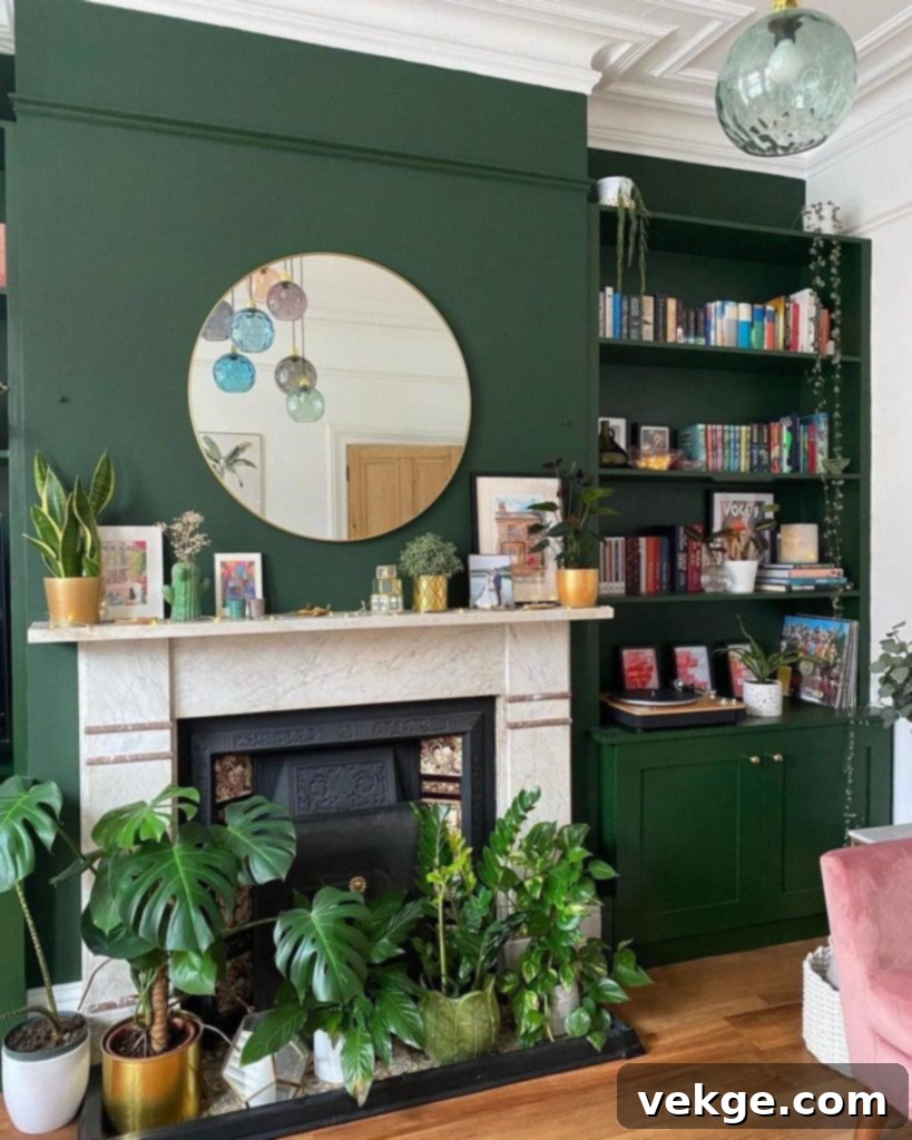
- Color Description: Duck Green is a deeply rich, jewel-like green, distinguished by its mature and complex undertones that give it an understated elegance. It’s a sophisticated, timeless shade that evokes the deep, lustrous color of a mallard’s plumage, providing a sense of established luxury.
- Best Use/Applications: This sumptuous shade is an impeccable choice for bedrooms, where it can create an incredibly soothing and sophisticated retreat, promoting rest and relaxation. It’s also ideal for dining rooms, imbuing them with a sense of formality and refinement, perfect for elegant entertaining.
- Lighting Impact: Duck Green is celebrated for its ability to maintain its sumptuous and rich quality consistently across varying light conditions. Its deep saturation ensures that it never appears washed out or overly bright, always delivering its characteristic elegance whether in soft morning light or dramatic evening illumination.
- Complementary Colors: To fully embrace its luxurious character, Duck Green pairs exquisitely with rich fabrics like velvet, silk, or chenille. Classic furnishings, dark wood tones, and metallic accents such as brass or bronze further enhance its sophisticated charm, creating an interior that feels both opulent and inviting.
Sherwin Williams’ Dark Green Paints
23. Country Squire
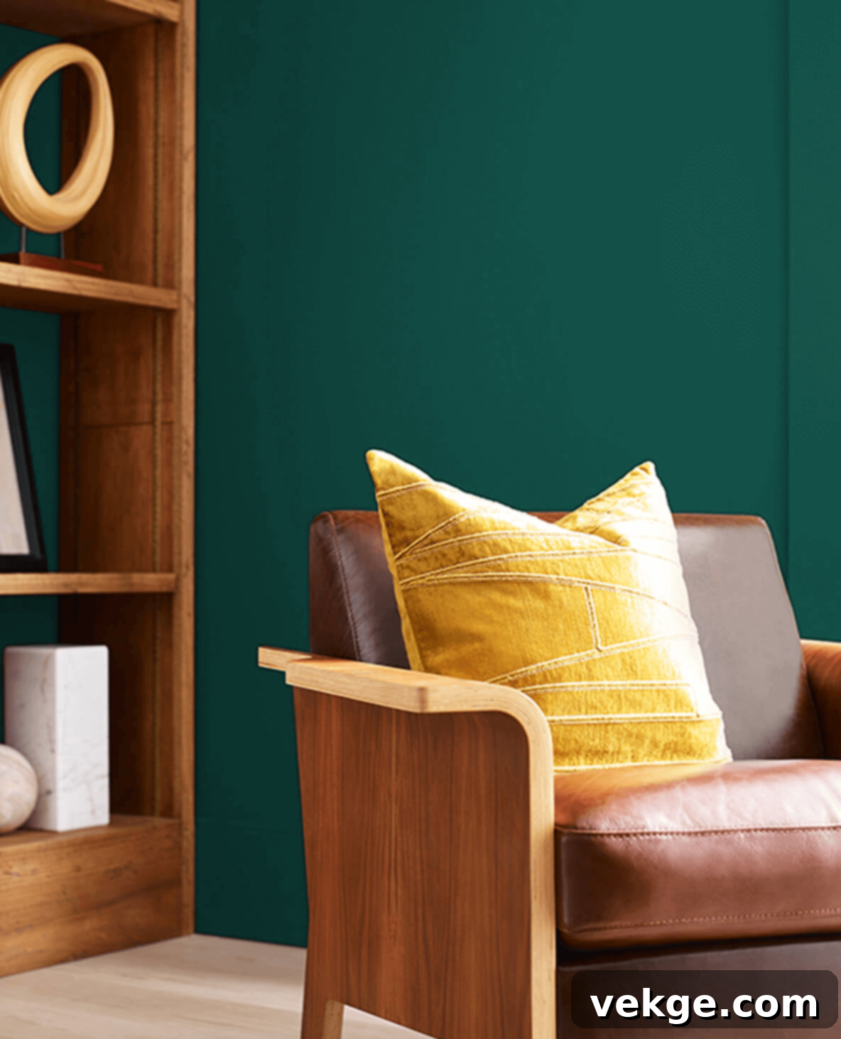
- Color Description: Country Squire is a vibrant, deep emerald green that exudes a strong and classic presence, reminiscent of manicured estates and traditional elegance. It’s a bold yet refined shade that brings a touch of regal sophistication to any space.
- Best Use/Applications: This distinguished color is absolutely perfect for mudrooms, transforming these often utilitarian spaces into stylish and welcoming entry points. It also works wonderfully in transitional spaces like hallways or entryways, immediately setting a tone of classic charm and depth.
- Lighting Impact: Country Squire expertly creates significant depth and character, particularly in entryways and connecting spaces. Its rich saturation ensures it holds its own, providing a grounding yet vibrant presence that warmly welcomes guests and residents alike, even in areas with varying light.
- Complementary Colors: To enhance its classic appeal, Country Squire pairs beautifully with black-and-white tiles, creating a timeless and elegant contrast. Vintage iron accents, dark wood furniture, and crisp white trim also work exceptionally well, reinforcing its traditional charm and sophisticated character.
24. Ripe Olive
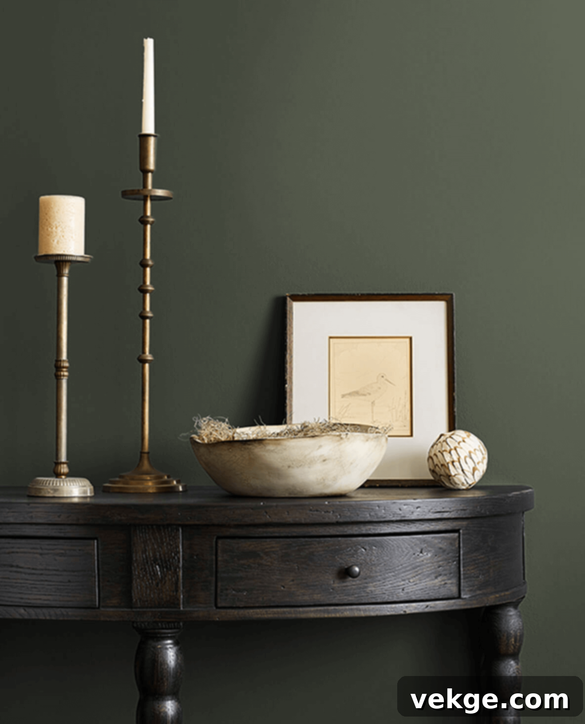
- Color Description: Ripe Olive is a deeply rich clay green that borders on black, offering a profoundly earthy and sophisticated hue. Its intensity gives it a gravitas that is both grounding and incredibly chic, making it a compelling choice for those seeking a dramatic natural shade.
- Best Use/Applications: This enveloping color is an excellent choice for creating intimate dining areas, such as breakfast nooks or smaller dining rooms, where it can foster a cozy and welcoming atmosphere. It’s also fantastic for creating a focal point in a kitchen or study, adding depth and character.
- Lighting Impact: Ripe Olive is a master at setting a moody and sophisticated scene, consistently maintaining its deep, dramatic character in virtually any lighting condition. Whether bathed in soft morning light or illuminated by warm evening lamps, it retains its enveloping charm, making it a highly reliable choice for ambiance.
- Complementary Colors: To lighten and balance its profound depth, Ripe Olive pairs beautifully with light woods, such as maple or birch, and cream-colored textiles, which provide a soft contrast. Brass or gold accents and crisp white trim also work wonderfully, adding a touch of elegance and warmth to its earthy foundation.
25. Pewter Green
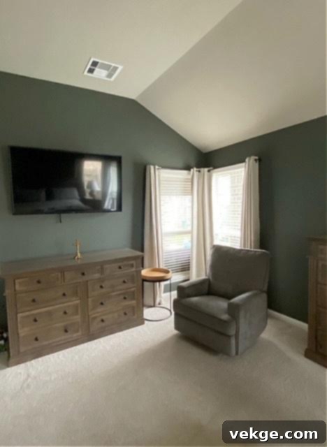
- Color Description: Pewter Green is a beautifully muted green that distinguishes itself with sophisticated gray undertones, making it incredibly versatile and understated. It’s a softer, more subtle dark green that feels grounded and serene, embodying a quiet elegance rather than overt vibrancy.
- Best Use/Applications: This highly adaptable shade is truly versatile for almost any room in the home, but it particularly excels in living spaces, bedrooms, and even bathrooms. Its calming nature makes it ideal for areas where you desire a sense of tranquility and refined simplicity.
- Lighting Impact: Pewter Green shows a lovely transformation with light. In abundant natural light, it appears distinctly lighter and brighter, allowing its green essence to shine. In lower light, its warm brown undertones subtly emerge, creating a cozier, more inviting atmosphere that feels both comforting and complex.
- Complementary Colors: Pewter Green harmonizes beautifully with natural woods (both light and dark), crisp whites, and warm metals like brass or copper. These pairings enhance its sophisticated gray-green character and contribute to a balanced, earthy palette that feels both modern and timeless.
26. Sage Green Light
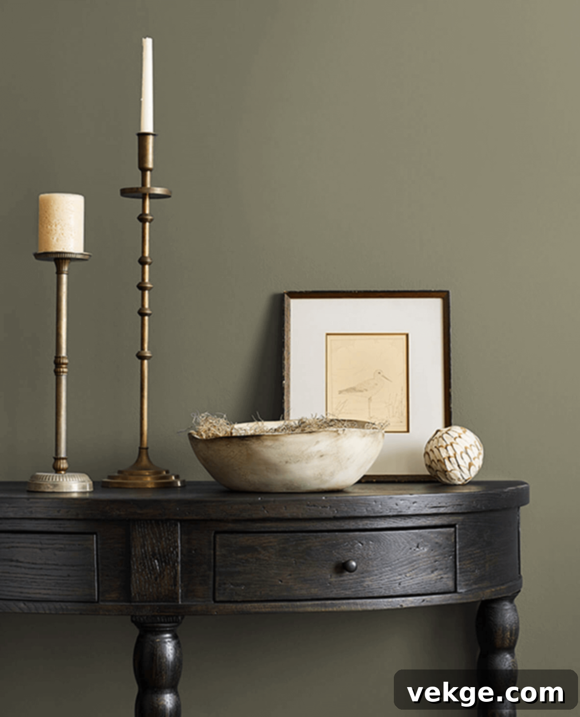
- Color Description: Despite its name, Sage Green Light offers a soft, muted green hue with subtle gray and yellow undertones that can lean towards a darker, more sophisticated sage in certain conditions. It’s a calming, organic color that feels incredibly peaceful and natural, without being overly vibrant.
- Best Use/Applications: This gentle shade is an excellent choice for living spaces, bedrooms, or any room where you are seeking to create a calm, soothing, and serene atmosphere. Its understated elegance makes it a perfect backdrop for relaxation and quiet contemplation, blending effortlessly into various design styles.
- Lighting Impact: Sage Green Light is highly adaptable and performs well across different lighting conditions, consistently maintaining its soft, inviting character. While it brightens in direct light, its muted nature ensures it never feels stark, offering a gentle presence that promotes tranquility.
- Complementary Colors: This versatile green works wonderfully with a wide array of color schemes and natural materials. It pairs beautifully with warm neutrals like cream, beige, and taupe, as well as light wood tones and crisp whites. Metallic accents like brushed gold or silver also complement its serene and organic appeal.
27. Secret Garden
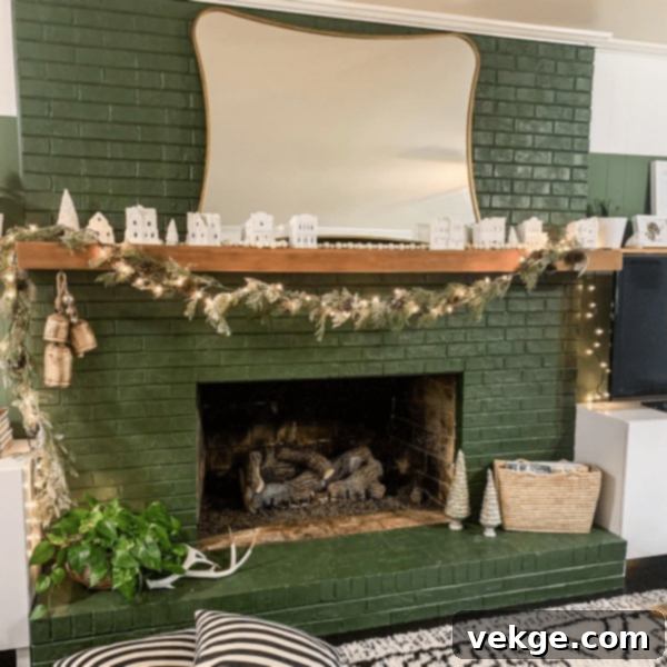
- Color Description: Secret Garden is a deeply rich green distinguished by noticeable brown and gray undertones, giving it a complex, organic, and slightly mysterious character. It’s a sophisticated shade that evokes the lush, hidden depths of an enchanted, secluded space in nature.
- Best Use/Applications: This evocative color is ideal for spaces where you specifically want to create a sense of profound warmth, depth, and intimacy. It’s excellent for studies, dining rooms, or a master bedroom, enveloping the room in a comforting and luxurious embrace that feels both serene and inviting.
- Lighting Impact: Secret Garden reveals more of its vibrant green character and complexity in natural light, showcasing its subtle nuances. Conversely, in low light or artificial illumination, its brown and gray undertones become more prominent, creating a muted, cozier, and more enveloping ambiance, perfect for evening hours.
- Complementary Colors: To enhance its earthy and rich qualities, Secret Garden pairs beautifully with other earth tones such as terracotta, deep browns, and warm taupes. Crisp warm whites for trim and ceiling, along with natural wood furniture and metallic accents like antique bronze, will complete a sophisticated and grounding palette.
28. Dried Thyme
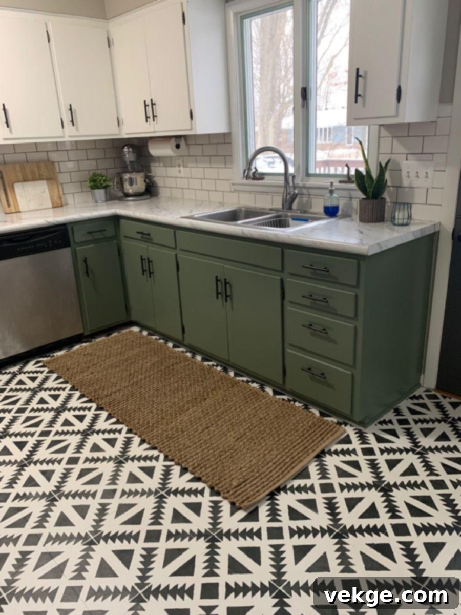
- Color Description: Dried Thyme is a sophisticated medium to dark muted green, imbued with distinctly earthy qualities and subtle gray undertones. It evokes the calming essence of dried herbs, offering a timeless and organic appeal that feels both natural and incredibly refined, avoiding any harshness.
- Best Use/Applications: This highly versatile shade is an excellent choice for various spaces that can benefit from its natural warmth and understated elegance. It works beautifully in kitchens, bathrooms, living rooms, or even as an exterior accent, seamlessly blending into diverse design aesthetics.
- Lighting Impact: Dried Thyme exhibits a lovely duality with light. It appears more vibrant and lively in bright, natural light, revealing its subtle green character. In dimmer conditions or evening light, it transforms into a muted, cozy, and more enveloping shade, providing warmth and depth that feels intimate.
- Complementary Colors: To highlight its earthy roots, Dried Thyme pairs exceptionally well with gray and brown neutrals, creating a harmonious and sophisticated palette. Natural textures like linen, rattan, and light wood tones, along with creamy whites, further enhance its organic charm and relaxed elegance.
Clare Paint’s Dark Green Paints
29. Daily Greens
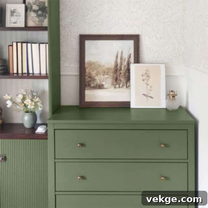
- Color Description: Daily Greens is a contemporary take on a deep olive green, offering a sophisticated and slightly desaturated hue that feels modern yet deeply rooted in nature. It’s a balanced shade that is neither too bright nor too muted, providing a fresh and enduring appeal.
- Best Use/Applications: This elegant green is particularly well-suited for home offices, fostering an environment of focus and calm. It also makes a striking statement on walls with mantels, drawing attention to architectural features. Consider it for full wall coverage in a living room or dining area to create an enveloping, refined atmosphere.
- Lighting Impact: Daily Greens skillfully maintains its richness and depth while consistently presenting itself as fresh and current, regardless of the lighting conditions. It avoids becoming dull in low light and doesn’t overwhelm in bright light, ensuring a consistently inviting and sophisticated presence.
- Complementary Colors: To elevate its modern twist, Daily Greens pairs beautifully with luxe finishes such as polished chrome or brushed gold, and contrasts wonderfully with vintage furnishings, creating an eclectic yet cohesive look. Creamy whites, natural wood, and subtle abstract art also complement its refined character.
30. Current Mood

- Color Description: Current Mood is a captivating deep blue-green that carries an undeniable modern freshness, blending the calming qualities of blue with the grounding essence of green. It’s a sophisticated and vibrant shade that makes a confident statement without being overpowering.
- Best Use/Applications: This bold yet serene color works exceptionally well for full wall coverage, creating an immersive and enveloping experience in bedrooms or living rooms. It’s also a fantastic choice for ceilings, where it can add an unexpected touch of depth and unique character, making the room feel more expansive and thoughtfully designed.
- Lighting Impact: Current Mood adapts remarkably well to various lighting, from bright spring-like conditions to more subdued settings. Its balanced blue-green blend ensures it consistently appears vibrant and fresh, bringing a lively yet sophisticated energy to the space throughout the day, never losing its unique charm.
- Complementary Colors: To enhance its modern freshness, Current Mood pairs beautifully with dusty pink, creating a chic and playful contrast. Light spring colors like soft yellows or pale peaches, along with crisp whites and natural wood tones, also complement its invigorating yet grounded appeal, fostering a contemporary and inviting palette.
31. Field Trip
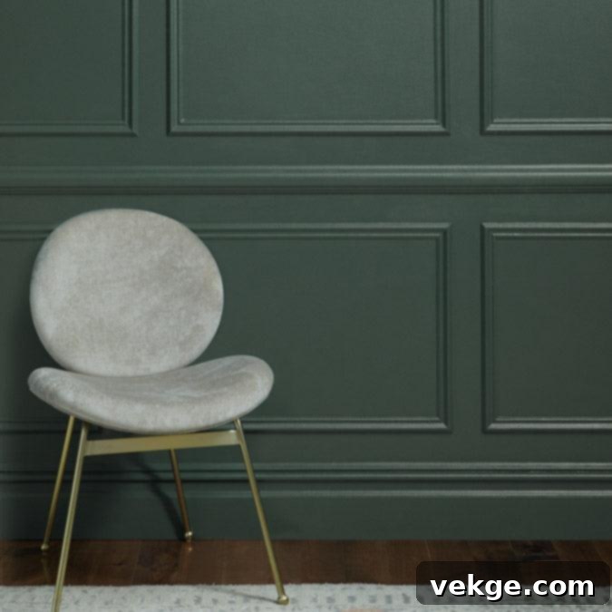
- Color Description: Field Trip is a perfect medium-deep olive green, distinguished by its innate natural appeal and a balanced earthiness. It avoids being too dark or too bright, offering a grounded and versatile hue that feels both inviting and subtly sophisticated, echoing the colors of nature.
- Best Use/Applications: This captivating shade is an excellent choice for accent walls, where it can define a focal point without overwhelming the room. It’s also incredibly effective for wainscoting, adding architectural interest and a touch of classic charm. Consider it for kitchen islands or built-ins as well, offering a pop of organic color.
- Lighting Impact: Field Trip offers a visually stimulating presence without ever becoming overwhelming, even in brighter lights. Its balanced depth ensures that it consistently adds character and interest to a space, maintaining its natural appeal and harmonious quality across different lighting conditions.
- Complementary Colors: Field Trip pairs beautifully with natural woods, such as oak or pine, enhancing its organic roots. Neutral accents like creamy whites, warm beiges, and soft grays also work wonderfully, providing a balanced backdrop that allows the sophisticated olive green to truly shine. Metallic accents in bronze or antique brass add a touch of warmth.
Backdrop Home’s Dark Green Paints
32. Lawn Party
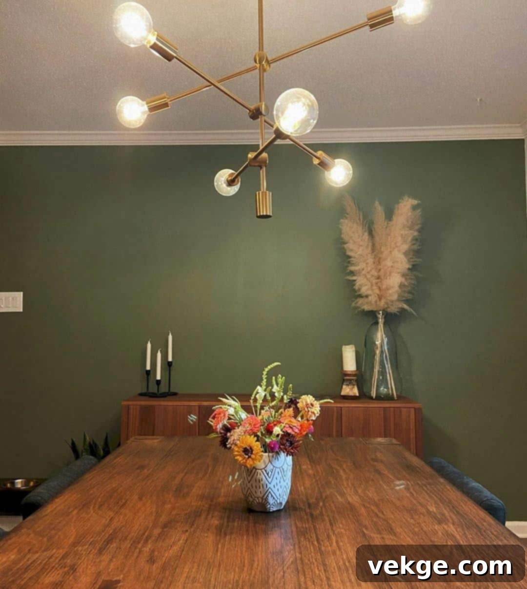
- Color Description: Lawn Party is a delightful matte moss-green that evokes the serene and calming qualities of a spa retreat. It’s a muted, sophisticated green that feels incredibly soft and tranquil, bringing a touch of gentle nature indoors without being overly vibrant or demanding.
- Best Use/Applications: This soothing shade is an ideal choice for rooms where you actively seek a peaceful, retreat-like feel, such as bedrooms, bathrooms, or meditation spaces. It creates an atmosphere of quiet luxury and ultimate relaxation, perfect for unwinding after a long day.
- Lighting Impact: Lawn Party consistently creates an effortlessly calming atmosphere in any lighting condition. Its matte finish absorbs light gently, ensuring that the color remains soft and inviting, never appearing harsh or overly bright, making it a reliable choice for serene interiors.
- Complementary Colors: To enhance its spa-like qualities, Lawn Party pairs wonderfully with painterly accents, soft flowing fabrics, and relaxed furniture pieces in natural materials. Crisp whites, creamy neutrals, light wood tones, and hints of brushed gold or silver also complement its tranquil and sophisticated appeal.
33. Kismet
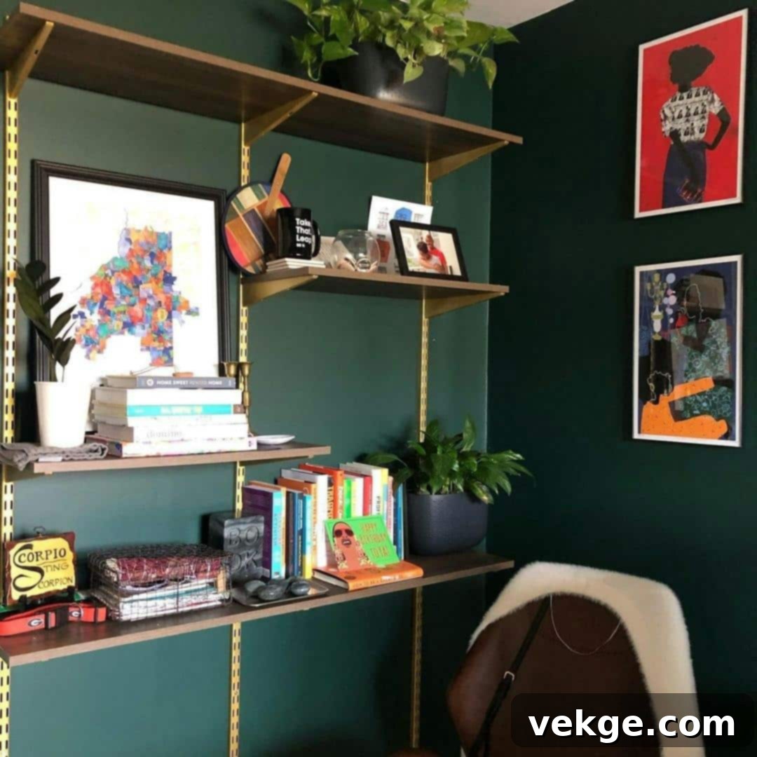
- Color Description: Kismet is a classic deep hunter green that impressively functions as a refined neutral, thanks to its profound depth and understated elegance. It’s a timeless, versatile shade that offers a grounding presence and a sophisticated backdrop without demanding all the attention.
- Best Use/Applications: This highly adaptable color is an excellent choice for kitchen islands, where it can provide a striking focal point and a pop of rich color against lighter cabinetry. It also works beautifully to accent white kitchens, adding depth and a touch of organic warmth to a crisp, clean aesthetic.
- Lighting Impact: Kismet is exceptionally good at providing the perfect amount of contrast in bright spaces. Its deep tone stands out beautifully against lighter elements, ensuring it maintains its sophisticated presence and adds visual interest without appearing overwhelming or too dark, even in sunny rooms.
- Complementary Colors: To fully leverage its refined character, Kismet pairs beautifully with crisp white countertops, white subway tiles, and light cabinetry, creating a fresh and elegant contrast. Leather accents, brass hardware, and warm wood tones also complement its classic appeal, contributing to a balanced and luxurious interior.
Answering Some Additional Queries You Might Have Regarding Dark Green Paint
How will dark green paint affect the mood of a room?
Dark green paint possesses a remarkable ability to profoundly influence the mood of a room, largely due to its strong association with the natural world. By bringing the calming and restorative essence of forests and lush landscapes indoors, it instantly instills a sense of peace, balance, and tranquility. This grounding effect can help reduce stress and create a sanctuary-like atmosphere where you can truly unwind and reconnect. Beyond its serene qualities, dark green also imbues a space with undeniable sophistication and a feeling of established elegance. It’s a color that speaks of heritage and quality.
From my experience, dark greens expertly balance drama with comfort. They can make large, open spaces feel more intimate and inviting, preventing them from feeling cold or cavernous. In smaller rooms, they create a cozy, enveloping “jewel box” effect that is both luxurious and deeply comforting. This unique combination of sophistication and warmth makes dark green an ideal choice for creating intimate gathering spaces, serene bedrooms, or productive home offices where focus and calm are paramount. It’s a color that encourages lingering, conversation, and relaxation, making any room feel more intentionally designed and lived-in.
Which dark green paint colors are currently trending?
The popularity of dark green continues to soar, as homeowners increasingly seek to bring nature-inspired elements and a sense of calm sophistication into their interiors. Several shades, in particular, are capturing the attention of designers and DIY enthusiasts:
- Pewter Green (Sherwin Williams): This muted green with sophisticated gray undertones is highly popular for its incredible versatility, blending seamlessly into various styles from modern farmhouse to contemporary minimalist.
- Studio Green (Farrow & Ball): Coveted for its exceptionally rich, almost black quality, Studio Green is a top choice for creating dramatic, moody, and luxurious spaces, particularly in bedrooms and powder rooms.
- Current Mood (Clare Paint): Offering a fresh and modern take on traditional green with its deep blue-green blend, Current Mood is trending for those looking for a vibrant yet refined statement.
- Essex Green (Benjamin Moore): A classic and timeless deep green with subtle blue undertones, Essex Green remains a perennial favorite for traditional homes and spaces seeking an air of historic elegance.
- Backwoods (Benjamin Moore): Gaining significant popularity for its rich, forest-inspired depth and beautiful muted quality, Backwoods is perfect for creating truly cozy and enveloping interiors.
These trending greens reflect a desire for both comfort and sophistication, offering a range of undertones to suit diverse design preferences.
How does lighting influence the appearance of dark green paint?
Lighting is one of the most critical factors in how dark green paint appears in a room, capable of dramatically altering its perceived shade and mood. Natural light, especially from different exposures (north, south, east, west), will reveal the true color and subtle undertones of dark greens most vividly. Morning light, often cooler and brighter, can bring out bluer or crisper green notes, while evening light, being warmer and softer, tends to emphasize earthy brown or golden undertones.
For example, a color like Farrow & Ball’s Studio Green can appear almost black and incredibly dramatic in dim or north-facing light, creating a deep, enveloping ambiance. However, in a south-facing room bathed in bright natural light, the same color will reveal rich emerald or even teal tones, showcasing its hidden vibrancy. Similarly, a green with prominent olive undertones, like Benjamin Moore’s Vintage Vogue, will look more earthy and warm in natural light, while artificial light can sometimes mute these complexities. This is precisely why I always emphasize the importance of testing paint samples directly on your walls at different times of day. Observe how the color shifts and interacts with your specific room’s light throughout the day to ensure it achieves the desired effect before committing to a full repaint.
What finishes work best with dark green colors?
The finish you choose for your dark green paint can significantly impact its look, durability, and how it interacts with light. Selecting the right sheen is crucial for achieving your desired aesthetic and functionality:
- Matte: This finish creates a soft, velvety, and highly sophisticated look. It absorbs light, giving the dark green a deep, rich, and almost theatrical appearance. It’s ideal for bedrooms, formal living rooms, or any space where you desire a refined, non-reflective surface and a cozy, intimate atmosphere.
- Eggshell: Offering a subtle sheen that is more durable than matte, eggshell is an excellent choice for living spaces, dining rooms, and hallways that experience some wear and tear. It’s easy to clean and provides a soft luster that enhances the depth of dark green without being overly reflective.
- Satin: With a noticeable sheen, satin is highly durable and easy to clean, making it perfect for high-traffic areas. It’s particularly well-suited for bathrooms and kitchens, where moisture and frequent cleaning are concerns. The slight sheen can also make dark green feel a bit more vibrant and reflective.
- High-gloss: This bold finish makes a powerful statement. High-gloss reflects light beautifully, adding a dramatic, lacquered effect that can make dark green appear incredibly rich and luxurious. It’s perfect for accent walls, cabinetry, interior doors, or furniture, turning them into true focal points and adding a touch of glamour.
Consider the room’s function and the desired level of drama versus practicality when making your finish selection.
How can I coordinate dark green walls with my existing décor?
Dark green walls are surprisingly versatile and can beautifully complement a wide range of existing décor styles and elements. Here are some effective ways to coordinate them:
- Natural Wood Tones: Dark green has an inherent connection to nature, making it a perfect partner for natural wood. From light oak to rich walnut, wood furniture and flooring create warmth and an organic balance against the cool or earthy tones of green walls.
- Gold and Brass Fixtures: These warm metallic accents provide a luxurious contrast to dark green, adding a touch of sophistication and glamour. Think gold picture frames, brass light fixtures, or decorative objects.
- Cream and White Fabrics: Crisp whites and soft creams offer a refreshing contrast, preventing a dark green room from feeling too heavy. Use them in curtains, rugs, upholstery, or decorative pillows to brighten and add softness.
- Natural Stone: Elements like marble, granite, or slate in countertops, fireplaces, or decorative items can enhance the organic depth of dark green, creating a cohesive and earthy palette.
- Leather Furniture: The rich texture and warm tones of leather furniture, whether a deep brown or a caramel hue, pair exceptionally well with dark green, adding a sense of cozy sophistication and masculine elegance.
- Black Accents: Introduce black through accessories, furniture legs, or framed art to add definition, modern contrast, and a touch of grounded drama that highlights the green’s depth.
- Warm Metals: Beyond gold and brass, consider other warm metals like antique bronze or copper for hardware, lighting, or decorative pieces. These metals contribute to a rich and layered look that complements the natural warmth in many dark greens.
By thoughtfully integrating these elements, you can create a harmonious and inviting space with dark green walls.
Are dark green paints suitable for small or large spaces?
Dark green paints are remarkably versatile and can be highly effective in both small and large spaces, though each requires a slightly different approach to maximize its impact:
- In Small Rooms: Don’t shy away from dark green in small spaces! When used strategically, it creates an incredibly intimate, cozy, and enveloping feeling, rather than making the room feel smaller. This is perfect for powder rooms, small studies, or reading nooks, transforming them into jewel-box-like sanctuaries. Using a uniform dark green on walls and trim can even blur the lines of the room, creating an expansive, seamless effect. The key is to ensure adequate lighting – both natural and artificial – to prevent the space from feeling too cave-like.
- In Large Spaces: In expansive rooms, dark green adds much-needed warmth, depth, and character. It helps to ground the space and can prevent large, open areas from feeling overwhelming or cavernous. A deep green can act as a sophisticated backdrop, allowing furniture and artwork to truly pop. It can also be used on an accent wall to break up an overwhelming area or to define different zones within an open-plan layout. To maintain balance, pair dark green walls with lighter ceiling colors, lighter furniture, and ensure there are sufficient light sources to keep the room feeling inviting and bright where needed.
The success lies in balancing the dark green with lighter elements, thoughtful lighting, and complementary textures to achieve the desired mood and visual effect, regardless of room size.
Summing Up
Dark green paints offer an incredible opportunity to profoundly change a room’s feeling and aesthetic. As we’ve explored, picking the right shade makes a significant difference, transforming a space from ordinary to extraordinary. The 33 distinct colors we’ve covered in this comprehensive guide serve a variety of purposes, each with its unique character and ideal application—some work better in bathrooms to create a spa-like retreat, others in living rooms to foster a cozy ambiance, and still others in kitchens to add a pop of sophisticated color.
The absolute key to success lies in understanding what you want to achieve from your space and, most importantly, testing paint samples directly in your room. Observe how the paint color looks during different times of day, under varying natural and artificial lighting conditions, as its appearance can shift dramatically. Moreover, ensure that your chosen dark green harmonizes beautifully with your existing furniture, decor, and architectural elements. With the detailed insights provided in this guide, you should now feel confident and well-equipped to find a dark green that not only works perfectly for your space but truly elevates your home’s interior design.
